In most cases, form is a central element of a website because it converts visitors into leads. So, the goal is to make it look and work as well as possible to inspire people to fill it.
Multi-step forms are a great way to split big forms into smaller steps and not scare off clients. They have many advantages, and we will talk more about them, as well as form UX and how to build multi-step forms.
Table of Contents
- UX Tips for Forms That Convert
- When to Use Multi-Step Forms?
- Multi-Step Forms Examples for Your Inspiration
- Creating a Multi-Step Form
- FAQ
- Bottom Line
UX Tips for Forms That Convert
The role of the forms in most websites cannot be overstated, especially if we talk about lead-generating ones. For fulfilling their mission, forms should be easy-to-note on the page but, at the same time, should not be annoying.
Remember that in most cases, users get to the website either from a search engine or clicking on an advertisement, and they skim the page. If they don’t find something that hooks them up during the first 5-20 seconds, they will leave it for good.
And in the next stage, when they get hooked and start to scan the page more carefully, looking for the content they need, they should definitely notice the form that looks attractive to them.
That’s why it’s important to talk about some basic principles of form design and placement.
- Avoid unnecessary fields
If there are fields that you can avoid – do it. The form should be as simple and logical as possible. Try to put yourself in the client’s shoes and check whether you can process it at a single glance and not think, “Oh, it feels overwhelming.”
- One-column design is preferable
One-column forms are easier to comprehend. But if there are many fields, and you can’t shorten it, consider using a multi-step form instead.
- Using multi-step design for longer forms
Sometimes, making a form short is impossible, so multi-step forms are the solution. Even if there are really many fields, the user doesn’t feel overwhelmed but, instead, gets engaged. However, it’s important to show how many steps are there. The free JetFormBuilder plugin has this functionality, where you can display the number of steps and set the custom names and descriptions for each of them.
- Mark required and optional fields very clearly
Mark required fields with clearly recognizable asterisks and optional fields with the word “(optional)” so your clients will not be confused and not spend time trying to figure it out from experience – but it’s guaranteed that after filling in a few unnecessary fields, they would feel nothing else but annoyance.
- Optimizing default WooCommerce forms
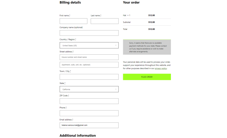
Default WooCommerce forms (let’s be honest) are quite annoying and not flexible enough. The risk here is that clients will think twice about whether to spend time filling out all these fields. And thrice when they saw all these default addresses fields, and so on. So, customization is the key here, as well as tools for editing product or archive layouts, such as JetWooBuilder and JetThemeCore.
Keep the checkout forms as simple as possible because you definitely don’t want to lose clients when they are almost made a purchase, right?
Below is an example of a default WooCommerce form, and it’s definitely not the best solution for most cases, don’t you think?
- Using conditions for multi-step forms
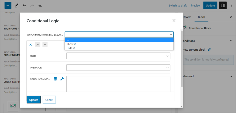
Use conditional logic where it is possible instead of stressing your clients with a lot of fields that are not essential at all. The Conditional logic sets the fields to be displayed next or on the next step of the form.
It’s a priceless functionality that reduces bounce rate, which is so important.
JetFormBuilder offers a Conditional Block – a container for as many form fields as you need, visible only if the conditions are met, with flexible settings.
When to Use Multi-Step Forms?
One of the most popular areas of application of multi-step forms is registration and quiz/survey forms. These topics are material for long forms that should be converted to multi-step ones. And the possibility of using conditional logic for every step is exactly what we want.
- Appointments
With Crocoblock, you can design your appointments and bookings using plugins that are perfectly connected to each other. The JetAppointment plugin (it works properly with JetEngine) adds a dynamic calendar form with time functionality anywhere in the JetFormBuilder dialog. It’s definitely very handy.
- Booking forms
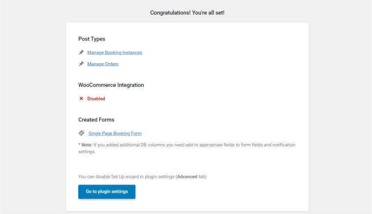
They are as easy to create as appointment forms. Install the JetBooking plugin, set up your properties’ booking details, and generate the form automatically.
- Shipping forms
This is where detailed information about the client is needed, but instead of a scary long form, use a multi-step one with conditional logic, so the clients would not change their minds about buying the product while filling out the form that seems endless.
- Content submission forms
In many cases, site visitors can be content creators, and this is where you might need the multi-step form functionality. JetFormBuilder offers an Insert/Submit Post post-submit action to add or update a post on the current website. It’s easy to set up, and what you need to do is a proper mapping of the fields.
💡 Also, you can use AI to help you modify your content automatically.
Multi-Step Forms Examples for Your Inspiration
- Appointment form for service
If you get really creative, you can put such forms on another level, and this is what the creators of this car service website did (using Crocoblock):
Combining lead-generation and appointment forms and placing them in the pop-up window is a non-obvious but quite effective way to get new clients. By the way, using JetPopup, you can create the most advanced pop-ups with any type of form, adding any display conditions and triggers you want.
- Lead generation
Lead generation forms are the place where you can be really creative and offer something first, for example, free guides, like Hubspot does:
Neil Patel’s site is all about conditional blocks and interactions with users. And this multi-step lead generation form is not an exception because it appears at a certain point when the user spends some time on the website without performing any actions:
- Personalized product selection quiz
Quizzes are fun, interactive, and helpful in getting new information or choosing the right product for every client. Almost every eCommerce site would benefit from this kind of multi-step form, and this is an example of such a quiz for finding a perfect mattress:
Also, it’s very important to show results immediately and not make a client check the mailbox or perform any other actions because it will not create a good user experience at all, and the site would be associated with something fishy.
Creating a Multi-Step Form
The difference between one-step and multi-step forms is in the page breaks elements and the evaluation of the steps. The other functionality that is really useful here is saving form progress so that the user can get to the form later, and the previous fields would stay filled. It encourages clients to fill out a few fields that are left instead of the frustrating feeling that they have to go through the process again in case they get interrupted while dealing with a form.
This tool is included in the set of premium add-ons of JetFormBuilder. Other useful instruments here are user auto-login (users can log in automatically after registering instead of filling out the sign-in form again), scheduling forms, or limiting form responses – which is perfect for sales. For the most advanced cases, there is hierarchical select functionality that enables multi-level select fields.
You can create personalized quizzes using it and automatically perform even the most complicated calculations there.
Add page breaks for each step after all the fields and elements are added and the form is tested. If there are any errors or validation issues, you will be able to see the whole picture and fix them faster.
Tips for working with JetFormBuilder
JetFormBuilder has a lot of settings to choose from, but you should be attentive to details not to get unexpected errors.
- Submit type
If you display your form using the JetForm Elementor widget, there’s a Submit Type setting. It should be the same as the Submit Type in your form editor; otherwise, the form will not be sent.
- User Access for Media field
Don’t miss the User Access setting; the form will not be validated if the user, who doesn’t have access, tries to upload a file.

- JetStyleManager
There is a dedicated free plugin for styling JetFormBuilder; it’s called JetStyleManager, and it’s available for download on the WordPress plugin directory or from the Crocoblock website. It’s lightweight, has many settings for designing form fields, and responsive controls.
💡 For more tips, check out this article.
FAQ
Install the JetFormBuilder plugin, add all the fields and blocks you need, and set up the necessary post-submit actions. Test the form. Add the Form Page Break block where you want to split the form into steps, activate the “Enable form pages progress,” and customize the messages for each step. That’s it; your awesome multi-step form is ready.
Use them when the form is quite long, for appointments, registration, shipping forms, etc.
No, with the right instruments, it’s as easy as building any other form.
It depends on the industry and type of the business, but according to most of the studies, a good conversion rate is above 5%.
Bottom Line
In most cases, forms appear at the critical point of users’ interaction with the website, so they play a pivotal role in the process of converting your visitors into clients. That’s why every little detail should be well-thought-out, as well as the appropriate instruments should be chosen. In this article, we talked about the UX principles of multi-step forms and JetFormBuilder as a great tool for creating them, and I hope you enjoy this free plugin from Crocoblock.

