In this article, I want to share my experience building coaching websites. You’ll find seven actionable tips for crafting better websites.
- Make It Simple
- Make Each Coaching Website Personal
- Personal Photos
- CTA’s for Coaches
- Getting Copy from Coaches
- Showing Prices or Not?
- Avoid Scope Creep
- Sum Up
#1 Tip: Make It Simple
One of the things I realized when I decided to focus solely on designing websites for coaches was the importance of making things as easy as possible for your client.
More often than not, coaches are a one-person show in their business, so they are swamped doing a bit of everything. Although this does vary (especially on the niche of the coach), I’ve found that coaches can be less techy and maybe a bit more disorganized than the typical clients I used to work with before niching down.
When working with coaches, it’s essential to make things as easy and step-by-step with them as possible. Although I think this is valuable to have when working with any clients, even with coaches, I found it important to have very clear project workflows and ensure that you are very good at communicating them to your client.
Simplified web design process checklist
- Make the division of labor and conditions very clear in your web design proposal/contract.
- Send an onboarding document that outlines all of the specific things they need to know about the web design process. Include things like:
- What are the web development stages?
- When do they need to send you something?
- How will revisions work?
- How often and when will you meet?
- What information do you need from them?
- Answers to FAQs.
- Create a Google Drive folder and share it with them. Set up a folder system where it’s obvious where everything goes.
- Get the copy before you start. I can recommend a copywriter to them, but I also send them worksheets to help develop their own.
- Meet with your client regularly throughout the project (weekly, fortnightly). This helps them feel part of the project and is suitable for you to follow up.
- Keep emails to a minimum. I prefer to talk them through in our meetings and then send an email recap with what we discussed and any outcomes or homework we discussed at the end.
- Use a design revision app, like MarkUp, to get feedback and changes from clients. They can comment, propose changes, edit text, etc., and then have a list of things from the client in one place. It’s excellent to give them a link and deadline and let them do it.
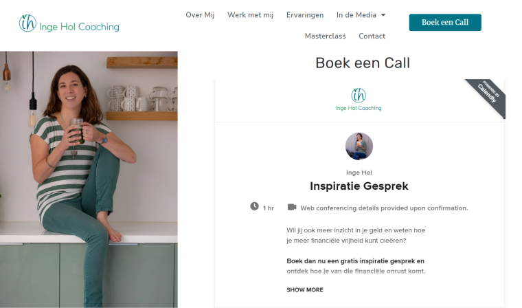
- Discuss additional features and make them easy to use them. For instance, my client’s recent website, Inge Hol, has more features like adding interviews, podcasts, etc., to their website; I make it as easy as possible to continue using custom post types.
#2 Tip: Make Each Coaching Website Personal
Before taking on the next project, a coach’s website must be very personal. As a coach, when you are signing up clients, you aren’t just selling your coaching service; you are selling yourself as a brand.
If someone is looking for a plumber or a lawyer, they just want the outcome but probably don’t care about whether they like the person that much.
However, someone looking for a coach, especially a life coach, is looking for someone they are prepared to share their, often very personal, problems to solve.
Therefore, when we are designing coaching websites, it is essential to remember two things:
- The notable difference that the coaching will have on people’s lives (e.g., what their life will look like when the problem is solved).
- What makes this particular coach right for them? (which is why you need to delve into their target audience to do this well).
#3 Tip: Personal Photos
Consequently, the next tip about using plenty of photos of the actual coach (client) comes.
From the very beginning, I recommend potential clients to get professional photos taken. However, many don’t, so I still guide them on how to get a friend to take photos of them.
Pro tip:
Don’t even think about taking on a coaching website project without the client being able to commit to sending you photos of them.
You just can’t “sell the coach” if you don’t have plenty of photos of them to work with.
You should include photos throughout the website or at least on the homepage and “About Me” pages in your website design.
Undoubtedly, you may need to guide your clients on how to take their photos if they aren’t willing to get professional images (which are so much better).
Coaching photos tips
- Use the best camera you can get your hands on.
- Take the images in the landscape.
- No selfies. Get someone else to take the photos.
- Make sure to leave lots of space around when taking photos, as that gives your designer more to work with.
- Make sure you’ve got an uncluttered background.
- Lighting is so important.
- Dress classically (as you were planning to meet a client).
- Send your designer the full, unedited photos.
#4 Tip: CTA’s for Coaches
When you first talk to a coach and ask them what their call-to-action (CTA) will be, they will look at you like you’ve got two heads.
You should work with your client to decide on the CTA buttons, but for those who have no idea, it’s best to guide them to one of the following:
- Free Consultation Call – becomes increasingly popular for coaches to have their CTA as clients can book a free 15/30 minute Zoom call (using JetAppointment, Calendly, or Acuity).
- Free Download – the usual freebie in exchange for an email address.

#5 Tip: Getting Copy from Coaches
As with the photos, the text should be prepared in one of the following:
- coaches have a copywriter;
- you include copywriting in your services;
- paired up with a copywriter.
NOTE:
However, you’ll often find coaches who want to write text independently. Coaches usually don’t come from a marketing background, so knowing what makes good website copy can be something they aren’t very good at.
I find that coaches can be terrible at writing their copy from their point of view and can go on and on about the different techniques they use, or they can use far too much coaching jargon.
While ideally, getting a copywriter involved would be better, if they’re going to come up with their own, you should help them by directing articles or mini-courses that will at least set them up better.
As a web designer, the last thing you want is to build an excellent website that is ruined by terrible copy.
#6 Tip: Showing Prices or Not?
I’ve written a blog post about the pros and cons of listing prices on a coaching website that I often send to clients.
There is no correct or wrong answer here, but I generally think it’s better to package up your offer and state your pricing clearly, as this will help carve out the clients who are just looking for the cheapest thing.
While I don’t think you should decide this for your client, I consider you should make a recommendation based on what you’ve learned about their business.
#7 Tip: Avoid Scope Creep
Every web designer’s worst enemy is scope creep. We’ve all had those moments when we’ve found the project has overstepped the initial proposal. And it’s so hard to come back from.
Avoiding scope creep is something that I think everyone must strive for, regardless of the industry they focus on. You need to do many important things to avoid it, like having an ironclad contract, clearly stating from the beginning what is and isn’t included, etc.
I could write a whole article on the point, but instead will share some notes that might help:
- Include homework time in your timeline: before you start, give the client homework (copy, photos, etc.) and clearly say what they need to do and when.
- When they sign up for the usual five pages (home, contact, work with me, blog), talk about what they might want, and have them clearly say whether they do or don’t want these elements:
- scheduling a free consultation call;
- online webinars;
- integrate a podcast using something like Libsyn, Blurry, or Buzzsprout;
- selling a book;
- a lead magnet (free item or service).
Sum Up
I hope this article will help you create magnificent coaching websites, understand your client better, and avoid website process mistakes.
Feel free to share your tips and tricks in the comments below.


