A contact page is easy to underestimate. It’s not a landing page or a sales page. It’s the page people visit after they’ve already decided they want to talk to you. That means the bar is higher than most people think.
The numbers speak for themselves. Across all industries, the average form abandonment rate is 67%. For every 1,000 people who start filling out a form, 670 leave before submitting. Among those who interact with a contact form, only 38% successfully submit, which puts the view-to-completion rate at around 9%. Most of those losses aren’t inevitable. They’re a design problem.
The typical WordPress contact page, with a three-field form, a phone number, and maybe a Google Map, was fine in 2018. In 2026, it’s a missed opportunity. Visitors compare multiple options before reaching out. AI assistants treat contact pages as official business data sources. And the way you handle first contact, whether that’s a form, a chat widget, or an AI-powered intake flow, directly affects whether someone follows through or closes the tab.
This article explains what actually makes a contact page work in 2026: design patterns with real examples, dynamic form options using JetFormBuilder, map and chat integrations, and schema markup that helps both search engines and AI tools read your contact data correctly.
What Makes a Contact Page Actually Work
Good contact pages don’t look the same, but they solve the same three problems: they make the first step fast, they build enough trust for someone actually to take it, and they match the contact format to the type of request.
That last point matters more than most contact page guides recognize. A freelance photographer and a B2B logistics company have very different contact needs. One needs a simple email link and a portfolio. The other needs a structured intake form that routes the request to the right team before anyone picks up the phone.
Before choosing a layout or a plugin, it’s worth determining which pattern fits your use case:
| Form-first | Agencies, B2B, high-volume inquiries | Multi-field or multi-step form, routing logic |
| Info-first + minimal form | Freelancers, local businesses, personal brands | Clear contact details above the fold, 2–3 field form |
| Split-screen: map + form | Brick-and-mortar, multi-location businesses | Embedded map alongside form, location data |
| Chat-first + form as fallback | eCommerce, SaaS, fast sales cycles | Chat widget or AI chatbot, form for structured requests |
| Quote/brief form | Service businesses, agencies, logistics | Longer form structured as an intake, conditional fields |
The sections below cover each of these in practice, with examples, WordPress implementation notes, and the edge cases worth planning for.
Must-Have Contact Page Elements
Apparently, for a fully functional website, the must-have elements are the contact form, email and phone numbers, links to social media, Google Maps, and sometimes a search bar. So, let’s closely examine the following contact page examples and find out how others implemented the vital contact page elements.
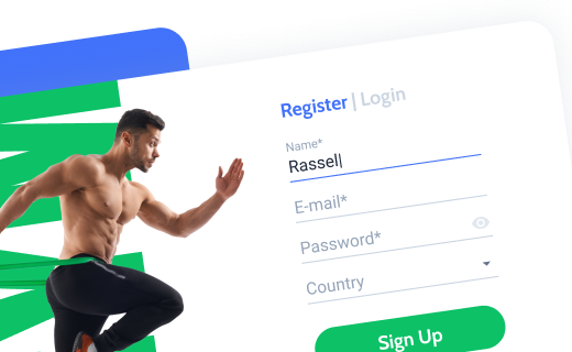
Contact form itself
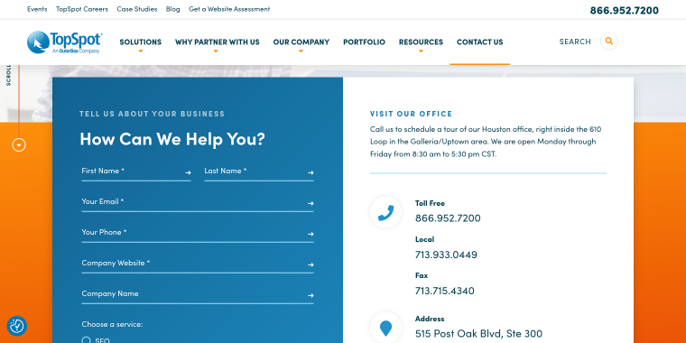
The contact form is an essential element of the contact us page design. Based on TopSpot’s design, the following tips are notable:
- too many fields for contact details are likely to intimidate users (e-mail, phone, name, and a message are enough);
- place it at the most visible place to avoid a client scrolling the page;
- users dislike long contact forms because they have to type a lot;
- design the WordPress contact us page form using bright colors;
- the sliding sidebar with the contact form is more functional than the pop-up (users can activate the sliding sidebar at any time with just one button, but the pop-up disappears after the user clicks).
Users want to know that their form has been delivered and when they will be contacted. Add a form submission confirmation message/pop-up and specify the average response time.
A contact form is one of the main elements on the WordPress Contact Us page. Too bad WordPress does not have built-in functionality for creating a form. Luckily, you can easily create one using plugins like the free JetFormBuilder from Crocoblock. With its help, you can create a form from scratch or choose one of the existing form layouts and customize it.
Email and phone numbers
The contact info is the main reason a business creates a contact page. On a website like Servegate, its main design features are:
- some people prefer emails, and some prefer phone calls. It never hurts to include all possible communication means;
- make emails and phone numbers clickable to save the users’ time and prevent additional actions;
- a phone number is a step toward a confidential relationship between your visitors and you. Providing this contact detail shows more trust and willingness to negotiate.
Now, here is how you can make the phone number and email clickable:
- a clickable phone number: write a number and add a link. In the link, indicate “tel:+(phone number without spaces).” After this, the user can click on the specified number and make a call from a convenient application;
- for a clickable email, write the necessary email and add a link. In the link, write “mailto:(email).” If you’re interested in more details on this, here’s a guide on how to create an email link in HTML.
If you want to respond to messages instantly and get even more satisfied customers, you can add a chatbot, feedback form, or Live Chat to the website.
Links to social media
Social media often becomes the main communication channel due to its quick response.
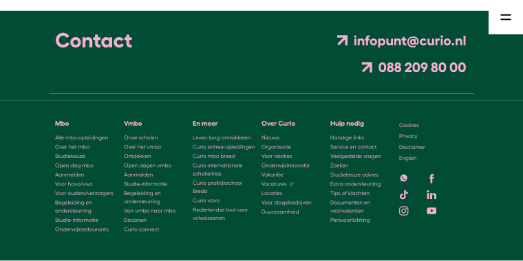
Usually, on a website like Curio, the advice for social media inclusion covers the following:
- it’s worth making links to social media pages easily reachable. Website visitors should be able to follow them without being confused;
- when creating social media buttons in web design software, make them eye-catching but not too annoying, large enough to notice at first glance, and place them smartly.
Google Maps
Google Maps makes your website look more advanced, and this element is crucial for businesses that have offices. You can easily incorporate this element using plugins, such as JetElements. See how it’s done on the IDFWO website.
Contact Page Do’s and Don’ts
Good contact pages don’t require a long checklist; they mostly come down to removing friction and making the right information easy to find. Here’s what separates pages that convert from those that don’t.
| Do’s | Don’ts |
|---|---|
| Make the contact page reachable in one click from anywhere on the site, and keep it short: three to five fields for general inquiries | Bury contact details in the footer or skip the page entirely |
| Use a form instead of a bare email address to reduce spam and structure incoming data | Display a raw email link as the only contact option |
| Include at least two contact channels (form + email, or form + chat) | Rely on a single channel and hope it works for everyone |
| Add a map if you have a physical location; it builds trust and answers a common question immediately | Embed a map but omit the actual address in text form |
| Keep contact details up-to-date: phone, email, hours | Leave outdated information on the page, and catch it only when someone complains |
| Add schema markup so search engines and AI tools can read your contact data correctly | Skip structured data and rely on AI parsers to guess correctly |
| Write a short line of copy above the form. Even one sentence sets the tone | Drop a form on a blank page with no context |
| Separate contact points by type (sales, support, billing) and region or office | Route all inquiries to a single inbox and sort them manually |
Contact Page Patterns and Real-World Examples
The examples below aren’t meant for visual inspiration. Each one illustrates a specific pattern, what it does well, when to use it, and how to build something similar in WordPress.
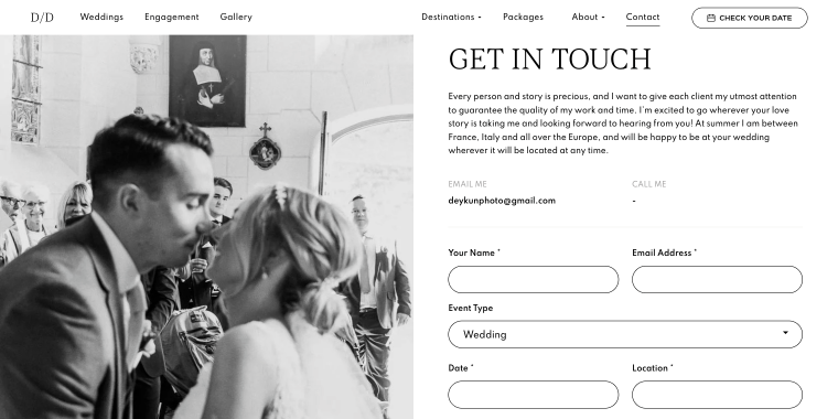
What works in Dina Deykun’s contact form: all decision-making happens above the fold. The visitor sees who they’re contacting and what they need to fill out without scrolling.
A form-first approach makes sense if the form is well-designed. Too many fields, lack of field grouping, or a generic “Send Message” button will kill conversion regardless of layout.
How to build it in WordPress? Use Elementor or Bricks for a two-column section with contact details or a CTA on the left and a JetFormBuilder contact form on the right. Keep the form to four fields max for general inquiries; use conditional logic if you need more data for specific request types.
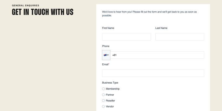
Info-first + minimal form
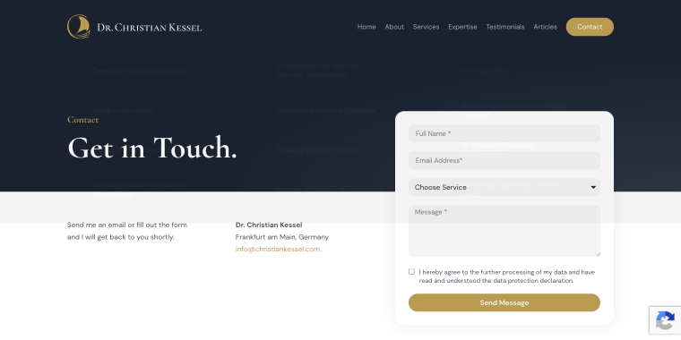
What works on Christian Kessel’s contact page: when the visitor already trusts you enough to reach out, friction is the enemy. Four fields (Full Name, Email Address, Choose Service, and Message) are often the right answer. The page’s job is to get out of the way.
“Minimal” doesn’t mean “bare.” The page still needs a clear CTA, a response time expectation, and at least one alternative contact method.
How to build it in WordPress? Create a JetFormBuilder contact form with a stripped-down layout, no labels cluttering the form, placeholder text as guidance, and a “Send a Message” button.
Split-screen: contact page with map and form
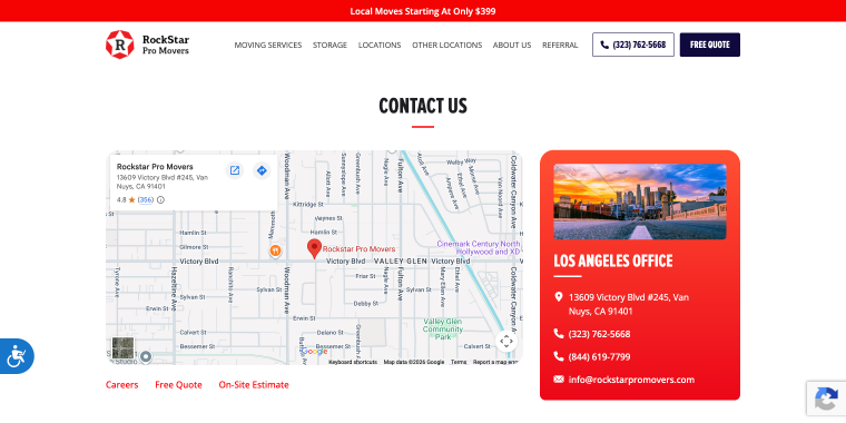
What works on Rockstar Pro Movers’ contact page: the map does two things at once. It answers “Where are you located?” and establishes physical legitimacy. Placing the form next to it lets the visitor act on the trust signal immediately.
Static Google Maps embeds are easy but limited. If you have multiple locations, a static map becomes complicated fast.
How to build it in WordPress? JetElements Advanced Map widget and JetFormBuilder in a side-by-side layout. If location data is stored as CPT meta fields in JetEngine, you can use the Map Listing to pull it dynamically.
Contact form vs live chat
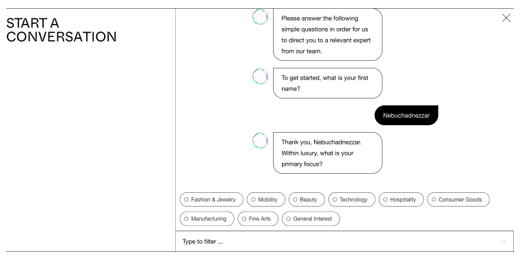
What works on the Liquid Crystal contact page for visitors is a quick answer before committing to a formal request; a chat interface lowers the barrier. The conversation qualifies the lead before it reaches your inbox.
Form chatbots have evolved dramatically, and when fed with all the corporate info, they can provide answers without referring a lead to a human agent. The current generation of AI chatbots for lead generation (Tidio AI, Intercom Fin, custom agents built on Claude) can pull answers from a knowledge base, book a consultation, and hand off to a human when needed.
How to build it in WordPress? Embed a chat widget (Tidio, Intercom, or a custom AI agent) as the primary contact surface, and place the JetFormBuilder form below or behind a “Prefer to write us?” toggle. If you want to create a human-driven client chat, consider the JetMessenger plugin, which allows you to create portal chat systems.
Quote/brief form
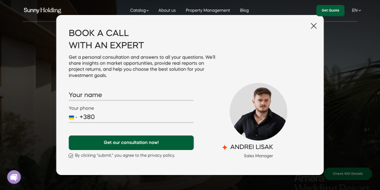
What works in the Sunny Development Group pop-up: some businesses can’t provide a useful response without information upfront. A shipping quote, a design brief, or a service estimate: these need structured intake, not a blank message field.
How to build it in WordPress? JetFormBuilder form with two form fields added to a pop-up created with JetPopups.
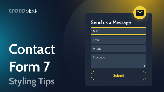
Mastering Dynamic Contact Forms with JetFormBuilder
EXTRA READING
See how JetFormBuilder handles contact forms; from simple three-field layouts to conditional multi-step flows.
A basic contact form (with name, email, and message fields) handles simple inquiries well. The problem arises when the business needs to route different types of requests differently, collect varying amounts of information depending on what someone needs, or perform a specific action after the form is submitted.
These are among the most common questions in JetFormBuilder support: how to show additional fields only for certain request types, how to split a long application form into steps, and what to do after submission beyond sending an email notification. The sections below cover each of these.
Conditional fields to show only what’s relevant
Conditional logic in JetFormBuilder lets you show or hide fields based on what a user has already answered. A visitor selecting “Sales inquiry” sees a budget field and a project timeline. Someone selecting “Technical support” sees a product field and a version number. Everyone else sees a clean, short form.
This solves a real UX problem: long forms intimidate before they’re even started. Research shows that reducing a form from 11 fields to four can increase conversion by over 120%. Removing a required phone number field alone has shown up to 275% improvement in some cases. Conditional logic lets you collect the same amount of data from users who need to provide it, without penalizing everyone else with a long form.
In JetFormBuilder: add a Select or Radio Field for request type, then set visibility conditions on other fields based on its value. No custom code required.
Multi-step forms with a progress bar
When a form genuinely needs more than four or five fields, such as a project brief, a service quote, or an onboarding intake, breaking it into steps with a visible progress bar significantly improves completion rates.
One documented B2B case showed completion rates of 8.1% for a multi-step contact form versus 0.96% for the same data collected on a single screen, roughly a 7x difference. The mechanism is simple: a single-screen form with ten fields signals effort before the visitor has committed. A first step that asks only for name and email is easy to complete, and once started, most people continue.
In JetFormBuilder, you can use the Next Page Field to divide the form into pages, enable the progress bar in form settings, and validate each step before allowing the visitor to proceed. Field grouping and clear step labels (About you > Your project > Confirmation) help set expectations.
Post-submit redirects and actions
JetFormBuilder’s Post Submit Actions let you configure the contact form redirect after submit:
- Redirect to Page — set expectations (response time, next steps) rather than just confirming submission;
- Redirect to a payment or calculator page — relevant for service businesses where a quote follows immediately;
- Conditional redirects — route to different pages based on form values (sales vs. support, location, request type);
- Webhook or CRM integration — send submission data to an external system without manual export.
Multiple actions can be chained and made conditional. A support request creates a ticket in one system; a sales inquiry notifies the sales team and redirects to a booking page.
Contact Page Schema Markup
Schema markup has been a Google recommendation for years, but its importance has shifted. AI-powered search assistants, whether that’s Google’s AI Overviews, Perplexity, or voice assistants, don’t just rank pages. They read pages as structured data sources and surface specific facts: business name, phone number, hours, service area, and contact email.
A contact page without schema markup relies on AI tools to parse unstructured HTML and guess correctly. A contact page with proper JSON-LD tells them exactly what each piece of information means. For local businesses, this especially affects whether your contact details appear in AI-generated answers at all.
Local business schema for contact page
The relevant schema types for a contact page are LocalBusiness (or a more specific subtype like ProfessionalService) and ContactPage. The key properties worth implementing:
{
  "@context": "https://schema.org",
  "@type": ["LocalBusiness", "ContactPage"],
  "name": "Your Business Name",
  "url": "https://yourdomain.com/contact",
  "telephone": "+1-800-000-0000",
  "email": "[email protected]",
  "address": {
    "@type": "PostalAddress",
    "streetAddress": "123 Main St",
    "addressLocality": "City",
    "addressRegion": "State",
    "postalCode": "00000",
    "addressCountry": "US"
  },
  "contactPoint": [
    {
      "@type": "ContactPoint",
      "contactType": "sales",
      "telephone": "+1-800-000-0001",
      "areaServed": "US",
      "availableLanguage": "English"
    },
    {
      "@type": "ContactPoint",
      "contactType": "customer support",
      "email": "[email protected]",
      "areaServed": "US"
    }
  ]
}
If you have multiple office locations, each should have its own page with its own LocalBusiness schema rather than a single page trying to cover all of them.
How to manage contact data with JetEngine
The practical problem is keeping it up to date. A phone number changes, an office moves, or a new support email is added, and the update needs to happen all around your website.
JetEngine local business contact data handling is achievable with the help of the Options Page feature, which can output phone, email, address, and support contacts in two places simultaneously via Dynamic Field in Elementor or Bricks.
FAQ
Use JetFormBuilder’s conditional logic. Add a Select or Radio Field for the inquiry type, then set visibility rules for other fields based on its value. Fields appear or disappear dynamically without a page reload, and no custom code is needed.
Two approaches work well together. First, adopt a multi-step layout with a progress bar; spreading the same number of fields across three steps performs significantly better than a single long screen. Second, use conditional contact form fields to show only what’s relevant for each request type. Hidden Field (UTM parameters, page URL, referral source) can capture context automatically without adding visible fields.
In JetFormBuilder, go to Post-Submit Actions and add a Redirect to Page action. You can set a single URL for all submissions or use a conditional redirect to a different destination.
Yes. Use the JetElements Advanced Map widget for the map output and the JetFormBuilder for the form, placed side by side. If location data is stored in JetEngine, the location can be pulled from the meta field dynamically, which is useful if you have multiple locations.
Both serve different purposes. AI-powered chat handles fast first contact and lead qualification, with response times under 30 seconds, versus 24-48 hours for a form sitting in an inbox. The form handles structured requests: formal quotes, file attachments, and data that needs to arrive in a reliable format. The most effective contact pages in 2026 use chat as the primary surface and keep the form as a reliable fallback.
Add a JSON-LD script block to the contact page using a Custom HTML widget or a schema plugin. Include LocalBusiness (or a relevant subtype) with contactPoint entries for each contact type: sales, support, or billing.
Sum Up
A contact page isn’t a formality. It’s the last thing standing between a visitor ready to reach out and an inquiry that actually lands in your inbox.
The pages that convert well in 2026 share a few key traits: the layout aligns with the business type and the request type, the form asks only for what it needs, and the page provides AI search tools with structured content to read. None of that requires a complex setup: JetFormBuilder handles conditional logic, multi-step flows, and post-submit actions without custom development.
The rest is ensuring those pieces match the actual contact pattern your visitors expect.

