Readability is an essential aspect of web design that determines how easily website visitors interact with content. Effective web typography can make a website look good and help readers absorb information in the text. However, this issue is more complicated than simply choosing fonts. In this article, I’ll explain many factors that influence the readability of text and how you can improve it.
Table of Contents
- Font Legibility
- Typographic Hierarchy
- Pairing Fonts
- Arrangement of White Space in Paragraphs of Text
- Background Contrast
- Typography for Mobile Devices
- Improving Web Typography for Disabled People
- Summary
Font Legibility
For website readability, choosing the right fonts is a key factor. Most importantly, consider if the font for the body copy, i.e., the font used on the page most frequently, is legible. Legibility is a typeface feature that determines how easily distinguishing each character is. Although there is no one answer to what makes a perfectly legible font, certain details make one font more accessible than the other.
These are some tips for choosing legible fonts for a body copy:
- Avoid fonts that use similar or almost-identical glyphs for denoting different letters. When examining the font, compare uppercase and lowercase ‘I’ with lowercase ‘L’ and numeric ‘1’ because if they look similar, they may slow down reading. Check out symbol pairs ‘c-o,’ ‘rn-m,’ ‘u-v,’ ‘6-b,’ and ‘0-O’.
- Some letters and numbers may look identical when flipped horizontally, and such pairs may baffle some readers. For example, speakers of languages that use non-Latin alphabets may mistake ‘b’ for ‘d’. Other examples of mirrored symbols are: ‘qp,’ ‘zs,’ a6’.
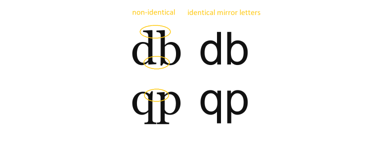
- Ascenders and descenders (the parts of the letterforms that extend above or below the central baseline of a type, such as stems in characters ‘b’ and ‘p’) help readers to recognize letters and words better. If they are too short, the font becomes less legible.
- Legible fonts should refrain from containing any letters that call the excessive attention of readers because it results in an unsteady reading experience.
- Ideal serif fonts have small and slightly bracketed serifs. Long, exaggerated serifs distract from the font’s legibility.
- The fonts with large x-height are more legible because reading them from a distance is easier.
Typographic Hierarchy
All web pages with textual content need an established hierarchy. Typographic hierarchy creates semantic division in text blocks, mainly employing typography instruments such as font size, design, and layout. By clearly distinguishing between important pieces of text that people should read first and the rest of the copy, we make the design easier to scan.
The beginning designers cannot underestimate the importance of hierarchy. Without it, all the text would look the same, and it would be impossible to determine what’s it about without actually reading through most of it. People’s attention spans are shorter than ever, so readers want to know what the information is about before they sacrifice their time and be able to focus on the content they need.
There are several ways for designers to build a typographic hierarchy. The general rule is to use three hierarchy levels: heading, subtitle, and body copy.
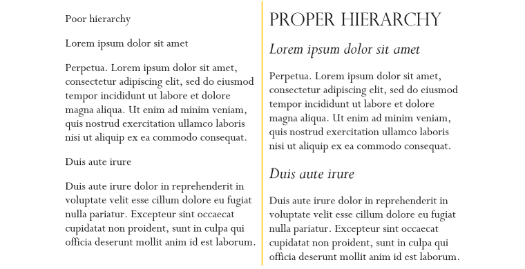
Heading is the biggest design type that draws the reader’s attention to the content and is also the highest level of typographic hierarchy. Since headings contain the most important information, they must be visually distinctive from the rest of the content.
Headings can use display and script typefaces that wouldn’t be readable in long-form texts to catch readers’ attention. They also must be significantly bigger than paragraph text, and capitalization is one of the options to show their importance, although all caps can further degenerate text’s readability. Another way to emphasize typographic hierarchy is to use spacing before and after the heading.
Subheadings generally help organize content into sections and provide information about what is in the following body text. One of their purposes is to let the reader scan through the whole page quickly and determine whether it contains important data. Viewers should easily identify subheadings, so they can be larger and use a different font than the main text. But, unlike the headings, they need to visually connect to the body text, so they often use the same typefaces.
It’s OK to use subheadings even in short-form texts. They can take a form of a phrase or a sentence that provides a more detailed look at the topic and spark curiosity in readers. On lengthy pages, such as guides, eCommerce product pages, and blogs, designers may use more than one level of subheadings to distinguish subtopics within chapters. However, always double-check if having multiple subheadings levels is a good idea, as overly complex typographic hierarchies distract readers’ attention.
The main text in a piece of content is called the body, which is the largest segment of a text-heavy design. The main text usually uses the smallest type in design, but it has to be large enough to be readable by all readers. Designers often use a 12px font size as a minimum for body text, increasing that to 14, 16, or even 22-point for additional readability.
Remember that the types with different designs may appear larger or smaller even if assigned the same font size. The usual choices for body copy are simple serif and sans serif fonts with traditional designs.
Pairing Fonts
Implementing good font pairing is vital for clear hierarchy and design readability. Aim to create a design with visual harmony while avoiding redundancy, so different level fonts don’t compete for the reader’s attention. While the different hierarchy levels must have different stylings, you can use one typeface across the entire design if it has different style variants.

Here, the New York Times designers use Georgia typeface. An easy-to-read classical serif font is used for the subheadings and body copy, while bold italic styling creates beautiful nuances for the heading.
The safe way to use contrast for creating an established hierarchy is by pairing serif and sans serif fonts.

In the above example, sans serif Helvetica font provides a strong appearance to the heading, thanks to condensed lettering and geometric forms. It is accompanied by a classical serif font Georgia with some small flairs to the design, making it look somewhat inconsistent and warming. This is a perfect combination of fonts for a humanitarian organization.
Readers first notice and read headings. It’s not a problem to use a decorative font for the title you wouldn’t normally use for your body copy as long as it accomplishes your design strategy. Pairing decorative with normal fonts will create stronger contrast for a unique user experience.

In this example, the display type is made up precisely for use in this article and has no visual similarities to the body font, reminiscing of the emotional split described in the article.

Examine the large script font and the sans serif font below it on this vintage advertisement. Surely, these fonts are contrasting, but they share the overall mood – they’re both upward static fonts, expressing stability, honesty, and dignity. They also create a visual harmony when paired together because their lines are roughly the same width.
With so many fonts available to designers, you may feel overwhelmed by the possibilities of various font pairings. With two or three fonts, you may evoke specific vibes and moods. You can play it safe and use the same fonts changing their weight and size or take a risk and use display and script fonts designed to get attention. In the latter case, try using fonts with subtle relations or mood similarities to create harmonic pairs. Use font pairing generators to be more productive and try out more alternative combinations.
Determine the fonts for your design as early in the process of building a user-friendly interface as possible. If you know how your headings, subheadings, and body fonts should look, how they should be formatted, and what they are going to be used for, you won’t have to redo them one by one in the future. Make a visual presentation of your typographic hierarchy before you start putting together the website to save yourself time and make a better design.
Arrangement of White Space in Paragraphs of Text
The arrangement of white space, or spacing, essentially determines how much text is contained in a given space. The effective usage of white space between text elements can make the design more attractive, harmonious, and comprehensive for the readers. The particular font defines some features that control spacing, and designers must determine the others.
Line length is an important characteristic when building large bodies of text. An ideal line shouldn’t be too long to allow the eye to naturally and easily move from the end of one line to the beginning of another. At the same time, if the line’s too short and contains three words or less, the track of thought becomes hard to follow.
Line height. It is easier to scan the body text if you set the right line height. It also must be balanced with line length – paragraphs with longer lines require more white space between them. On the other hand, if the lines are too far, the text may appear unconnected, and the headings may lose their distinction made by spacing.
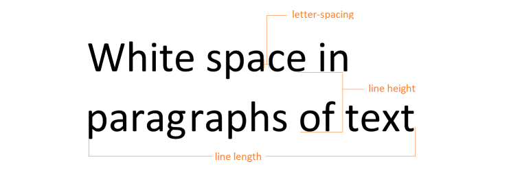
Letter spacing determines how much space there is between letters, and it impacts text readability greatly. However, each typeface has its own set of letter spacing, and generally, you shouldn’t change it in the body copy. If letters are too tight, the text appears heavy and hard to read, and if they’re too loose, white space becomes similar to gaps between words which also negatively affects legibility. You may want to change letter-spacing settings for the headings and subheadings to obtain some visual effects. For example, increasing the white space between letters in all-caps subheadings will make them look more important.
Paragraph spacing. Adding an extra space between blocks of text might seem unimportant, but it’s not. It makes the design more scannable as the eyes can quickly move from one concept to another. It also allows the reader to pause and get back to reading easier by making the text layout more distinct.
Background Contrast
Web design and typography design are two separate disciplines. However, knowing the basics of color composition is essential for successful fonts on the website.
One of the most important factors influencing design readability is selecting colors for text and background. If you combine the right colors, your text will catch the reader’s eye and convey the message accurately, and if you fail, the interface will look messy, and the text will be unreadable.
You can achieve the biggest contrast when matching white with black. So, dark fonts are better distinguishable on a white background and light fonts on a black. It’s a good idea to check the colors on a grayscale to know if your foreground color has enough contrast against the background.
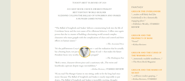
Often, websites turn to low-contrast designs, attracted by the trend of minimalism, and that can cause some usability issues. In the above example, designers chose Georgia typeface (with some of the letter lines being hair-thin) in gray color for the body font. This shade of gray isn’t exactly on the opposite sides of the grayscale with white background, and when the font is only 12 points in size, the reading becomes problematic. I used a color picker tool to zoom in on a letter to show you why choosing low-contrast color combinations for small font sizes impairs readability, especially for typefaces with thin lines.
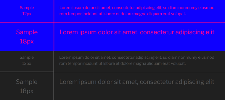
Some colors only seem to be dissimilar but are not actually good when used together for foreground/background. As you see, pink and blue are not a good combination. Comparing them on a grayscale reveals why they’re hard to read.
Typography for Mobile Devices
Creating a clean and user-friendly design for text-heavy content on small-screen devices requires understanding all the above typography aspects. Additionally, follow these best practices to make the user interface on mobile devices more accessible.
Adjust line spacing. The maximum recommended line length for regular-size screens is 80 characters. For text this wide, designers usually use a line height of 150% of the font’s height or more so it is easier for the eye to find the beginning of each line. You must adjust the line length to about half that size with mobile devices.
With the lines containing 40 characters or less, it’s much easier to track the beginning of each new line, so you may want to reduce line height slightly. On a mobile device, you’d have to make five swipes to go through a text visible on one desktop screen. So why add white space between lines if it’s not helping with readability and can make lines look detached?
Apply simple typographic hierarchy. Use only one level of subheadings. The subtopics within the subheadings need titles with distinguishable styles. Because on the small-screen devices, readers only see one element of typographic hierarchy at a time, it’s harder to determine whether the next section is the subheading or the sub-subheading.
Use sans serif typefaces for subheadings. Without the serifs, the minimalistic letters are easier to read at a glance. This way, a person can scroll through the entire textual content and find out what sections it contains.
Reduce size contrast for headings. Font size is one of the main tools to indicate the different types of typographic elements. But on the small screens, the giant headings will push everything else out of sight. Make emphasis on other contrast instruments, such as font weight and style.

In the above example, the heading and subheading’s size is reduced from 65 and 28px to 44 and 25 for small screens, but the body text stays at 22 points.
Improving Web Typography for Disabled People
Typography design and the choice of fonts can tremendously impact the design’s readability for disabled people, particularly those with visual impairments and learning disabilities such as dyslexia. To make your website more accessible, you don’t have to sacrifice much of its aesthetics but pay attention to the font designs and colors you’re using.
- Pick simple, minimalistic fonts for the body text. Examples of popular accessible fonts are Arial, Calibri, and Verdana. They are all sans serif fonts. The serifs at the end of lines can make letter design blurrier and indistinguishable for people with low vision. The serifs will make the font even less readable for readers with low-resolution screens, as they can be distorted by pixelation.
- People with dyslexia and visual impairments may confuse the letters with similar designs. Aim for fonts with clear and distinctive designs: vv vs. w, rn vs. m, lJ vs. U, etc. The same holds for the designs that are exact symmetrical copies: d and b, q and p.
- Maximize the color contrast between the font and the background. When using a black-and-white combination, use the grayscale tool to see for yourself if the text is readable for people with color blindness.
- Using italics and uppercase variants of the typeface makes the font less legible. Increasing a font weight to emphasize a message is a better option.
Summary
A readable design helps visitors extract information from the source easily and effectively. Web typography is a crucial component for creating an accessible interface, and mastering it as a skill will improve your work quality and performance.
