Let’s break it down: talking about price formation for website design, we also mean that there are two quite the opposite parties involved: a client and a designer (or a studio). The first one wants prices to be low, while the latter wants them to be high, right? So, how to find common ground, and what objective factors of website design cost calculation exist? It’s time to sort it out.
- Main Principles of Web Design Price Formation
- Cheap vs. Expensive Web Design Scenarios
- Website Design Pricing Models
- FAQ
- Wrapping Up
Main Principles of Web Design Price Formation
Of course, there are many not very logical things on the market, such as junior freelancers ready to work for a penny, and thus not only bringing unhealthy competition but also confusing clients without much experience in this field. (Needless to say, such “cheap thrills” rarely end up well, primarily for clients.) But, after all, there is a middle ground in all of this. And it’s called good design.
It cannot be very cheap, but it will not cost an arm and a leg. By understanding the principles of a good (or effective) design, the client understands what they are paying for and why it can’t cost a couple of dollars.
To make it more clear, let’s concentrate on the website (not the application) design process.
Principles of good web design
Web design is not about art. First of all, it’s a marketing and sales tool.
Good designers are those who bring the client an added value with the job they have done.
General rules while designing a website:
- Do not start designing a website before your digital marketing strategy is ready. Otherwise, there’s almost 100% probability that it will be entirely remade afterward.
- Communication between the designer and the client is the key to the success of any design project.
- Good web design doesn’t exist without good prior research.
- Basic UX texts must be created before making the website design, on the stage of wireframing.
- The main texts must be created on the stage of web design development because the designer should understand the idea of the message to be delivered and the length of the texts. “Lorem ipsum” is a bad practice.
Popular myths about “good” web design
- It should be very creative. The more, the better.
No, unless your initial goal is to literally show your creativity, and it’s a part of your marketing strategy and has reasons behind it. For example, if your business is a creative studio, you want to attract attention in the market and establish your brand image. Or it’s a part of your PR strategy to promote something and use the website as a media opportunity.
But as a rule, the website or application is a business tool with clear goals, not an artwork for an exhibition.
- It should contain as much information as possible about your business, preferably on the home page.
For the visitor, it takes just a couple of seconds to decide whether to stay on the web page or leave it. And they will leave it unless they get caught up from the very beginning. That’s why overloading the home page with information as if the visitor came to the library is the wrong idea.
- The more animations and sliders, the better.
Animations are a good idea when their purpose is clear, and they are relevant. Sliders, especially full-screen, are considered a questionable practice because they slow down the website considerably, but most of the slides are usually not seen by the visitor.
- The more colors and the bigger headings and buttons, the better. Every inch must be used.
The role of white space (also called “negative space”) in the composition is hard to overestimate. It helps to build a visual hierarchy on the page and focus the visitor’s attention on what is really important, unlike the cacophony of colors and fonts.
The power of UX
Unfortunately, many clients (and even designers) don’t fully understand the value and the crucial role of the initial research and the UX design. And what differentiates a good web designer from the bad is how well they can design a user flow with all that entails.
Every website or application must have a measurable goal (one of few). The user flow is the user’s journey throughout the website to accomplish the task set by the primary goal. For example, purchasing a product can be a goal, so the designer should define the user’s steps before reaching it. Then, determine what might attract the user in each step, how to motivate him to make the next one, what kind of bottlenecks can appear along the way, and how to avoid them. It is the basis of any design development on a stage of wireframing.
Even if the designer creates a very simple and cheap project, they should keep in mind those basic user flow principles. In more complex projects, there are A/B tests needed to find the most optimized user path.
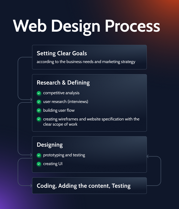
The main steps of the website design process
There are several main steps the client and designer must go through and talk through:
- defining goals and objectives;
- market research;
- defining the scope of work;
- creating the website structure and building wireframes and prototypes;
- content creation;
- testing;
- finalizing the detailed design;
- coding;
- filling with content;
- testing.
Cheap vs. Expensive Web Design Scenarios
There are two main scenarios in this niche; for the sake of convenience, let’s simply call them “Cheap” and “Expensive.”
The “Cheap” scenario means that the client doesn’t want to go deep into the user journey or just doesn’t need to sell or promote anything. As an example, it can be a website of an NGO with already existing donor funds, and the only reason the website is needed is to publish their financial reports and main news. So the whole goal of it is to communicate with a couple of dozen stakeholders without the purpose of attracting more.
Another example is when the client has a limited budget yet needs a simple website to give information about the business or sell a few goods and services.
Both types of clients don’t need anything exclusive, and they are happy to have a ready template slightly changed. What they definitely don’t need is a long, complicated, and multi-staged development process with sprints, PMs, and so on.
Good communication and a clear contract with an accurate limit of amends and time to work on the project is the key to success here. What designers shouldn’t do dealing with such cases is to lower their prices below the acceptable on the market to outperform the competitors. By doing so, they not only kill the market but ensure their own bad pricing prospects in the future.
The “Expensive” scenario means that the client wants not only “something on the Internet” but an effective business tool helping to meet their sales, marketing, and branding goals. So, it needs proper research, ideation, prototyping, as well as time for communication, testing, and editing.
Projects of this type can have the widest price spread and are not necessarily really expensive (because small projects, such as effective landing pages, also exist in this scenario). And, of course, there can be huge projects that simply cannot cost a little.
The best strategy for the designer to navigate between both scenarios is to set up their minimum acceptable price and never go lower. At the same time, learn the client’s needs and never try to offer them a “cheap” scenario when they need “expensive” and vice versa. Thus, you can not only avoid frustrations and time/money losses but also do some upsales and gain reputation, recommendations, and good portfolio cases.
Website Design Pricing Models
The more experienced is the designer/developer, the more refined the pricing model they have. It is based on experience and the ability to mix different pricing models.
Every project is different, so there are several main pricing models to use or mix and match.
- Hourly rate.
It is a very popular pricing model on freelance websites, such as Upwork, and normally it requires monitoring software to prove that the time was not wasted. If the hourly rate for web design is reasonable, there’s a good chance to earn some decent money even doing some not complicated tasks. This model is handy when there are many different types of big and small tasks or if they are unclear. The other case when this model is the best is when the project scope changes all the time. To avoid misunderstandings, there must be an accurate tracking of time, reports, and constant communication between the designer and the client.
- Fixed (flat) rate for the project or task.
It works well when the projects require a lot of research and creativity: those things cannot be properly tracked hourly. In this model, it’s essential to have a very clear contract with formulations about the maximum number of amends, as well as all the additional services, such as meetings, consultations, and workshops, if they are needed.
- Package-based pricing.
In the package model, the executor offers the client the set of services for a fixed price: It can be digital strategy, branding, website design, development, and content. It can work well either for smaller projects or if the executor is an agency. Otherwise, if done by a freelancer, the quality of the final product might be questionable.
- Retainer pricing.
It is a great option but works only if the client needs ongoing services from the designer. In this case, both parties agree on the amount of time the designer does work for the client during the month, and a fixed amount of money will be paid for it. For example, there will be 30 working hours per month, and the designer will receive $1000.
This model works well when both sides have good communication, and the designer is familiar with the specific job to do.
- Reputation and value-based pricing models.
If the designer or a studio won several reputable design awards, offers absolutely unique solutions, and has clients queuing years in advance, it changes the whole story. Then the executing party dictates how much they charge for their work.
FAQ
It stands for “user experience,” and, according to the “father” of this term Don Norman, it encompasses all aspects of end-user interactions with the company’s products, services, and the whole image. In other words, good UX in digital products gives users a clear understanding of the value of the product/service, is easy to use, is functional, and creates an excellent emotional impression.
UI stands for “user interface.” It is a process of designing interfaces, particularly their style, shapes, colors, interactivity, and overall stylish and trendy appearance.
The cheapest website design cost will be if you buy a ready template for $50-200 in a marketplace. But you will need to set it up, adjust it to your particular needs, and, most probably, slightly modify it to fit your business. The custom-made one made by a more or less qualified designer will cost from $1000, and the one made by an experienced professional will cost around $3000-$10,000.
It’s a document that is important for building a proper website architecture. It articulates the goal of the company and the website, in particular; its value for clients; objectives and outlines of the future website, its technical aspects; aspirations about visuals and content, structure, and usability. So, basically, it documents the communication between the client and the designer about what the future site should be like and what means will be used to create it.
Wrapping Up
Website design is a complex thing that requires not only designing and artistic skills but also some marketing knowledge and needs time for research. The more skilled the designer is, the more freedom they have when it comes to using different pricing models and, naturally, charging more for their work.
