
Did you know it takes a website visitor about five seconds to decide whether they like the vibe a website gives? Everything counts – design, color palette, accessibility, and – most importantly – website navigation.
What is it, and how to make it great? Keep reading to find out. 😎
Table of Contents
- What Is Website Navigation?
- Most Common Site Navigation Types
- What Makes Website Navigation Great?
- Website Navigation Best Practices
- Website Navigation FAQ
- Final Thoughts
What Is Website Navigation?
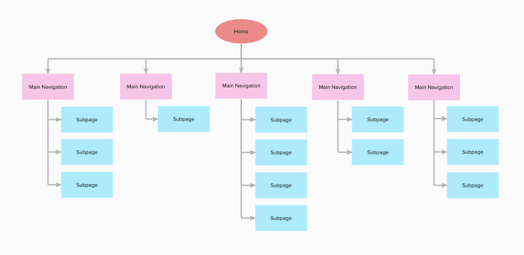
To get site navigation, one must understand what information architecture (IA) is. IA is about structuring information and making its hierarchy clear to users. Information architecture reflects how users will switch between the website’s many content sections and pages. Basically, it draws the shortcut to the needed content, making as few clicks as possible along the way.
Website navigation is, therefore, directly linked to the IA, as it represents the worked-out structure visually. You cannot omit the structuring because the final result will be flawed.
Source
For that matter, site navigation comprises vital UI components, which help users quickly find their way around the website. These elements can be text, links, buttons, and menus.
Web navigation is carried out thanks to hyperlinks, which can be internal and external. The first lead to different pages on the same domain, and the second lead to pages existing outside the current domain.
Frequently, site navigation incorporates a navigation menu containing internal links to different website pages. Now, it brings us to the next logical question. 👇🏼
What is a navigation menu?
A WordPress navigation menu is the website’s main “travel route,” containing links to other web pages, usually internal. It is mainly located in the website header for the visitors to access the needed page quickly.
There is primary navigation represented by the main website menu and sub-navigation represented by additional menu items – subitems – nested under the primary menu items.
Most Common Site Navigation Types
We reached the point where it’s time to find out more about website navigation types. Typically, there are three main types, which break down into several subtypes.
Global navigation
The first and foremost navigation type is global, where the menu and internal links it includes are identical across all the website pages. The reason behind it is the desire to keep it clear for users and show them a solid menu structure without confusing them.
Where can you see global navigation?
Horizontal navigation bar, aka horizontal menu, placed in the website header. It lists the main web pages side-by-side and provides immediate links to them. Most often, the horizontal nav bar features commonly met sections like “Products,” “Pricing,” “About Us,” “Blog,” and “Contacts.”
Hamburger navigation menu. It can be spotted next to the main horizontal nav bar in the website header and next to the site logo (most often), opening a mega menu. The hamburger menu is represented as a three-dot (three-line) icon, and once you click on it, it opens a vertical drop-down / horizontal pop-out containing navigation links.
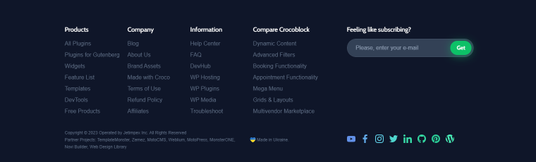
Footer navigation menu, which naturally continues the horizontal nav bar. Whenever site visitors don’t see the needed link in the header, they can scroll down the page and check out the footer, which typically contains more options. Another important detail: footer content remains the same no matter which website page you open.
Hierarchical navigation
The next navigation type creates a hierarchy in the menu featuring upper and lower-level menu items. The menu content changes depending on the web page context.
For instance, global navigation preserves the same menu structure when you follow a link to another category. But hierarchical navigation reveals new links, leading to subcategory pages. Every time you open a new category page, the links will differ.
Where can you spot hierarchical navigation?
Dropdown navigation menu, which is somewhat close to the mega menu. It can include multiple links to different web pages and can save you nerves when it’s impossible to list all the essential options side-by-side. It is ideal for complex information architecture.
Vertical navigation sidebar. It is not the most common navigation type, yet, some consider it the most integral one. Because the menu items are positioned in the sidebar and remain visible at all times, vertical navigation offers a seamless user experience. In addition, you can write longer navigation links and include more top-level options.
Local navigation
Lastly, the local navigation type is opposed to the global and hierarchical types because it refers to internal links in the content. Local navigation helps redirect users to other website pages for more relevant information. You can call it “internal linking,” and you will be right. Plus, local navigation is important for WordPress SEO.
What Makes Website Navigation Great?
Since you’ve had a look at a few website navigation examples, it’s time to address the burning question. What is the secret to the most intuitive, good navigation? Find out below.
- Good web navigation is all about convenience and usability. It is well-planned, follows established standards, links to the relevant pages, and doesn’t confuse users.
- Good navigation is easy to understand because it is as close to the user’s vocabulary as it can be.
- It is well-designed, too. Web navigation is distinguishable from the main content because it uses color changes, enough white space, and other design techniques.
- Website navigation is responsive and can be read equally well across all devices.
- Good navigation is contextual, meaning it creates a particular user journey every time one accesses the website.
Website Navigation Best Practices
Regarding proper web navigation, the more obvious it is, the better. You don’t want to confuse site visitors; quite the opposite – make their journey as straightforward as possible. I’ve tried and gathered the most widespread practices, which are sure to make the site navigation smooth sailing.
Create a sitemap
Referring to the IA, a sitemap should visually represent the website’s architecture. How many pages should there be? Which links go where? How are pages connected? A sitemap will answer all these questions by simply showing the user a webpage hierarchy.
Use the footer space
Footer is a vital website template; too bad it’s sometimes underestimated. For starters, the footer doesn’t “eat up” the space above the fold, so you can include almost anything. There is enough space for a sitemap, navigational menu, subscription form, social links, legal information, etc. Use the footer template to the fullest – add extra links to different web pages, which might be useful to site visitors.
Make primary navigation clearly visible
The main navigation typically houses the website’s most important pages, those you really want users to visit. I’m talking about the so-called “big 5” – “Home,” “Contact,” “About,” “Services,” and “Blog” pages, and it is important to make these pages stand out. How, you might ask? You can place a navigation bar in the website header and make sure it includes links to vital web pages. Despite its obvious simplicity, the method works because we are all used to finding the website navigation bar at the top.
Another useful tip is to use wording every user would understand. First-time visitors might not be able to understand what you’ve hidden under the cutesy names and decide to leave the site.
Additionally, you could categorize the products and put them into the mega menu. Categorization is key for content-heavy websites like eCommerce, retail sites, and marketplaces. This way, you’ll give users and visitors the opportunity to browse by category and find the needed item faster.
Rethink the hamburger menu use
Where do you typically put a hamburger menu? Is it next to the main nav bar? Is it placed separately and embraces the website nav bar? For the desktop, you can use the hamburger panel when you wish to create a wow effect and drive attention to performance. When we talk about mobile, it’s okay to leave a tiny hamburger icon for space-saving purposes.
Make navigation responsive
In 2022, the global share of mobile web traffic has reached almost 60%, which will only grow. Responsive design is about giving the visitor an equally good browsing experience across all devices – mobile, tablet, laptop, and desktop. Horizontal menus, with their inconsistent display and tiny texts, cannot meet such a need. Therefore, it’s common practice to use a compact hamburger panel, which one can expand back and forth.
Add breadcrumbs
Now, you wouldn’t want potential users to get lost, would you? Use breadcrumbs to prevent this from happening. They leave a navigation trail letting the user know the exact page and category they are currently browsing.
Put design techniques to use
Last but not least, try out different design techniques to make the navigation menu really pop. These could be different fonts, colors, and smart use of white space. You must be very clear about what makes the website navigation and what doesn’t.
Make the pivotal navigation item stand out above the rest – paint it a brighter color, use a button, etc. It will immediately catch the visitors’ attention.
Website Navigation FAQ
Web navigation comprises UI components allowing visitors to navigate website pages and find the content they need. Oftentimes, these components are represented by buttons, links, texts, and menus.
There are three main types: global, hierarchical, and local. These three types can be subdivided into several more subtypes like horizontal/vertical navigation bar, dropdown navigation menu (aka mega menu), hamburger panel, and footer navigational menu.
First and foremost, plan the page structure. Approach the task from the user’s standpoint and try to anticipate where their attention will be focused. Second, follow the best practices like content categorization, breadcrumbs, comprehensive wording, etc. Third, make navigation mobile- and tablet-friendly. Check the website navigation examples on the Internet, too; it will help you cultivate watchfulness.
Final Thoughts
It’s easy to underestimate the role convenient web navigation plays. Without a doubt, it is the #1 thing to pay attention to when building a WordPress website. Easy to use and comprehensive navigation equals more visitors and more time spent on the website.
There are three main navigation types – global, hierarchical, and local. The perfect variant is to combine these types and implement them on the website. This way, users will be able to browse the resource freely and perform the target action you expect them to.
To turn basic site navigation into great, you should follow established standards and best practices:
- create a sitemap;
- make primary navigation visible and easily accessible;
- use commonly-known wording;
- add breadcrumbs to prevent users from getting lost;
- build responsive navigation;
- use design techniques like colors, white space, and fonts.
Hopefully, the advice from the article will help you create easy-to-grasp web navigation. Good luck! ✨
