How to Setup Mega Menu for Mobile View
Learn how to manage the Mega Menu widget settings to add different menus for the WordPress site and display them on mobile devices and tablets.
Before you start, check the tutorial requirements:
- Elementor (Free version)
- JetThemeCore plugin installed and activated.
If you have not done it yet, read the tutorial tutorial.
Configure the Mobile Render Settings
Go to WordPress Dashboard > Crocoblock > JetPlugins Settings > JetMenu > Mobile Render page to set the mobile mega menu. Unroll the needed tab and configure the required settings. In this case, we kept the default settings because the needed settings can be configured directly via the widget (e.g., the Layout, Toggle Position, Container Position, Show Sub Menu Trigger, Close After Navigation, and more).

Read the JetMenu Dashboard Overview to learn how to manage the Mega Menu widget settings.
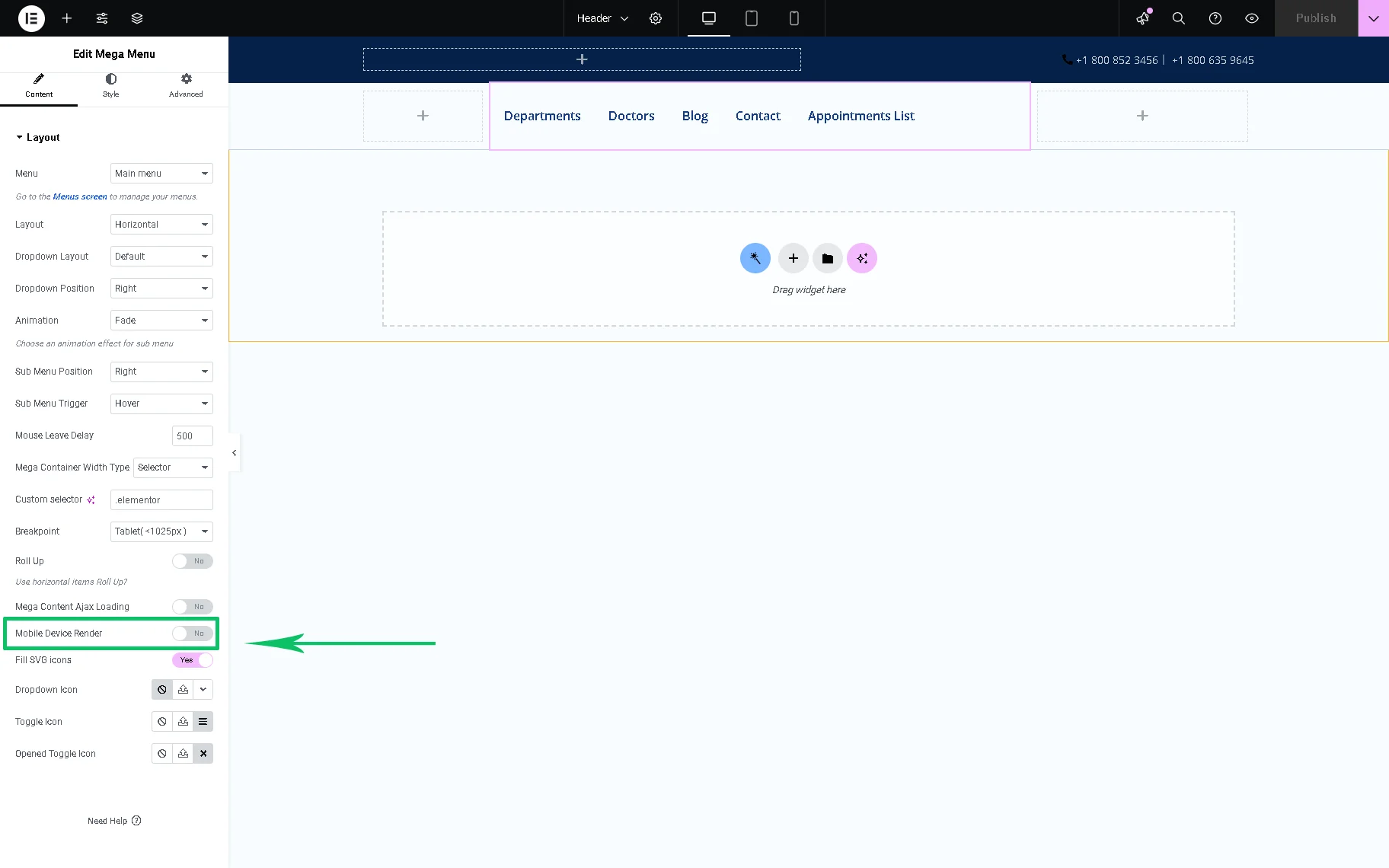
Setup Mega Menu for Mobile View
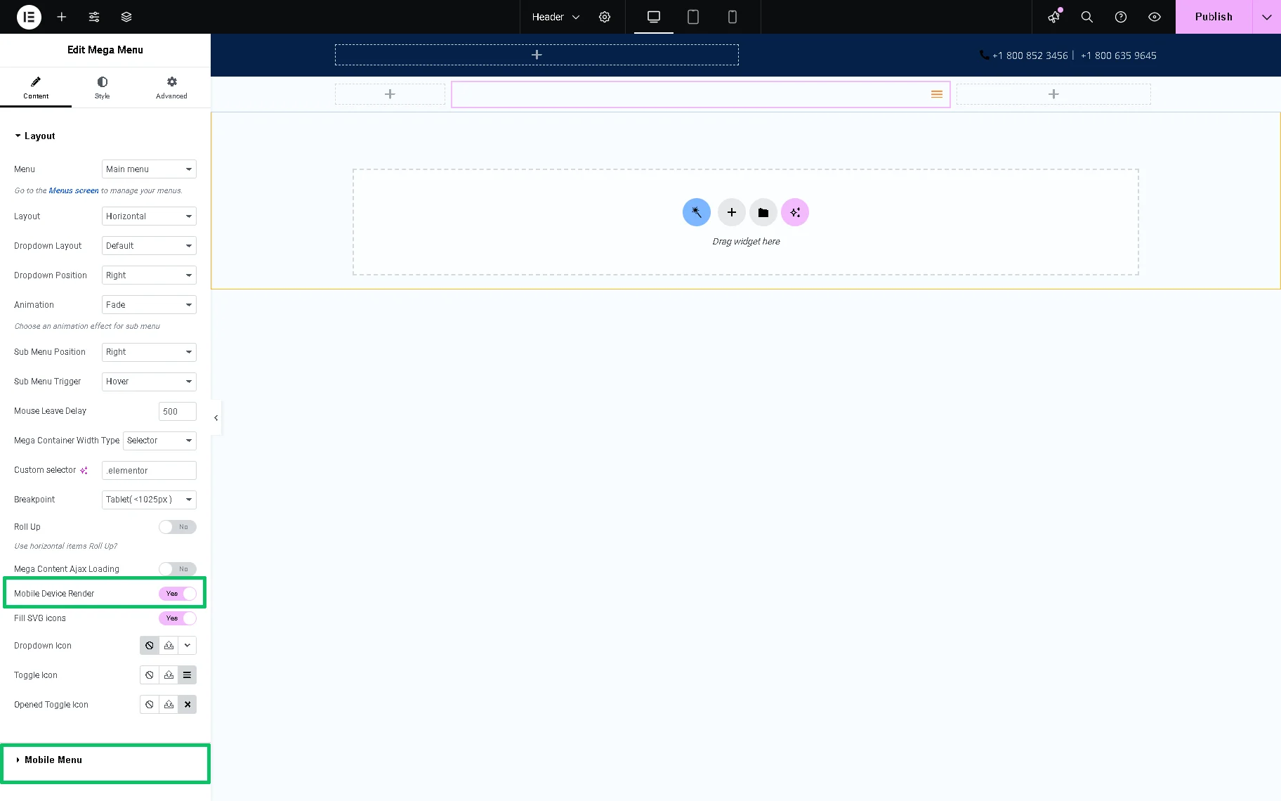
Navigate to the WordPress Dashboard > Crocoblock > Theme Templates tab and open the header template with the Mega Menu widget added. Here, the only Layout tab is available. Then, move down to the Mobile Device Render toggle and enable it.
Once activated, the Mobile Menu tab of this widget will appear.
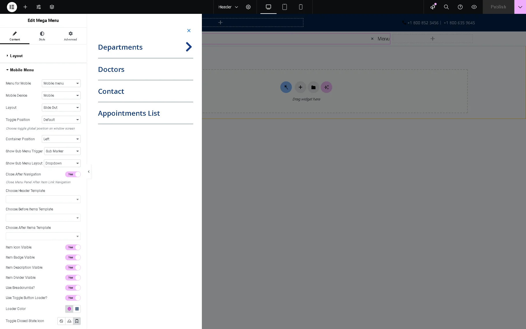
Unroll this tab and select the needed menu in the Menu for Mobile drop-down list. In this case, we chose the “Mobile Menu” option. Next, select the Mobile Device on which this menu will be displayed (in this case, we selected the “Mobile and Tablets” option in the Mobile Device drop-down list).

Then, we modified the menu design’s options. We set the “Left” Container Position, enabled the Close After Navigation, Item Description Visible, and Item Divider Visible toggles, and selected the Loader Color and Toggle Closed State Icon.
Once completed, press the “Publish” button.
That’s it. Now you know how to set the mobile menu for your WordPress website using the JetMenu plugin.