JetMenu Dashboard Overview
This tutorial will guide you through all settings available in the JetMenu Dashboard.
JetMenu is a first-class plugin for creating a mega menu with Elementor or Gutenberg (Block editor). Let’s review all the settings available in the JetMenu Dashboard.
One should follow the WordPress Dashboard > Crocoblock > JetPlugins Settings > JetMenu pathway. The customization options are organized into three tabs:
- General Settings;
- Main Menu;
- Mobile Render.
General Settings Overview
On top of the General Settings tab, there are tools for creating a preset of current options: “Preset Manager,” “Export Options,” “Import Options,” and “Reset Options.”
Also, one can turn on or off the following settings:
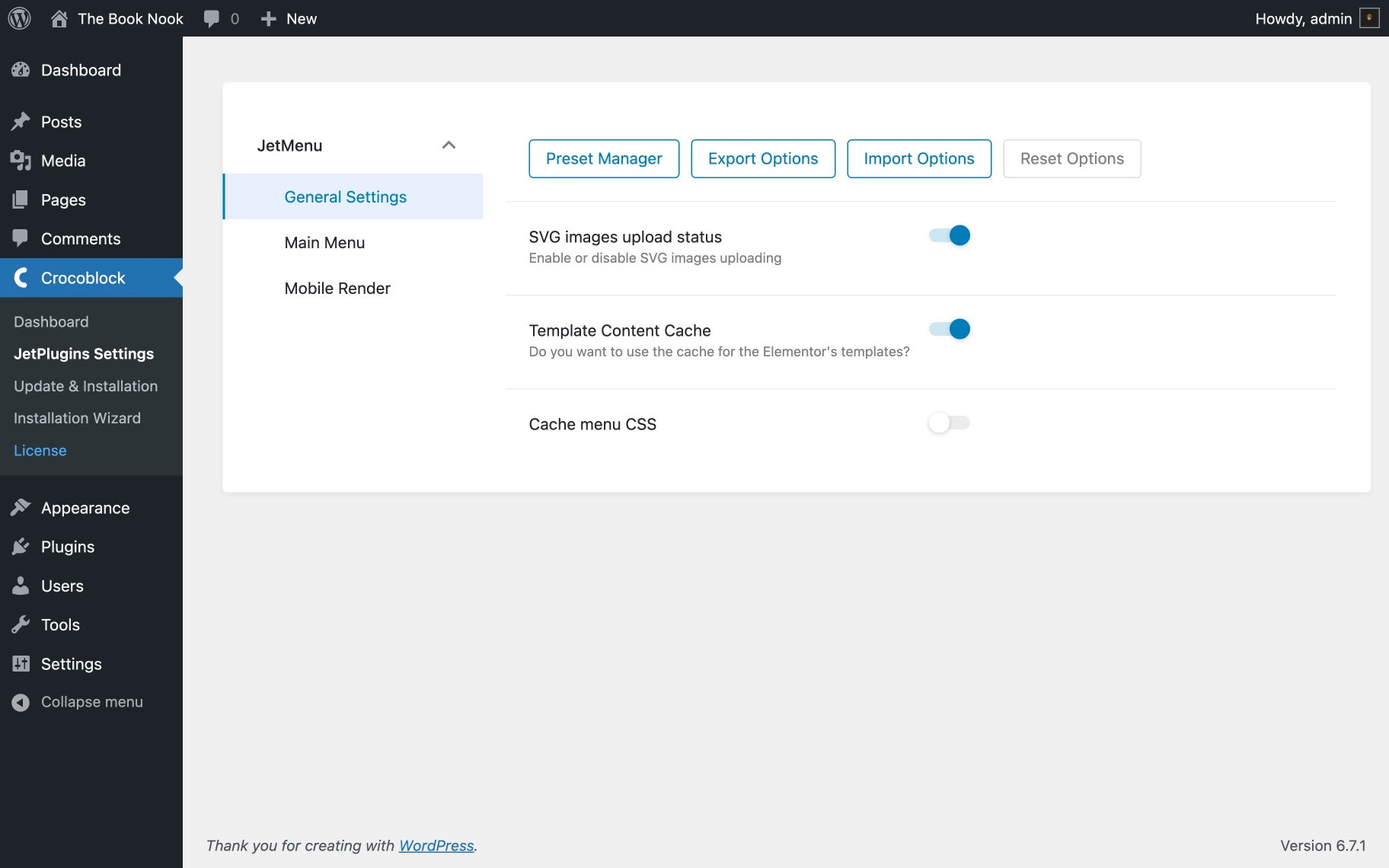
- SVG images upload status — this toggle allows uploading SVG images;
- Template Content Cache — this toggle allows using the cache for the Elementor’s templates;
- Cache menu CSS — this toggle should be activated to cache menu CSS.
Further menu customization can be achieved using the settings found within the Mega Menu, Vertical Mega Menu, and Hamburger Menu widgets. Specific options are detailed in the JetMenu Dashboard settings; the How to Create a Mega Menu in Elementor tutorial will thoroughly explain them.
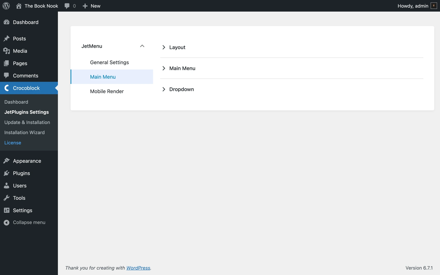
Main Menu Settings
As mentioned, the settings below work only for menus from WordPress locations. These settings will be used to configure all menu widgets/blocks created with the JetMenu plugin. The Main Menu section includes three tabs: Layout, Main Menu, and Dropdown.
Layout tab
The settings within this tab allow customizing the main menu’s layout, including the width, alignment, and spacing between items.
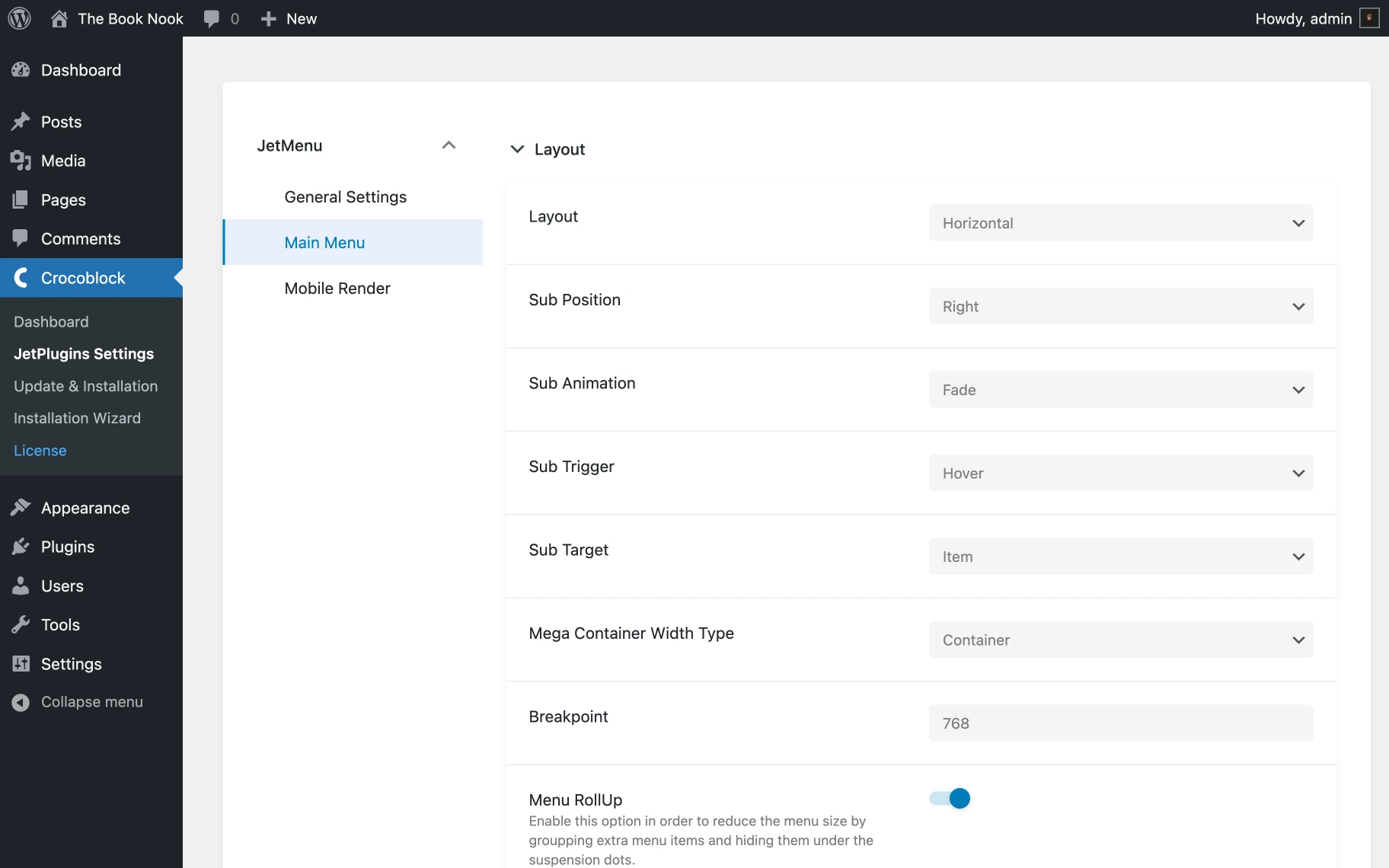
- Layout — menus can be set to “Horizontal,” “Vertical,” or “Dropdown”;
- Sub Position — submenu items can be positioned to the “Right” or “Left” of the main menu item;
- Sub Animation — submenu items can be assigned “Fade” animation effect or left without animation (“None”);
- Sub Trigger — a submenu opening trigger can be selected, either “Hover” or “Click”;
- Sub Target — the submenu will be opened by targeting the chosen element (“Item”/“Sub Icon”);
- Mega Container Width Type — the width can be determined by selecting one of three container types: “Container,” “Selector,” and “Items”. If “Selector” is chosen, a custom width can be specified using the revealed Custom selector field;
- Breakpoint — the menu view can be switched to a mobile layout using this option;
- Menu RollUp — menu items can be grouped and hidden under the suspension dots using this option;
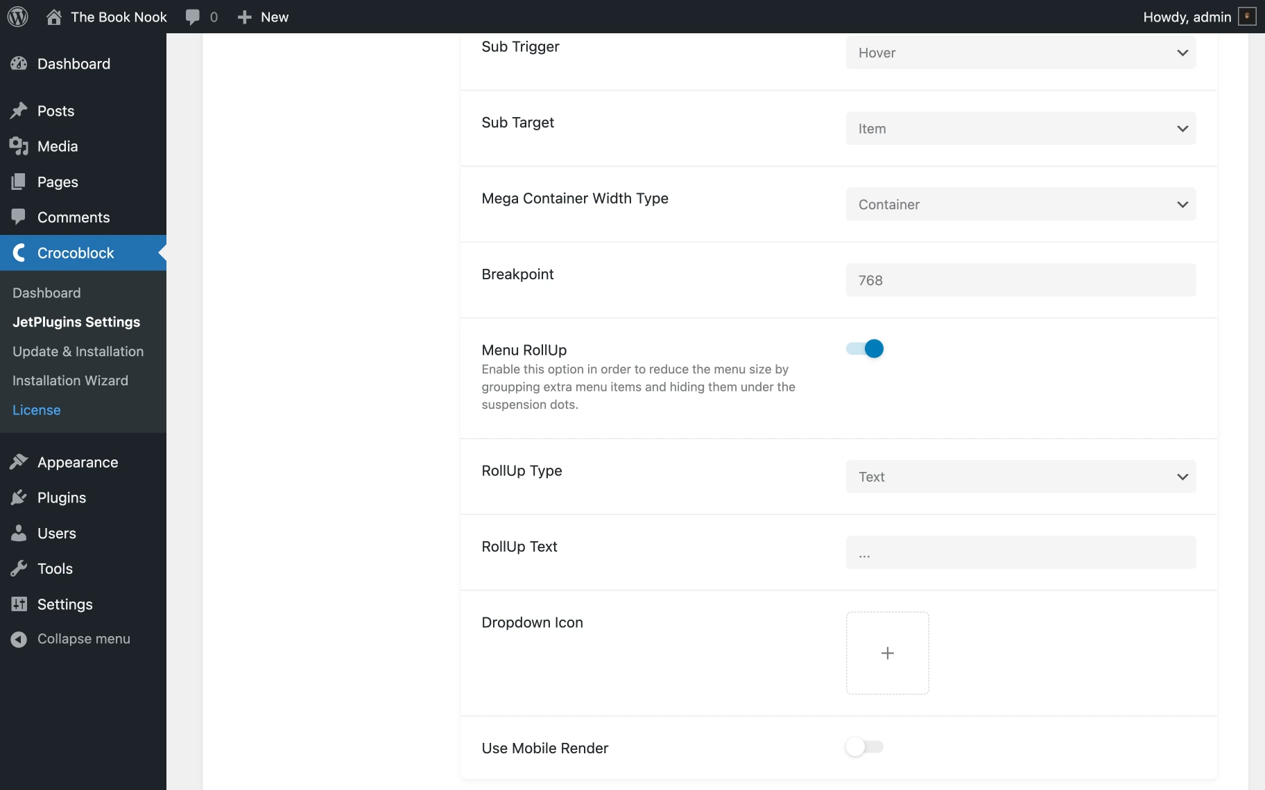
- RollUp Type — menu items outside the menu container can be replaced by selecting an item here. It can be “Text” or “Icon”;
- Dropdown Icon — menu icons can be customized by uploading a new icon;
- Use Mobile Render — the Mobile Render mode can be turned on or off, and a device for menu rendering can be chosen — either “Mobile” or “Tablet and Mobile.”
Main Menu tab
Let’s have a closer look at the Main Menu tab settings.
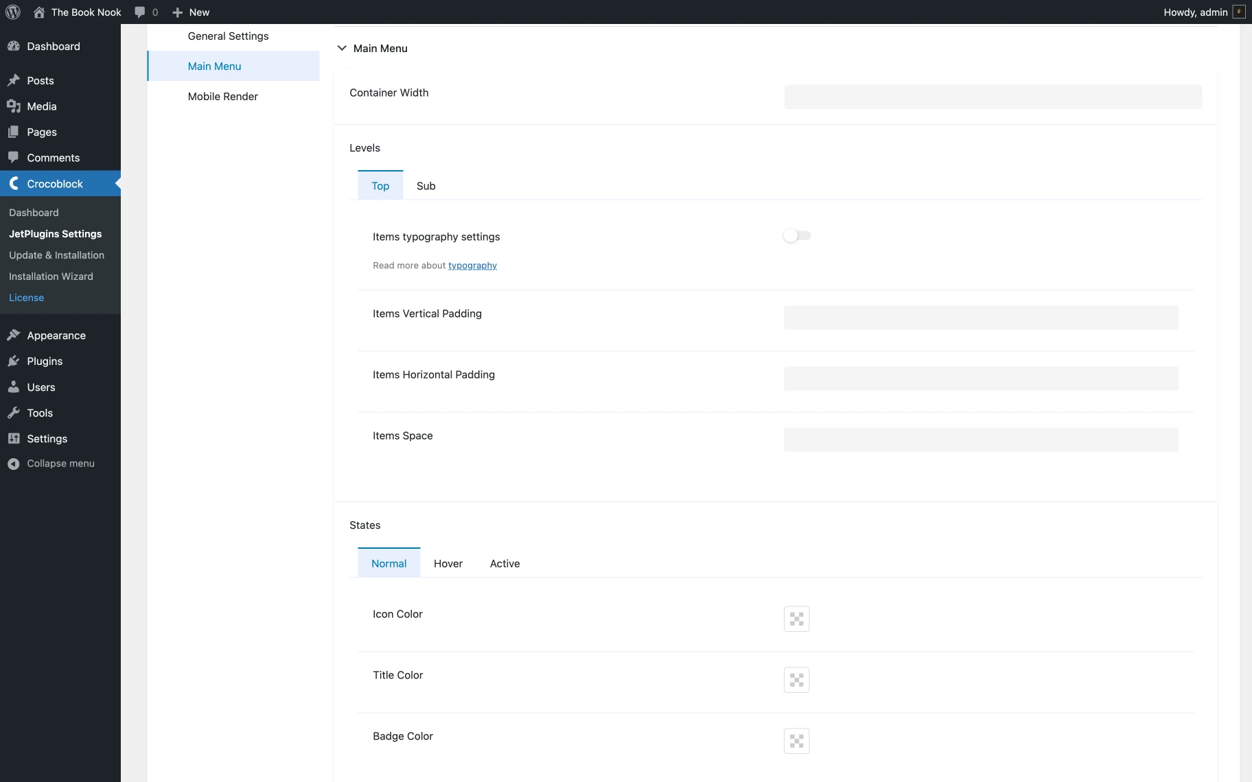
- Container Width — sets an appropriate value for the menu container width;
- Levels Top — provide tools for customization of typography settings, vertical/horizontal paddings, and items space of top-level menu items;
- Levels Sub — provide the same options for submenu items. One will also find a tool for selecting a container color here;
- States — provide different colors for icons, titles, and badges in other states (“Normal,” “Hover,” and “Active”) should be chosen. The example can be found in our JetMenu demo.
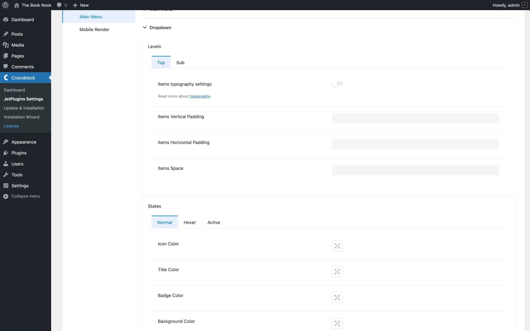
Dropdown tab
The Dropdown menu has the same settings as the Main Menu items. The only new tab here is the Dropdown Toggle. Using it, one can set up the dropdown Toggle Size and Toggle Distance from the main menu item in pixels.
Mobile Render Settings
The same settings for revamping the mobile menus are available here: Options, Toggle Styles, Container Styles, Items Styles, Sub Menu Icon Styles, and Advanced Styles.
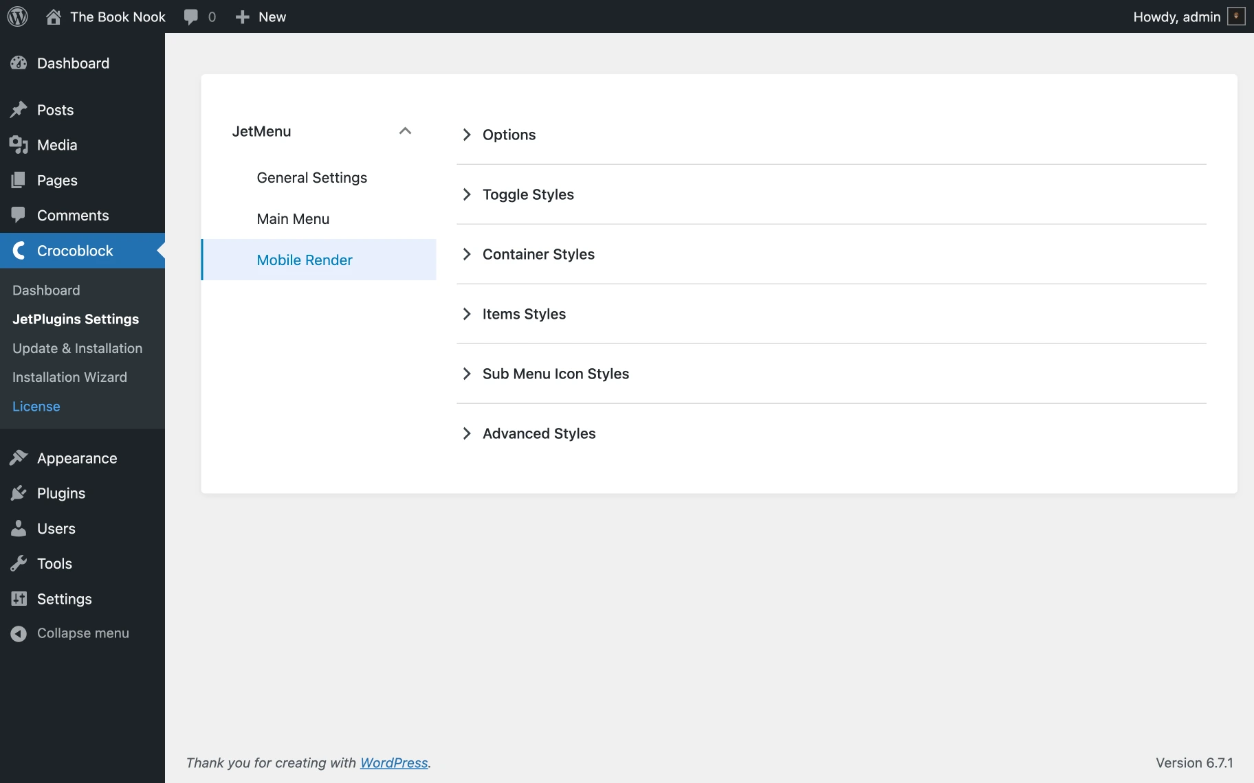
Let’s take a closer look at each tab.
Options tab
Here, one can customize the mobile menu’s foundational settings, including the Layout type, Toggle position, Container alignment, and submenu display.
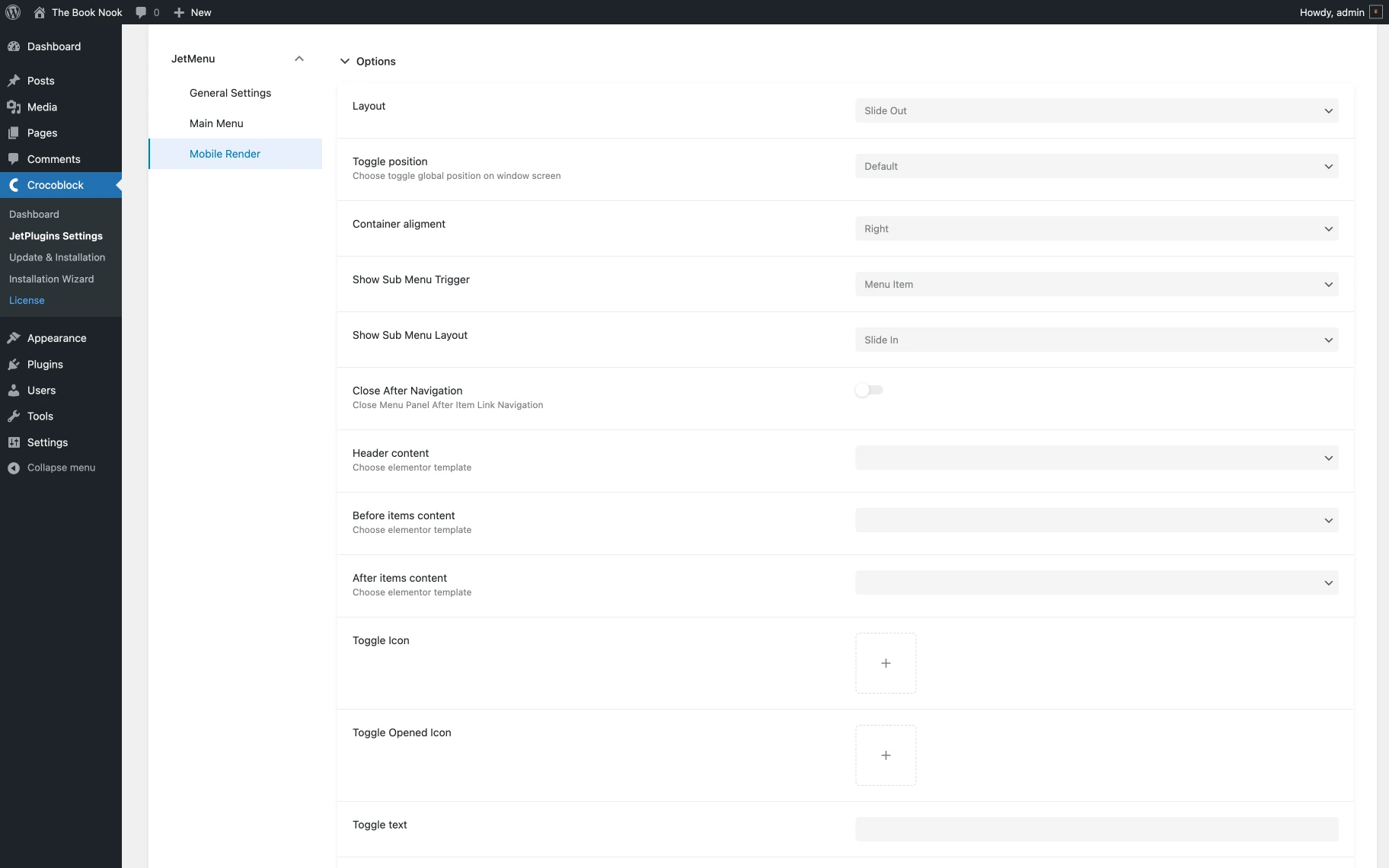
- Layout — allows choosing the overall layout style for the menu, such as “Slide Out,” “Dropdown,” or “Push,” to fit the design needs;
- Toggle position — allows choosing the position of the menu toggle button, which can be either “Default,” “Fixed to top-left screen corner,” or “Fixed to top-right screen corner”;
- Container alignment — allows choosing the alignment for the menu container within the available space, allowing “Left” or “Right” alignment to match the website’s layout;
- Show Sub Menu Trigger — allows choosing the trigger for showing submenus, which can be activated by a “Menu Item” or a “Sub Menu Icon”;
- Show Sub Menu Layout — allows choosing the layout style for submenus, offering “Slide-in” or “Dropdown” to enhance the user experience;
- Close After Navigation — allows closing the “Menu Panel After Item Link Navigation”;
- Header content — allows choosing a custom Elementor template;
- Before items content — allows choosing an existing Elementor template for the menu;
- After items content — allows choosing a pre-designed Elementor template for the menu;
- Toggle icon — allows choosing an icon from the website’s gallery that matches the website design and usability can be selected;
- Toggle opened icon — allows choosing an icon from the website’s gallery and displaying it when the menu is open;
- Toggle text — in this field, one can specify the toggle button text;
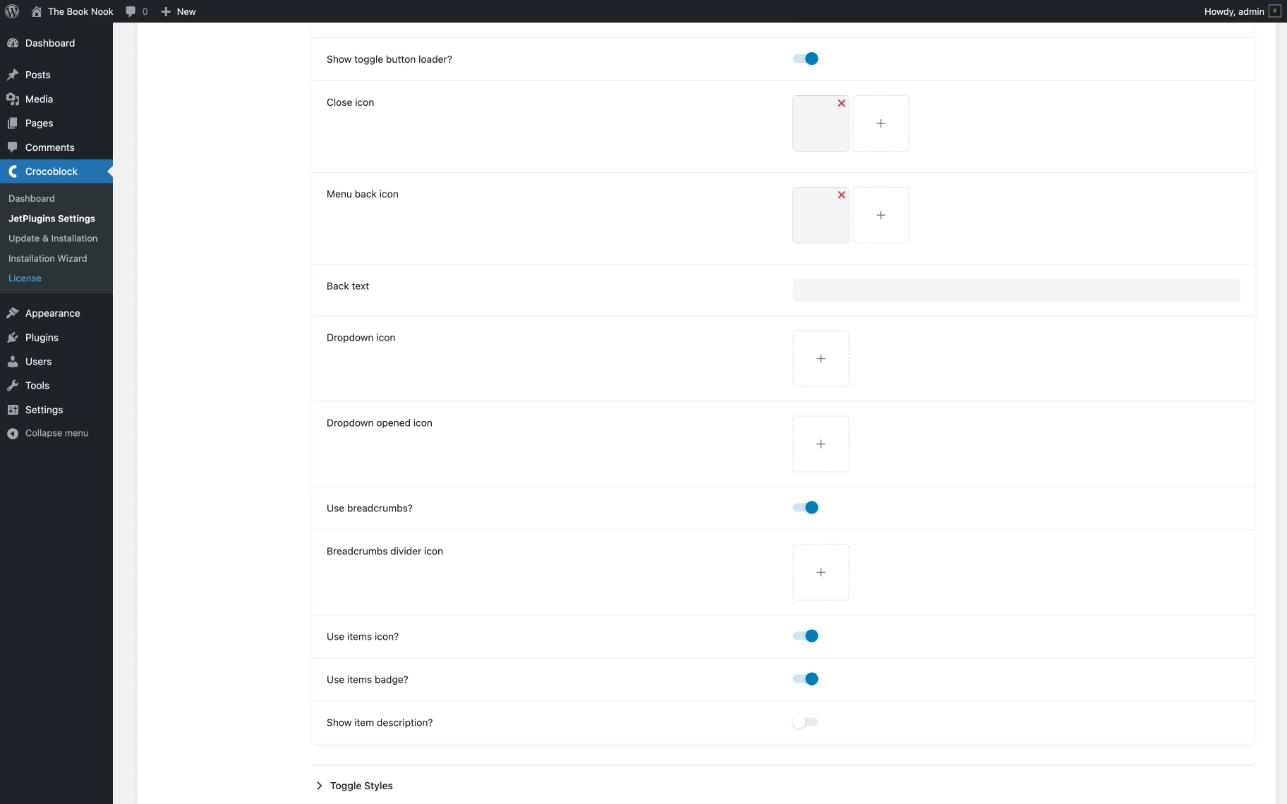
- Show toggle button loader? — the switcher enables the loading indicator on the toggle button when activated;
- Close icon — this option allows changing the menu closing icon;
- Menu back icon — with this option, one can select the back button icon;
- Back text — the back button text can be set with this option;
- Dropdown icon — an icon for a dropdown menu can be chosen;
- Dropdown opened icon — an icon for when dropdowns are open can be picked;
- Use breadcrumbs? — when activated, the Breadcrumbs divider icon can be chosen;
- Use items icon? — when activated, the item icon will be displayed;
- Use items badge? — activated switcher will show the item badge;
- Show item description? — this switcher enables the item description.
Toggle Styles tab
Using the Toggle Styles settings, one can customize how the toggle button looks and behaves. One can define icon size and color, select a background color, and adjust border properties. To make the toggle button distinctive and user-friendly, one can adjust padding, border radius, box shadows, and padding to align with the site’s design.
The settings within the Toggle Styles section include:
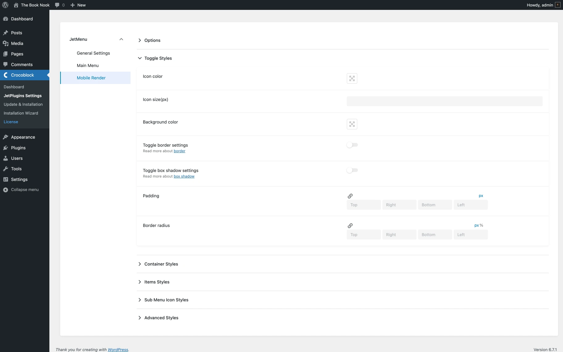
- Icon color — an option to recolor the toggle button icon;
- Icon size(px) — a field that defines the size of the toggle button icon in pixels for better visibility and aesthetics can be adjusted;
- Background color — an option that allows choosing a background color for the toggle button;
- Toggle border settings — an option that defines the border of the toggle button can be customized, including color, style, and width;
- Toggle box shadow settings — an option that adds box shadow to the toggle button for depth and emphasis, including color and size adjustments;
- Padding — an option that sets padding around the toggle button;
- Border radius — an option that sets the border radius of the toggle button.
Container Styles tab
The Container Styles settings allow customizing how the menu container integrates seamlessly with the site’s design. One can configure the container’s width (up to 100% of the device’s viewport), select a background color, and adjust the border’s color, style, and width. In addition to changing the container padding for better spacing, one can define the radius of the border for rounded corners and add box shadows.
Let’s overview the Container Styles settings in greater detail:
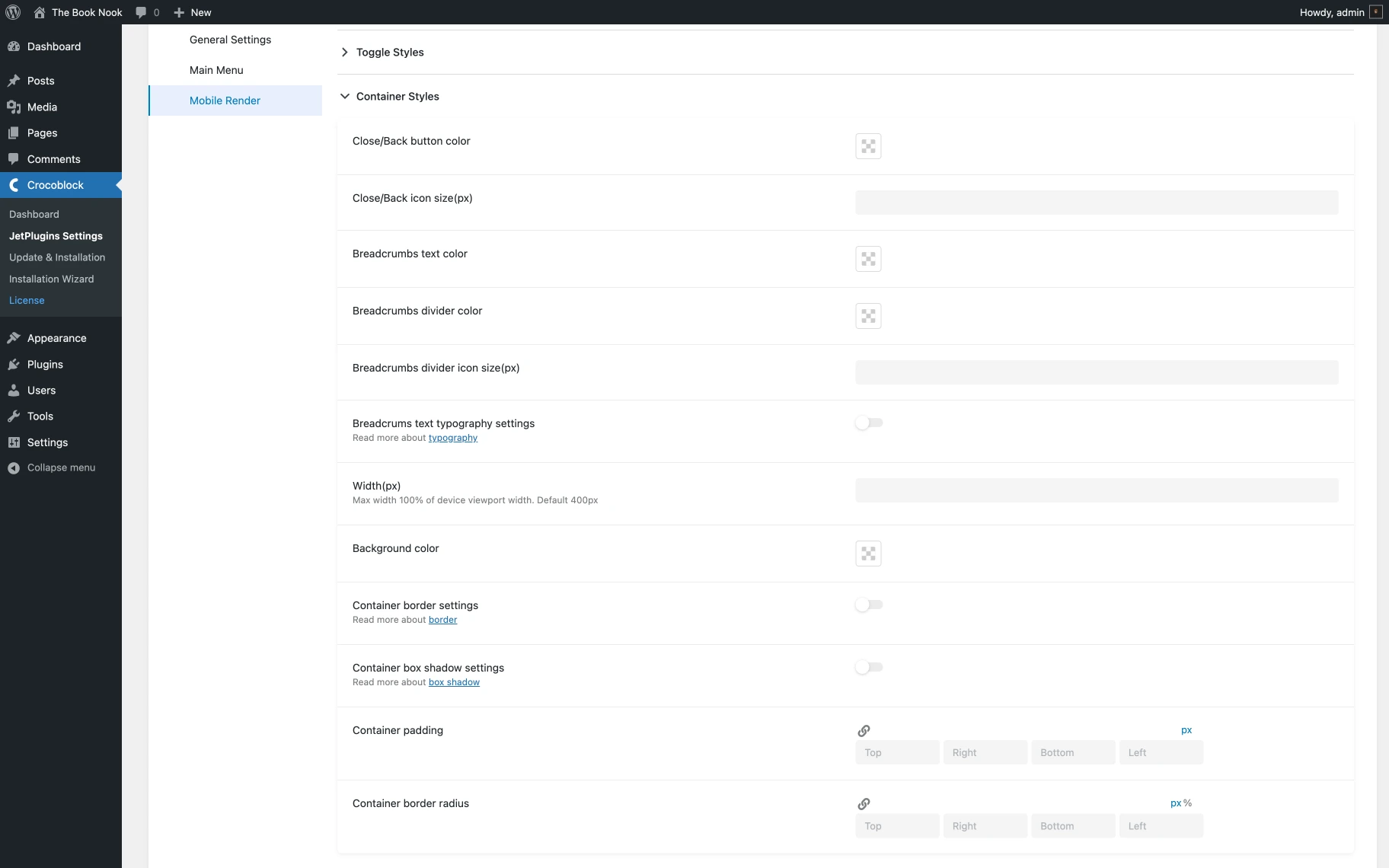
- Close/Back button color — an option that defines the color for the close and back buttons can be set to match the menu’s design;
- Close/Back icon size — an option to adjust the size of the close and back button icons in pixels;
- Breadcrumbs text color — an option to adjust the color of the breadcrumbs text;
- Breadcrumbs divider color — an option to adjust the color of the breadcrumbs divider;
- Breadcrumbs divider icon size(px) — an option to adjust the size of the breadcrumbs divider icon;
- Breadcrumbs text typography settings — a toggle switch that is disabled by default. When enabled, the following options become available for customization:
- Breadcrumbs text font family — a selector to set the font of the breadcrumbs text;
- Breadcrumbs text subset — a selector by which the subset of the font is specified;
- Breadcrumbs text font size (px) — a field where the font size of the breadcrumbs text is defined in pixels;
- Breadcrumbs text line height (em) — a field where the line height of the breadcrumbs text is determined in “em” units;
- Breadcrumbs text letter spacing — a field where the spacing between letters of the breadcrumbs text is adjusted;
- Breadcrumbs text font weight — a selector by which the font weight of the breadcrumbs text is selected;
- Breadcrumbs text transform — a selector where the transformation (e.g., uppercase, lowercase) of the breadcrumbs text is set;
- Breadcrumbs text font style — a selector where the font style (e.g., italic, normal) of the breadcrumbs text is chosen.
- Width — an option to alter the width of the menu container, which can be a maximum of 100% of the device’s viewport width (the default is 400px);
- Background color — an option to set the background color for the menu container can be chosen to ensure it complements the site’s theme;
- Container border settings — an option for the customization of the border of the menu container, including color, style, and width for a refined look;
- Container box shadow settings — an option to add a box shadow to the menu container for depth and emphasis, including color and size adjustments;
- Container padding — an option to set the padding inside the menu container to control the spacing around the content;
- Container border radius — an option that defines the border radius of the menu container, creating rounded corners for a sleek appearance.
Items Styles tab
In this tab, one can customize the visual style of each menu item to make it more readable and enjoyable to use. It is possible to set the color and typography settings for the labels, and item dividers can be enabled or disabled. To ensure each menu item stands out and is easy to navigate, one can customize icons and badges, such as their size, color, vertical alignment, and margins.
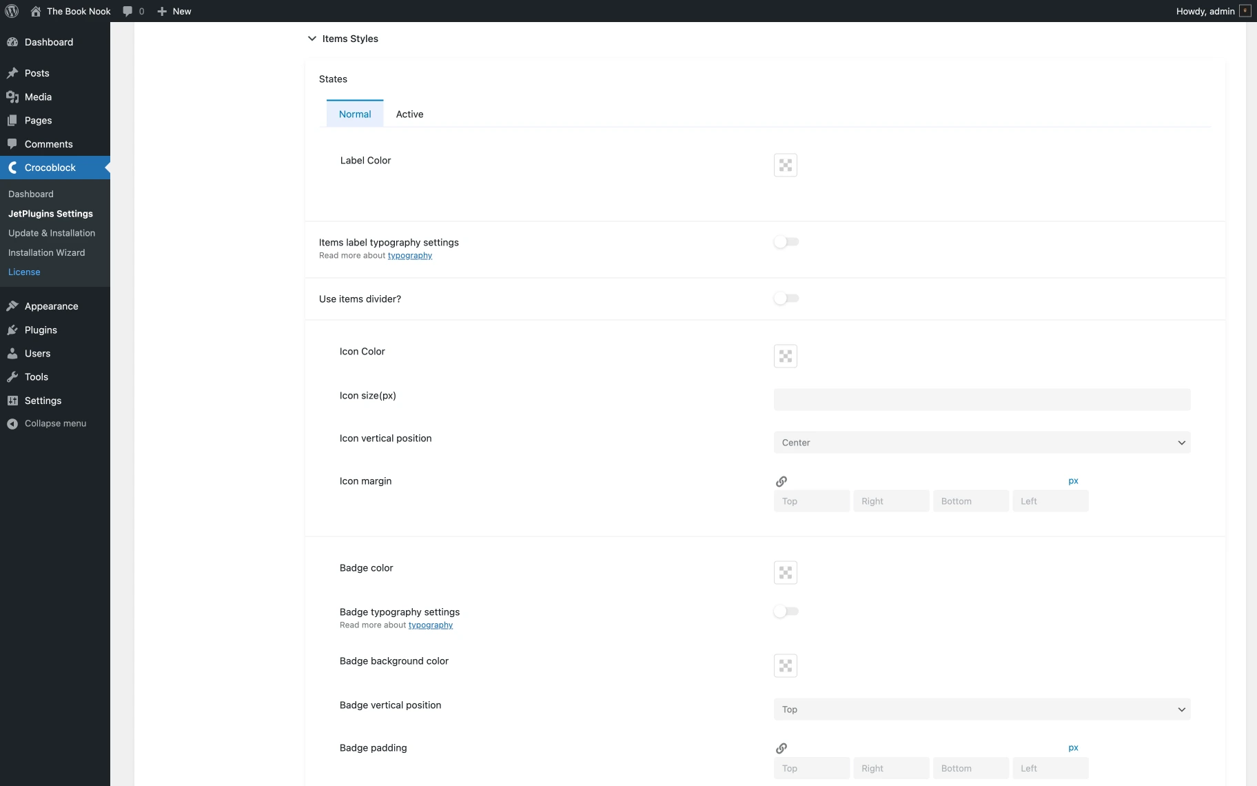
Label settings
- States (Normal/Active) — an option that defines the appearance of menu items in their normal and active states;
- Label Color — an option that sets the color of the menu item labels to match the theme design;
- Items label typography settings — a switcher that adjusts typography settings such as font family, size, and style for the menu item labels;
- Use items divider? — an option that adds dividers between menu items. If activated, the divider color and width can be customized.
Icon settings
- Icon Color — an option that sets the color of icons used in menu items to enhance visibility and match the theme;
- Icon size(px) — an option that adjusts the size of icons in pixels for appropriate scaling;
- Icon vertical position — an option that aligns icons vertically to “Top,” to ”Center,” and to ”Bottom” within the menu item;
- Icon margin (px) — an option that sets the margin around icons to control spacing relative to the label.
Badge settings
- Badge color — an option that sets the text color for badges displayed on menu items;
- Badge typography settings — a switcher that allows customizing badge typography, including font family, subset, size, line height, letter spacing, weight, text transform, and style;
- Badge background color — an option that allows setting the background color for the badges to make them stand out;
- Badge vertical position — an option that optimizes badge placement within the menu item, aligns badges vertically, choosing between the top, center, or bottom position;
- Badge padding — an option that sets the padding around badges to control spacing within the badge;
- Badge border radius — an option that defines the border radius for badges to create rounded edges for a refined look.
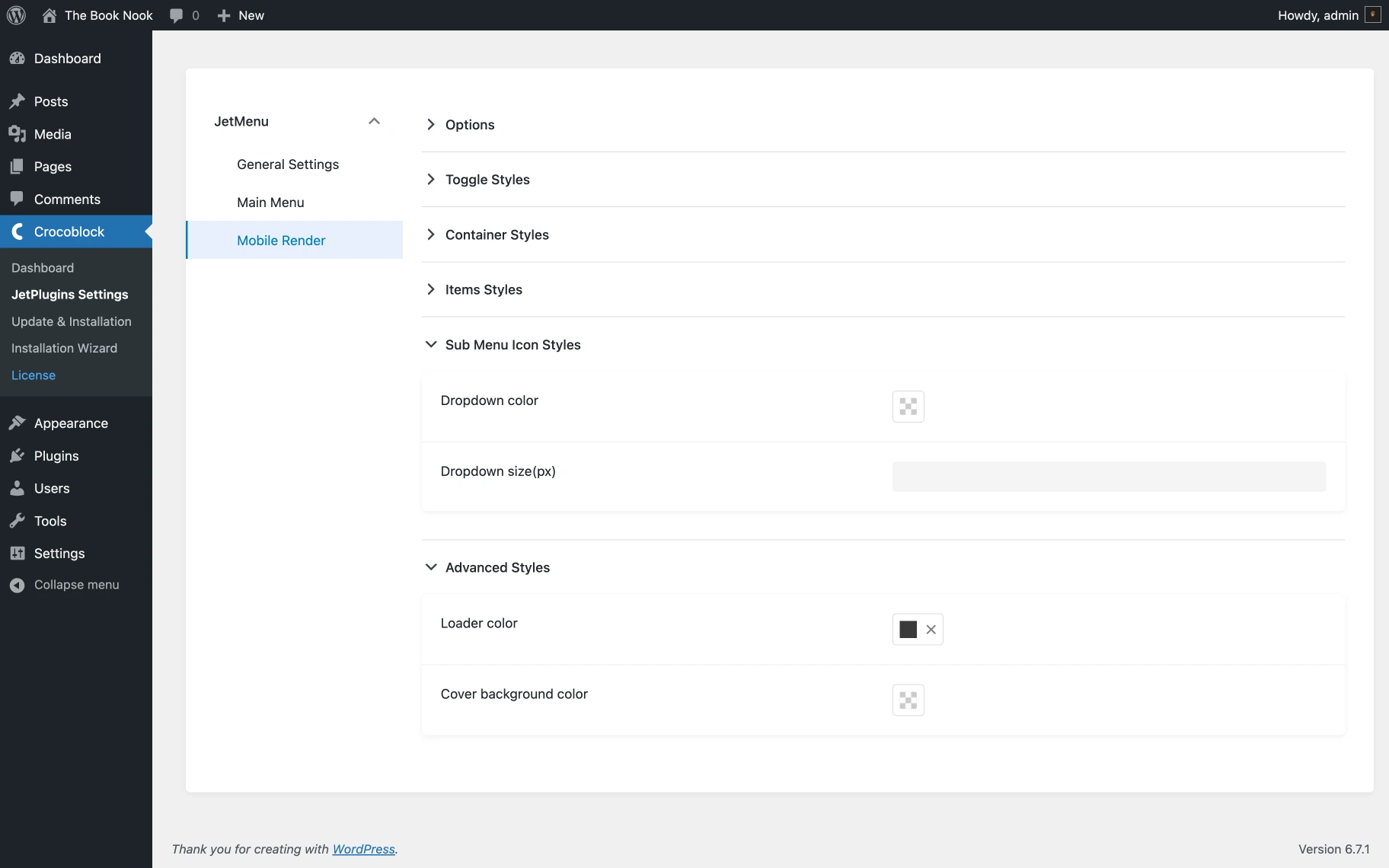
Sub Menu Icon and Advanced Styles tab
The Sub Menu Icon Styles and Advanced Styles settings allow customizing the appearance of submenu icons by setting their colors and sizes. Additionally, one can manage advanced styling options such as the color of the loader, which indicates whether or not the menu is loading, and the background color of the cover, which enhances visibility when the menu is open.
Sub Menu Icon Styles
- Dropdown color — an option that sets the color of the dropdown icons to match the overall menu design;
- Dropdown size(px) — an option that adjusts the size of the dropdown icons in pixels for better visibility and proportion.
Advanced Styles
- Loader color — an option that adjusts the color of the loader to indicate the menu loading status;
- Cover background color — an option that sets the background color that appears behind the menu.
That’s all you should know about JetMenu Dashboard settings. Don’t hesitate to try these options and make the site menu even more attention-getting.