How to Create Visual Filter with Taxonomies Data Source
Learn how to filter items by colors or images added as terms to taxonomies by using the “Visual” filter type and the “Taxonomies” data source by JetSmartFilters.
Before you start, check the tutorial requirements:
- Elementor (Free version), Block editor (Gutenberg), or Bricks
- JetSmartFilters plugin installed and activated
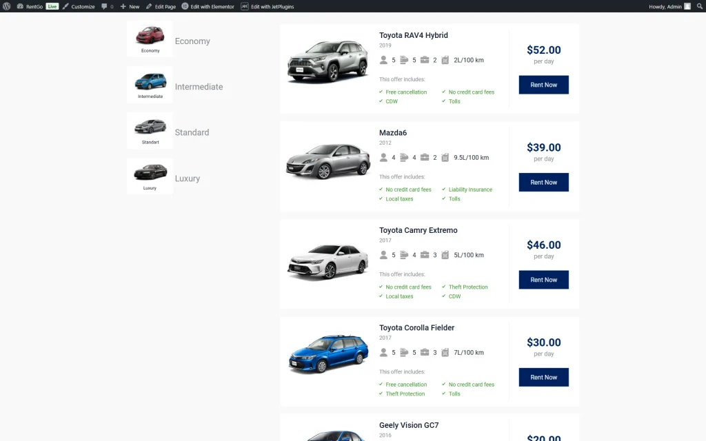
In this guide, we will examine the “Visual” filter with the “Taxonomies” Data Source creation steps. We will build a filter based on the car class, where the filter options will be accompanied by a corresponding image.
Add a New Filter
To build a new filter, go to WordPress Dashboard > Smart Filters > Add New.
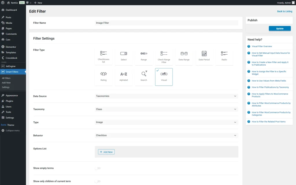
Define the Filter Name and move to the Filter Type field. Here, pick the “Visual” option.
After that, select the “Taxonomies” Data Source and pick the needed Taxonomy — the one you want to be the source of the filter. In our case, it’s “Class.”
Next, you should choose the Type of the “Visual” filter. It can either be a “Color” or “Image” to enable filtering by color or image, correspondingly. In this case, we choose the “Image” option.
In the Behavior menu, specify the filter behavior: it can be the “Checkbox” or “Radio” one. In our case, it’s “Checkbox” as it allows selecting several options, while the “Radio” is for selecting one option at a time.
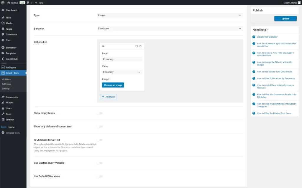
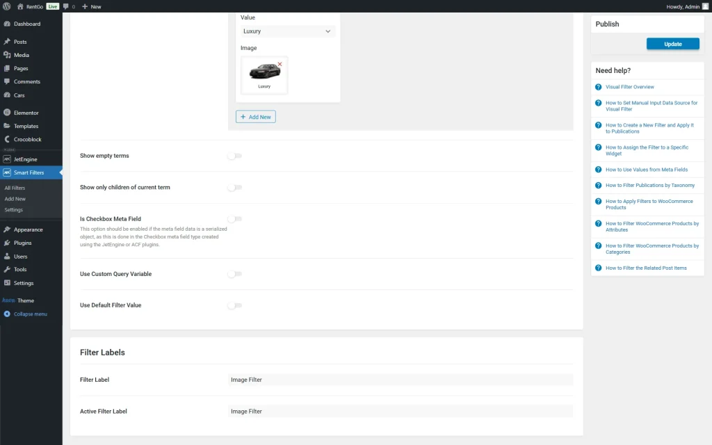
Next, proceed to the Options List and click the “+ Add New” button there to add the first option to the filter.
To create a filter option, you should enter the Label that will be displayed in the filter and the Value that will be stored in the database.
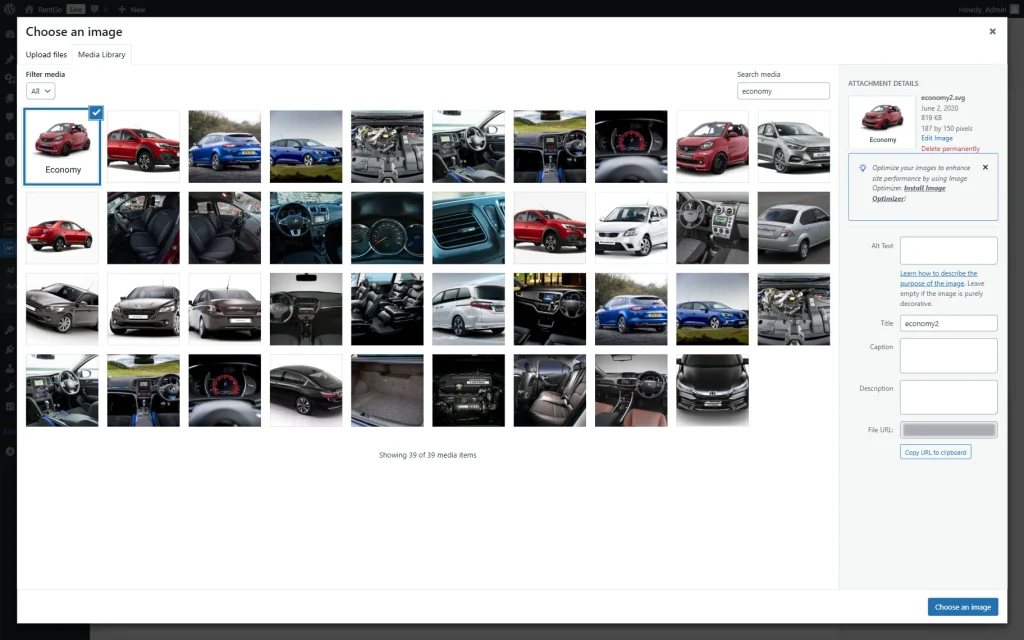
Next, if you have selected the “Color” option in the Type field, click the default black icon to be able to pick the Color for the current option, and if you have selected “Image”, as in this tutorial, press the “Choose an image” button to open the Media Library.
Upload or select the needed image from the gallery and press the “Choose an image” button.
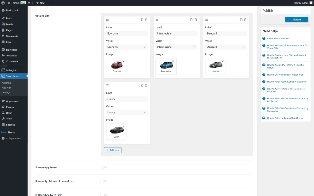
Add other options that you want to be displayed in the filter the same way.
Now, work on other settings if needed. More about them, you will find in the Visual Filter Overview.
For instance, we leave the rest of the Filter Settings fields untouched and complete the Filter Labels in the corresponding section.
When the setup is done, press the “Update” button.
Add the Visual Filter to a Page
Open the page editor where you want to place your filter. It can be Elementor, Blocks Editor (Gutenberg), or Bricks. The settings and the customization stay the same regardless of the page editor.
In this tutorial, we will work with the Elementor editor. First, we add a two-column layout to put the filter and provider in two separate columns.
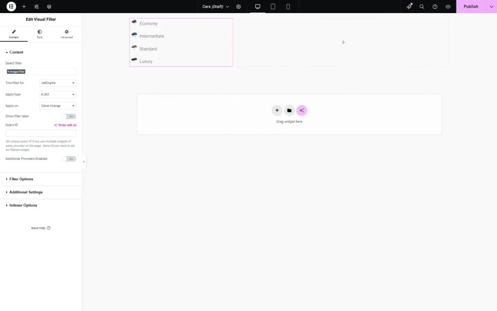
Drag and drop the Visual Filter widget to the canvas (we put it in the left column). In the Select filter field of the Content tab, choose the filter that you’ve previously created.
In the This filter for field, select the provider that will be filtered. In our case, it’s “JetEngine,” as we want to filter JetEngine’s Listing Grid.
After that, you can adjust other settings in the Content tab if needed.
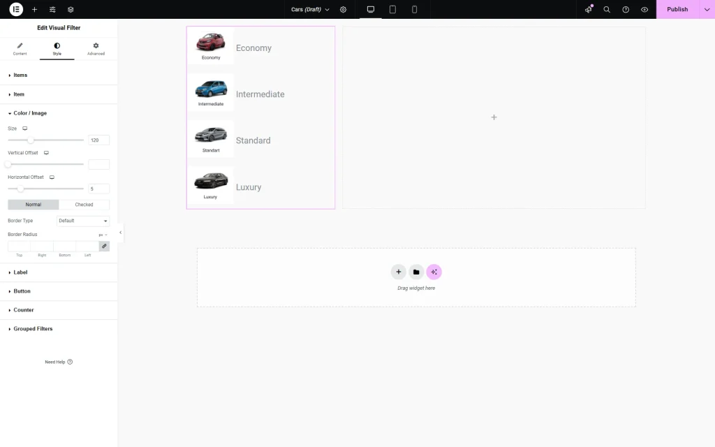
Customize the filter layout in the Style tab if desired.
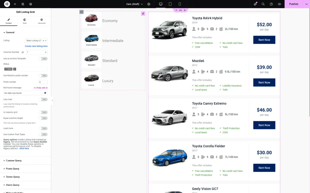
Now, add a provider that will be filtered. For example, we add the Listing Grid widget.
If you also work with the Listing Grid, pick the Listing built beforehand.
We also change the Columns Number to “1,” and that’s all for the changes. However, feel free to adjust other Listing Grid widget settings if needed.
Whenever ready, press the “Publish” button to save the result.
Check the Result
Open the just-built page on the front end. Here, the filter and the provider are now displayed.
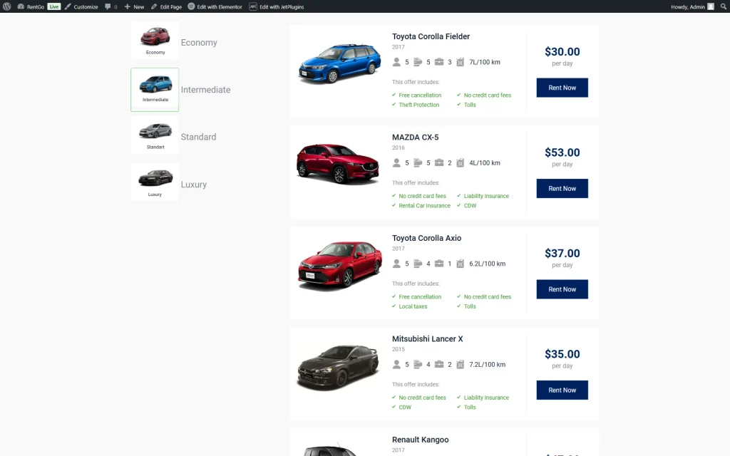
Now, pick one or several options to check if the filter works. For instance, we select the “Intermediate” option and observe how the listing changes — now, it only displays the posts attached to the mentioned term.
The result is achieved; now, you know how to build a WordPress custom taxonomy filter by image or color with the help of the JetSmartFilters plugin for WordPress.
