Visual Filter Overview
This overview is about the Visual Filter from the JetSmartFilters plugin and its general settings.
The Visual Filter is a part of the JetSmartFilters plugin functionality. It allows users to filter the content by images or colors, following the concept of the “Radio” or the “Checkboxes” filter.
To create this type of filter, one should proceed to WordPress Dashboard > Smart Filters > Add New.
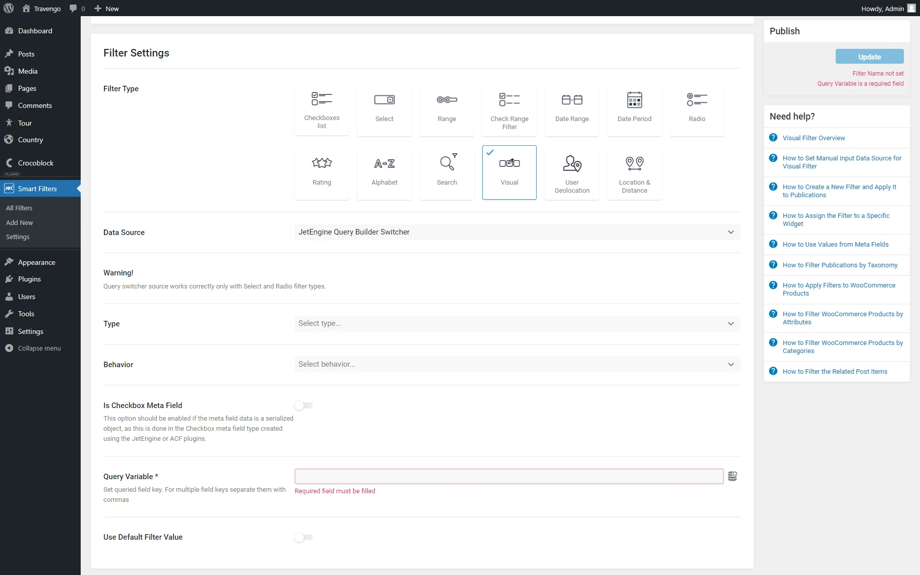
Filter Settings
Initially, for any type of filter, the following fields are available:
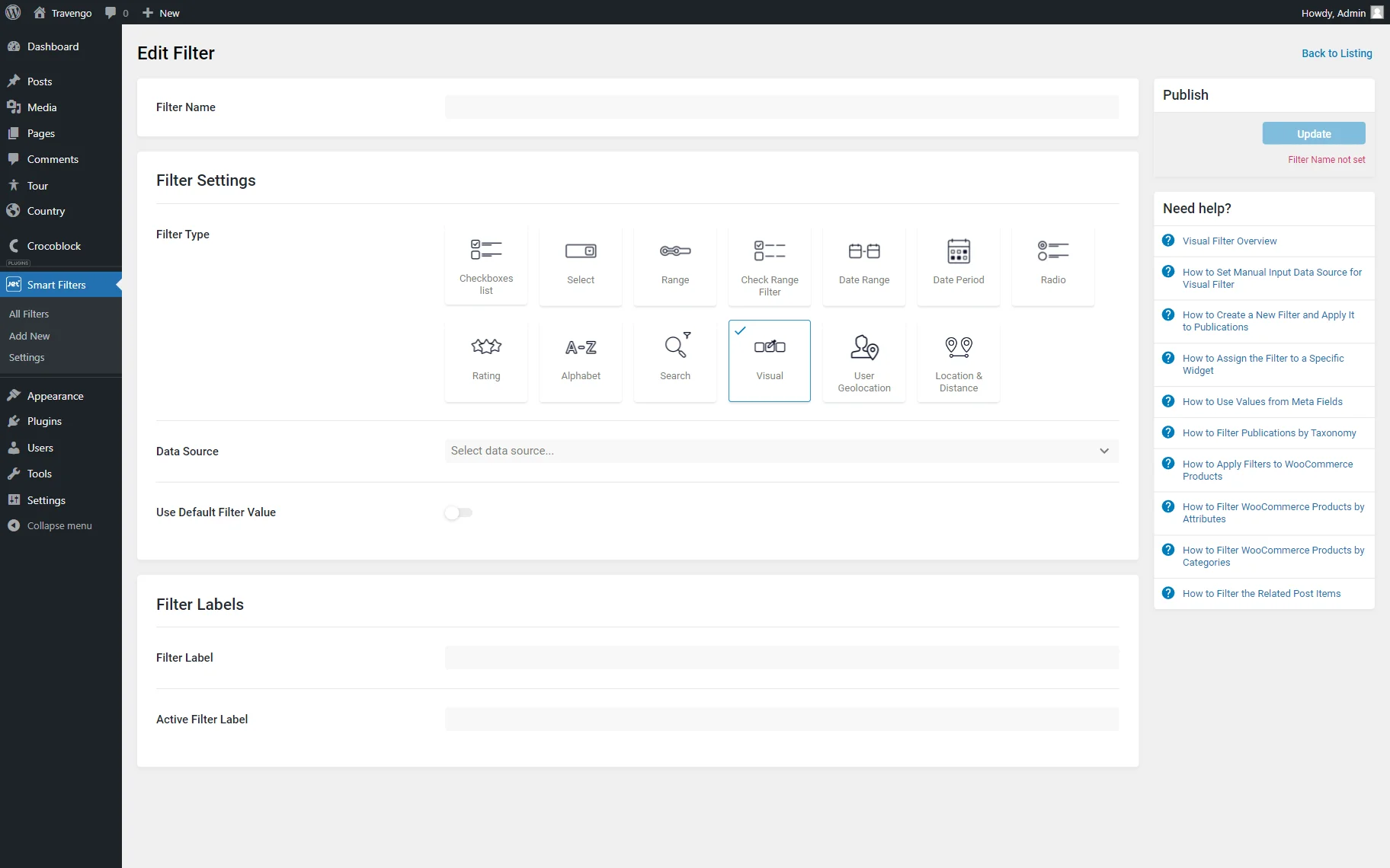
- Filter Name — a name used for identifying the filter in the list of filters;
- Filter Type — a drop-down list where the “Visual” option should be picked;
- Data Source — a drop-down list with available data sources for the current filter.
Data Source
Here, the most suitable variant should be picked to filter the needed options from a particular data source.
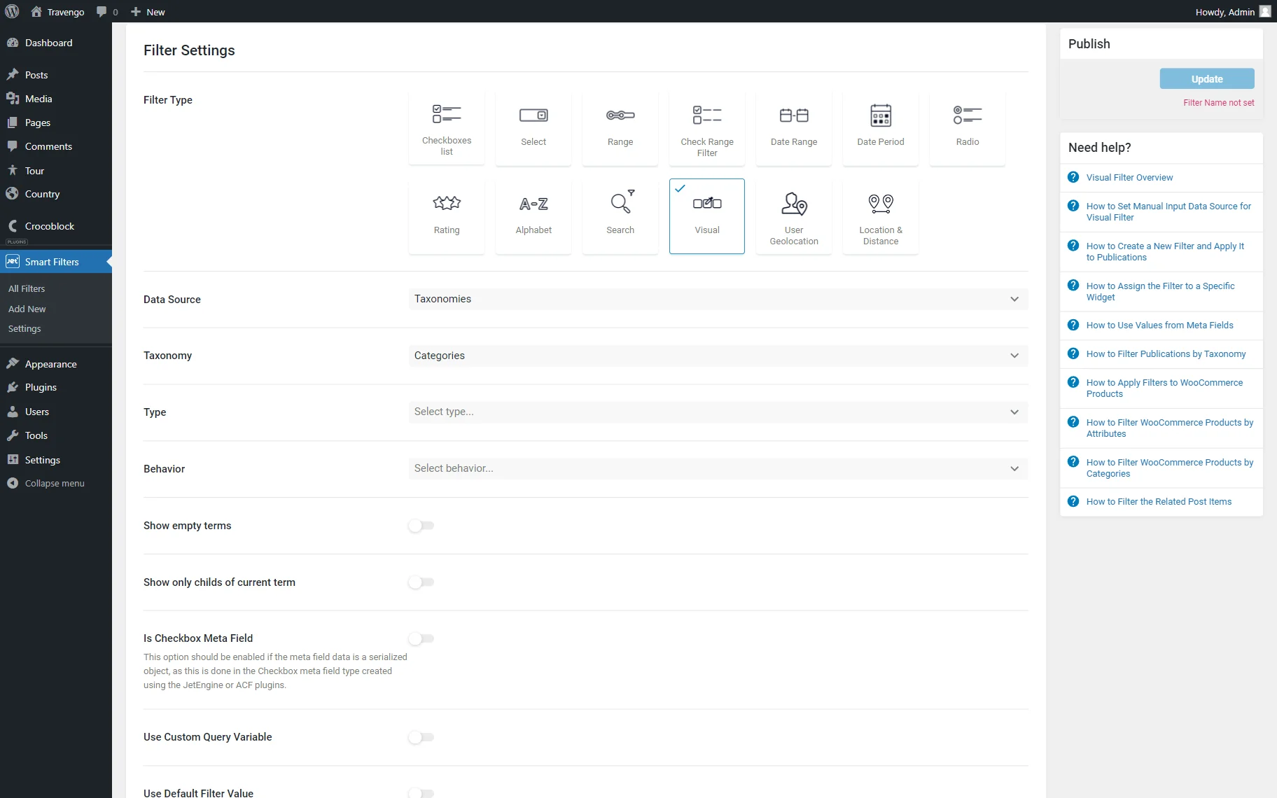
Taxonomies
Once chosen, this option will take the data from the selected taxonomy. For instance, it can be categories, tags, or product taxonomies used for an online shop.
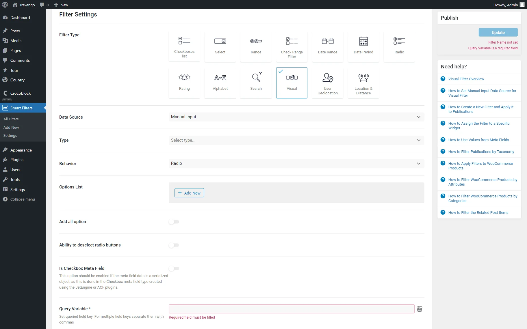
Manual Input
All the values can be set up manually. The options will not be pulled automatically. The manual input source allows entering your own values. As an example, it can be color options or images set as meta field values.
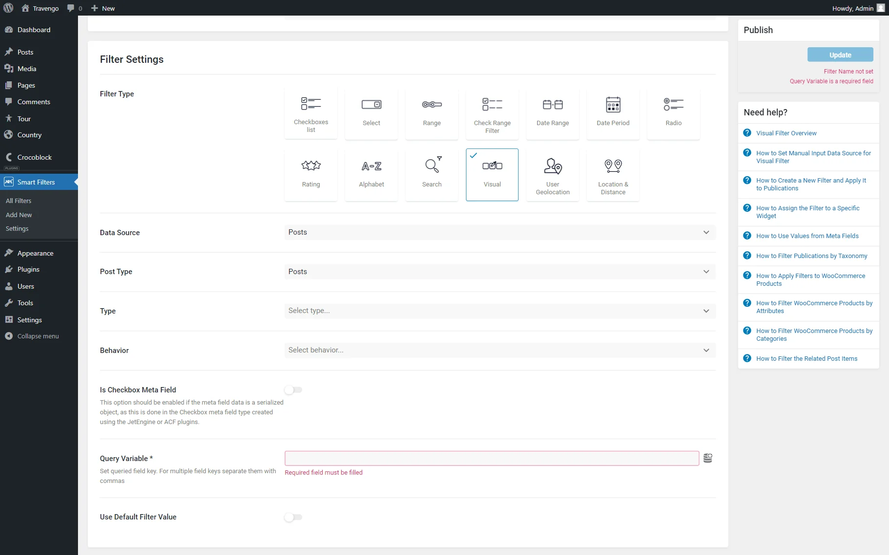
Posts
With this option, the default WordPress post type or Custom Post Type created manually can be picked to filter it with the built filter.
JetEngine Query Builder
This Data Source option is also available only when the JetEngine plugin is installed and activated.
It allows filtering by query options built with the help of the JetEngine Query Builder functionality.

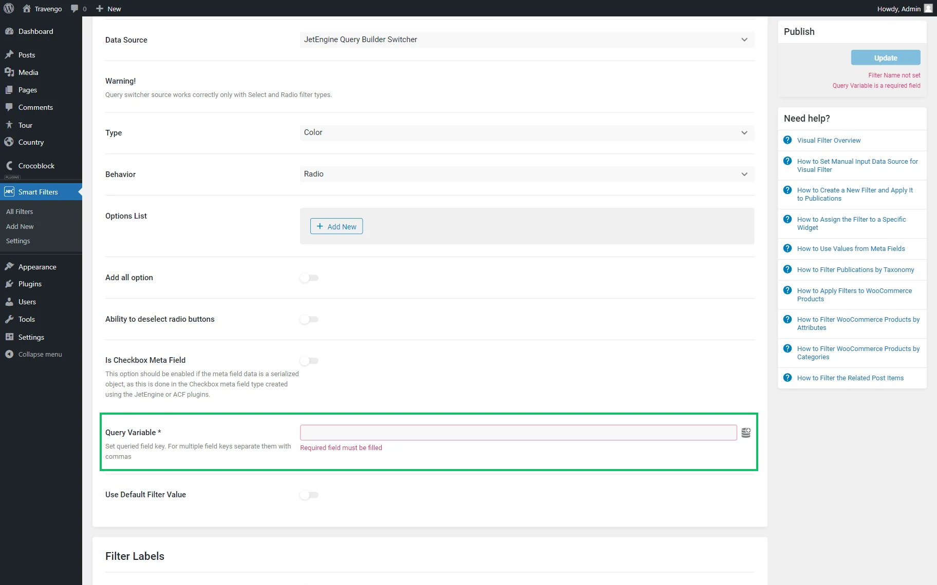
JetEngine Query Builder Switcher
Once the Data Source is picked, further settings are shown. They can differ depending on the chosen data source.
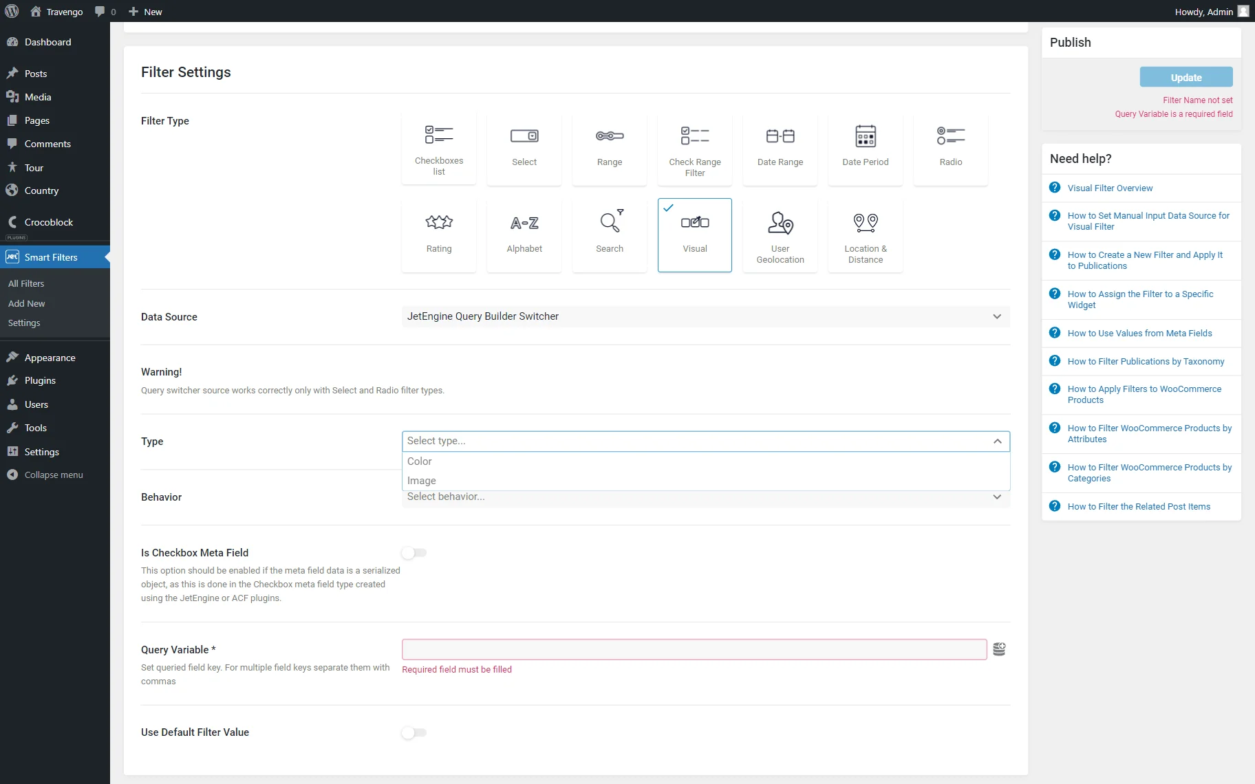
Type
This field refers to the appearance of the filter. Filter options can be displayed as “Color” or “Image.”
The “Color” filter will represent values in colors chosen in the color picker or by code, while the “Image” filter will depict images as options.
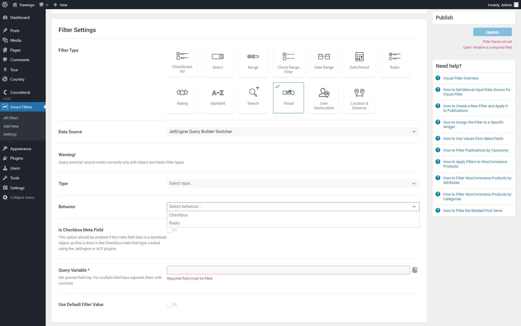
Behavior
This field includes two options: “Checkbox” and “Radio.” The “Checkbox” option lets the users select several options from the given list, while “Radio” enables them to select just one option.
Radio settings
If one selects the “Radio” Behavior option, additional settings appear:
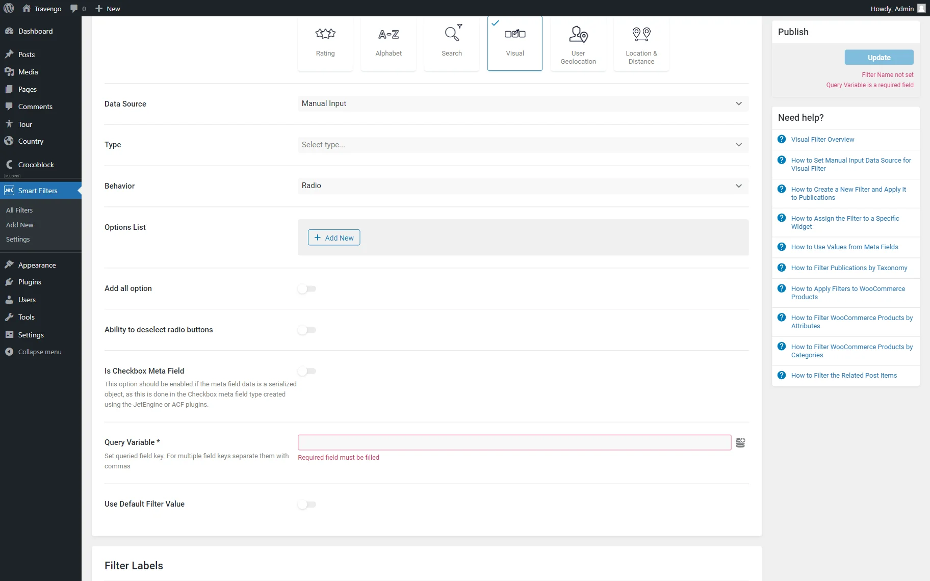
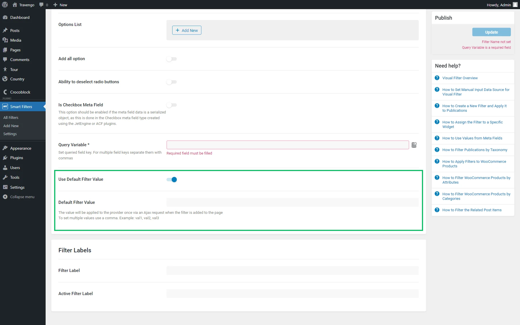
- Add all option — a toggle that adds the “All” option to the previously set options list;
- All option label — a text displayed as the label for the “All” option. The “Choose an image” button below the text field allows setting an image for the “All” option;
- Ability to deselect radio buttons — a toggle that activates the ability to untick the selected choice.
Is Checkbox Meta Field (JetEngine)
The Is Checkbox Meta Field (JetEngine) toggle filters data from the “Checkbox” meta fields type if activated.
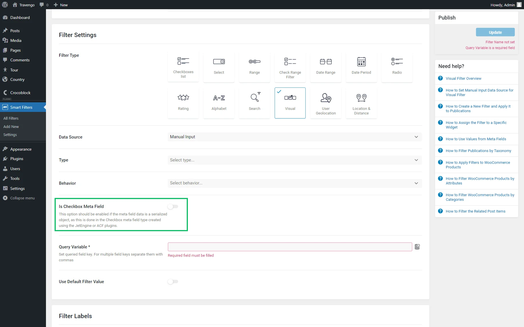
Query Variable
The Query Variable field is required for completion as it is responsible for the correct display of the filtering parameters. Here, the meta field name by which the data will be filtered can be added.
Use default filter value
Use Default Filter Value is a toggle that activates the Default Filter Value field. Values there can be separated by commas; they will be applied to the provider once via an Ajax request when the filter is added to the page.
Filter Labels
The last settings tab lets users customize the field labels with the help of the following fields:
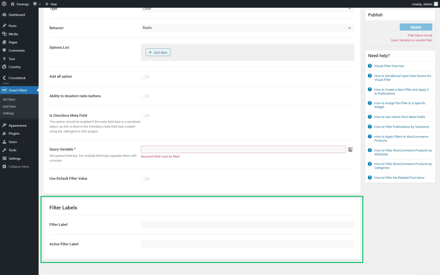
- Filter Label — the value typed in here will be defined as the filter title. It can be used as the label displayed next to the filter;
- Active Filter Label — a label that is displayed in the Active Filters and Active Tags blocks for Gutenberg or widgets for Elementor.
To save the filter, one should click the “Update” button.
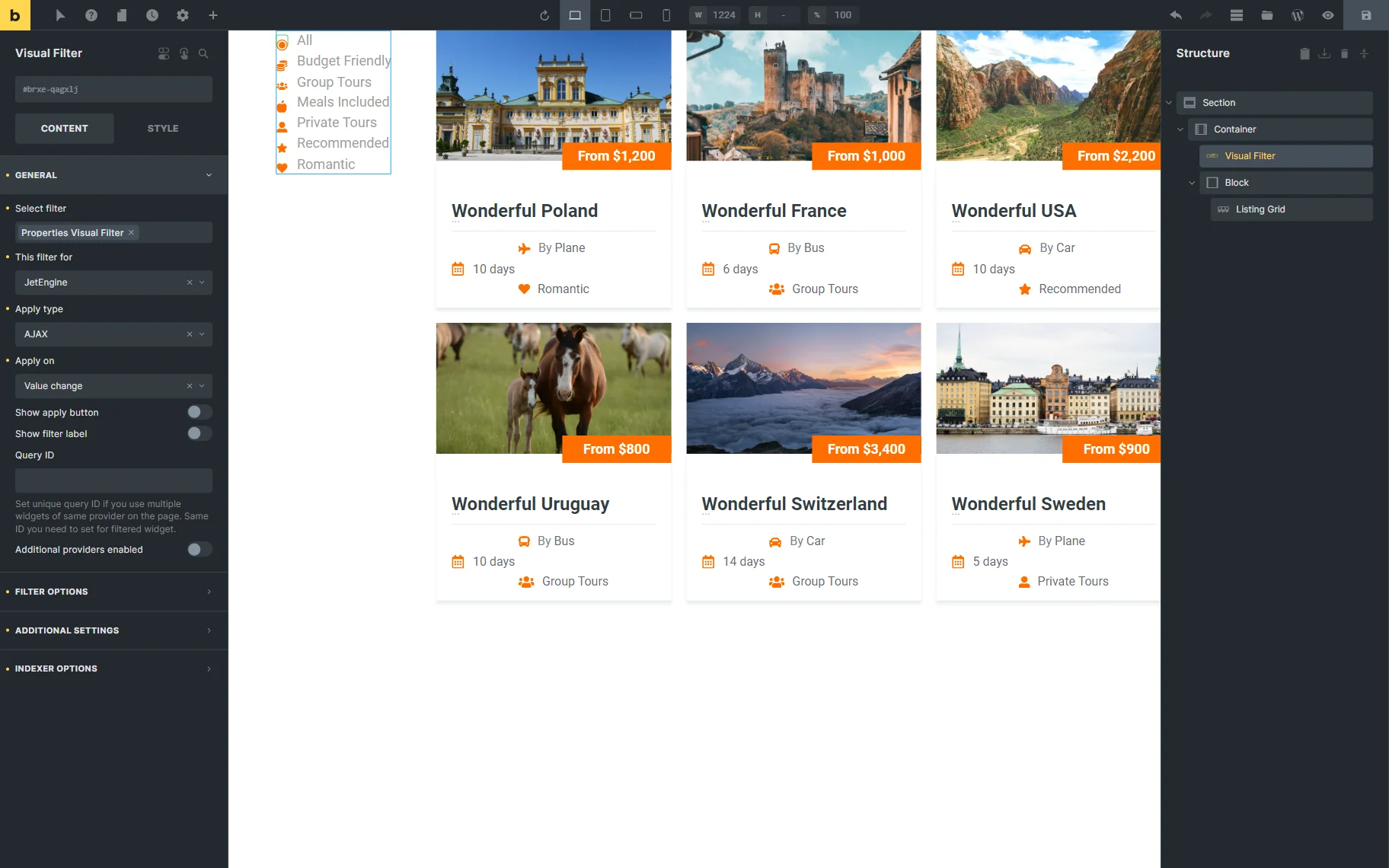
Visual Filter Widget in Elementor
In the Elementor editor, a Visual Filter widget can be found in the search bar.
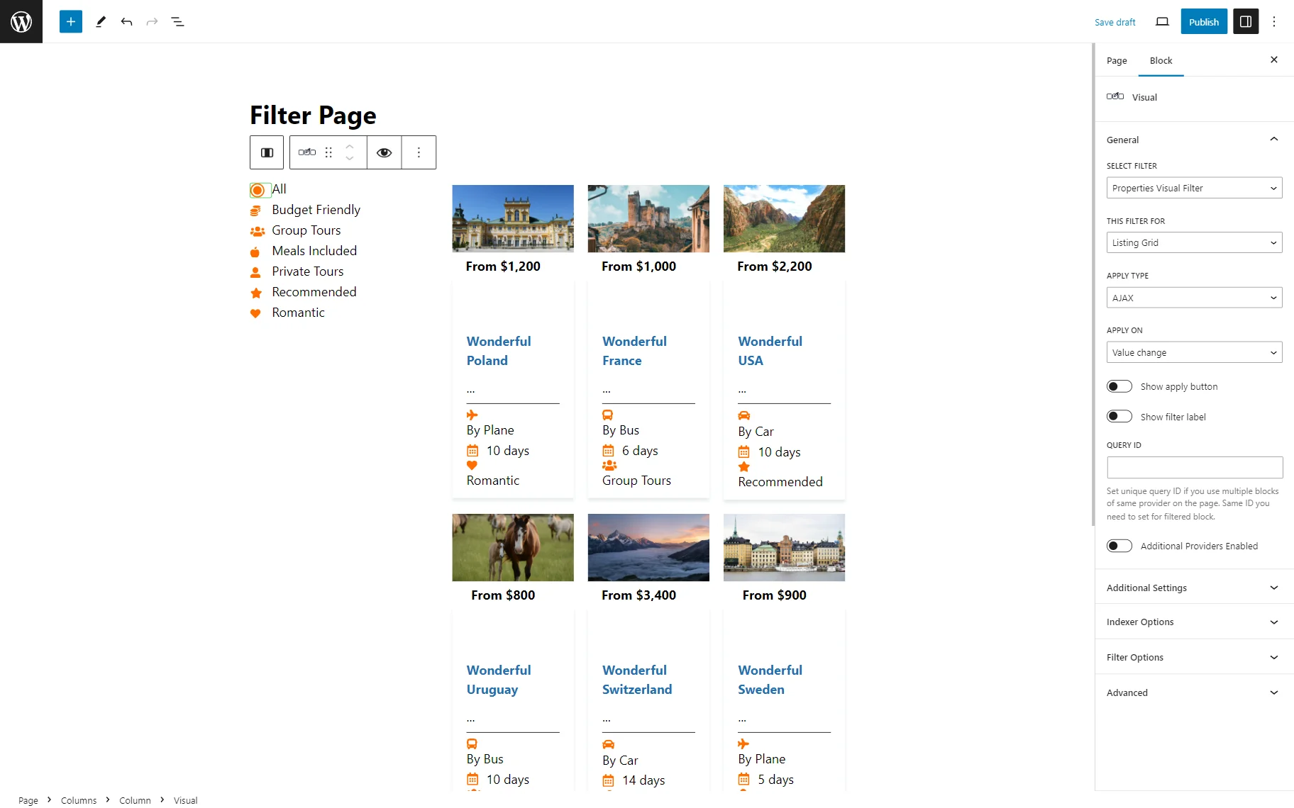
The first Content tab consists of such customization fields:

- Select filter — the filter that will be displayed;
- This filter for — the filter provider to attach the filter;
- Apply type — the way how the filter results will be shown, with page reloading (“Page Reload”) or without (“AJAX”);
- Apply on — the action that will trigger the filter;
- Show apply button — a toggle that adds an “Apply” button;
- Show filter label — a toggle that displays the filter label above the filter;
- Query ID — an ID to be added if there more than one widget of the same provider on the page is needed to be used;
- Additional Providers Enabled — a toggle to apply the filter to several providers.
The following settings tab is called Filter Options and includes such settings:

- Show items label — a toggle that is activated by default and displays the options labels;
- Image Size — the image quality (can be used when working on the Image Filter).
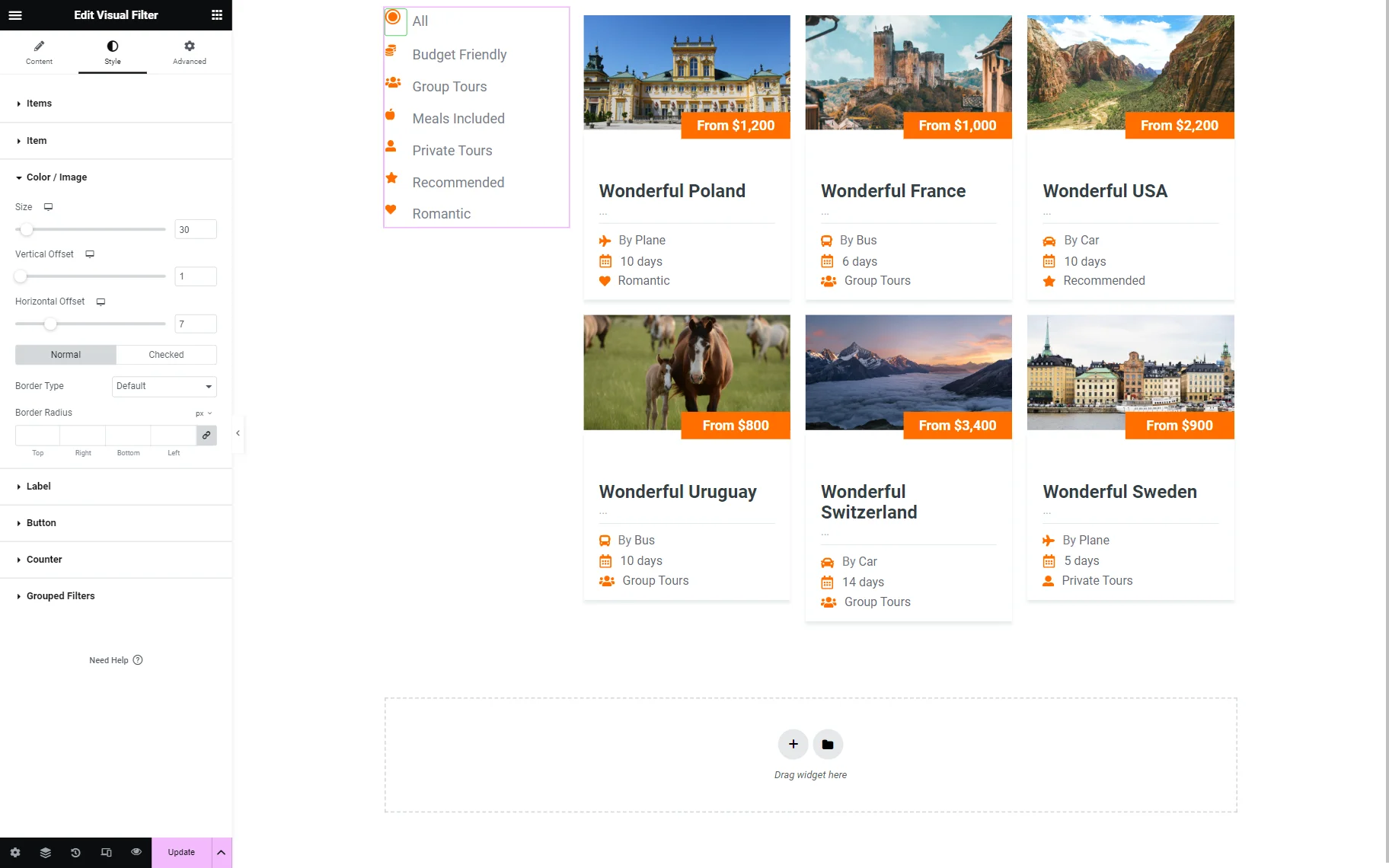
The image or color size can be additionally changed in the Style tab. In the Color/Image tab, the size can be altered by moving the switcher or typing the needed value in the field.
In the Additional Settings tab, the further settings are presented:

- Search Enabled — a toggle that adds the search bar for quicker filter navigation;
- Search Placeholder — the text shown as the default “Search” value in the search bar. It can be changed if needed;

- More/Less Enabled — a toggle that enables “More” and “Less” buttons to hide some filter options;
- Less Items Count — the number of displayed options if the option mentioned above is activated;
- More Text — the “More” text on the button;
- Less Text — the “Less” button text;

- Dropdown Enabled — a toggle that activates the drop-down list to place filter options in it;
- Placeholder — a drop-down menu placeholder;
- N Selected — a toggle that hides the options labels and shows the number of the picked items after the N-item;
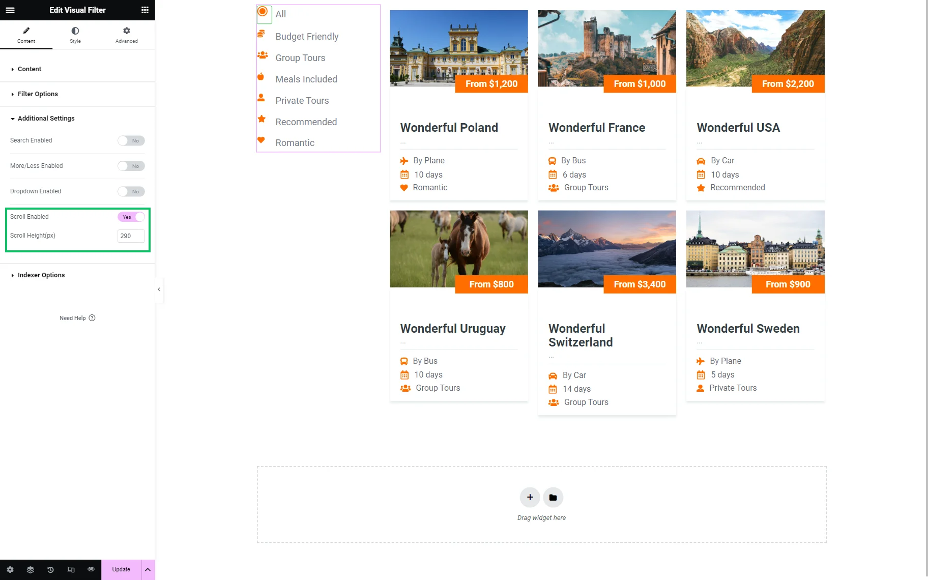
- Scroll Enabled — a toggle to activate the filter options scroll;
- Scroll Height(px) — a height of the filter scroll.
Also, the Indexer Options allow adjusting the Indexer feature:

- Apply Indexer — a toggle for indexing the filter;
- Show Counter — a toggle that enables the counter for the number of available options. Once activated, the Counter Prefix and Counter Suffix fields are available for customization;
- If Item Empty — the action for the empty options;
- Change Counters — a drop-down list that allows setting whether to change counters when filters are applied.
Visual Filter Block in Gutenberg
In the Gutenberg-edited page, the Visual Filter block can be added as well. The block settings are the same as the Elementor widget ones described above.
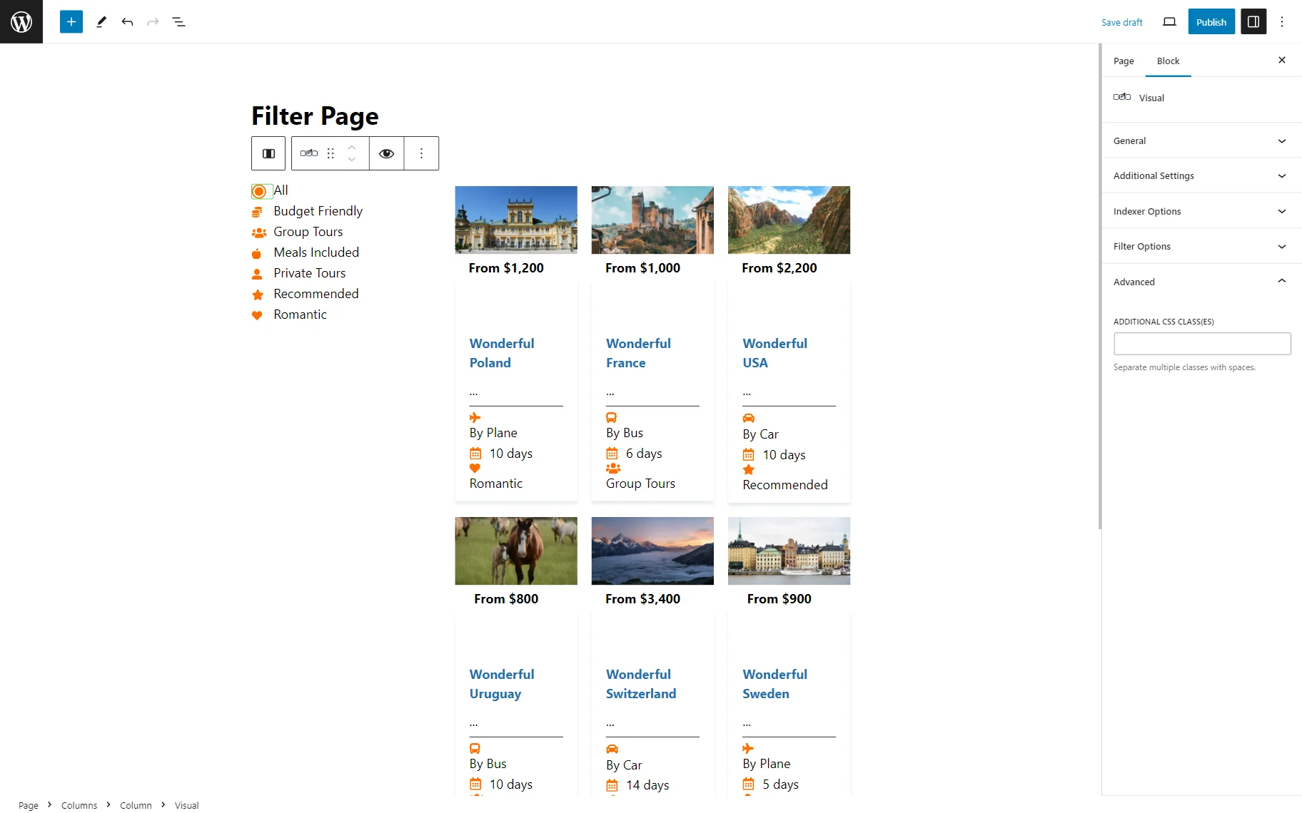
The Advanced tab is responsible for the filter appearance. Here, the CSS class can be put in the Additional CSS class(es) field.
Alternatively, the JetStyleManager plugin can be used to implement the style changes right in Gutenberg.
Visual Filter Element in Bricks
The Visual Filter element is also available in the Bricks Builder.
This element can be found by its name in the search bar. It includes the same settings as the same named widget in Elementor.
Results
Once the page is saved, the results can be checked on the front end.

Now, you know how to set up the visual filter that will meet your needs using the JetSmartFilters plugin.