How to Pick the Load Level of Style Settings in Elementor Editor
Learn how to pick the needed load level of the Style settings for the JetTabs plugin in the Elementor editor to optimize the WordPress site's working speed.
Before you start, check the tutorial requirements:
- Elementor (Free version)
- JetTabs plugin installed and activated
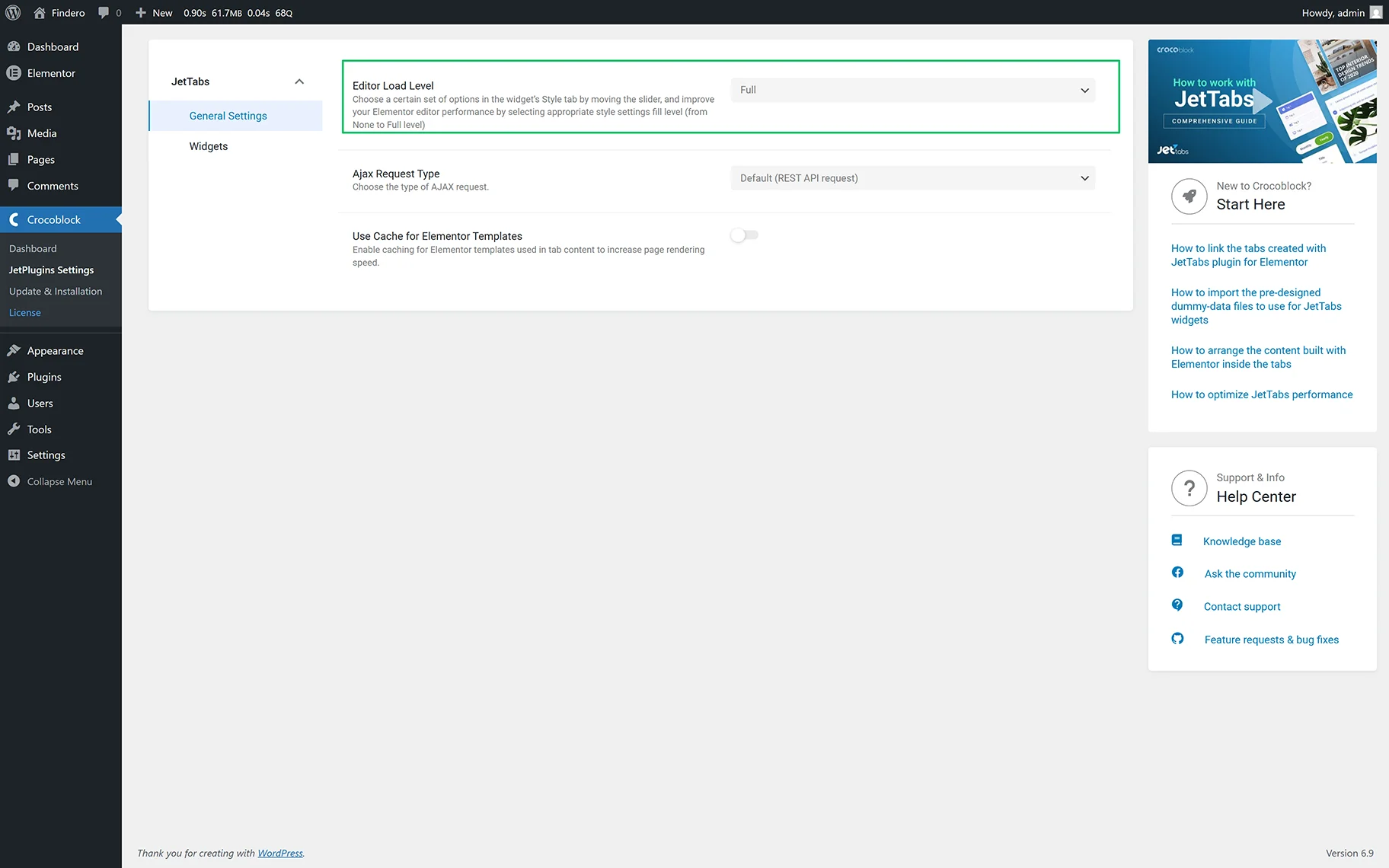
Configure the JetTabs Settings
Open the WordPress Dashboard and navigate to the Crocoblock > JetPlugins Settings > JetTabs > General tab. Here, select the needed option in the Editor Load Level drop-down. Once chosen, the data will be saved automatically.
Affect on the Style Settings
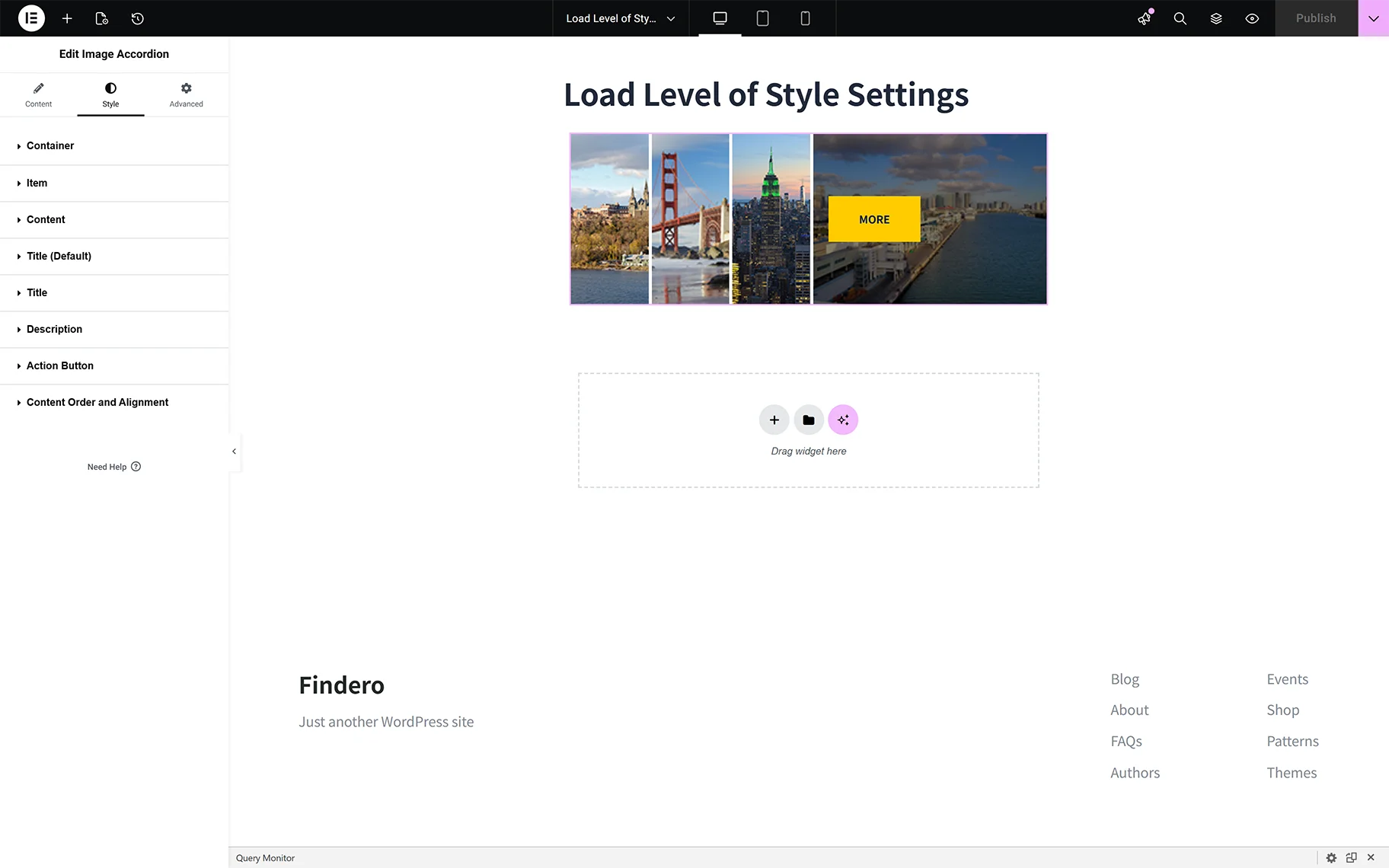
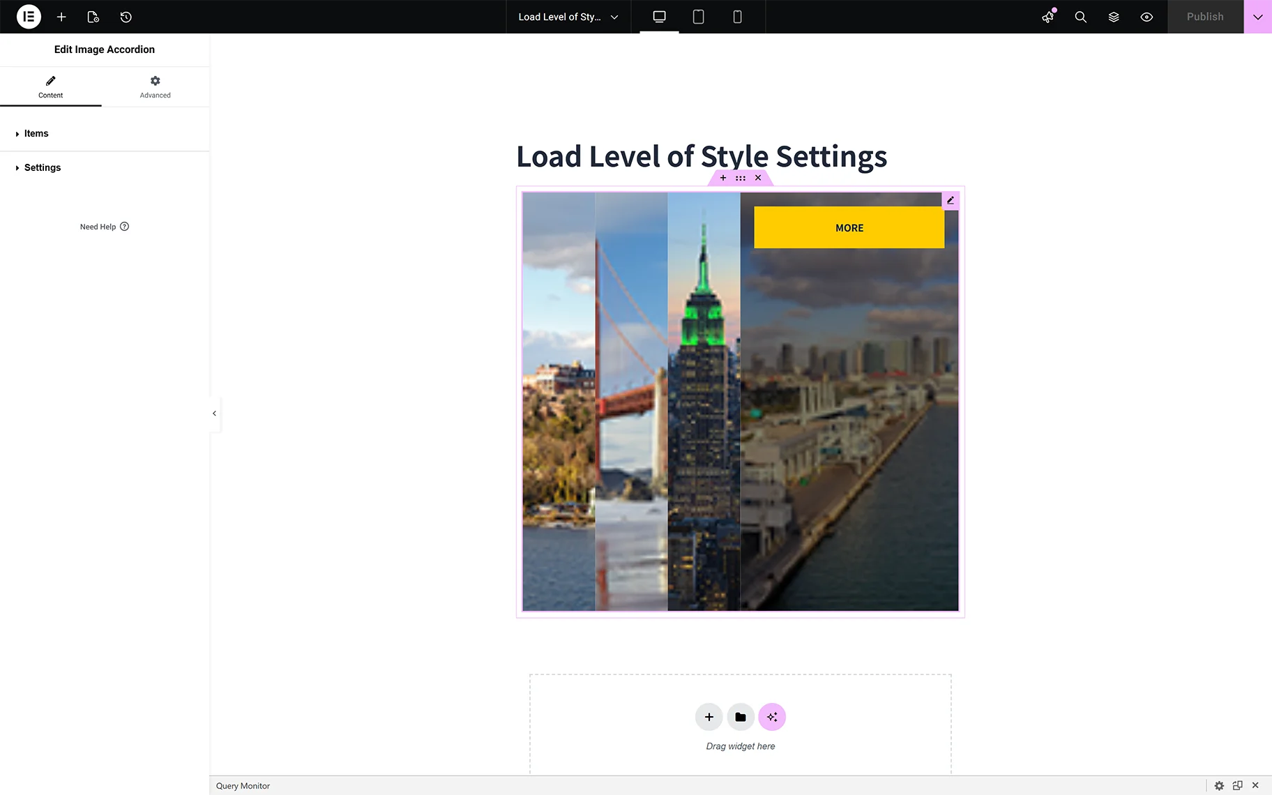
Open a page or post in Elementor. Add any activated JetTabs widget (here, we insert the Image Accordion widget).
Remember that the lower the selected level, the fewer opportunities are available. This means the full range of settings is available for the “Full” Editor Load Level.
In contrast, the “None” Level hides the Style tab and displays the widget with the default options.
Manage the Load Levels of Style Setting
It may be perfect for you to use one of the halfway levels, and its settings meet your requirements. Additionally, you might need one more setting (or maybe several slight ones), but you don’t want to choose another level to save the optimized work of the Elementor editor. In this case, you should add the necessary option using appropriate CSS code.
In this way, you will save the lower-level general settings for tabs while still having the options you need.
It’s essential to keep in mind that if you customize the Tabs and set the Load Level Editor option to “None,” your stylization will revert to the default settings. The same will happen if you change the level from lower to higher, and vice versa. But once you choose the higher level, the settings revert to their original state.
In between are “Low,” “Medium,” and “Advanced” levels, each with settings that appear progressively as the level is selected.
That’s it. Now you know how to pick the needed load level of the Style settings for the JetTabs plugin in the Elementor editor to optimize the WordPress site’s working speed.