Dynamic Image Widget Overview
Learn how to manage the Dynamic Image widget/block/element settings of the JetEngine plugin to configure image displaying in the Elementor/Block Editor/Bricks theme.
The Dynamic Image widget/block/element is available after the JetEngine plugin is installed and activated. Users can add this widget/block/element to single or archive templates and create Listing Items.
Dynamic Image Widget in Elementor
The Dynamic Image widget can be found in Elementor and put on the page where needed. Among the settings tabs are Content, Style, and Advanced.
Content Settings
The Content Settings are presented by the following drop-downs, toggles, and text fields:

- Source 一 a drop-down list that allows selecting the source of the image, i.e., the “Post thumbnail,” “User avatar,” featured image of products, or Custom Post Type (CPT) images;
- Custom field/repeater key/component control 一 a text field intended to insert the meta field ID, meta field name, or component control. If used, the field value prevails over the Source value;
- Image URL Prefix 一 a text field intended to add a prefix to the image URL (for example, for the cases when the source contains only part of the URL);
- Image Resolution 一 a drop-down list that allows selecting the necessary size of the image (i.e., “Thumbnail – 150 x 150,” “Medium – 300 x 300,” “Medium Large – 768 x 0,” “Large – 1024 x 1024,” and more);
- Custom Image Alt 一 a text field that allows typing an alt text for the image or taking it from meta fields using the Dynamic Tag;
- Add Image Caption 一 a toggle that, if enabled, turns on the ImageCaption Position drop-down and Image Caption Text field:
- Image Caption Position 一 a drop-down that allows setting the “Before” or “After” position of the caption text;
- Image Caption Text 一 a text field that allows typing an image caption text or taking it from meta fields using the Dynamic Tag;
- Lazy Load 一 a toggle that optimizes the image download speed;
- Linked Image 一 a toggle that, if enabled, makes the image clickable. It turns on the following fields and toggles:
- Link Source 一 a drop-down menu to select a link applied to the image. The drop-down menu shows “Permalinks,” meta field data associated with the current CPT (here, Properties (Copy), user info, and more;
- Custom field/repeater/component control 一 a text field intended to insert the meta field ID, meta field, or component control. If data is inserted, the field value prevails over the Meta Field value;
- Link URL Prefix 一 a text field to type a URL shown before the image on the front end;
- Open in new window 一 a toggle that, if enabled, opens the link of the image in a new window;
- Add to “rel” attr 一 a drop-down menu that allows adding a relation between the linked image and a page as “Author,” “Bookmark,” “Help,” and more;
- Alignment (responsive) 一 a switcher that sets the image on the “Start,” “Center,” “End,” or “Stretch” on the different devices (desktop, tablet, portrait, or mobile);
- Hide if value is empty 一 a toggle that hides the image if it is not filled with data;
- Fallback Image 一 a field that allows adding an image to be shown if the meta field of the post doesn’t include data. Users can upload the picture in JPG, GIF, or PNG formats;
- Context 一 a drop-down menu that allows you to select the source of the image more specifically, i.e., “Default Object,” “Current Object,” “Current User,” and more.
Style Settings
The Style Settings manage the Image and Caption text options. In particular, the Image tab allows setting the Width, Max Width, and Height and selecting the Border Type and Border Radius; in turn, the Caption tab includes the Color, Typography, Max Width, Caption Text Alignment, Padding, Margin, Border Type, and Border Radius settings.

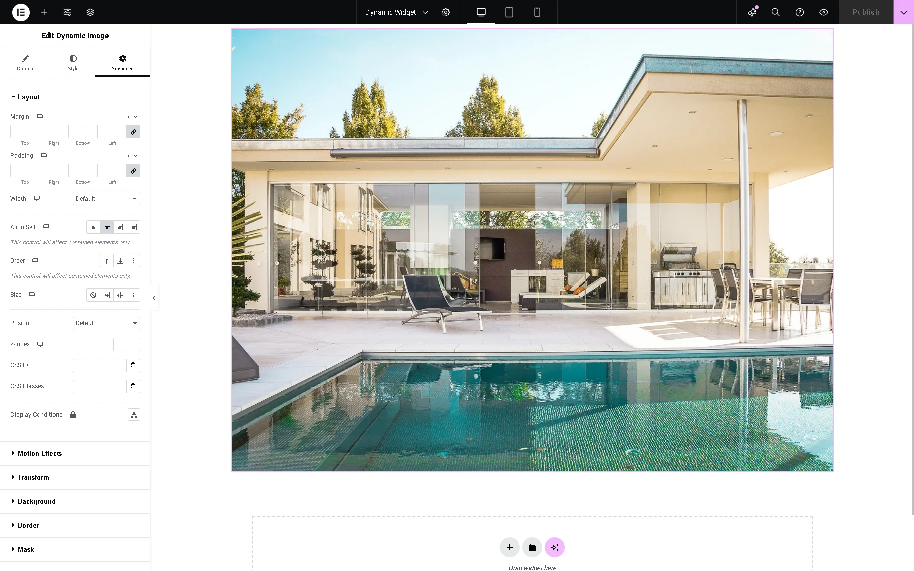
Advanced Settings
This tab includes settings and displays tabs referring to the installed plugins (such as JetTricks, JetPopup, JetWooBuilder, etc.).
Dynamic Image Block in Block Editor
The block can be found in the search bar and inserted where needed. Among the Dynamic Image block settings tabs are General, Layout, Caption, and Advanced.
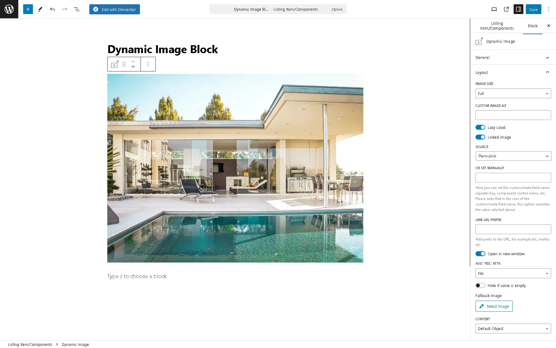
General settings
The General tab of settings is presented by the following fields:

- SOURCE 一 a drop-down list that allows selecting the source of the image, i.e., the “Post thumbnail,” “User avatar,” featured image of the products, etc.;
- OR SET MANUALLY 一 a text field to type a custom/meta field name, repeater key, component control name, etc. If added, the field value prevails over the SOURCE value;
- IMAGE URL PREFIX 一 a text field intended to add a prefix to the image URL (for example, for the cases when the source contains only part of the URL).
Layout settings
The Layout tab of settings is presented by the following fields:
alt text: layout settings of the dynamic image block
- IMAGE SIZE 一 a drop-down menu that allows selecting the necessary size of the image (i.e., “Thumbnail – 150 x 150,” “Medium – 300 x 300,” “Medium Large – 768 x 0,” “Large – 1024 x 1024,” and more);
- CUSTOM IMAGE ALT 一 a text field that allows typing an alt text for the image;
- Lazy load 一 a toggle that optimizes the image download speed;
- Linked image 一 a toggle that, if enabled, makes the image clickable. It turns on the following fields and toggles:
- SOURCE 一 a drop-down menu to select a link applied to the image. The drop-down menu shows meta fields associated with the current CPT (here, Properties (Copy), user data, and more;
- OR SET MANUALLY 一 a text field intended to insert the meta field ID, meta field name, and component control name. If data is inserted, the field value prevails over the Meta Field value;
- LINK URL PREFIX 一 a text field to type a URL shown before the image on the front end;
- Open in new window 一 a toggle that, if enabled, opens the link of the image in a new window;
- ADD “REL” ATTR 一 a drop-down menu that allows adding a relation between the linked image and a page as “Author,” “Bookmark,” “Help,” and more;
- Hide if value is empty 一 a toggle that hides the image if it’s not filled with data;
- Select Image 一 a button that allows selecting the image to be shown if the meta field of the post doesn’t include data. Users can upload the picture in JPG, GIF, or PNG formats;
- CONTEXT 一 a drop-down menu that allows you to define the source of the image more specifically, i.e., “Default Object,” “Current Object,” “Current User,” and more.
Caption settings
The Caption settings are activated by the Add Image Caption toggle:
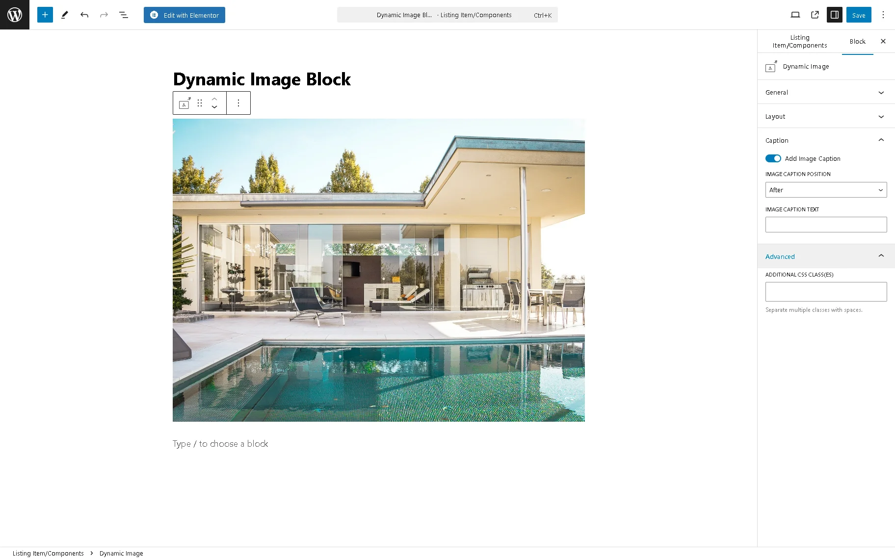
- IMAGE CAPTION POSITION 一 a drop-down field that allows set the “Before,” or “After” position of the caption text;
- IMAGE CAPTION TEXT 一 a text field for typing an image caption text.
Advanced settings
The Advanced setting is presented by ADDITIONAL CSS CLASS(ES), a text field intended to add the CSS class(es) for this block.
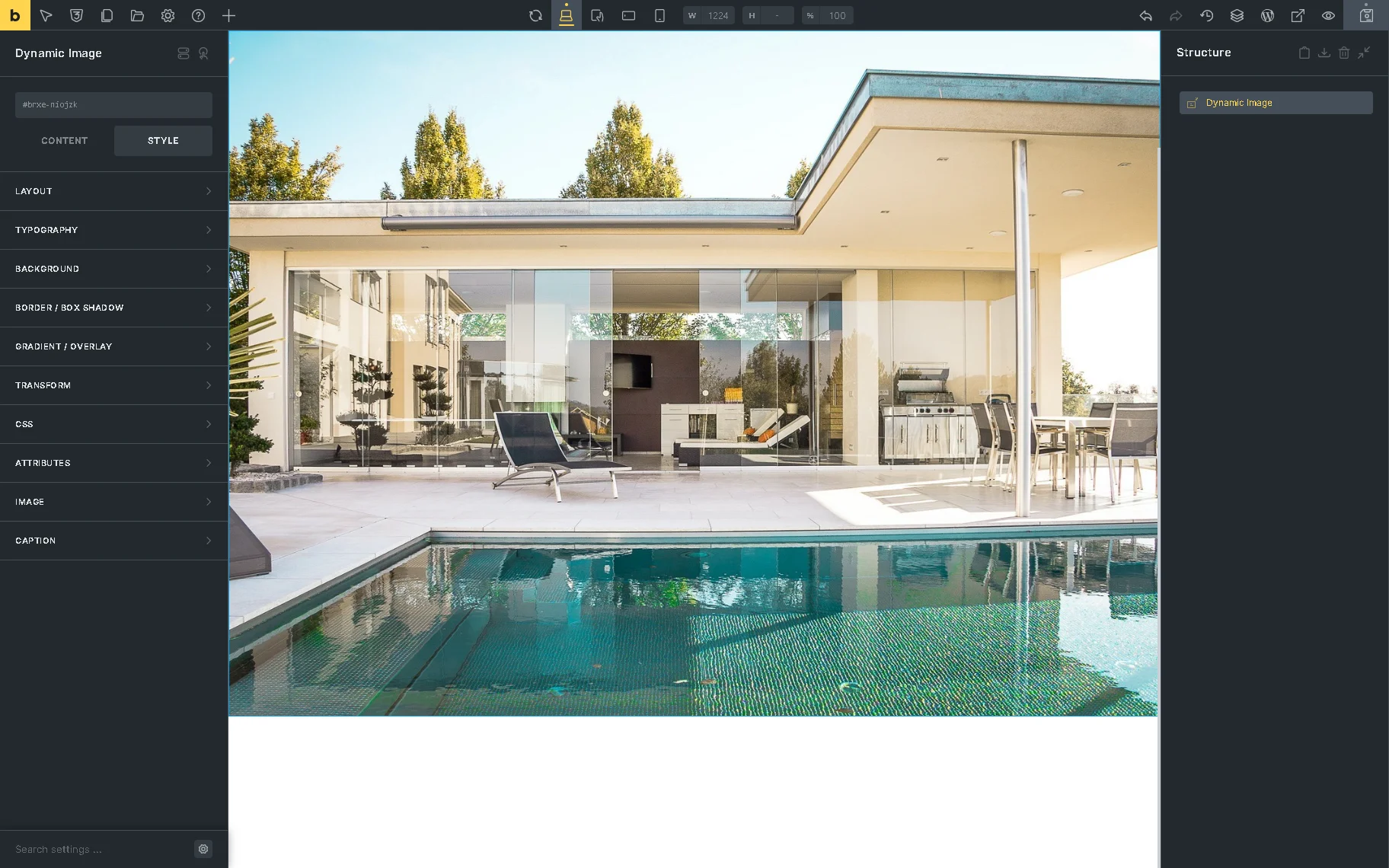
Dynamic Image Element in the Bricks theme
The element can be found in the search bar and then drag-n-dropped where needed. Among the Dynamic Image element settings are the CONTENT and STYLE tabs.
Content settings
The following settings are included in the Content settings:
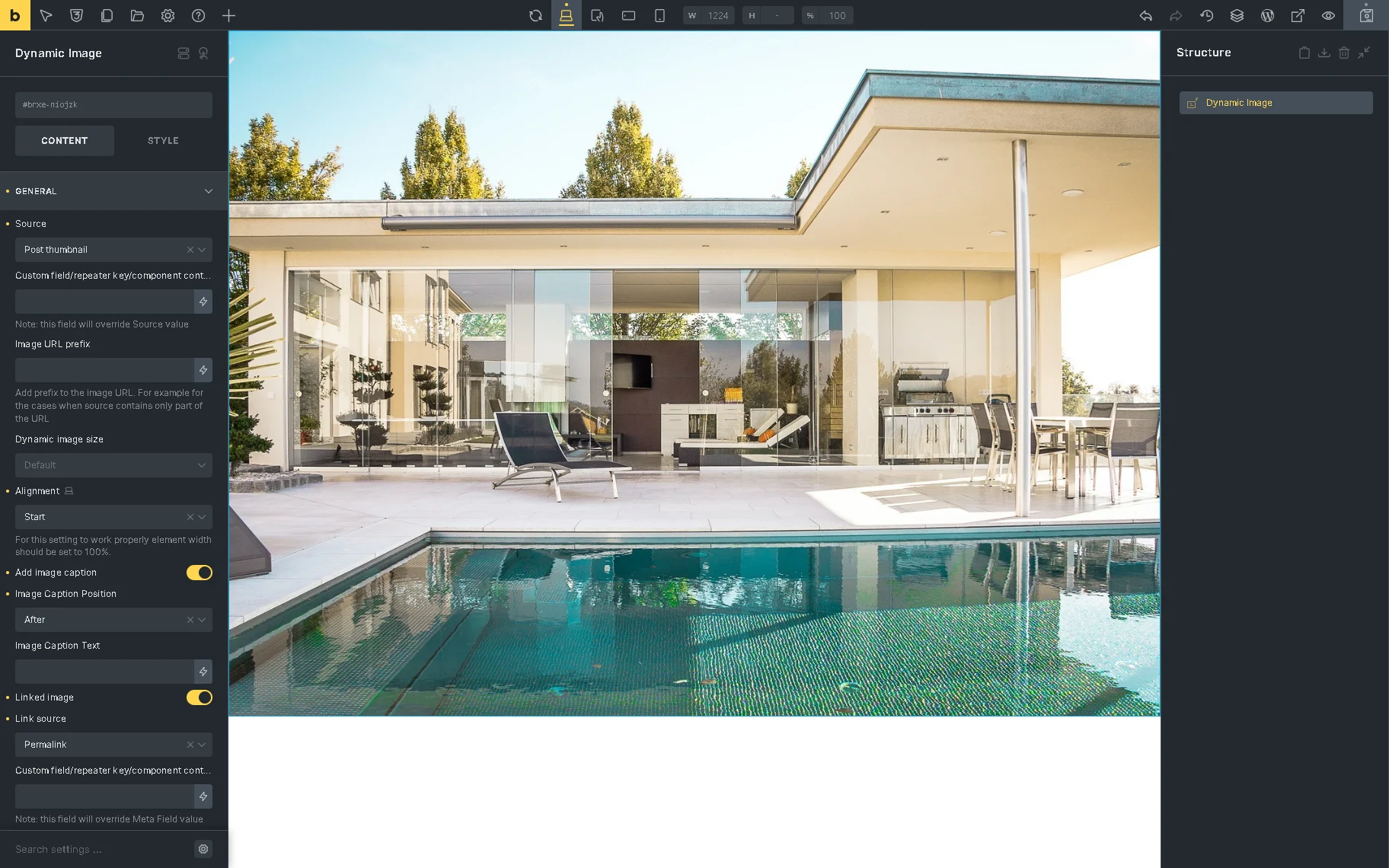
- Source 一 a drop-down list that allows selecting the source of the image, i.e., the “ Post thumbnail,” “User avatar,” featured image of the products, etc.;
- Custom field/repeater key/component control 一 a text field intended to insert or select the dynamic data (the meta field ID, meta field name, component control name.) If added, the field value prevails over the Source value;
- Image URL prefix 一 a text field intended to add or select the prefix to the image URL from the dynamic data (for example, for the cases when the source contains only part of the URL);
- Dynamic image size 一 a drop-down menu that allows selecting the necessary size of the image (i.e., “Thumbnail – 150 x 150,” “Medium – 300 x 300,” “Medium Large – 768 x 0,” “Large – 1024 x 1024,” and more);
- Alignment (responsive) 一 a drop-down list that sets the image on the “Start,” “Center,” “End”, or “Stretch” on the different devices (desktop, tablet, portrait, or mobile);
- Add image caption 一 a toggle that, if enabled, turns on the ImageCaption Position drop-down and Image Caption Text field:
- Image Caption Position 一 a drop-down that allows setting the “Before” or “After” position of the caption text;
- Image Caption Text 一 a text field that allows typing the image caption text or selecting the text from the dynamic data;
- Linked Image 一 a toggle that, if enabled, makes the image clickable. It turns on the following fields and toggles:
- Link source 一 a drop-down menu to select a link applied to the image. The drop-down menu shows meta fields associated with the current CPT (here, Properties (Copy), user settings, options, and more;
- Custom field/repeater/component control 一 a text field intended to type the needed data or select the meta field ID, meta field, component control from the Dynamic Data;
- Link URL Prefix 一 a text field intended to type the URL or select the dynamic data shown before the image on the front end;
- Open in new window 一 a toggle that, if enabled, opens the link of the image in a new window;
- Add “rel” attr 一 a drop-down menu that allows adding a relation between the linked image and a page as “Author,” “Bookmark,” “Help,” and more;
- Fallback image 一 a set of controls that includes the SELECT IMAGE button and text fields to insert/select the dynamic data and Custom URL, respectively;
- Context 一 a drop-down menu that allows for defining the source of the image more specifically, i.e., “Default Object,” “Current Object,” “Current User,” and more.
Style settings
This tab can be used to edit the layout, typography, background, and other style settings of the element.
That’s it. Now you know how to manage the Dynamic Image widget/block/element settings of the JetEngine WordPress plugin to configure image displaying.