Layout Switcher Widget Overview
The Layout Switcher widget is a feature available as part of JetEngine’s plugin for the Listing Grid widget in Elementor. It allows users to switch between the Listing Grid layouts on the front end to select the most convenient one.
The Layout Switcher widget is a feature available as part of JetEngine’s plugin for the Listing Grid widget in Elementor. It allows users to switch between the Listing Grid layouts on the front end to select the most convenient one.
Widget Activation
The widget can be found in the Crocoblock account and activated as a usual WordPress plugin by following the WordPress Dashboard > Plugins > Add New path, pressing the “Upload Plugin” button, and then “Choose File” to find a needed ZIP archive on the computer.
After that, one should press the “Install Now” button and “Activate Plugin” after installation.
Layout Switcher Settings
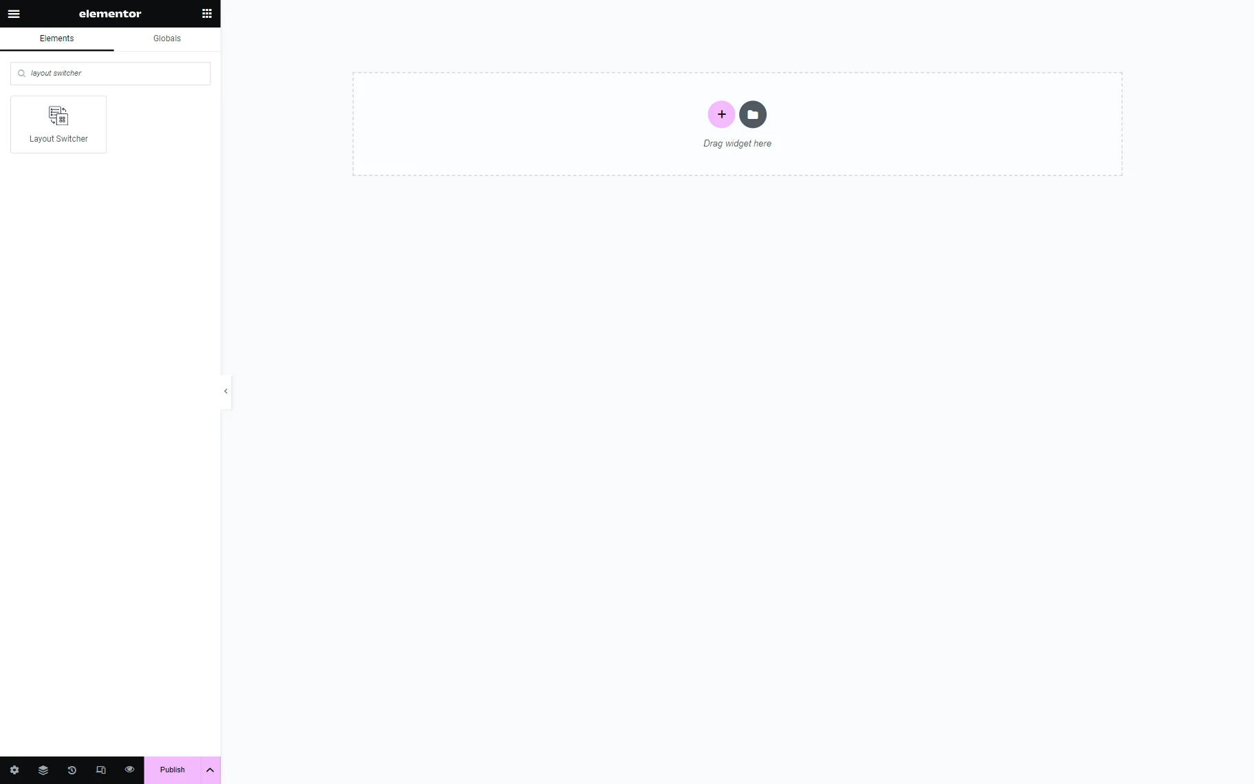
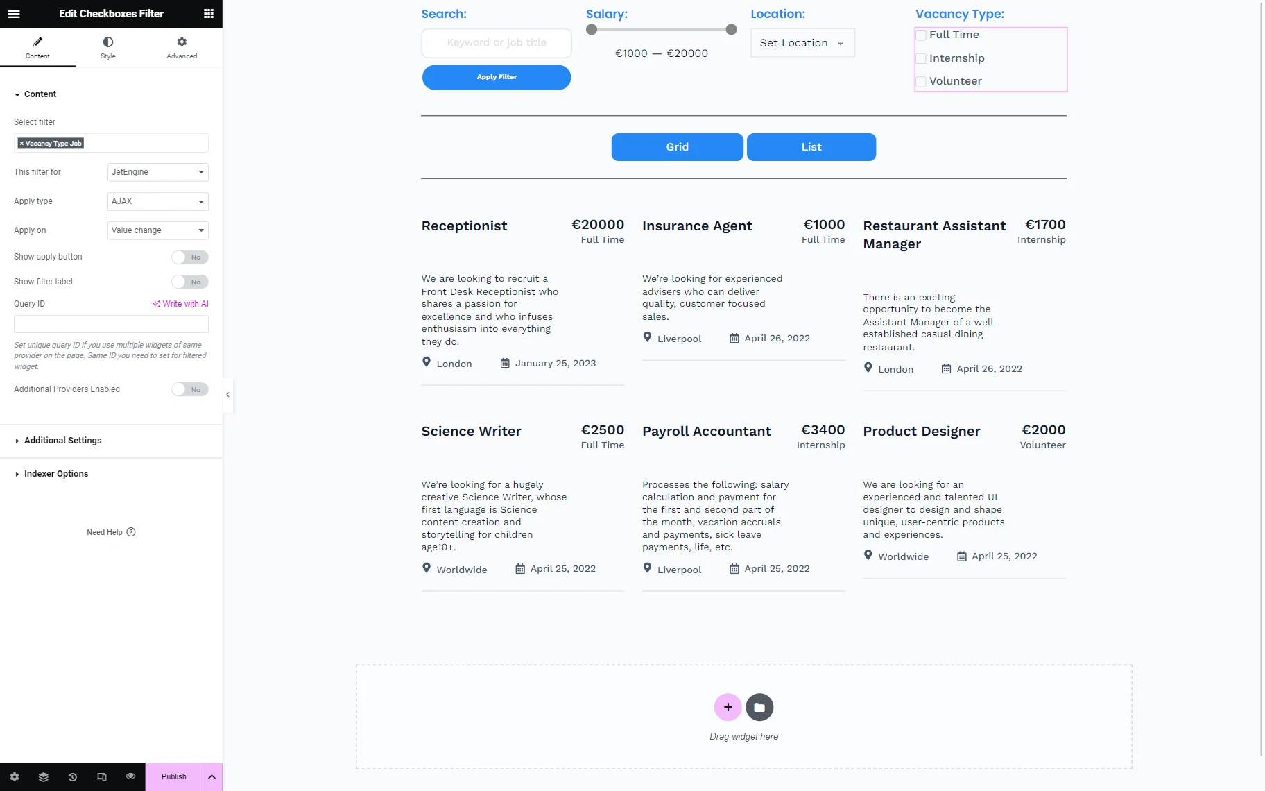
The Layout Switcher widget can be found in the Elementor Page Builder by typing its name in the search bar or by selecting it in the list of all the widgets in the Listing Elements section.
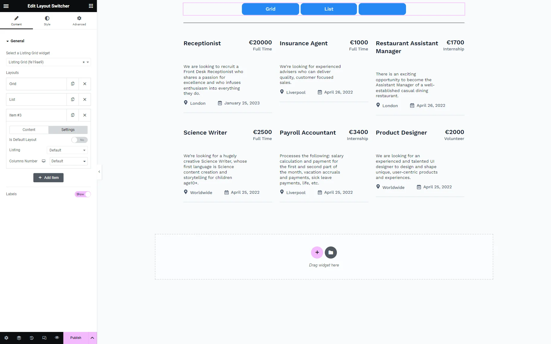
The only settings section in the Content tab is General.
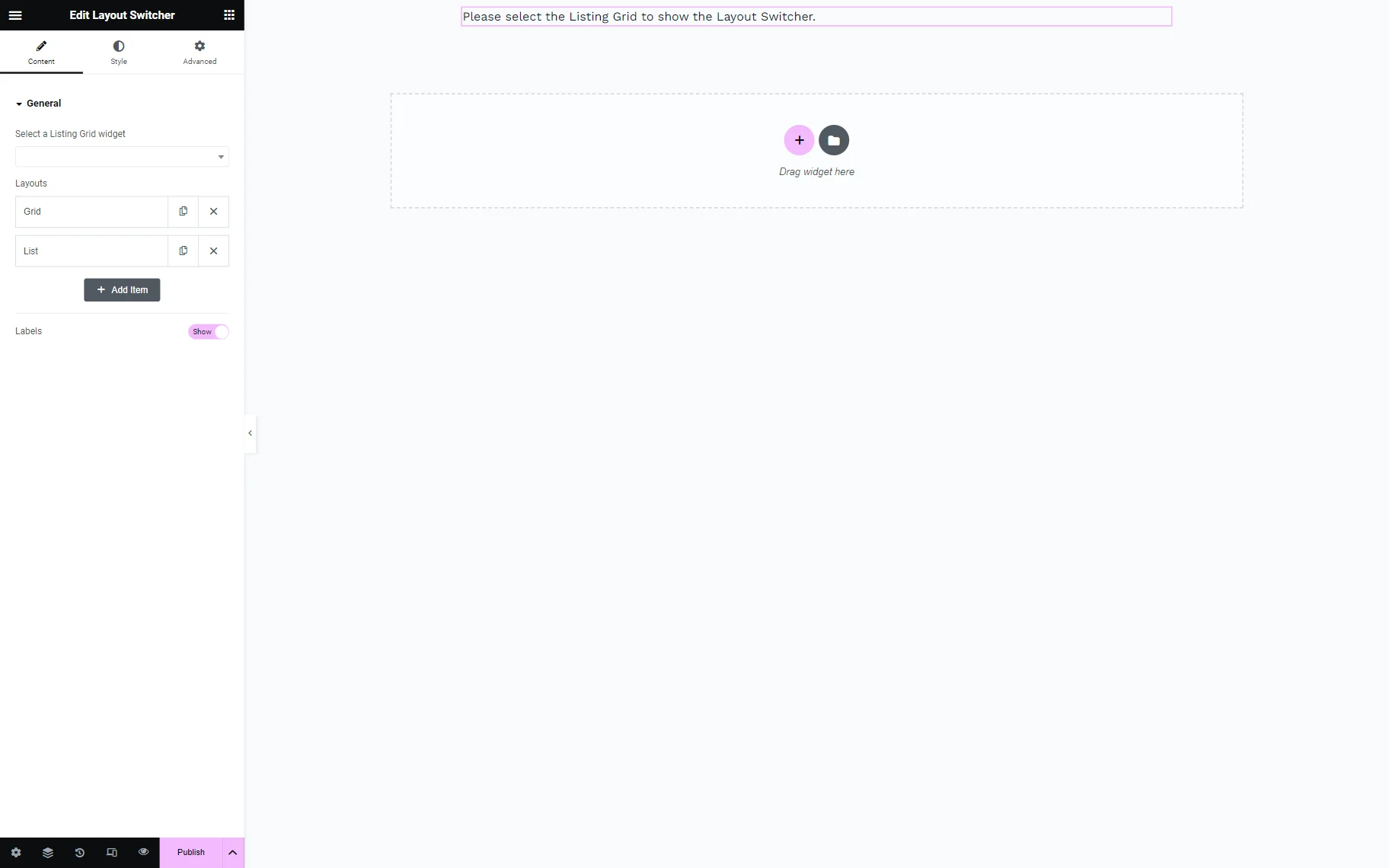
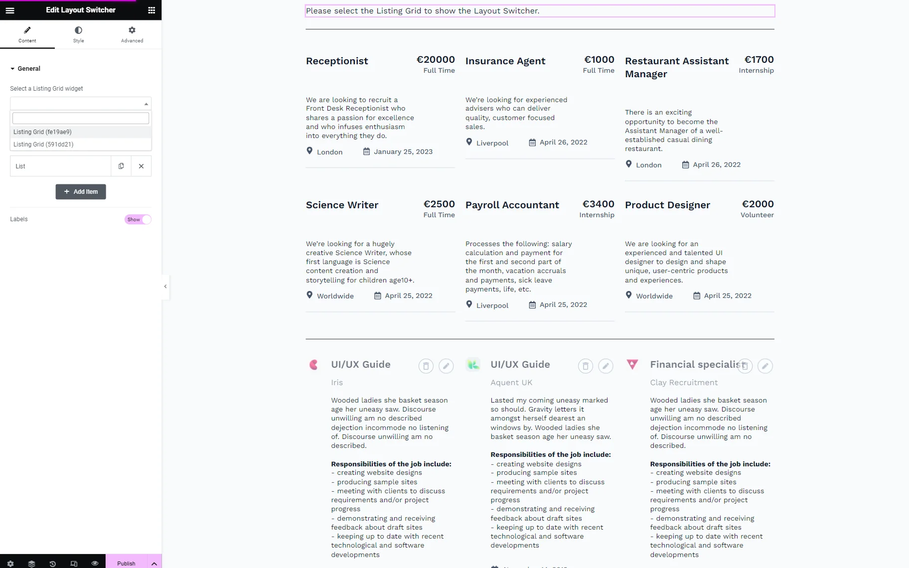
First, the Select a Listing Grid widget field should be filled in using options in the drop-down menu. It is possible only if there is at least one Listing Grid widget on the page.
Two Layouts are displayed by default: “Grid” and “List.” Users can duplicate or delete them by pressing the “copy” and “close” buttons.
To edit the layout, one should open the layout by clicking on it.
Layouts adjusting
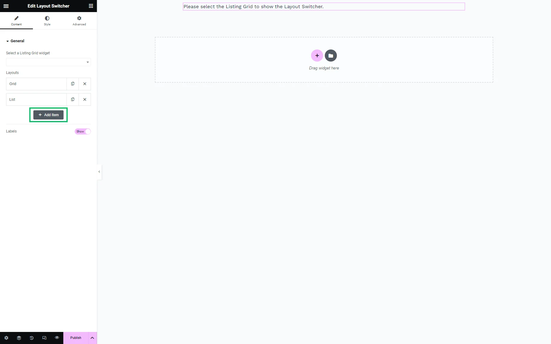
To create a new layout, one should press the “Add Item” button.
There are two tabs to adjust the layout: Content and Settings.
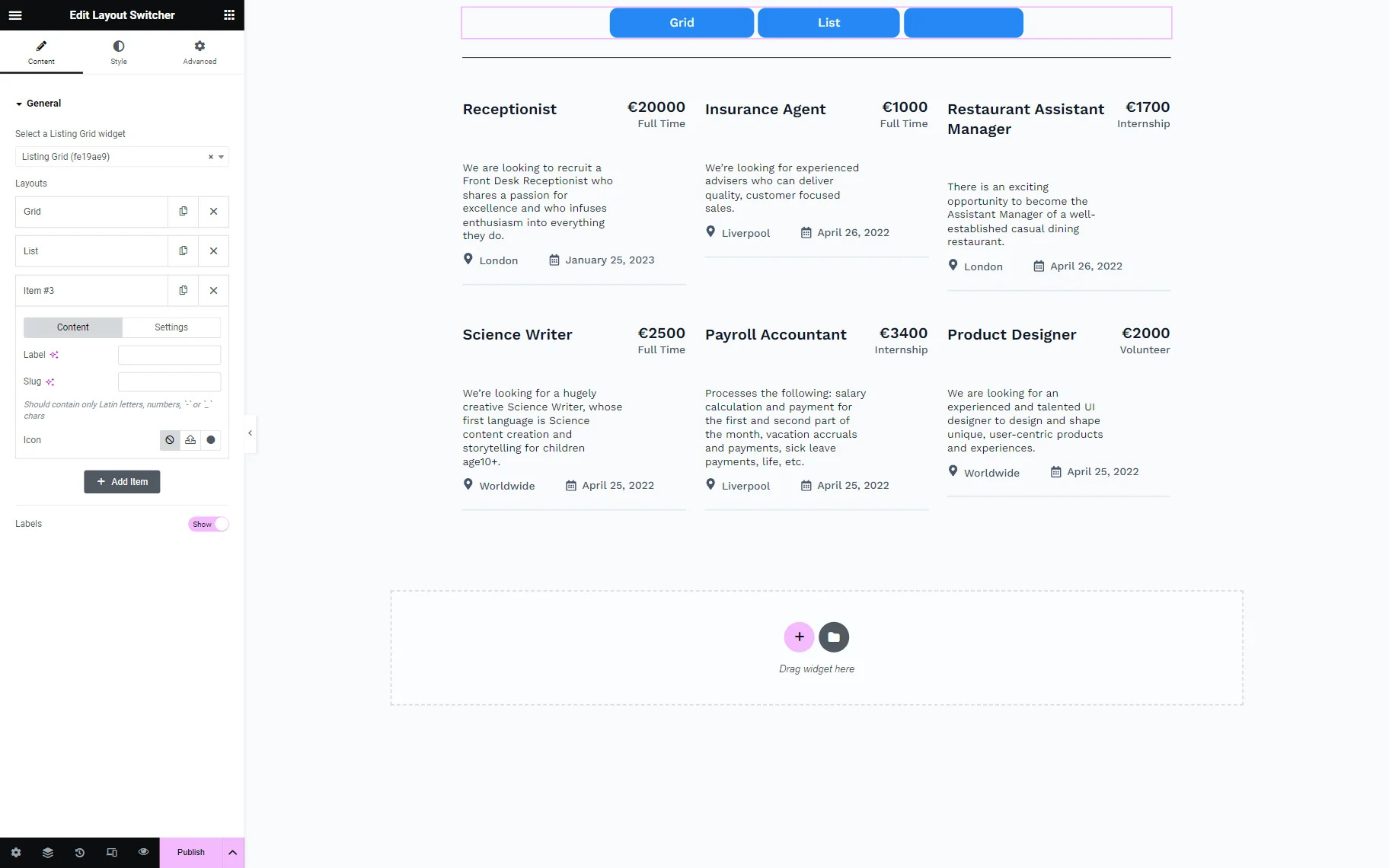
In the Content tab, the following setting fields are presented:
- Label — a title of the layout that will be displayed on the page or can be disabled later;
- Slug — a slug attached to the current layout. It should be completed with lowercase Latin letters with no spaces; this value can contain numbers and “-” or “_” symbols as well if needed. If this field remains empty, the slug will be created automatically based on the Label field (mind that, in this case, the slug will not be automatically shown in this field);
- Icon — a field to select an icon that can be attached to the label; it includes three buttons:
- None — a default option that means that there is no icon attached to the label;
- Upload SVG — a button that opens the WordPress Media Library from where an icon in the SVG format can be uploaded;
- Icon Library — a button that opens an Elementor Icon Library with a selection of icons. There can also be other icon libraries that can be uploaded by pressing the “Upload” button next to My Libraries.
The Settings tab includes additional options:
- Is Default Layout — a toggle to confirm that the current layout is the one selected in the Select a Listing Grid widget field.
When the Is Default Layout toggle is disabled, the following setting fields are available for modification of the default listing layout or switching to the alternative listing:
- Listing — a drop-down menu with a “Default” option to create a new layout based on the default listing or to select a different pre-built listing with a different layout;
- Columns number — a field to select the number of displayed columns within the selected layout style.
The “Add Item” should be pressed whenever a new option is needed.
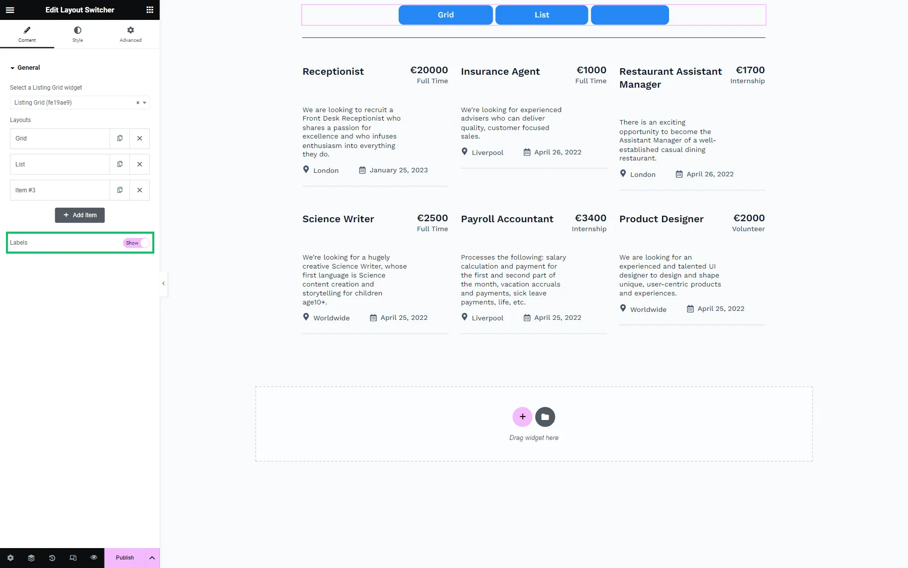
The last toggle in the General tab is called Labels. It is switched on by default, which means the Label will be displayed on the button. If it is disabled, the button will be empty or will contain an icon if it was attached.
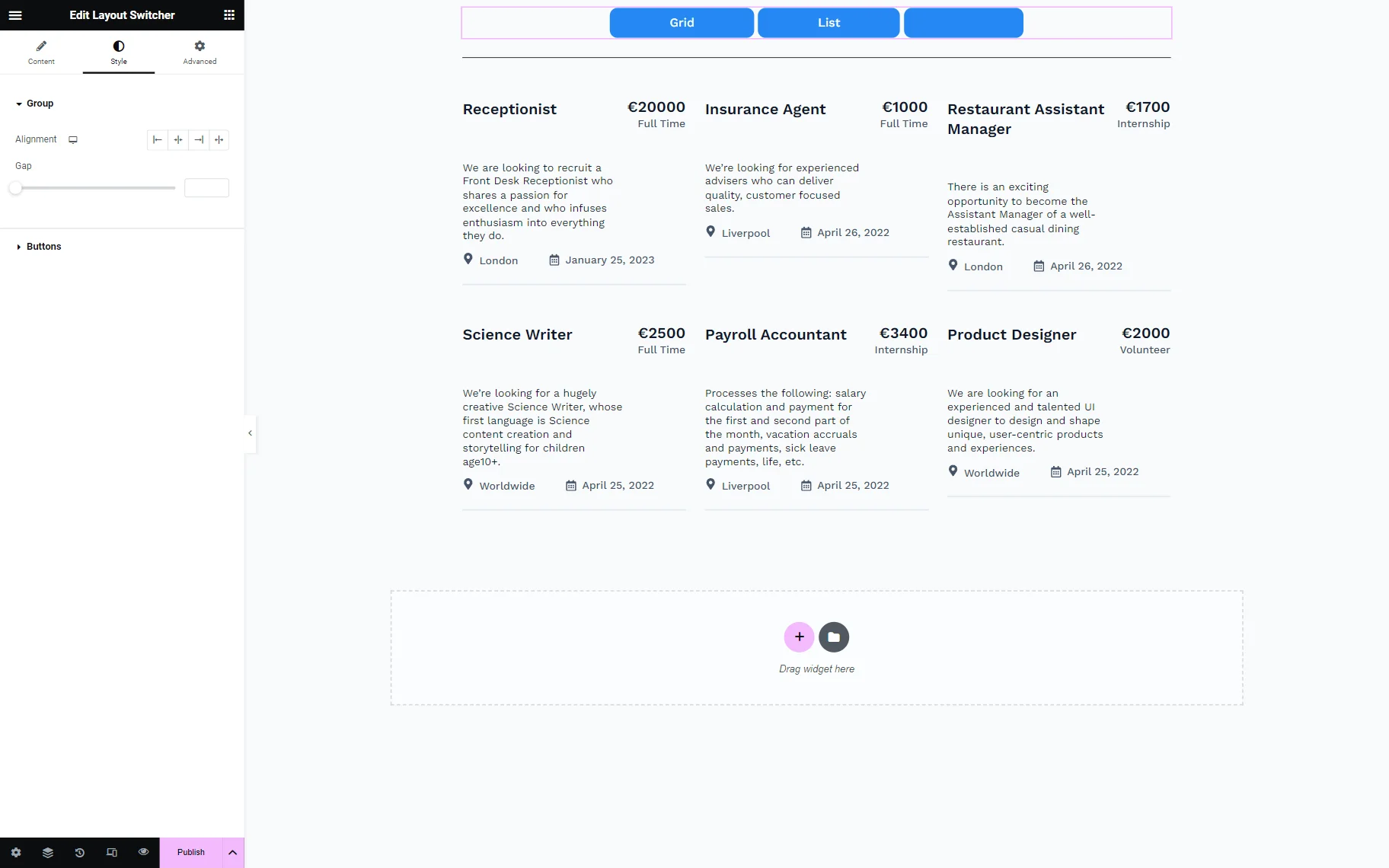
Style settings
The Layout Switcher widget can also be styled. To adjust the widget’s appearance, one should open the Style tab.
Result on the Page
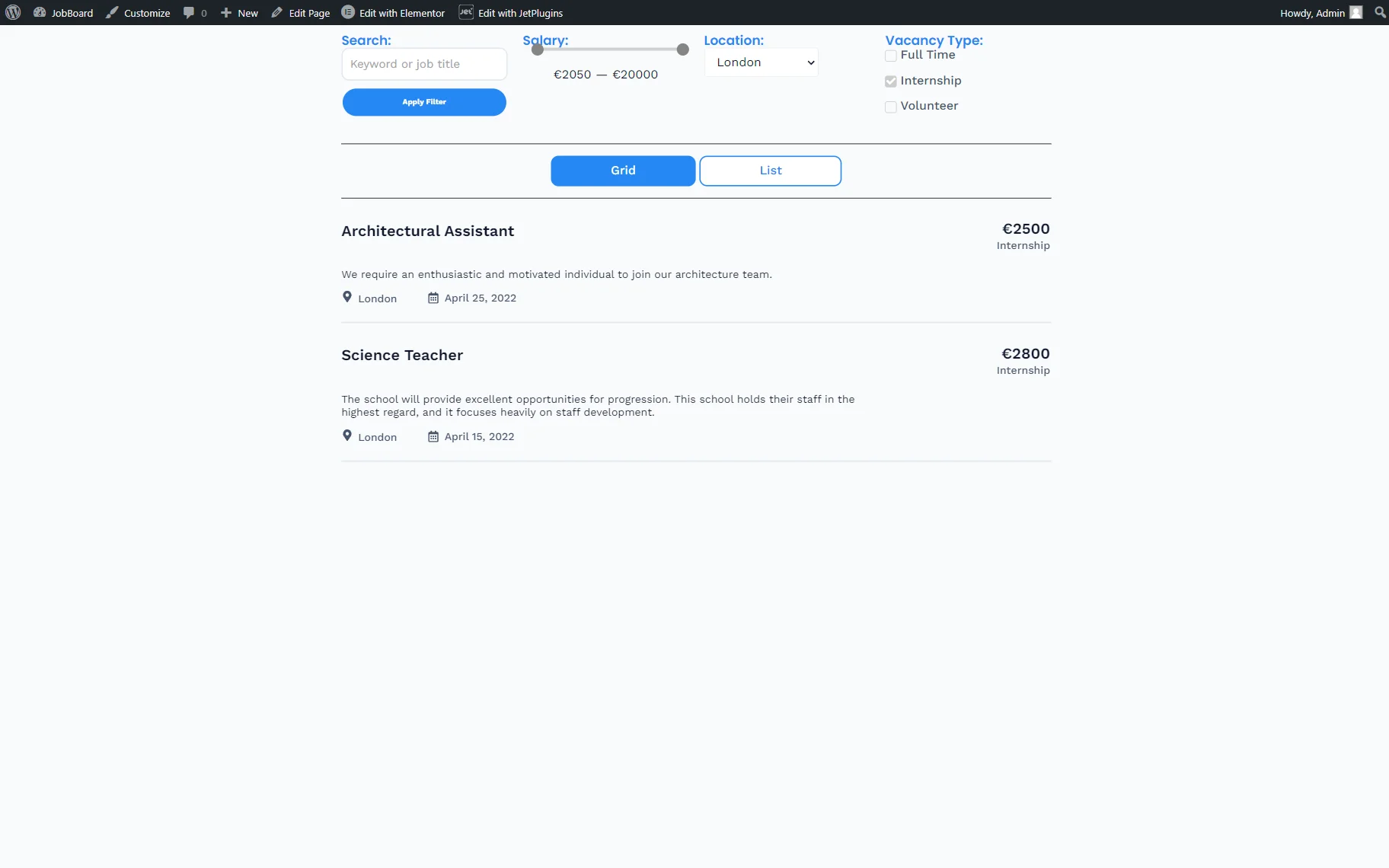
Once the page content is ready, one can press the “Publish/Update” button.
The result can now be checked on the front end.
That’s all about the Layout Switcher widget available as part of the JetEngine plugin for WordPress websites.