How to Setup Mega Menu for Mobile View
The tutorial details how to manage the Mega Menu widget settings to develop revamp menus that are automatically adaptive for desktops, mobiles, and tablets, as well as responsive menus with different settings for desktops and mobiles.
Before you start, check the tutorial requirements:
- Elementor (Free version)
- JetMenu plugin installed and activated.
If you have not done it yet, please read the mega menu creation tutorial.
- JetThemeCore plugin installed and activated.
If you have not done it yet, please read the tutorial adding a menu to a header template.
You can set the mega menu for mobile devices via the Mega Menu widget of the JetMenu plugin as follows:
- build one mega menu automatically adaptive referring to the breakpoints (i.e., desktops, mobiles, and tablets) by managing the JetMenu settings via the WordPress Dashboard (the revamp menus);
- build two menus (one for desktops and one for mobiles) and manage their settings separately via the Mega Menu widget settings (legacy).
Revamp Menu
If you don’t want to create two different menus for desktops and mobiles and want to use one menu on various devices, you can set the Revamp Menu option. You can find it in the WordPress Dashboard > Crocoblock > JetPlugins > JetMenu > General Settings tab.
Enable the Revamp Menu toggle.
Once this option is enabled, you can start building menus from scratch.
If enabled, this toggle turns on the Main Menu and Mobile Render settings tabs. If disabled, the JetMenu contains the Desktop Menu and Mobile Render settings tabs.
The Main Menu settings (for the revamp menus) include the Layout, Main Menu, and Dropdown tabs and cover the positions, effects, icons, widths, typography, colors, and more. In contrast, the Desktop Menu settings (legacy) include the general Options and style settings for the menu and sub containers and top and sub-items.
Mobile Render Settings
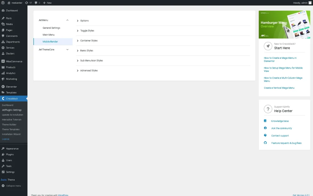
Go to Crocoblock > JetPlugins Settings > JetMenu > Mobile Render to style up the mobile mega menu. The Mobile Render setting tab includes the same settings for the revamp menus and non-revamp ones: Options, Toggle Styles, Container Styles, Items Styles, Sub Menu Icon Styles, and Advanced Styles.
Options section
The settings of this section have options for managing the appropriate items, including Layout type, Toggle position, Container alignment, Show Sub Menu Trigger, Show Sub Menu Layout, Header content, Before items content, After items content, and styling settings for breadcrumbs, images, texts, and more.
Toggle Styles settings
The settings allow choosing the Icon color, Size, Background color, turn on/off the Toggle border settings, and Box shadow settings. Also, you can set Padding and Border radius.
If enabled, the Toggle border settings toggle turns on the style drop-down menu, width fields, and color selection.
The Toggle box shadow settings toggle, if enabled, turns on the inset toggle, color selection, and field to set the positions of the horizontal/vertical shadows, blur distance, and shadow size.
Read the JetMenu Dashboard Overview tutorial to learn more about the main settings of the JetMenu plugin.
Container Styles settings
The section manages colors, sizes, paddings, borders, typography, etc., for buttons, breadcrumbs, and containers.
Items Styles settings
The section contains settings for menu items in the Normal and Active states, where you can choose different style settings. The settings manage the colors, typography, positions, sizes, margins, backgrounds, and paddings for labels, icons, fonts, dividers, badges, etc.
Sub Menu Icon Styles and Advanced Styles settings
These tabs allow you to choose the drop-down color and size from the Sub Menu Icon settings and the loader color and cover background color from the Advanced Styles settings.
Revamp Menu Settings in Elementor
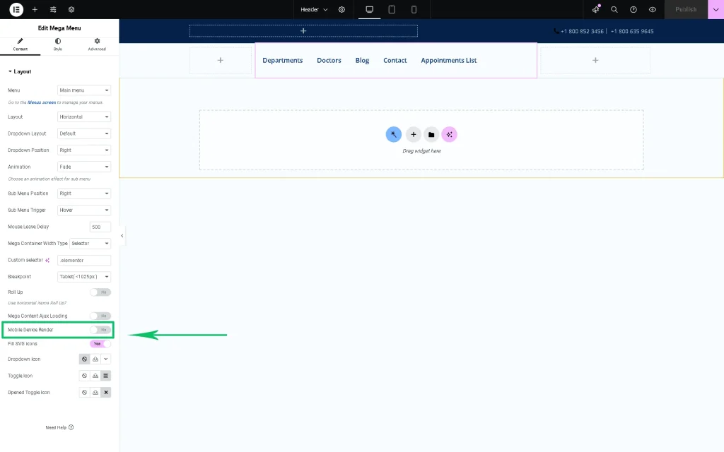
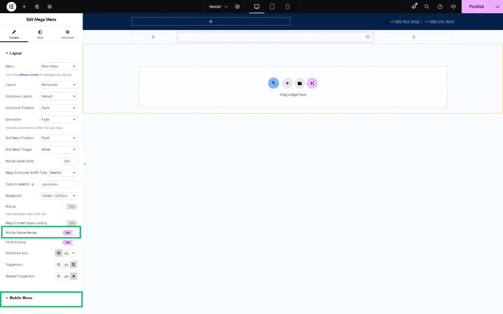
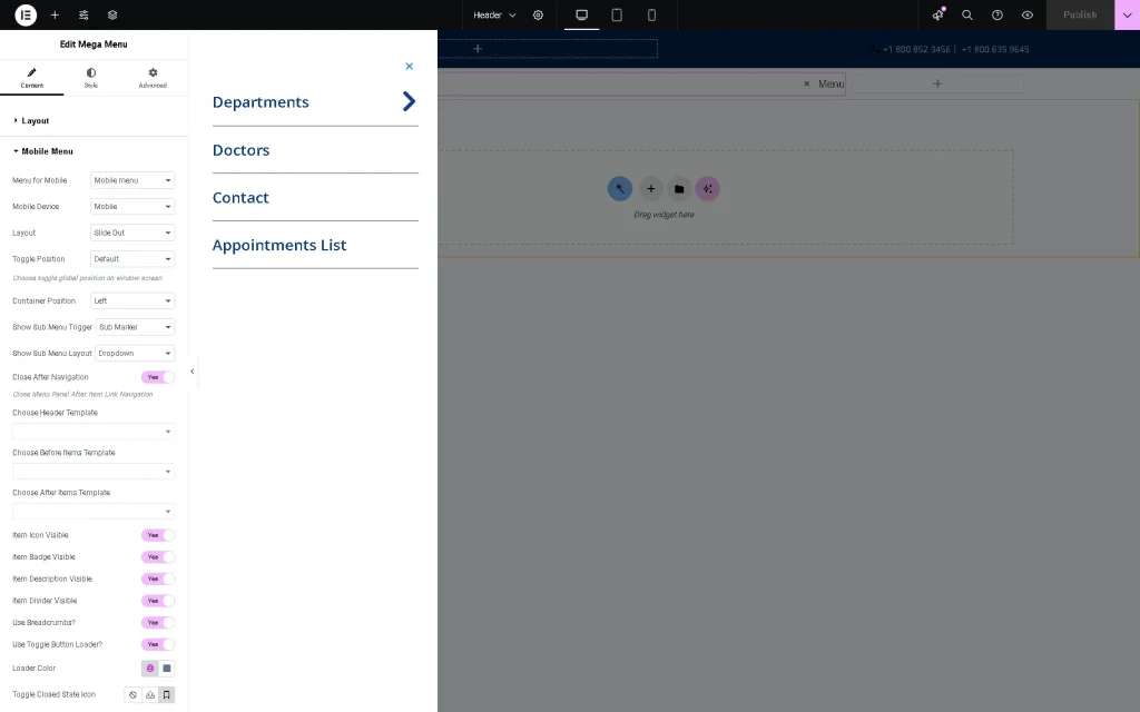
Open the needed header in Elementor and add the Mega Menu widget. Now, the Mobile Device Render option appears in the Layout section. Once enabled, the option allows customization of the same menu for the desktop. That means that your mega menu will be converted to the mobile one due to the breakpoints you set. But with the Mobile Device Render, we can manually set up the menu for different devices according to our needs.
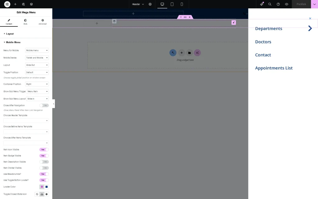
The Mobile Menu section is the same as before we enabled the “Revamp Menu” option.
Just scroll down to check how the menu will look on mobile devices. You will spot the Responsive Mode Option; click on it and choose the mobile preview.
Move the “Mobile Device Render” toggle to turn on the Mobile Menu tab and allow the menu to be added for mobile devices.
Assign the header template to the Choose Header Template field and press the “Update” button to save the header.
Mega Menu Mobile Responsive Settings in Elementor (Legacy)
As mentioned, users can set the mobile mega menu via the Mega Menu widget settings for Elementor.
Go to the WordPress Dashboard > Crocoblock > Theme Templates tab and open the header template. Add the “Mega Menu” widget.
The widget allows for the addition of different menus for the site and their display on mobiles and tablets: unroll the General tab and set the appropriate menus in the Select Menu for Desktop and Select Menu for Mobile drop-down menus. If selected, the Select Menu for Mobile drop-down menu allows you to set the Mobile view in the appropriate drop-down menu.
Then, set the Mobile Layout options for displaying the menu on mobiles.
The Style settings manage the colors, sizes, typography, backgrounds, borders, paddings, etc., for the toggles, container box, controls, breadcrumbs, and badges for the desktop and mobile view.
That’s it. You now know how to create a mobile menu for your WordPress website using the JetMenu plugin.