Popup Style Settings Overview in Elementor
Find out how to style up a popup created with JetPopup plugin in the Elementor builder.
Before you start, check the tutorial requirements:
- Elementor (Free version)
- JetPopup plugin installed and activated
Firstly, create a new pop-up in the Elementor editor and customize the Settings.
Then, open the Style tab. Let’s look through the options.
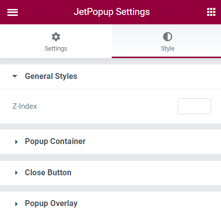
In the General Styles accordion block, you have the only option, Z-index, which you can use to place the pop-up either in the background or the foreground of other elements on the page.

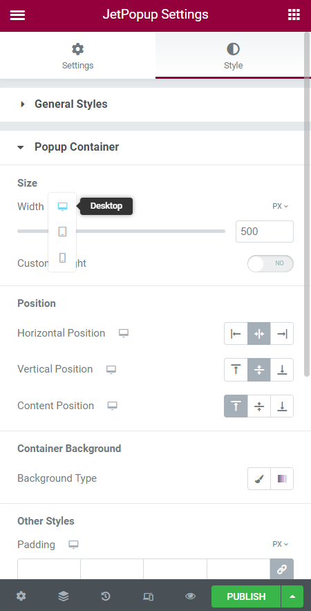
In the Popup Container settings, you can set the Size, Position, background, and other style settings of the pop-up container.
Also, keep in mind that you can set different settings for the Desktop, Tablet, and Mobile view.

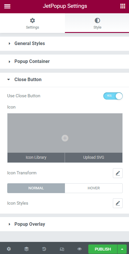
In the Close Button tab, you can enable the Use Close Button toggle; it adds a button to the pop-up by clicking on which users can close the pop-up. Also, you can select the Icon for the close button by picking it from the Icon Library or uploading SVG.

If you hit the pencil icon near the Icon Transform field, you can set the close button custom position. Click on the rollback icon to restore the default settings.
Design the Close button when it is in Normal mode and on Hover via the Icon Styles settings.
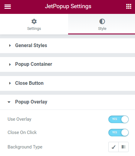
In the Popup Overlay tab, there are such options:
- Use Overlay. If enabled, cover the screen beyond the pop-up by darkening the background;
- Close on overlay click. If enabled, the user can close the pop-up by clicking on the overlay;
- Background Type. If you push the first pencil (Classic) icon, you can set the monochrome-colored background or image on the pop-up background. If you press the second (Gradient) icon, you can set the color gradient background.

Click the “Publish/Update” button to save the settings.
That’s all. Customize the pop-up style settings using the JetPopup functionality.