Checkboxes Filter Overview
This overview is about how to create a new Checkbox filter and apply it to different publication types using the JetSmartFilters plugin.
Checkboxes Filter is a feature that lets users select several options to filter the content on a page; it can be used on any Block Editor/Elementor/Bricks edited pages.
The filter can be built by proceeding to the WordPress Dashboard > Smart Filters > Add New page.
Filter Settings
The starting point is completing the following fields:
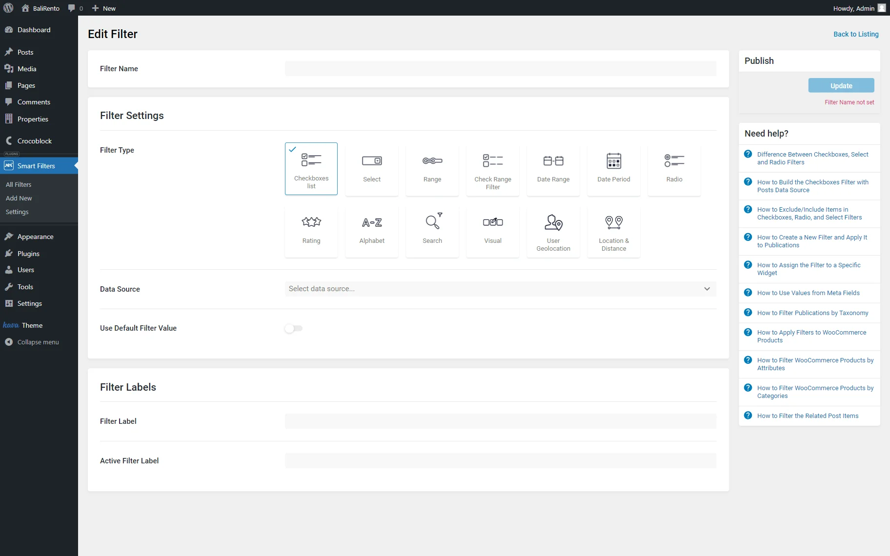
- Filter Name — a name that will identify a current filter;
- Filter Type — a list of options that contains different kinds of filters. Now, the “Checkboxes list” option should be selected.
Data source
The next field appearing after the Filter Type selection is Data Source. The option picked in this selector defines the settings available next.
The Data Source defines where the data to filter the content will be pulled. Among the options are: “Taxonomies,” “Manual Input,” “Posts,” and “Custom Fields.”
Taxonomies
This option will take the data from the selected taxonomy. For instance, it can be categories, tags, or product taxonomies.
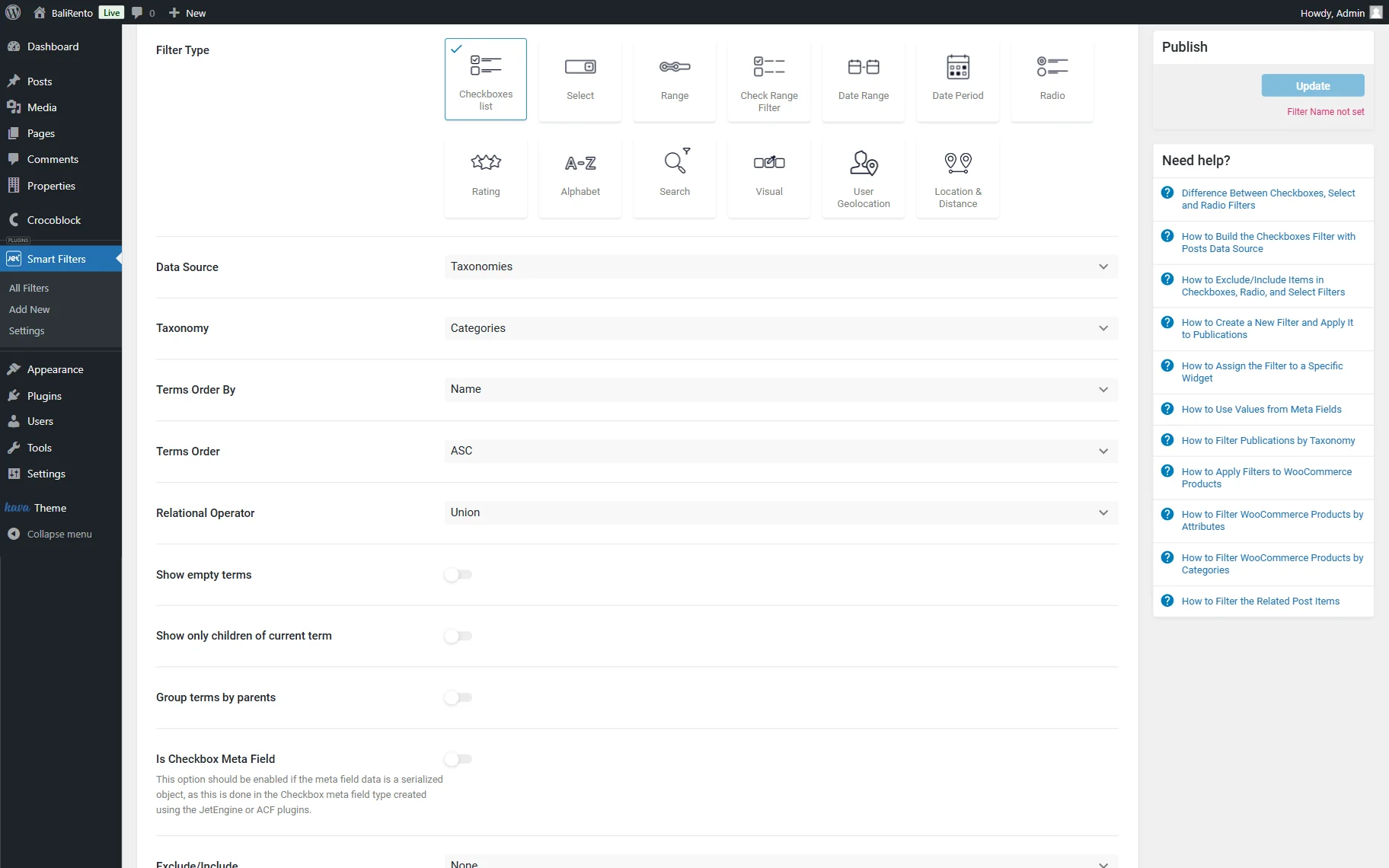
- Taxonomy — the taxonomy that will be used for filtering;
- Terms Order By — criteria used for filter options order. Available options include: “Name,” “Slug,” “ID,” “Count,” “Description,” “Meta Key,” and “Meta Key Numeric”;
- Terms Order — the order of the selected option in the Terms Order By. It can be either “ASC” (ascending) or “DESC” (descending);
- Relational Operator — a selector that allows picking the relational operator. The “Union” operator will display results corresponding to at least one of the selected checkboxes. For example, if “House” and “Villa” options are selected, items belonging to either category will appear. For the “Intersection” option, the result is vice versa. Only items that belong to both “House” and “Villa” options will be displayed;
- Show empty terms — if enabled, the empty terms that have no items assigned to them will also be shown on the list;
- Show only childs of current term — on the parent category archive, only its child categories will be shown. On all other pages, all categories will be displayed;
- Group terms by parents — this option should be switched on to save the hierarchical structure where child terms are listed under the parent ones. If enabled, the Collapsible toggle becomes available and, if activated, makes the child objects appear after clicking on the parent term;
- Is Checkbox Meta Field — this option should be enabled to filter items by the Checkbox meta field saved as an array, Select meta field saved as multiple select, Posts meta field saved as multiple, or Checkbox meta field of ACF. This option is mainly used for filters with the Custom Fields source;
- Exclude/Include — a feature that can be used to include or exclude some of the terms so they will be or will not be shown in the options list;
- Use Custom Query Variable — this setting is unrequired for the “Taxonomies” Data Source. This setting can be enabled to filter items related by the Relations feature of the JetEngine plugin. For example, if the given taxonomy is the child object or the parent object in a relation, it is possible to use this taxonomy to filter the related objects. Follow another tutorial to find more information on how to filter related items.
Manual input
This source allows adding the Checkbox Filter options manually. Among unique settings are:
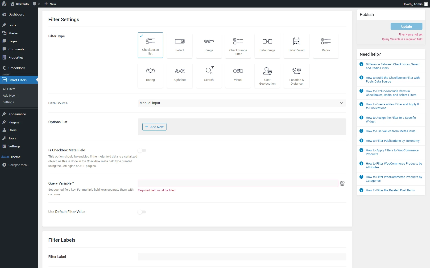
- Options List — an area where the manual options can be added and edited by clicking the “Add New” button;
- Query Variable — an obligatory field where the query variable key should be put. When filtering by a meta field, one should copy and paste the Name/ID of the meta field into the Query Variable field. Multiple field keys should be separated with commas.
Posts
Posts can also become a source for the filter. This source includes the following unique setting field:
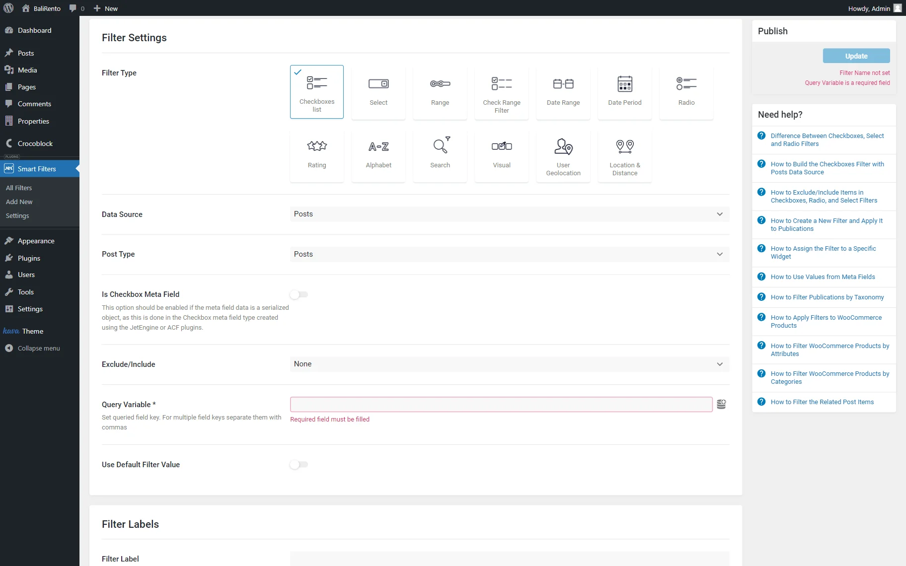
- Post Type — a post type that will be used as the source for filtering.
Custom Fields
The “Custom Fields” source allows customizing the following set of fields:
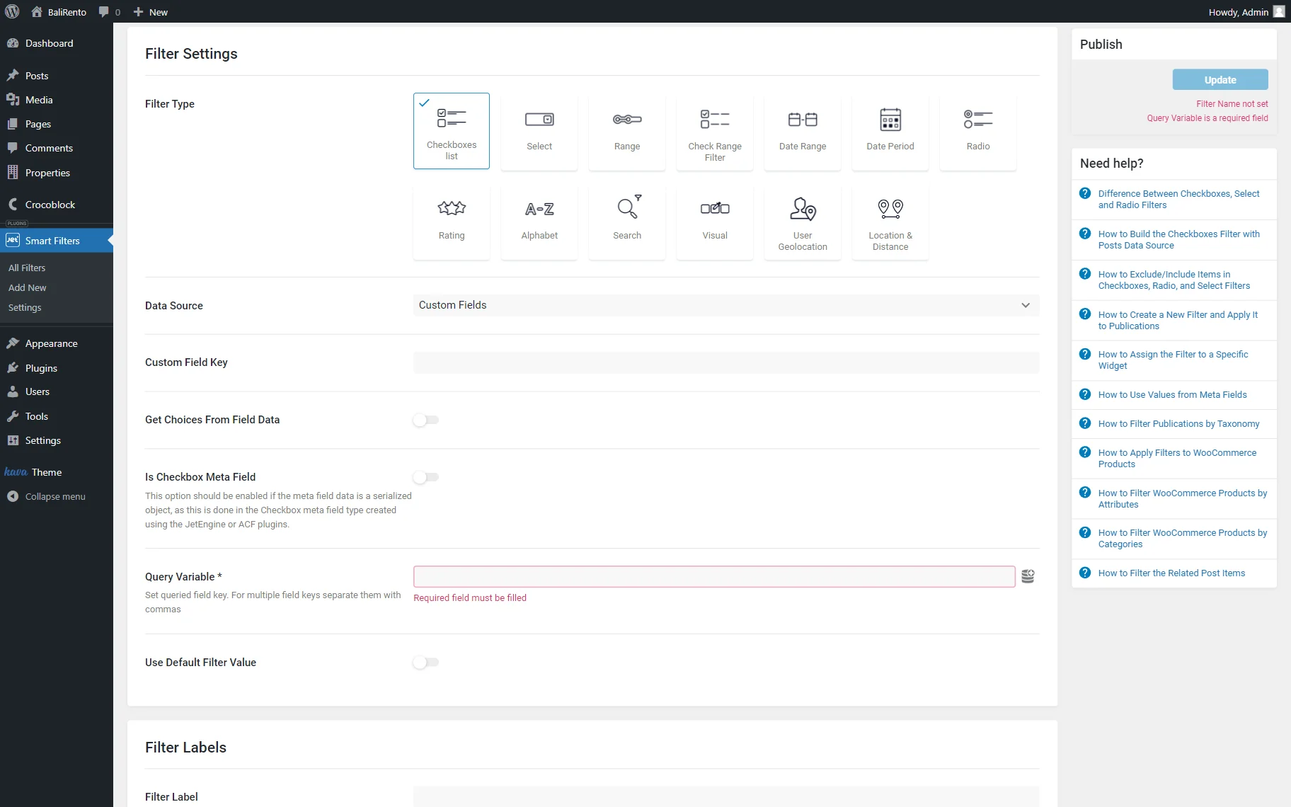
- Custom Field Key — a custom field key that will be used as the source for filtering;
- Get Choices From Field Data — the setting that makes the filter take the filter options from the options of the meta field.
JetEngine Glossary
The option is available if the JetEngine plugin is installed and activated. To make the Glossary a filter source, one should fill in the following settings:
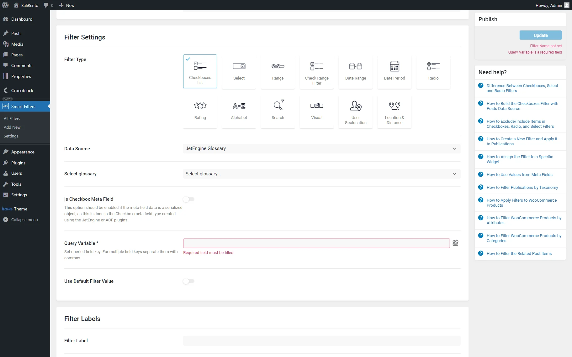
- Select glossary — a glossary that will serve as the data source.
JetEngine Query Builder
The option is available if the JetEngine plugin is installed and activated. The source, in this case, is the Query from JetEngine; it includes the following settings:
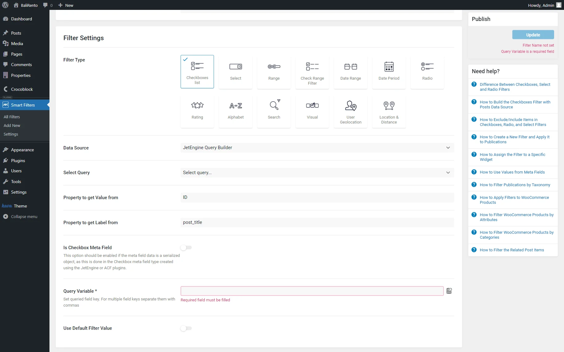
- Select Query — a query that will serve as the data source;
- Property to Get Value from — a field that indicates where the value for the options will be taken. By default, it is set to “ID”;
- Property to get Label from — a field that indicates where the label for the options will be taken. By default, it is set to “post_title.”
Read more about How to Create Filters with Query Builder Source.
JetEngine Query Builder Switcher
The option is available if the JetEngine plugin is installed and activated. This source allows switching between content queries.
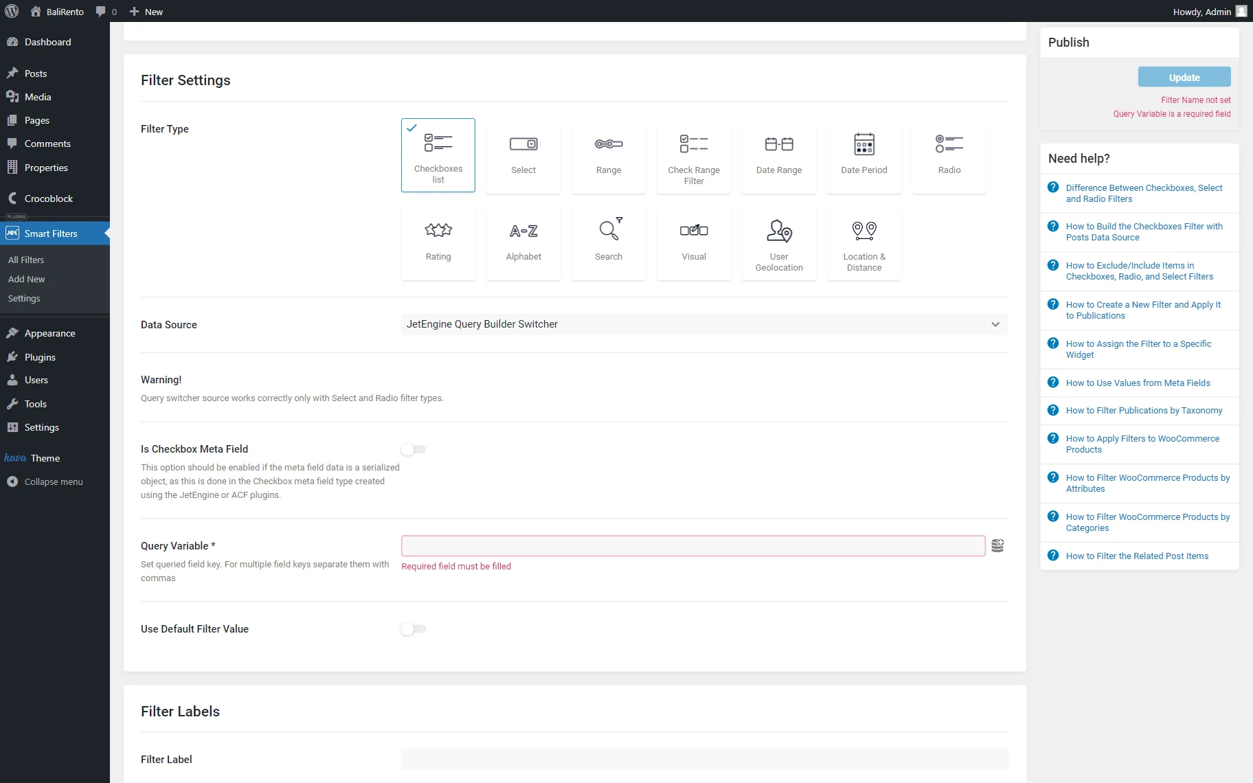
Find out more about How to Set Query Builder Switcher Data Source.
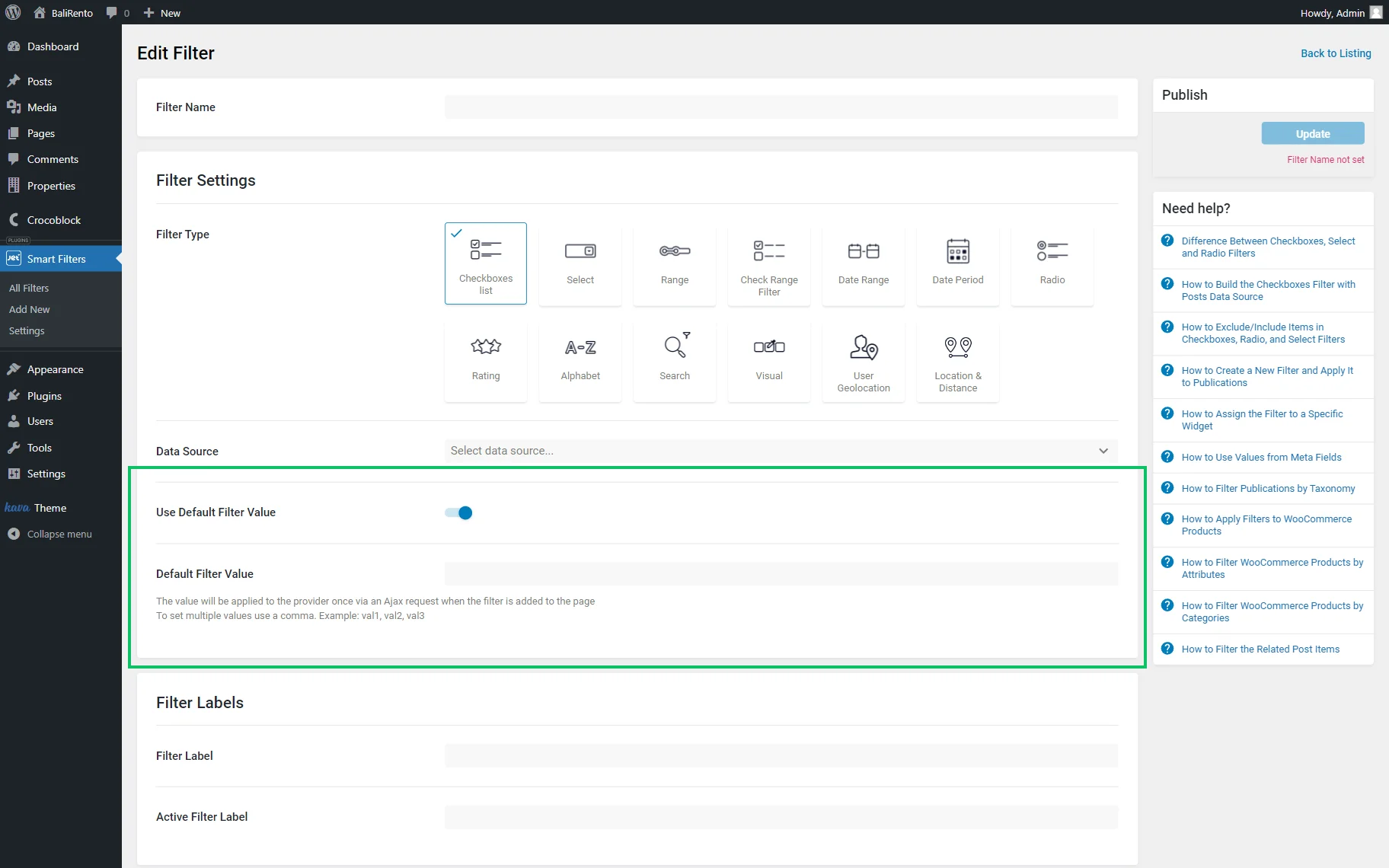
Use Default Filter Value
Use Default Filter Value is a toggle that activates the Default Filter Value field. Values there can be separated by commas; they will be applied to the provider once via an Ajax request when the filter is added to the page.
Filter Labels
Filter labels can be adjusted in the corresponding part of the settings:
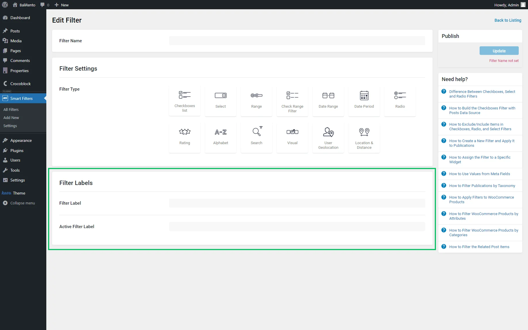
- Filter Label — a label that can be displayed next to the filter;
- Active Filter Label — a label shown if the filter is active.
The filter can be saved by pushing the “Update” button.
Checkboxes Filter Widget in Elementor
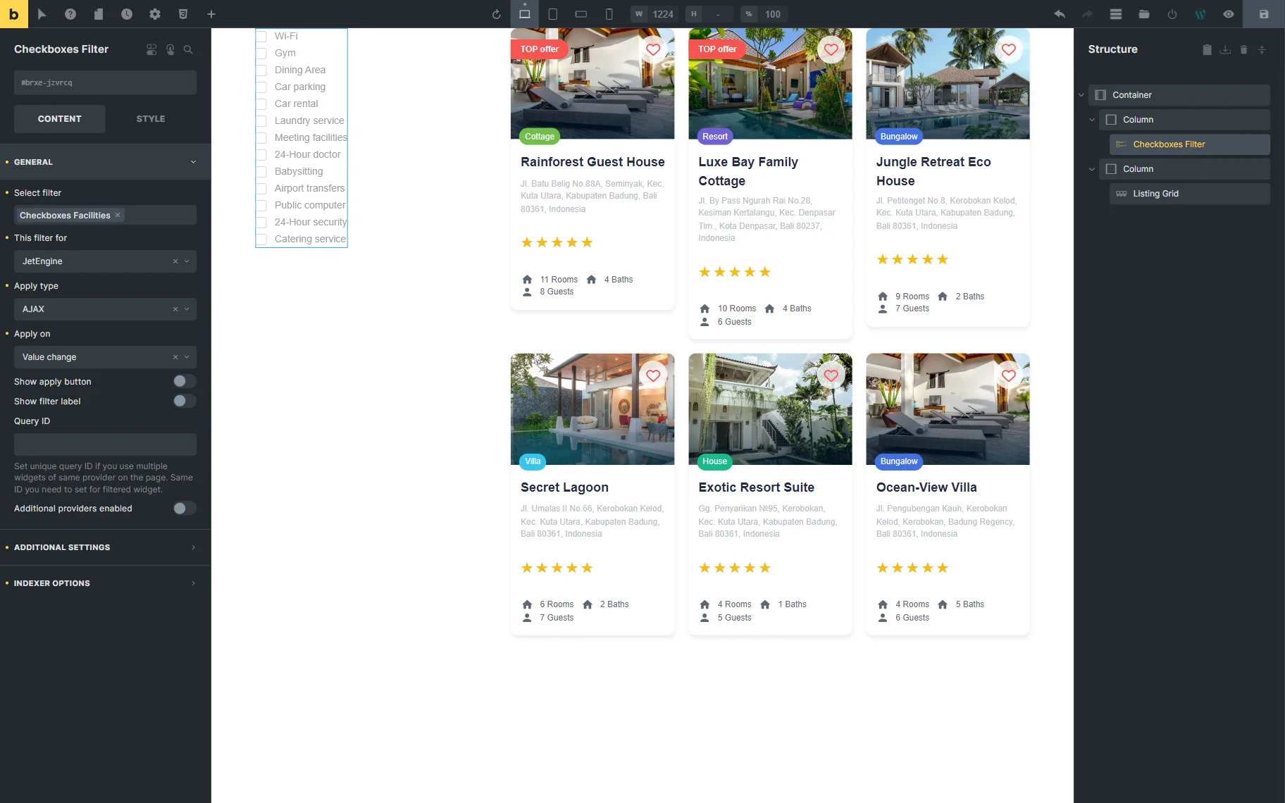
The Checkboxes Filter widget is available in the Elementor Page Builder. The widget contains the following settings:
Content

- Select filter — a bar where the name of the filter should be put so it appears on the page;
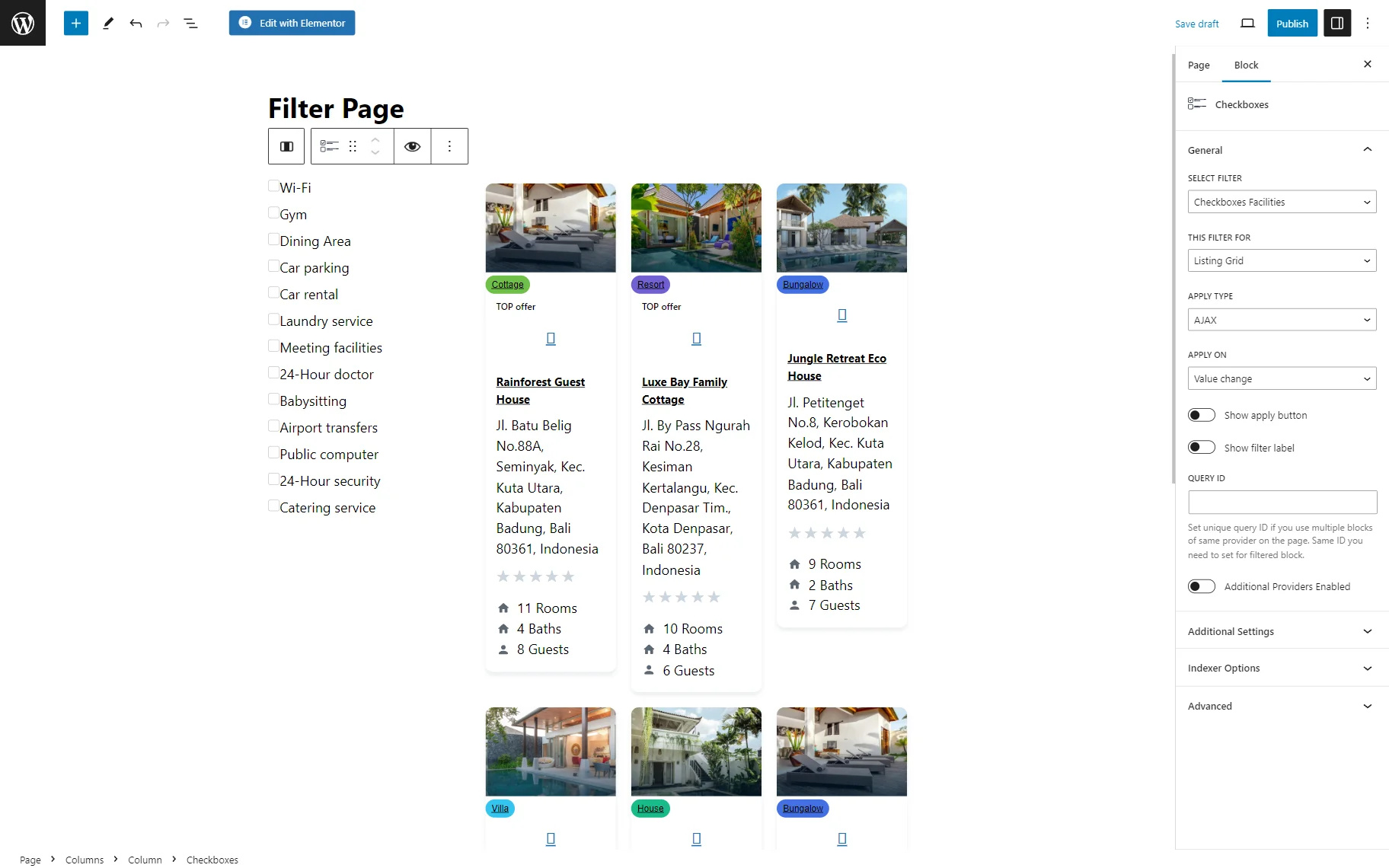
- This filter for — a provider list to pick the widget to which the filter will be attached;
- Apply type — a field to choose a way the filter will work. Presented options: “AJAX,” “Page Reload,” and “Mixed.” “AJAX” displays results without reloading the page, “Page Reload” reloads a page, and “Mixed” doesn’t reload a page but transforms the page URL.
- Apply on — a field to pick when the filter is applied: once the value changes or by clicking the “Apply” button;
- Show apply button — a switcher to be activated if the “Click on apply button” option is selected in the previous Apply on selector;
- Show filter label — a toggle that shows a filter label above the filter;
- Query ID — a field that can be used if there are several widgets of the same type on the same page, and one is supposed to be used as a provider. For instance, if there are two Listing Grids on the page and only one should be filtered, the Listing Grid settings (Advanced tab) should be opened, and its unique name should be set in the CSS ID field and then put here, in the Query ID field of the filter;
- Additional Providers Enabled — a toggle to be enabled if several widgets should be filtered.
If the Additional Providers Enabled toggle is switched on, more settings are displayed:
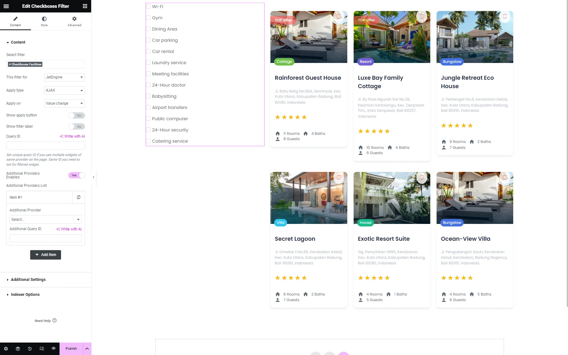
- Additional Provider — a drop-down list to select an extra provider;
- Additional Query ID — an ID to be set if several identical widgets are on the page. Works as the Query ID field described earlier.
Additional settings
Search enabled

- Search Enabled — a toggle that activates search above the filter;
- Search Placeholder — a text displayed in the search bar that can be changed.
More/less enabled

- More/Less Enabled — a switcher that shows the “More/Less” labels below the filter to hide/show items. If activated, the following fields appear:
- Less Items Count — a field where the number of items displayed by default should be specified;
- More Text — a text on the “More” button;
- Less Text — a text on the “Less” button.
Dropdown enabled
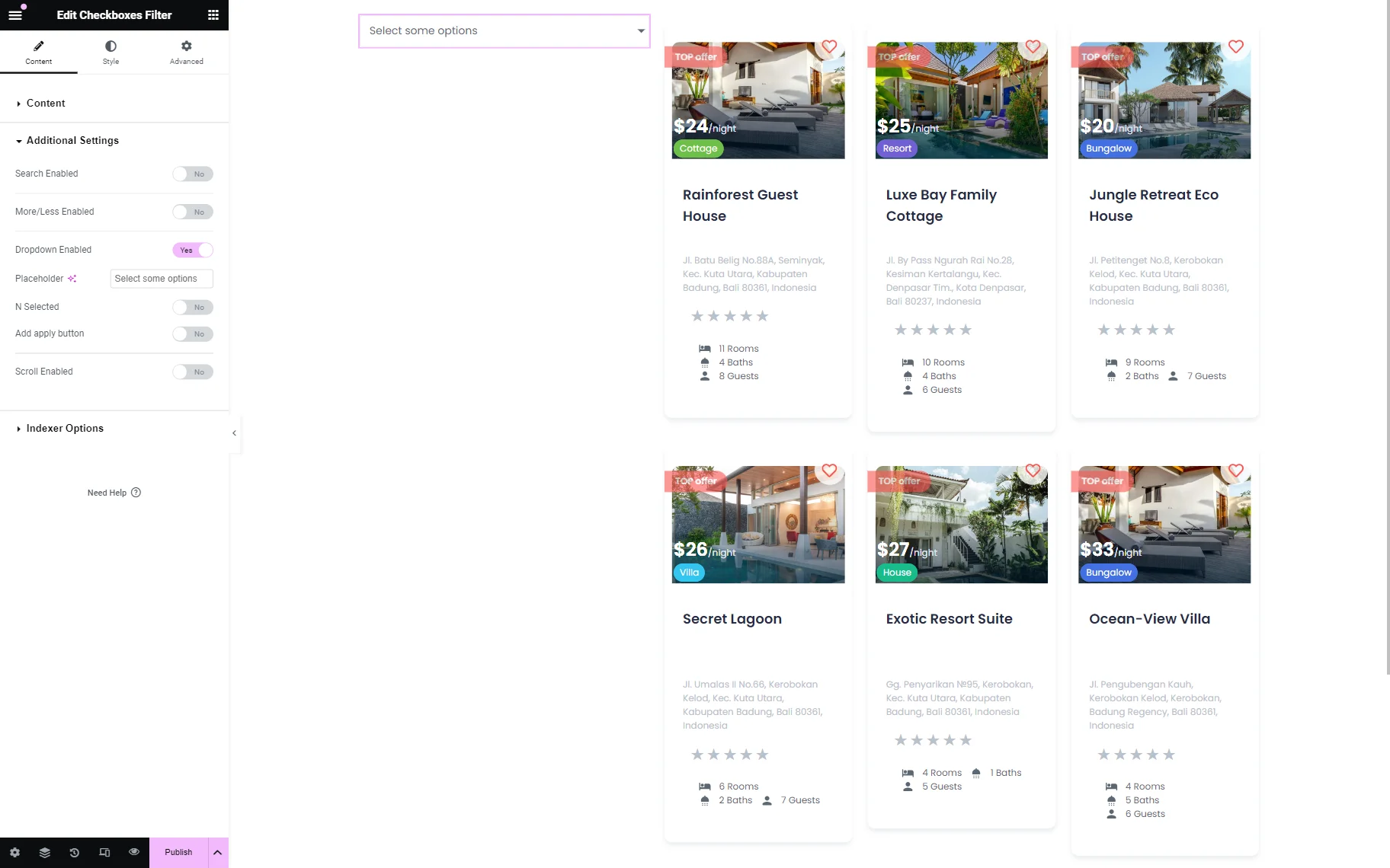
- Dropdown Enabled — a feature that hides options in a dropdown list. Once activated, the following features appear:
- Placeholder — a text displayed in the dropdown;
- N Selected — a feature that hides options labels and shows a number of selected options after the N-item:
N selected
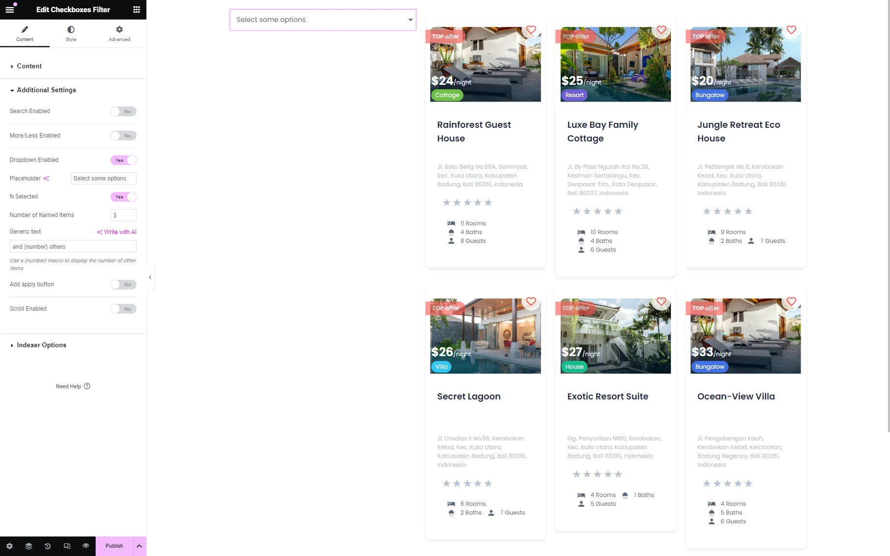
- Number of Named Items — a field where the number of shown labels can be specified. For instance, if “3” is set, after three labels, there will be a text “and 1/2/3… others” shown;
- Generic text — a text displayed after labels. Mind that a {number} macro should be used in the text to generate value afterward.
Add apply button
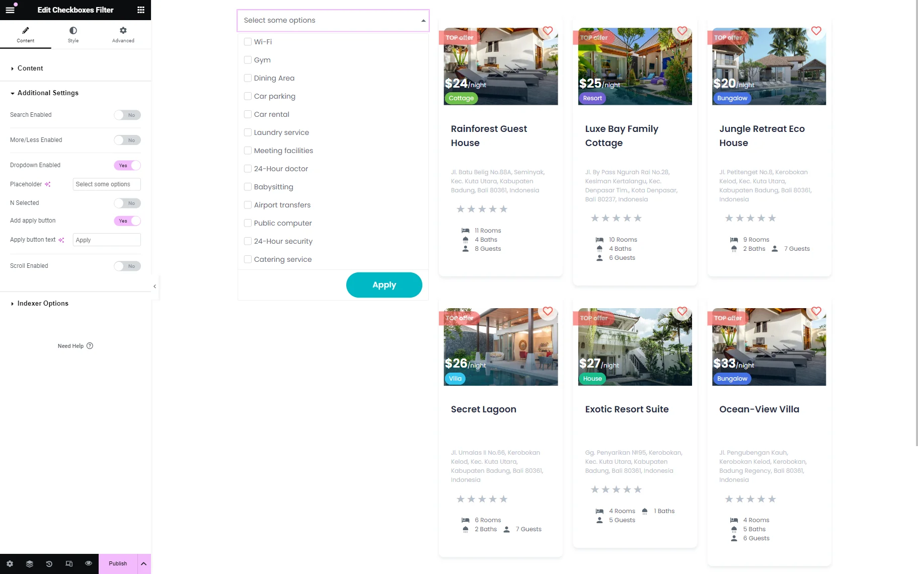
- Add apply button — a toggle that adds the “Apply” button to the dropdown list;
- Apply button text — a text of the “Apply” button.
Scroll Enabled
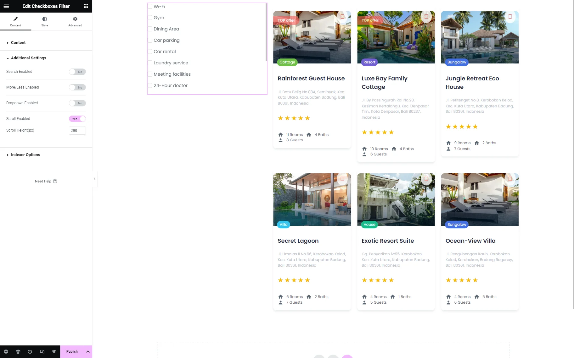
- Scroll Enabled — a feature that adds scroll next to Checkbox;
- Scroll Height(px) — a field to complete the height of the scroll in pixels.
Indexer options
One more settings tab available in Elementor is Indexer Options.

- Apply Indexer — a switcher that activates indexer, a feature that shows how many items match a filtering option;
- Show Counter — a toggle that enables a counter next to the options that are currently displayed on the page;
- Counter Prefix — a prefix before the counter;
- Counter Suffix — a suffix after the counter;
- If Item Empty — a selector to pick whether the item will be shown, hidden, or disabled once it has no items attached;
- Change Counters — a dropdown field where the counter behavior can be altered: whether they always be altered, never, or once other filters are changed.
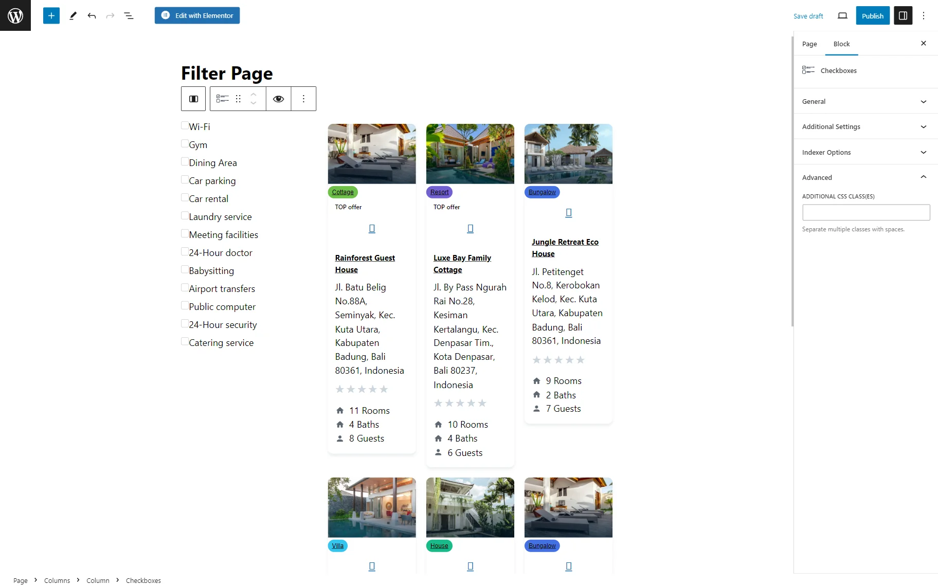
Checkboxes Filter Block in Gutenberg
Checkboxes Filter Element in Bricks
Checkboxes Filter element available in Bricks also repeats the settings used in Elementor. There is a General tab with the main settings:
Also, Additional Settings are presented. Here, except for the already known features described earlier, one more field is displayed:
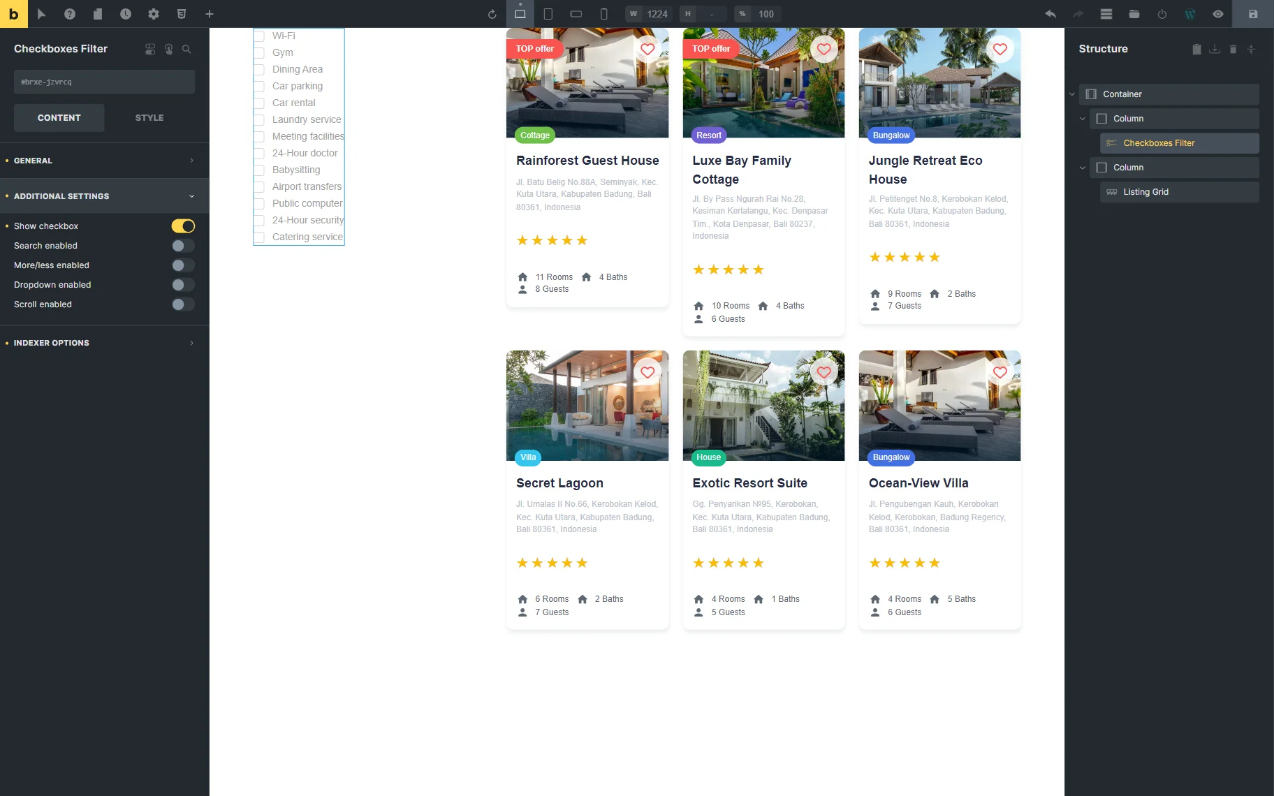
- Show Checkbox — a toggle that hides checkboxes next to the options if deactivated.
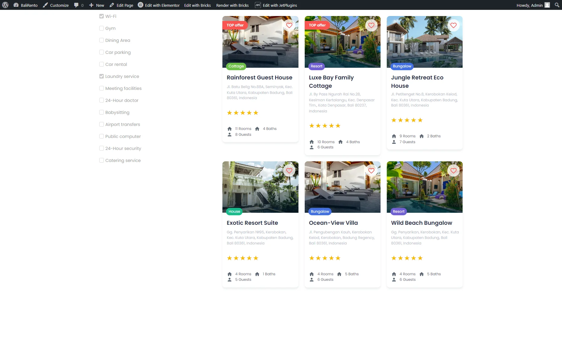
Result
The result can be seen on the front end after one of the pages built with the preferred editor is published.
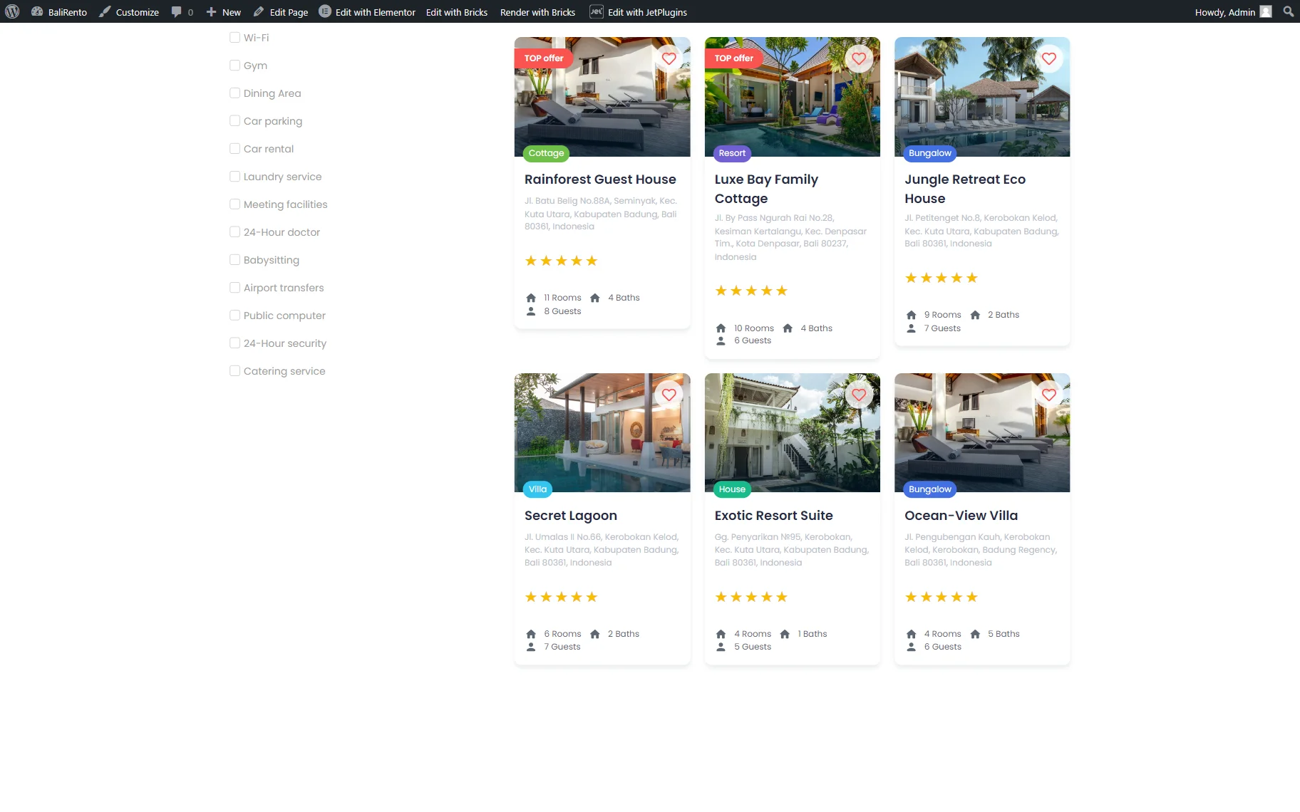
Checkbox Filter can now be tested in action:
That’s it; now you know how to use the Checkboxes Filter available with the JetSmartFilters plugin on your WordPress website.