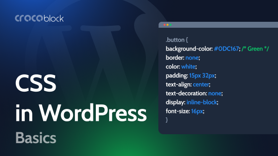
If you build a website, even when simply editing a page in Elementor, you add styles here and there – e.g., make the container blue, add white text that uses certain typography, and so on. All of this means that styles are added, and the more you add, the more they start to pile up. So, it would be very logical to organize them and then reuse them, wouldn’t it?
Now, look a little deeper. When you build a theme or start analyzing your website’s structure and performance, you’ll notice that almost everything contributes its own styles – plugins, core WordPress files, and your custom code. The result is a dense web of overlapping CSS rules.
And this is where CSS variables really make a difference, as they help bring order to that chaos. They let you define design tokens such as colors, spacing, and typography once and reuse them everywhere. You can change a single color value and see it cascade across the entire site. Or, a very illustrative case – you can build light and dark modes without maintaining multiple stylesheets.
In this article, I will explore how CSS variables work, their usefulness in WordPress, and how to structure them for optimal long-term performance and maintainability.
Beginner’s Corner: How CSS Variables Work Behind the Scenes
If you have ever edited a website, you have definitely dealt with variables even without realizing it. Let’s take a look at one of the most popular themes, Astra. Most of the themes use a similar approach, too.
So, if you open the Customizer of Astra, you will see a bunch of settings – colors, fonts, container widths, paddings, sidebar layouts, and more.
But behind that simple interface, there’s a clever system at work. These themes generate and inject CSS variables dynamically based on your saved Customizer values. This keeps the CSS file lean and the entire design system consistent across hundreds of pages.
Let’s get back to Astra. When you change a global color in the Customizer, Astra doesn’t rebuild the entire CSS file. Instead, it prints variables in the <head> section of your site:
:root {

  --ast-global-color-0: #1e73be;

  --ast-global-color-1: #e63946;

  --ast-container-width: 1200px;

}
And these variables are then referenced in Astra’s stylesheets, for example:
a {

  color: var(--ast-global-color-0);

}

.container {

  max-width: var(--ast-container-width);

}
So, when you update the Customizer, WordPress simply regenerates the <style> block with new variable values, not the entire CSS. The front end automatically adapts. This method is extremely fast and lightweight because the main CSS file stays cached.
CSS Variables in WordPress Builders
Page builders have changed the way developers structure and style WordPress websites, as well as the approach to CSS variables. Now, even if you are a seasoned coder, in most cases, there’s no reason to create a custom theme from scratch when you can simply use a solid, ready-made foundation – the builder of your choice.
As a result, you no longer have to hand-code every style. You set things visually, such as global colors, font sizes, and spacing. The builder then automatically creates CSS behind the scenes, made possible by CSS variables. They serve as the link between your visual settings in the builder and the actual reusable CSS values used by the browser.
Let’s see how various popular builders handle CSS variables.
Elementor
Elementor introduced CSS variables several years ago when it added global colors and typography. Whenever you define a Global Color or Global Font, Elementor automatically creates a corresponding CSS variable.
For example, if you create a color named “Primary,” Elementor will generate something like:
--e-global-color-primary: #0073aa;You can then use this variable by choosing a color named “Primary” anywhere in the style settings. But also, you can use it anywhere on your website by writing the following:
background-color: var(--e-global-color-primary);For example, while building JetEngine’s Listing template using Twig, you can set colors, fonts, and other elements like this. Thus, it will be synchronized with the changes you make in global Elementor’s settings, so you don’t have to edit your Twig templates manually if styles have changed.
But if you don’t deal with any code, you can just set it up much more easily in your editor. First, you assign a global color, font, or typography detail, and then choose it instead of manually searching for your color number or adding typography settings. It’s not just more convenient, but it’s also good for performance, as you don’t bloat your page with repetitive CSS rules.
Adding Elementor CSS variables by using custom code
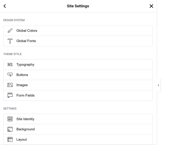
Elementor has visual controls for adding global colors, fonts, and typography settings (font size, width, decoration, etc.), but that’s it. But what if I want to use variables for, let’s say, margins or paddings? It’s so important for responsive design.
Of course, I can use Calc and Clamp, but what if I want to take it to the next level and control it globally? Here is the way to do it. First, add some CSS globally, either in Customizer > Additional CSS, or using Elementor Pro, Site Settings > Custom CSS.
Let’s add some variables using :root { }, which means that they will be available everywhere on the website.
:root {

  --gap-section: clamp(2rem, 4vw, 5rem);

  --radius-soft: 8px;

  --padding-section: clamp(1.5rem, 3vw, 3rem);

  --border-gray: 1px solid #333;

}
Then, whenever you need one of these variables, open the Custom CSS section (you will need Elementor Pro) and insert a variable instead of the values, like this:
.selector {

  padding: var(--padding-section);

  margin-bottom: var(--gap-section);

  border: var(--border-gray);

  border-radius: var(--radius-soft);

}
You can apply variables to as many widgets as you need, and once you change the value globally, it will be changed for all the widgets globally, so you don’t have to revisit each of them and change styling manually. Plus, you have cleaner code.
The Elementor team is currently working on a new editor (V4), which is in Alpha. It already looks promising and will integrate variables and global classes even more naturally than the current version. That’s why understanding the concept of CSS variables is so important, even for those who didn’t use them much when designing Elementor websites.
Bricks Builder
Bricks Builder was built with CSS variables in mind from day one. Instead of generating inline styles for everything, it stores values as variables and references them across the layout. This makes Bricks one of the cleanest builders in terms of front-end output.
You can access the CSS Variables section from the editor and define your own variables.
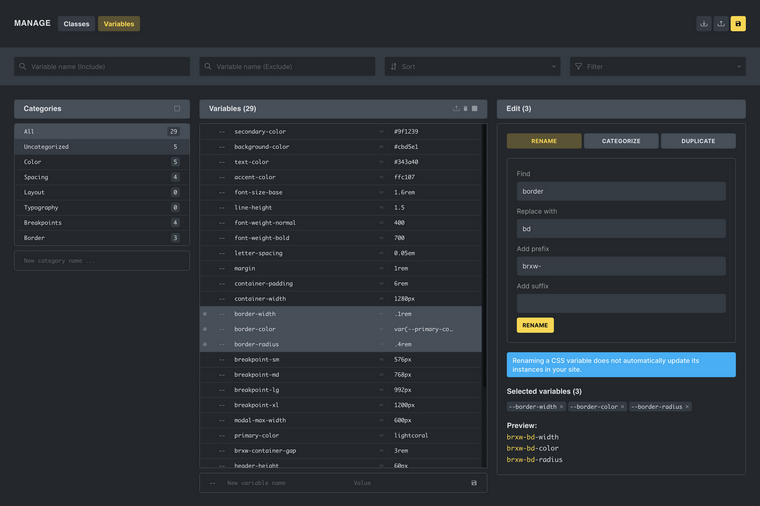
You can then use these variables anywhere: inside element style panels or custom CSS. Bricks even has a visual selector, so you don’t have to write your variables manually; you can just choose them from the list of all available.
Bricks also supports component-level variable overrides, which means you can redefine a variable inside a section, container, or block to create contextual variations (for example, darker text in a light section).
Gutenberg / Block Editor
If you’re building with the native Block Editor or a Full Site Editing (FSE) theme, you deal with WordPress’s built-in variable system. When you define colors, font sizes, or spacing inside theme.json, WordPress automatically generates custom properties that start with –wp–preset–.
For instance, this snippet in theme.json:
{

  "settings": {

    "color": {

      "palette": [

        { "slug": "primary", "color": "#0073aa" },

        { "slug": "secondary", "color": "#e63946" }

      ]

    }

  }

}
Will automatically produce:
--wp--preset--color--primary: #0073aa;

--wp--preset--color--secondary: #e63946;
Adding custom CSS variables is quite easy in FSE themes – you just add them in the Settings.
But for standard themes, adding custom variables requires a bit more manual setup. You need to register your own stylesheet or inline styles in functions.php and ensure that these variables are loaded inside the Block Editor as well. This usually means enqueuing an additional editor stylesheet with add_editor_style() or printing the variables directly into the <head> using wp_head.
That’s why, in many real-world projects, if you just want to incorporate variables in your Block Editor-based pages, first add the variables in custom CSS using :root { }, then create custom classes that use these variables. And, finally, assign these classes in the editor for the elements you want to stylize.
Other builders: Oxygen, Breakdance, and Divi
Oxygen allows you to add collections of global colors, typography, and spaces. Also, you can add custom CSS variables in the stylesheet and then use them inside custom CSS fields or in the visual controls. Overall, the approach is quite similar to the one I’ve described for Elementor.
Divi, especially in its upcoming Divi 5 update, is catching up. Earlier versions relied heavily on inline styles, which made variable usage inconsistent. Divi 5, however, introduces a new rendering engine that supports CSS variables natively for global colors and typography. Once fully released, it will behave similarly to Elementor’s global system but with improved front-end efficiency.
powered by Divi-5 dynamic?
Some key behaviors to keep in mind when working with CSS variables
Here are some things to remember to avoid confusion when working with CSS variables and builders:
- CSS variables work in real time. The browser applies them while rendering the page, not during compilation, which makes them flexible but also means you should use them carefully to avoid unnecessary overrides. For example, when you’re using Elementor and Block Editor on the same website, and the same variables for both of them, keep your variable naming consistent and understand which tool controls it. Otherwise, one variable may unintentionally override another and cause confusing styling results.
- Also, remember that if you add variables using custom CSS, e.g., in Customizer > Additional CSS, you can still use them in Custom CSS fields in Elementor or Bricks; however, these styles will not appear in the Global Variables managers of these builders.
- Using them correctly means thinking of your CSS as a set of reusable design tokens inside the solid design system rather than individual, one-off styles. For example, you can define spacing units such as –space-xs, –space-md, and –space-lg, and then reuse them throughout your layout instead of repeating static margin or padding values.
JetEngine Tools for Dynamic Styling
JetEngine, one of the most powerful WordPress plugins on the market, offers tools to help you create more dynamic styling. Here are the two tools that can streamline website development along with CSS variables.
JetEngine Components
JetEngine’s Components solve the problem of repetition and keep your website structure well-organized, as every project ends up with repeating elements – cards, author boxes, or banners that use the same layout and style. Normally, you would copy and paste a section, tweak it, and hope it stays consistent.
With Components, you design it once, define which settings should remain editable (like title, color, or icon), and then reuse it everywhere. It also protects styling from intentional or unintentional styling edits made by website editors.
If you ever update the component, all instances are automatically updated, whether in Elementor, Bricks, or the Block Editor.
How to use it
You create a component once in JetEngine (using an editor of your choice: Elementor, Bricks, Block Editor, or even Twig, which comes with JetEngine), set its style and content controls, and then insert it anywhere using your builder’s interface.
You can even nest it inside a Listing Item. That means you can have, for example, a product card with a reusable rating badge or a banner that adapts its text dynamically but keeps a unified style.
Dynamic colors, images, or videos using JetEngine’s custom fields
JetEngine lets you fetch colors and images from your custom field values, so each listing or post can have its own look automatically. For example, a real estate site can pull the category color for each property, or a job portal can show different background colors for job types – all from custom fields.
This saves time while also keeping the design consistent. Editors can just update field values in the backend, and the front end automatically updates the visual style without editing templates or CSS.
How to use them
Let’s say you want to add a post or category color dynamically, which can be used for backgrounds, text, or border/icon colors on the front end. Add a custom field to the corresponding taxonomy or post type using the Post Type editor by JetEngine or the Meta Boxes tool.
It can be either a Text or a Color Picker field type.
Then, add a HEX color code or choose the color using the Color Picker in the post/taxonomy editor.
After that, in Elementor, Bricks, or Gutenberg, you can connect that field to a visual control using JetEngine’s dynamic tags. The builder automatically pulls and applies the right value for each post.
For images and videos, the process is similar. For images, you can improvise with the field type, but for videos, use a Text field with the video URL copied from Media Library.
CSS Variables vs. Preprocessors (Sass, Less, and others)
Before CSS variables were widely introduced and supported, developers needed a way to organize large stylesheets, reuse values, and avoid repetition. That is how preprocessors such as Sass and Less became popular.
A preprocessor is a tool that takes special CSS-like code with extra features and converts it into standard CSS that browsers can read, but it does not run in the browser. The conversion occurs either on the server or during the deployment process, resulting in a CSS file that your visitors actually load.
You can think of a preprocessor as an assistant that helps you write cleaner code and then prepares the final version for the web.
What preprocessors actually do
With Sass or Less, you can write CSS that feels more like a programming language. You can use variables, nesting, and mixins to keep styles short and logical.
For example, in Sass you could write:
$primary: #0073aa;

$padding-md: 1rem;

button {

  background-color: $primary;

  padding: $padding-md $padding-md * 2;

}
When the preprocessor compiles it, the output that your website uses looks like this:
button {

  background-color: #0073aa;

  padding: 1rem 2rem;

}
Once this happens, the browser no longer knows about $primary or $padding-md. They are gone. The final CSS contains only real values.
This means that if you ever want to change the color or spacing, the CSS must be regenerated on the server.
How CSS variables are different
CSS variables (also called custom properties) work very differently. They are built directly into browsers and can change while the page is running. There is no separate compilation step.
You declare them once, usually inside the :root selector, and reuse them anywhere in your CSS:
:root {

  --primary-color: #0073aa;

  --spacing-md: 1rem;

}

button {

  background: var(--primary-color);

  padding: var(--spacing-md);

}
If you update –primary-color, every element that uses it will instantly reflect the change.
There is no need to rebuild or re-upload any CSS file, because variables are evaluated live in the browser.
This real-time nature makes CSS variables perfect for WordPress, where styles often depend on user settings, theme options, or Customizer values. For example, a user might choose a new accent color or a dark theme, and the change appears instantly without affecting cached CSS files.
The current state of preprocessors
Preprocessors like Sass are still around and not obsolete. They are often used in theme or plugin development where teams want advanced features such as imports, logic, or reusable mixins.
However, their main role has shifted to development-time organization rather than runtime styling.
In real-world WordPress projects, most developers now rely on native CSS and PostCSS (a lightweight building tool that adds prefixes and optimizations) instead of full preprocessors.
CSS variables have become the new standard because they can work directly with WordPress components such as the Customizer, theme.json, and modern page builders.
Best Practices Checklist When Using CSS Variables
I’ve already mentioned some things to consider when using them with WordPress builders. But here are some more general rules to remember:
- Give your tokens meaningful names: –color-primary, –space-lg, –radius-sm rather than generic names like –a, –b.
- Keep your variables simple and global. Define them in :root (to be global) unless a specific component truly needs its own unique version within a specific container (in very rare cases).
- Use fallback values with var(): e.g., font-size: var(–font-base, 1rem); so you’re safe if the token is missing.
- Combine variables with fluid CSS patterns while keeping formulas clear and performance-aware by using clamp() and calc() thoughtfully.
- Test across real devices and browsers. Some mobile browsers handle viewport units differently; variables don’t fix broken layout logic if your base styles are flawed.
- Keep a “design token” mindset: variables represent values aligned with your design system (colors, spacing, typography, radii), not one-off tweaks.
- Ensure accessibility-aware usage: if colours or spacing shift dynamically (e.g., dark mode), verify contrast ratios and other best practices.
FAQ
CSS variables are reusable style values stored as custom properties in your CSS. They make it easy to keep your design consistent, reduce duplicate code, and instantly apply global changes to colors, spacing, or typography across your entire site.
Yes. Many popular themes utilize them internally to manage global settings from the Customizer. When you change colors or layout widths, those updates are applied via CSS variables instead of regenerating large CSS files.
Absolutely. Both builders support variables.
Takeaway
CSS variables transform your styling into a flexible system, moving away from a collection of fixed values. They are one of those things that look simple but completely change the way you handle styling. Once you start using them, everything becomes more predictable, resulting in cleaner code, faster edits, and fewer random styling mismatches.
In this article, I covered not just the general idea of CSS variables, but also how they work across different builders and how you can use them in real projects. Hope it was helpful!

