Being a WordPress site is not easy… All the other sites are so lovely and content-rich, but I’m afraid I have nothing to offer to visitors. They’ll look at me for less than five seconds and then just… bounce! Without even checking my blog section and browsing my shop page. What can I do?
List of Excellent Websites Built with WordPress
There, there, don’t be upset. Not every website must contain tons of media. And smart WordPress plugins eliminate the need for hundreds of hours of manual coding from web developers to make visually-pleasing functional web pages.
The following list contains ten examples of websites with unique designs. Check out the instruments that these sites use for advanced functionality. See if some of these examples resonate with your vision of a future project and use them as general guidelines for building beautiful sites.
Escuela21
Escuela21 is an organization advocating for an innovative approach to children’s education that provides personalized schooling for all. Its members include trainers, experts, and collaborators from Spanish-speaking countries with educational experience. The organization cooperates with schools, foundations, and governments and showcases success stories on its website.
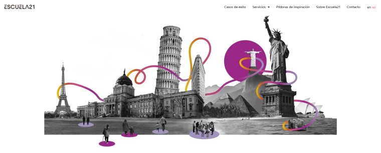
The navigation is simple since there are only six pages on the website. Each page consists of post sections presented in dynamic masonry grids laid over white background. Visually the website looks settled and calm. Many posts contain original images that support the website’s branding. These images employ modern techniques, combining gray and white stills with colorful appliqués.
The website’s peculiarity lies in the intense usage of parallax scrolling effects. These effects are provided by Crocoblock’s JetTricks plugin and Elementor Pro. As users scroll down the pages, the forefront elements become visible via different animations: they fade in and out of focus, move up the page with different speeds catching up on each other, scale up and down, or wander into the middle of the page sideways.
By altering the way things show up on a page, developers manage to attract users to each moving object. Such simple tools make scrolling fun even for site visitors not interested in whatever subject the website covers.
Theme and template: Hello Elementor.
Lion Tree
The following website is a creation by an award-winning agency that builds sites and landing pages for all kinds of businesses. Indeed, the website features hundreds of websites made by Lion Tree Group.
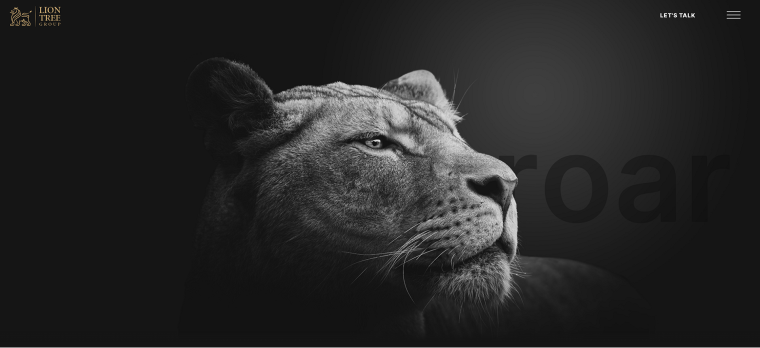
The first thing visitors see on a homepage is a full-screen image of a lion’s head and the word “roar” in the background. To me, it signals the developers are ready to tackle the job with the energy and assertiveness of a young wild animal. As visitors hover over the lion’s head with a mouse cursor, it tilts in different directions, creating a fantastic 3D effect. This image, and almost any other element on the page, is powered by the parallax layout list effect.
All the web pages are vibrant and dynamic, with many scrolling effects and Lottie files supported by the JetElements plugin. Even though the website showcases tons of images and rich, dynamic content, the pages load instantly because of a lazyload feature.
Theme and template: Jupiter.
Eyepples
This website sells hundreds of NFT collectibles inspired by fairytales, fantasy-world, and darker aesthetics.
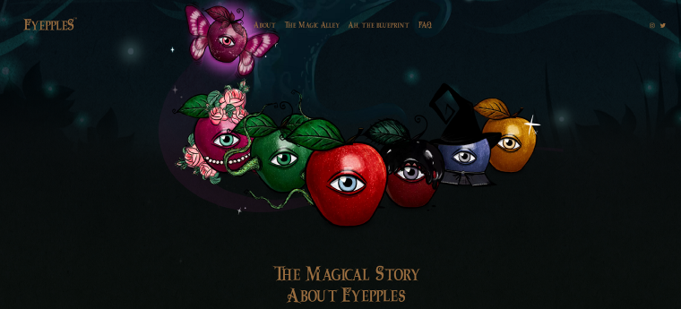
The NFT images are fabled apples alluding to widely-known children’s stories. The website design presents visitors with nostalgia and childhood delight as the pages are abundant with imaginary creatures and Harry Potter-style headings. The centered alignment of text resembles fairy tale storytelling.
Almost all homepage elements employ animation effects and react to the mouse cursor. JetEngine’s dynamic listing and JetElement’s sliding grid instruments power up the lists of NFT products. All this motion on the website and beautiful artistic illustrations bring together the world of “Magical Story About Eyepples.”
Theme and template: Hello Elementor.
Mimoments Wedding Film Studio
Mimoments Studio offers wedding videography and photography services. Naturally, web pages contain very little text but lots of full-screen photos and background videos by some high-end wedding pros.
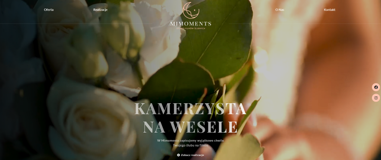
The landing page opens with a wedding video playing in a loop, followed by screen-wide stills of wedding ceremonies and celebrations. All the text elements over the images are white and perfectly readable. The links are put in place using JetEngine instruments. They don’t distract visitors from enjoying holy matrimony moments but are visible to those looking to find the authors’ names.
Mimoments is an example of a WordPress website that almost entirely consists of high-quality media content and runs smoothly because of dynamic and caching plugins.
Theme and template: Hello Elementor.
Barrel Marketing
This is a social media marketing, web development, and video production agency helping businesses tell their stories by producing authentic content. The bulk of their home page is devoted to case studies featuring some big names like Eco Canada.

The website employs a minimalistic look with deliberate usage of white space. The black-and-white pics merged with colored geometric shapes (supported by the Inline SVG feature) enrich web pages with a modern vibe.
While the examples of Barrel Marketing video products, eye-catching images, and easy browsing prove the team’s professional qualities, the bold, punchy lines reveal there are friendly and fun people standing behind every project.
Haim Banisty
Haim Banisty is a branding and website development specialist and a founder of Artline Studio. For building his promo site, he uses lots and lots of visual effects showing the capabilities of the WordPress platform.
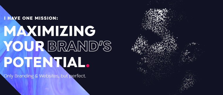
Each page is a delight to scroll, showcasing parallax effects, moving background images and videos, unusual hover effects (such as buttons taking odd forms when the mouse cursor focuses on them), and others.
Haim Banisty is also a great storyteller. On the About page, he makes visitors travel through critical stages of his life, moving from one page to another, even looking through a sniper’s sight at some point.
Trust me; when you get into the Projects section of this website, you will want to see every site built by Haim Banistry to find inspiration for work with WordPress and creative plugins.
I almost forgot to mention: the Crocoblock Facebook community voted for this website to be the best site built with Crocoblock plugins in 2021!
General Condition
General Condition is a boutique studio specializing in creating visual solutions and creative concepts based on learning and research. Their official website’s design is a unique mixture of classic European paintings with computer graphics glued together with a wide range of visual effects.
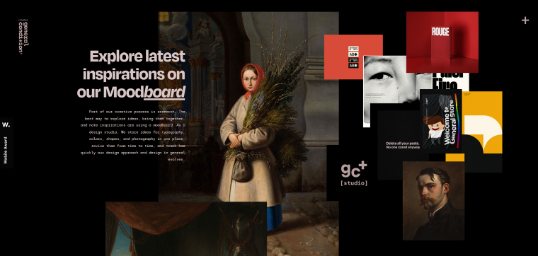
The web pages have a black background with some pink details, a perfect framework for media content. The vertical parallax effect is assigned to the elements, including images, icons, and text, creating a multidimensional effect. The text sections overlap sections with pictures (this effect is accomplished with the JetTricks Satellite feature).
General Condition developers often use WordPress tools in an odd way, proving that designers can use classic sets of instruments to create unique and authentic content. Their official website won numerous awards, including Elementor site of the year in 2021 and Crocoblock site of the month in August 2021.
Theme and template: Kava.
Mindcube
Sometimes using fewer plugins makes a more striking effect and creates a unique browsing experience.
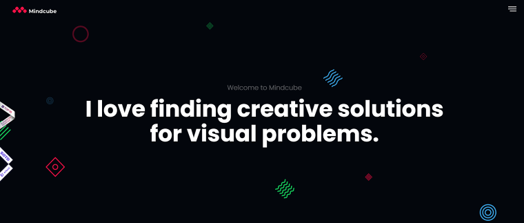
This website is an electronic business card for Mordi Levi, a freelance web developer. He says that using a strong brand, enriched with unique illustrations and fused into a well-oiled website, could change the business course of tiny startups and big-name companies.
His website uses a minimalistic approach. All Mordi’s projects appear as simple geometrical forms floating over black background. Elementor’s motion tilt effect creates the feeling of outer space, with objects flying freely. By the way, the tilting tool makes a better 3D effect for simple geometrical forms than for photos.
This site uses only Elementor tools, JetElements, and the MouseWheel Smooth Scroll plugin, and that’s all that is necessary for transmitting the author’s clear inspirational messages.
This simple website offers unique UX on mobile and desktop devices.
Ahmed Ali Dewan & Co.
This is a website of a law firm specializing in many areas of the legal portfolio. Visitors only need a few seconds to see what this company does, as the home page features case studies, pictures of team members, and information about their partners.
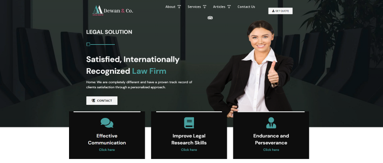
The website offers tons of information, but the landing page is not overly complicated. The navigation bar attached to the top of a page has a mega dropdown menu with two levels of submenus guiding visitors directly to the content they’re searching. It also contains a CTA button, “Get Quote,” so visitors can check their fees whenever possible.
The firm highlights its experience and achievements, presenting some of the data in the form of charts with horizontal bars built using JetElements’ widgets.
The website design makes it clear that the firm has many years of experience in providing legal services.
Green
This WordPress website contains information and reviews about luxurious furniture and accessories that visitors can buy online or in one of the brick-and-mortar stores owned by the GREEN company.
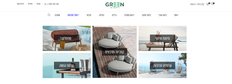
The website features easy-to-use navigation and a mega menu that contains dynamic media content, such as items on sale and the latest additions to the collection. The search tool powered by Crocoblock’s JetSmartFilters and JetSearch plugins offers several filters that allow picking relevant products out of thousands of items on the website.
Green’s design is clean and minimalistic, so the visitors keep their attention on the high-quality pictures of the furniture.
Summary
Everyone knows that the WordPress platform, combined with high-quality plugins made by third-party developers, can create any type of website for startups or big-name companies. However, different sites require different levels of complexity. Some of them focus on visual presentation (marketing studios), flawless browsing and searching process (eCommerce), while the others value transparent navigation and visitors’ access to contact forms (legal services).
Hopefully, the examples of WordPress sites above inspired you for your future projects. Check out our list of popular websites built with WordPress to learn more tips and tricks for website building. And make sure to share your projects made with Crocoblock on our web library!
