When we think about landing pages, one of the first things that come to mind is conversion rates. Your site’s landing pages are crucial. According to statistics, average conversion rates across all industries in eCommerce are only 2-3%, so it’s essential to focus on improving them. Factors such as your industry, product or service type, and target audience can play a vital role in influencing your ability to convert site visitors into leads.
Nonetheless, optimizing your landing pages to achieve the highest possible conversion rates should be one of your primary business goals. In this article, you’ll learn various methods to help improve your landing page conversion rate.
Determine Campaign’s Objectives
An effective landing page has one clear goal. The goal will determine the optimal layout of your page and your approach.
If your landing page has several offers, it will confuse users, resulting in them losing sight of your goal. Focus on creating landing pages that provide users with one offer so that they’re on the same page as you.
A landing page can aim to:
Get people to answer a survey: Maybe you want feedback from consumers about your newest product?
Urge them to avail of a free trial: If you’re selling SaaS, you might want to do this.
Collect emails: Email marketing is considered one of the best converting digital marketing strategies. It is the best way to reach out to customers personally.
Determine what your goal is first so you’ll know how to create your landing page.
Hook Your Reader with Your Headline
Landing pages are a critical component of your sales funnel. You only have a few seconds to grab a customers’ attention. So, the headlines on your landing page must be concise and impactful.
Here are some valuable headline tips:
Be clear: A headline must never come off ambiguous or vague.
Be relevant: The headline must be aligned with the ad linked to it. The messages should be similar. You don’t want your visitors to leave the page because they won’t get what they were looking for.
Be empathetic: Put yourself in the visitor’s shoes and empathize with their issues. Your headline should portray product advantages to visitors to have them believe your products can solve their problems.
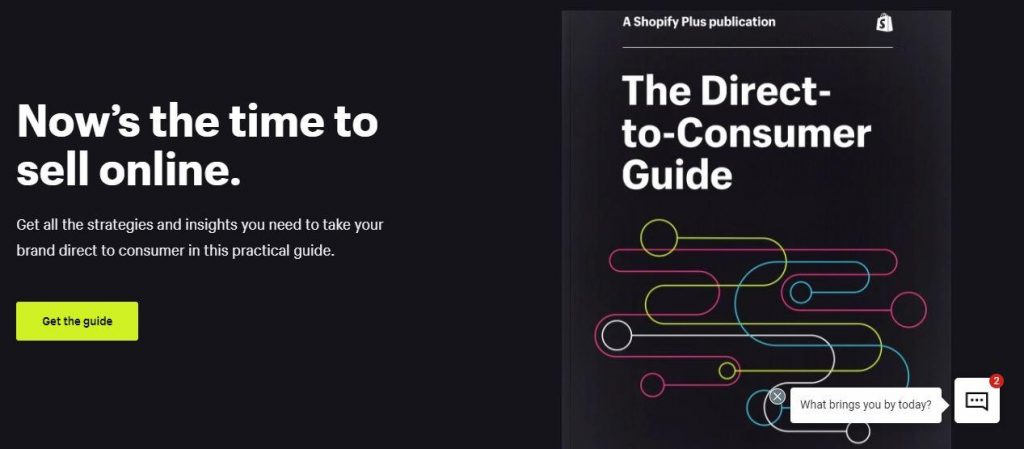
Here’s an example of a great headline from a Shopify landing page:
The headline is compelling and stands out against the black background. There’s that sense of urgency as well. Notice the word “Now” to get visitors to “Get the Guide” right when they get to the landing page.
Create headline variations that trigger emotions in readers. For example, when a reader comes across your headline, it could elicit powerful or positive feelings in them. Then test those headlines to see which one generates the best results.
Create an Engaging Text Flow
You need to engage your visitors with your text. You can do this by addressing their pain points. If visitors see your product could be the solution to their problem, they’ll continue reading your landing page and might even take action.
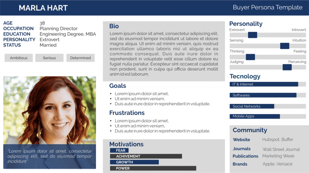
To know your customers’ pain points, create customer personas. Customer personas are fictional representations of your ideal audience. They look like this:
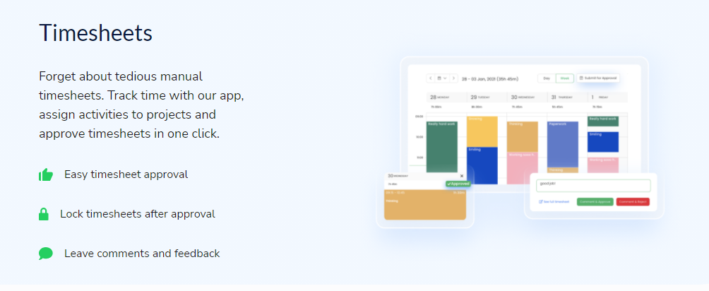
Once you know your ideal audience better, you can create text to get them to take action. Here’s an example from TimeTracker:
Based on their research, consumers want a tool that can spare them from time-consuming manual timesheets. So, their text reflects how their tool addresses that problem and more.
Use the Appropriate Photos
Visual content is a must to make a landing page both informative and aesthetically appealing. Research has shown that posts that include images produce 650% higher engagement rates compared to text-only posts.
Images also bring out emotional responses in people. However, you need to ensure that all the photos on your landing page are synchronized with the content written. A hero image is vital because it visually depicts what you’re giving away. The hero image is the first thing your visitors will see on the page.
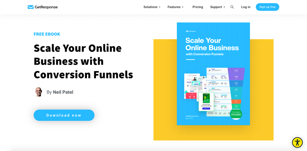
Check out this example:
Your hero image must have images aligned with your branding strategy so it doesn’t appear out of place.
Your landing page must also support high-definition photos with relevant icons to make your main selling points stand out. A balanced text-to-image ratio is essential for a landing page to make its full impact.
Use Subheads to Keep People Engaged
Don’t just rely on your title headings to keep people engaged. Use subheads to emphasize the information you provide in your header. That way, nothing is subject to interpretation.
Here’s an example:
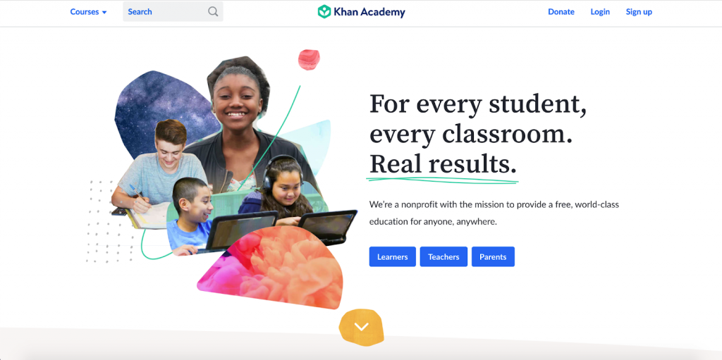
Notice that the subhead explains how Khan Academy achieves that “For every student, every classroom. Real results. Khan Academy is a nonprofit with the mission to provide a free world-class education for anyone, everywhere”.
Subheads can also help keep your visitors on your landing page. They can summarize that bulk of text people usually don’t like to read.
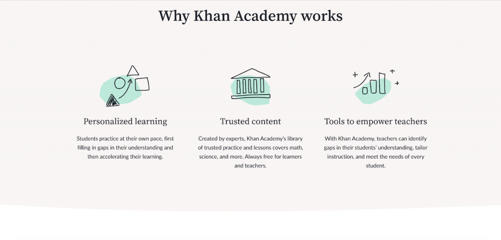
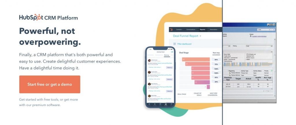
One look at the subheads in this example, and the landing page visitor already knows what the text below says.
Optimize CTA Button
Your CTA or call to action is an essential element of your landing page. It allows users to take action.
To get the most out of your landing page, consider changing the look of your CTA button. For example, it can have a color that contrasts with the background of the landing page. Aim for a color contrast that blends in well with the rest of the page but manages to stand out, too.
The CTA button mustn’t be too small as it can become unnoticeable. Make sure it isn’t too big either since that can take customers aback. Focus on creating a button that looks in sync with the layout of the page.
Your CTA button should also instill a sense of urgency in customers. Make them feel like they’d miss out on a great offer if they don’t avail of yours right away.
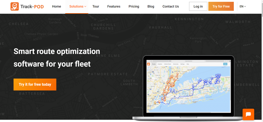
Instead of using CTAs like “Buy now” or “Learn more” use CTAs that will encourage site visitors to click. Offering a free trial and promoting this through a “Try it for free today” call to action is better for your conversion rates. Take a look at how this route optimization software entices site visitors to try their software through the CTA.
Optimize Lead Capture Form
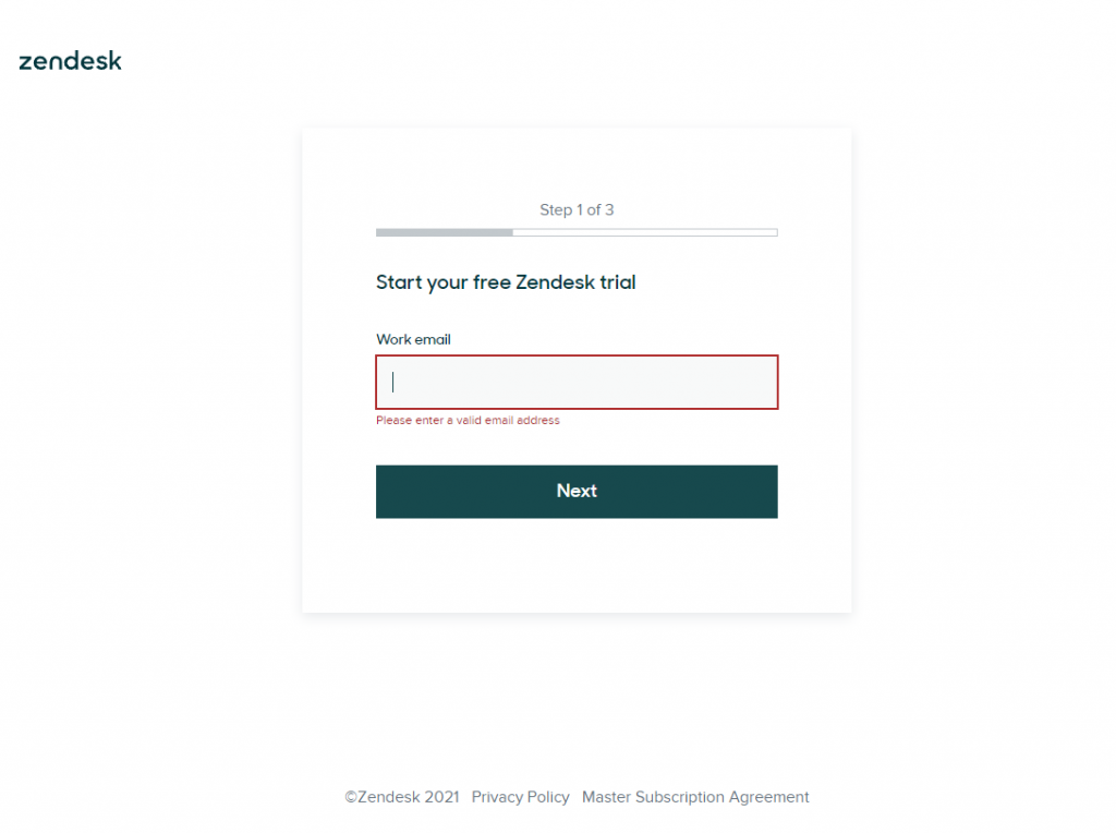
If your main goal is to gather users’ contact details, you need to optimize your lead capture form.
Make sure your form is adequately placed. Visibility and actionability play a key role in boosting landing page conversion rates.
Don’t include too many fields in the form. Remember, your visitors are busy people. They don’t have the time to fill out all those fields, even if they’d love to receive content from you. Avoid using buzzwords and keep it simple.
Keep the forms mobile-friendly, too.
Add Badges of Trust and Assurances
Add badges of trust and assurance to improve your landing page conversion rates. Examples of these badges include previous clients, awards and certifications, or security badges.
Badges are symbols you display to let site visitors know that your company and website are legitimate and trustworthy. They give visitors a sense of safety. That encourages them to share their personal contact information with you.
That said, your trust badges should be easily recognizable.
To illustrate how effective trust badges are, here’s a case study. When Bag Servant replaced their 4000+ followers Twitter badge with a WOW badge that was very hard to get, their site saw a 10% increase in engagement.
How great is that?
Obtain Referrals and Testimonials from Customers
Referrals and testimonials can be an effective way of improving your landing pages conversion rates. That’s because they can act as proof of customer satisfaction and guarantee.
Make sure, though, that the referrals and testimonials you put on your landing page are not generic. Reviews like “excellent product” or “great service” are not a good idea. They add no value as they don’t describe the customer’s experience of your product in detail.
Here’s a great example of how to use a testimonial on a landing page:
Comprehensive reviews will offer potential customers the assurance they need to purchase your products. They will also provide them with deeper insights into your brand. If you have a satisfied set of customers, don’t hesitate to ask them for a detailed review. That can help you.
Bottom Line
Your landing page is the most important page there is. If it’s optimized for conversions, you can increase the chances of your customers taking action.
As business owners, the primary goal is to meet the needs of our target audience. You also need to ensure the methods you choose to optimize your landing page tie together with your brand image.
I shared with you tips to improve those landing page conversion rates. Follow them to get the best out of your landing pages. The correct text, an engaging photo, or a trust badge can go a long way in helping you generate conversions.
Article was written by Baidhurya Mani, the founder of SellCoursesOnline. He regularly shares tips, tools, and strategies to help creators and entrepreneurs build a successful online course business.
