Something Familiar is a creative agency with a conscience. Empowering brands to do great things. We find exactly what makes a brand unique and use it to say something meaningful. Whether that’s with a website, identity, or campaign, it’ll always make an impact.
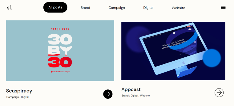
Recent projects have included:
- campaign for the Netflix Original documentary Seaspiracy;
- brand and website build for Appcast, the global leader in programmatic recruitment advertising technology;
- super-low-carbon website for green PR and digital communications agency Greenhouse;
- rebrand and website build for forms2, a revolutionary no-code platform empowering businesses to create efficient automations and drive digital transformation.
We’re big on creativity for good.
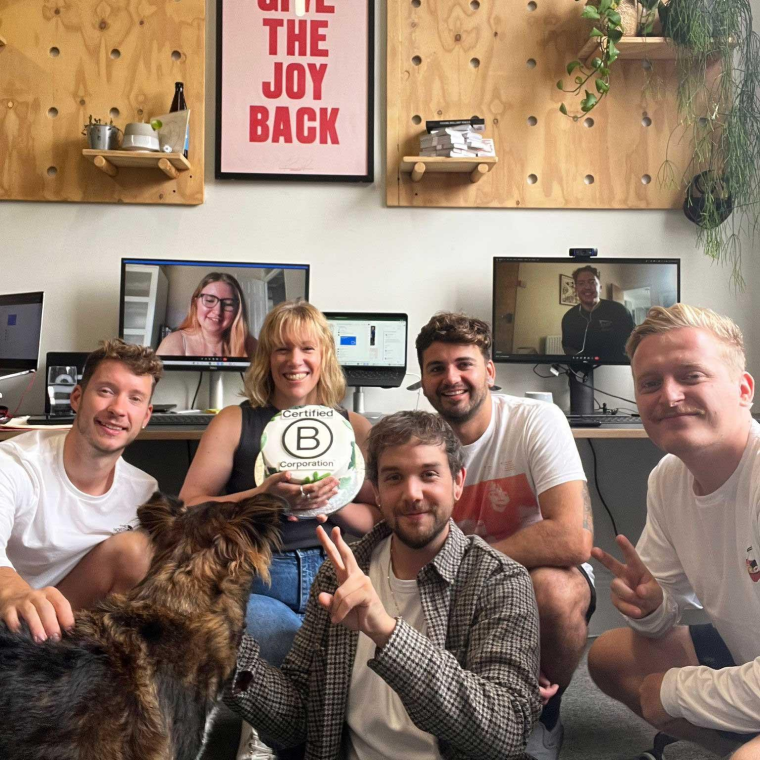
The most important work comes with a conscience, so we inspire our clients to make positive changes. Last year, we were certified as a B-Corp, joining a growing group of companies reinventing business by pursuing purpose as well as profit. Read our manifesto here.
MND Scotland Rebrand and Website Build
Most recently, though, we used one of our favorite combinations of plugins, Elementor and Crocoblock, to help deliver an entire brand and website refresh for the incredible UK charity MND Scotland.
Motor Neuron Disease (MND)is a progressive and terminal illness that affects the nerve cells in the brain and spinal cord that control movement. MND Scotland works tirelessly to offer a range of services to people living with MND, including financial assistance, support groups, information about clinical trials and research, and much more.
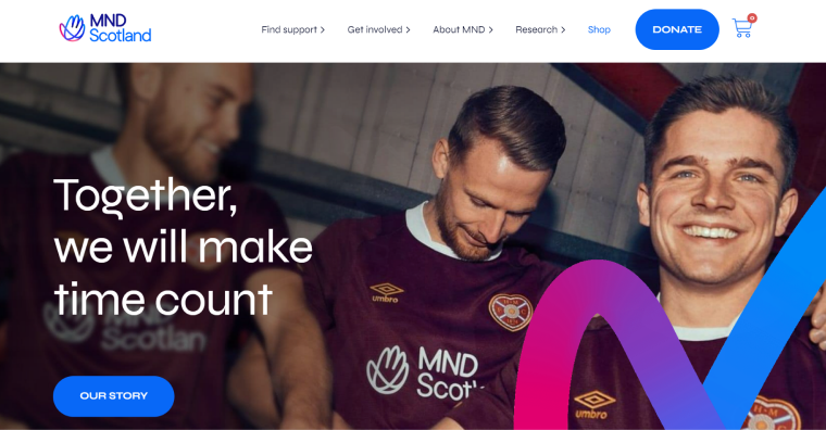
Despite having just celebrated its 40th anniversary, and with continued sponsorship from Hearts FC, the charity had only seen an increase of 6% in awareness by the general public over the last year. This was the springboard for us to deliver a website and brand that pushed MND Scotland forward.
Starting Out
We began this 12-month project by evaluating the existing brand and website. Because it hadn’t evolved for around 10 years, it quickly became clear that the original Umbraco CMS-based website was full of redundant posts and pages that had been buried with years of revisions.
User journeys were clunky, payment systems were outdated, and, of course, the general design was in need of a refresh.
By deep diving into the audience, we could identify what visitors to the website would need and deliver a site that improved the user experience for both front end and backend users.
We started by considering our primary audiences: those supporting people with MND and those suffering from MND themselves.
As you can imagine, it was a huge undertaking and resulted in complex strategic journeys that ensured people could find the information they needed effortlessly, despite the amount of information on the site.
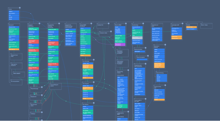
Alongside these journeys, we began looking at design solutions that would bring the brand into the public eye and provide a much stickier level of recognition and recall.
To start, we chose a simple, professional but-friendly typeface with a bit of character: Google’s Syne. We then used the well-established “MND blue” as our base for color palettes, adding warm and approachable human tones and hues to complement the vibrancy of the blue.
We wanted this warmth and vibrancy in the images too, so we briefed the team at MND Scotland, who organized multiple photoshoots, which delivered perfectly. This image library was later paired with bespoke animation, adding another approachability layer to our designs.
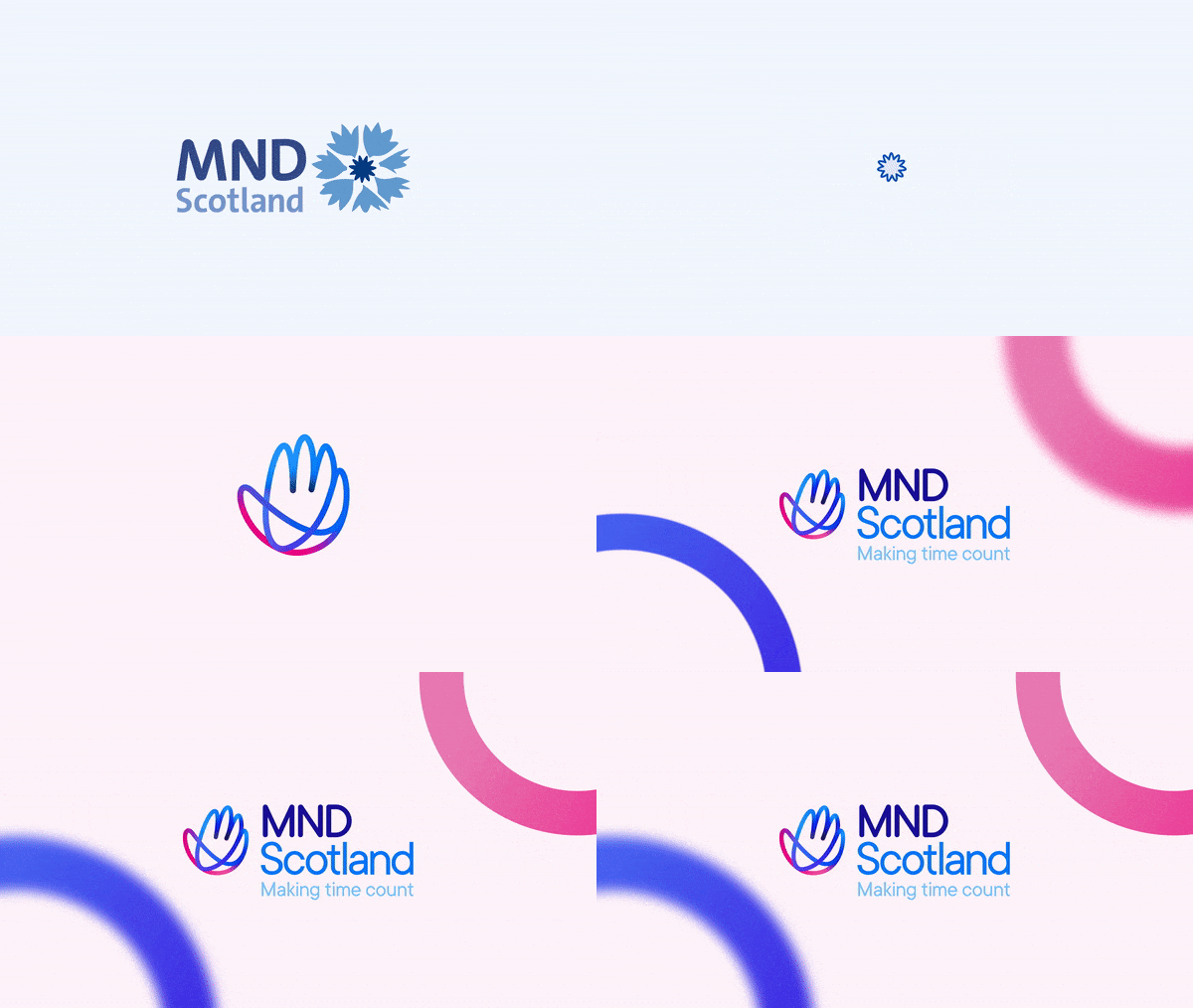
With the brand elements in place, we could move on to designing each website page for client approval before moving them over to development.
More Power to You
We’ve always believed that clients should always have the power to make simple website changes without relying on a developer.
It was important that MND Scotland could change any page, so we turned to one of our favorite combinations, WordPress empowered with Elementor and Crocoblock.
WordPress continually evolves in line with the latest technologies, so it’s typically future-proof. But what makes it incredibly adaptable is the huge number of plugins that let us shape it precisely as we need.
The combo of Elementor and Crocoblock gives our clients the power to make adjustments visually without touching a line of code. Crocoblock supercharges the already robust Elementor and helps us deliver low- and no-code solutions beyond what was previously possible.
Website specifics
There’s a lot going on under the surface for a relatively simple-looking website. An online store, recurring and single donation options, complex multi-step forms, five custom post types, and the need for different design solutions for each of these aspects – it was essential there was a manageable approach to working with all of these elements.
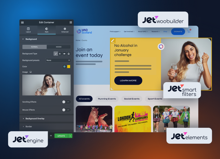
Our solution was to work using Crocoblock’s JetWooBuilder, JetSmartFilers, JetEngine, and JetElements, all of which gave us the control we needed in different areas whilst all playing nicely together.
As the name suggests, JetWooBuilder enabled us to create a bespoke design for the online store. Without digging into the CSS, we styled all aspects of the shop, the checkout pages, empty carts, and even product tiles/listings.
With JetElements, we created a unique timeline, effortlessly visualizing MND Scotland’s journey and growth while also handling our post grids.
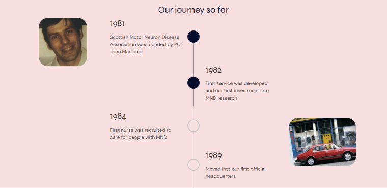
This, paired with JetSmartFilters, allowed us to filter the news and events archives and the products in the store. We also embellished features with a little CSS to allow for horizontal scroll when the filters were viewed on a mobile device.
Finally, JetEngine was used to create the event archive, where we used custom fields to display event dates. We wanted to be able to order posts by custom fields, not the date the post was published. The query builder allowed us to do exactly that.
To help us migrate between the two different Content Management Systems, we also used Gravity Forms, Migrate Guru, and Yoast SEO.
Results
Since the website launched in October 2022, it’s received more than 20,000 users. Even better, the charity has seen an incredible increase in revenue of 30.3% compared to the same period last year.
Our work also significantly improved the website’s performance in general. Using Google’s page speed insights, we measured a 273% performance score increase for the homepage on mobile devices and a 21% performance increase on desktop. We’re looking to improve these figures over the coming months further and look forward to our continued partnership with MND Scotland.
For more information on how we use awesome no-code tools like Crocoblock to support our clients, please contact me at [email protected].
