Since the release of WordPress’ default editor, Gutenberg, thousands of WordPress developers have explored working with it. Initially, it faced criticism from the IT community due to compatibility issues, a steep learning curve, and bugs, especially when compared to classic editors. However, like many innovations, it has improved over time and gained wider acceptance.
The Gutenberg editor continues to evolve, following WordPress’ long-term roadmap for Full Site Editing. Many in the WordPress community are watching closely to see how it develops and how it might reshape website building in the future.
Today, Gutenberg has proven itself stronger than ever, but it still lacks a lot of features, user-friendliness, and design freedom. With the ongoing introduction of Full Site Editing and block-based themes, it is gradually moving toward a more comprehensive site-building tool. While it has not yet replaced website builders like Elementor or Divi, its continued evolution raises interesting possibilities for the future of WordPress development.
What Is Gutenberg?
Here I’m answering the question “What is Gutenberg and where does it all start?”. The editor is named after Johann Gutenberg, the European printing press inventor, who made a publishing revolution. WordPress developers are striving for the same revolution (well, we’ll see).
At first, many WordPress users were resistant to the change, leading to a surge in Google searches on how to disable Gutenberg or restore the Classic Editor. To accommodate this demand, WordPress released the Classic Editor plugin, which remains popular today.
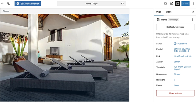
WordPress used the TinyMCE editor for many years as the default tool for creating posts and pages. The Classic Editor was a simple text window with a basic formatting toolbar.
Although this editor worked well, users had to apply different methods for adding images, creating galleries, embedding videos, and inserting tables. This learning curve made WordPress slightly more complex compared to drag-and-drop website builders.
With the introduction of Gutenberg (Block Editor), WordPress now offers a modern, block-based approach to content creation. Each element — text, image, video, or button — is a separate block that can be easily moved, customized, and styled without writing code.
As WordPress continues to develop Full Site Editing (FSE), Gutenberg is gradually expanding beyond just post editing. While it is not yet a full drag-and-drop site builder, its capabilities are growing with each update.
Functionality Overview
Gutenberg is a powerful content editor, but it’s still evolving. While it is not yet a full replacement for visual page builders like Elementor, Bricks, or Divi, WordPress is gradually integrating Full Site Editing, which could bring Gutenberg closer to a true site-building experience.
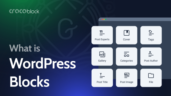
Gutenberg operates with blocks, each representing different types of content elements. These blocks include:
- Text elements: paragraphs, headings, quotes, lists;
- Media elements: images, galleries, videos, audio;
- Design elements: buttons, rows, columns, cover images;
- Embeds: YouTube, Reddit, and other third-party platforms.

Gutenberg allows users to move blocks using drag-and-drop, but it still follows a more rigid structure compared to visual page builders like Elementor or Bricks. In classic drag-and-drop builders, you can place elements freely and adjust their size, spacing, and alignment with more flexibility. Gutenberg, on the other hand, maintains a structured grid-like layout where blocks follow predefined rules, making it less freeform than a visual drag-and-drop page builder.
Advanced Gutenberg features
The editor includes additional tools to enhance the editing experience:
- Top toolbar. Moves formatting options to the top of the editor.
- Spotlight mode. Highlights only the currently selected block.
- Fullscreen mode. Hides distractions like the WordPress admin menu.
- Visual and code editor toggle. Allows switching between block view and raw HTML.
- Reusable blocks. Save and reuse custom-designed blocks across different pages.
- Block manager. Enable or disable specific blocks to streamline workflow.
Gutenberg continues to evolve, with each WordPress update bringing new improvements. While it may not yet be a full-fledged page builder alternative, its role in WordPress is growing, and it may eventually become a central tool for site customization.
Gutenberg and Full Site Editing
One of the major directions in Gutenberg’s evolution is becoming a website builder. While initially designed as a content editor, Gutenberg is now moving toward Full Site Editing (FSE), a feature that allows users to build and customize their entire website using blocks.
With FSE, users can create custom headers, footers, and page layouts without relying on their theme’s built-in settings. This shift makes it possible to design a website from scratch using only Gutenberg and a block-based theme.
As of WordPress 6.7, Full Site Editing is available, though still evolving. However, the WordPress Core Team continues to expand Gutenberg’s capabilities with each update.
Let’s take a closer look at the missing features that could further shape Gutenberg’s future as a full-fledged website builder.
Gutenberg Editor: What’s Still Missing?
Gutenberg has evolved significantly, but many features still make visual drag-and-drop page builders like Elementor more flexible. Here are some key areas where Gutenberg still lags:
Limited global styling options
While WordPress introduced global styles in 5.9, they are not as advanced as Elementor’s full theme styling system. More improvements are expected in future updates.
Basic column controls
Gutenberg has a Columns block, but it lacks advanced width, spacing, and responsive settings.
Lack of dynamic content support
Gutenberg does not natively support dynamic content (such as post meta fields), but plugins like JetEngine, ACF, and Toolset allow this functionality.
FSE needs improvements
FSE is still evolving — the UI is raw, not beginner-friendly, and lacks visual cues.
Performance can suffer from too many third-party add-ons
Developing website layouts using the Block Editor requires either a lot of custom CSS or third-party add-ons. The latter can bloat sites, affect performance, and loading times in the editor (and sometimes front-end) can take a hit.
Gutenberg is rapidly improving, but it still lacks design flexibility and other features. Many missing features can be added with plugins, but for advanced design control, Elementor, Bricks, or Divi remain superior for now.
FAQ
Gutenberg is the default block-based editor introduced in WordPress 5.0. It replaces the Classic Editor and allows users to create and format content using individual blocks.
WordPress introduced Gutenberg to provide a more modern and flexible content creation experience. The block-based approach makes it easier to add and style different types of content without needing to write code.
Yes, you can build a full website using only Gutenberg. It allows you to create and design pages with blocks for text, images, columns, buttons, and more — no coding needed. For more control, you can use block-based themes and additional block plugins.
The Bottom Line
One of the major benefits of Gutenberg as a native tool is the potential openness to extensions. Right now, there are lots of Gutenberg block plugins to extend the editor functionality.
Despite initial criticism, it has matured into a reliable content editor, with Full Site Editing expanding its potential for site-wide customization.
Although you can build a website using Block Editor, it still relies on themes for layout flexibility and lacks advanced design controls and dynamic content capabilities. However, WordPress continues to improve Gutenberg with every update, and its growing feature set suggests that it could become a strong competitor to popular page builders in the future.


