So, you want to design a website, but where do you start? Although it may sound trivial, the first thing you need to do is draft a website layout. What is it, how to create it, and what should it include? Today, I’ll answer all those questions and give you some nice references to get inspired. Stay tuned! 🤗
What Is a Website Layout?
Simply put, a site layout is a framework defining a website’s structure. Its main purpose is to structure the information so it looks coherent to website owners and their audiences. A proper web layout demarcates the content hierarchy, provides a clear navigation path from one webpage to another, and makes the most important website elements stand out. Most importantly, it helps to get the brand message past the textual level and convey it through visual forms.
What Elements Should the Website Layout Include?
A site layout is about planning past the homepage; it should take into account the crucial elements one can spot throughout the website. You can call them the “backbone” elements, as they shape the way a website looks and operates.
Website header
It is the uppermost site section, which immediately catches a visitor’s eye. A header typically includes the brand’s logo, navigation links, and login/logout functionality.
Navigation menu
Previously mentioned as “navigation links,” a website menu is another crucial homepage layout element. It helps users and visitors navigate the site without getting lost. It doesn’t matter which form you choose to implement – a sidebar, a mega menu, or a hamburger panel – a menu should always be present on the website.
Website content
The page body “houses” the site content – it can be text, images, video content, banners, buttons, forms, and any other type you feel like adding.
Website footer
Lastly, the site footer is a “closing” layout element, which often contains a sitemap, a social bar, a subscription form, and links to other important pages.
What Makes a Website Layout Good?
The key to a good web page layout is proper planning and A/B testing. For a particular website type, it’s best to choose a flattering layout type. But how to decide which one is optimal? Consider the following when selecting a layout:
- Lay everything out clearly and simply. It takes visitors a few seconds to make up their minds about a website’s usability. Are the vital content sections easily spotted? Is the navigation intuitive? How flattering is the color scheme? Take all these aspects seriously because a bad site layout is frustrating.
- Make it engaging. A good web layout can help you increase user engagement by prolonging their stay on the website and making them want to come back.
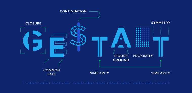
- Consider human psychology. Visual design and Gestalt principles make a good combo when it comes to winning over a website user. There are over 10 Gestalt principles, including Closure (Reification). According to it, the human eye tends to complete images visually when seeing distorted lines and abstract shapes.
Okay, but how will it help you create a web design layout? There are three possible scenarios:
- You focus on details, which may lead to exponential user engagement growth.
- You pay less attention to details and focus more on shaping the global view of the website. Users will find a way to navigate themselves.
- You ignore details on purpose and choose to bring originality into play. Users will not only find a way around the website but also find it memorable.
How to Choose the Right Website Layout
- The first step is to figure out which layout type will be the most suitable for the site. One way to do this is to research the competition, niche leaders, and their website layout ideas.
- Next, try to visualize several layout ideas based on different designs and see which way to present information and content is a bigger success. Please note that it’s best to take into account survey data and usability testing (A/B) results when choosing a layout.
- It’s not necessary to stick to a single webpage layout and use it consistently on the website. You can use up to three different layouts for different page types. When done smartly, it helps users understand what page they are currently viewing and its purpose.
- Do not forget to watch the layout’s adaptability – it should be mobile-friendly and responsive. When building one, make sure the web layout design remains usable and accessible for all users across all devices.
- If the brand/company/agency already has a specific color palette, be sure to use it. This will help it remain a recognizable brand in the market.
Choosing the layout is definitely not building one, and proficient web designers know how important it is to have all the right tools, including hardware. Check out the following article; it’ll help you pick the right computer for graphic design.
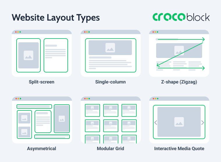
Top 5 Website Layout Types
The modern world welcomes creativity, and so does web design. There are many different website layout types out there, but you know what they say – everything new is well-forgotten old. So, prepare to learn more about the five most popular and time-proven layouts (and check out the website layout examples).
Further, the most popular and effective layout types are presented:
- single-column layout;
- zigzag layout;
- split-screen layout;
- asymmetrical layout;
- modular grid layout;
- full-screen media layout.
Here you can see short, clear schemes for each type of layout.
Single-column layout
Number one on the list is a proud all-timer – the single-column layout. It presents the content as a vertical scrollable column, which makes it the simplest layout type. It is suitable for minimalist websites, where the design itself is laconic and doesn’t steal the spotlight from the visual part. Surrounded by white space, the images appear larger and look crisp and clear, and the scrolling experience is seamless.
As you can see, the evenly spread white space makes the primary content vibrant yet not overwhelming and pleasant to look at. Besides, such a layout is easy to view from mobile devices.
When to use:
- personal blogs and micro-blogs;
- minimalist design;
- long-form articles;
- mobile-friendly design.
A good example of this approach is HBA Architecture & Interior Design, where the layout relies on generous spacing, large visuals, and a clean vertical flow that keeps the focus on the project’s content.
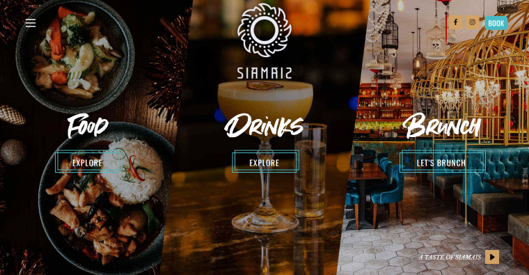
Split-screen layout
There are two types of it – horizontal and vertical. A vertical split-screen website layout type will be the optimal choice when you want to convey dual importance to two or more content areas. It helps to offer quick choices, a better user experience, and higher engagement.
In the example above, the screen is split into two, but possible variations include three, four, and even five-column screens. When done logically correctly, a multi-column split-screen can secure a second-to-none viewing experience:
- it helps to keep all the important page content above the fold;
- it makes the transition from one picture to another smooth and consistent;
- you can choose a flattering color scheme to accentuate the choices without taking the focus from the targeted action.
When to use:
- multiple equally important options to choose from;
- side-by-side webpage layout;
- the contrast between content areas;
- the static image next to a video/animation;
- highlight a vertical image.
A strong example of this approach is Goodman Gallery, where the homepage uses a clean split-screen composition to balance navigation, imagery, and featured content without overwhelming the visitor.
Asymmetrical layout
Asymmetry can be a good website layout idea because it upends the standard layout rules and promises to offer something beyond perfection. The asymmetrical layout type is about compartmentalizing the website content into small logical chunks and placing them unevenly on the page.
Such a trick can help you create active space, which directs the sight from one spot to another, and make white space lively.
When to use:
- maintain visual balance;
- advanced image gallery;
- portfolio presentation;
- balance out contrasting colors;
- too many content types and visual elements.
A great real-world example is Ian Aldous Photography, where the asymmetrical composition, varying image proportions, and unconventional spacing create a dynamic browsing experience while still maintaining visual harmony.
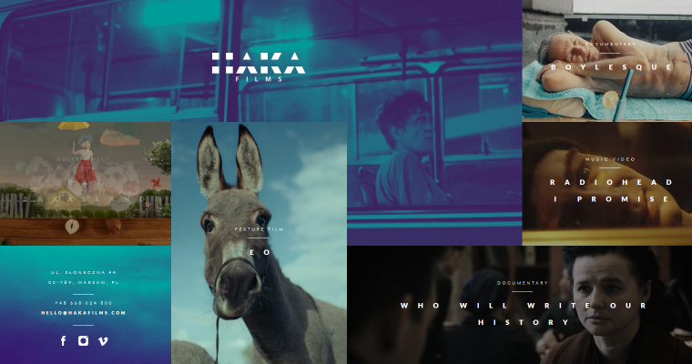
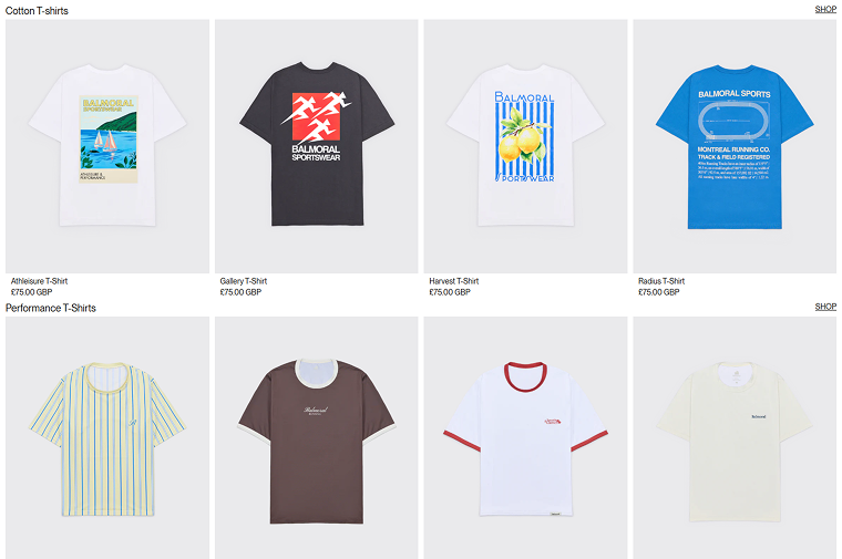
Modular grid layout
Otherwise known as card/block layout, it is excellent for content-heavy websites, where elements are hierarchically made equal. Another way to explain the concept: every content unit, be it text, picture, video, button, etc., is included in a separate card and has its own space.
You can choose to include gaps (the so-called gutters) between images, like in the example above. When done properly, symmetrical grids can give the website content a unique look and feel – streamlined, well-organized, and eye-pleasing.
In addition, the modular grid is a flexible and responsive layout type since columns can adjust to the screen size, and users get a nice browsing experience from all devices.
When to use:
- business websites;
- blogs;
- clean-looking archive pages;
- media gallery.
A great example of this approach is the Balmoral Running shop, where products are presented in a clear grid, which makes customers’ interaction with them straightforward.
Zigzag layout
It’s the second most popular website layout idea after the single-column layout. The zigzag layout basically repeats the way a human eye scans the webpage content – following a Z-letter pattern:
- The eye goes from left to right.
- Then, the eye goes down and back to the left.
- From there, the eye moves to the right again.
Such a layout is perfect when you need to direct the user’s attention to specific points using well-placed visuals, text, and CTAs.
When to use:
- symmetrical and smooth scrolling;
- different website types.
A modern example of this structure is Synthesis Capital, where alternating content blocks and visual sections naturally guide visitors through the page in a smooth, engaging reading flow.
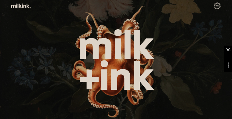
Bonus: full-screen media layout
Full-screen media always looks “juicy” and complements the immersive user experience. Once the users first visit the website, they are immediately captivated by the authentic brand-relevant visuals, which help to establish trust. The text sections, menu, and CTAs are there to support the “living” image.
A full-screen media layout has many benefits:
- it provides a rich user experience;
- easy to design and implement;
- well-suited for responsive design;
- cultivates the visitor’s curiosity to scroll down the page;
- despite being a simple design choice, it’s impactful.
By choosing a full-screen media website layout type, you inform the site visitor about the services you can provide and the brand’s specialty. For example, Milkink is a creative studio, and its website illustrates what the team can deliver. Mind the colorful foreground images, animations, parallax effect, moving pictures, stylish logo, and harmonious color scheme.
When to use:
- strong branding strategy;
- increase conversion rates;
- emphasize #1 offered use case;
- faster decision-making for users.
A striking example of this layout type is La Revoltosa, where large-scale visuals, motion effects, and immersive full-screen sections instantly communicate the brand’s personality and creative direction.
How to Build These Layouts in WordPress Using Elementor and Crocoblock
The good news is that you don’t need to code complex page structures from scratch to recreate these popular website layouts. Thanks to Elementor and the Crocoblock toolkit, you can build flexible, responsive layouts using visual tools, dynamic content, and advanced styling features.
JetBlog and basic Elementor structure single-column layout
Single-column layouts are one of the easiest to build in WordPress because they rely on clean vertical stacking and generous spacing. In most cases, the standard Elementor section structure is enough: simply place content blocks one below another and control the spacing, typography, and media widths.
For blog-style pages and long-form content, the JetBlog plugin can simplify the process even more. Its widgets help organize posts into elegant single-column feeds, hero sections, and smart content lists optimized for readability and mobile responsiveness.
This approach works especially well for:
- editorial websites;
- personal blogs;
- portfolio storytelling;
- minimalist landing pages.
JetEngine and JetSmartFilters solution for modular grid layout
The modular grid layout becomes much more powerful when paired with dynamic content. Using JetEngine, you can create Custom Post Types, dynamic listings, and reusable content cards without changing code.
The core element here is the Listing Grid widget, which lets you display posts, products, events, or portfolio items in a responsive card-based structure. You can then enhance usability with JetSmartFilters, allowing users to filter content dynamically by category, taxonomy, tags, price, and other criteria.
This combination is especially useful for:
- online stores;
- directory websites;
- real estate listings;
- media galleries;
- blog archives.
Elementor and JetEngine repeater for zigzag layout
Zigzag layouts rely on alternating content sections, where images and text switch sides while scrolling down the page. Elementor’s flexbox containers or section controls make this structure easy to recreate visually.
To make the layout scalable and dynamic, you can combine Elementor with JetEngine repeater fields. This setup allows you to store repeating content blocks (such as titles, descriptions, images, and buttons) and output them dynamically on the front end.
As a result, you can build reusable zigzag sections for:
- service pages;
- case studies;
- storytelling landing pages;
- feature showcases.
The biggest advantage is consistency: once the structure is created, editors can update content directly from the WordPress dashboard without rebuilding layouts manually.
Elementor and JetEngine dynamics for full-screen media layout
Immersive full-screen layouts are heavily dependent on visuals, motion, and background media. Elementor already includes tools for creating full-width sections with videos, overlays, animations, and responsive positioning.
To make these layouts dynamic, you can use JetEngine’s dynamic sources functionality to pull featured images, videos, or custom field media directly into sections through Dynamic Tags. This is especially helpful for projects where visuals change frequently, such as portfolios, creative agencies, travel websites, or restaurant pages.
This setup allows you to create:
- fullscreen hero sections;
- dynamic portfolio showcases;
- interactive brand presentations;
- visually driven landing pages.
Combined with Elementor motion effects and responsive controls, dynamic backgrounds help create modern immersive experiences without relying on custom code.
Website Layouts Comparison
Here is a comparison table of the website layouts we discussed earlier. It provides a short summary of the main features, best practices, and recommended tools for each layout type.
| Layout Type | Main Features | Best For | Recommended Crocoblock Tools |
| Single-column layout | Vertical content flow with generous white space and simple structure | Blogs, long-form articles, minimalist websites, portfolios | Elementor + JetBlog |
| Split-screen layout | Page, divided into two or more equally important sections | Creative studios, galleries, product comparisons, storytelling pages | Elementor containers and flex layouts |
| Asymmetrical layout | Uneven placement of content blocks and dynamic spacing | Creative portfolios, photography websites, and experimental design | Elementor + JetProductGallery/ JetGridBuilder |
| Modular grid layout | Content displayed inside equal cards or blocks arranged in a grid | eCommerce, directories, archives, media galleries | JetEngine + JetSmartFilters |
| Zigzag layout | Alternating left-right content structure following eye-scanning patterns | Landing pages, service websites, feature showcases | Elementor + JetEngine Repeater fields |
| Full-screen media layout | Large immersive visuals, videos, and animated sections | Creative agencies, restaurants, travel, and branding-focused websites | Elementor + JetEngine dynamic media |
Website Layout FAQ
A website layout is a framework or visual structure that determines how content is arranged across a webpage. It helps organize text, images, navigation, buttons, and other elements in a logical way so users can easily browse the website and understand its hierarchy.
Most website layouts include four core components: a header, a navigation menu, the main content area (body), and a footer.
Together, these elements create the website structure and improve usability, accessibility, and navigation.
Some of the most popular website layout types include:
– single-column layout;
– zigzag layout;
– split-screen layout;
– asymmetrical layout;
– modular grid layout;
– full-screen media layout.
Each layout serves different purposes depending on the website’s goals, content structure, and target audience.
In 2026, modular grid and zigzag layouts remain among the best choices for business websites because they combine visual clarity, responsiveness, and conversion-focused design. Grid layouts work especially well for service directories, SaaS platforms, and eCommerce sites, while zigzag layouts are effective for storytelling, landing pages, and showcasing services step by step.
The best option ultimately depends on your business goals, content type, and branding strategy.
Single-column layouts are considered the most mobile-friendly because they naturally adapt to vertical scrolling and smaller screens. They improve readability, simplify navigation, and create a seamless browsing experience on smartphones and tablets.
Responsive modular grids and stacked zigzag sections also perform well on mobile devices when properly optimized.
A grid layout is a broader design system based on rows and columns used to align content consistently across a page. A modular layout is a specific type of grid layout where each content piece is placed inside its own independent block or “card.” In practice, modular layouts are more flexible and content-oriented, making them ideal for blogs, online stores, galleries, and listing websites.
There is no single “best” SEO layout, but layouts that improve usability, readability, and page structure generally perform better in search engines. Single-column and modular grid layouts are often SEO-friendly because they support:
– clear content hierarchy;
– responsive design;
– faster loading times;
– improved user engagement;
– easier internal linking.
A well-structured layout also helps search engines better understand page content and navigation.
Wrapping Up
When designing a website, it is incredibly important to draft a wireframe first, a mockup if you will, where you’ll mention all the vital website parts, their content, and section placement. Having a ready-to-follow web page design layout will save you time during further development.
Which layout to choose? It depends on the goal you wish to achieve. There are many layout types, each having its own peculiarities and suitable for particular niches. Among the most common layouts, I’d like to point out single-column, split-screen, zigzag, modular grid, and asymmetrical. These are time-proven and creative methods for organizing the site content.
The best part is that all these layouts can be recreated in WordPress without custom coding by combining Elementor with Crocoblock plugins. Whether you need dynamic listing grids, immersive full-screen sections, responsive blog structures, or advanced content repeaters, the toolkit gives you the flexibility to build modern website layouts visually while keeping them scalable and easy to manage.
I hope the article helped you find more website layout ideas and inspiration. ✨