AJAX Search Overview
Learn how to apply the AJAX Search widget/block/element for Elementor, Gutenberg, and Bricks. Discover its general settings and main features.
The Ajax Search widget/block/element from the JetSearch plugin enables users to perform fast, live searches across your WordPress website. It displays instant results as visitors type, without reloading the page. This overview explains the Ajax Search’s main features and settings, showing how to configure the search form, adjust its appearance, and refine search results to deliver a seamless user experience.
AJAX Search Form Widget in Elementor
The Ajax Search widget can be found among other widgets while editing a page in the Elementor builder.
In the Content tab, the following sections are presented: Search Form, Search Query, Results Area, Custom Fields, Additional Results, Search Suggestions, and Notifications.
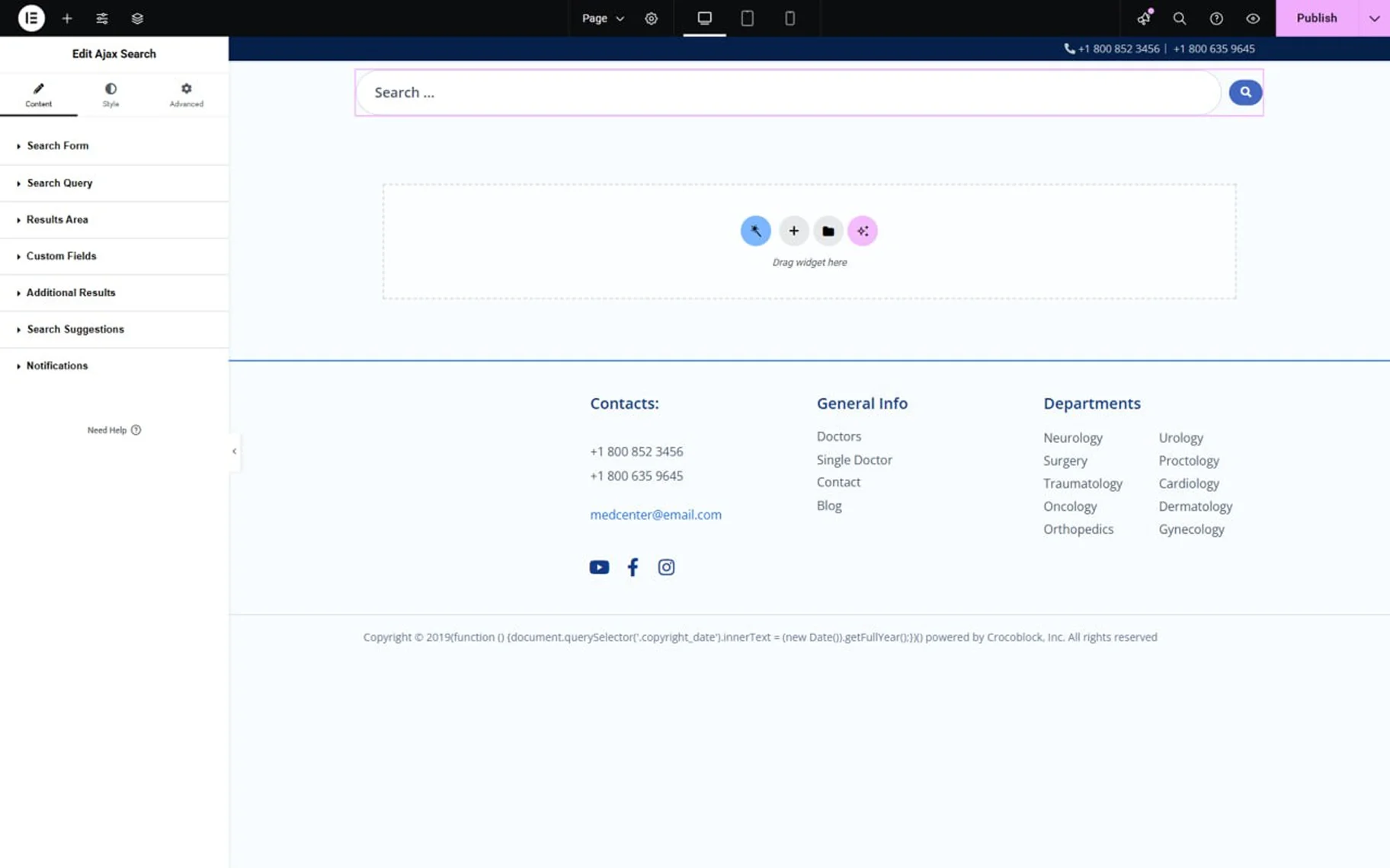
In the Search Form section, among the settings are:
- Input Icon — this setting allows one to add an icon from a library or upload an SVG file;

- Clear Text Button Icon — this allows users to select the icon that appears after typing text into the search input. Clicking this icon, one can delete the typed text at once;
- Placeholder Text — this is a field to type the text to be displayed in the search bar.
In the How to Customize the Placeholder Text Shown in the Search tutorial, more info can be found;
- Minimal Quantity of Symbold for Search — in this input, the number of symbols required to start the search can be entered;
- Allow Search by Empty String — when this toggle is on, one can search even without entering anything. All the results will be displayed;
- Disable Submit on Enter — this toggle allows search only by clicking the “Submit” icon, but not by the “Enter” keyboard button;
- Show Submit Button — the toggle shows and hides the “Submit” button;
- Submit Button Label — in this input, the “Submit” button label can be changed;
- Submit Button Icon – this field allows one to select the icon for the “Submit” button;
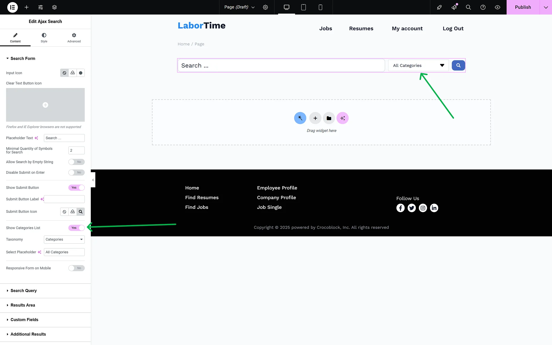
- Show Categories List — the toggle specifies the scope of searching. If enabled, this option determines the taxonomies — WooCommerce product taxonomies specific to a site and custom taxonomies of the JetEngine plugin — to find the information the user needs;
When the Show Categories List toggle is on, two more fields appear:
- Taxonomy — one can select the taxonomy whose categories will be shown in the dropdown;
- Select Placeholder — in this input, one can type the placeholder text for categories;
- Responsive Form on Mobile — this toggle enables the responsiveness of the search form for mobile devices.
In the Search Query tab, the same settings are presented as on the global Ajax Search Settings page. This helps one shorten the search results URL generated by this widget.
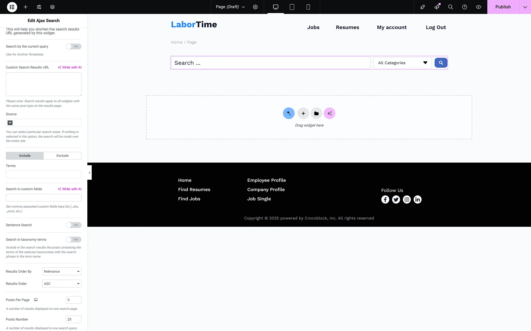
- Search by current query — the toggle can be used to conduct a search based on the current page context. This toggle should also be enabled for archive pages;
- Custom Search Results URL — this input allows users to enter their desired custom search results URL. Search results apply to all widgets with the same post type on the results page;
- Source — this field provides the possible search areas. If nothing is selected in this option, the search will be made over the entire site. Refer to the How to Set the Search Only for Specific Post Types guide to learn more about the search source settings;
- Terms — the input allows one to include or exclude terms from the category search;
- Search in custom fields — allows entering custom fields’ names, in which the search engine can also search. Separate custom fields’ names with commas;
- Sentence search — the toggle allows searching by the whole sentence, not just separate words;
- Search in taxonomy terms — include in the search results the posts containing the terms of the selected taxonomies with the search phrase in the term name. When the toggle is on, the Taxonomies field appears;
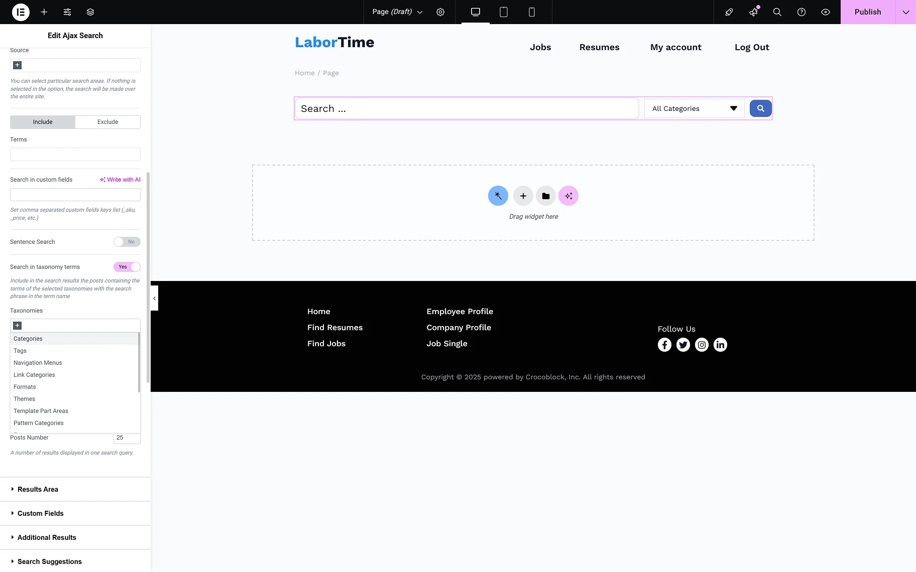
- Taxonomies — the required taxonomies can be selected from the dropdown for the category search. The How to Enable Search for Specific Taxonomies guide gives detailed information on the settings;
- Results Order By — from the dropdown list, one can select the way the results should be ordered. It is possible to order by “Relevance”, “ID”, “Author”, “Title”, “Date”, “Last modified” date, “Rand”, “Number of comments”, and “Menu order”;
- Results Order — from this dropdown, the ascending or descending order can be selected;
- Posts Per Page — reflects the number of results displayed on one search post page;
- Posts Number — allows to set the number of posts displayed in a search query.
In the Results Area tab, the following settings are presented:

- Listing — from this dropdown, the listing template that will be used as the search result template;
- Results Area Width — here, one can select the desired width of the results area: “by Search Form”, “by Input Box and Categories List”, or “Custom”. When the “Custom” is selected, the Custom Width field appears;
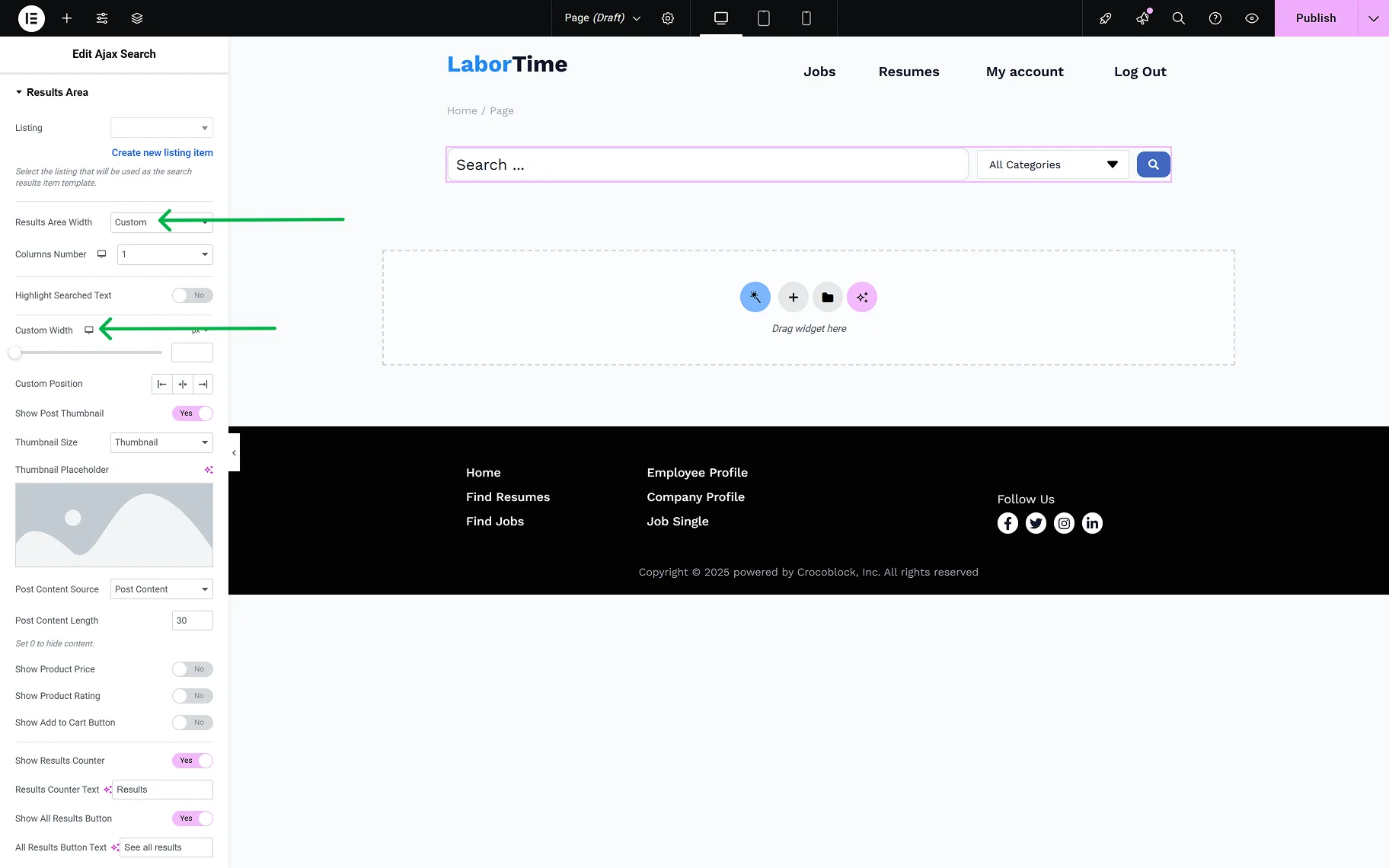
- Columns Number — allows selection of the number of columns in the results area from “1” to “10”;
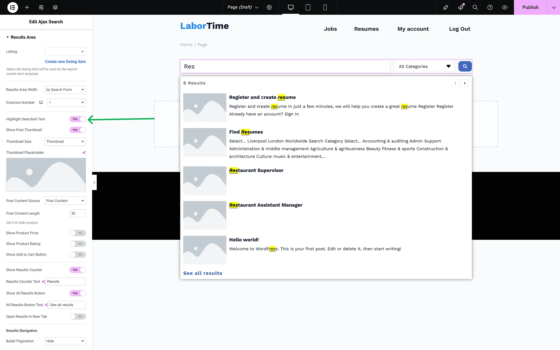
- Highlight Searched Text — when this toggle is enabled, the letters typed into the search field will be highlighted in the results area;
- Show Post Thumbnail — the toggle allows one to show or hide the thumbnails of the posts shown in the results area;
- Thumbnail Size — this dropdown is available when the Show Post Thumbnail toggle is on. It provides a common list of image sizes;
- Thumbnail Placeholder — the field is available when the Show Post Thumbnail toggle is on. The placeholder image can be set for the posts that do not have a thumbnail image set to be shown in the results area;
- Post Content Source — the dropdown provides a selection of places from which the content of the posts shown in the results area will be obtained: “Post Content”, “Post Excurpt”, or “Custom Field”. When the “Custom Field” option is selected, the Custom Field Key input appears;
- Post Content Length — in this input, the needed number of symbols can be set. When “0” is set, all the content will be hidden.
The following settings are useful if WooCommerce products are expected to be shown in the results area:
- Show Product Price — the toggle hides and shows the price of products shown in the results area;
- Show Product Rating — the toggle hides and shows the rating of products shown in the results area;
- Show Add to Cart Button — the toggle hides and shows the “Add to Cart” button for products shown in the results area.
The following settings allow customization of the results area:
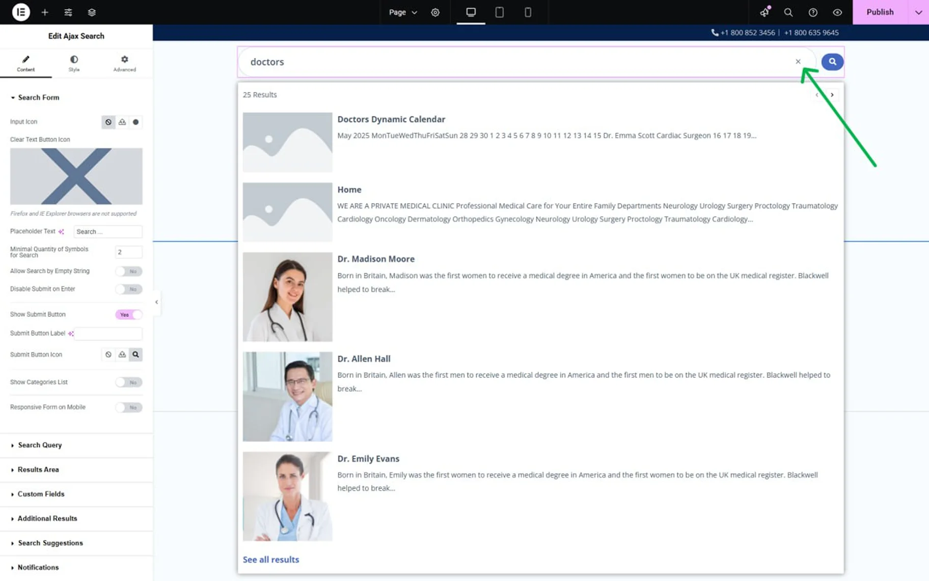
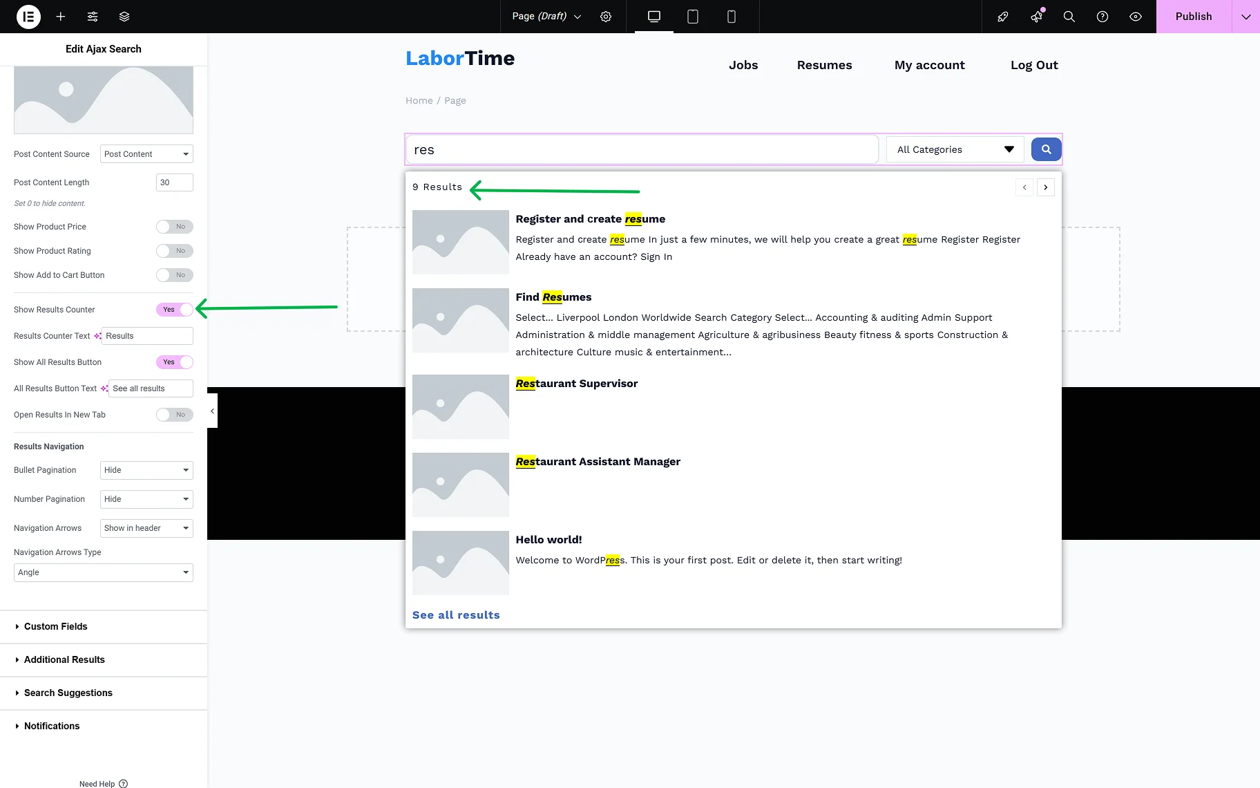
- Show Results Counter — the toggle adds the “results” counter label to the results area;
- Results Counter Text — the field becomes available when the Show Results Counter toggle is enabled. In the input, one can set the desired label;
- Show All Results Button — the toggle adds the “See all results” button to the results area, which redirects to the Results page;
- All Results Button Text — the field becomes available when the Show All Results Button toggle is on. In this input, the “See all results” button text can be changed;
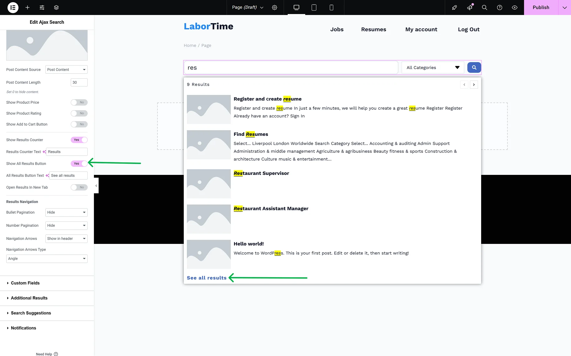
- Open Results in New Tab — the toggle allows opening the Results page in a new tab, after clicking the “See all results” button.
For the navigation in the results area, the following settings can be used:
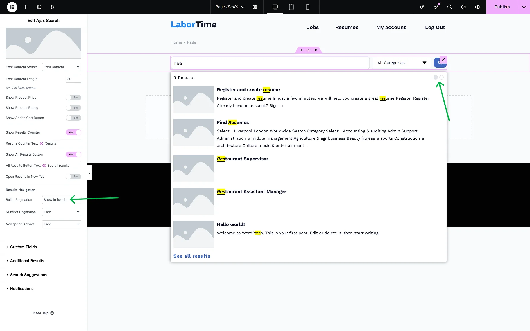
- Bullet Pagination — the dropdown provides a selection of the placement of the pagination icons (in the header or the results area, footer, or both) or hiding them;
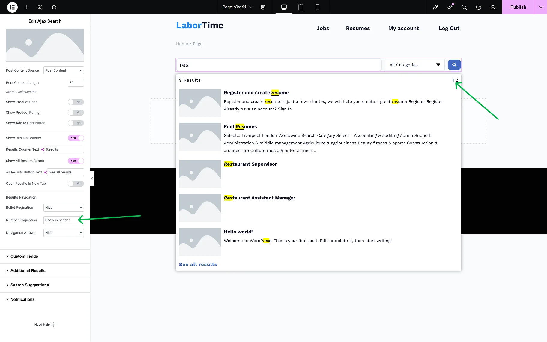
- Number Pagination — the dropdown provides a selection of the placement of the page numbers (in the header or the results area, footer, or both) or hiding them;
- Navigation Arrows — the dropdown provides a selection of the placement of the navigation arrows (in the header or the results area, footer, or both) or hiding them;
- Navigation Arrows Type — the dropdown is available when Navigation Arrows is selected. The desired arrow type can be selected from the dropdown.

The Custom Fields tab provides two toggles:
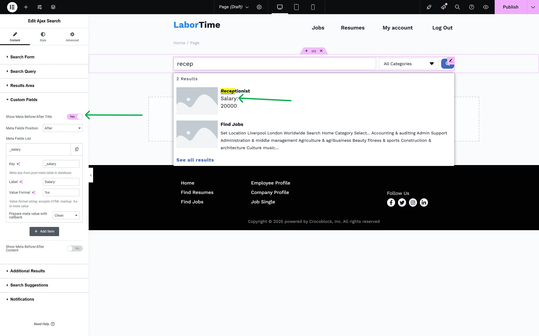
- Show Meta Before/After Title — the toggle allows extra information from the meta fields to be displayed in the search results before/after the post’s title. When the toggle is on, the following settings will appear:
- Meta Field Position — this is where the position of the meta field can be determined;
- Item #1 — the section appears by default, and can be customized as necessary by clicking it. The settings windows will show up;
- Key — in the field, the meta key from the post meta table in the database should be inserted;
- Label — the option allows defining the label text;
- Value Format — the string, where one can insert a value format (using HTML markup). The “%s” is used for a meta value;
- Prepare meta value with callback — option for the correct display of the date, URL, and images.
- Show Meta Before/After Content — the toggle allows extra information from the meta fields to be displayed in the search results before/after the post’s content. When the toggle is on, all the same settings appear for setting up the meta field.
In the Additional Results Overview guide, a detailed description of the Additional Results tab can be found. In this tab, one can set terms, users, or any Custom Post Type or Custom Content Type created on the site to display as additional results.
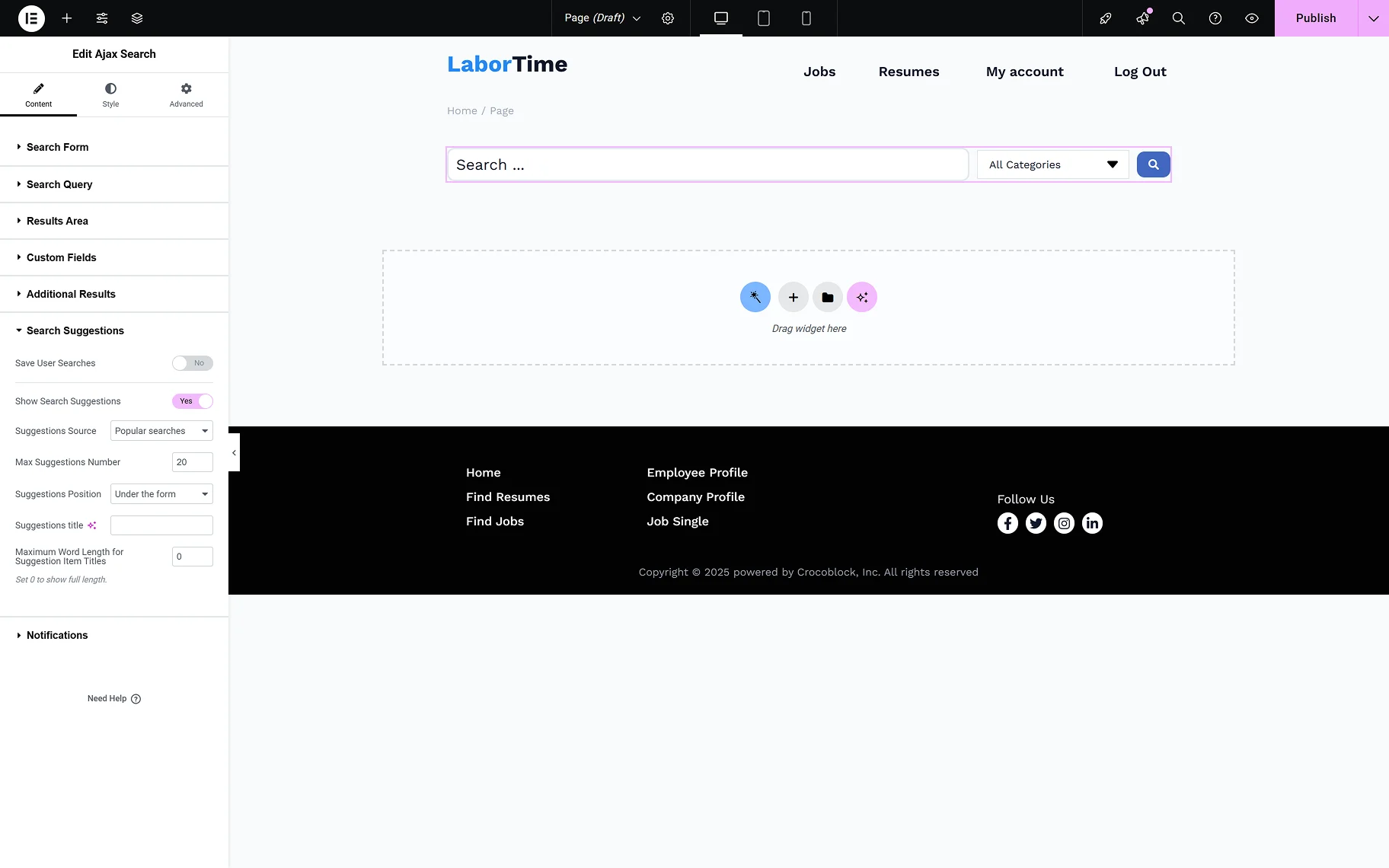
In the Search Suggestions tab, two toggles are presented:
- Save User Searches — the toggle enables users to save their entered searches;
- Show Search Suggestions — the toggle allows users to view Search Suggestions during their search. When the toggle is enabled, the following options become available:
- Suggestions Source — the dropdown provides a selection of the sources for suggestions: “Popular searches” and “User searches”;
- Max Suggestions Number — one can set the desired max number of suggestions shown while searching;
- Suggestions Position — the dropdown provides a selection of the positions for the suggestions shown while searching: “Under the form” or “Inside search results area”;
- Suggestions Title — the input allows typing in the needed title for the suggestions;
- Maximum Word Length for Suggestion Item Titles — in this field, one can set the needed maximum word length limit for the suggestion titles. When “0” is set, the full length will be shown.
In the Search Suggestions Overview guide, more information about the Search Suggestions feature can be found.
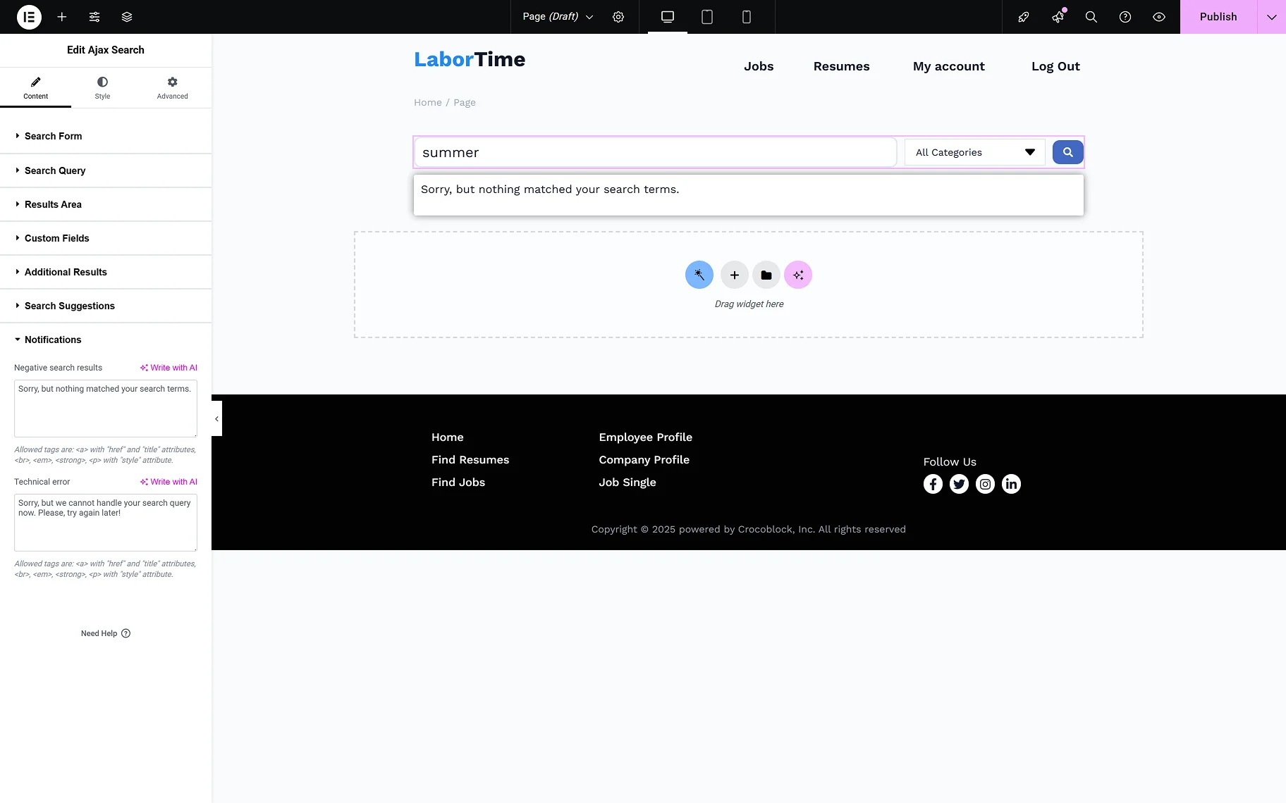
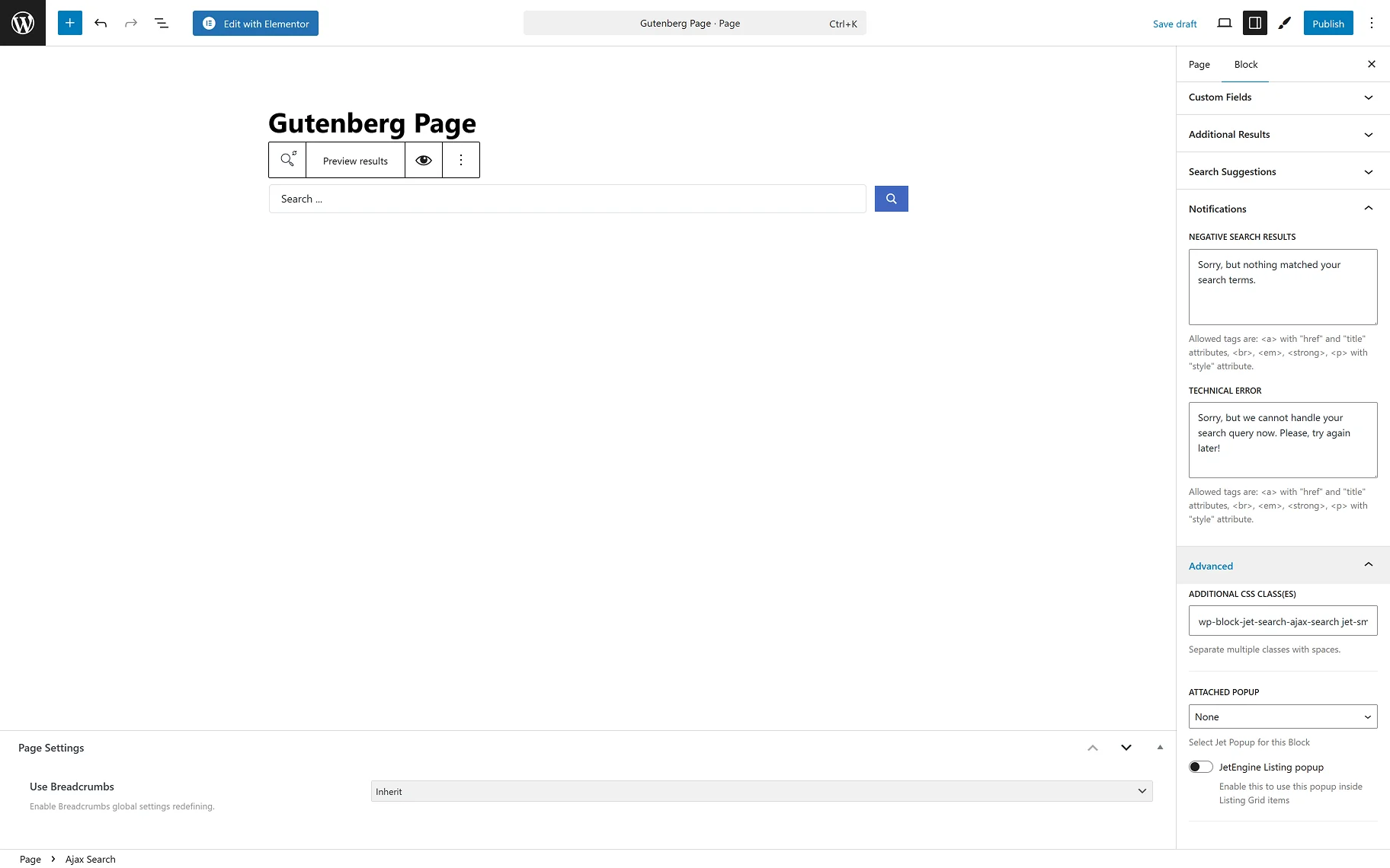
In the Notification tab, the following notifications’ text can be entered:
- Negative search results — enter the needed text for when no results are available;
- Technical error — enter the needed text for when the search query cannot be handled.
In the Style tab, the common Elementor style settings are available for each section of the Ajax Search widget.

AJAX Search Form Block in Gutenberg
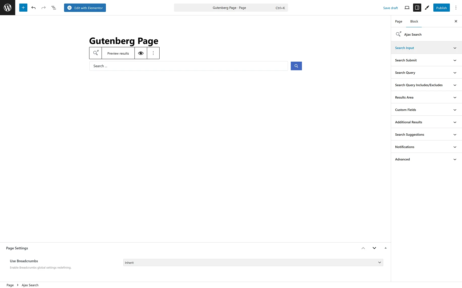
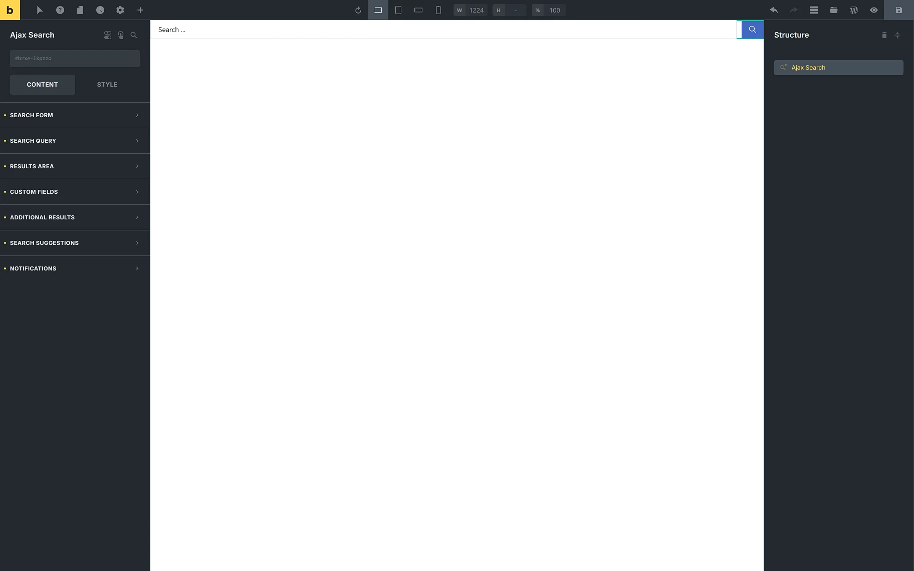
The Ajax Search block can be found among other blocks while editing a page in the Gutenberg (Blocks) builder. Let’s have a closer look at the block’s settings.
In the block settings section, the following tabs are presented: Search Input, Search Submit, Search Query, Search Query Includes/Excludes, Results Area, Custom Fields, Additional Results, Search Suggestions, and Notifications.
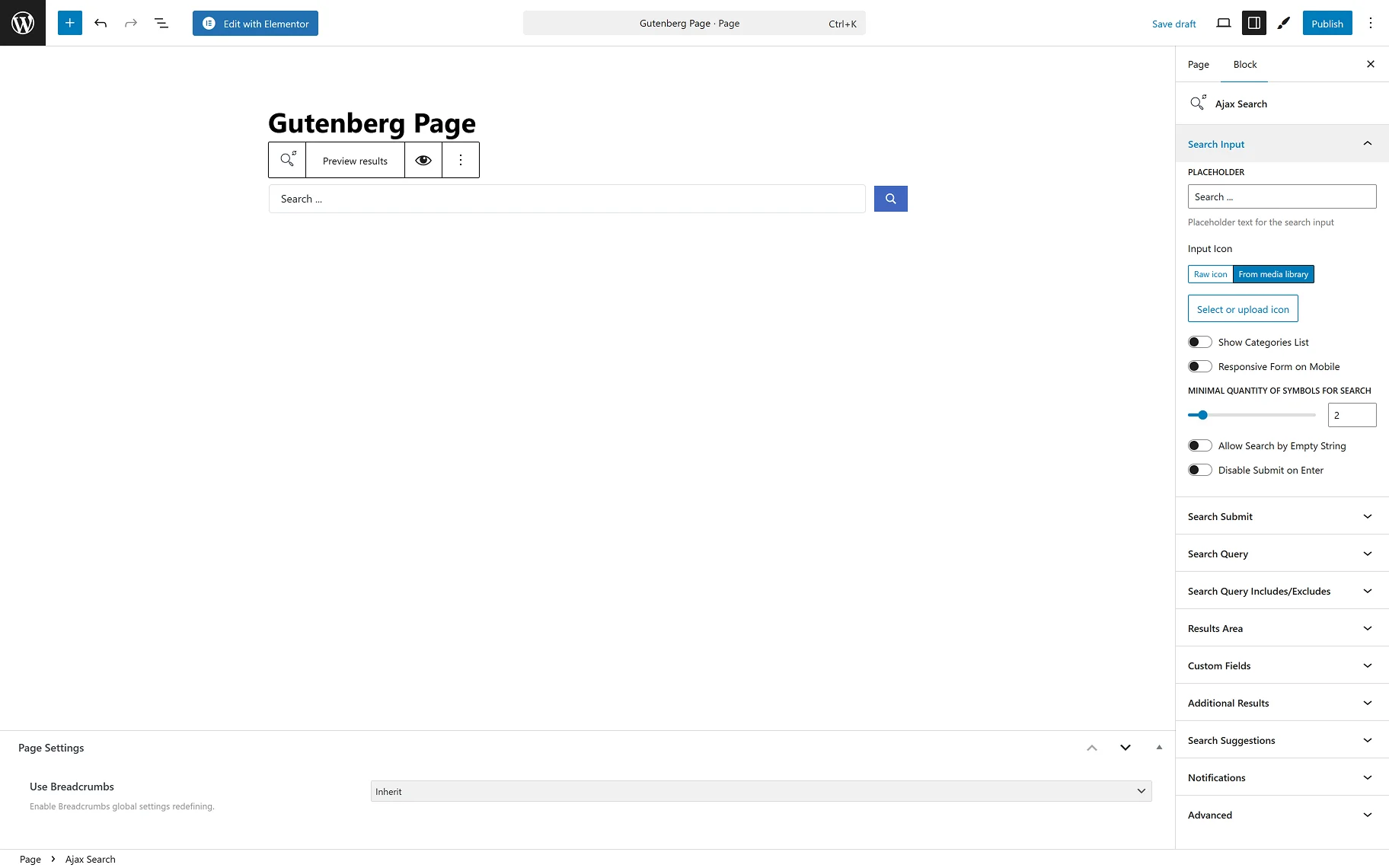
In the Search Input section, among the settings are:
- PLACEHOLDER — this is a field to type the text to be displayed in the search bar;
- Input Icon — the setting allows adding icons from the media library or SVG file and pasting raw SVG icon code;
- Show Categories List — the toggle specifies the scope of searching. If enabled, this option determines the taxonomies — WooCommerce product taxonomies specific to a site and custom taxonomies of the JetEngine plugin — to find the information the user needs;
- Responsive Form on Mobile — this toggle enables the responsiveness of the search form for mobile devices.
- MINIMAL QUANTITY OF SYMBOLS FOR SEARCH — in this input, the number of symbols required to start the search can be entered;
- Allow Search by Empty String — when this toggle is on, one can search even without entering anything. All the results will be displayed;
- Disable Submit on Enter — this toggle allows search only by clicking the “Submit” icon, but not by the “Enter” keyboard button.
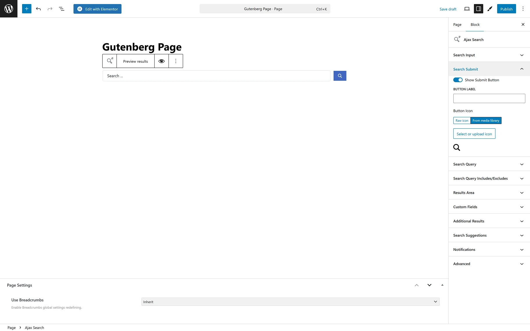
In the Search Submit tab, the following settings are presented:
- Show Submit Button — the toggle shows and hides the “Submit” button;
- BUTTON LABEL — in this input, the “Submit” button label can be changed;
- Submit Button Icon – this field allows one to select the icon for the “Submit” button.
In the Search Query tab, the same settings are presented as on the global Ajax Search Settings page. This helps one shorten the search results URL generated by this block.
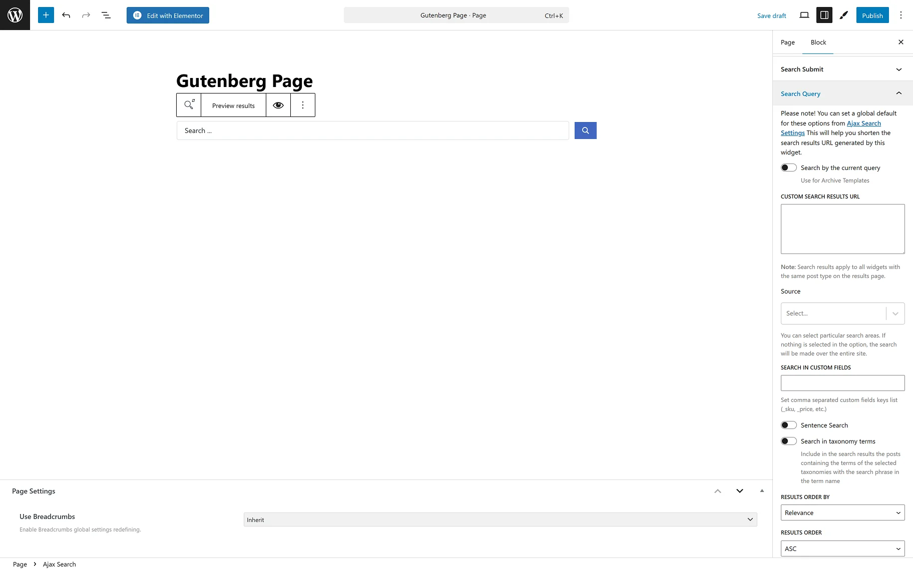
- Search by current query — the toggle can be used to conduct a search based on the current page context. This toggle should also be enabled for archive pages;
- CUSTOM SEARCH RESULTS URL — this input allows users to enter their desired custom search results URL. Search results apply to all blocks with the same post type on the results page;
- Source — this field provides the possible search areas. If nothing is selected in this option, the search will be made over the entire site. Refer to the How to Set the Search Only for Specific Post Types guide to learn more about the search source settings;
- SEARCH IN CUSTOM FIELDS — allows entering custom fields’ names, in which the search engine can also search. Separate custom fields’ names with commas;
- Sentence search — the toggle allows searching by the whole sentence, not just separate words;
- Search in taxonomy terms — include in the search results the posts containing the terms of the selected taxonomies with the search phrase in the term name. When the toggle is on, the Taxonomies field appears;
- Taxonomies — the required taxonomies can be selected from the dropdown for the category search. The How to Enable Search for Specific Taxonomies guide gives detailed information on the settings;
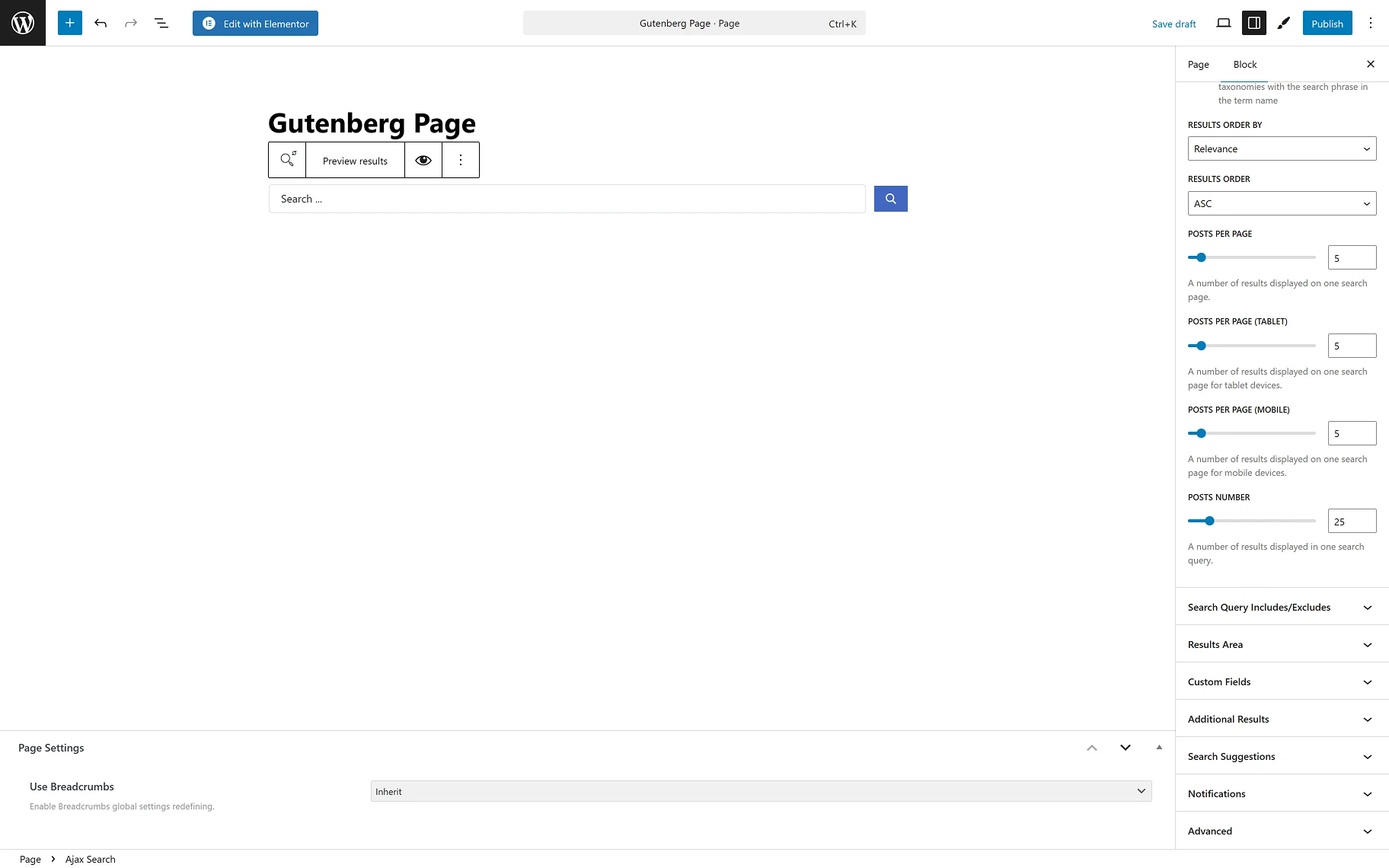
- RESULTS ORDER BY — from the dropdown list, one can select the way the results should be ordered. It is possible to order by “Relevance”, “ID”, “Author”, “Title”, “Date”, “Last modified” date, “Rand”, “Number of comments”, and “Menu order”;
- RESULTS ORDER — from this dropdown, the ascending or descending order can be selected;
- POSTS PER PAGE — reflects the number of results displayed on one search post page;
- POSTS PER PAGE (TABLET) — reflects the number of results displayed on one search page for tablet devices;
- POSTS PER PAGE (MOBILE) — reflects the number of results displayed on one search page for mobile devices;
- POSTS NUMBER — allows to set the number of posts displayed in a search query.
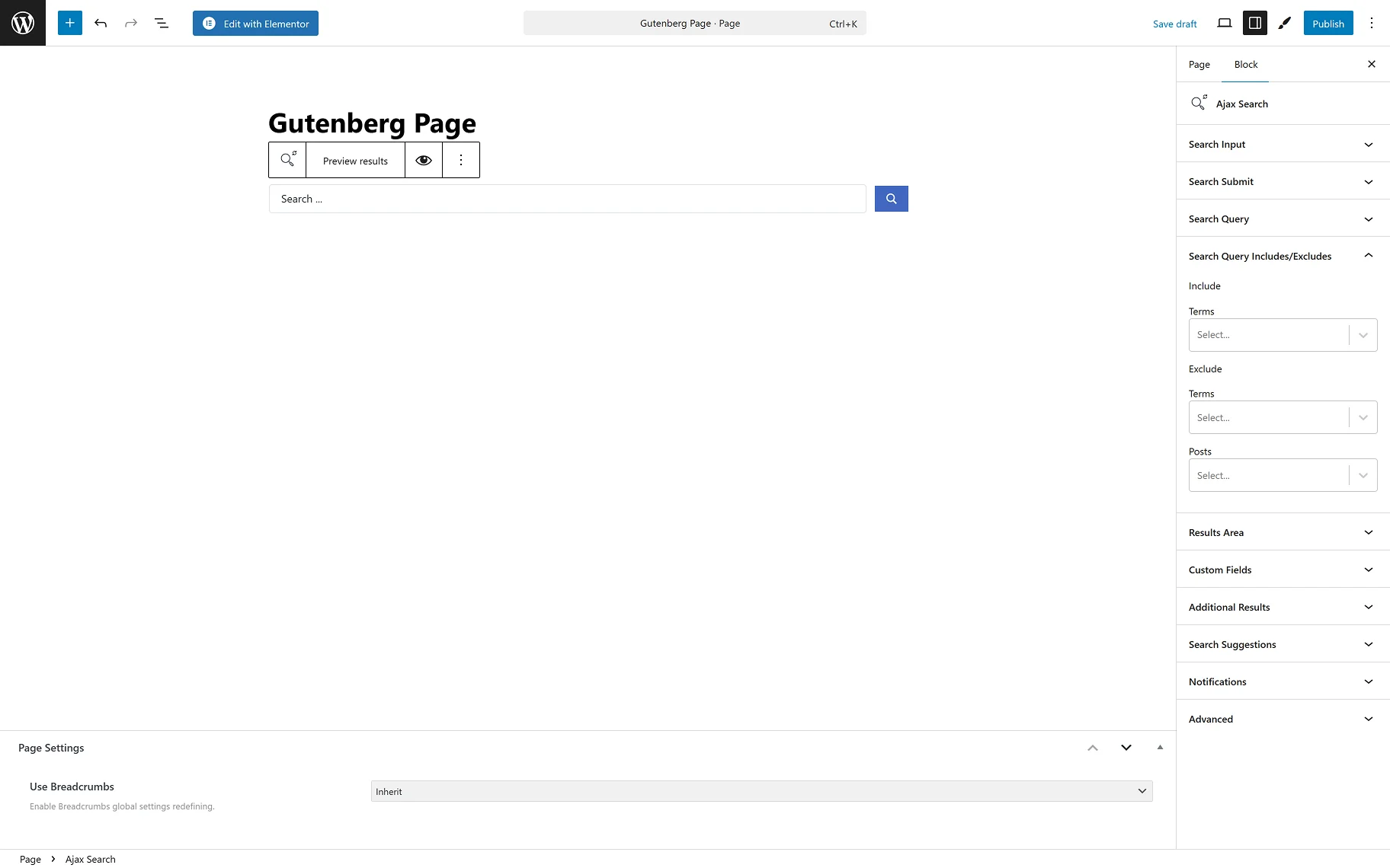
In the Search Query Includes/Excludes tab, one can select Terms to Include and Terms and Posts to Exclude from the search engine.
In the Results Area tab, the following settings are presented:
- LISTING — from this dropdown, the listing template that will be used as the search result template;
- RESULTS AREA WIDTH — the dropdown provides a selection of the possible width of the results area: “by Search Form”, “by Input Box and Categories List”, or “Custom”. When the “Custom” is selected, the CUSTOM WIDTH field appears;
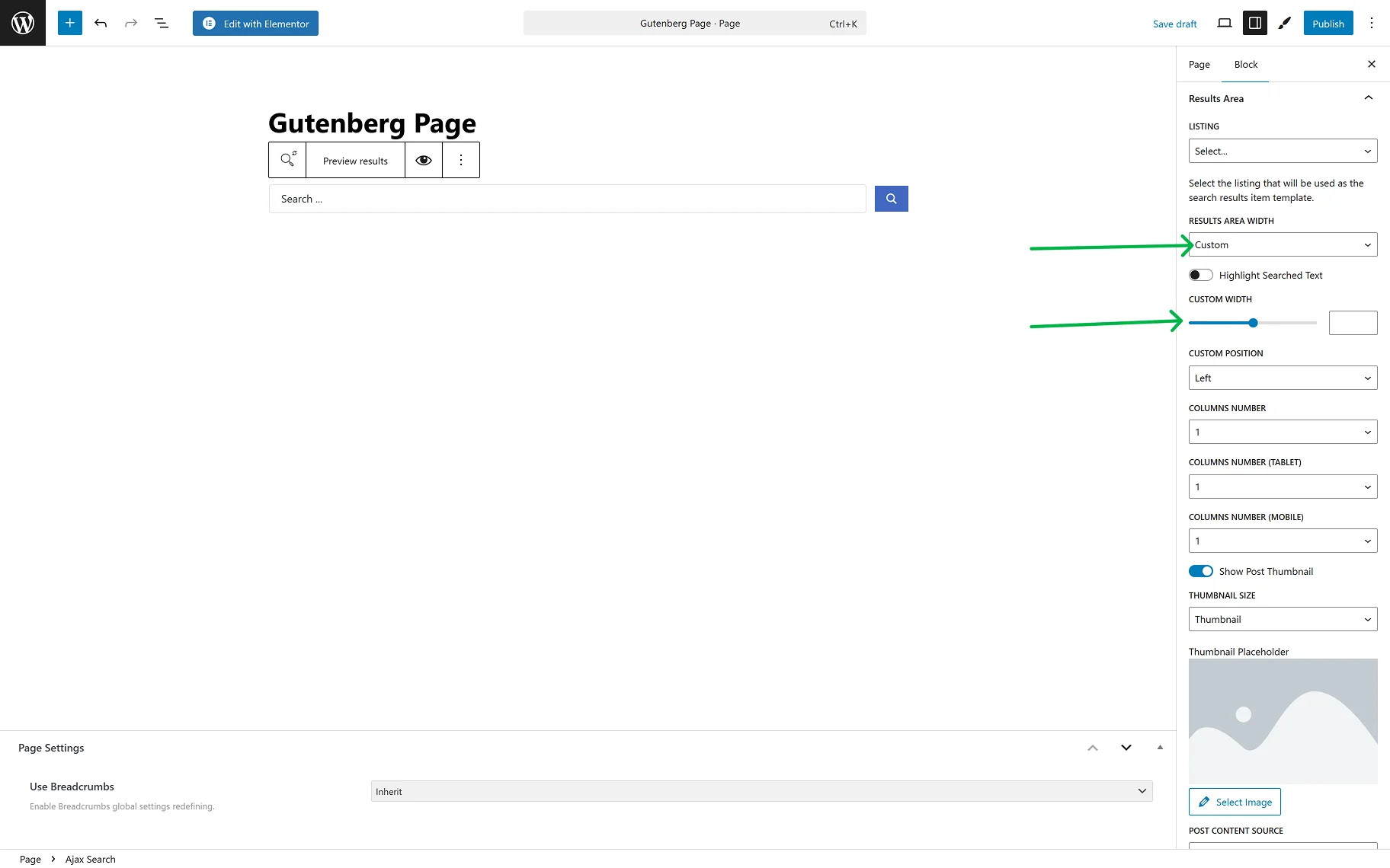
- Highlight Searched Text — when this toggle is enabled, the letters typed into the search field will be highlighted in the results area;
- COLUMNS NUMBER — allows selection of the number of columns in the results area from “1” to “10”;
- COLUMNS NUMBER (TABLET) — allows selection of the number of columns in the results area from “1” to “10” on one search page for tablet devices;
- COLUMNS NUMBER (MOBILE) — allows selection of the number of columns in the results area from “1” to “10” on one search page for mobile devices;
- THUMBNAIL SIZE — this dropdown provides a common list of image sizes;
- THUMBNAIL PLACEHOLDER — the placeholder image can be set for the posts that do not have a thumbnail image set to be shown in the results area;
- POST CONTENT SOURCE — the dropdown provides a selection of places from which the content of the posts shown in the results area will be obtained: “Post Content”, “Post Excurpt”, or “Custom Field”. When the “Custom Field” option is selected, the CUSTOM FIELD KEY input appears;
- POST CONTENT LENGTH — in this input, the needed number of symbols can be set. When “0” is set, all the content will be hidden.
The following settings are useful if WooCommerce products are expected to be shown in the results area:
- Show Product Price — the toggle hides and shows the price of products shown in the results area;
- Show Product Rating — the toggle hides and shows the rating of products shown in the results area;
- Show Add to Cart Button — the toggle hides and shows the “Add to Cart” button for products shown in the results area.
The following settings allow customization of the results area:
- Show Results Counter — the toggle adds the “results” counter label to the results area;
- RESULTS COUNTER TEXT — the field becomes available when the Show Results Counter toggle is enabled. In the input, one can set the desired label;
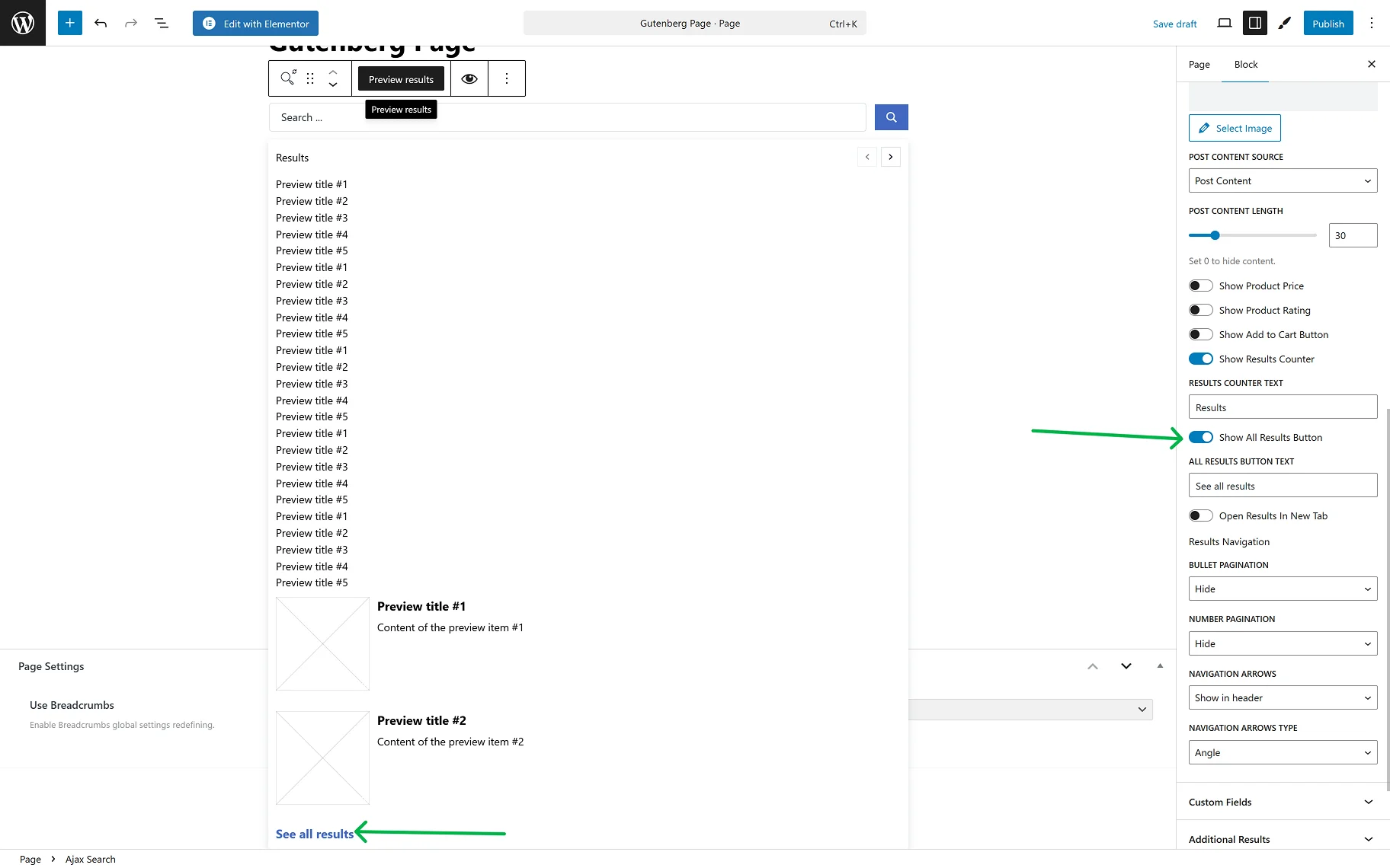
- Open Results in New Tab — the toggle allows opening the Results page in a new tab, after clicking the “See all results” button.
For the navigation in the results area, the following settings can be used:
- BULLET PAGINATION — the dropdown provides a selection of the placement of the pagination icons (in the header or the results area, footer, or both) or hiding them;

- NUMBER PAGINATION — the dropdown provides a selection of the placement of the page numbers (in the header or the results area, footer, or both) or hiding them;
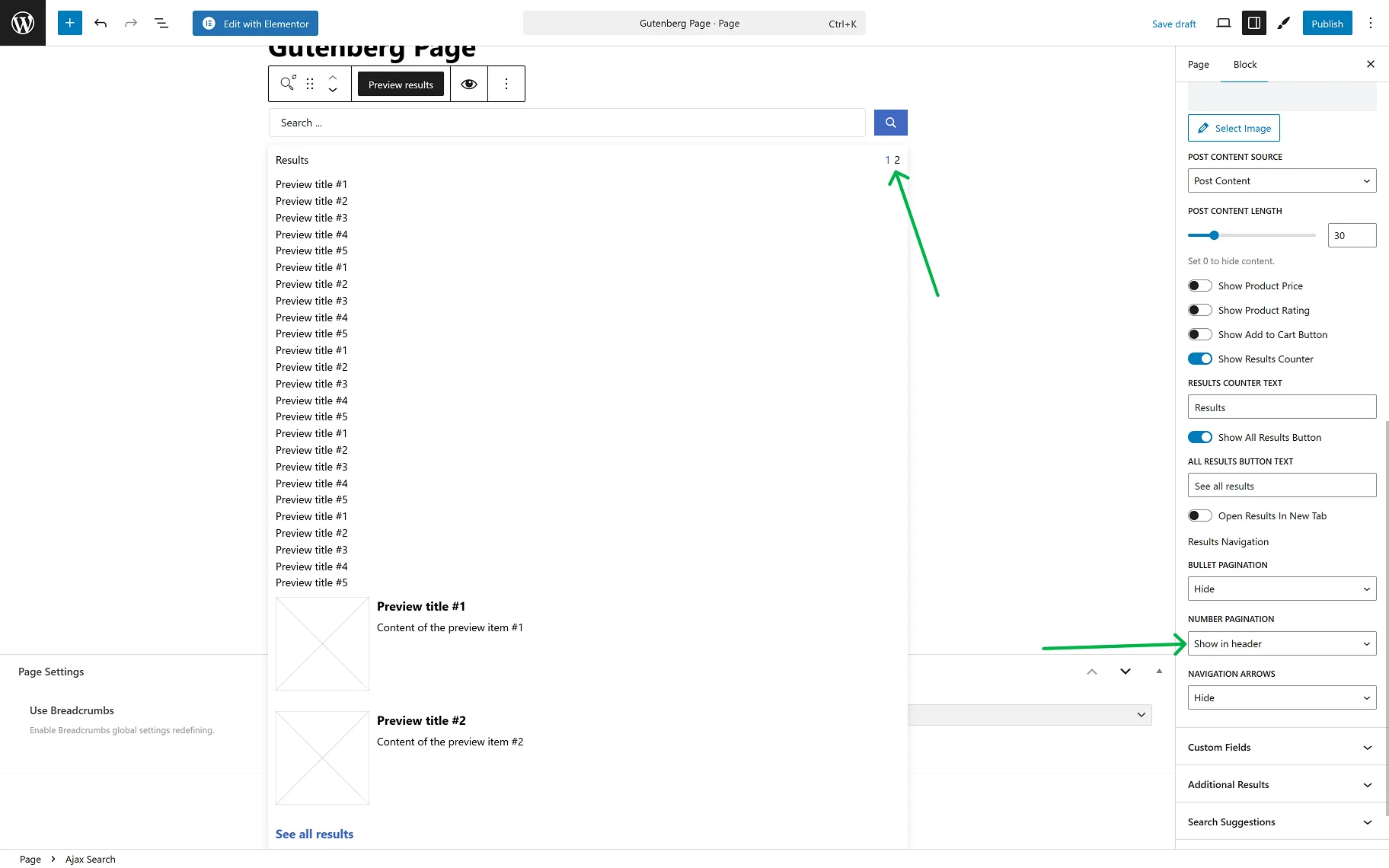
- NAVIGATION ARROWS — the dropdown provides a selection of the placement of the navigation arrows (in the header or the results area, footer, or both) or hiding them;
- NAVIGATION ARROWS TYPES — the dropdown is available when NAVIGATION ARROWS is selected. The desired arrow type can be selected from the dropdown.

The Custom Fields tab provides two toggles:
- Show Meta Before/After Title — the toggle allows displaying extra information from the meta fields in the search results before/after the post’s title;
- Show Meta Before/After Content — the toggle allows displaying extra information from the meta fields in the search results before/after the post’s content.
When any of these toggles is on, all the same settings appear for setting up the meta field:
- Meta Field Position — this is where the position of the meta field can be determined.
The Item appears after clicking the “Add new item” button and can be customized as necessary. The settings windows will show up:
- KEY — in the field, the meta key from the post meta table in the database should be inserted;
- LABEL — the option allows defining the label text;
- VALUE FORMAT — the string, where one can insert a value format (using HTML markup). The “%s” is used for a meta value;
- PREPARE META VALUE WITH CALLBACK — option for the correct display of the date, URL, and images.

In the Additional Results Overview guide, a detailed description of the Additional Results tab can be found. In this tab, one can set terms, users, or any created Custom Post Type or Custom Content Type on the site to display as additional results.
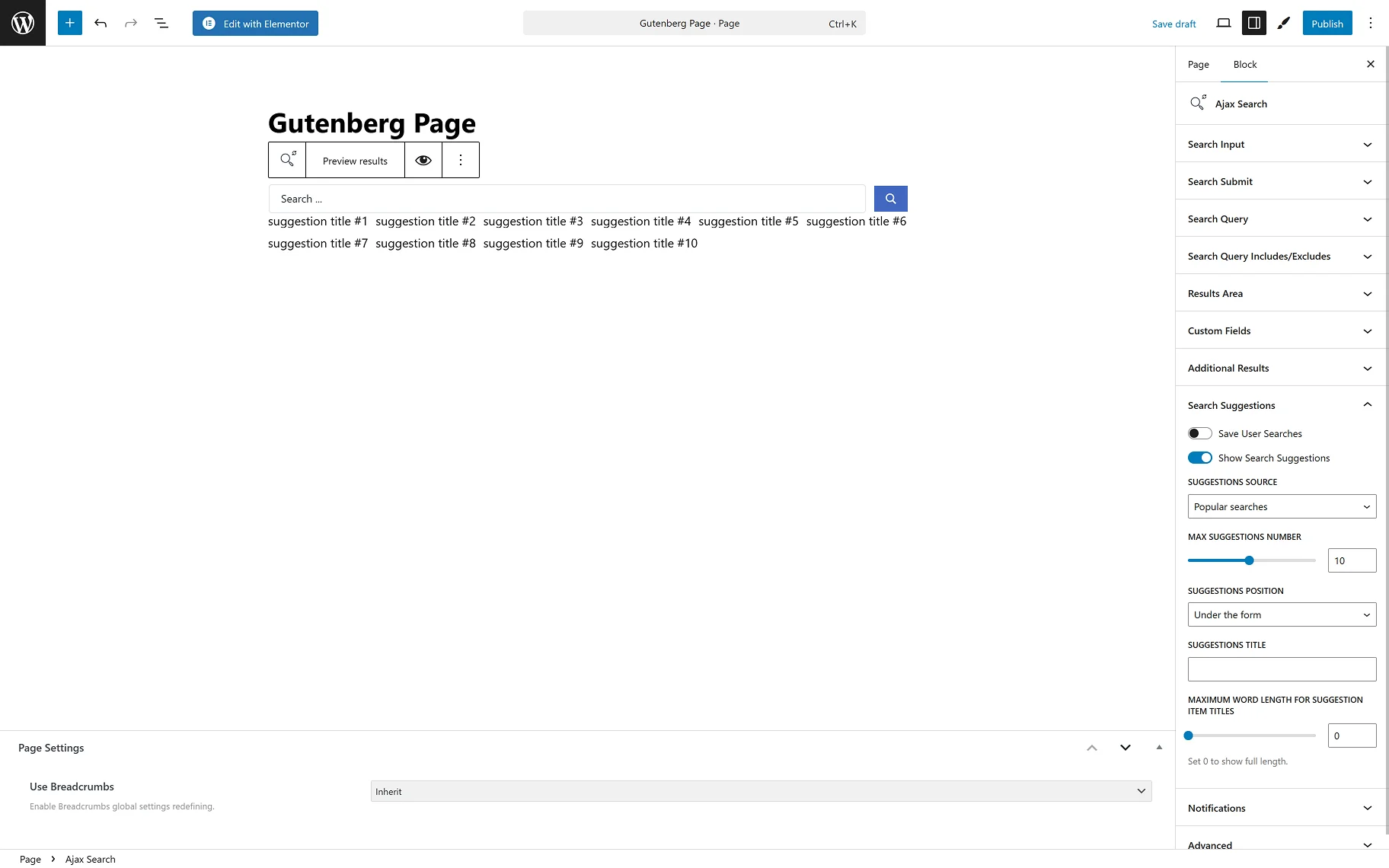
In the Search Suggestions tab, two toggles are presented:
- Save User Searches — the toggle enables users to save their entered searches;
- Show Search Suggestions — the toggle allows users to view Search Suggestions during their search. When the toggle is enabled, the following options become available:
- SUGGESTIONS SOURCE — the dropdown provides a selection of the sources for suggestions: “Popular searches” and “User searches”;
- MAX SUGGESTIONS NUMBER — one can set the desired max number of suggestions shown while searching;
- SUGGESTIONS POSITION — the dropdown provides a selection of the positions for the suggestions shown while searching: “Under the form” or “Inside search results area”;
- SUGGESTIONS TITLE — the input allows typing in the needed title for the suggestions;
- MAXIMUM WORD LENGTH FOR SUGGESTION ITEM TITLES — in this field, one can set the needed maximum word length limit for the suggestion titles. When “0” is set, the full length will be shown.
In the Search Suggestions Overview guide, more information about the Search Suggestions feature can be found.
In the Notification section, the following notifications’ text can be entered:
- NEGATIVE SEARCH RESULTS — enter the needed text for when no results are available;
- TECHNICAL ERROR — enter the needed text for when the search query cannot be handled.
AJAX Search Form Element in Bricks
The Ajax Search element can be found among other elements while editing a page in the Bricks builder.
In the CONTENT tab, the following sections are presented: Search Form, Search Query, Results Area, Custom Fields, Additional Results, Search Suggestions, and Notifications.
In the SEARCH FORM section, among the settings are:
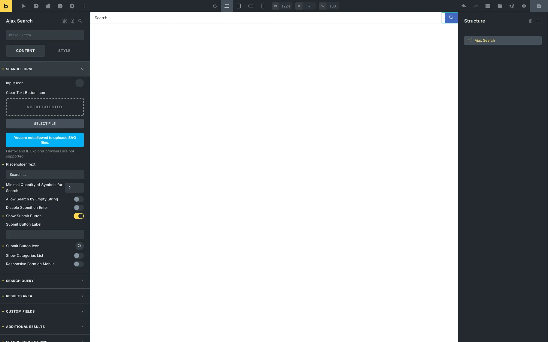
- Input Icon — this setting allows one to add an icon from a library or upload an SVG file;
- Placeholder Text — this is a field to type the text to be displayed in the search bar.
In the How to Customize the Placeholder Text Shown in the Search tutorial, more info can be found;
- Minimal Quantity of Symbold for Search — in this input, the number of symbols required to start the search can be entered;
- Allow Search by Empty String — when this toggle is on, one can search even without entering anything. All the results will be displayed;
- Disable Submit on Enter — this toggle allows search only by clicking the “Submit” icon, but not by the “Enter” keyboard button;
- Show Submit Button — the toggle shows and hides the “Submit” button;
- Submit Button Label — in this input, the “Submit” button label can be changed;
- Submit Button Icon – this field allows one to select the icon for the “Submit” button;
- Show Categories List — the toggle specifies the scope of searching. If enabled, this option determines the taxonomies — WooCommerce product taxonomies specific to a site and custom taxonomies of the JetEngine plugin — to find the information the user needs;
When the Show Categories List toggle is on, two more fields appear:
- Taxonomy — one can select the taxonomy whose categories will be shown in the dropdown;
- Select Placeholder — in this input, one can type the placeholder text for categories.
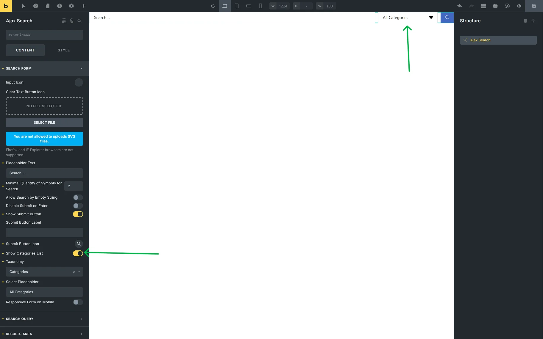
- Responsive Form on Mobile — this toggle enables the responsiveness of the search form for mobile devices.
In the SEARCH QUERY tab, the same settings are presented as on the global Ajax Search Settings page. This helps one shorten the search results URL generated by this element.
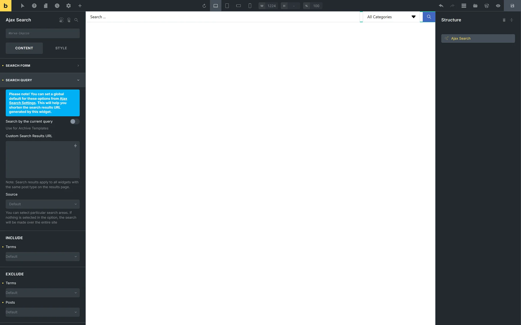
- Search by current query — the toggle can be used to conduct a search based on the current page context. This toggle should also be enabled for archive pages;
- Custom Search Results URL — this input allows users to enter their desired custom search results URL. Search results apply to all elements with the same post type on the results page;
- Source — this field provides the possible search areas. If nothing is selected in this option, the search will be made over the entire site. Refer to the How to Set the Search Only for Specific Post Types guide to learn more about the search source settings;
- Terms — the input allows one to include or exclude terms from the category search;
- Search in custom fields — allows entering custom fields’ names, in which the search engine can also search. Separate custom fields’ names with commas;
- Sentence search – the toggle allows searching by the whole sentence, not just separate words;
- Search in taxonomy terms — include in the search results the posts containing the terms of the selected taxonomies with the search phrase in the term name. When the toggle is on, the Taxonomies field appears.
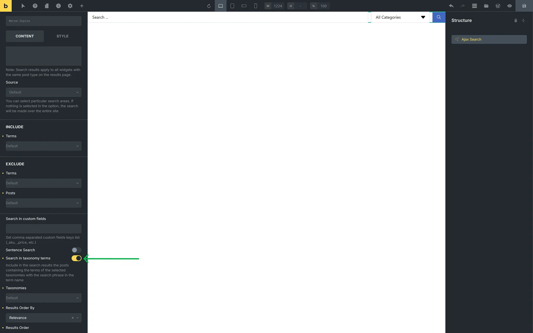
- Taxonomies — the required taxonomies can be selected from the dropdown for the category search. The How to Enable Search for Specific Taxonomies guide gives detailed information on the settings;
- Results Order By — from the dropdown list, one can select the way the results should be ordered. It is possible to order by “Relevance”, “ID”, “Author”, “Title”, “Date”, “Last modified” date, “Rand”, “Number of comments”, and “Menu order”;
- Results Order — from this dropdown, the ascending or descending order can be selected;
- Posts Per Page — reflects the number of results displayed on one search post page;
- Posts Number — allows to set the number of posts displayed in a search query.
In the RESULTS AREA tab, the following settings are presented:
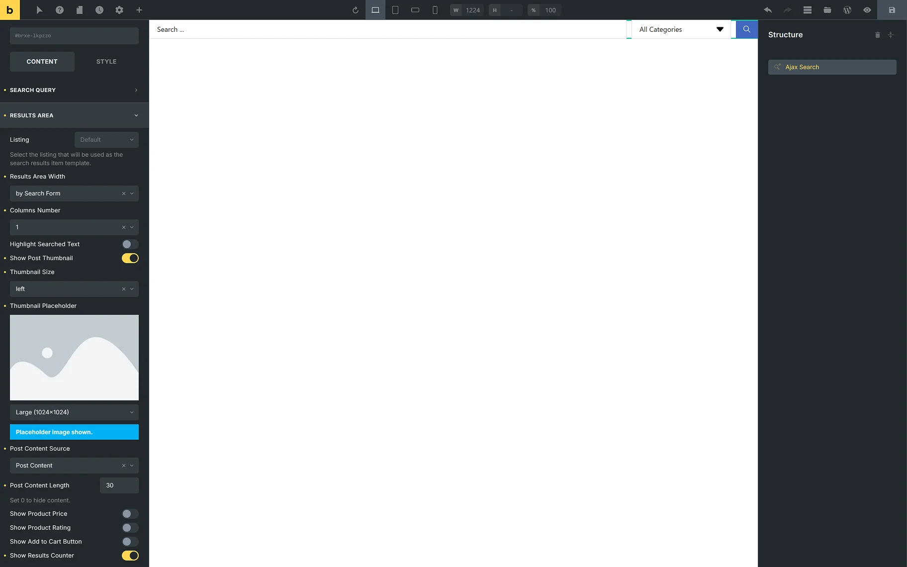
- Listing — from this dropdown, the listing template that will be used as the search result template;
- Results Area Width — here, one can select the desired width of the results area: by Search Form”, or “by Input Box and Categories List”, or “Custom”. When “Custom” is selected, the Custom Width field appears;
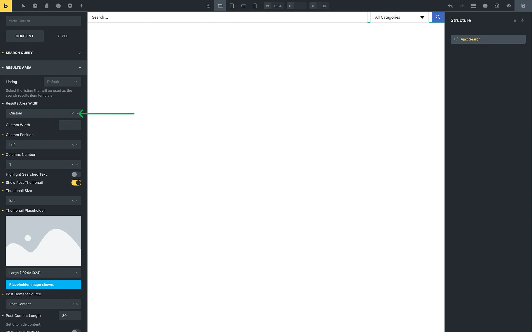
- Columns Number — allows selection of the number of columns in the results area from “1” to “10”;
- Highlight Searched Text — when this toggle is enabled, the letters typed into the search field will be highlighted in the results area;
- Show Post Thumbnail — the toggle allows one to show or hide the thumbnails of the posts shown in the results area;
- Thumbnail Size — this dropdown is available when the Show Post Thumbnail toggle is on. It provides a common list of image sizes;
- Thumbnail Placeholder — the field is available when the Show Post Thumbnail toggle is on. The placeholder image can be set for the posts that do not have a thumbnail image set to be shown in the results area;
- Post Content Source — the dropdown provides a selection of places from which the content of the posts shown in the results area will be obtained: “Post Content”, “Post Excurpt”, or “Custom Field”. When the “Custom Field” option is selected, the Custom Field Key input appears;
- Post Content Length — in this input, the needed number of symbols can be set. When “0” is set, all the content will be hidden.
The following settings are useful if WooCommerce products are expected to be shown in the results area:
- Show Product Price — the toggle hides and shows the price of products shown in the results area;
- Show Product Rating — the toggle hides and shows the rating of products shown in the results area;
- Show Add to Cart Button — the toggle hides and shows the “Add to Cart” button for products shown in the results area.
The following settings allow customization of the results area:
- Show Results Counter — the toggle adds the “results” counter label to the results area;
- Results Counter Text — the field becomes available when the Show Results Counter toggle is enabled. In the input, one can set the desired label;
- Show All Results Button — the toggle adds the “See all results” button to the results area, which redirects to the Results page;
- All Results Button Text — the field becomes available when the Show All Results Button toggle is on. In this input, the “See all results” button text can be changed;
- Open Results in New Tab — the toggle allows opening the Results page in a new tab, after clicking the “See all results” button.

For the navigation in the results area, the following settings can be used:
- Bullet Pagination — the dropdown provides a selection of the placement of the pagination icons (in the header or the results area, footer, or both) or hiding them;
- Number Pagination — the dropdown provides a selection of the placement of the page numbers (in the header or the results area, footer, or both) or hiding them;
- Navigation Arrows — the dropdown provides a selection of the placement of the navigation arrows (in the header or the results area, footer, or both) or hiding them;
- Navigation Arrows Type — the dropdown is available when Navigation Arrows is selected. The desired arrow type can be selected from the dropdown.
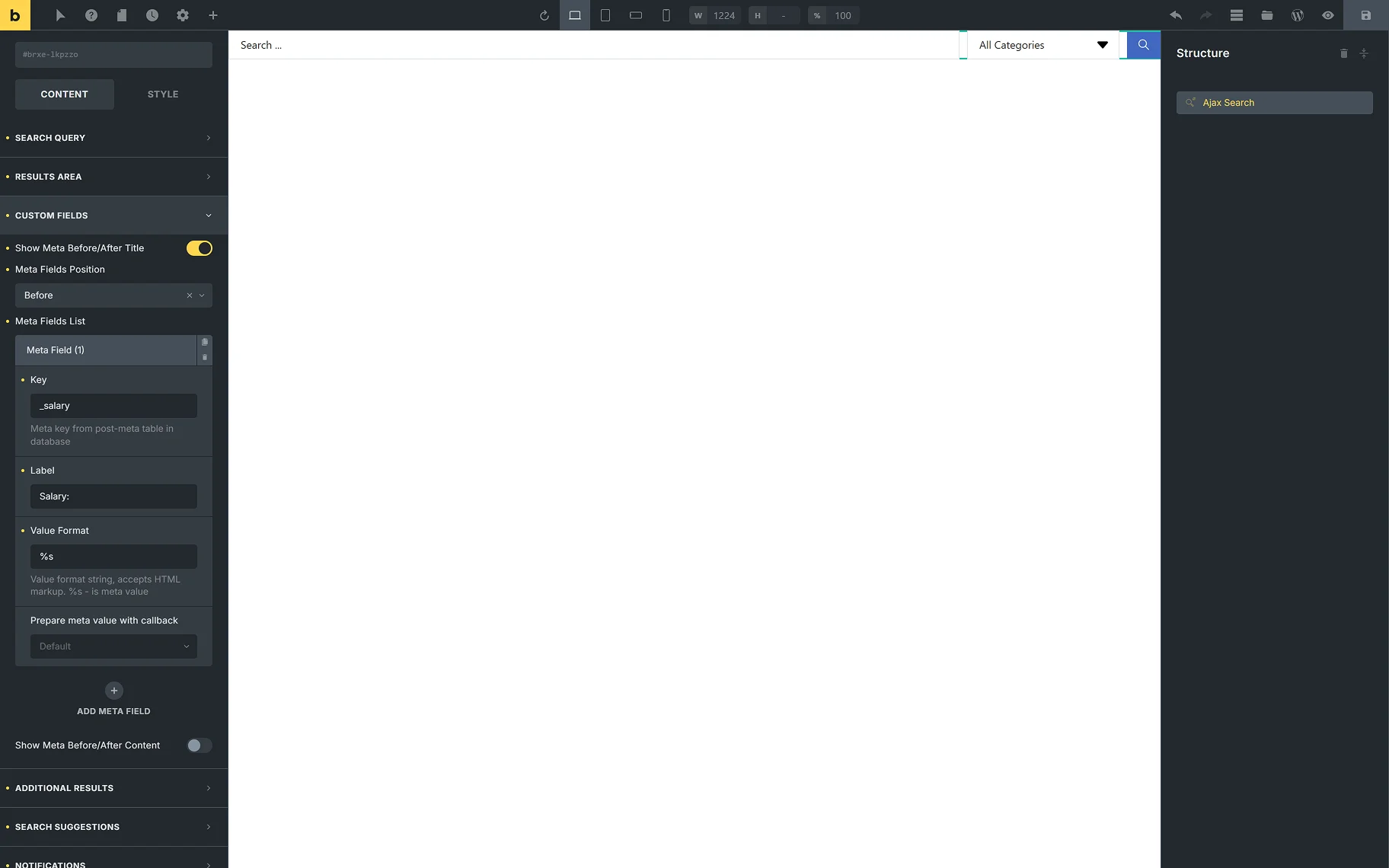
The CUSTOM FIELDS tab provides two toggles:
- Show Meta Before/After Title — the toggle allows displaying extra information from the meta fields in the search results before/after the post’s title. When the toggle is on, the following settings will appear:
- Meta Field Position — this is where the position of the meta field can be determined;
- Meta Fields List — the section appears by default, and can be customized as necessary by clicking it. The settings windows will show up;
- Key — in the field, the meta key from the post meta table in the database should be inserted;
- Label — the option allows defining the label text;
- Value Format — the string, where one can insert a value format (using HTML markup). The “%s” is used for a meta value;
- Prepare meta value with callback — option for the correct display of the date, URL, and images;
- ADD META FIELD — this button can be clicked to add another meta field before/after the title.
- Show Meta Before/After Content — the toggle allows displaying extra information from the meta fields in the search results before/after the post’s content. When the toggle is on, all the same settings appear for setting up the meta field.
In the Additional Results Overview guide, a detailed description of the ADDITIONAL RESULTS tab can be found. In this tab, one can set terms, users, or any Custom Post Type or Custom Content Type created on the site to display as additional results.
In the SEARCH SUGGESTIONS tab, two toggles are presented:
- Save User Searches — the toggle enables users to save their entered searches;
- Show Search Suggestions — the toggle allows users to view Search Suggestions during their search. When the toggle is enabled, the following options become available:
- Suggestions Source — the dropdown provides a selection of the sources for suggestions: “Popular searches” and “User searches”;
- Max Suggestions Number — one can set the desired max number of suggestions shown while searching;
- Suggestions Position — the dropdown provides a selection of the positions for the suggestions shown while searching: “Under the form” or “Inside search results area”;
- Suggestions Title — the input allows typing in the needed title for the suggestions;
- Maximum Word Length for Suggestion Item Titles — in this field, one can set the needed maximum word length limit for the suggestion titles. When “0” is set, the full length will be shown.

In the Search Suggestions Overview guide, more information about the Search Suggestions feature can be found.
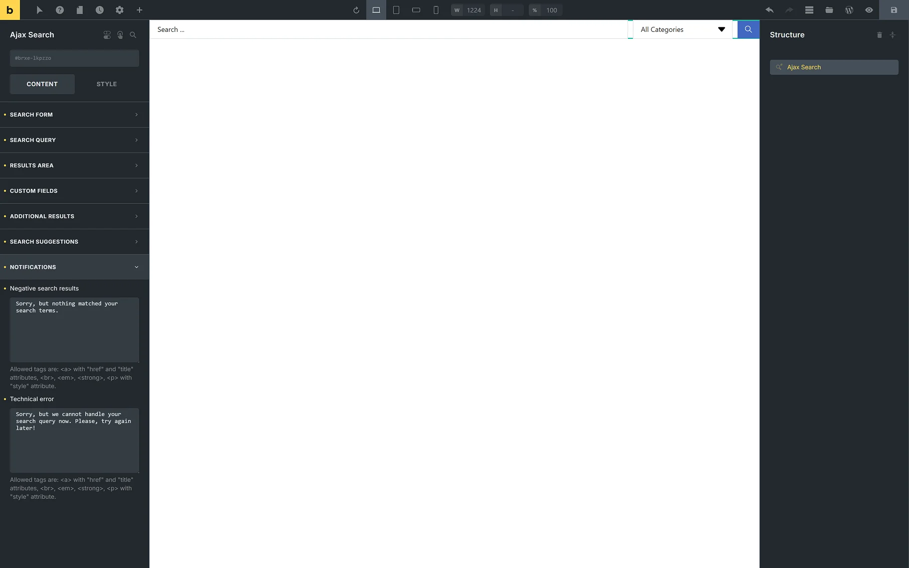
In the NOTIFICATIONS tab, the following notifications’ text can be entered:
- Negative search results — enter the needed text for when no results are available;
- Technical error — enter the needed text for when the search query cannot be handled.
In the STYLE tab, the common Bricks style settings are available for each section of the Ajax Search element.
That’s all about the Ajax Search JetSearch widget/block/element settings in different page builders.