How to Reuse the Created Component
Learn how to create and reuse components (templates that allow content changes while keeping the design and structure) using the JetEngine WordPress plugin, manage their settings, and display them on pages.
Before you start, check the tutorial requirements:
- Elementor (Free version)
- JetEngine plugin installed and activated with CPT with meta fields created
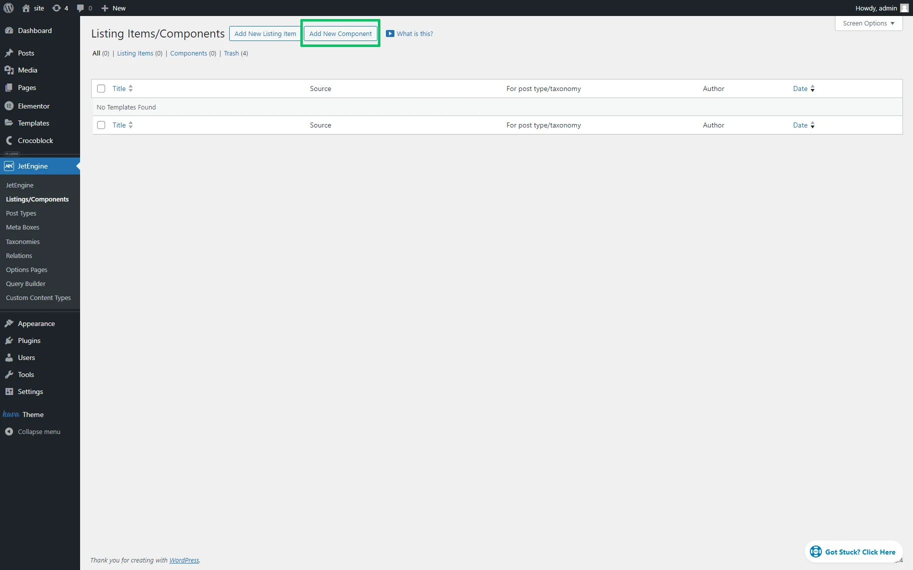
Create a Component
Navigate to the WordPress Dashboard > JetEngine > Listings/Components tab. Press the “Add New Component” button to create a new component.
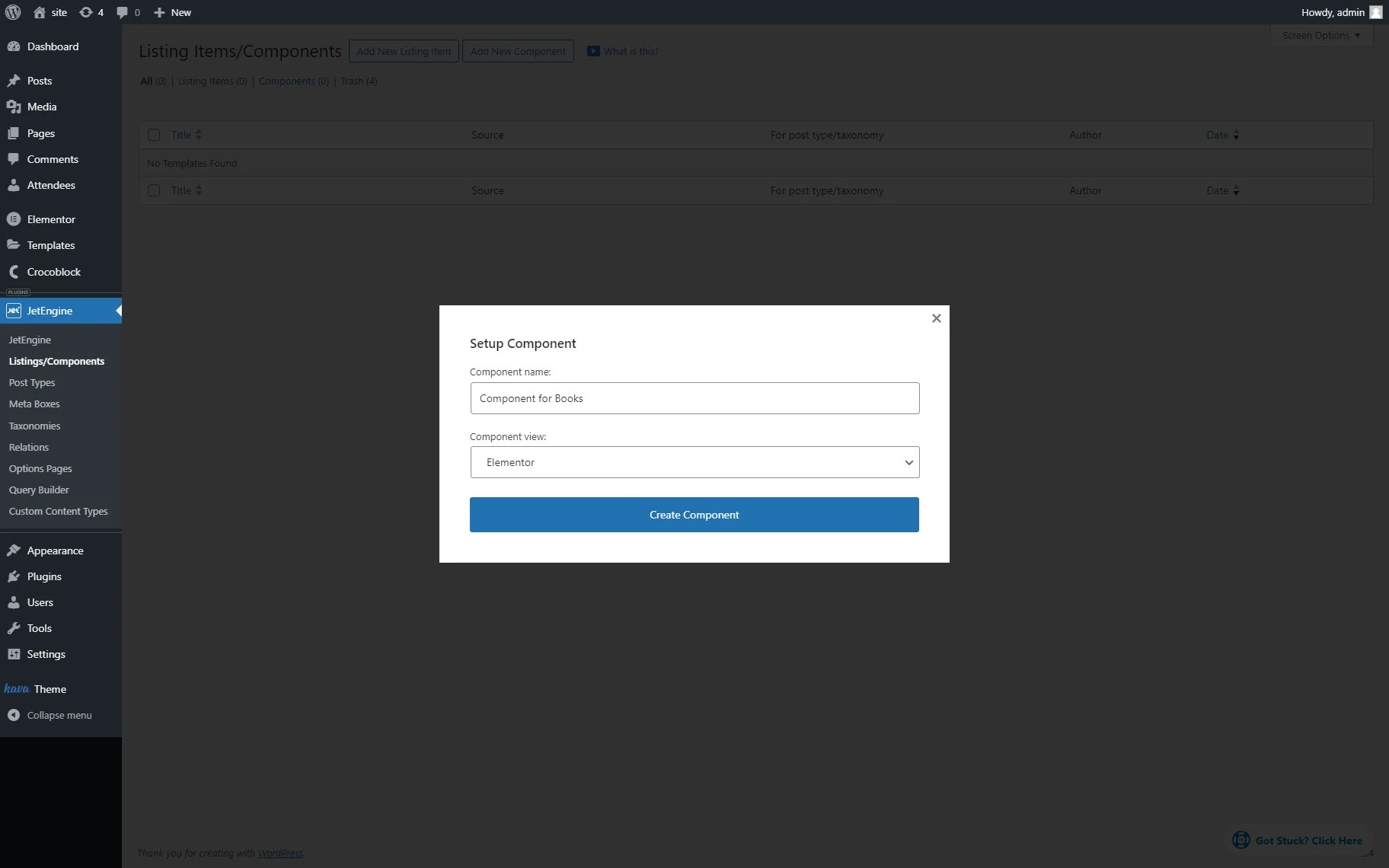
Fill in the Setup Component pop-up fields: type the Component name in the appropriate field and select the editor in the Component view drop-down list.
Here, we set the “Component for Books” Component name and chose “Elementor” as the Component view.
Adjust the Settings of the Component
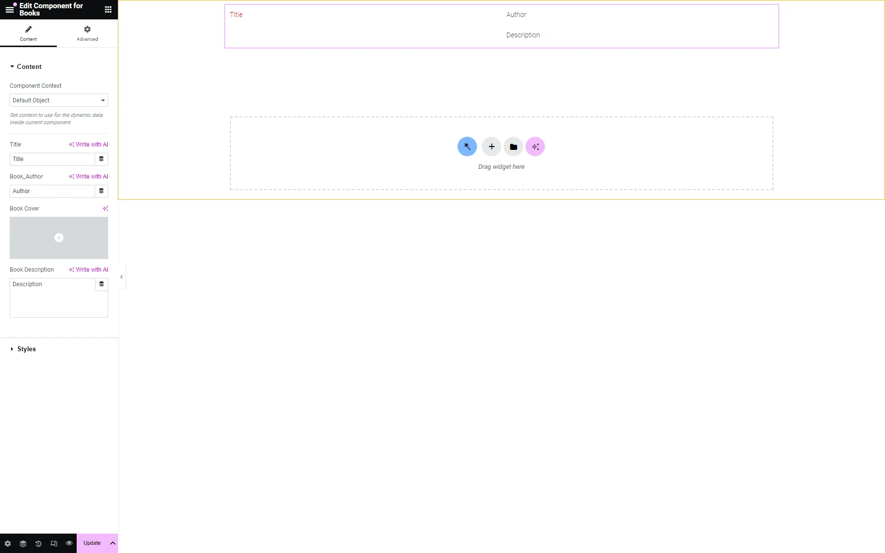
In the given case, we created the component that displays the post title and the “Author,” “Cover,” and “Description” meta fields of the pre-created “Books” Custom Post Type. Therefore, we set three controls, each for the appropriate widget.
The Custom Meta Fields Overview tutorial details how to create the meta fields.
The How to Create Custom Post Types in WordPress tutorial details all features of CPT creation.
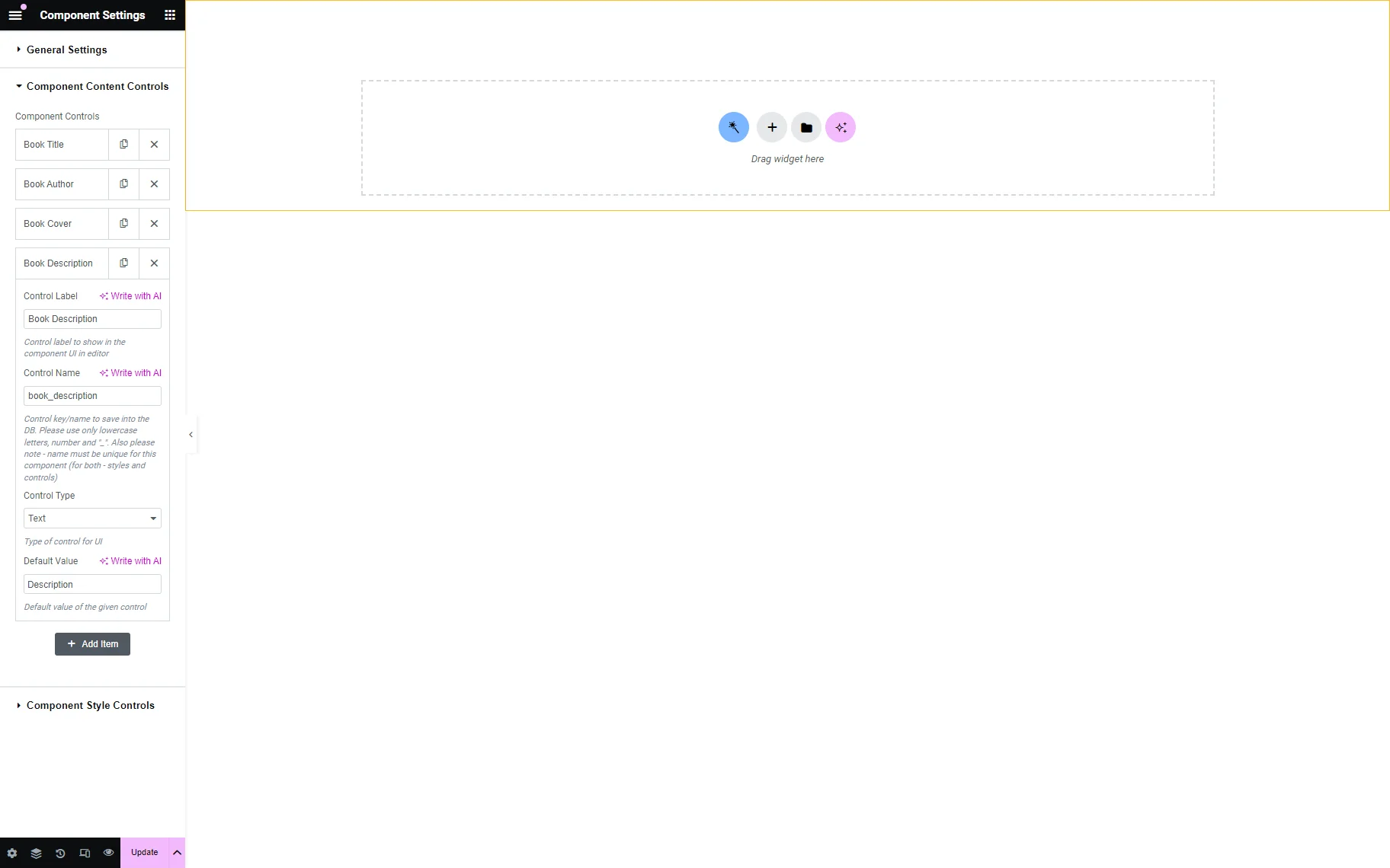
We navigated to the bottom left corner of the opened component page, pressed the “gear” icon to unroll the Component Settings tab, and moved to the Component Content Controls block.
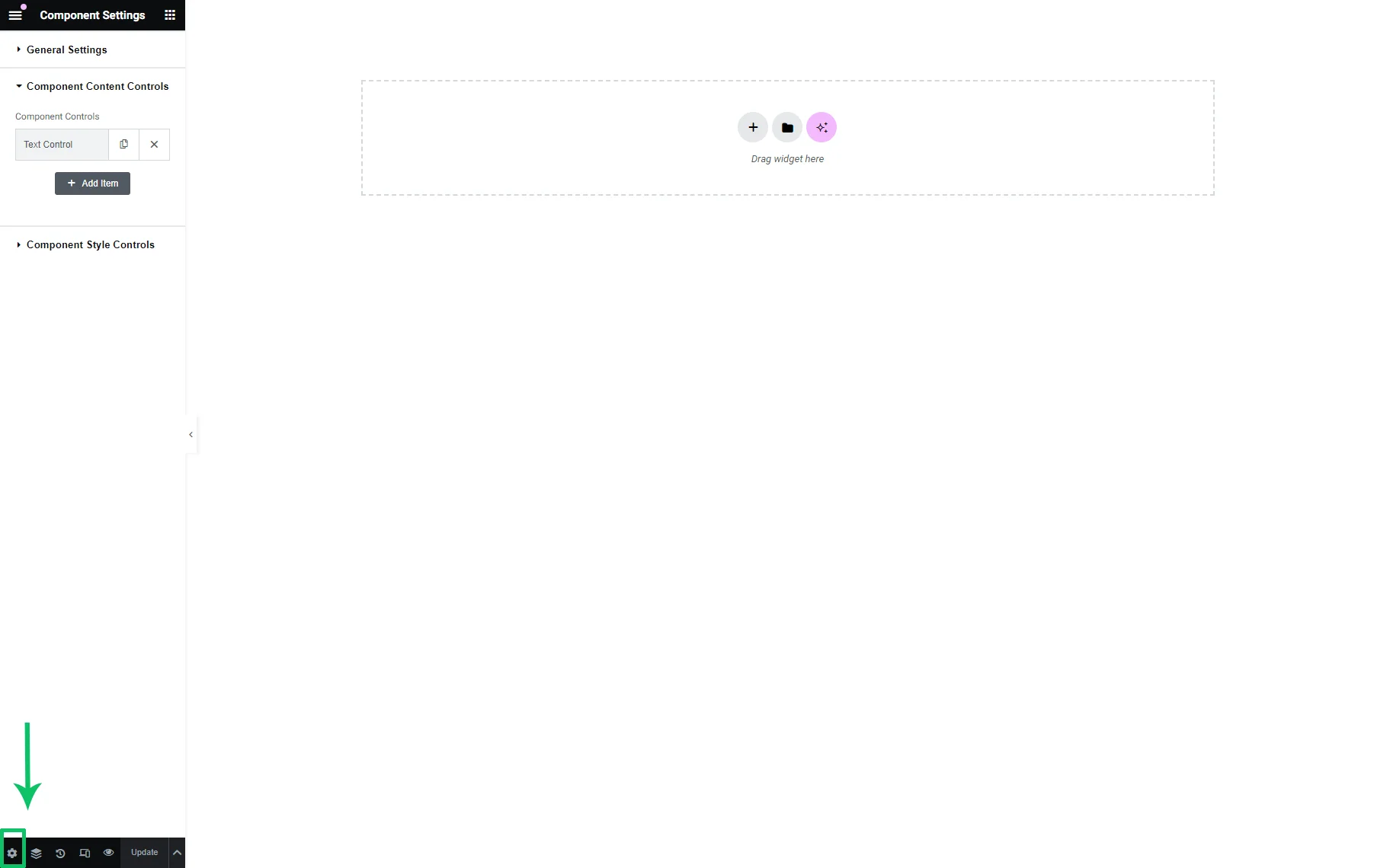
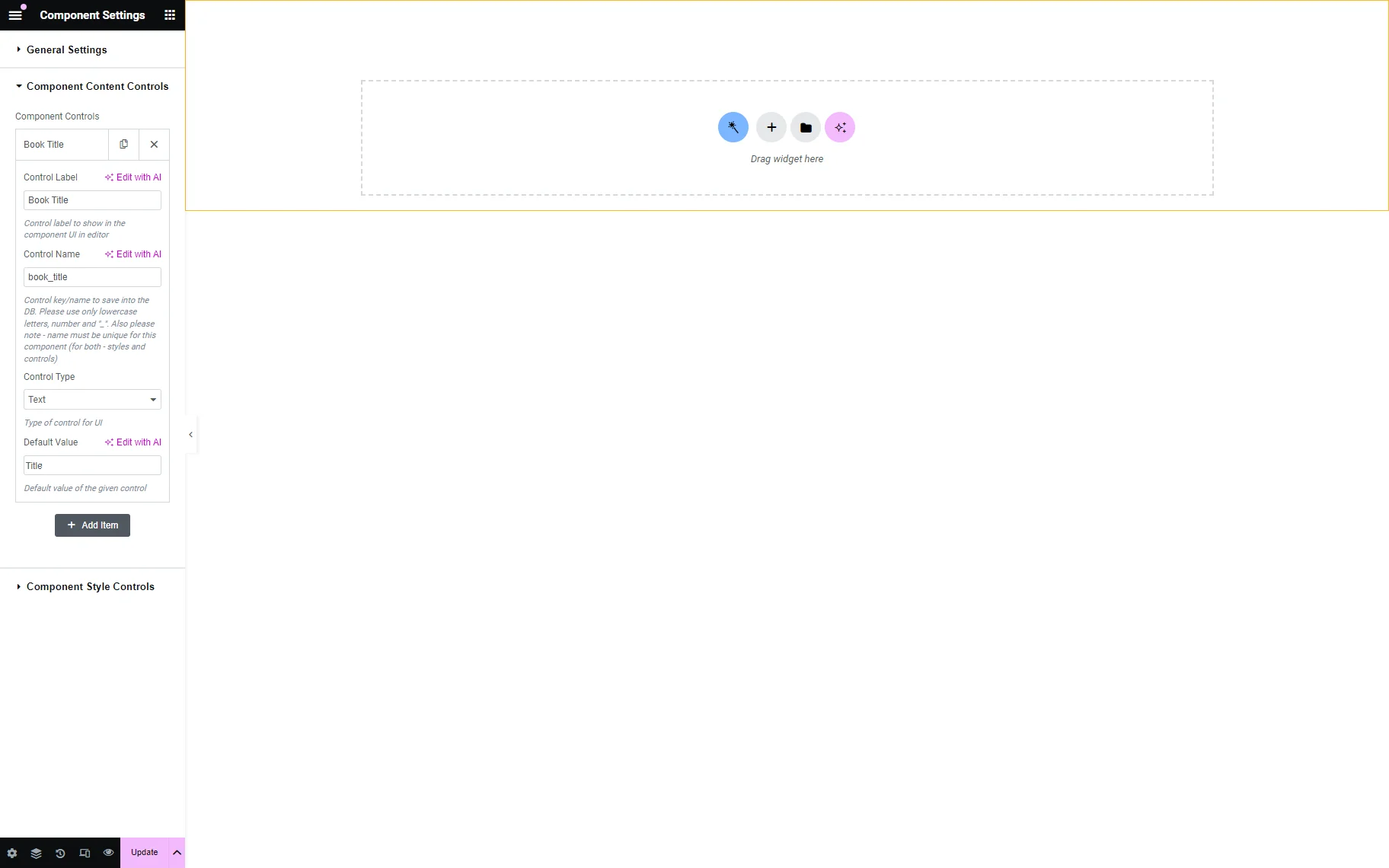
Press the “Text Control” tab to unroll its settings. Then, complete the Control Label and Control Name text fields, select its type in the Control Type drop-down list, and set the Default Value. To add another control, press the “Add Item” button.
Here, we set the following settings for a widget that will be added to display the post title: typed the “Title” text in the Control Label, the “title” in the Control Name text fields; selected the “Text” option in the Control Type drop-down list, and then typed the “Title” text in the Default Value text field.
To add controls for other widgets, press the “Add Item” button.
For instance, we set the following controls:
- To display the “Author” meta field via the Dynamic Field widget, we typed the “Book Author” text as the Control Label, “book_author” as the Control Name, and the “Author” text as the Default Value. Then, we selected the “Text” option in the Control Type drop-down list;
- To display the “Cover” meta field via the Dynamic Image widget, we typed the “Book Cover” text in the Control Label and the “book_cover” text in the Control Name text fields and selected the “Single Media” option in the Control Type drop-down list;
- To display the “Description” meta field via the Dynamic Field widget, we typed the “Book Description” text in the Control Label, “book_description” for Control Name, and the “Description” text in the Default Value text fields. Finally, we selected the “Textarea” option in the Control Type drop-down list.
Once completed, press the “Update” button.
Add the Needed Widgets
Return to the component page and add the needed widgets.
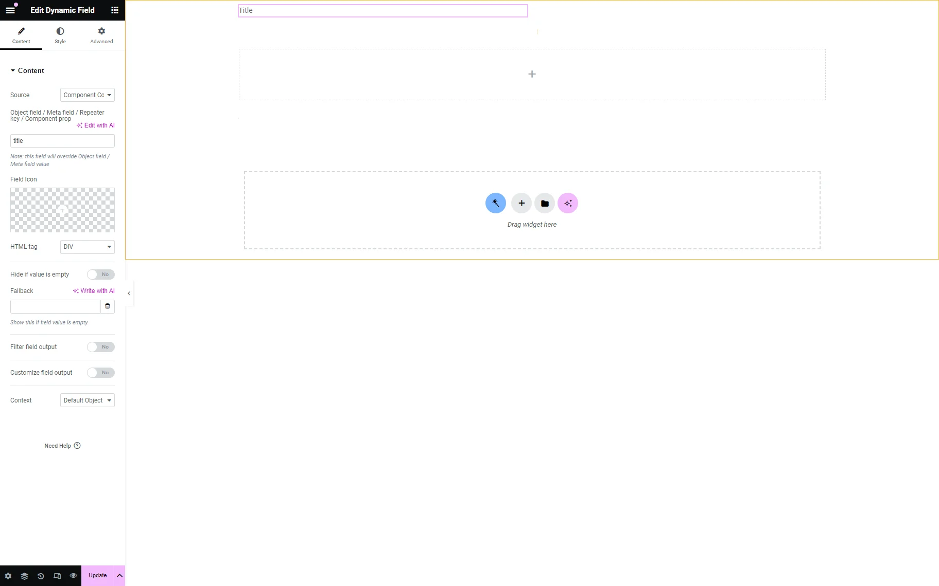
Here, we divided the layout into two columns. We dragged and dropped the Dynamic Field widget into the left column to display the CPT post title. Then, we selected the “Component Control Value” option in the Source drop-down list and typed the control’s name in the Object field / Meta field / Repeater key / Component prop text field (the “title” text, which was added in the Control Name field of the Component Settings tab, in the given case.)
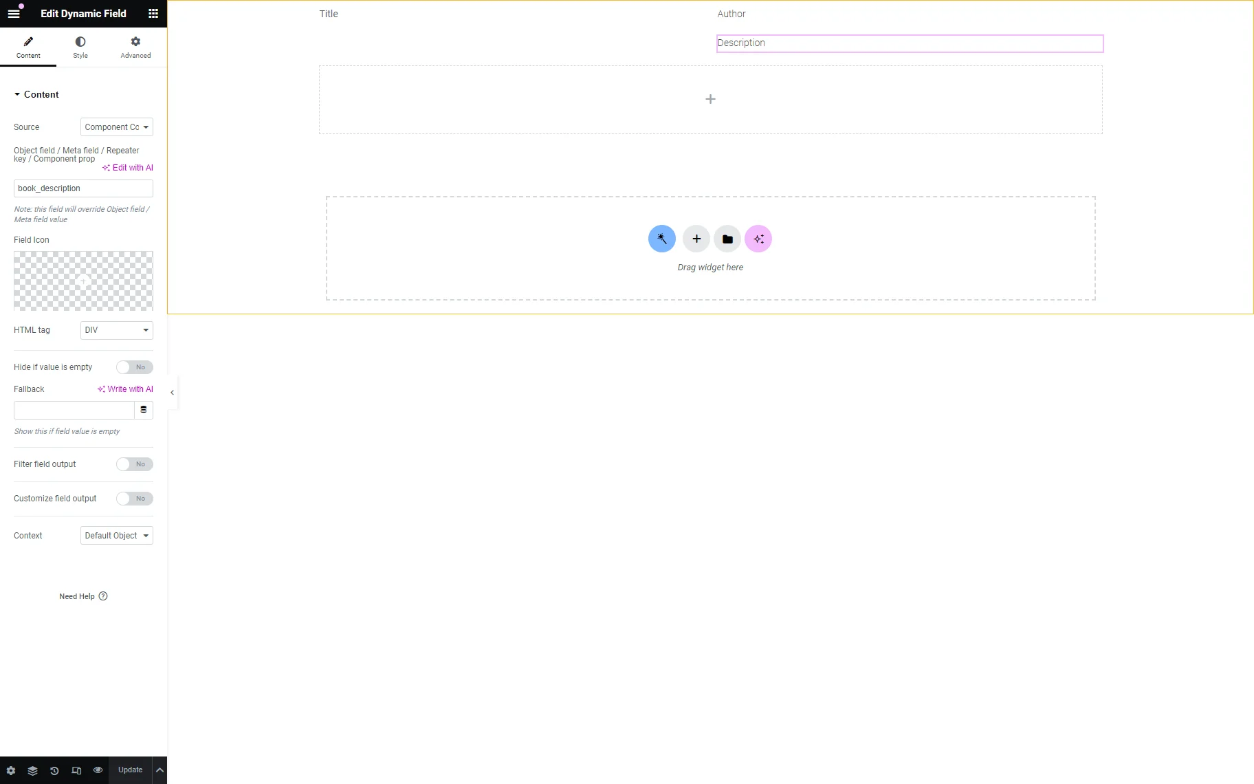
We added the Dynamic Fields and Dynamic Image widgets to display another meta field, selected the “Component Control Value” option in the Source drop-down list, and typed the appropriate control’s name in the Object field / Meta field / Repeater key / Component prop text fields.
Read more about managing the Dynamic Field’s settings in the Dynamic Field Widget Overview tutorial.
Press the “Update” button to save the changes.
Set the Styling for the Controls
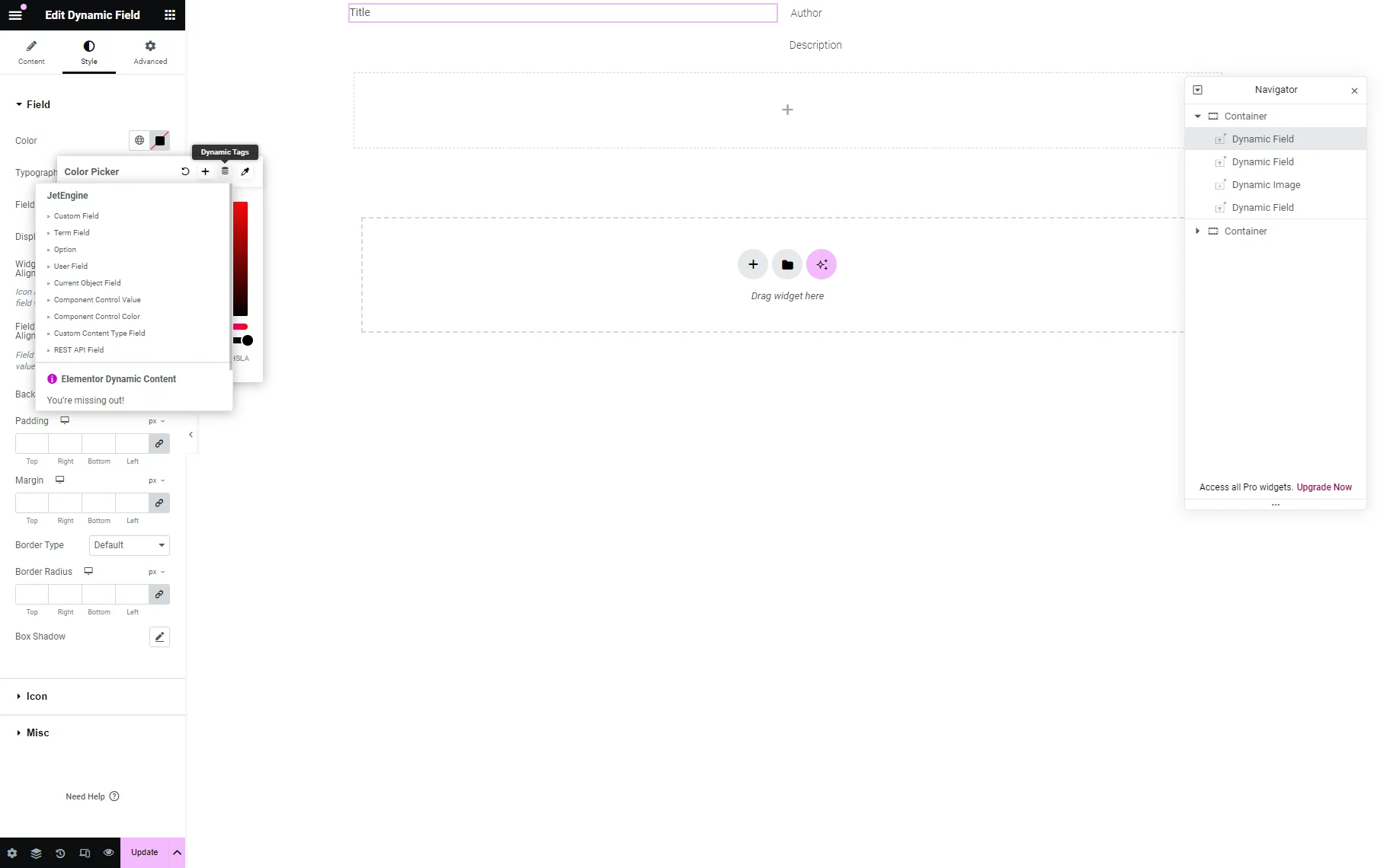
Return to the Component Settings tab of the component page. Unroll the Component Style Controls block and fill in the Control Label and Control Name text fields (the “text_color,” in this case). Then, navigate to the Default Value color-picker field and set the needed color. Finally, press the “Update” button.
Now, back to the component’s page. Select the widget you want to style. In this case, we selected the Dynamic Field widget to display the CPT post title and unrolled its Style > Field settings. Then, we pressed the Dynamic Tags icon in the Color field and selected the “Component Control Value” option in the drop-down list.
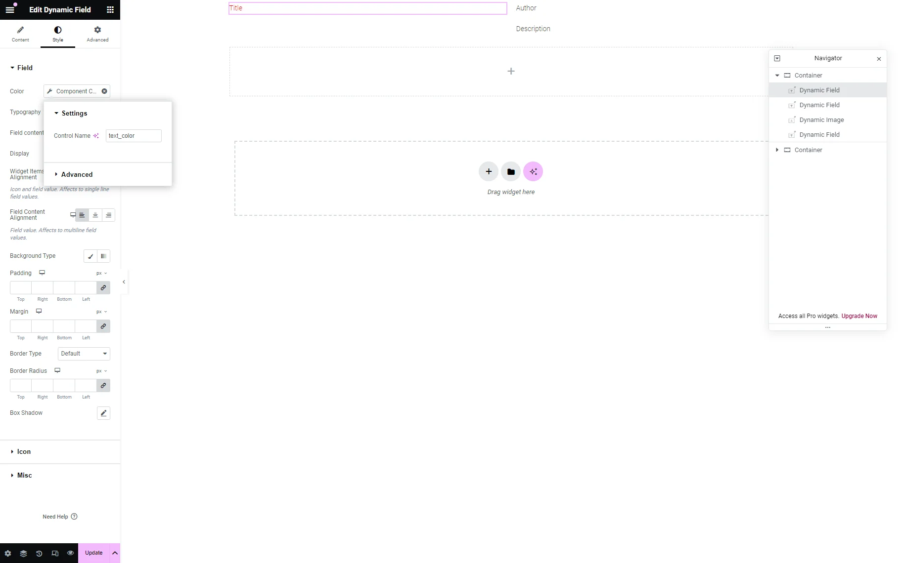
Finally, we typed the Control Name in the opened Settings field (the “text_color”, in this case).
Once completed, press the “Update” button.
Create a Listing Item
Navigate to the WordPress Dashboard > JetEngine > Listings/Components tab. Press the “Add New Listing Item” button to create a listing item that displays the pre-specified CPT.
The How to Create Listing Template for Post Types in Elementor tutorial details how to develop listing items for CPT posts.
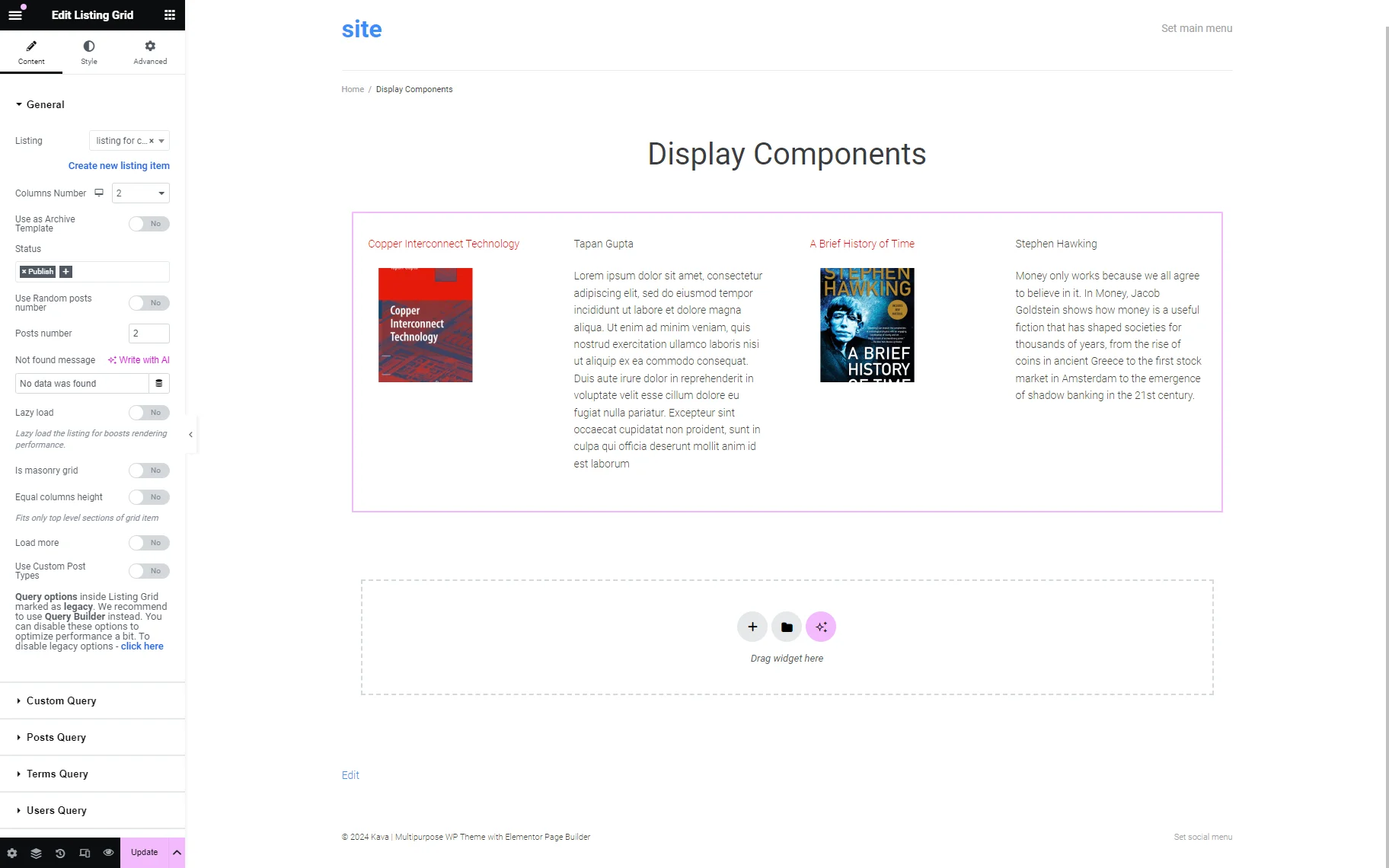
In this tutorial, we created the listing item for the “Books” CPT posts.

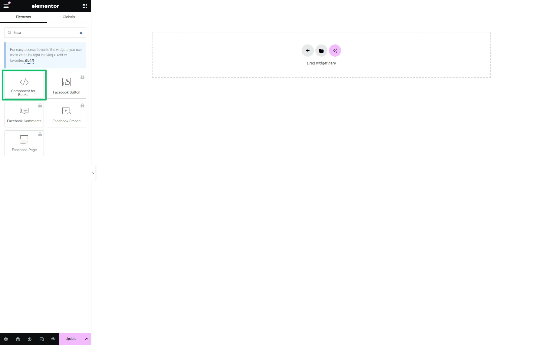
To find the needed component, type its name (“Components for Books” in our case) in the search bar. Find the component and drag and drop it onto the page.
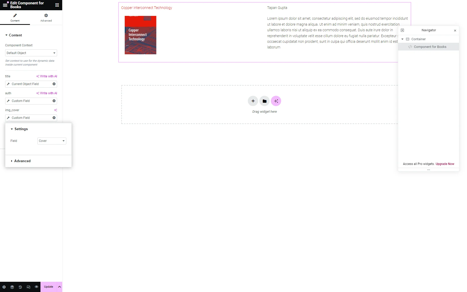
Unroll the component Content Settings.
The “Default Object” option in the Component Context drop-down list is set by default. Below this field, the added controls are enlisted.
Press the “Dynamic Tags” icon near the appropriate component’s field and choose the “Custom Field” or “Current Object Field” option in the drop-down list. Then, select the needed field in the Field drop-down list of the pop-up that appears.
For instance, for the Book Title control, we selected the “Current Object Field” option in the drop-down list and then chose the “Title” option in the Field drop-down list.

For the Book Author control, we chose the “Custom Field” option in the drop-down list and set the “Author” meta field from the Field drop-down list, and for the Book Cover control, the “Image” meta field.
When everything is complete, press the “Update” button.
Add the Listing Item to a Page
Navigate to the WordPress Dashboard > Pages tab and create a new page or edit a previously created one.
Find the Listing Grid widget and drag and drop it onto the page. Then, select the created listing in the Listing drop-down list.
For a more in-depth understanding of the main features of the Listing Grid widget, we recommend checking out our Listing Grid Widget Overview.
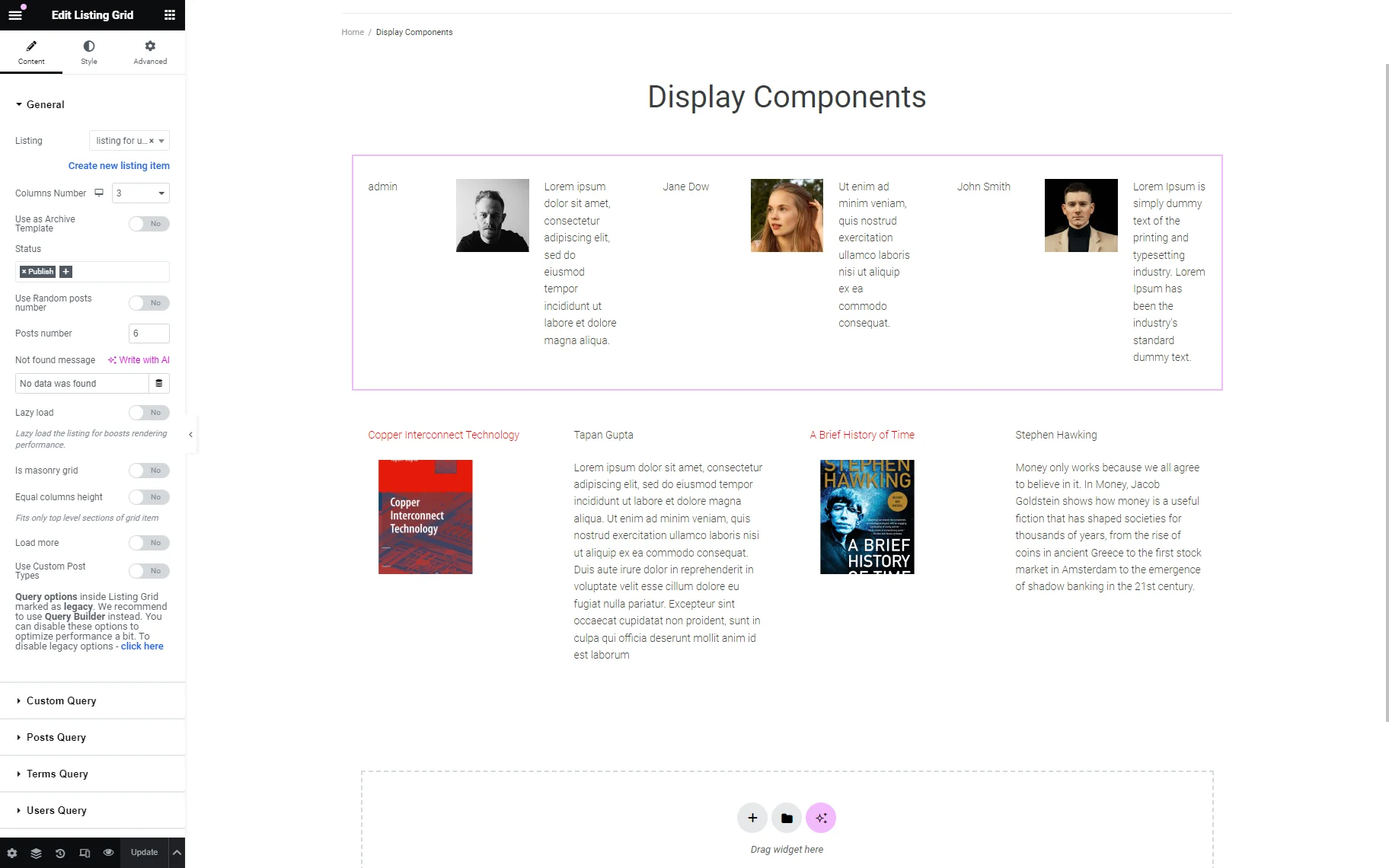
Additionally, you can display another group of components (i.e., based on the user’s data) on the page. The only exception in this case is creating the listing item for users.
Read the tutorial How to Create a New User via WordPress Dashboard to learn how to create users via the dashboard.
That’s it. Now you know how to create and reuse components (templates that allow content changes while keeping the design and structure), manage their settings, and display them on pages using the JetEngine plugin for WordPress.