Tabs Widget Overview
This overview covers the Tabs widget and its settings, which are part of the JetTabs plugin functionality for Elementor and WordPress.
This overview covers the Tabs widget and its settings, which are part of the JetTabs plugin functionality for Elementor and WordPress.
Tabs is a widget that is part of the JetTabs plugin functionality. It allows adding and breaking content into several tabs, allowing showcasing both static and dynamic content inside.
Tabs Widget in the Editor
The Tabs widget can be added to the page edited with Elementor.
The first, Items tab, of the widget settings, includes the following toggle:
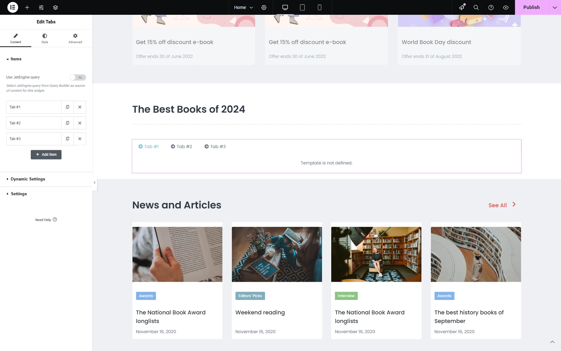
- Use JetEngine query — a toggle that, if enabled, allows selecting the query built with JetEngine’s Query Builder in the Select Query field to apply the built query to the tabs.
Also, by default, there are three tabs added to the layout. One can edit them, copy, delete, or add a new tab by pressing the “Add Item” button.
When the item tab is unrolled, its settings become available:
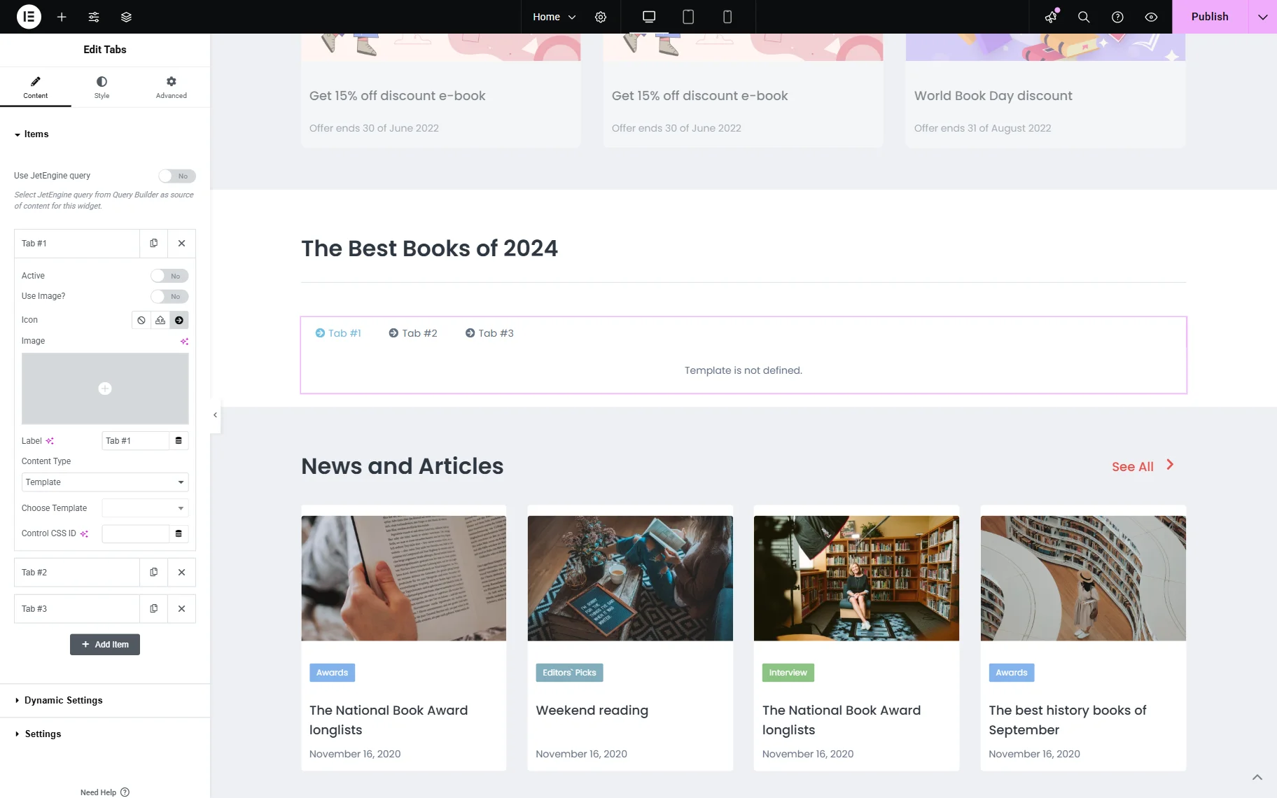
- Active — a toggle that allows making the current tab active when the page is opened;
- Use Image? — a toggle that, if activated, allows adding an image to the tab title;
- Icon — an icon that will be displayed next to the tab title. It can be deactivated or changed to the image if the Use Image? toggle is activated;
- Image — an image that will be displayed next to the tab title;
- Label — a label of the current tab;
- Content Type — content that will be displayed inside the tab: “Template” or “Editor.”
Template
With this Content Type, one can display the previously built Elementor template in the tab.
- Choose Template — a template that will be used as the content of the tab.
Editor
- Content — a text area where one can add content that will be displayed in the tab.
Another field that is available for both Content Types is:
- Control CSS ID — a field that allows adding an ID to the current tab.
Dynamic Settings
This section is available only when the Dynamic Data Addon is installed and activated on the website. This tab allows enabling dynamic data for tabs.
Initially, the Enable dynamic data toggle should be activated in order to have access to further settings:
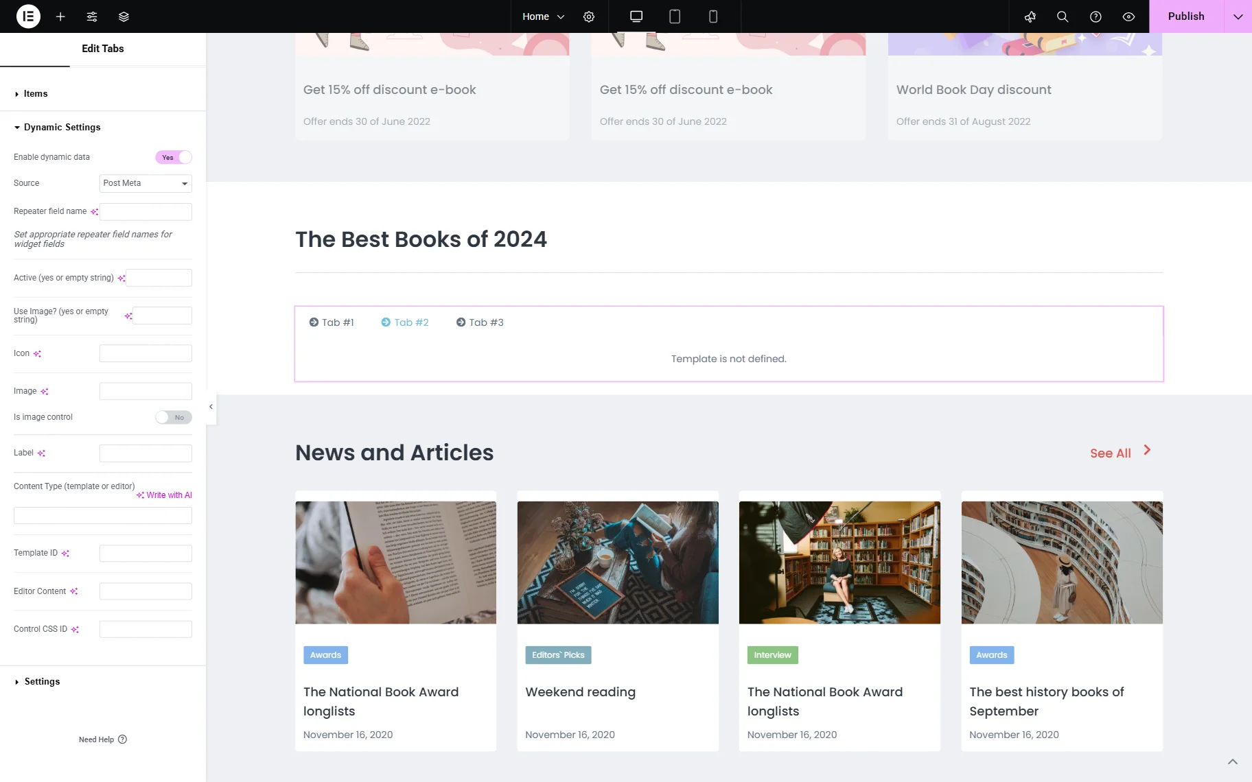
- Source — a source from where the dynamic data for tabs will be pulled: “Post Meta,” “Option,” or “Taxonomy”;
- Repeater field name — a field where a “Repeater” field name can be specified to use it as content for tabs;
- Active (yes or empty string) — a field that should be filled with the “yes” value to make the first tab active or left empty;
- Use Image? (yes or empty string) — a field that should be filled with the “yes” value to use the image next to the tab label (instead of the standard icon) or left empty;
- Icon — a field where the field name with the icon stored should be put;
- Image — a field where the field name with the image stored should be put;
- Is image control — a toggle that should be activated to make an image in the item title a control that can be clicked to open the tab;
- Label — a field where the field name with the label stored should be put;
- Content type (template or editor) — a field where the “template” or “editor” value should be put;
- Template ID — if the “template” content type was selected, this field should be completed with the template ID that will be used for tabs;
- Editor Content — if the “editor” content type was selected, this field should be completed with the field name where the content for tabs is stored;
- Control CSS ID — a field that allows adding an ID to the current tab.
Settings
A tab that represents additional settings that can be adjusted for tabs:

- Item Label HTML Tag — an HTML tag of the tab label;
- Tabs Position — a position where the tab labels will be located. By default, tabs are displayed above the content (“Top” option);
- Show Effect — an effect used for tab content appearance;
- Tabs Event — a dropdown that allows selecting the trigger for the tab content appearance: “Click” on the tab item or “Hover” over it to open the content;
- Auto Switch — a toggle that, if activated, switches between the tabs automatically. When activated, the Auto Switch Delay field becomes available, allowing changing the delay from “3000” ms to the needed value;
- No Active Tabs — a toggle that, if activated, ensures that no tabs are active by default;
- Use Ajax Loading for Template — a toggle that, if activated, uses AJAX loading type for tab templates;
- Scrolling to the Content — a toggle that, if activated, scrolls to the content once the tab is switched. If activated, one can set the Scrolling offset (px);
- Scrolling Tab Navigation — a toggle that can be activated if one has many tabs. By default, a large number of tabs are all shown in rows, but with this toggle, they can be shown either with the help of the “Plain” horizontal scrollbar or the “Slider” option, which allows swiping between the tabs. If the “Slider” option is activated, one can activate the Fixed Slide Width, Centered, Looped, and Enable Navigation toggles for corresponding features to be active.
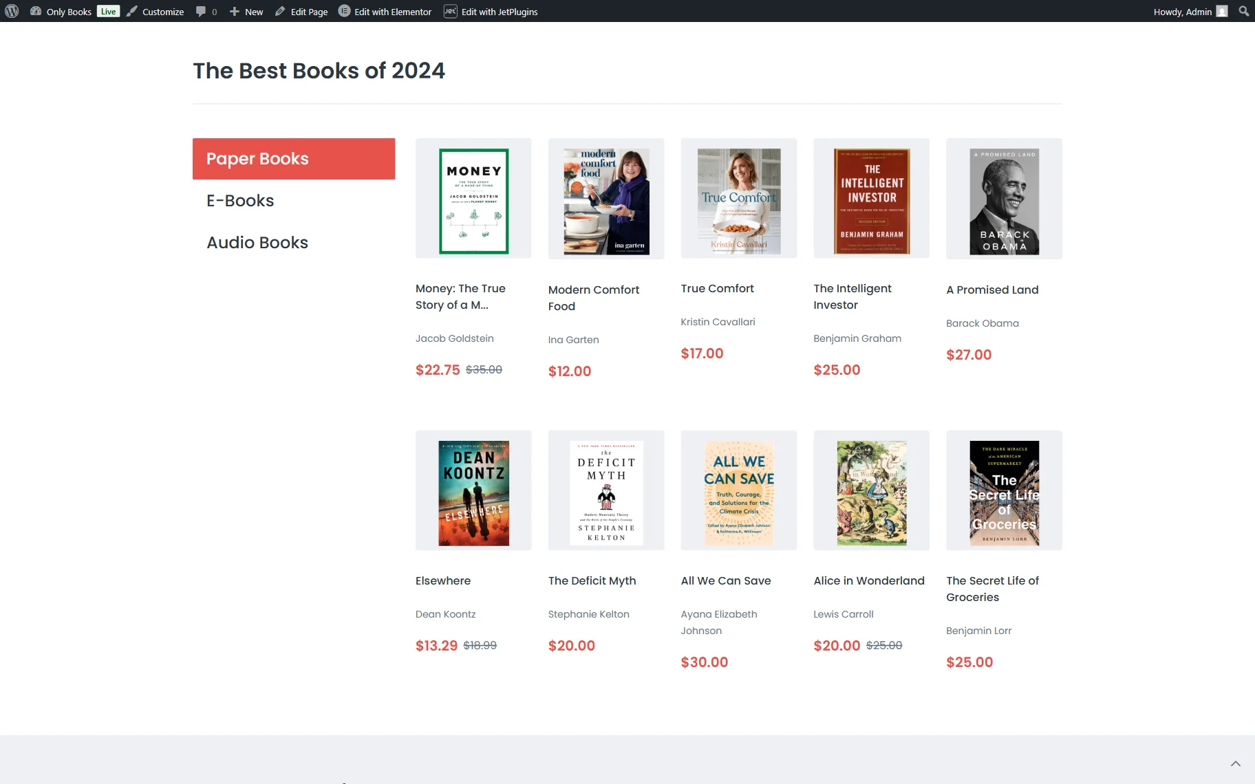
Tabs Widget on the Front End
After the page has been saved, the result can be checked on the front end.
That’s all about the Tabs widget available as a part of the JetTabs plugin functionality for WordPress websites.