Flexbox has revolutionized modern web design, allowing developers to create cleaner, more efficient layouts without excessive DIVs or complex CSS.
Elementor’s container system embraces Flexbox, making it easier to build flexible, responsive designs while improving page speed and performance.
For WordPress website developers, understanding Flexbox as a CSS module and, in particular, Flexbox in Elementor is essential for crafting high-performing websites with minimal bloat. In this article, I will break down Flexbox fundamentals, compare them with Elementor’s legacy method of sections and columns, and explore practical use cases. Let’s dive in.
Table of Contents
What Is Flexbox?
Before exploring Flexbox functionality in Elementor, it’s important to understand Flexbox itself.
Flexbox, short for Flexible Box Layout, is a CSS module designed to distribute space and align elements efficiently within a container. Unlike traditional layout techniques that rely on floats or inline-block elements, Flexbox provides a more intuitive and dynamic approach to structuring content.
These are some of the benefits Flexbox added to website layouts:
- Improved responsiveness as elements adjust dynamically to different screen sizes.
- Easier alignment positioning.
- Reduced need for extra containers, which is great for performance.
Flexbox is particularly useful for one-dimensional layouts, meaning it works best for arranging items in a single row or column. While CSS Grid is better suited for two-dimensional layouts, Flexbox remains the go-to choice for UI elements like navigation menus, cards, buttons, and form structures.
Before Flexbox was introduced in CSS, another approach was used, and it required some tricks to be used. Let’s say we need a layout with three columns. To achieve it, we typically relied on floats or inline-block elements – both of them have significant limitations.
One of the most common methods before Flexbox was using the float property. Developers would create a container DIV and float individual columns inside it.
HTML:
<div class="container">

  <div class="column">Column 1</div>

  <div class="column">Column 2</div>

  <div class="column">Column 3</div>

</div>
CSS:
.container {

  width: 100%;

  overflow: hidden; /* to clear the floats */

}

.column {

  width: 33.33%;

  float: left;

  padding: 10px;

  box-sizing: border-box;

}
The float property has these drawbacks:
- no built-in equal-height columns;
- manual clearfix or overflow: hidden to prevent layout issues;
- limited flexibility, e.g., for adjusting spacing, alignment, or reordering elements, required additional CSS hacks.
Using the inline-block property
Instead of floats, some developers used display: inline-block to align columns horizontally.
CSS:
.column {

  display: inline-block;

  width: 33.33%;

  vertical-align: top;

}
The inline-block property has these drawbacks:
- whitespace gaps appear between columns unless extra fixes (e.g., font-size: 0; on the parent container) are applied;
- not as flexible for responsive layouts.
Now, let’s compare it with Flexbox:
.container {

  display: flex;

  justify-content: space-between;

}
That’s all you need.
Flexbox has a list of properties using which you can create layouts of any complexity.
Key Flexbox properties
There are two types of Flexbox entities:
- Flex container – the parent div;
- Flex items – DIV blocks inside the parent container.
A lot can be controlled using the parent container properties. But flex items can also have their own properties – for precise controlling. For example, you want to align all items centrally, but only one should be aligned to the end of the container. This is where the individual properties for child items are very useful. Note that because unlimited nesting is allowed for the Flexbox, items can have a combination of properties for flex container and flex item.
Here, I will put only properties for the parent flex container.
Flex container
To use Flexbox, you first define a flex container by setting the display property to flex or inline-flex. This establishes a flex formatting context for its direct children.
.container {

  display: flex;

}
Flex direction
The flex-direction property determines the direction in which flex items are placed within the flex container. It can be set to row (default), row-reverse, column, or column-reverse.
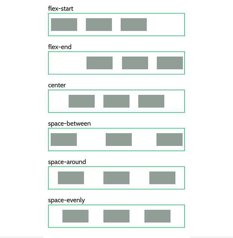
Justify content
The justify-content property aligns flex items along the main axis (horizontal by default). Values include flex-start, flex-end, center, space-between, space-around and space-evenly.
Align items
The align-items property aligns flex items along the cross axis (vertical by default). Values include stretch (default), flex-start, flex-end, center, and baseline.
Flex wrap
By default, flex items are laid out in a single line. The flex-wrap property allows items to wrap onto multiple lines. Values include nowrap (default), wrap, and wrap-reverse.
💡 For more information, read this comprehensive guide on Flexbox on the CSS-Tricks website.
Flexbox vs. traditional Elementor sections and columns
Before the introduction of Flexbox containers in 2022 and making it a default feature in 2023, Elementor used a section + column + inner section structure (I will refer to it as “sections and columns” further).
While effective, this approach had several drawbacks. Let’s compare just some features with Flexbox containers:
| Feature | Sections and columns | Flexbox containers |
| HTML Markup | More DIV wrappers | Less markup, cleaner code |
| Performance | Slower (more elements) | Faster (reduced DOM size) |
| Alignment Options | Limited control | Full control over positioning |
| Nesting | One inner section | Infinite nesting |
| Widget Location | In a column within a section | Directly in the container |
| Flexibility | Rigid structure | More adaptable layouts |
| Responsiveness | Requires extra CSS tweaks | Built-in flexibility |
As you can see, Flexbox has a lot of advantages.
One of the most important differences is that you can add multiple widgets directly to the flex container and align them in a row by clicking one button.
With the old sections and columns system, you had to create a separate column for each widget or inner section, which doubles the number of containers and makes the DOM structure overly nested and bloated.
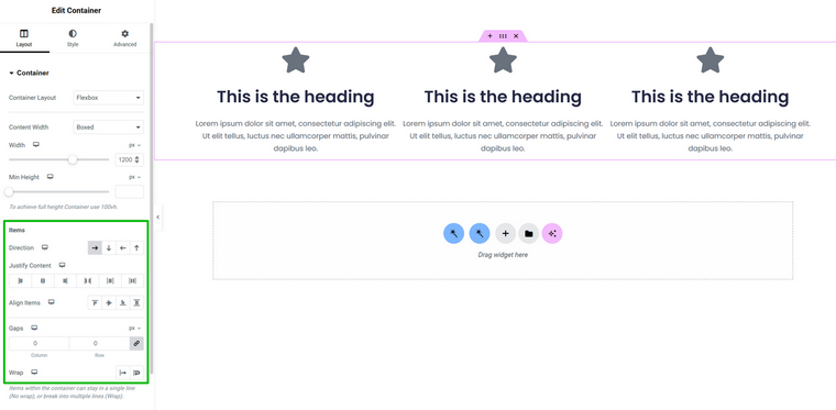
In the example below, I placed three widgets inside the container. As you can see, all the Flexbox-related settings can be found in one place, which is very handy.
But let’s have a look at the HTML output and compare.
This is how it looks when a flex container is used:
<div class="elementor-container">

  <div class="elementor-widget"> <!-- Widget 1 --> </div>

  <div class="elementor-widget"> <!-- Widget 2 --> </div>

  <div class="elementor-widget"> <!-- Widget 3 --> </div>

</div>
This is the output when the old sections and columns approach is used:
<div class="elementor-section">

  <div class="elementor-container">

    <div class="elementor-column">

      <div class="elementor-widget-wrap">

        <div class="elementor-widget"> <!-- Widget 1 --> </div>

      </div>

    </div>

    <div class="elementor-column">

      <div class="elementor-widget-wrap">

        <div class="elementor-widget"> <!-- Widget 2 --> </div>

      </div>

    </div>

   <div class="elementor-column">

      <div class="elementor-widget-wrap">

        <div class="elementor-widget"> <!-- Widget 3 --> </div>

      </div>

    </div>

  </div>

</div>
As you can see, the difference is huge.
Flexbox in Elementor
Flexbox container has been activated by default in Elementor since 2023, when it became a stable feature. If your website is made using old sections and columns, Elementor will offer you the option to convert them to containers. As usual, it works very well, and you don’t need to adjust almost anything, so the process of transition is smooth.
‼️ However, if you created your layouts using flex containers and then switched back to sections and columns, all the layouts and content will disappear. This happens because sections and containers are fundamentally different structures – they don’t store content the same way. The content will reappear once you switch back to containers, but toggling between the two carries risks, especially if you accidentally save your site while in the wrong mode.
Mastering Flexbox in Elementor is intuitive and even enjoyable. But Elementor created not only this detailed documentation on the Flexbox container but also the interactive playground, where you can practice it.
Common Pitfalls When Using Flexbox
While Flexbox is offering so much flexibility, don’t overcomplicate layouts. While it’s much more optimized than the sections and columns method, remember that you still get Elementor wrappers, and if you, let’s say, create too deep nesting, your DOM structure will be too deep, which is bad for performance. Just be reasonable – if something feels overly complex, chances are there’s a more efficient way to achieve the same result.
Another thing to consider is mixing Flexbox with other layout models in ways that don’t make sense. For example, nesting a Flexbox container inside a Grid container without fully understanding how they interact can cause unpredictable results. Flexbox is great for one-dimensional layouts (either rows or columns), while Grid is better for two-dimensional ones. Using the right tool for the job prevents unnecessary frustration.
One more issue (yet not that frequent) is not understanding how Flexbox calculates widths and spacing. So, Flexbox can distribute space dynamically (it primarily refers to flex-grow, flex-shrink, and flex-basis properties), which means setting fixed widths (e.g., width: 33.33%) on flex items can sometimes conflict with flex-grow, and you will not get what expected. In such cases, it’s better to use flex:1 or other values instead of manually assigning widths.
Another common issue is misusing alignment properties, especially when it comes to responsive design. It’s easy to get everything looking perfect on a desktop, but then you check mobile and realize items aren’t stacking the way you expected. This often happens when flex-direction: row is used without considering how elements should behave on smaller screens. To prevent this, assign flex-direction: column for mobile or wrap elements properly to prevent awkward layouts. Always test across different screen sizes to make sure everything aligns as expected.
FAQ
Flexbox is a CSS layout system that allows for efficient alignment, spacing, and resizing of elements within a container. Elementor adopted Flexbox to replace the older sections and columns in its container system, improving performance and design flexibility.
Flexbox reduces unnecessary DIV elements, making the HTML structure cleaner and more efficient. This leads to faster page load times, better responsiveness, and improved SEO by reducing excessive nesting.
Yes, Elementor provides a built-in conversion tool to migrate sections and columns into the new container-based structure. The transition is smooth, with minimal manual adjustments needed in most cases.
Wrapping Up
Flexbox has completely changed the way layouts are built in Elementor, making designs lighter, faster, and more flexible.
For sure, there’s a slight learning curve, but still, Flexbox in Elementor is intuitive, and once you get the hang of it, you’ll wonder how you lived without it. 🤓
Keep your structures clean, test across different screen sizes, and make the most of Elementor’s interactive tools. The future of the web is all about efficiency, dynamic tools, and performance, and Flexbox is a big step in the right direction. While there are still questions and opportunities for optimization, Elementor’s team did and keeps doing a great job.