Have you taken the time to invest in the mobile optimization of your WordPress website? If not, you might be in big trouble.
Most of your potential readers and customers surf the web using their mobile phones and tablets. If your website doesn’t offer them a pleasant experience, they might leave and never come back.
To avoid this scenario, in this post, we’ll go over actionable steps you can take to make sure your website’s mobile experience is all it is supposed to be and how a plugin like WP Rocket can help you.
Table of Contents
- Why You Should Care About Mobile Optimization
- 7 Best Practices for Mobile Optimization on WordPress
- Wrapping Up
Why You Should Care About Mobile Optimization
First of all, let’s talk about why this topic even matters. You might think, “So what if my mobile experience isn’t the best? What’s the big deal?“
Here’s why it is, indeed, a big deal.
For one, as mentioned in the introduction, more than half of all Internet traffic comes from smartphones and tablets.
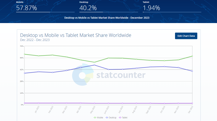
So, right off the bat, if you don’t optimize your website for mobile experience, you are potentially alienating more than 50% of site visitors.
Scary, right?
Yet, it gets even worse:
- 53% of mobile users will leave a website that doesn’t load within three seconds. Not to mention that mobile devices often have slower Internet connections.
- In 2023, Google finished changing its search engine to a mobile-first index. That means they look at the mobile version of your website to decide where to rank it, even for visitors on desktop devices.
- Google now uses metrics called Core Web Vitals to measure user experience on your site, which puts a premium on quick loading speed and reactions to visitor input. These are direct ranking factors, so it’s important that you improve your Core Web Vitals. Otherwise, it could tank your standing in the search results.
7 Best Practices for Mobile Optimization on WordPress
If the above has woken you up to the dangers of neglecting the mobile optimization of your WordPress site, let’s talk about how to avoid them. In the following paragraphs, we will go over some proven steps to ensure mobile visitors will have a good site experience. As mentioned, we’ll also show you how you can easily implement many of these steps with WP Rocket, one of the best caching plugins out there.
Use a mobile-friendly theme
Everything begins with your WordPress theme. It controls the website’s layout, structure, and markup, including how it displays on mobile devices. If it’s not optimized for that purpose, the rest of your optimization efforts will not be as effective.
There are two factors that make a theme mobile-friendly:
- Responsive design. This means it automatically adapts to smaller screen sizes and displays the website in a way that doesn’t require panning or zooming.
- Lightweight. Page loading speed is crucial for mobile devices. If your theme is a bloated mess, you can’t make up for it completely with other measures.
How can you be sure your chosen theme fulfills these criteria? By testing it beforehand. Install it on a staging site and access it from a mobile device, or simply shrink and enlarge the browser window. Run it through a speed test without any other optimization. This will give you a good idea.
To get started, check our list of the fastest WordPress themes.
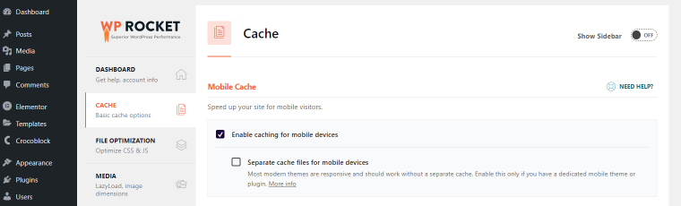
Enable mobile caching
Next up, we have the topic of caching. To get a grasp of it, you need to know how WordPress creates web pages first.
How caching works
Websites are written in HTML because that’s what browsers understand. However, WordPress itself does not contain HTML files; it creates them dynamically from PHP code and content pulled from a database. This can be a time-consuming process, which you can improve by using a WordPress cache.
Caching means processing your pages beforehand and then saving a copy of the finished HTML versions on your server to deliver directly to the browser. It saves a few steps in between, making for better performance.
To implement caching, you usually have to add some code to a server file called .htaccess. However, a more accessible alternative is to use a plugin. For example, when you install and activate WP Rocket on your WordPress site, caching is automatically enabled.
The importance of mobile caching
This matters especially for mobile devices because WordPress themes and plugins often use different markup, styles, and even JavaScript files for desktop and mobile users.
For example, in most cases, mobile menus look very different from their desktop counterparts.
As a consequence, they need totally different markups, which wouldn’t make sense to load for desktop users.
Another scenario is delivering different background images for mobile and desktop users. The mobile version can be smaller and might need a different image ratio. Page builders often have an option to implement this.
Finally, gallery plugins change the images they display depending on whether they load on desktop or mobile. This, too, has to do with adjusting them to smaller screen formats.
For that matter, it makes a lot of sense to create a separate cache for mobile devices. That way, users receive the appropriate cached version for their screen size.
In WP Rocket, you can simply switch this on in the Cache menu.
Pay attention to Interaction to Next Paint (INP)
We have already mentioned Core Web Vitals further above. A new metric that will soon become part of it is Interaction to Next Paint (INP).
It measures the responsiveness of a web page by determining how quickly it responds to user input, especially during load. The difference to the current metric is that it takes into account all interactions during a visit and not just the first.
Because this will be such a central topic, in the future, we’ll likely start seeing themes and plugins, including lighter versions of their style and scripts. This aims to give an equally good experience on mobile devices while considering the lower processing power and slower network performance compared to desktops.
Delays in INP are most often caused by too much JavaScript on the page, keeping the browser from reacting promptly. Caching and most of the measures described below help address this issue.
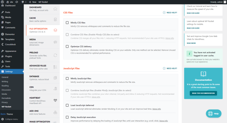
Optimize your code
Another important step for mobile optimization is improving your website’s code. Caching can only go so far; if the rest of your website is a mess, it will still not perform at its best.
Here is a collection of easy-to-implement techniques for better website code:
- GZIP compression for shrinking files so they are quicker to send. You are probably familiar with this from zip files on your computer. You can do the same on a server so that website files download faster.
- CSS and JS optimization for eliminating elements that keep web pages from rendering.
- Minification. This technique strips away all formatting from website files that are only there to make code more readable for humans (comments, indents, etc.). Browsers don’t need it, as it makes files larger and, thus, slower to download.
- Reduce unused CSS. Any code on your website that is not needed and the browser still has to download reduces website performance.
- Delay and defer JavaScript. Websites often have JavaScript files that are not needed for the first display of web pages, such as analytics scripts. Delaying and deferring means telling the browser to deprioritize them so that they don’t stand in the way of more important files.
WP Rocket has options for all of the above. It automatically adds compression to any website on which it is active and can minify, optimize, and defer JavaScript and CSS on your site by checking a few boxes under File Optimization.
Use optimized and responsive images
Images play a special role in website speed because they often make up most of the data on a web page. Therefore, anything you can do to make them smaller and faster to download will help your mobile performance.
Here are a number of things you can do for that purpose:
- Use modern image formats. Formats like WebP are much smaller than JPG or PNG.
- Size correctly. Make images only as large as they need to be. Otherwise, visitors load data they are not going to use.
- Compression. Just like the text files above, images can be compressed, making them smaller.
- Use responsive images. Serve different image sizes for different screens. WordPress now does this automatically.
If you want to implement the above automatically, you can use Imagify, a companion plugin of the aforementioned WP Rocket. It can compress images in bulk and convert them to WebP.
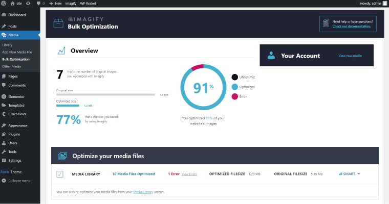
That way, you automatically use the most optimized image versions on your site.
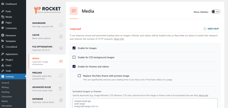
Implement Lazy Loading for images, videos, and ads
A way to take image optimization one step further is to use lazy loading. This means only loading images that are visible at the beginning. Images further down the page are displayed only when visitors scroll down towards them. As you can imagine, this can save a lot of bandwidth.
Lazy loading doesn’t only work for images; you can use it for other elements like videos or ads as well. If you want to take advantage of it, you can either manually add <loading=”lazy”> to each element or have WP Rocket do it for you. For that, under Media, switch it on for images, iframes, and videos.
Avoid full-screen pop-ups, sliders, and heavy plugins
Smartphones and tablets have smaller screens than other devices. As a consequence, elements that block them have more impact on how pleasant a website is to use.
Prime examples here are pop-ups and sliders. They can make it difficult for mobile visitors to use your site. Pop-ups are especially hard to close on mobile phones.
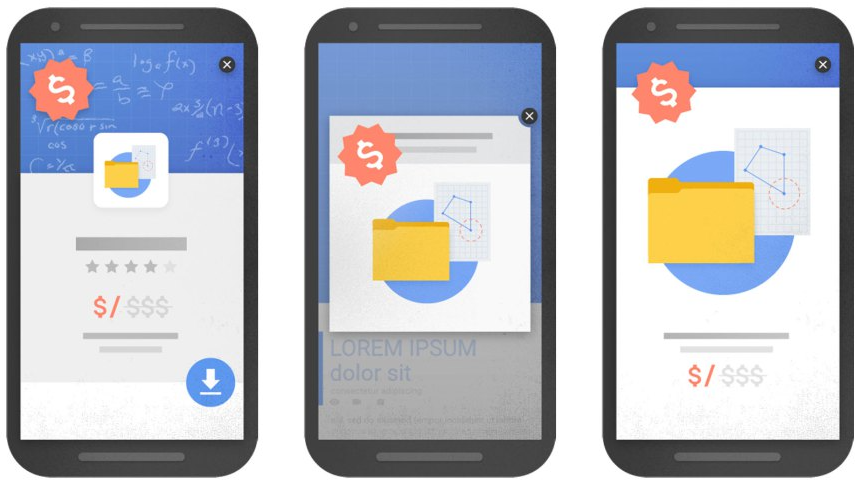
Google also advises against full-screen pop-ups and will punish your website if you use them. Therefore, it’s best to avoid them.
In addition, try to stay away from WordPress plugins that are especially heavy in JavaScript and other markups to avoid slowing down the website. If there is no way around using them, take advantage of the aforementioned delay and defer option to lessen their impact on performance.
Use a CDN
A Content Delivery Network (CDN) is a group of connected servers located around the globe. When you sign up for it, copies of your website files are stored on each of them. That allows visitors to receive the files from a nearby location, so the data has to travel a shorter distance.
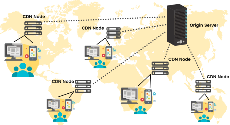
There are a lot of CDNs out there. You simply need to sign up and configure them.
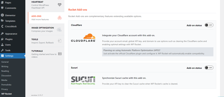
WP Rocket makes this really easy, too. If you’re using Sucuri or Cloudflare, there are dedicated add-ons for quick configuration.
For all others, simply enable the option under CDN, provide the CNAME of your network, and configure which files to outsource to it.
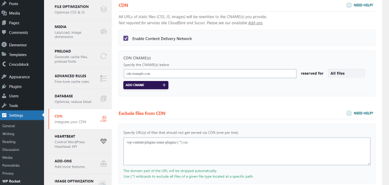
Finally, WP Rocket also has its own CDN that you can easily add to your existing account and have it automatically configured.
Wrapping Up
Mobile optimization is a topic that is important for any WordPress website owner. With the majority of web traffic coming from mobile devices and search engines like Google putting a premium on mobile user experience, ignoring this topic is a big risk.
Thankfully, as you have seen above, it’s not overly complicated. WordPress mobile optimization mostly comes down to paying attention to a number of best practices that help your website load fast and be functional on mobile devices. From using a mobile-friendly theme and caching, over code and image optimization to lazy loading, avoiding disruptive elements, and using a CDN – everything is completely doable.
If you need a little help and don’t want to do it yourself, take advantage of plugins like WP Rocket to do the heavy lifting for you. Happy optimizing!