The exit-intent pop-up is a powerful tool to prevent visitors from leaving your website. The JetPopup plugin monitors cursor movement to detect signals indicating the visitor is about to leave, allowing you to display a pop-up at the crucial moment.
This article discusses where and why you should use exit-intent pop-ups and look at their essential parts.
Table of Contents
- When to Use Exit-Intent Pop-Ups
- What Does Conversion Pop-Up Window Look Like?
- The Don’t’s of Using Exit-Intent Pop-Ups
- FAQ
- Conclusion
When to Use Exit-Intent Pop-Ups
Exit-intent pop-ups encourage users to stay or take a specific action before leaving. Here are some scenarios in which you might consider using exit-intent pop-ups:
- Offer users a last-minute opportunity to subscribe to your newsletter or email updates before leaving the site.
- Provide users with a special discount code or coupon when they attempt to exit.
- Sometimes users add items to their shopping cart but abandon them during checkout. Use exit-intent pop-ups for abandoned cart recovery. You can offer a discount or free shipping if they complete the purchase.
- Prompt users to fill out a form or provide their contact information for lead generation. Offer them to download a whitepaper or sign up for a webinar.
- Exit-intent pop-ups can invite users to provide feedback about their website experience or participate in a survey. This helps you gather valuable insights and improve your site.
- Exit-intent pop-ups can increase social media engagement. They encourage visitors to follow your social media accounts, share content, or join your online community.
- You can use exit-intent pop-ups for content promotion. If you have ebooks, guides, or videos, you can offer them as a free download when visitors are about to exit.
What Does Conversion Pop-Up Window Look Like?
Each pop-up should include several essential elements, ensuring it can impact your website’s visitors as soon as they try to leave. Let’s look at each of them closely.
Offer
An offer is the most important element of a pop-up. Here are some of the examples which work well in exit pop-ups:
- time-limited discounts and bonuses;
- promo codes and coupons;
- gifts and free downloads (the word “free” always works well);
- information that the visitor will not find anywhere else.

In short, the pop-up should offer your visitors something valuable and be simple.
Which Crocoblock widgets can you use to make your pop–up more eye-catching?
- The Subscribe Form widget increases a subscriber database to share the latest news and special offers.
- Time-limited offers add a feeling of urgency and work better than anything else. Use the Countdown Timer widget to show how long the offer is active. There are loads of style settings available.
- The Circle Progress widget can emphasize the importance of your offer. You can persuade someone to decide by showing the numbers (e.g., how many people have already purchased the service or the product and are satisfied with the results, etc.).
- The Download Button widget gives your customer access to the file you offer for free.
Title
You need a catchy title to:
- raise your visitor’s interest;
- announce your offer;
- entice the visitor so that they study the entire content of the pop-up window.

You can draw your visitors’ attention by making the title move.
It can be done with the Animated Text widget, where you can find 12 animation effects. Sometimes the way your text looks defines the offer’s success. Make your heading distinct using a bright color, changing the font’s weight, etc.
You can also use a Headline widget to create pop-ups. Each headline consists of two parts where you can insert images or text.
Content
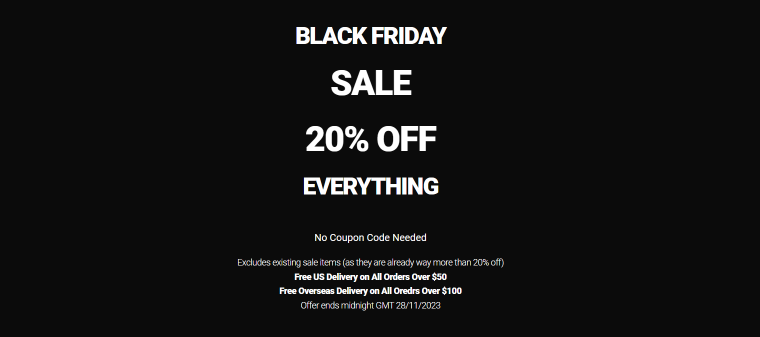
Once you have attracted the visitor’s attention, you must tell more about your offer in just a few phrases. Some companies provide a visitor with the details of their offer, and others give instructions on how to use it.
In this example, the additional information is at the bottom of the pop-up in smaller letters.
Location
The location of a pop-up matters nearly as much as the content. Your goal is to engage departing visitors with your offer. For this to happen, the visitors have to notice your pop-up. At the same time, you shouldn’t scare them off and poke the message right in the eye. Fortunately, there are lots of great pop-up layouts available in the JetPopup plugin:
- in the middle of the screen;
- on the left or the right;
- at the top or the bottom.
The standard position for an exit-intent pop-up is in the top left corner or the middle of the page so that it is more noticeable. You can adjust a pop-up container using the custom width and height options to fit into your page’s concept.
JetPopup provides such functionality as the Open Event option, where you can select when you want your pop-up to open up. For an exit-intent pop-up, choose the Try Exit option in the Open Event dropdown.
💡 To learn more about open events options of exit-intent WordPress pop-ups, head to our article about JetPopup.
Image
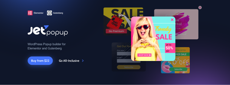
Exit pop-ups can raise your conversion rates without pictures. But vivid and dazzling images can enrich the pop-up’s content and increase the chances of a visitor paying attention to the pop-up window.
Use contrasting colors, e.g., a combination of yellow and black, pink and white. It’s a good idea to shorten the message of your pop-up while inserting a bright picture.
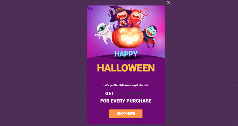
You can add a background image with JetPopup. Click the gear icon at the bottom bar of the Elementor editor. Go to Style > Popup Container > Container Background. Clicking the Brush icon will enable you to set the plain background color or use an image from your Media Library. Upload the image and define its position, attachment, and size. Try different combinations to find the most suitable one.
If you want to manage the pop-up background in Gutenberg, click the “JetPopup” button. Navigate to Container Styles > Background Color. Here, you can choose background color options and editing settings to use background images.
You can use the Parallax feature in the JetElements plugin to animate your decorative elements when you move a cursor on the screen. Read our tutorial to find out more about animation effects. Check out Crocoblock’s interactive pop-up library for the best exit-intent pop-up examples.
CTA
A pop-up informs visitors about something you offer and includes a call-to-action button. Most CTAs contain a verb that defines the exact action needed.
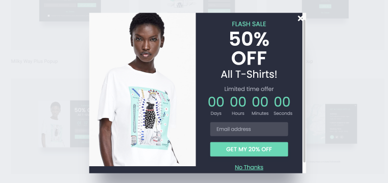
The CTA button is vivid. You can notice it at first glance. Crocoblock has the Action Button widget, which adds CTA functionality to your pop-up (usually adding Yes/No options for questions such as “Are you sure you want to leave” or “Are You 18 or Older?”). With this widget, you can choose the action type, change the button text, and add the URL.
Several action types are available depending on the action you want to implement with your button.
- The Link option allows you to attach any link to this particular button.
- Select the Close Popup option if you want this button to close the pop-up.
- It’s possible to leave the page after clicking this button by selecting the Leave Page action type.
- The Close Constantly option allows you to prevent the pop-up from opening once again. You can also use the Show Once option in the pop-up settings. It allows for determining the Show Again Delay – the time after which a pop-up will open again.
You can find all the pop-ups used in this article in the templates library for the JetPopup plugin. The library includes over 150 templates, many of which can be used for exit-intent pop-ups.
The Don’t’s of Using Exit-Intent Pop-Ups
Exit intent pop-ups can be effective in many scenarios. Still, it’s important to use them carefully and consider the user experience. Here are some “don’t’s” to keep in mind when using exit-intent pop-ups:
- Don’t make pop-ups hard to close. Ensure that the exit intent pop-up includes a clear and accessible close button. Users who decide to leave the website should have a straightforward option to close the pop-up. If the visitor cannot close it, hatred for the site is guaranteed.
- Don’t interrupt important user actions. Avoid triggering exit-intent pop-ups during the checkout or when submitting a form. Interrupting these actions can frustrate users and lead to abandonment.
- Don’t use pop-ups that cover the entire screen. Such intrusive designs may appear disconnected from the website, frustrate users and drive them away.
- Don’t overuse exit-intent pop-ups. Pop-up opening conditions allow choosing pages where exit pop-ups will appear. Use them sparingly in combination with other types of pop-ups.
FAQ
Exit-intent pop-ups appear on a screen when users display behavior indicating they are about to leave a webpage. They encourage visitors to stay or take a specific action before leaving.
Excessive or poorly designed pop-ups can irritate users and potentially drive them away. It’s crucial to balance grabbing attention and providing a positive user experience.
JetPopup is a WordPress plugin for building pop-ups using Elementor and Gutenberg editors. It provides many benefits, including advanced customization features, a user-friendly interface, and an abundant templates library.
Conclusion
Exit intent pop-ups can be powerful tools for boosting conversions. Advanced WordPress plugins provide access to many customization options. With all the necessary tools, you can build effective pop-ups that are not intrusive. In the case of JetPopup, you can create exit-intent pop-ups with Elementor or WordPress native builder.
Finally, refer to our blog to learn more about website pop-up essentials.
