The main task of most websites is to quickly and conveniently deliver all the necessary information to the user. This is especially important for sites viewed on mobile devices, where the correct placement of information plays a critical role.
Here, organizing content with the help of accordions can be very useful, as information is revealed by clicking on the appropriate button.
One of the most common uses of accordions is in the menu format. In this article, we’ll look at the main principles of using WordPress accordion menus, provide some examples for inspiration, and explore the most popular alternatives.
Table of Contents
- When Should You Use an Accordion Menu for WordPress?
- Using Different Types of Menus Instead of Accordions
- Accordion Menu UI Best Practices
- Accordion Menu Examples for Inspiration
- FAQ
- Final Words
When Should You Use an Accordion Menu for WordPress?
There are several situations where it is best to choose an accordion menu for your website:
- when users only need to get a portion of the information;
- when most users view your WordPress website from mobile devices.
In these cases, accordion menus will help users quickly access the data they need and familiarize themselves with your site.
Using Different Types of Menus Instead of Accordions
Effective modal design is a topic in itself, but the key is to focus on content organization and cognitive load reduction. Deciding whether to use a modal depends on the content and context. In many cases, simply displaying all content with proper structure, formatting, and scannability is sufficient.
Accordions are popular for menu designs, but they can fall short for websites with numerous subcategories. In such cases, alternatives to accordions might be more effective.
As you may have noticed, most of the mobile menus with dropdowns act similarly to accordions and are even called “accordion menus.” However, menus can be used in page sections not only on mobile but also on all devices.
Vertical menus can actually work as 2D accordions, offering not only rolling down but also to the side and down and adding in the mega menu sections not only rows but columns as well. Using this method, you can fit a lot of content framed with a visually appealing design that catches customers’ attention.
Mega menus are commonly found on eCommerce websites with numerous subcategories. Typically, there are a few main categories (around seven or eight) with many subcategories visible at once, requiring no additional clicks. This setup allows users to view all options at a glance and make quick, comparative decisions.
Another advantage of this method is that you can incorporate two layers of content in one section: the main page and the mega menu section. This mega menu can include links like a traditional menu, but it can also have none of them: it’s up to your creativity.
The JetMenu plugin offers numerous options that go beyond typical accordion plugins, which usually only support text within their sections. With JetMenu, you can add anything – forms, media, galleries, or dynamic content – enhancing the functionality and interactivity of your menus.
Using menus and mega menus in the sidebars of templates is particularly beneficial as it allows users to switch between pages without navigating back and forth, significantly improving user engagement. Finally, using on-page anchor menus as an alternative to accordions is a good practice and is quite frequently used.
Accordion Menu UI Best Practices
Menus are ideal for content-heavy sections where space is at a premium. Users can navigate to different parts of the content or access additional information on specific topics and then collapse the menu to maintain a clutter-free interface. This approach ensures a seamless and engaging user experience.
Before we show you the best accordion menu examples, let’s break down some UI elements worth adding.
Headers
The headings of each submenu displayed in the accordion should be simple, clear, and informative enough so that people know exactly what to expect from that section when they click on it.
Icons
Small images or icons help users realize that they will see some information when they click on a submenu. This helps users navigate if they are interested in such a section. An arrow, triangle, or plus sign lets people know that you have additional information in the accordion. These aren’t the only icons you can use; they can be any icons related to the content of your website or accordion.
Panels
Panels contain content that you have hidden under some sort of subheading. They should be short, clear, and informative so that the user gets the information they need quickly. You can add one or more sentences there.
Animation
You can add animation to an icon that moves when an item is clicked or hovered over. You can also add gradual color filling to a submenu the user selects or choose another effect. Animations make your website more attractive and interactive.
Also, don’t forget to design your accordions. These can be colorful panels or highlighted headings. Such design elements help users quickly find their way around an accordion menu.
Accordion Menu Examples for Inspiration
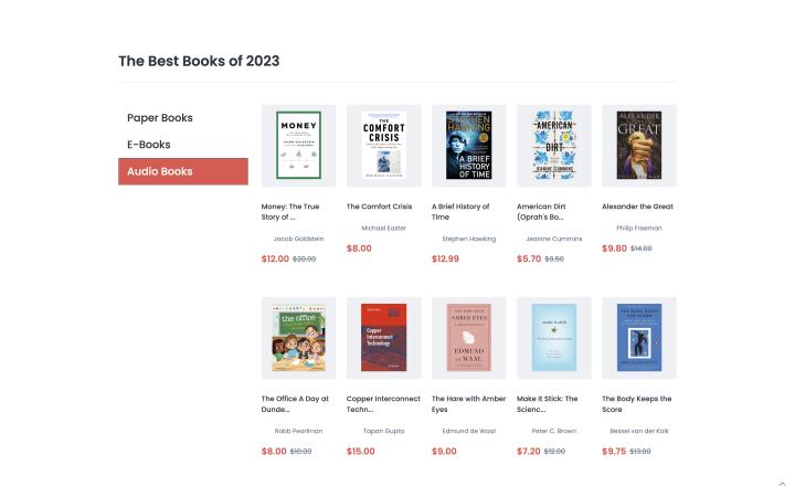
Only Books
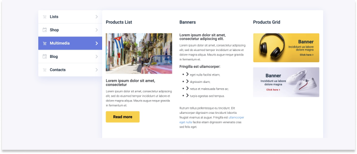
The accordion menu can easily be adapted to categorize your products. Here is what it could look like on a bookstore website. When you click on a selected category, the books that match it are shown.
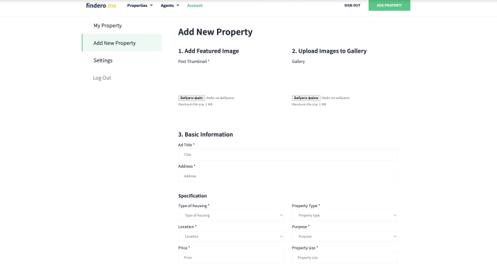
Findero
You can add an accordion menu to the personal user account so users can gradually fill in all the needed information. For convenience, you can highlight the currently active accordion submenu item. Here’s how it can look:
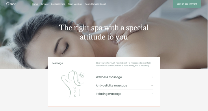
Once
You can place an accordion right in the center of the webpage to introduce people to your services. The main thing is that the design should look minimalistic and concise. Here is an example of such a design.
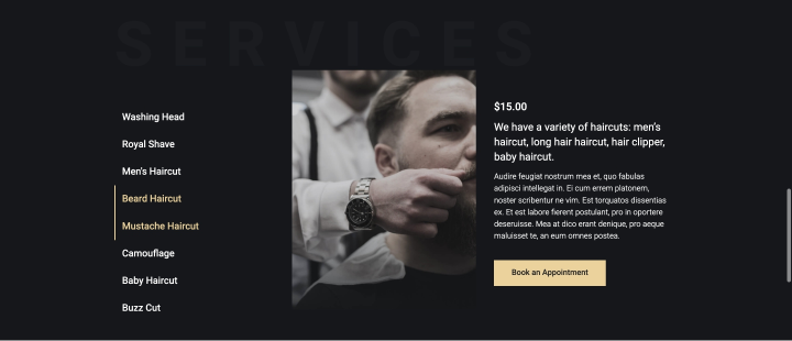
Cutcloud
The following is an example of how you can use an accordion to design the description of your services so that users have no problem finding the right option and reading everything. On a black background, the white font looks especially effective, and the accordion items are noticeable and equally attractive.
FAQ
Yes, they help improve the user experience, especially for those who view the site from a smartphone.
You can use dedicated plugins, such as JetTabs, Elementor, Easy Accordion, etc.
Use clear headings, icons, animations, and colors to help users understand what menu item they are currently viewing.
Final Words
The accordion is a useful tool for presenting a lot of information on a small website. It fulfills several functions at once: it allows users to view only the information that is relevant to them, shows them what else they could potentially be interested in, and declutters your website.
In this article, you’ve found the most important things you need to know about accordion menus on WordPress websites and seen some great examples. Use this information for inspiration for your next development project.