Dropdown menus are a website design staple, and for good reason. They provide a clean and organized way to present many links, keeping your WordPress site’s navigation user-friendly and efficient. This guide dives deep into the world of WordPress dropdown menus, equipping you with the knowledge to create intuitive and effective menus that enhance your website’s functionality and user experience.
Table of Contents
- What Is a Dropdown Menu?
- Benefits of a WordPress Dropdown Menu
- How to Create a Great Dropdown Menu for Your Website?
- Creative Dropdown Menu Inspiration with JetMenu
- FAQ
- Final Thoughts
What Is a Dropdown Menu?
A dropdown menu, also known as a drop-down list or pull-down menu, is a user interface element that hides a list of options under a button or another control. When the user clicks or hovers over the control (depending on the design), the list “drops down” from the button, revealing the available choices. This allows users to select a specific option from a set list without cluttering the interface with all the options at once.
Dropdown menus are widely used across websites and applications to provide users with a clear and organized way to navigate through different features, categories, or settings. They’re particularly helpful when dealing with a large number of options, as they keep the interface clean and uncluttered by hiding the full list until it’s needed.
Benefits of a WordPress Dropdown Menu
WordPress dropdown menus offer a powerful way to streamline your website’s navigation and enhance the user experience. Here are some key advantages of incorporating them:
- Improved navigation. Dropdown menus excel at organizing complex websites with numerous pages or categories. By keeping the primary menu concise and using submenus for deeper dives, users can find the content they seek faster and with fewer clicks.
- Efficient use of space. Websites with extensive content menus can quickly become overwhelming. Dropdown menus elegantly solve this problem by keeping the main menu bar uncluttered. They allow you to include a significant number of links without sacrificing valuable real estate on your page.
- Enhanced scalability. Dropdown menus seamlessly adapt as your website grows and you add more content. You can easily incorporate new pages or categories into submenus without redesigning your entire navigation system.
- Boosted user engagement. A well-designed dropdown menu with clear labeling and an intuitive structure keeps users engaged. They can find what they’re looking for quickly, navigate between related pages efficiently, and are likelier to stay on your website longer.
- Potential SEO advantages. Search engines consider website dynamic structure when ranking pages. Clear and well-organized navigation with dropdown menus can make it easier for search engines to crawl and index your website’s content, potentially improving your SEO.
How to Create a Great Dropdown Menu for Your Website?
While some themes come with built-in dropdown menu options, WordPress menu plugins offer a powerful and flexible approach to creating these navigation elements. One popular option is JetMenu, which empowers you to design and customize dropdown menus with ease. Here’s why JetMenu can be a top choice in crafting great dropdown menus for your website:
Design and user experience
JetMenu’s menu system offers a variety of layouts, including horizontal, vertical, and hamburger menus, ensuring that you can perfectly match your website’s design and user experience. With a high degree of customization, you can utilize widgets, drag-and-drop editing, and pre-made templates to create unique and visually appealing menus. The menus are designed to be responsive, guaranteeing they look great and function flawlessly on all devices, with customizable layouts for both mobile and desktop. Prioritizing a mobile-first approach, the system includes breakpoint control and a dedicated hamburger menu builder for optimal performance on mobile devices.
You can also style the menus to match your website, customizing fonts, badges, spacing, icons, and more for perfect integration. Additionally, the system supports easy migration, allowing you to export and import menu settings effortlessly to apply configurations to other websites.
Functionality and user engagement
The plugin supports complex navigation structures with submenus and dropdown menus for organizing your website’s content, creating a clear and hierarchical layout. You can include multimedia content such as videos and audio within the dropdown menus for a more engaging user experience and display various content like product categories, promotions, and contact information for quick access.
Interactive elements such as icons and images can be added to make menus more visually appealing and user-friendly. Advanced navigation features include breadcrumb navigation to help users understand their location on your website and the ability to create multiple menus for different sections. Visual effects and animations can be incorporated into submenus and mega menus, providing a dynamic and engaging user experience.
Additional features
The system integrates seamlessly with other functionalities, allowing you to add social media links and maps to your menus. You can also easily display blog posts within dropdown menus using widgets and pre-made templates, keeping visitors updated on your latest content.
Creative Dropdown Menu Inspiration with JetMenu
As previously mentioned, dropdown menus are powerful website navigation tools. They can organize a lot of information in a clear and user-friendly format. But they can also be so much more! With the right plugin, dropdowns can become interactive experiences that enhance your website’s design and functionality.
This collection showcases various websites that leverage the power of JetMenu to create unique and engaging dropdown menus. Let’s look at examples that might inspire you to create a masterpiece for your website.😜
#1 The Mumma Secret
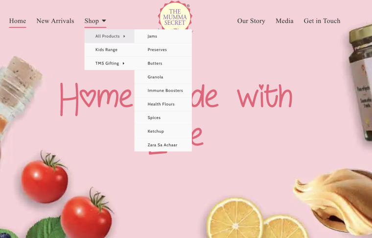
The Mumma Secret website uses a neat trick to keep its navigation menu clean and simple. Its “Shop” section has a dropdown menu titled “All Products.” This dropdown menu likely contains additional categories for groceries, jams, and other offerings. This way, it can offer a wider variety of products without cluttering the main menu with too many options.
#2 Web Premiere
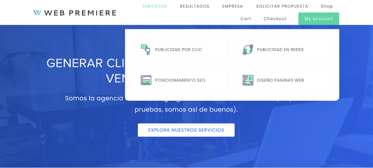
Web Premiere demonstrates that even a dropdown menu can be concise, occupying only a portion of the screen. The developers made a clever choice by using icons near the text, making the outlook more attractive to users.
#3 Swiss Healthcare
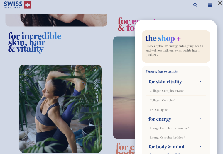
A dropdown menu is essential for healthcare websites. Swiss Healthcare shows how to design a simple and concise menu that doesn’t clutter your site while still being visually appealing to visitors.
#4 Wander North Georgia

There are three things you can watch forever: fire burning, water flowing, and the dropdown menu of Wander North Georgia. They creatively designed it by incorporating visual elements alongside text.
#5 Pretty Casual
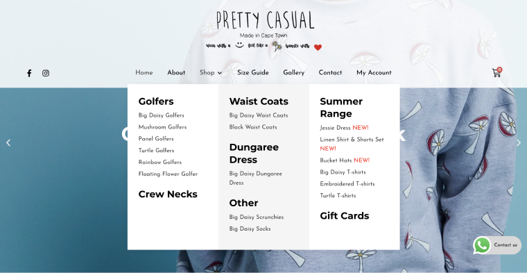
The website’s mega-menu, characterized by black text on a white background, harmonizes effortlessly with its visual identity. The diverse selection of fonts accents the menu’s hierarchical organization.
FAQ
Dropdown menus play a crucial role in website navigation, providing a compact and organized way to display many options or categories. They enhance user experience by simplifying navigation and reducing clutter on the webpage.
To design a user-friendly dropdown menu, consider factors such as menu placement, size, color contrast, typography, and animation effects. Prioritize simplicity and clarity in design while ensuring the menu is easily accessible and functional for all users.
Yes, there are alternative navigation options, such as hamburger menus, tabbed navigation, accordion menus, and mega menus. Each alternative has its advantages and is suitable for different website layouts and content structures.
Final Thoughts
Don’t underestimate the power of the humble dropdown menu! It might seem like a simple design element, but these little elements can make a world of difference on your website. Think of them as secret portals, cleverly tucked away, waiting to be revealed, and whisk your visitors to the exact information they need.
But just like any portal, a dropdown menu needs to be well-designed. Confusing labels and clunky functionality are like cobwebs – they’ll only deter your users from venturing further. By keeping things clear, consistent, and working flawlessly across devices, you can transform your dropdown menus from hidden obstacles to delightful discoveries that keep visitors engaged and exploring your website’s vast landscape.
