Visual effects play a crucial role in web design. They make browsing more engaging, direct attention to key areas and enhance product descriptions. Parallax has emerged as a modern and captivating motion effect among these effects.
This article explores different types of parallax effects and how to implement them on WordPress sites. Enjoy the inspiring examples of websites that use parallax scrolling to create unique experiences.
Table of Contents
- What Is a Parallax Effect?
- Benefits of the Parallax Effect in Web Design
- Implementing the Parallax Effect in WordPress
- Best Practices for Effective Use of Parallax Effect
- Inspiring Parallax Examples by Big Companies
- FAQ
- Final Words
What Is a Parallax Effect?
Parallax scrolling is a web design effect that makes web pages look dynamic and interactive. It mimics a visual effect when objects at different distances show different apparent displacements due to observer movement.
Back in the day, this technique was used in 2D games, creating the illusion of depth. Growing up in the 90s, it seemed like a huge jump in game development. Multiple independent background layers were the astounding upgrade from 8 to 16-bit platforms, sometimes resulting in a multidimensional playing experience.

What types of parallax effects are there?
Designers use different types of parallax effects to enhance user browsing experience. Their common feature is the ability to change the location and appearance of different objects on the screen by scrolling.
The following examples are from the Made with Croco library, where people share their websites created with Crocoblock products.
Vertical scrolling is the most common type of parallax effect. It involves the background moving slower than the foreground. The same technique can be applied to multiple layers of content, making them move at different speeds or even in opposite directions, resulting in a more complex and dynamic visual effect.
Besides providing the viewer depth and immersion, assigning different speeds to images and text blocks creates multiple compositions. Imagine the benefits of scrolling effects for online galleries and showrooms, where visitors can pause scrolling when they come across unexpected color combinations and interior design matches.
The background image remains static in a fixed background parallax while the foreground content scrolls over it, creating a great storytelling narrative. For example, one section of the article can be scrolled over one background and another over a different one. The static paper book-like illustrations provide site visitors with an excellent reading experience.
Horizontal scrolling adds a new direction of movement, allowing layers of content to move horizontally at varying speeds. This effect can create a unique and captivating user experience, especially when combined with creative design elements and interactive features.
In the above example, a shark, a school of fish, and a submarine swim into the screen during the scrolling. These events happen while the little diver submerges into the darkening ocean. The viewers scroll to see more adventures until they arrive at the My Portfolio section of the website.
However, designers should be cautious when implementing horizontal scrolling as it may not be as intuitive for users and can affect usability. In the following example, we move down through the webpage until we get to featured posts which move horizontally. Nothing else on the page moves vertically, giving a feeling the scrolling controls don’t work.
In addition to the movement of objects, parallax effects include scrolling-triggered animation. As the user scrolls, specific elements may fade in or out, zoom in, or change their appearance. This combination of parallax scrolling and animations adds another layer of interactivity and visual interest to the webpage.
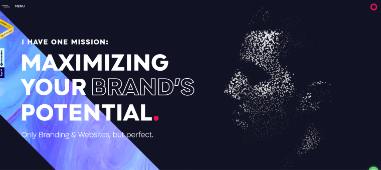
Mouse-controlled parallax reacts to the movement of the mouse cursor. As the user moves the mouse, the elements on the webpage respond by following or moving away from it. This web effect makes users feel actively engaged with the content providing a unique browsing experience.
This site’s landing page illustrates the author’s face made of many glowing particles. They start moving chaotically as the cursor approaches them, creating a gamification effect.
What types of websites use parallax?
Web designers implement parallax effects across various industries.
One particular category of websites using it excessively is creative agencies and freelance web designers. Almost every such website on the Made with Croco page showcases its work and artistic flair using this design technology.
Parallax scrolling is an effective way for photographers and visual artists to present their projects in a captivating manner. It adds interactivity to the portfolio pieces creating an immersive browsing experience.
Moreover, parallax effects can enhance all types of single-page websites and websites that aim for convincing storytelling. Industries such as eCommerce, event websites, nonprofit organizations, and even educational institutions use parallax to create visually engaging experiences that captivate visitors and effectively convey their message.
Benefits of the Parallax Effect in Web Design
The parallax effect plays a multifunctional role on websites. It can guide users to important parts of a webpage, simplify the browsing experience, or create entertaining visuals. Here are some key advantages of using parallax scrolling on websites:
- Reduced bounce rates. Parallax scrolling creates a visually captivating and interactive experience for users. Adding depth, movement, and interactivity grabs visitors’ attention and encourages them to explore the website further. This leads to longer visit durations, reduced bounce rates, and improved user satisfaction.
- Visual storytelling. Parallax scrolling is a powerful tool for storytelling on websites. Combining text, images, and animations is especially effective for long-form content. Parallax uses these elements with scrolling, letting the viewers control their pace while dynamically narrating the story.
- Improved UX. Many page elements move at different speeds when scrolling through parallax websites, giving viewers hints of where to focus. By employing the parallax effect, designers can make content-heavy pages easy to navigate.
Implementing the Parallax Effect in WordPress
One approach to implementing parallax in WordPress is using JavaScript and CSS. This method provides full control over design but requires expertise in HTML and CSS coding. If you’re not comfortable with coding and you want to apply parallax quickly, use plugins designed for parallax scrolling.
When it comes to adding visual effects to WordPress designs, the Elementor page builder stands out with its extensive range of widgets. But, for incorporating parallax effects, additional plugins are often required. One such plugin is JetTricks. It expands Elementor’s capabilities by offering eight design features.
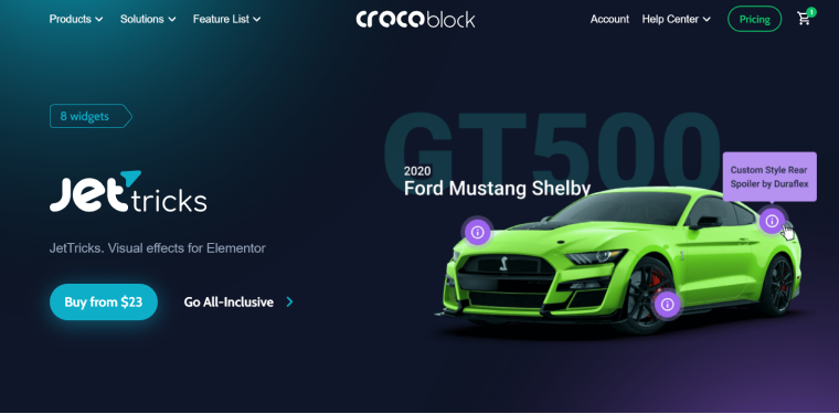
Among these features is Particles, a mouse-scrolled parallax effect. It allows inserting interactive particles into the section background and customizing them to look like snow, atoms, stars, etc. And the Parallax feature applies the parallax scrolling effect to any Elementor widget.
Another tool by Crocoblock with similar capabilities is JetElements with its Section Parallax Extension. In addition to vertical scrolling, it can add scrolling zoom, blur, opacity, 3D rotation, and other parallax effects to your WordPress design.
One more option for implementing parallax effects is to install Elementor Pro. This premium version integrates seamlessly with Elementor’s animations providing many visual effects.
They can be found in the widgets Advanced > Motion Effects section. Users can apply various animation effects such as fade in/out, zoom in/out, slide in, and more and combine them with the parallax effect to create dynamic and engaging designs.
For those using the Gutenberg block builder, plugins are also available to enhance its design capabilities. Greenshift, in particular, offers a comprehensive solution.
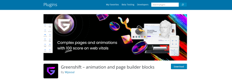
Its paid version includes the Advanced Animation Addon allowing you to apply horizontal and vertical parallax effects to any text or block.
Best Practices for Effective Use of Parallax Effect
The parallax effect can greatly enhance a website’s visual appeal and user experience. But, it’s important to consider certain best practices for its effective implementation.
- Consider performance and page loading speed. The parallax effect often involves the use of large images and complex animations. They can negatively impact the website’s performance and loading speed. To ensure a smooth user experience, optimizing image sizes, minimizing code, and employing caching techniques are crucial. These actions will help maintain fast loading times and prevent potential frustration for visitors.
- Maintain responsiveness and mobile-friendliness. With the increasing use of mobile devices for web browsing, it’s essential to ensure that the parallax effect remains responsive and mobile-friendly. Designers should test it across different screen sizes making necessary adjustments. Sometimes, parallax effects are omitted on small screens to ensure a seamless experience for mobile users.
- Balance visual appeal with usability. It’s important to strike a balance between aesthetics and usability. The effect should enhance the user experience rather than hinder it. Websites should maintain clear navigation, provide intuitive scrolling cues, and avoid excessive or distracting animations that might overwhelm visitors.
Inspiring Parallax Examples by Big Companies
With the powerful design capabilities of parallax, it’s no surprise tech giants use it to make their websites look pretty. Check out the Apple official sites to see every possible type of parallax. Their scrolling effects are, in fact, so complicated and heavyweight that none of them will appear if you access the website on your smartphone.
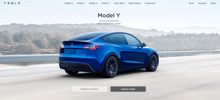
Tesla’s landing page showcases its main products. The users can scroll from one background image to another while the product’s description fades in and out in the foreground.
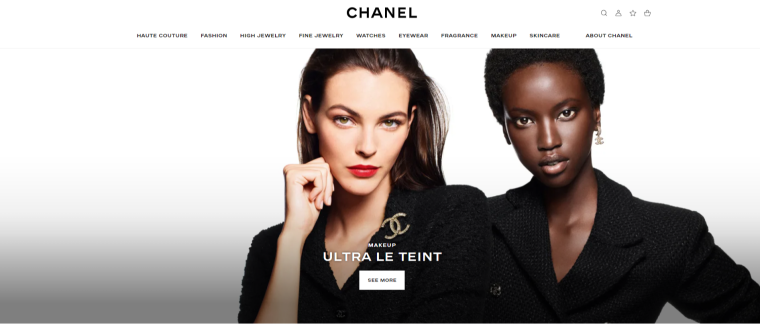
This landing page has full-screen images rolling into the view one after another. The foreground text moves just a bit faster than other content. Although the parallax effect is used moderately, it adds a sense of deepness and makes scrolling dynamic. Scrolling through Chanel’s website on a mobile device is a real pleasure.
FAQ
In design, the parallax effect refers to the technique of moving different layers of content at different speeds to create a sense of depth.
Yes. The parallax effect adds visually engaging elements, enhances storytelling, and creates a memorable user experience.
An example of the parallax effect can be observed when viewing objects while moving. If you are traveling in a car, the objects closer to you seem to pass by quickly, while objects in the distance appear to move slower.
The most common parallax effect is vertical scrolling. Other parallax effects include horizontal scrolling, mouse-controlled parallax, scrolling-triggered animation, and fixed background parallax.
The easiest way to add parallax effects to your site is by using plugins. JetTricks and Elementor Pro provide easy-to-use tools for adding many visual effects, including parallax.
Final Words
Honestly, going back to non-parallax websites after scrolling through these examples makes me want to ask, “Can’t you be more hip and fun?”
Parallax can make tremendous changes to browsing experiences. Using this effect is like scrolling on steroids. It enlightens content-heavy pages by breaking down information into digestible sections and highlighting key points.
The great news is that implementing parallax scrolling doesn’t have to be a daunting task. With the right tools, such as plugins for Elementor or Gutenberg, adding parallax effects to your WordPress website is just a few clicks away.
So why settle for a static and uninspiring website when you can elevate your design to new heights with the parallax effect? Embrace the fun, interactivity, and dynamic nature of parallax scrolling to captivate your audience, tell your story, and create a unique browsing experience.
