Nothing is worth more and costs less than politeness. It’s crucial for successful customer relationships, especially in eCommerce. While the thank you page often gets overlooked, it’s a golden opportunity to leave a lasting positive impression and encourage repeat business.
Surprisingly, even prestigious platforms like Awwwards neglect to highlight the importance of this essential page. It’s time to change that. Just as you meticulously craft your homepage, equal attention should be given to the “Thank You” page. Let’s face it: the generic “Thank you for your order” is as overused as “Your opinion matters.” It’s time to break free from these clichés and create a thank you page that truly connects with your customers.
Let’s explore strategies to transform your “Thank You” page into a powerful tool for customer retention and engagement. Discover best practices and tips to create a thank you page that leaves a memorable impact.
Table of Contents
- What Is a Thank You Page?
- Why Is a Thank You Page Important?
- When Do You Need to Have a Thank You Page?
- Thank You Page Essentials
- Thank You Page Best Examples
- How to Create a Thank You Page in WordPress?
- FAQ
- Sum Up
What Is a Thank You Page?
A thank you page is more than just a polite goodbye; it’s the digital equivalent of a warm handshake after a great conversation. This dedicated webpage is your chance to shine after a user takes a desired action – be it buying your product, signing up for your newsletter, or submitting their details.
The thank you page is the page your client sees after making conversion actions, which can be:
- registration;
- application;
- ordering a service/item/callback from you;
- subscription to the news.
Beyond simply saying “thank you,” a well-designed thank you page serves several important purposes. It confirms that the user’s action was successful, providing reassurance and building trust. Additionally, it offers an opportunity to guide users toward their next steps, whether it’s exploring additional products, confirming their order details, or accessing the downloaded content.
Why Is a Thank You Page Important?
A thank you page serves as a crucial component of a website or digital service for several reasons. Firstly, it provides immediate confirmation to users that their actions, such as a purchase, signup, or form submission, have been successfully completed. This confirmation reassures users that their effort was received and understood, helping to prevent confusion and potential frustration. It’s an opportunity to solidify the positive experience they just had with your brand or service.
Beyond simply confirming a transaction or action, a thank you page also offers a chance to engage further with the user. Offering additional resources, suggestions for next steps, or related content helps to keep users engaged with your website longer. This continued engagement can increase the likelihood of repeat visits or additional purchases, contributing to a stronger relationship with the customer. A well-crafted TYP also helps collect valuable feedback. By including a survey or request for a review, businesses can gather insights into the customer experience and identify areas for improvement.
Also, an Elementor thank you page can be an effective tool for encouraging social sharing and building community. By offering shareable content or prompts, you can encourage satisfied users to share their positive experiences on social media or through word of mouth. This kind of organic promotion is highly valuable, as it often carries more weight and authenticity than traditional advertising. In essence, a thank you page is not just a courteous end to a transaction but a strategic touchpoint that can drive engagement, feedback, and community growth.
When Do You Need to Have a Thank You Page?
There are many reasons to add the thank you page to your site. But the main points are:
- to give a thank you note to buyers;
- to confirm some actions;
- to evoke a smile and say something useful;
- to talk about the further steps after completing the application;
- to show relevant and valuable content.
The thank you page is a powerful sales tool with multiple benefits. It can boost conversions by strategically suggesting additional products, extending website visit duration (improving SEO), providing essential product information like usage instructions or related posts, and encouraging customer engagement through subscriptions, surveys, or social media follows. By building trust and loyalty, the thank you page can also serve as a valuable platform for verifying customer data.
Thank You Page Essentials
The thank you page can include many different elements, but the must-have structure is as follows:
- a text to express gratitude to the client for performing a specific action: thank you for signing up, registering for an event, ordering a service or a good, subscribing to news, downloading a file, thank you for your update, or purchasing on the site;
- elements to strengthen the brand (photos, links to special content, links to news, etc.);
- call to action (i.e., get more information, join our community, visit the webinar);
- social network links;
- social proof (i.e., testimonials).
The main elements of the thank you page should motivate the clients to revisit the site. But you can add other details to make your thank you page more user-friendly. For example, you can spruce it up with:
- a promo code, bonuses, discounts on subsequent purchases;
- a countdown to some registered events;
- videos and photos of management and staff.
Every website needs a special thank you page. Sometimes, a bright photo and some text are enough to emphasize the site’s style. The thank you page should be simple, effective, and informative because its mission is primarily to say “thank you” to the client.
Thank You Page Best Examples
Look at these best examples of the TYP. They vary greatly and can include more than standard elements.
Kindlepreneur uses a stylish thank you page with a video containing a personal thanks from a recognizable person representing the company.

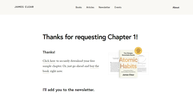
James Clear’s page has the necessary elements: a thank you, a value offer, and a link to other offers. They are not very noticeable, so it was worth making a big bright button for visitors to find out what the offer is. I’d suggest adding a discount code for subscribers here.

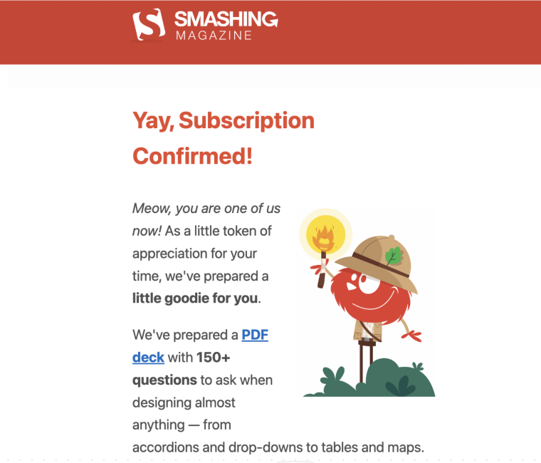
Smashing Magazine delighted us with the original and humorous design of their custom WooCommerse thank you page. They’ve shown that even a seemingly standard page can be interesting and memorable.

Voices use a strong call to action to keep users engaged. After completing the form, users are prompted to listen to their voices, which encourages them to take the next step.

After filling out the form on the Craves website, you will receive a pleasant surprise: a stylish “Thank you” page with a bit of a funny message.

How to Create a Thank You Page in WordPress?
You can create a thank you page like a normal WordPress page. Although there are many decent WordPress plugins for this purpose, I’d like to describe how to use the top-rated Elementor WooCommerce plugin.
To create such a page in WordPress, you need JetWooBuilder and Elementor free. Additionally, you can use JetThemeCore to create a page with a header and footer.
JetWooBuilder has 60+ widgets to add to the “Thank You page” and all other pages (single product page, shop page, custom cart page, checkout, success, and account page). Concerning the thank you page, it proposes three widgets: Custom Address Order, Order Details, and Order.
FAQ
A “Thank You” page is displayed after a user completes an action (like a purchase or form submission). It confirms the action and expresses gratitude. It can also guide users to further steps, collect data, suggest additional products, or strengthen brand loyalty.
A basic thank you page should include a clear confirmation message, a thank you statement, and a clear call to action for the next step. Additional elements might include order details, download links, or social sharing buttons.
To improve your thank you page, focus on providing value to the user. Offer additional information, incentives, or exclusive content. A/B testing different page designs and content can also help optimize performance.
Sum Up
A well-designed thank you page is a crucial part of any site. It is an excellent tool for reaching out to customers interested in your company. In this article, I presented the essential tips on how to make this page effective, and the main of them are as follows:
- the thank you page should maintain a consistent site design;
- a call to action should refer to the business goals;
- use it to collect data in order to fine-tune your business and content strategy;
- design elements of the thank you page should contribute to conversions, i.e., present links to social networks, offer bonuses, have FAQs, etc.
This page should not be empty or boring because it is a fully-fledged conversion tool. You can include a lot of information here, such as order confirmation and details, a call to action, photos, videos, bonus offers, links to social networks, and additional services.
Appreciation for your time and attention. Would you care to leave a reaction below?