Website forms really matter because they turn the website into an interactive tool. For any request, question, feedback, booking, or setting up an appointment, as well as any other way of communication with the clients, forms are the number one instrument. That’s why they must never be overlooked.
With web forms, online companies can turn browsing readers into full-blown consumers. However, many websites don’t pay enough attention to the web forms and prioritize other page sections and functionality.
A poorly constructed form can be off-putting to the consumer and may detract them from signing up for your newsletter or purchasing. As a result, you could lose leads, sales, and profit.
So, it’s time to talk business 😎 and figure out how to make the forms look and feel great. That’s why first, let’s outline some basic principles and then go into details and inspirational examples.
Table of Contents
- UX Tips and Principles for Better Website Forms
- 7 Great Form Examples for Inspiration
- FAQ
- A Few Final Thoughts
UX Tips and Principles for Better Website Forms
Understanding principles is the key and much more important than just seeing inspiring examples without understanding why, right? So, let’s start with them.
And, well, let’s start with some cornerstone reasons why some forms are working efficiently, and some don’t. But there is no magic recipe here, and I would distill it down to seven essential principles followed by seven real-life form examples for your inspiration.
- Know your target audience. Because there’s no single recipe for the perfect, amazing, godsend, and magically converting website form. The reason for this is the target audiences are different. So, the better you know your audience, the better you can speak their language and, thus, create that particular design and content that attracts them.
Well, this implies that we shall talk about this second point. - Remember that your website’s form is a two-way communication thing. Not another advertisement or “We just need your e-mail address to annoy you with newsletters you’ve never subscribed to” situation.
Most of the freelancers’ and studios’ clients, when reaching out to them and asking to create a website, be it a corporate one, portfolio, a shop, you name it – may not even mention or discuss a form functionality while this is an instrument of two-way communication. - Keep your forms as simple and straightforward as possible. Imagine the person you met 5 minutes ago at a cafe asking you about your company, industry, what you think about them, and so on. Even if you are the biggest extrovert on the planet, such questions might take you some seconds to digest and think about the answers. So, while you will probably not leave the place the next second because of some social rules, you can do it easily online when “speaking” to the form. So do the website visitors when they see a bunch of confusing questions.
- Clearly mark mandatory and optional fields so users understand what exactly you want from them from first sight. If most of the fields are mandatory, mark the optional ones. And vice versa, if most are optional, mark the required ones.
- Use inline validation. Instead of showing one big error message after pressing the Submit button and confusing the client, use inline validation with error messages shown immediately after the particular input is filled.
- Use help texts if there is something complicated or confusing in your form. If you ask some questions that potentially can raise concerns about privacy, there must be an explanation about why you ask it. For example, in some countries, guests must provide a marriage certificate if booking a hotel room for a heterosexual couple. It sounds weird and even insulting to many foreigners, but it’s the country’s law. So, it’s better to explain why you ask for such a document.
- If the form is long and can’t be shortened, use multi-step forms. When it comes to booking, content submission, surveys, and other forms like this, you just can’t keep them short. And it’s time for multi-step forms to shine. They also can be a solution for mobile versions of any form.
7 Great Form Examples for Inspiration
Have a look at our collection of cool web forms and why they got their place on our list.
PAXAFE
This company offers technological solutions for supply chain management. And speaking about such services, we are talking about huge financial risks if something goes wrong. Therefore, companies providing such services must instill confidence in their customers’ unwavering accuracy and reliability so that they can trust millions of dollars a day that could be lost if a system fails, products spoil, or a needed part is not delivered on time and intact.
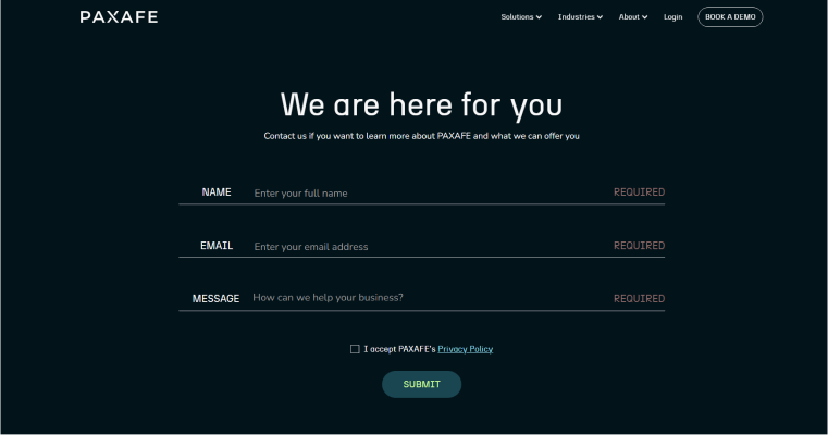
🏆 And this form gets: 10 out of 10 points.
Why? The overall design perfectly matches the services the company provides, with its minimalistic but still not austere style. From the first moment, the user can understand that this company is about technology. Despite the fact that the form consists only of three fields, it gives the client an extremely clear message that the company is there for them and ready to provide a personalized offer.
Also, it’s great that they don’t overload clients with more than these three fields and don’t ask typical questions for such situations, e.g., “your industry.” Moreover, the form occupies a whole screen, and they don’t try to squeeze offers and promotions here, which gives them extra credits.
Networkx
This is a website of a service that connects people with business clubs around the world. They use AI to match candidates and clubs, so emotions and prejudice are not involved. The specificity of this website and the service is that they have to know facts about the clients willing to use the product. That’s why the registration form has to be long.
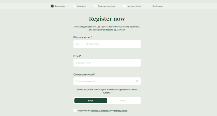
🏆 And this form gets: 8 out of 10 points.
Why? They turned this long form into a multi-step one, where each step is explained so the client understands what they will do and which information to give. Also, there is a nice greeting message to make the user feel valuable.
Two points were deducted because the overall process of how exactly the service works and why this particular information is needed is explained neither on the form page nor somewhere else on their website.
Metropolis Moving
This is a moving company, and you don’t even need much explanation that it operates in New York because it’s almost obvious from the Request a Quote form and page design. The step indicators are beautifully executed. Moving can be a really stressful process, and it’s so nice that the designer added this rather playful and adventurous feel to it.
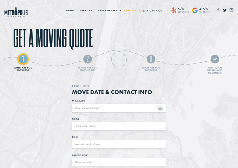
🏆 And this form gets: 9 out of 10 points.
Why? It has a great design that matches the service with a pinch of gamification.
One point was deducted because the form fields on the first screen look a bit overwhelming and stretched vertically (with both labels on top and placeholders), and it’s a bit of a question whether the e-mail confirmation is necessary here when clients also provide the phone number.
Hexens
This company works in the cybersecurity field, and the website designer took full advantage of stereotypical images of cybersecurity, hackers, dark screens, and Matrix-like glowing green moving lines of text. It’s a pop-up form, so it doesn’t take extra space on a page. The communication in a form title is amiable and clear, and there are no unnecessary field labels.
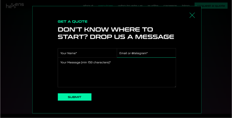
🏆 And this form gets: 10 out of 10 points.
Why? Bold and well-thought-out design that uses pop-culture images about the industry. The placeholders are clear and concise: for example, look at the “Email or @telegram” one. The thing is, users can be found on Telegram both by phone number or the nickname (which starts from @). So, they clearly told us to use a nickname without any labels or explanatory texts.
Media.Monks
Given their background as a digital marketing and advertising agency, “Media.Monks” knows how to design a website. Their site is full of quirky animations, culminating in aesthetically pleasing interfaces and easy-to-use web forms.
First, they give a choice of what kind of request you have and then display a corresponding form.
🏆 And this form gets: 10 out of 10 points.
Why? The form design is fully aligned with the overall website design, and they put a choice of departments before the form is filled, spicing it up with an animated illustration.
Robby Leonardi
Proficient in coding and animation, a multidisciplinary designer, Robby Leonardi created his interactive virtual resume to stand out from the crowd. It worked. Visitors to his site simply scroll down and watch his avatar run, jump, and swim through different “sections” – from skills to hobbies to work experience.
Finally, in the last stage of his Super Mario-like animation, readers are presented with a contact form. The engaging and joyful journey culminates in this form, which is as attractive as the rest of the site.
🏆 And this form gets: 10 out of 10 points.
Why? This form is a very logical final step in the animated journey the website offers.
Rose Family
The Rose Family restaurateurs have been providing fine-dining experiences of the highest quality for over four decades, and their classy, sophisticated website reflects this. The high-end nature of their work needed an equally elegant web design, which is reflected in their reservation form.
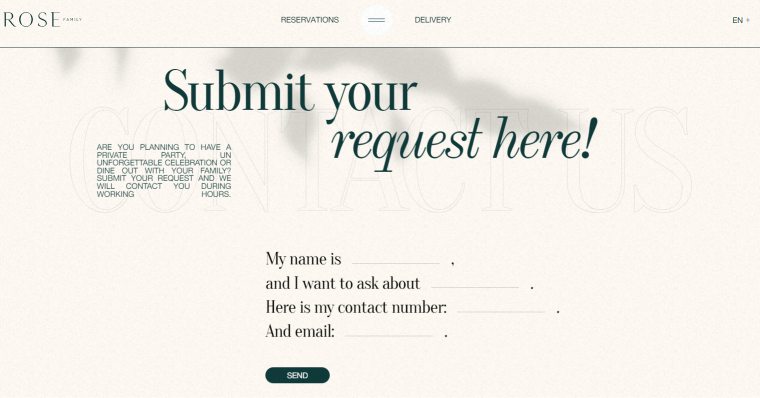
🏆 And this form gets: 10 out of 10 points.
Why? The designer used a natural-language approach instead of the typical table-like layout. It definitely highlights the overall message and feel of the site.
FAQ
Contact, registration, sign-up, and sign-in forms are definitely the most popular. Then, we have booking, appointment, survey, and content-submission forms.
You can choose a form plugin depending on your goal, but remember that Crocoblock offers a powerful free JetFormBuilder plugin. It has many features and uses Block Editor (Gutenberg) UI, which makes it very flexible because you can mix the form blocks with other blocks to achieve a custom look and functionality. And, of course, as any other JetPlugin, it gets superpowers for working with dynamic content when combined with JetEngine.
A Few Final Thoughts
Website forms are basically an interface for communicating with users and getting precious information from them. In the majority of cases, the event when a potential client fills up a web form is considered a conversion since this person makes the first step into becoming a loyal customer. That’s why forms deserve attention, best UX and UI practices, and efficient plugins if the website is built on WordPress.
I hope this article was helpful!
