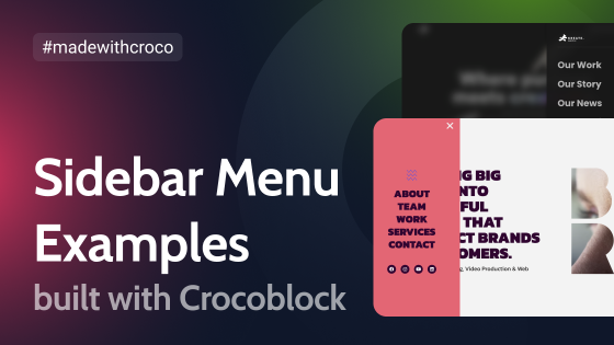
Navigation menus in the sidebar are essential for guiding users through online content on countless websites. These menus are typically located on the left or right side of the screen, providing easy access to a website’s different sections, pages, or features. In this roundup of WordPress sidebar navigation menu examples, we’ve hand-picked 15 real sites – built with Elementor, JetMenu, and block-theme tools – and broken down what actually makes each one work. If you’re evaluating sidebar navigation for a WordPress project in 2026, this is a practical reference, not a style gallery.
What Is a Sidebar Navigation Menu?
Sidebar navigation menus are vertical nav bars positioned on the left or right side of a page. Users click or tap links to move between sections, and the menu typically stays anchored while the main content changes. Beyond basic links, sidebar menus sometimes carry a logo, social media links, or an AJAX search form; though how much you pack in depends on the site’s purpose and screen real estate.
Types of Sidebar Navigation Menus
Sidebar navigation in WordPress falls into four main patterns. Each solves a different problem, and the right choice depends on your site structure, theme architecture, and target device.
Several types exist: fixed (sticky), slide-out, hamburger, and FSE (block theme). A sticky menu widget inside a sticky column stays visible while scrolling. A slide-out appears on click or hover. A hamburger reveals a hidden panel. FSE menus are defined directly in the Site Editor and travel with the template.
| Type | How it appears | Best suited for | Mobile behavior | JetMenu support |
|---|---|---|---|---|
| Fixed (sticky) | Always visible | Docs, dashboards, content-heavy sites | Collapses to hamburger | ✅ |
| Slide-out | Hidden, triggered by click/hover | Agency and portfolio sites | Native overlay | ✅ |
| Off-canvas | Overlays the page from the edge | Mobile-first layouts | Native | ✅ |
| FSE (block theme) | Defined in the Site Editor template | Block-based WordPress themes | Inherits from template | ✅ JetMenu 3.0 |
UX Best Practices for Sidebar Navigation
Good sidebar navigation doesn’t announce itself. Users shouldn’t have to think about where to click; the structure should be obvious enough that the menu becomes background infrastructure. Most of these principles apply to any WordPress navigation menu, but sidebar menus have a few constraints worth addressing separately.
Navigation is where users decide whether to stay or leave. 61% of users abandon websites with complicated or unclear navigation, and if completing a task takes too many steps, 67% leave entirely. A sidebar menu that looks clean in Figma but fails on mobile or buries critical links is a conversion problem, not just a design one.
Limit depth to two levels
Users struggle with navigation that goes deeper than two levels. If your sidebar needs three or more levels, that’s usually a signal that the information architecture needs restructuring, not the menu. Accordion-style expansion can help in some cases, but each additional click adds cognitive load and increases the risk of users losing their place.
Label items by destination, not action
Blog, Services, and Contact outperform Explore, What We Do, and Get in Touch. Clever labels look good in Figma and fail in the browser. Use the noun the user is looking for, not the verb you want them to perform. This is especially important in sidebar menus where vertical space turns label length into a layout problem.
Signal current location
Users need to know where they are at all times; that’s why navigation should be a top priority for 94% of consumers on digital platforms. A highlighted or visually distinct active state (a color shift, underline, or icon change) reduces navigation errors and disorientation on deep pages. In Elementor + JetMenu builds, this is handled through the Active state in the widget’s Style tab. Don’t leave it at the default.
Don’t hide critical navigation behind a hamburger on desktop
Hamburger menus reduce discoverability. On a desktop, if your top five pages matter, they should be visible. Reserve hamburger-triggered sidebars for supplementary navigation or for sites where visual hierarchy demands a minimal UI, like in portfolios, photography, or luxury brands. For everything else, hiding navigation is a UX tax on every visit.
Sticky menus earn their keep on long pages
If a user scrolls past the fold, a non-sticky menu forces them back to the top to navigate. On content-heavy pages (documentation, long-form editorial, product listings), sticky sidebars reduce friction measurably. The tradeoff is screen area: on narrower viewports, a 240px sidebar starts competing with content. Test at 1280px, not just 1920px.
Test collapse behavior on mobile before launch
Seventy percent of mobile users abandon sites with unresponsive navigation. In a sidebar context, “unresponsive” usually means one of three things: touch targets that are too small, a sticky menu that fights with the browser, or a hamburger trigger that doesn’t fire reliably on tap. All three are fixable, but only if you test on an actual device.
Building a Sidebar Navigation Menu in WordPress
With JetMenu and Elementor
JetMenu integrates with Elementor as a Vertical Mega Menu, Mega Menu, and Hamburger Menu widgets. You build the menu structure in WordPress (WordPress Dashboard > Appearance > Menus) and control the visual presentation (layout, mega menu panels, icons, hover effects) in Elementor.
For sidebar use specifically: JetMenu’s Vertical Mega Menu widget combined with sticky column behavior, which covers most sidebar navigation patterns without custom CSS.
With JetMenu 3.0 and block themes (FSE)
JetMenu 3.0 added support for Full Site Editing, which changes where and how you build your sidebar navigation in WordPress.
Instead of WordPress Dashboard > Appearance > Menus, you work inside the Site Editor; the menu becomes part of your template, not a separate configuration layer.
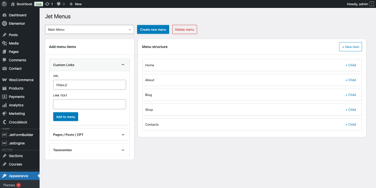
Under WordPress Dashboard > Appearance > Jet Menus, you create and manage menu structures that plug directly into block-theme templates. For themes like Twenty Twenty-Four, this means you get JetMenu’s mega menu capabilities (conditional visibility, icon support, AJAX search integration) inside the Block Editor, without switching to Elementor.
Compared to the native WordPress Navigation block, which gives you basic link structure and minimal styling, JetMenu adds mega menu panels, visibility rules, and richer interaction states. For sites where navigation carries real functional weight (directories, eCommerce, membership platforms), that gap is significant regardless of whether you’re building with Elementor or the Block Editor.
The sites below were hand-picked from the Made with Croco gallery. Each illustrates at least one of the patterns from the table above, and a few make tradeoffs worth unpacking. The majority are powered by JetMenu. In the meantime, you can check out our JetMenu video tutorials. If you’ve built a WordPress site with any Crocoblock product, you can add it to the gallery for free; who knows, it might end up in a roundup like this one. ✌️
15 Sidebar Navigation Menu Examples
Your Digital Solutions Studio
In Your Digital Solutions Studio, the sidebar navigation menu is positioned on the right-hand side of this website and is activated by clicking the hamburger icon. The menu smoothly slides into view with a subtle animation, creating a clean and modern interaction. Its semi-transparent background keeps the focus on the content while maintaining clear readability. Visitors can quickly access key pages through a concise set of navigation links.
It was built with Elementor, extending menu behavior and allowing flexible styling and animations.
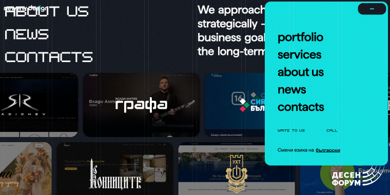
ACRE Project
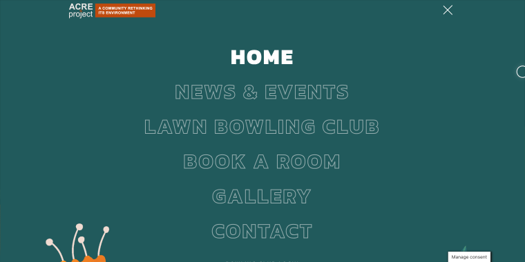
A full-screen navigation menu of the ACRE Project website is triggered by the hamburger icon, covering the entire viewport for a focused browsing experience. The layout presents menu items in a clear vertical structure, making navigation straightforward and distraction-free. The minimal design and strong typography help users quickly understand available sections and move across the site.
It was built with Elementor and JetMenu plugins. These tools support full-screen layouts and advanced menu customization.
Marko Pantelić | Bariton
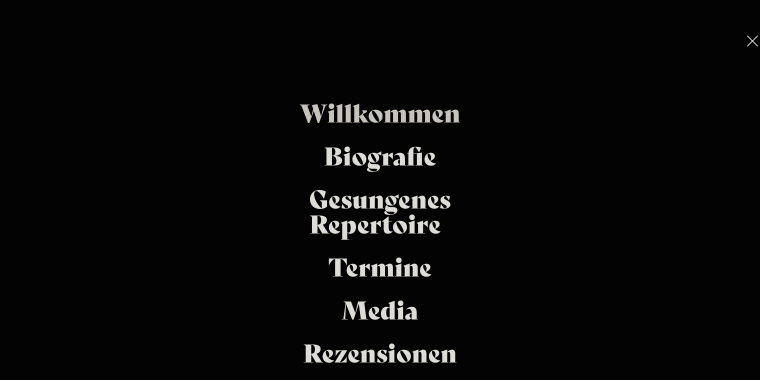
A full-screen navigation menu on the Marko Pantelić website appears after clicking the hamburger icon, presenting links in a centered vertical layout. Each menu item features a smooth hover animation, slightly lifting upward to create a subtle interactive effect. This adds a sense of depth and responsiveness while keeping the interface simple and elegant. Users can easily explore the site through clearly defined navigation options.
It was built with Elementor and JetMenu plugins. They provide control over animations, layout, and overall menu behavior.
Concept Formation
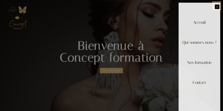
At Concept Formation, the sidebar navigation menu is positioned on the right-hand side of this website and activated by clicking the hamburger icon. It provides visitors with a seamless and intuitive way to navigate the site. A semi-transparent white background adds a touch of elegance without overpowering the menu. Users can easily access important pages through four essential links on the menu.
It was built with Elementor and JetMenu plugins. Both enhance menu functionality and customization options.
Bike Green
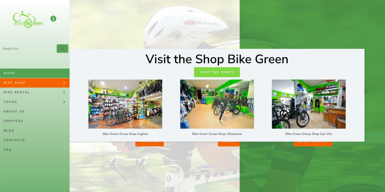
Bike Green‘s sticky left sidebar mega menu makes it easy to find important pages and features on this website. The navigation bar remains visible despite scrolling down, making browsing easier. The menu includes the website’s logo and an AJAX-based search that lets users quickly find what they want. Eight primary links below the search box cover various topics and services.
Additionally, the menu includes a language switcher to accommodate multilingual users, enhancing accessibility and inclusivity. The menu also includes social media links so visitors can stay connected with the website across various platforms.
It was built with Elementor and JetMenu plugins.
SheSapiens

A sticky full-height menu at SheSapiens remains fixed as users scroll, providing quick access to important sections. Its white background creates a clean, contemporary look that complements the overall design aesthetic. The hover effect on the menu adds a touch of interactivity and visual appeal.
The menu is divided into two main sections: “Explore” and “Members-only.” These links cover a wide range of content, from company information to resources and collaborations, catering to different user interests. This segmentation enhances user experience by providing tailored content and functionality based on user status.
It was built with Elementor and JetElements plugins.
MLKStudio
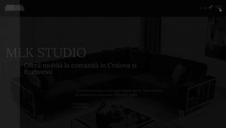
The menu on the MLKStudio site is an outstanding feature that makes navigation seamless and unobtrusive. With a full-page layout, users have access to comprehensive navigation options without cluttering the main content area. When activated, the menu slides in from the left side, making it easy to access menu items. In contrast to the website’s black hero area, the menu’s white background creates a clear visual distinction. The contrast enhances the readability of the menu and makes it stand out without overwhelming the overall design.
Four menu items have sub-items that can be accessed by clicking on the menu item or a plus symbol next to it. Hierarchical structure makes navigation easy and allows content to be accessed efficiently.
It was built with Elementor and Header Footer Elementor plugins.
Emerald Guitars
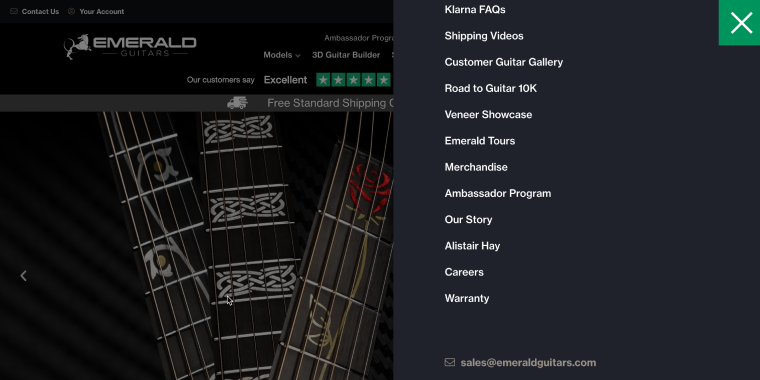
The hamburger sidebar menu on the Emerald Guitars website combines functionality with a stylish design, providing users with an efficient way to navigate. A right sidebar slide-out effect offers ample room for menu items without obstructing the main content. Upon closing, the menu seamlessly slides back to the right side of the page.
It was built with Elementor and JetPopup plugins.
Barrel Marketing

The hamburger sidebar menu on Barrel Marketing‘s website complements the site’s overall bold design aesthetic with a dynamic and visually engaging element. With its left-side slide-out effect, the menu provides seamless navigation while maintaining the website’s vibrant and contemporary appearance. When closed, the menu slides out to the same side, ensuring a seamless transition.
This menu background color complements the website’s captivating design elements, including bold typography, vibrant colors, illustrations, and video. A cohesive design approach creates a visually striking user experience that enhances brand recognition and captures attention.
It was built with Elementor.
Kreate. Agency

Kreate. Agency‘s hamburger menu complements the site’s bold and contemporary design with stylish and functional elements. An easy-to-use right-side slide-out menu maintains the website’s sleek aesthetic while providing convenient navigation. When closed, the menu slides out to the same side, making it seamless and visually pleasing. A black menu background contrasts sharply with the website’s bold typography, vibrant colors, white accents, and illustrations, enhancing the overall visual impact. This way, the agency creates a modern, sophisticated user experience reflecting its creativity and professionalism.
From the menu, users can access essential links such as “Our Work,” “Our Story,” “Our News,” and “Our Details,” which provide detailed information on services, history, and news updates. Social media icons are also prominently displayed on the site so visitors can connect with the agency.
It was built with Elementor and JetMenu plugins.
Javligt Gott
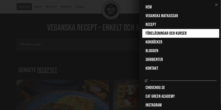
With Javligt Gott‘s stylish and contrasting design, the hamburger menu enhances navigation within the site’s stylish and user-friendly elements. The right-side slide-out menu provides easy access to essential links while maintaining a seamless and engaging user experience. When closed, the menu slides out to the same side.
The menu’s black background creates a dramatic contrast that highlights the photos, white accents, and other design elements. In the bottom segment, there are links to social media accounts.
It was built with Elementor.
Milan Experts
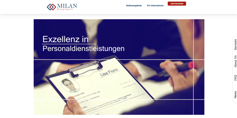
The fixed right sidebar menu on the Milan Experts website is a practical and visually appealing navigation element that enhances user experience within the website’s clean and modern design. While scrolling, this menu remains fixed, providing constant access to essential links. The menu features vertical menu item labels and offers a straightforward and intuitive navigation experience.
It was built with Elementor and the Scroll Navigation Widget by Crocoblock.
Skelementor
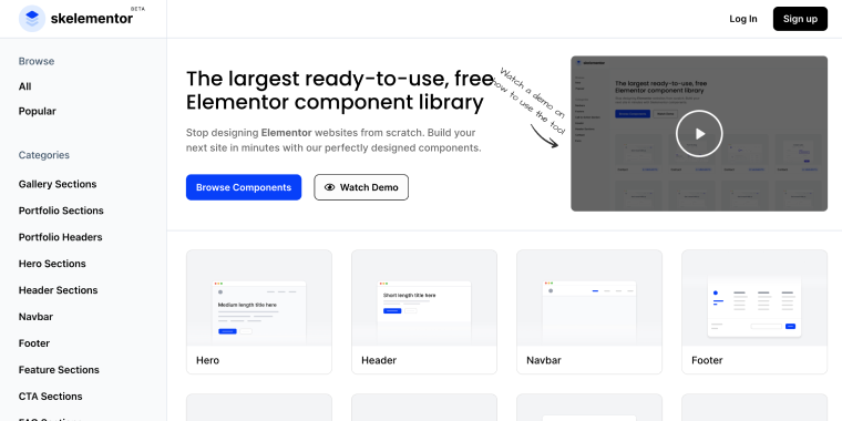
In Skelementor‘s content-rich environment, the left-sidebar menu provides a comprehensive and user-friendly navigation tool to enhance browsing and accessibility. Keeping this menu fixed as users scroll allows users to access important links without interrupting the main content. The white background maintains a clean, professional appearance that blends seamlessly into the overall design. Menu items are categorized into three sections for easier navigation: “Browse,” “Categories,” and “More.”
It was built with Elementor and JetSmartFilters by Crocoblock. Smart filters enhance user experience by enabling users to find specific content more quickly or navigate according to their preferences. As a result, Skelementor’s website visitors have a seamless and efficient browsing experience.
Devitus Digital
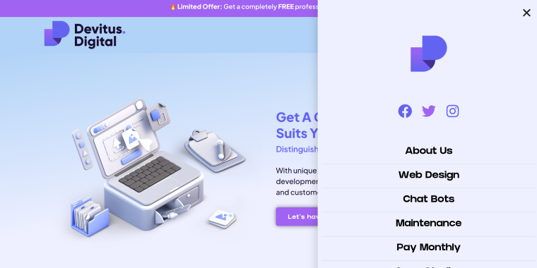
The right-side hamburger slideout menu on Devitus Digital website is a user-friendly and visually appealing navigation element designed to enhance accessibility and streamline user interaction. The menu’s very light shade of blue background blends seamlessly with the website’s overall color scheme, creating a cohesive and inviting browsing experience. Logos and social media links are included in the menu, allowing visitors to connect with the brand across different platforms.
It was built with Elementor.
Irini Konstantinidi
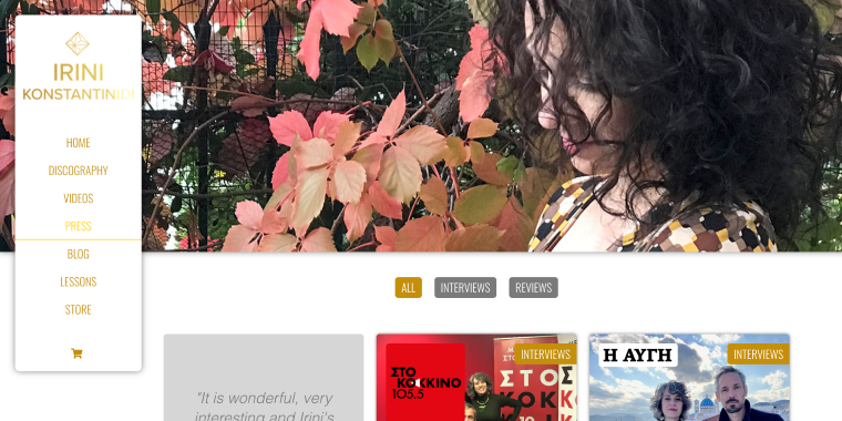
On Irini Konstantinidi‘s press page, the left sidebar menu is a functional and visually appealing navigation element designed to enhance user experience. As a vertical rectangular block with a drop shadow, the menu stands against the white background, making navigation clear and organized. Menu components include a logo for brand recognition and links covering key areas of interest.
It was built with Elementor and JetMenu plugins.
FAQ
Sidebar navigation menus offer a clear and organized structure for users to navigate through website content efficiently, improving overall usability and user experience.
Essential elements include logos for brand recognition, navigation links for easy access to content, social media links for engagement, and responsive design for accessibility across devices.
Drawbacks may include limited space, leading to a crowded interface and challenges with mobile responsiveness, which require careful design considerations for optimal user experience.
As of JetMenu 3.0, the plugin supports Full Site Editing, which means you can create and manage sidebar navigation menus directly in the WordPress Site Editor instead of Appearance > Menus. You get JetMenu’s mega menu capabilities (icon support, conditional visibility, AJAX search) inside the block theme workflow.
Not really, it’s an alternative for a specific scenario. If you’re building with Elementor, the classic JetMenu Mega Menu widget for Elementor is still the more flexible and better-documented path.
Conclusion
These 15 sidebar examples illustrate how flexible and functional modern website navigation can be. Each menu type offers unique benefits and features tailored to enhance user experience, from fixed sidebars to hamburger menus with sleek animations.
Here’s a short recap of websites from this collection.
- Your Digital Solutions Studio has a right-side hamburger menu with a sliding animation, a semi-transparent background, and a minimal set of links, built with Elementor.
- ACRE Project uses a full-screen hamburger menu with a vertical layout and bold typography.
- Marko Pantelić features a full-screen hamburger menu with centered links and subtle hover animations.
- Concept Formation has a right-side hamburger menu with four links and a white, semi-transparent background.
- Bike Green has a sticky left sidebar menu with links categorized and built with Elementor and JetMenu plugins.
- SheSapiens is a sticky full-height menu with a hover effect, divided into Explore and Members-only sections. It was built with Elementor and JetElements plugins.
- MLKStudio has a hamburger menu with a full-page layout sliding in from the left side, which is built with the Elementor and Header Footer Elementor plugins.
- Emerald Guitars has a hamburger menu with a right sidebar slide-out, built with JetPopup and Elementor Nav Menu.
- Barrel Marketing has a hamburger menu with a left-side slideout built with Elementor.
- Kreate. Agency has an Elementor and JetMenu hamburger menu with social media links and a right-side slideout.
- Javligt Gott has a right sidebar menu with vertical item labels created with Elementor and Scroll Navigation Widget.
- Milan Experts has a fixed left sidebar menu presented as a vertical rectangular block with a white background, built with Elementor and JetMenu.
- Skelementor has a fixed left sidebar menu with its scroll, featuring a white background, built with Elementor and JetSmartFilters.
- Devitus Digital has a right-side hamburger slideout menu with a light blue background built with Elementor.
- Irini Konstantinidi has a fixed left sidebar menu with a white background, built with Elementor and JetMenu.
With logos, social media links, and categorized menu items, these menus prioritize usability and accessibility. Whether it’s a stylish slide-out menu or a full-height sidebar with smart filters, these examples demonstrate the importance of intuitive navigation design for creating engaging and user-friendly websites.
