Products List Widget Overview
The Products List widget settings are explained to showcase the WooCommerce products and their attributes in different list layouts (including both simple and variable products).
Activation of the Products List Widget and Adding It to a Page
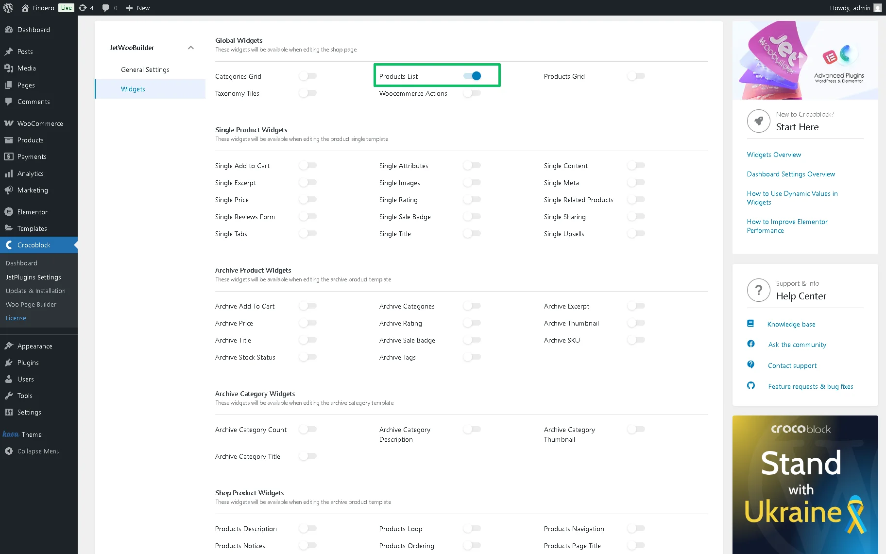
The widget should be activated first in the WordPress Dashboard > Crocoblock > JetWooBuilder > Widgets tab by enabling the corresponding toggle in the Global Widgets section.
The Products List widget can be added to a Shop page built by the JetWooBuilder plugin or any other Elementor plugin by finding it in the search bar and dragging and dropping it to a page.
More details on creating the Shop pages can be found in the JetWooBuilder Shop and Archive Page – Step-By-Step! video.
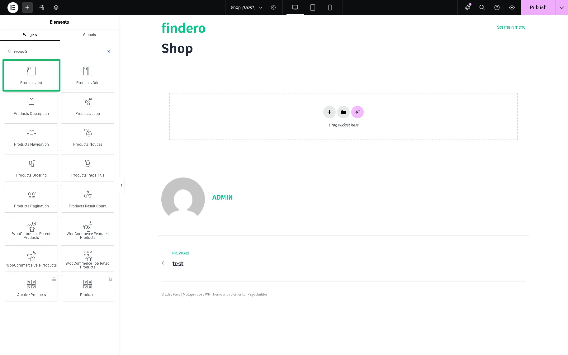
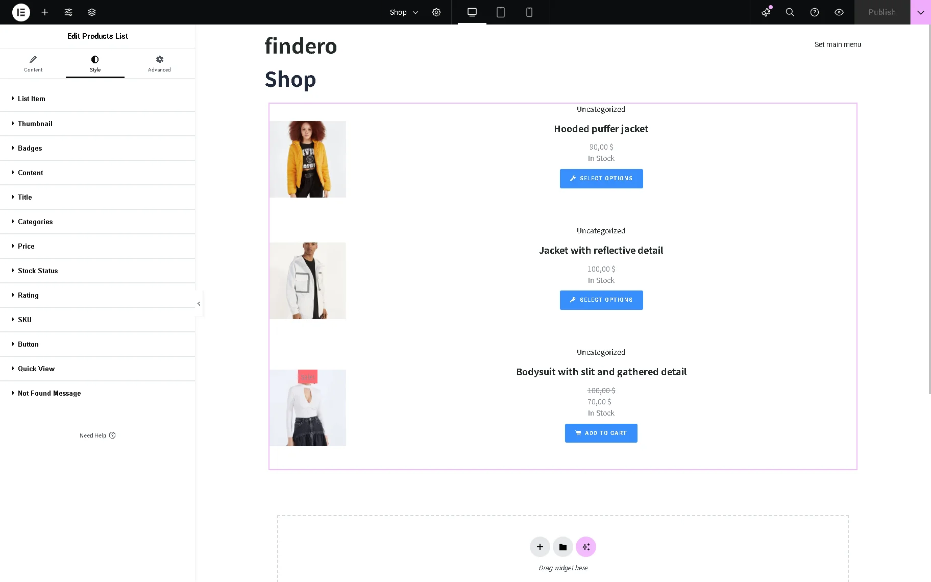
After that, the widget with the unrolled Content > Products List settings tab will appear.
Content Settings
Initially, the Content settings tab is presented by the Products List section. Other sections to this tab can be added if other plugins are installed and activated.
The Products List section contains the following fields:
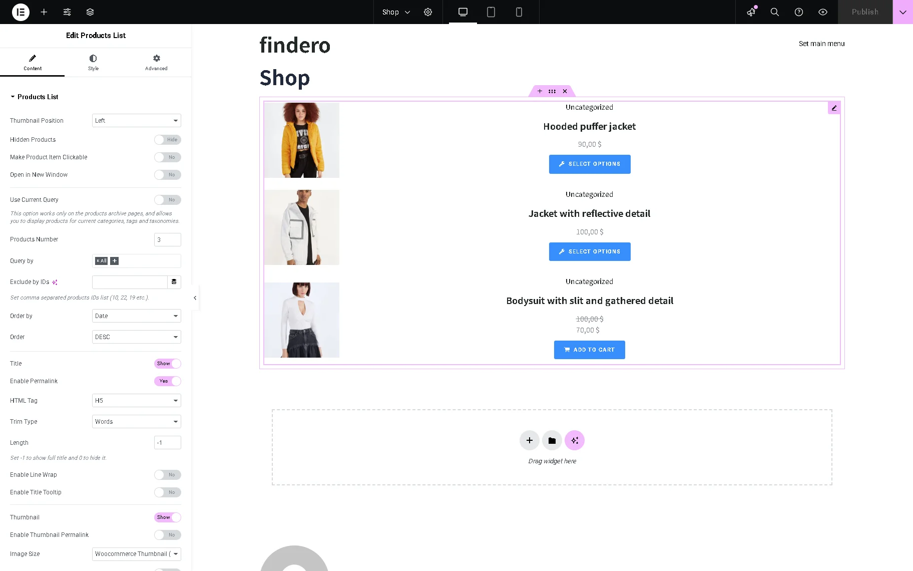
- Thumbnail Position 一 a drop-down list to set the “Left,” “Right,” or “Top” position of the thumbnail;
- Hidden Products 一 a toggle that, if enabled, shows the products with the “Hidden” visibility status;
- Make Product Item Clickable 一 a toggle that, if enabled, allows customers to proceed to the product page by clicking on the product item in the list;
- Open in New Window 一 a toggle that, if enabled, allows the product page to be opened in a new window;
- Use Current Query 一 a toggle that, if enabled, displays products for current categories, tags, and taxonomies. This option works only on the product archive templates;
- Products Number 一 a text field to enter the number of products that will be shown on the page;
- Query by 一 a field that is displayed if the Use Current Query toggle is disabled, which allows querying products by different taxonomies, such as Featured, Sale, Tag, etc.;
- Exclude by IDs 一 a field that is displayed if the Use Current Query toggle is disabled, and which allows entering IDs of the products one wants to hide from the list. The “Dynamic Tag” feature can also be set to exclude products related to certain dynamic content. For example, one can exclude the products of a specific author;
- Order by 一 a field that is displayed if the Use Current Query toggle is disabled, and that allows order products by such features based on WooCommerce product settings: Date, Modified Date, ID, Price, Title, Random, Sales, Top Rated, Menu Order, SKU, Current, and Stock Status;
- Order 一 a drop-down list displayed if the Use Current Query toggle is disabled, and allows selecting the “ASC” (ascending) or “DESC” (descending) option to order the products by the field set in the Order by field;
- Title 一 a toggle, if enabled, shows the product’s title and turns on the following settings:
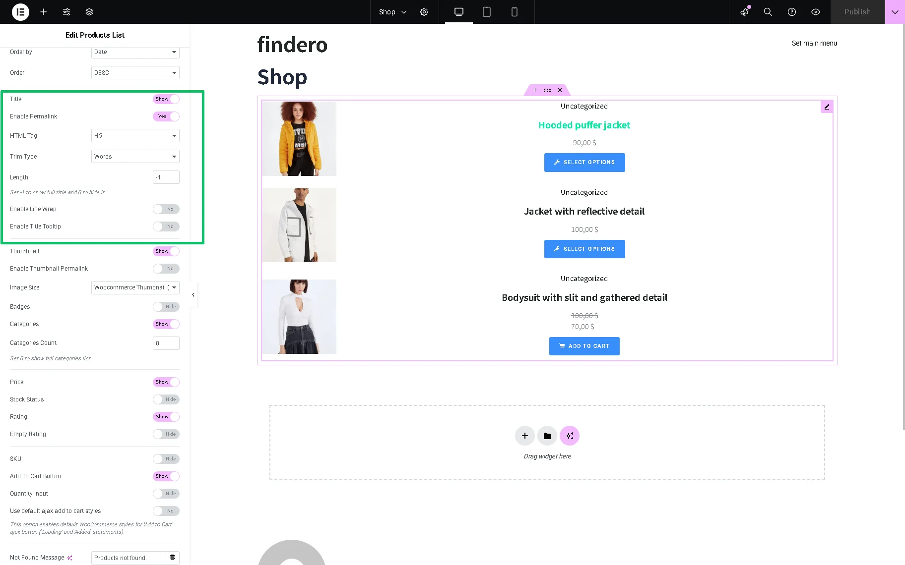
- Enable Permalink 一 a toggle that allows customers to proceed to the product page by clicking the product title;
- HTML Tag 一 a drop-down list to select <H1-H6>, <div,> <span,> and <p> HTML tags for the product titles;
- Trim Type and Length 一 a drop-down list and a text field to set the product title length. If selected, the “Words” or “Letters” Trim Type allows setting the product title length in words or letters, correspondingly, in the Length text field. Also, entering the ” -1″ shows the full title, and “0” hides it;
- Enable Line Wrap 一 a toggle that, if enabled, divides the title’s text into lines to fit the necessary width;
- Enable Title Tooltip 一 a toggle that, if enabled, adds the title of the WooCommerce tooltips to the product title;
- Thumbnail 一 a toggle that, if enabled, hides the product thumbnail;
- Enable Permalink 一 a toggle that, if enabled, allows customers to proceed to the product page by clicking the product picture;
- Image Size 一 a drop-down list to set the product image size;
- Badges 一 a toggle, if enabled, allows adding badges to the products. Then the Badge Label field will become activated to type the text on the badges. Also, the %percentage_sale% and %numeric_sale% macros can be used to display a withdrawal of discounts as a percentage or numeric value of the initial price.
- Categories 一 a toggle, if enabled, turns on the Categories Count field to enter the number of the displayed product categories or set 0 to show the complete categories list;
- Price 一 a toggle, if enabled, shows the product price;
- Stock Status 一 a toggle, if enabled, shows the product stock status and turns on the following field to type: In Stock Label, On Backorder Label, and Out of Stock Label text fields to enter the corresponding data;
- Rating toggle 一 a toggle, if enabled, shows the product rating and turns on the Empty Rating, which shows/hides the product rating even if no one has rated it yet;
- SKU 一 a toggle, if enabled, shows the product stock-keeping unit;
- Add To Cart Button 一 a toggle, if enabled, displays the “Add to Cart” button and turns on the Quantity Input toggle for adding more than one item to the cart, and the Use default ajax add to cart styles toggle to enable the default WooCommerce styles for the “Add to Cart” AJAX button;
- Not Found Message 一 a field for setting the “not found” notification by entering the needed text or clicking the “Dynamic Tag” icon to select the text from meta fields, Custom Post Types (CPT), etc;
- Query ID 一 a field for inserting a unique custom ID to allow server-side filtering. Also, dynamic data by the JetEngine, JetReviews, and JetSmartFilters plugins can be added by pressing the “Dynamic Tag” icon.
Content Settings Displayed if Other Plugins are Installed and Activated
JetPopup plugin
If the JetPopup plugin is installed and activated, the following settings will appear in the Content > Products List settings tab:
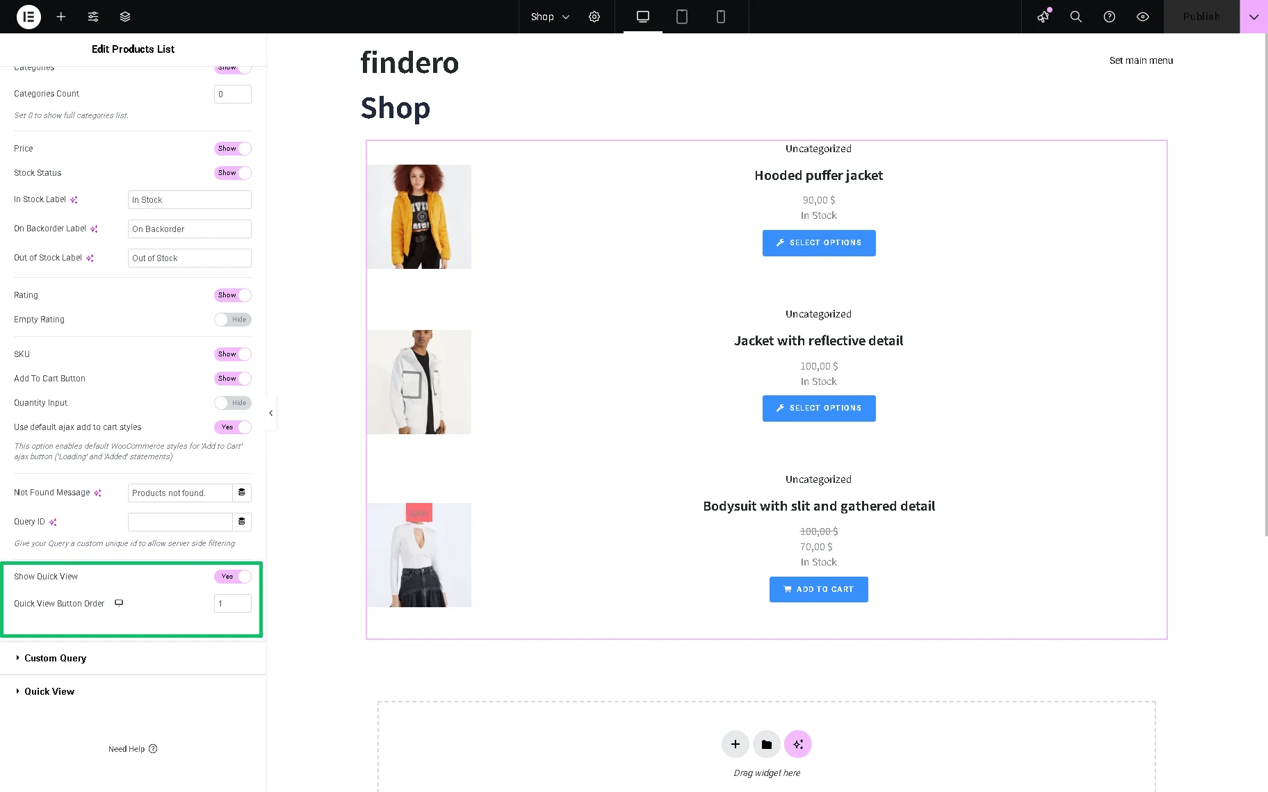
- Show Quick View 一 a toggle that adds the “Quick View” button that opens the Quick View pop-up created with the JetPopup plugin. For more details about how to make such a pop-up, the How to Create a Product Quick View Popup tutorial should be read;
- Quick View Button Order 一 a field that allows setting the order of the available pop-up buttons (e.g., “Quick View,” “Add to Compare,” and “Add to Wishlist“, except the “Add to Cart” button, which is always first). Also, the order can be set for the Desktop, Tablet, and Mobile views.
After enabling the Show Quick View toggle in the Products List section, the Quick View section will appear. This section is presented by the following fields:
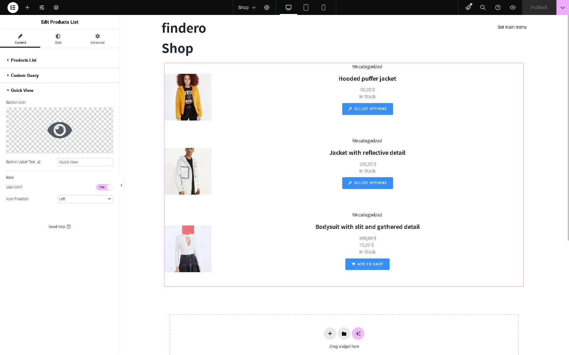
- Button Icon 一 a field that allows selecting the icon for the corresponding button from the library or uploading an SVG file;
- Button Label Text 一 a text field for entering the text to be displayed on the corresponding button;
- Use Icon? 一 a toggle that allows using a specific icon and setting its position in the newly appeared Icon Position drop-down list.
JetEngine plugin
If the JetEngine plugin is installed and activated, the Custom Query section will be added to the Content settings tab:
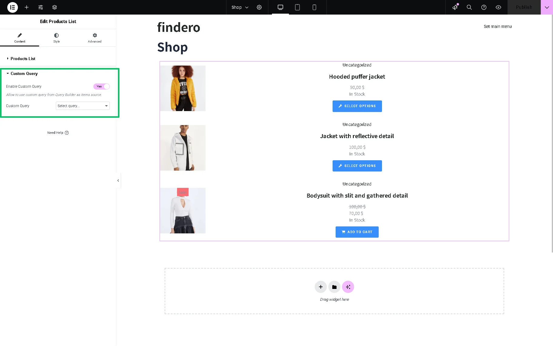
- Enable Custom Query 一 a toggle that allows using a specific query;
- Custom Query 一 a drop-down list that allows selecting the needed query. Also, a WC Product Query created with the JetEngine Query Builder feature can be chosen here.
JetCompareWishlist plugin
If the JetCompareWishlist plugin is installed and activated, and the WordPress Dashboard > Crocoblock > JetPlugins Setting > JetCompareWishlist > Compare Settings > Enable Compare toggle is enabled, the Compare sections will be added to the Content settings tab.
More details about configuring the settings of a page for WooCommerce products comparison can be found in the How to Create a Page with Products Comparison tutorial.
Also, if the WordPress Dashboard > Crocoblock > JetPlugins Setting > JetCompareWishlist > Wishlist Settings > Enable Wishlist toggle is enabled, the Wishlist sections will be added to the Content settings tab. More details about configuring the settings of a page for a WooCommerce product wishlist can be found in the How to Create a Wishlist Page tutorial.
The following fields are included in the Compare section tab:

- Compare Button 一 a toggle that adds a compare button to the list;
- Icon 一 a toggle that enables fields to insert the needed icon from the library or upload an SVG file;
- Icon Position 一 a drop-down list to set the “Left,” “Top,” “Right,” “Bottom” positions;
- Icon 一 a field to insert the needed icon from the library or upload an SVG file.
The appearance of the standard button and the button view after users add the product to the compare page can be set by hitting the “Normal” and “Added” buttons. In both cases, the Icon and Label fields can be configured:
- Label 一 a text field insert a text to be displayed on the “Compare” button;
- Order 一 a field that allows setting the order of the available buttons, except the “Add to Cart” or “Select Options” button, which are always first (depending on the WooCommerce product type). By default, the “Compare” button is added under the “Add to Card” or “Select Options” buttons. Also, setting the order for the Desktop, Tablet, and Mobile views is available.
The Wishlist section is presented by fields:
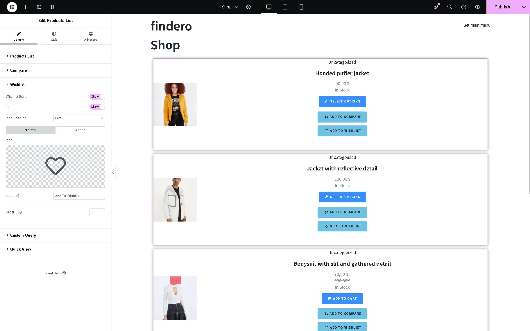
- Wishlist Button 一 a toggle that adds a wishlist button to the list;
- Icon 一 a toggle that enables fields to insert the needed icon from the library or upload an SVG file;
- Icon Position 一 a drop-down list to set the “Left,” “Top,” “Right,” “Bottom” position;
- Icon 一 a field to insert the needed icon from the library or upload an SVG file.
The appearance of the standard button and the button view after users add the product to the wishlist page can be set by hitting the “Normal” and “Added” buttons. In both cases, the Icon and Label fields can be configured:
- Label 一 a text field to insert a text to be displayed on the “Wishlist” button;
- Order 一 a field that allows setting the order of the available buttons, except the “Add to Cart” button, which is always first. By default, the “Wishlist” button is added under the “Compare” button. Also, setting the order for the Desktop, Tablet, and Mobile views is available.
Style Settings
The Style settings tab is presented by the List Item, Thumbnails, Badges, Content, Title, Categories, Price, Stock Statuses, Rating, SKU, Button, Quick View, and Not Found Message groups according to the items they manage.
Initially, after clicking the Style tab, the List Item section will be unfolded by default. The following fields are included:
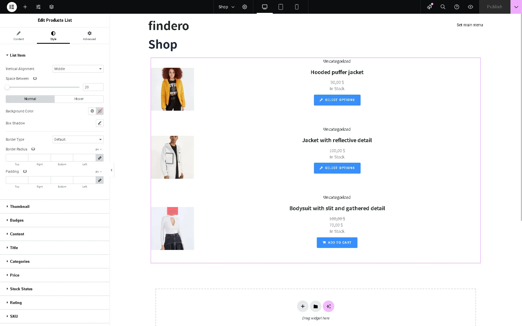
- Vertical Alignment 一 a drop-down list to set the listing items on the “Top,” “Middle,” “Bottom,” “Stretch”;
- Space Between 一 a field to set the distance between the listing items;
- Normal and Hover 一 buttons to configure the needed settings for the item in the normal mode and on hovering, correspondingly;
- Background Color 一 a field to set the item background’s color;
- Box Shadow 一 a field to set the item background’s color;
- Border Type, Border Radius, Padding 一 fields to configure the corresponding settings.
Also, other sections allow configuring the corresponding Width, Background Color, Box Shadow, Border Type, Border Radius, Padding, and specific settings such as:
- The Thumbnail section allows setting the CSS Filters options (e.g., “Blur,” “Brightness,” “Contrast,” and more);
- The Badges section has the “Inline” and “Block” Display Type and Custom Size settings;
- The Title section has the “Inline” and “Block” Display Type settings;
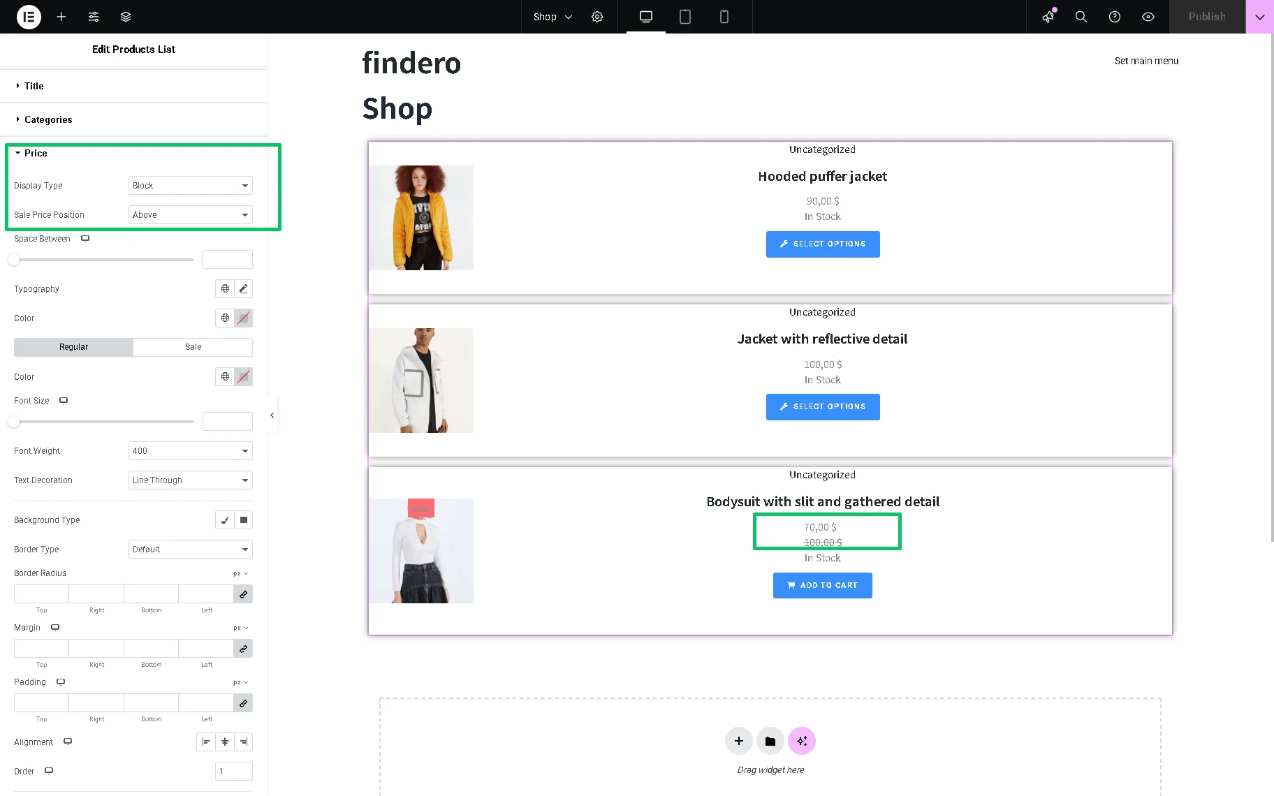
- The Price section allows setting the sale price position above or below the regular price: in this case, the “Block” Display Type option should be selected and the needed position set in the Sale Price Position drop-down list;
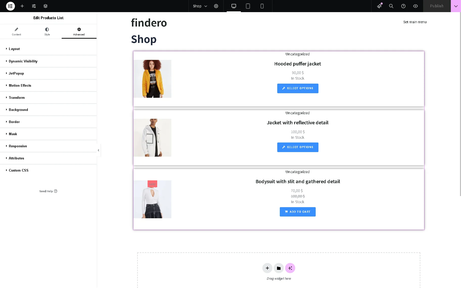
Advanced Settings
The Advanced settings tab includes the Layout, Dynamic Visibility, JetPopup (if the corresponding plugin is installed and activated), Motion Effect, Transform, Background, Mask, and more.
The Advanced settings allow the customization of the Margin, Padding, Width, Position, Z-Index, CSS ID, CSS Class settings, and more.
That’s it. Now you know how to display WooCommerce products in an eye-catching way with the help of the Products List widget of the JetWooBuilder plugin for Elementor.