Forms Field Types Overview (Legacy)
Learn more about all JetEngine Forms field types by following this detailed overview.
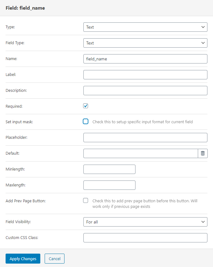
First of all, let’s take a look at the features that are common for most of the fields:
- Field Type. This drop-down contains a few most popular ways this field can be used for: email, URL, phone number, and password. If you choose one of the options, other settings will be customized according to it;
- Name. The name you type into this bar will be used as an ID of this field;
- Label. Here you can place the name of the field that the users will see;
- Description. If you need to give the users some explanations about how to fill the field, type them into this text area. The description will be shown under the Label;
- Required. Tick this checkbox if you want to make the field required. This means that users won’t be able to submit the form without filling in this field;
- Placeholder. In this bar, you can put a text that will be shown in the field before the user starts typing in it. With the help of a placeholder, you can give the user some tips about what to put into the field;
- Default. If you want to set some default value for this field, place it into this bar. The user will be able to change it or leave it as it is;
- Add Prev Page Button. By ticking this checkbox, you add a button that leads to the previous part of the form right before this field;
- Field Visibility. In this drop-down menu, you can choose who will be able to see this field;
- Custom CSS Class. You can add some CSS coding to this bar if you need it.
Text
Text is the simplest type of Form field that allows the user to input short text information. For example, with its help, you can create a field for Email, User Name or Surname, etc.
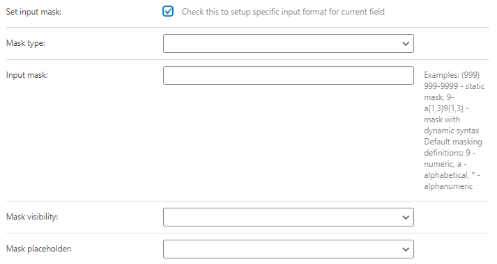
- Set input mask. If you mark this checkbox, it will open a set of additional options. A mask is a template you offer to the user. It shows the way you would like this field to be filled. Let’s take a closer look at its features:
- Mask type. There are two options in the drop-down menu. Default allows you to set any type of mask, and Datetime is a special mask type for time.
- Input mask. This is the bar where you type the mask into. “9” means you have to place a number on that place, “a” means alphabetical character, and “*” means you can place a letter or a number there.
- Mask visibility. The mask could be Always visible, become visible On hover, or On focus (in this case, you need to click on the bar to see the mask).
- Mask placeholder. The symbol you will choose here fills the mask in case a user leaves the bar empty. For example, if you choose the “-” from the list, the mask for the bar is “999999”, and if the user didn’t fill it, it would look like this “——” in the end.
- Min/Max length. Here you can set the minimum and maximum number of symbols a user can put into the field;
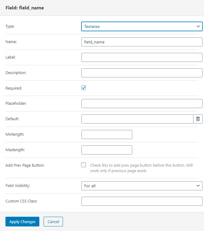
Textarea
Set this field for people to add an additional comment to the request or simply clarify some special wishes. In simple words, the Textarea field is a multi-lining text field. The number of symbols that can be displayed is unlimited, and the entered text will be showcased in a monospaced font. The settings of this field are almost the same as the ones for the Text field.
Hidden
According to its name, this field will not be shown to the users. You can set a value for it and afterward use it in combination with other fields, like the Calculated field. An example of how those two fields can work together is described in this tutorial.
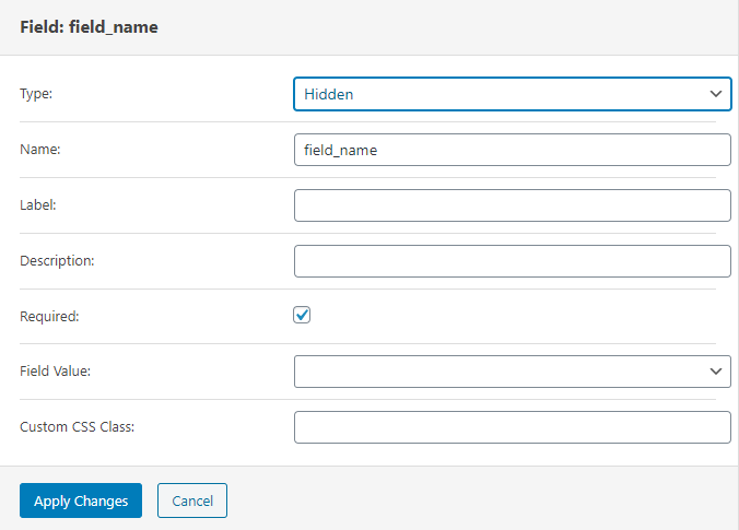
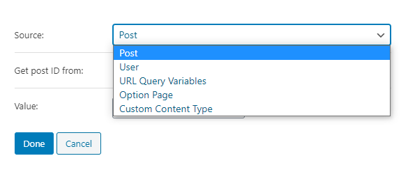
In the Field Value drop-down menu, not only can you choose to set the Manual Input but also use the data from the meta fields. Post ID or title, some of Post Meta values, current date – all of that can be used as the value of the Hidden field.
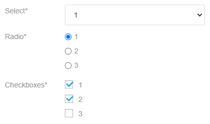
Select – Checkboxes – Radio
These fields give the user several variants to choose from. The Select field is a drop-down menu from which the user can choose only one variant. The Radio field also allows only one choice but places the list of available options under the label. The Checkboxes field has a list of available variants put under the label but allows the user to choose several options.
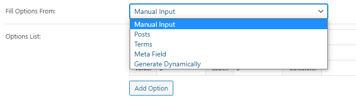
The values of these fields can be set in five different ways. Not only can you input them manually, but you also choose to use the values of one of the meta fields of the post or term. You will find more details about that in our selection fields guide.
Number
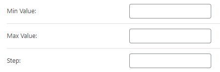
The Number is a field for any numerical values like amount or percentage. It can also be used in combination with the calculated field. In addition to the default settings, you can set the Max and Min Value and the Step between those values.
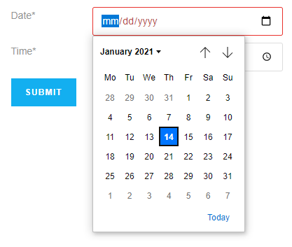
Date
The Date field gives the user an opportunity to actually choose a specific date. He/she will be able to type it in manually or choose it in the drop-down calendar. In the settings window, you will be able to make the date user chooses a timestamp by ticking the Is Timestamp checkbox. Besides that, you can set a Default date that will be inserted automatically into the bar. It can either be a static date or a dynamic value chosen from the meta fields. You can open the settings window by clicking on the button in the right corner of the Default bar.
Here’s how the field will look on the front end:
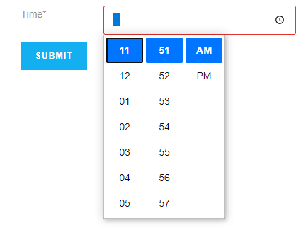
Time
The Time field, as it is evident from the title, is for choosing a specific time in the form. The user can type the time manually to the bar or choose it from the special drop-down menu. In the settings section, you can set the Default value for this field, and it is similar to the one in the Date field. Here’s how it is visible to the user:
Calculated
It is a field that can calculate any mathematical formula. You have to write the formula to the Calculation Formula text area using the macro codes for the values the user will insert into the form. Besides the values of the form fields, you can use the values of the meta fields, too.
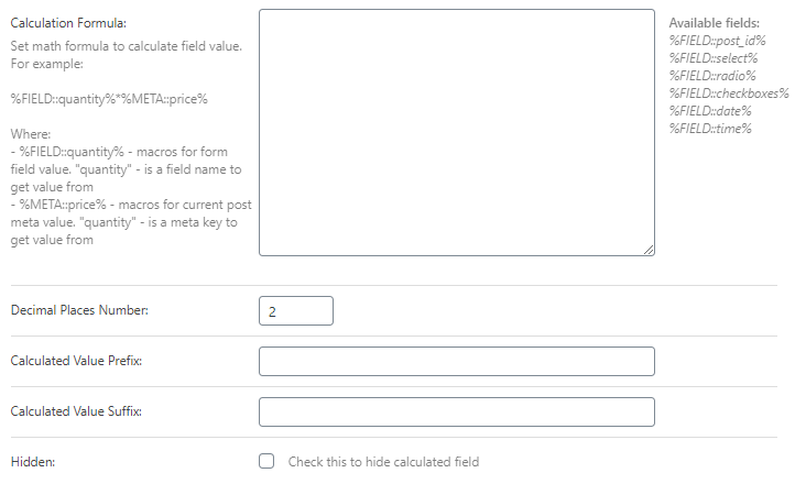
In the Decimal Places Number bar, you can choose how many numbers will be shown after the comma. Calculated Value Prefix and Suffix will be displayed to the user before and after the result of the calculations. More about the Calculated field usage you can read in this tutorial.
Media
There are cases when you need to allow the users to upload some media to your website. This field will give users that opportunity.
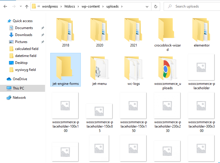
Be aware that when the user uploads the media file, it is stored on the PC where you have installed your WordPress. To find them, on the disc where you store the WordPress, open wordpress > htdocs > wp-content > uploads > jet-engine-forms folder.
And here are the Media field settings.
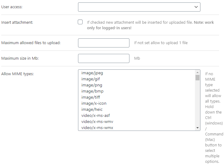
- User access. In this drop-down menu, you can choose who will be allowed to upload the media files;
- Insert attachment. If you tick this checkbox, the loaded media files will become available in your website’s Media Library. Afterward, you will have to choose how you would like to store them there – like a URL, as an ID, or as an array with both URL and ID;
- Maximum allowed files to upload. Here you can set how many files the user will be allowed to upload;
- Maximum size in Mb. The default size of a file that is allowed to upload to the website is 40MB. In this bar, you can change that value;
- Allow MIME types. From this list, you can choose what type of files will be allowed for the upload. if you haven’t chosen any of the types – the users will be allowed to upload the files of all listed types.
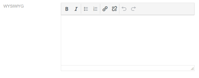
WYSIWYG
This field adds a text editor, similar to the default WordPress one to the form. The user will be able to enter any kind of content, or custom HTML. The title of the field means “What You See Is What You Get”. Here’s how it will look on the front end:
Range
This field creates a slider that the user can drag to choose the value. In the editing window of this field, you can set the Min, Max value, and the Step between them. By default, the slider will be set to the number you choose in the Default bar.
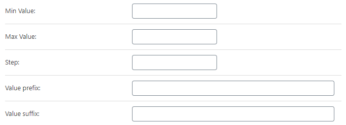
You can also add a Value prefix and suffix that will be shown before and after the value number.
Heading
This field simply adds a header to the form. You just have to type into the Label bar, and it will be shown as one of the headings on the front end.
Group Break
Actually, this is not a field. It adds a line that divides the form into visually understandable parts. When you add it, it won’t be visible. You will have to go to the Style menu tab in the Elementor page builder or Block Style section in Gutenberg Editor to change its appearance and make it visible.
Repeatable Fields Group Start and End
Repeater is a group of fields that the user can add by clicking on the special button. You create a block by adding the Start and End fields. All the fields you add between those two will be added to the block. When the user hits the “Add New” button, the whole block is added. The fields of the form repeater can be connected with the repeater in the post’s meta fields. Also, the Repeater form field can be combined with the Calculated field. To read more about the usage of the Repeater field and combining it with the Calculated field, follow this link.
Those are all fields offered by JetEngine Forms functionality.