In today’s digital era having an online presence is essential for all businesses. A website to present brand identity and communicate with customers is even more crucial for companies working in the tourist sector, particularly hotels.
A website enables a hotel to attract prompt customers by showcasing its amenities and services. It can also provide the instruments to make reservations online and complete payments.
However, employing every possible tool does not guarantee the hotel will be booked up. As you can imagine, people look through multiple housing offers when planning a trip. Creating a website that is easy to use and captures your unique brand identity is important. It will attract a person’s attention and stand out from the competition.
In this article, we will look at examples of beautiful and memorable hotel sites, outline the requirements and best practices for creating them, and discuss how Crocoblock tools can facilitate website building for hotels.
Table of Contents
- Hotel Website Design Inspirations
- Hotel Website Requirements & Best Practices
- The Process of Building a Typical Hotel Website
- Crocoblock Dynamic Templates at Your Service
- Bottom Line
Hotel Website Design Inspirations
To start off, let’s review the examples of 5-star hotel websites to get the right direction and inspiration for your future project. Some of them I collected from the Made with Croco section of our platform.
1. Quinta do Valdalágea
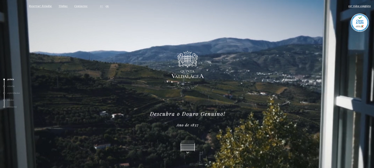
The first on our list is the Portuguese hotel in Douro Valley. On the first scroll, visitors see a video representing beautiful nature, winery, hotel design, and outskirts. Honestly, I spent some time watching this video. The website is made in perfectly matching high-contrast colors. The best thing about Quinta do Valdalágea’s website is its excellent storytelling and smooth scrolling. The navigation is also clear, and the book room link is easily noticeable.
2. Borgo Egnazia
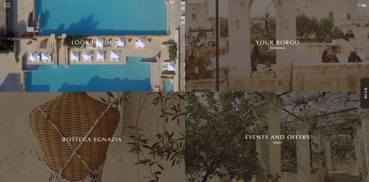
The second hotel website also greets visitors with a beautiful landing page showing all the splendors of living in Borgo Egnazia. The page space is divided into four sections; each part leads to the page with different information about the hotel. You can see the video with amazing scenery when you hover over each section. The website provides straightforward and effective navigation solutions. You can access the full-screen mega menu with links to all important website places by clicking the hamburger menu icon in the upper left corner of every web page. And you can open a booking form instantly by hovering over the Book button on the right.
3. NISEKO HAKUUNSO
You can take eye-catching design ideas for the hotel website from this Japanese hotel website featuring the “weather adaptive” style. The homepage is concise and well-structured; it provides the blocks with the necessary information and an abundance of fascinating photos. Most of the elements are customized with hover animation tools making the design more intuitive and modern-looking.
4. Casa Angelina
Casa Angelina Hotel looks like a paradise on earth, and its website reflects it through the light and juicy colors of water and white buildings. The parallax effect noticeable when scrolling the page combined with big and bright photos create an astounding storytelling effect. You’ll find a nice surprise at the bottom of the page – a clean and stylish weather forecast to entice a traveler for a trip to Italy.
5. King Solomon
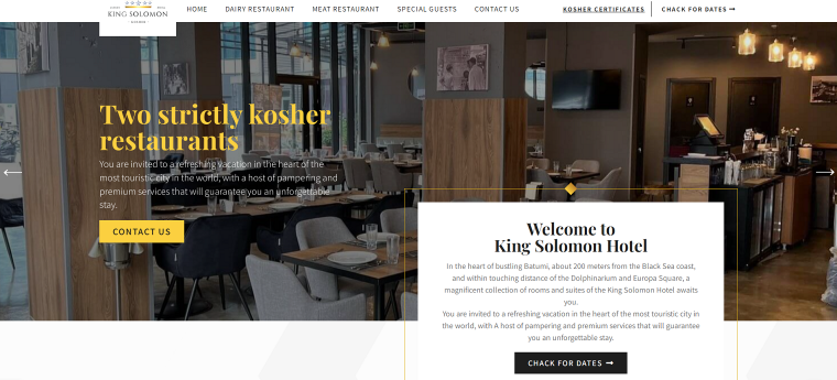
King Solomon is a high-class kosher hotel and restaurant in Batumi. The first screen features impressive images of a bar, dining area, lobby, and apartments. Although the landing page contains a lot of information, the abundance of white space makes the design light and elegant.
The elements on the web pages are customized using JetEngine dynamic plugin, among other Crocoblock plugins employed on this site.
6. Ellerman House
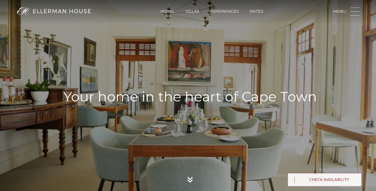
The Cape Town hotel website bets on clean design, much white space, and a simple but elegant structure. The landing page invites visitors to watch a video about Ellerman House. The standard blocks made in a minimalistic style are combined with impressive photos of the hotel’s unique features, such as the wine collection, art gallery, and restaurant.
The header bar is pinned and visible wherever you are on the website, making navigation through the pages easier. At the bottom of the homepage, you’ll see a cool manuscript-looking map of Cape Code, with tooltip notes about different parts of the town.
7. Crown Delta
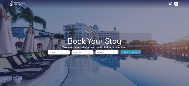
The website for Crown Delta Hotel & Spa is another hotel design example featured in our Made with Crocoblock section. It has many tools to enhance user experience and optimize website performance, such as hover animations, images slider in the footer, lazy loading gallery, weather forecast incorporated in the header navigation bar, and more.
8. Tofino Resort
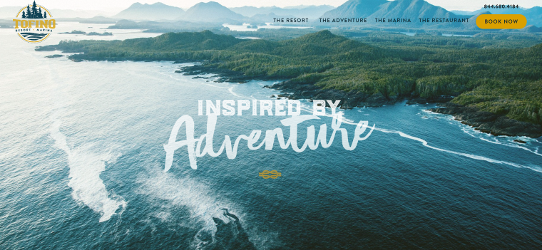
Tofino Resort’s portal greets visitors with ravishing island views and decorative scripts. The clean design, unorthodox layouts, unique typography, and fantastic visuals combine to provide aesthetic pleasure and exciting storytelling. The Book Now button is always visible in the top right corner so the users can open the booking form anytime while browsing the website. The form is another pleasant surprise, clean, minimalistic, and accompanied by a beautiful aerial view photo of the resort.
9. Hotell Nordevik
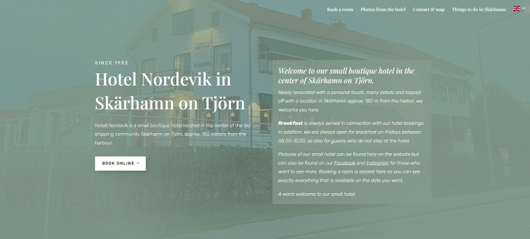
Hotell Nordevik’s website is a bright example of Scandinavian lagom, which means “not excessive, fitting, reasonable.” This concept is visible in the web design: from a cold and calm color scheme and using white space to landing all important information on a single home page.
The website features laconic descriptions of the hotel’s amenities. Instead, it focuses on showcasing things to do in the town of Skärhamn and neighboring Swedish islands. I also noted the unusual font used for headings (Playfair Display) and discovered a Scandinavian artist created it. These factors point out the hotel owner’s love for their cultural traits and the beauty of nature.
Hotel Website Requirements & Best Practices
Creating a good hotel website requires meeting general requirements for all good websites, as well as incorporating specific features for hotel businesses.
Ensure high-speed loading
Often, websites are the first instance of interaction between travelers and hotels. That’s why site visitors see them as a reflection of hotel service and customer support. Website speed is crucial for establishing a positive user experience and improving SEO ranking.
Many factors influence site speed, including image optimization, choice of WordPress themes and plugins, and more. For detailed information, check out our blog articles about WordPress site optimization.
Make it mobile-friendly
Today, more and more travelers make bookings via smartphones and tablets. If your website design is not adapted for phones and tablets, the clients won’t be eager to make bookings. They may be frustrated by bad user experience and lose interest in your brand.
Design responsiveness also influences SEO rankings because powerful search engines take into account mobile versions of the sites.
Allow users to make bookings on your site
Make it easy for your clients to secure their bookings directly on your site instead of sending them to third-party service providers. This way, you’ll have full control over a buyer’s journey and provide site visitors with a complete user experience.
Employ one of many WordPress booking plugins to create booking forms and manage booking calendars.
Provide secure booking and payment process
Make your hotel website secure. First of all, use HTTPS protocols and incorporate SSL certificates. Also, it would be better if your website adheres to the PCI Compliance security standards. This set of standards is required for all types of businesses that utilize credit card transactions.
For the best protection against hackers and malicious bots, use WordPress security plugins.
Pay attention to the effective layout
Ensure you create a natural and consistent flow through all web pages. Whether the visitors follow the Z Pattern or the F Pattern when going through the content on the web, they always start scanning the page from the top left corner and finish in the bottom right (for content written in left-to-right scripts). Remember this when choosing where to place your promotions, booking forms, etc.
Include inspiring visuals
Amaze your potential clients with stunning photos and videos. Use only the photos that highlight your property’s features and avoid low-resolution and stock pictures. Use your images to tell site visitors exactly what you offer; thus, don’t show only your top-of-the-line suits. Add galleries with fascinating events, lovely places nearby, weddings or conferences held at your place, and all available amenities.
WordPress allows different layouts for creating galleries. Carousel and slideshow have proven to be effective layouts for overviewing hotel rooms.
Prove trustworthiness
Travelers check feedback about the hotels on TripAdvisor, Booking.com, and Google. So, instead of making your potential guests ransack the Internet, generate a base of positive reviews from previous visitors by encouraging them to leave their feedback on your site or other platforms. Incorporate them into your hotel web design in the form of testimonials.
Give clear contact information
Don’t bury the contact details in the footer. It should be easy to find phone numbers and emails on the site. And, of course, provide an exact address with an embedded Google map for people to find your hotel.
Keep your website content updated
Fresh and relevant content shows potential guests that the hotel is active and engaged with its customers. It also improves SEO rankings by sending to search engines new useful information.
Whenever you organize a photoshoot of your location, take extra photos to be able to add them to the site later. Use different images for different seasons of the year. And don’t forget to update your guests’ testimonials.
Show your brand identity
Having a unique brand identity on a hotel website is crucial to differentiate your business from its competitors, create a strong impression on potential guests, and build loyalty among current guests.
On your website, introduce your team, and write about your hotel’s values and unique selling points. Make the website design memorable – use three or four brand colors and choose fonts that convey a friendly and engaging atmosphere.
Offer Virtual Tour of Your Hotel
Along with using inspiring visuals of your hotel rooms, you can offer something unique to your visitors.
A 360-degree virtual tour of your rooms and facilities will give them a more realistic view of your hotel. Using a quality element like a virtual tour makes you stand above your regular competitors and proves your authority.

And people are more likely to confirm a booking once you give them a real-life experience of your accommodations.
You can use the virtual tour builder plugin WPVR for this.
Use promotions
Use promotions to create a feeling of urgency and encourage customers to take action sooner. They can take different forms: deals on weekdays, free nights and discounts for loyal guests, package deals, discounts from your local partners, etc. Special offers may save your business during slower periods.
The Process of Building a Typical Hotel Website
Here is some basic functionality your hotel website has to feature:
- hotel news feed;
- online booking;
- room pages;
- image gallery;
- script for booking rooms (after the visitor fills out the form, the message should be sent to the hotel administrator);
- weather forecast (collect data from AccuWeather or other services);
- embedded Google Map;
- feedback form.
Building a website from scratch involves using HTML, CSS, and other programming languages. This option offers flexibility and customization but requires technical knowledge, development skills, and ongoing maintenance. Thus, it is a costly and time-consuming process.
On the other hand, a content management system (CMS) like WordPress allows even non-technical users to build various sites. It provides pre-built templates and themes that can be customized through a user-friendly interface.
To achieve greater flexibility when building sites with WordPress, it’s necessary to use plugins. These third-party instruments can provide hotel websites with the functionalities we discussed above without needing custom web development.
NOTE:
Creating effective web design for hotels requires using multiple plugins. Ensure all plugins are mutually compatible before investing in them.
Crocoblock Dynamic Templates at Your Service
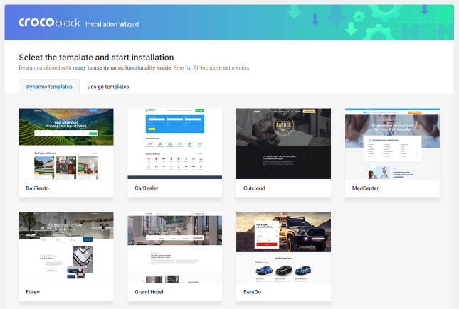
While WordPress plugins offer the flexibility to build functional and eye-catching hotel web designs, you will still have to learn basic WordPress technicalities, such as setting relations, adjusting custom post types and taxonomies, creating booking and registration forms using different field types, and more.
That’s when Crocoblock Dynamic Templates come to the rescue. ✊
Dynamic templates are pre-coded websites created for use in different business niches. They are fully responsive, SEO-optimized, and compatible with all WordPress themes. The installation takes under three minutes, and you can immediately start filling your site with the original content.
The dynamic templates from Crocoblock allow you to create new custom pages and listings to showcase your hotel’s unique services. It’s easy to customize the website’s design, change layouts, and add new elements without worrying that everything will function properly.
Bristol
Bristol is a dynamic template for creating a grand hotel and resort web design.
This template is perfect for businesses that offer many types of amenities, such as restaurant, pool, and spa, as it has pre-built pages for all these services. The booking form can calculate the final price based on the number of guests, room type, dates, and additional services.
Bristol template features:
- room single pages and catalogs;
- AJAX filtering;
- built-in booking forms with calculator fields;
- WooCommerce integration.
Foreo
Foreo is a mini-hotel booking dynamic template.
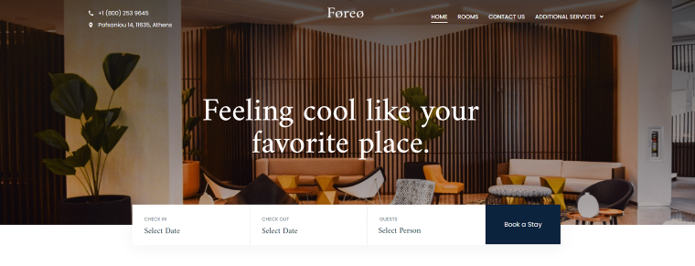
Foreo is a feature-rich, highly customizable template for running resorts, hotels, and hostels. The home page displays services in four different layouts, adding to the design’s dynamic personality.
Foreo template features:
- customizable pre-configured booking forms;
- dynamic layouts, including sliders;
- social share buttons.
Bottom Line
As we can see, most hotel websites feature common trends, which helped them to get on our list. The primary of them are:
- fixation of the booking button to make it noticeable whenever the person is on the website;
- an abundance of impressive images of all the amenities;
- easy and understandable navigation;
- in-built booking forms;
- elaborated storytelling.
Functionality and eye-catching design are crucial for attracting and retaining customers. A functional website should be user-friendly, easy to navigate, and provide all the necessary information to the users, whether they use desktops, tablets, or mobile phones.
A visually appealing website design with high-quality images reflecting the hotel’s personality can set your business apart from its competitors and create a lasting experience for your guests. Lastly, keep in mind that Crocoblock dynamic templates allow WordPress users with no coding experience to build websites with a 5-star hotel design.
