Not long ago, such articles had to begin by emphasizing the importance of responsive menus. Now, they’re a standard feature. The next debate might be whether we still need desktop menus at all.
But still, constant learning of best practices for mobile menus is key to making this website element work and look great, serving users, and contributing to a better conversion rate. So, let’s discuss the top tips for your responsive menus and how to create them.
Table of Contents
- What Is a Responsive Menu?
- Responsive Menu Tips and Best Practices
- Mobile Menu Patterns
- WordPress Tools for Creating Responsive Menus
- FAQ
- Bottom Line
What Is a Responsive Menu?
A responsive menu “responds” to the device size and adjusts its design depending on it. It might appear on larger screens as a standard horizontal menu, with all options or first-level menu items visible without additional clicks. However, when viewed on a smaller device, such as a smartphone, the menu can condense into a more compact format, often represented by a “hamburger” icon (three horizontal lines). This icon, when tapped, expands to reveal the full menu options, making navigation straightforward to use, despite the small screen.
The design of mobile menus focuses on touch-friendly elements, ensuring that buttons and links are large enough to be easily tapped without accidentally hitting other items. But the most important for such menus is their well-thought-out structure and behavior.
Smooth transitions and animations are key features that help the menu work more intuitively when opened or closed.
Last but not least, well-designed responsive menus on WordPress improve usability and contribute to better search engine optimization (SEO), as search engines favor mobile-friendly websites.
It’s also worth mentioning that the phrase “responsive menu” is often used as a general term for mobile and adaptive menus. This highlights the idea that a responsive menu works great on all devices, particularly mobile. So, I will use it like that in this article.
Responsive Menu Tips and Best Practices
- Keep menu structure simple. Remember that website users will see things for the first time and things/structures that seem simple to you because you already know the topic might be overwhelming for them. So their focus will not be lost because of intricate structure and too many elements.
- Mobile-first approach. Design the menu for mobile devices first, then scale up for larger screens. This ensures a better user experience on mobile devices, which often have more constraints.
- Prioritize performance, especially for mobile devices. Avoid heavy scripts and excessive CSS that can slow down the menu. Performance is crucial for a good user experience, and intricate animations will rather annoy people on a slow website than impress them.
- Prioritize key menu items. If you know the most popular elements your users are looking for, use a billboard pattern or highlight these menu items.
- Make menus touch-friendly by ensuring elements are big enough to be tapped easily without accidentally clicking neighboring items. Aim for a minimum touch target size of 48×48 dp.
- Provide clear open and close buttons for mobile devices. Instead of something more exotic, use the hamburger icon (three horizontal lines), a widely recognized symbol for a menu. It saves space and can reveal a more extensive menu when clicked or tapped. When the menu is expanded, ensure a clear and easily accessible way to close it, such as an “X” button or tapping outside the menu area.
- Ensure accessibility by using appropriate ARIA (Accessible Rich Internet Applications) roles and properties to enhance navigation for users with disabilities.
- Use smooth animations and transitions to open and close the menu to provide a pleasant user experience without causing delays.
Mobile Menu Patterns
Choosing the right mobile menu pattern for your website is key for effective navigation. The first thing to consider is the structure and complexity of your site’s content to make the best choice.
Slide-out nested menu
This is one of the most common menu patterns when the menu drawer appears from the right or left side. The menu slides into view with smooth animation, either covering the main content or pushing it aside.
If implemented well, it’s good for menus of different levels of complexity. Its weak point is its lack of discoverability and the many tap actions required from the user when going to deeper menu levels.
It’s good for menus where the purpose is clear, e.g., for stores when the client is normally looking for a particular category. And it’s definitely not recommended to create more than three levels of navigation. Also, it’s highly recommended to make a clear return button (e.g., “Woman’s clothes”) instead of just a default “Back” one.
This is an example by Luisa Via Roma and their solution for a responsive content-rich menu. On desktop, they don’t even have a traditional menu for the main categories; they open at the second menu when the user chooses one of the main categories: Men, Women, Kids, Home.
On mobile, it shows all the major categories from the beginning, but the main four categories are still prioritized and are on top. So, even if the menu is quite big and has three levels, it’s easy to handle because the logic is very clear here.
Curtain menu pattern
A curtain menu is the right solution when there are many categories at the first level that may be interesting for the customer, so they can easily switch between them and don’t have to go back to the parent category. As the name suggests, it looks like two curtains, one of which is the first level, another is the second level, and both are visible, just like in this example by LCFC:
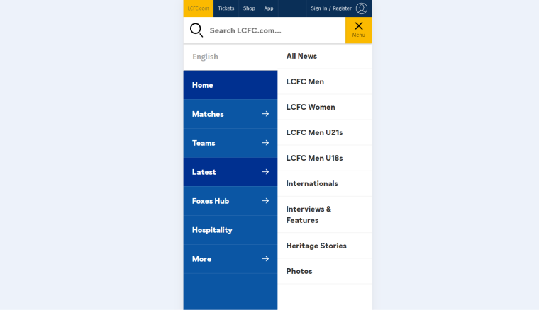
However, the unique thing about the curtain menu pattern is that it can combine menu buttons, icon grids, and links if needed.
The PlayStation website is a perfect example of how to do it:
So, as you can see, the curtain menu pattern can be very different, particularly when combining the main and secondary items, as in this example.
Billboard and FAB menus
This menu pattern is great when there are main actions or categories to highlight, and their icons can be easily recognized. Deutsche Post successfully combines them, making it work as a billboard menu on mobile and as FAB (floating action button menu) on desktop:
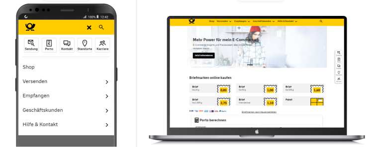
Nothing to add to it; it just works as planned, so – good job!
WordPress Tools for Creating Responsive Menus
And here comes the main question – what is the best tool for creating a custom menu for a WordPress website? It’s definitely up to you, but you can consider Crocoblock solutions, which offer you the flexibility to create menus of any complexity.
Let me show just a few examples:
Hamburger menu with JetTabs
SunVest managed to create a beautiful website with a menu that was designed according to their design.
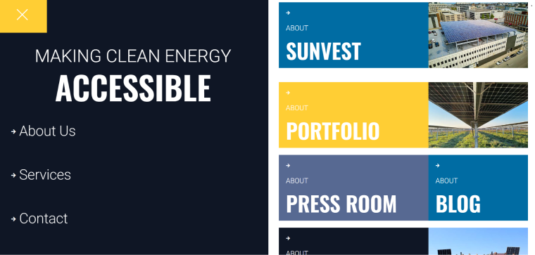
They use the JetTabs plugin to showcase their main sections on the desktop. The whole website is made using Elementor, and the left menu is actually an Elementor pop-up. On mobile, the right part disappears, while the left one gets a more condensed look.
Wild Wild Western listing website
This listing website beautifully shows various ranches for sale. It’s made with Elementor and Crocoblock and uses the JetMenu plugin for the menu. On desktop, it shows custom mega menus with images and links while keeping it simple and lightweight on mobile.
Another listing website for millionaires
UC Ranch Properties is all about listing ranches all over the United States. It showcases beautiful properties and is also made with Elementor and Crocoblock. The menu here is made with JetMenu. The interesting element here is filters by JetSmartFilters, implemented as a mega menu. Again, it looks simple and lightweight on mobile, while filters were moved to the page.
Archipop
This organization makes memories live forever by collecting private video archives in France. Their desktop menu has animated icons, and the top one is simple but colorful. However, on mobile, it looks minimalistic yet complete. And yes, the website is made with Elementor and Crocoblock.
FAQ
It’s a navigation menu that automatically adjusts its layout and functionality to provide an optimal user experience across various devices and screen sizes.
Use plugins like JetMenu to create any type of responsive menu on WordPress.
The mega menu allows you to add dynamic elements to your menu. To create a mega menu, use plugins such as JetMenu because this is not a default WordPress functionality.
Bottom Line
A beautiful and well-functioning WordPress menu is like a promise that your website, business, or non-profit organization is worth trusting because the creators thought about every detail behind the project. Moreover, with good website navigation, users can easily find what they are looking for, and search engines can index everything promptly.
In this article, I collected the most important tips about creating effective responsive menus, tools for making them, and inspiring examples. So, I hope it was useful.