The popularity of online stores has surged in recent years; purchasing any product on the Internet is now easier than ever, with delivery companies providing a seamless experience akin to buying from a local store. In this fiercely competitive eCommerce landscape, where multiple websites offer identical products at the same price, the victor is the one that best aligns with modern buyer needs and delivers exceptional services.
This article delves into best practices for creating a customer-friendly website and explores how to get people to buy your product by optimizing your website with specific sales features.
Table of Contents
- Principles for Making eCommerce Websites More Likely to Convert Leads
- Practical Features
- FAQ
- Conclusion
Principles for Making eCommerce Websites More Likely to Convert Leads
Site performance
We all recognize that site performance, especially site speed, clear navigation, legibility, and usability, is a necessity not only for eCommerce websites but for any site aiming to retain and grow its audience. Let’s briefly discuss it from the buyer’s perspective. If I buy a product and am satisfied, I might return to the same website for more. However, just like in real life – if the store is unpleasant, I won’t return, and if the waiter in a restaurant is disrespectful, I won’t dine there again. So, remember, having the right product is not only, and perhaps not even the primary reason, the lead will be converted. Over 30 percent of buyers expressed that they wouldn’t return to a website after one bad experience.
Here’s another perspective: you have to make a website quick and easy to navigate so users don’t waste time waiting but can view beautifully displayed products. The more products potential customers see, the better! Don’t forget about responsive designs – the era of businesses creating separate “simplistic” versions for small screens with cut-off features is long gone. Nowadays, technical development and progress in design ideas enable using the same site functionalities on mobile devices, such as using hamburger menus, presenting content in tabs, and automatically adjusting forms for different screen widths.
Displaying products in the best way possible
Ensure you provide all relevant information about the products – everything that might be needed for the customer. Yes, the customer may inquire about the product from you or the site admin, but if you’re not selling something unique, it might be easier for them to buy that product from another vendor. It’s better to provide more information about the product than make the customer waste time waiting for a reply from you.
In addition to textual data, include pictures – more than one if possible – and make them zoomable, clearly showcasing the product.
Relevance between point of sale and eCommerce site
Ensure that when the lead enters the website, they see what is expected after viewing your point of sale offer, whether it was through a Google ad, social media ad, or other means. First and foremost, verify the accuracy of the information in the ad – if a sale is promised, it must be reflected on the website. If you claim to have the “lowest prices,” it must be the truth.
If the person enters your page and encounters unrelated or false information, the likelihood of bouncing is maximum – you lose the person’s trust and possibly irritate them because they wasted time. Also, if you do have what the person needs but direct them to the wrong page, that’s not ideal either.
With that said, let’s move on to the list of practical features that your eCommerce site must have.
7 Practical Features to Try and Implement
The various tools utilized on the eCommerce site should adhere to basic principles to enhance conversion rates. They must prioritize a pleasant user experience, encourage users to explore more products, and present products in the best possible way.
Product filtering
For an e-store, having an advanced filtering and search mechanism is essential. Consider various ways buyers might want to filter products and create relevant filters. Design the system to help buyers find specific items while also showcasing other products in different categories.
It’s always a good idea to add extra categories for filtering rather than not adding them. Dividing products by unexpected factors may pique viewers’ interest and encourage them to explore more products.
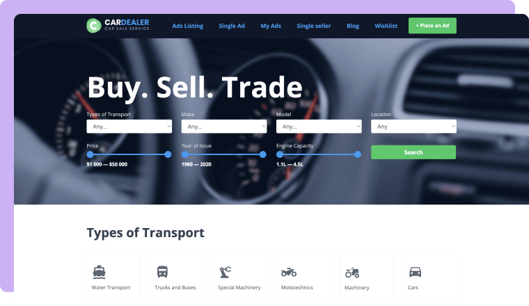
When it comes to the search tool, ensure it connects not only to product titles but also to all categories and descriptions assigned to the product. For example, in an online bookstore, a user searching for “Napoleon” should find all relevant books with that name featured in the description, including biographies, novels, and history books, without needing a specific filtering category.
Finally, to make your well-designed filtering system function as a navigation tool for exploring your store’s content, ensure it performs quickly. Utilizing the AJAX feature for displaying results instantly can be an optimal solution.
Image displaying instruments
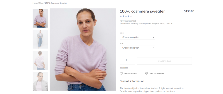
Online users want to see authentic products, so employ instruments on your e-store that allow for detailed product display. Features for optimal product display include:
- Switching between pictures: enable users to view products from different angles by clicking on additional thumbnails or using a slider layout with arrows indicating additional pictures.
- Automatic image zoom: automatically zoom in on the image when the user hovers over the title. This automation enhances user experience, adds interactivity to the site, and boosts trustworthiness.
- Lightbox display: allow users to view images in a lightbox, opening an enlarged image in a separate pop-up instead of redirecting to a new page. Use navigation arrows and short descriptions under the image within the lightbox layout for seamless switching between images without leaving the lightbox.
NOTE
Avoid using generic stock images that every other vendor utilizes, especially if you own the physical products. Original images contribute to trustworthiness and make your content stand out.
Multiple layouts for displaying products
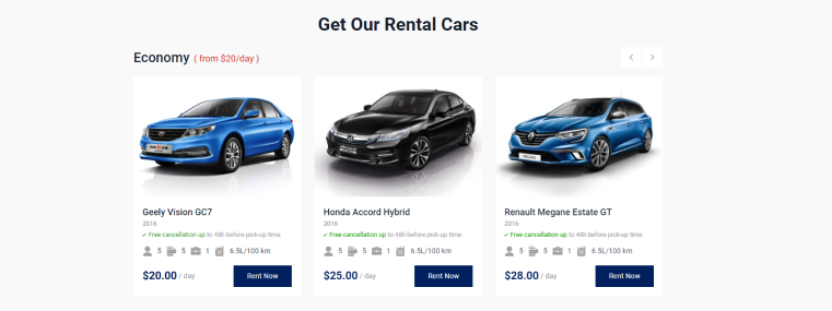
If you’re selling products, offering vacation packages, hosting paid video courses, or running a vehicle renting website, you will likely have all your items gathered in a single mega list for users to access from one place. This is the right approach. However, consider creating additional lists for specific categories. Style them differently; for example, while the general list might use a grid or list layout, employ a carousel for additional lists. Use these additional lists on the same page or include links to dedicated pages in a navigation bar.
Examples of using this approach include:
- best-selling items;
- the latest additions to online courses;
- chef-recommended products for a recipe blog;
- hot deals for seasonal sales on a vacation website;
- software products with the highest ratings.
Displaying products in several lists captures additional user attention, leading to increased user engagement, more clicks, longer time spent on your website, and higher conversion rates. This technique also directs users to the items you want to sell the most.

JetEngine’s dynamic features make it easy to create category-based lists. Once set up, these dynamic lists automatically update when new product posts with relevant categories appear in your store. An even simpler approach is using one of Crocoblock’s dynamic templates with premade product layouts and category pages.
Dynamic sales notifications
Continuing with dynamic features to boost user engagement, consider displaying dynamic sale notifications for WooCommerce sites. Create a pop-up notifying users about the last sale made on the website. This interactive feature draws users to product pages, especially if they are not already there, and conveys that your store is a busy place trusted by other users.
Similar functionality can be applied to display products with the most sales overall or during a specific time, the last sale in a specific category, or the most popular category of products. Creative ideas are only limited by the specifics of data organization on your site.
For these functionalities, Crocoblock’s JetEngine allows pulling dynamic data using its query builder mode, while JetPopup enables displaying it based on specific triggering conditions. Additionally, the query builder is now integrated with an advanced AI mode, simplifying the creation of queries for your specific needs.
Reviews
Having a review functionality can significantly influence user decisions on your site. Products may receive good or bad reviews, but the ability for users to leave them fosters authenticity and trust.
Beyond the product itself, users may reflect on their overall experience with your website, including interactions with personnel, delivery services, response time, etc. In the competitive realm of Internet marketing, these qualities can be crucial for user decision-making, just as confirmation from other buyers about them is.
Import positive reviews about your WooCommerce business from various platforms, including your website, social media accounts, and public forums. Regularly monitor all reviews and address user questions. Try to respond to all reviews, including negative ones, to show users that you value their feedback and prioritize user satisfaction.
Compare items feature
The ability to select multiple items from the product list and view them side-by-side on a separate page is advantageous for every WooCommerce site. This saves users time and makes product browsing more effective.
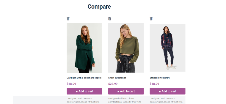
Make this functionality intuitive by adding a “Compare” button on the product listing and displaying essential product details on a dedicated comparison page.
Exit-intent pop-ups
By offering users a special discount code or coupon as they attempt to leave, businesses can effectively entice potential customers to reconsider their decision to exit without completing a purchase. This function is usually performed by setting up the pop-up with the relevant offer appearing when the user’s mouse behavior signals departure from the site.
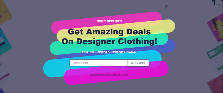
Cart abandonment is a common challenge for online retailers, with exit-intent popups serving as a proactive solution again. For users who have added items to their shopping cart but abandoned them during checkout, these pop-ups act as a targeted approach to recover potentially lost sales. By providing incentives such as discounts or free shipping, businesses can successfully encourage users to complete their purchases, turning potential abandonment into conversions. Additionally, you can offer discounts at the checkout stage in exchange for a user’s subscription to a newsletter.
FAQ
A good product-selling website prioritizes performance with fast speed and responsiveness, ensuring a seamless user experience. Additionally, it features a clear and engaging product display, incorporating high-quality visuals and intuitive navigation.
The five most important things for a website specializing in eCommerce include user reviews, product filtering, cart abandonment pop-ups, dynamic grid layouts, and payment gateways.
Yes, you can build an effective eCommerce store on WordPress by utilizing specialized plugins tailored for eCommerce needs, such as JetEngine for dynamic product layouts, JetWooBuilder for payment gateways and product displays, and others.
Conclusion
In crafting a successful WooCommerce website, prioritize site performance, offer high-quality products aligned with customer expectations, and optimize product displays. These key aspects enhance user engagement, establish brand trust, and are essential for driving successful product sales.
For further inspiration and to explore essential features for boosting eCommerce site conversion rates, check out the database of sites powered by JetPlugins. Feel free to share your insights on crucial features in the comments. Thank you for your attention!
