Do you want to increase sales and encourage users to buy goods and services on your site as quickly as possible?
Add a sense of urgency with a timer. In marketing, there is a concept of opportunity cost. People fear missing out on something truly interesting or profitable. Adding a countdown timer widget to your website creates that sense of urgency and FOMO (fear of missing out) on something important.
A countdown timer is a simple yet effective tool for helping people realize that your products or services are about to run out and prompting them to make purchasing decisions.
Let’s explore how different businesses use such timer widgets and the best practices you can implement.
Table of Contents
- What Is a Countdown Timer Widget?
- Types of Countdown Timers
- Best Practices for Countdown Timers
- Countdown Timer Examples
- Countdown Timers Made with Crocoblock Plugins
- FAQ
- In Conclusion
What Is a Countdown Timer Widget?
A countdown timer is a widget on your website that counts down the time until a certain moment, like a holiday sale, the end of the year, or the arrival of a new product.
There can be many variations, and you can customize such a timer for your specific occasions.
Types of Countdown Timers
Countdown timers come in several types. To choose the right one, consider what products or services will be featured on it. Determine whether you want the timer to count down to a product’s launch, generate excitement, or prompt immediate purchases. Evaluate your audience before creating a timer.
- Timer to a specific date: ideal for running promotions or ending sales at a particular date and time.
- Evergreen timer: updates each time a user reloads the website page. While less popular now, these timers still enhance urgency for potential customers.
- Repeatable countdown: this type of timer is useful for recurring special offers, such as weekly deals starting every Friday. It maintains excitement and keeps your customers engaged.
Best Practices for Countdown Timers
To ensure your timers are effective, follow these simple rules:
- Set a realistic deadline. Users should understand they have a limited time to make a purchase decision as long as the special offer is valid.
- Relevance. Ensure the timer aligns with the page content and the scheduled event. For example, if you’re promoting cupcakes, place the timer on the cupcake sale page.
- Timing. Display the timer at the appropriate moment, especially in pop-ups. Allow users to familiarize themselves with your site before prompting them to purchase.
- Clear message. Clearly communicate what the countdown is for and the action users should take before the deadline. Include a clear call to action.
- Optimize for mobile. Ensure the timer displays correctly on various devices, including smartphones and tablets.
- Replace the timer promptly. Once the countdown reaches zero, replace or remove the timer promptly to maintain relevance.
- Consistent style. Integrate the timer seamlessly into your WordPress site’s design. It should complement your site’s overall style and branding.
By following these practices, you can maximize the effectiveness of countdown timers on your website.
Now, let’s explore a few countdown timer examples commonly found on various websites.
Countdown Timer Examples
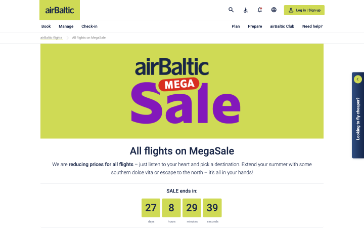
One notable example is on the AirBaltic website, where the widget countdown timer displays the time remaining until a promotion offer ends, encouraging users to select a destination and purchase tickets promptly.
A small, simple timer in the colors of the site shows how long the discount lasts. It does not stand out much on the site, but it is clearly visible and indicates which offer it refers to.
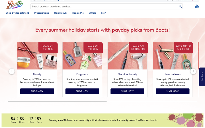
On the Boots cosmetics website, the timer counts down the days and hours until the start of their summer promotion. The timer is placed at the bottom of the site and is displayed when viewing promotional offers. Additionally, when ordering a product, users see a timer that encourages them to complete their order faster to receive the product the next day.
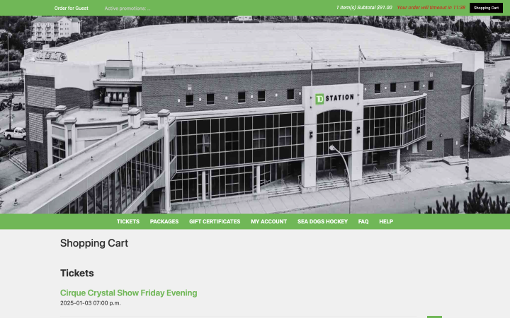
Sometimes, timers are implemented to expedite the checkout process, as seen when purchasing Cirque du Soleil tickets.
Here, the timer is placed in the site’s header and is practically invisible. However, it shows how much time a user has to place their ticket order and reminds users that they have something in the cart.
Countdown Timers Made with Crocoblock Plugins
If you want to add a countdown timer to your WordPress site, the easiest way is through plugins. In this video, you will find instructions on how to do it using JetElements.
Next, you will see some interesting examples of timers created with JetElements.
Coursebit
For instance, here’s how a timer encouraging users to download a useful book might appear. The timer is placed on the main screen, where it is immediately visible. Designed in the site’s colors, it blends in without standing out much yet encourages users effectively to make a decision.

🔗 Check the live version
Brandson
Here’s another example of what a summer discount timer created with JetElements might look like. In this example, we see the timer directly on the discount banner. Thus, the user has no doubt what this timer refers to. It is made in a minimalistic style and fully corresponds to the banner design.

🔗 Check the live version
ICOnyx
The following example illustrates what a timer designed for selling cryptocurrency might look like. In this example, the timer is also located on the main screen. The numbers are in white on a dark blue background, which corresponds to the site’s style. Such a timer does not disrupt the overall design while effectively capturing users’ attention.

🔗 Check the live version
Nutritix
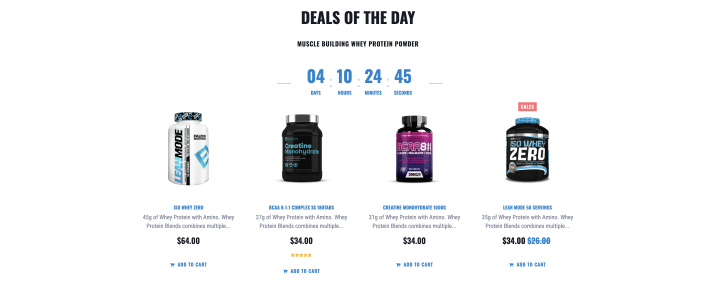
Here’s another example of a minimalist timer designed for daily sale items. Here, we see a timer in blue on a white background, indicating the remaining time until the end of the day’s sale. It doesn’t attract much attention, but users notice it right above the products they are interested in, prompting them to place an order as soon as possible.
🔗 Check the live version
Byazier
You can even count down to an event, such as a website restart, as shown in this example:

Here, you see a timer at the top, which uses a simple font on a white background to show how long it will be before the main website opens. This is a clear and simple solution for those interested in this web spot.
🔗 Check the live version
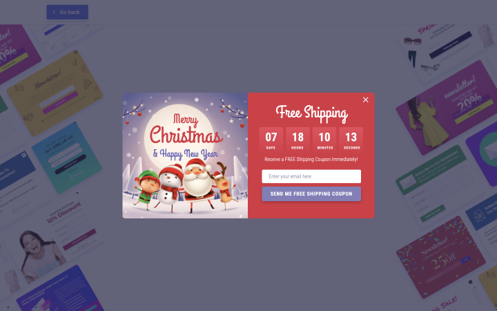
Often, timers and limited offers are presented as pop-ups. These can also be created using Crocoblock plugins. For instance, you can make such a timer with JetPopup, as shown below.
FAQ
A countdown timer on a website displays the time remaining until a specific event starts/ends. It can be general, showing the time until a promotion, or specific, indicating the time left to place an order.
The easiest way to implement a WordPress countdown timer is by using plugins like JetElements.
Yes, countdown timers are effective in increasing sales because they create a sense of urgency among users.
In Conclusion
A countdown timer is a valuable widget for boosting sales and engaging users to take immediate action. It instills urgency by highlighting that the best time to act is now.
You can customize the design and format of your countdown timer, but remember to keep your offer relevant and compelling. This ensures that the timer effectively motivates users to act, making it a reliable tool for driving conversions.

