Mobile navigation is an area that WordPress users often neglect. In many projects, I’ve seen the mobile menu is just the same desktop navigation hidden behind a hamburger icon. Technically, it functions. But from a usability perspective, it can cause issues.
Desktop navigation, especially with a mega menu, is usually designed to show a wide hierarchy of pages and categories. When this structure shifts to a mobile panel, users often have to scroll through lengthy lists and nested items just to find the section they need.
For websites with extensive catalogs, this quickly becomes frustrating.
In practice, mobile navigation performs better when treated as a separate interface instead of a condensed version of the desktop menu.
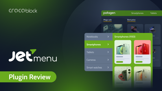
This is exactly where JetMenu becomes useful. The plugin allows one to build a separate mobile menu, display it in a slide-out panel, and control the structure of that navigation independently from the desktop layout.
When Does a Separate Mobile Menu Make Sense?
Honestly? A separate mobile menu makes sense in every case, except if your goal is to keep your conversion rate exactly where it is.
On the other hand, not every site needs a separate mobile navigation.
For simple websites, this may be acceptable. But for projects with larger navigation structures (especially Woo stores), the mobile menu quickly becomes difficult to manage.
JetMenu solves this by letting users create a separate WordPress mobile menu or compress the desktop menu.
💡 Personally, I’d recommend separating desktop and mobile navigation in a few common scenarios.
One example is online stores with many categories. Desktop mega menus often contain multiple category levels, brand lists, and promotional sections. On a large screen, this works fine.
On a mobile device, the same hierarchy becomes too long.
Mobile users usually want to do one of a few things quickly:
- search for a product;
- open the cart;
- browse main categories;
- check current promotions.
When the WordPress menu mobile is designed around these actions, navigation becomes much faster.
Let’s see how we can implement this structure with JetMenu.
Building a Custom WordPress Mobile Menu for an Online Clothing Store
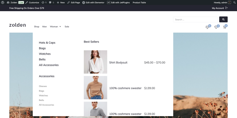
As an example, we’ll use Zolden fashion store, a dynamic template clothing store that has a large desktop mega menu. The navigation includes multiple product categories, seasonal collections, and the Best Sellers section with a product table shortcode created with JetProductTables.
How to Implement Mobile Menu with JetMenu?
With JetMenu’s Mega Menu widget, we have two ways to handle mobile navigation, and the choice depends on how different you want the mobile experience to be from the desktop version.
- The first option is faster; we’ll use the Mobile Device Render option, and then we’ll optimize the existing menu for smaller screens.
- The second option gives you full independence; again, we’ll use the Mobile Device Render option, and then we’ll build a separate WordPress mobile menu from scratch.
Both are valid. Let’s walk through each one using the Zolden clothing store as the example.
Option 1: Optimizing the main menu for mobile
Instead of creating a new menu, let’s configure the existing Mega Menu widget to render differently on mobile devices. The same navigation structure is used, but JetMenu controls how it looks and behaves on smaller screens (collapsing columns, adjusting spacing, and switching the panel layout).
This approach works well when your desktop menu structure is already reasonable for mobile. If your category list isn’t too deep and users can navigate it comfortably on a phone, optimizing the render is quicker than rebuilding the menu from scratch.
Step-by-step
Step 1: Open your website header in Elementor. Select the Mega Menu widget in your header section and open the widget settings panel on the left. In the widget settings, locate the Mobile Device Render toggle. Enabling it activates a separate Mobile Menu tab.
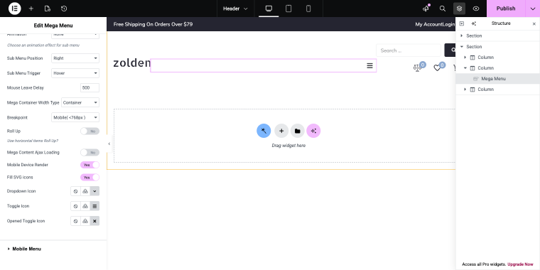
Step 2: Within the Mobile Menu tab, you can configure the mobile layout: set the panel width, behavior (slide-in or overlay), and position (left or right). You can also control whether the panel closes on outside click and whether a close button is visible. Since we’re going to optimize the same menu for smaller screens in the Menu for Mobile, select the main menu that is displayed on desktop.
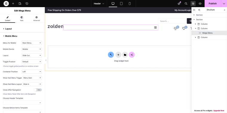
For the Zolden store, a right-side slide-in panel with a visible close button works because it matches how users expect a mobile panel to behave in a fashion store.
Step 3: Since our desktop menu contains a mega item, we need to adjust it for mobile screens. This means that something should be hidden so we can fit the menu item into smaller screens.
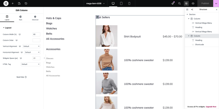
The right column of the mega item contains a set of best sellers table that we can easily hide by going to Column > Advanced > Responsive and enabling two switches: Hide on Tablet Portrait and Hide on Mobile Portrait.
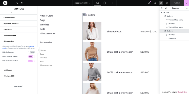
This will hide the column, leaving only those widgets that fit perfectly on smaller screens.
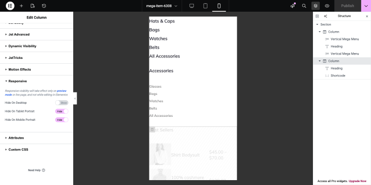
Step 4: Preview and test. Use Elementor’s responsive preview to check the result on phone and tablet sizes. Confirm that all items are reachable and the panel opens and closes correctly.
Result for the Zolden store
The desktop mega menu, with its two-column layout, product table shortcode, and promotional sections, stays completely intact. On mobile, the same menu renders as a clean slide-out panel with no layout conflicts.
Option 2: Creating a dedicated mobile menu
This approach creates a completely independent navigation structure for mobile. This time, we’ll create a new WordPress menu with only the items that matter on small screens, then display it through JetMenu’s Mega Menu widget in the header. The desktop mega menu is not affected in any way.
This is the more flexible option and the one that makes JetMenu stand out as a mobile menu plugin for WordPress; it’s not just a responsive fallback, it’s a separate mobile interface built around user intent.
Use this when your desktop navigation is too complex for mobile “as is.” If you’re running a WooCommerce store with deep category hierarchies, promotional columns, and dynamic content blocks, simplifying the structure for mobile usually leads to a noticeably better experience. This is the case with Zolden.
Step-by-step
Step 1: Create a new WordPress navigation menu. Go to WordPress Dashboard > Appearance > Menus. Create a new menu and name it something clear, like Mobile Menu, to keep it separate from your desktop menu and make it easy to manage independently.
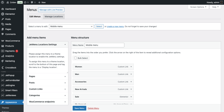
For the Zolden store, the mobile menu includes the following menu items: Women, Men, Accessories, New Arrivals, Sale, and My Account. That’s it. No nested brand lists, no product table blocks, no seasonal sub-sections. Mobile shoppers need to get somewhere quickly (the menu should reflect that).
For reference, I’ll add a sub-menu mega item under Women, keeping it to one level deep. To enable the mega item, hover over the menu item, click the “Settings” button, and then in the pop-up, enable the Use Mega Content switch.
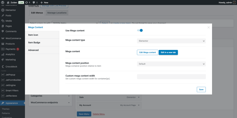
Step 3: Edit the mega item (clicking the “Edit Mega content” button in the pop-up). I’m not going to create something over-complex, I’ll just use a Heading widget and Products Grid widget to display some best-selling women’s items.
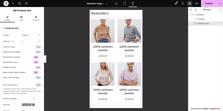
The Products Grid widget is set to “Preset 2” (via the Presets option), displaying products in “2” columns (via the Columns option). The Products Number is set to “4,” and the Query by field is filtered to the “Bestsellers” tag.
Step 4: Edit the Mega Menu widget in your header. Since the Mobile Device Render is already enabled, let’s move on to the Mobile Menu tab to change the mobile menu.
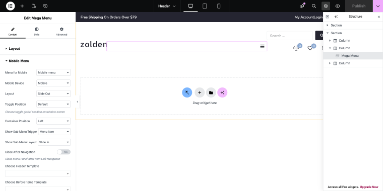
Step 5: Configure the slide-out panel. Set the panel position (left or right side), animation style (slide or fade), panel width, and overlay behavior. For the Zolden store, a right-side panel at around 320px width felt natural on most phones. Enable the overlay so users can close the panel by tapping outside it.
Result for the Zolden store
The desktop mega menu (with its full category hierarchy, product table, and multi-column layout) stays completely unchanged. On mobile, users see a focused slide-out panel with four main categories, a search field, and quick access to their account. Navigation becomes faster, and the panel structure matches how mobile shoppers actually use a clothing store.
If you’re working on a content site or a small store, Option 1 is usually enough. If you’re building a WooCommerce store with a large catalog, Option 2 gives you the control you need to design a proper WordPress menu for mobile rather than a compressed version of the desktop layout.
Why Crocoblock All-Inclusive Expands Navigation Possibilities
JetMenu becomes even more powerful when used inside the Crocoblock ecosystem.
The All-Inclusive subscription provides access to plugins such as JetEngine, JetSmartFilters, JetSearch, and JetWooBuilder.
Together, these plugins allow navigation elements to interact with dynamic content, product listings, and search results.
For example, a mobile menu panel can include:
- AJAX search;
- dynamic category lists;
- filtered product sections.
Instead of being just a list of links, the navigation becomes an interactive part of the store interface.
FAQ
Yes, but it usually depends on the tools you use. By default, most WordPress themes display the same navigation menu on both desktop and mobile devices. The mobile version is typically just a responsive variation of the desktop menu. With JetMenu, you can create a separate mobile menu and assign it to a navigation panel. This allows you to design a mobile navigation structure that focuses on quick actions and key categories instead of replicating the full desktop hierarchy.
In my experience, a good mobile menu focuses on actions first and categories second. For example, placing search, account access, and the shopping cart at the top of the menu helps users perform common tasks quickly. Below that, the menu can include a short list of main product categories. This approach usually works better than copying the entire desktop mega menu structure. JetMenu makes it easy to implement this structure by allowing developers to design custom slide-out panels for mobile navigation.
Yes. Modern mobile menus often include additional elements such as search bars, promotional blocks, or quick account links. With JetMenu, the mobile menu panel is not limited to a simple list of links. Because it can be built with Elementor, developers can place widgets, banners, or other content blocks directly inside the navigation panel. This makes the mobile menu more than just a navigation list. It can also highlight promotions, improve product discovery, and give users faster access to important features.
Conclusion
Mobile navigation does not always need to replicate the desktop menu.
For websites with large catalogs or complex structures, a dedicated mobile navigation panel often provides a better experience.
JetMenu makes it possible to implement this approach directly inside WordPress. Developers can create independent mobile menu structures, display them in slide-out panels, and customize their layout using Elementor.
The result is a mobile navigation that is easier to use while keeping the full desktop mega menu intact.