Products Grid Widget Overview
Learn about how to use Products Grid widget from JetWooBuilder to showcase WooCommerce products on the Shop Page.
Products Grid Tab
In the Products Grid tab, there are such settings:
- Presets. The options from this drop-down menu help you fill the Products Grid with previously defined settings in just a few seconds;
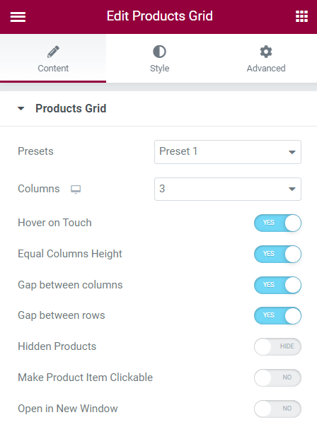
- Columns. Set the number of columns for the Desktop, Tablet, and Mobile view;
- Hover on Touch. Enables the hover effect;
- Equal Columns Height. If products have different pictures size and text lengths, you can enable this toggle to level items;
- Gap between rows. Enable to add the extra gap between rows in the grid;
- Hidden Products. If enabled, it shows the products with the “Hidden” Catalog visibility status. You can set this status by the product editing or quick editing;
- Make Product Item Clickable. If you enable this toggle, customers can proceed to the product page by clicking on the product item in the grid;
- Open in New Window. With this toggle enabled, the product page will be opened in a new window;
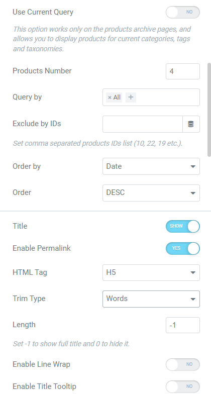
- Use Current Query. This option works only on the product archive templates and allows you to display products for current categories, tags, and taxonomies. For example, on the “Women” category page, this feature will show only women’s clothes;
- Products Number. Enter the number of products that will be shown on the page;
- Query by. You can query products by different taxonomies, such as Featured, Sale, Tag, etc.;
- Exclude by IDs. Enter IDs of the products you want to hide from the grid. You can also set the Dynamic Tags feature to exclude products related to certain dynamic content. For example, you can exclude the products of the specific seller;
- Order by. You can order products by such features based on WooCommerce product settings: Date;
- Modified Date; ID; Price; Title; Random; Sales; Top Rated; Menu Order; SKU; Current; and Stock Status.
- Order. Select the “ASC” (ascending) or “DESC” (descending) option. For example, if you select the “Title” Order by and “ASC” Order, the grid will show products in alphabetical order. If you select the “Date” Order by and “DESC” Order, products will be displayed from the newest to the oldest added;
- Title. Disable this toggle to hide the product title;
- Enable Permalink. If enabled, customers can proceed to the product page by clicking the product title;
- HTML Tag. You can select <H1-H6>, <div,> <span,> and <p> HTML tags for the product titles;
- Trim Type and Length. With these two features, you can set the product title length. Select the “Words” or “Letters” Trim Type and enter the number of words or letters that will be visible in the grid item. Set -1 to show the full title and 0 to hide it;
- Enable Line Wrap. If disabled the full title is shown, if enabled the title is wrapped on the end of the line;
- Enable Title Tooltip. If enabled, it adds the WooCommerce tooltips (e.g., “Sale!”) to the product title;
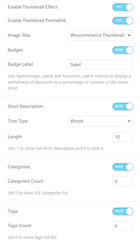
- Enable Thumbnail Effect. This option shows the second picture in the product gallery on hover;
- Enable Thumbnail Permalink. If enabled, customers can proceed to the product page by clicking the product picture;
- Image Size. Set the product image size in this drop-down menu;
- Badges. Enable to show the badges;
- Badge Label. Enter any text that will be shown in badges. Use the %percentage_sale% and %numeric_sale% macros to display a withdrawal of discounts as a percentage or numeric of the initial price;
- Short Description. Enable the toggle to show the product short description;
- Trim Type and Length. Set the product short description length here. Select the “Words” or “Letters” Trim Type and enter the number of words or letters that will be visible in the grid item. Set -1 to show the full title and 0 to hide it;
- Categories. Disable this toggle to hide the product categories;
- Categories Count. Enter the number of the displayed product categories or set 0 to show the full categories list;
- Tags. Disable this toggle to hide the product tags;
- Tags Count. Enter the number of the displayed product tags or set 0 to show the full categories list;
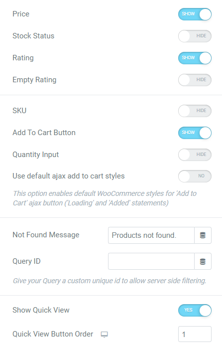
- Price. Disable this toggle to hide the product price;
- Stock Status. Disable this toggle to hide the product stock status;
- Rating. Disable this toggle to hide the product rating;
- Empty Rating. If you enable this toggle, it will show the product rating even if no one has rated it yet;
- SKU. Enable this toggle if you want to show the product stock-keeping unit;
- Add To Cart Button. This toggle displays the “Add to Cart” button;
- Quantity Input. With this feature, users will be able to add more than one item to the cart;
- Use default ajax add to cart styles. This option enables default WooCommerce styles for the “Add to Cart” AJAX button (“Loading” and “Added” statements);
- Not Found Message. Here you can set the “not found” notification. This message appears, for example, if you set the Products Grid widget on the Search Archive Page template. Instead of the regular text, you can use a Dynamic Tag or enter a shortcode;
- Query ID. Give the Query a unique custom ID to allow server-side filtering. You can use a Dynamic Tag with this option;
- Show Quick View. Adds the “Quick View” button that opens the Quick View pop-up, created with the JetPopup plugin. To learn how to create such a pop-up, proceed to the How to Create a Product Quick View Popup tutorial;
- Quick View Button Order. If you have more than one button (“Quick View,” “Add to Compare,” and “Add to Wishlist”), you can set their order. Be aware that this feature doesn’t affect the “Add to Cart” button that is always first. You can also set the order for the Desktop, Tablet, and Mobile view.
Quick View Tab
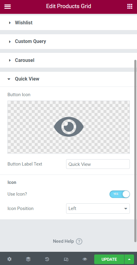
To set the “Quick View” button settings, enable the Show Quick View toggle in the Products Grid tab, proceed to the Quick View tab, and open it.
You can change the Button Icon and Button Label Text, disable the icon with the Use Icon? toggle, and set the “Left,” “Top,” “Right,” or “Bottom” Icon Position.
Compare Tab
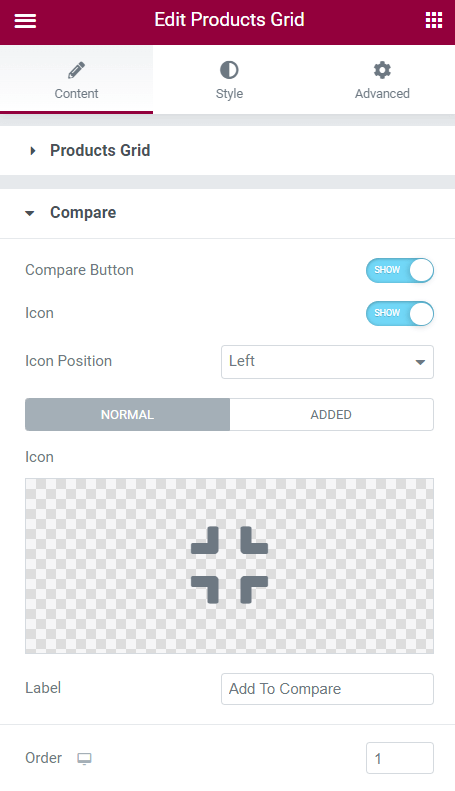
To customize the “Add to Compare” and “Add to Wishlist” buttons, you need the JetCompareWishlist plugin.
Proceed to the Compare tab and enable the Compare Button toggle.
You can disable the button Icon and set the “Left,” “Top,” “Right,” or “Bottom” Icon Position.
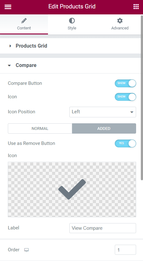
You can also customize the appearance of the standard button, and the button view after users add the product to the Product Comparison Page. For that, hit the “Normal” and “Added” buttons to switch the settings. In both tabs, you can set the Icon and Label.
Be aware that in the Added settings tab, you can enable the Use as Remove Button toggle, so customers can remove the product from the Compare Page by clicking on the same button.
If you have more than one button (“Quick View,” “Add to Compare,” and “Add to Wishlist”), you can set their Order. Be aware that this feature doesn’t affect the “Add to Cart” button that is always first. You can also set the order for the Desktop, Tablet, and Mobile view.
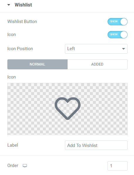
Wishlist Tab
Proceed to the Wishlist tab and enable the Wishlist Button toggle.
You can disable the button Icon and set the “Left,” “Top,” “Right,” or “Bottom” Icon Position.
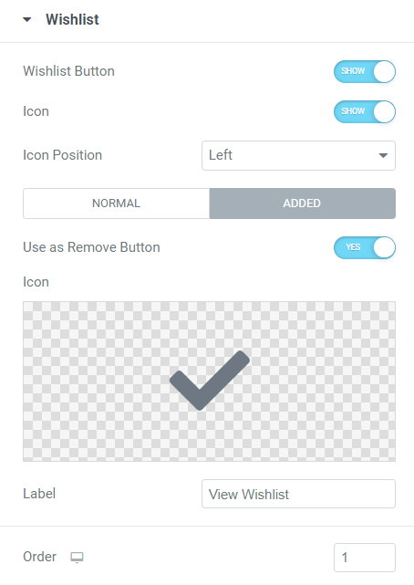
You can also customize the appearance of the standard button and the button view after users add the product to the Wishlist Page. For that, hit the “Normal” and “Added” buttons to switch the settings. In both tabs, you can set the Icon and Label.
Be aware that in the Added settings tab, you can enable the Use as Remove Button toggle, so customers can remove the product from the Wishlist Page by clicking on the same button.
If you have more than one button (“Quick View,” “Add to Compare,” and “Add to Wishlist”), you can set their Order. Be aware that this feature doesn’t affect the “Add to Cart” button that is always first. You can also set the order for the Desktop, Tablet, and Mobile view.
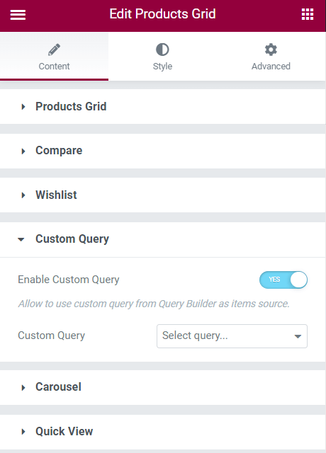
Custom Query
Move to the Custom Query tab and switch on the Enable Custom Query toggle. You can apply the WC Product Query created with the JetEngine Query Builder feature here.
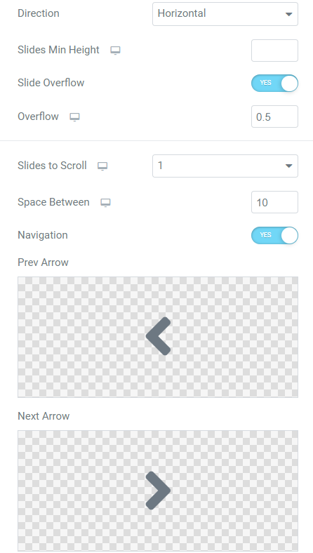
Carousel Tab
Go to the Carousel tab and activate the Enable Carousel toggle.
There are such settings:
- Direction. Set the “Vertical” or “Horizontal” direction of the carousel scrolling;
- Slides Min Height. Set the slides minimal height for the Mobile, Tablet, and Mobile view;
- Slide Overflow and Overflow. If you enable the Slide Overflow toggle and, for example, set the “0.5” in the Overflow field, the carousel will show half of the extra product slide;
- Slides to Scroll. Here, you can set the number of slides to scroll for the Mobile, Tablet, and Mobile views;
- Space Between. Enter the number of pixels between the slides. You can set the different numbers for the Mobile, Tablet, and Mobile views;
- Navigation. This option enables the arrows by clicking on which customers can scroll the slides;
- Prev Arrow and Next Arrows. Here you can set the custom icons for the arrows. Note that you can upload only SVG format icons;
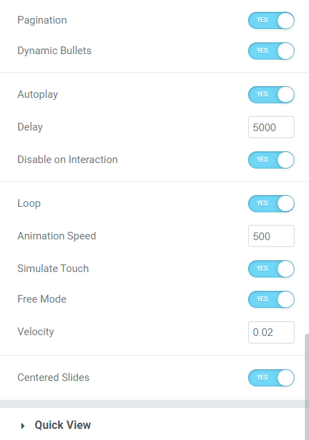
- Pagination. Shows the dots on the carousel bottom that indicate the different slides. By clicking the dot, users can move to the needed slide;
- Dynamic Bullets. This option is available if Pagination is enabled;
- Autoplay. Makes scroll slides automatically;
- Delay. Defines the frequency of the automatic slide scrolling. For example, if you set “500,” slides will scroll too often, and if you set “5000,” slides will scroll less frequently;
- Disable on Interaction. After users interact with the carousel, it disables autoplay, and slides freeze until the page isn’t reloaded;
- Loop. If enabled, the carousel scrolls the slides in the loop, and if disabled, then when the last slide is reached, the carousel shows the slides in reverse order;
- Animation Speed. Defines the speed of the slide’s movement. For example, if you set “100,” the slides will scroll sharply, and if you set “1000,” the animation will be smoother.
- Simulate Touch. It allows you to scroll the slides by holding down the cursor on the Desktop devices;
- Free Mode and Velocity. The Velocity option defines the speed of slide scrolling in the free mode;
- Centered Slides. If the Slide Overflow option is toggled on, the Centered Slides option allocates overflow on both sides of the carousel.