In modern web design, sticky menus have revolutionized user navigation and experience. They’ve become one of the cornerstones, offering unparalleled navigation and user engagement benefits. Using best practices and maximizing their potential will improve your website’s user experience and help you make money.
This article will review sticky menus, their best practices, and their importance.
Table of Contents
- What’s a Sticky Menu?
- Sticky Menu WordPress Plugins That I Recommend
- Best Practices for Sticky Menus
- Sticky Menu Pros and Cons
- Sticky Menu Websites Examples
- FAQ
- Conclusion
What’s a Sticky Menu?
Sticky menus are fixed navigation bars that stay visible as users scroll through a page. They’re common on WordPress and HTML sites, especially with complex layouts. Sticky menus enhance user engagement by reducing bounce rates and improving conversion rates. Here are three of the most popular types of sticky menus.
Fixed top navigation
Sticky header navigation menus remain at the top of the screen as users scroll, ensuring that essential navigation elements are always visible. These menus are often customizable using plugins and widgets, making them versatile for different web designs.
- Many corporate sites use fixed top navigation to highlight key sections like About, Services, Contact, and Blog. Microsoft’s website uses fixed top navigation to ensure easy access to the main sections.
- Portfolios can have a fixed top navigation so visitors can easily navigate through different projects, the artist’s bio, and contact info. Graphic designers or photographers might use this to showcase their work, with sections for portfolios, testimonials, and contact.
Fixed left-side navigation
Sidebar navigation menus are vertically aligned along the left edge of the screen, making it easy for users to navigate categories.
- A WooCommerce store can list categories, filters, and brands in a fixed left-side navigation menu. Users can easily browse through different sections without losing sight of the navigation—for example, Amazon’s category menu, where users can see all product categories and subcategories.
- Fixed left-side navigation can be helpful for informational sites like glossaries, listings, and educational resources. For example, Skelementor has quick links to Elementor sections and other resources.
- This type of navigation helps blog readers find related content easily by listing archives, tags, categories, and popular posts. For example, a tech blog might have categories like reviews, tutorials, and news updates.
Fixed right-side navigation
Fixed right-side navigation menus, often used on platforms like YouTube, facilitate quick transitions between related content, such as recommended videos, related articles, or additional resources.
- Media-rich websites can enhance user engagement by displaying recommended or next-up content on the right side. YouTube uses this layout to show suggested videos and playlists while watching a video.
- On news websites, the right-side navigation can feature trending news, related posts, or ads. CNN’s website often has links to popular stories and related news.
- A right-side menu can make accessing other modules or tools in applications like online courses and tutorials easy. Coding platforms often have a right-side menu with additional resources, exercises, or examples.
Sticky Menu WordPress Plugins That I Recommend
JetTricks
Crocoblock’s JetTricks plugin allows you to create sticky elements on your website. These elements can be enhanced with various animations, such as fade-in, slide-in, and sticky opacity effects. These enhancements can also visually enhance sticky menus, improving user interaction and aesthetics.
Now, let’s see it in action.
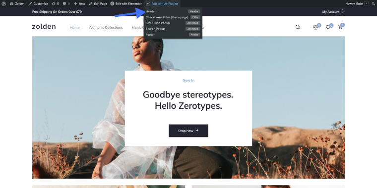
I’ll use the same Zolden dynamic template as an example. Here, I’m going to create a sticky column with a bunch of widgets inside (a “range filter” and a “products list”).
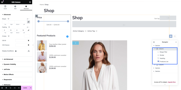
You can add whatever widgets you want on your website. Let’s make this column sticky so it remains visible regardless of how we scroll the page.
Choose the column you want to edit, and you’ll find JetTricks under the Advanced settings tab. Enable the Sticky Column toggle to make the column sticky. You can also set up the stickiness to your preference, including margins, position, and whether it is on or off on desktops, tablets, and mobile devices.
To make it more relevant to this article, I have added the Main menu to the left column so that you can see how it appears when it sticks to it.
JetMenu
JetMenu is another great menu plugin with tons of customization options. It allows website owners to create sticky menus with custom layouts, styling, and functionality. This plugin allows you to create menus in infinite ways, giving you much control over the menu design.
If you want to build a sticky menu with JetMenu, you better couple it with JetTricks or JetSticky. Alternatively, you can use Elementor’s basic option, Fixed position. I’m not sure the Zolden dynamic template is the best way to show you how this works, but I’ll try.
Let’s say I have terrible taste in design and want my shop menu to be placed in the bottom left corner. How do I do that?
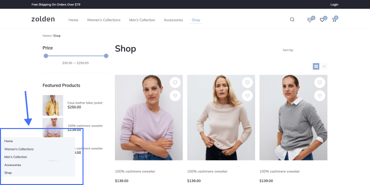
Since it will be on top of everything, I want it to cover the content underneath it. I’ll go to the menu’s options and give it some background color; in this case, it’s the #ECECEC.
Now, I’ll go to the Advanced settings tab and change the width and position values.
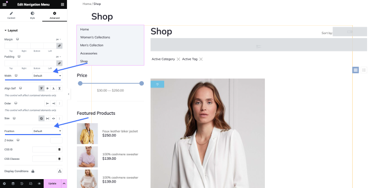
It is necessary to alter the width because if I change the position to fixed, the menu element will stretch over the full width of the page.
I’m pretty sure nobody will ever create a fixed menu like that, but since this option exists, I can’t deny that someone will use it. 😊
JetSticky
JetSticky is a powerful plugin for creating sticky navigation elements in a few clicks. You can customize sticky elements like menus, headers, and anything else on the page. JetSticky lets you create sticky menus with smooth transitions and responsive behavior, enhancing UX.
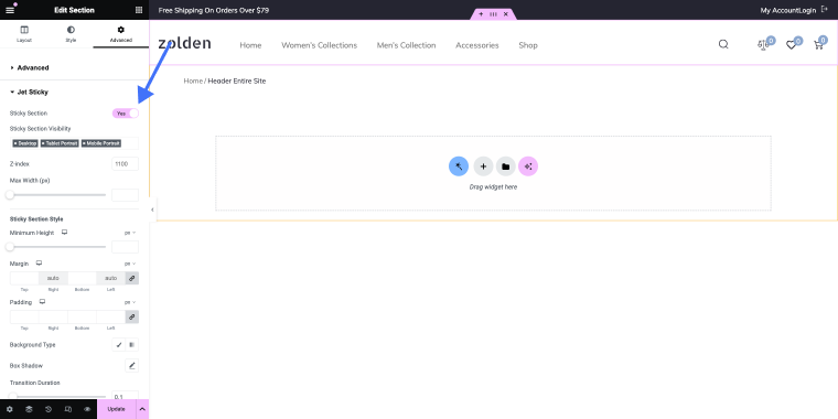
How do we enable the sticky section with the help of this plugin?
I will use Crocoblock’s Zolden dynamic template as an example. First, we need to open the Header with Elementor.
Once you reach the Advanced tab, find the Jet Sticky section and enable the corresponding toggle.
Once it’s on, you’ll have additional customization options to fine-tune the sticky section. You can create a sticky menu with just one click.
Best Practices for Sticky Menus
Sticky menus have a lot of benefits, but their effectiveness depends on how you implement them. Consider the following key best practices.
Minimal motion
Users prefer menus that don’t “jump around,” so you better avoid unnecessary motion in sticky headers. If any movement is necessary, it should be minimal and responsive. Consider allowing users to drag or reposition the menu if needed, but ensure this functionality is intuitive and non-disruptive. This keeps the user experience smooth and prevents distractions.
Optimize content-to-chrome ratio
The content-to-chrome ratio balances actual content and navigational or decorative elements. Ensure that sticky menus are compact, occupying minimal screen space while remaining readable and clickable. This is particularly important for mobile users, who now comprise more than half of all Internet traffic. A well-optimized menu won’t obstruct content, enhancing the overall user experience.
Contrast for visibility
Design your sticky menus with colors that stand out against the background and surrounding content. High contrast ensures that the menu remains easily visible and accessible, highlighting its role as a critical navigational tool. Use contrasting colors to make the menu elements pop, aiding in quick recognition and usability.
Sticky Menu Pros and Cons
Let’s look at the pros and cons of sticky menus.
Pros
- Predictable navigation across different pages makes it easy for users to find what they want. For example, a news website with categories like “Politics,” “Entertainment,” and “Sports” in the sticky menu allows users to switch sections without scrolling back to the top.
- If the sticky menu contains links to your cart, account options, and product categories, it can streamline your shopping experience.
- If important elements like popular posts, subscription options, and social media links are accessible, users are more likely to explore content and interact with the site.
- A more inclusive browsing experience will benefit users with disabilities by allowing them to access essential links and features easily.
Cons
- On smaller devices, sticky menus can take up valuable screen space, making the layout cramped and hard to read.
- Users can be distracted from the main content by overly prominent animations, bright colors, or intrusive placement.
- Designing a responsive and smooth sticky menu across various devices and screen sizes requires careful coding and testing. Issues like glitches or slow responsiveness can impact usability.
Sticky Menu Websites Examples
Let’s look at some live sticky nav examples on websites that use Crocoblock products (and not only).
KhanWork

KhanWork’s sticky menu offers effortless navigation with essential elements at users’ fingertips. Featuring the logo, navigation items, and prominent buttons to “book a call” or “get started,” this menu, built with JetThemeCore, enhances the user experience while maintaining a sleek and modern design aesthetic against a white background.
Achieve Migration

Achieve Migration’s sticky menu offers seamless navigation for users, ensuring easy access to key elements while exploring the website. The menu includes the company logo, menu items for effortless browsing, and buttons for booking a consultation or connecting via WhatsApp. This sleek and efficient menu was built with Elementor’s fixed position option.
Machupicchu Turistico
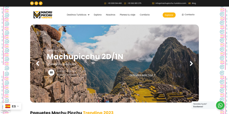
Machupicchu Turistico’s sticky menu stands out for its dynamic design and functionality. Users scroll down, and the menu detaches from the background, appearing as a floating navigation bar with rounded corners. It’s built with JetSticky, which makes navigation smooth while maintaining visual appeal. The menu features the logo, items, and explore button.
Goodwill

Goodwill’s sticky menu offers straightforward navigation with essential elements that are always within reach. The menu at the top of the page includes the logo, navigation items, and contact information. It is built using Elementor’s fixed position feature, seamlessly integrating with the website’s design and enhancing user experience without compromising aesthetics.
AntaWeb

With AntaWeb’s sticky menu, users can navigate through the website’s content with ease and impact. Initially, the menu is transparent to reveal the hero area’s background image, but it transitions to white when scrolling. Featuring the logo, navigation items, and a prominent “Partner” button, this menu, powered by JetSticky, ensures smooth navigation while complementing the site’s design.
FAQ
Sticky menus enhance user experience by providing consistent access to essential navigation options as users explore a webpage. By remaining fixed in position, they eliminate the need for users to scroll back to the top for menu access, resulting in smoother and more efficient browsing.
Yes, sticky menus can be optimized for mobile devices to ensure seamless navigation across all screen sizes. Responsive design techniques allow sticky menus to adapt dynamically, maintaining usability and functionality on smartphones and tablets. It’s essential to prioritize mobile optimization to accommodate the growing number of users accessing websites on mobile devices.
When implemented correctly, sticky menus have minimal impact on website performance. However, excessive animations or complex JavaScript functionalities may lead to increased load times or decreased responsiveness. Striking a balance between functionality and performance is crucial to ensure an optimal user experience.
Conclusion
Sticky menus are valuable tools for improving website navigation. Following best practices and optimizing their design can enhance user experience, keep visitors engaged, and drive more conversions to your site.