Have you ever had that exciting moment when you’re rubbing your hands in anticipation of online purchase – you open the website and see a whole set of filters to help you find the one – but the moment you start using them, the experience turns into a battle against the interface.
Maybe selecting one category suddenly disables others, forcing you to go through them one by one. Or you scroll down, pick a filter near the bottom, and – boom! – the page jumps back to the top. The list of annoyances goes on, but the outcome is the same: frustration. Instead of smoothly picking out what you need, you’re stuck trying to outsmart the filters, wrestling with the system rather than browsing the products.
Here is the solution: follow UX best practices for filter design and use tools that help implement them effectively. In this article, I’ll share key best practices and show you how to apply them using the JetSmartFilters plugin by Crocoblock.
Table of Contents
- Avoid Cramped Scrollable Windows: Improve Checkbox Filter Usability
- Add Text Inputs to Range Sliders
- Prevent Disruptions in Filter Interactions
- Extra Control Over Active Filters Above the Results
- Full Page Overlays for Mobile
- FAQ
- Takeaway
Avoid Cramped Scrollable Windows: Improve Checkbox Filter Usability
If there are many filters, some try to fit as many as possible on the top of the page, so they create tiny and short panes for Select filters. It’s absolutely fine if there are three or five options, but the problem is that such panes might cramp up dozens of checkboxes. Thus, users have to scroll a lot (as one scroll step means just a few options), being really careful not to miss anything and not tap a filter accidentally if they use mobile devices.
The solution is quite obvious: make scrollable panes for filters bigger and set up a proper minimum height. But what if you have a lot of different options and a variety of filters?
In this case, use expandable filter containers – display only up to ten options, and the rest can be revealed by clicking on the “Show more” button.
As the goal here is to help users find the desired items faster, it’s also important to organize options alphabetically or by popularity.
But what if the user already knows what exactly they are looking for? In this scenario, the search input with autocomplete functionality is something that will make the filtering experience great.
And finally, it’s cool when the customer can see how many items each filter category has.
This is how it looks:
How to create user-friendly Checkbox/Radio filters with JetSmartFilters
First, set up filters on the backend, where you choose not only the data source but also adjust the ordering rules and other options. In my example below, I have taxonomies as a data source, and they are ordered by popularity.
You can also exclude or include particular elements.
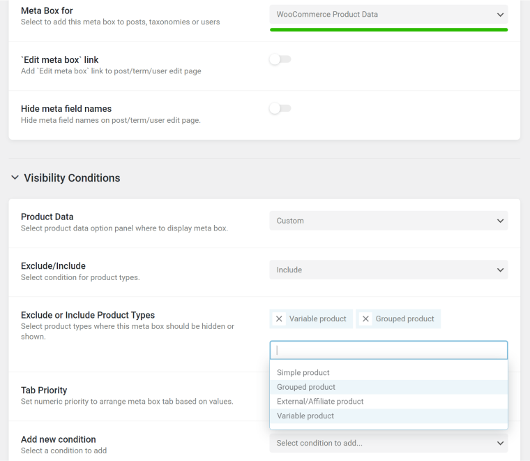
After this, go to the editor; JetSmartFilter is fully compatible with Elementor, Bricks Builder, and Block Editor.
There, in the Additional Settings section, you can not only make the filter pane expandable but also adjust the texts for expanded and collapsed states. You have full control over the number of items to be shown in the pane when it’s not expanded. Finally, you can adjust the height when the scroll appears – this is useful if you have a large number of filter items and don’t want the pane to be expanded to the end of the page.
And, of course, you can activate and set up the Search field and add a custom text.
To show the item count, proceed to the Indexer section and activate it. But before that, make sure the Indexer tool is activated in the filter settings in Crocoblock > JetPlugins Settings > JetSmartFilters > Indexer Settings.
In the Styling section, you can adjust fonts, colors, gaps – basically, everything.
Add Text Inputs to Range Sliders
Sliders are great because they make numeric values easy to visualize. Customers can play with the ranges, adjusting them on the fly and instantly seeing how the available options change. It feels quick, interactive, and far less intimidating than dealing with raw numbers.
But there’s a small catch with range sliders: they can be frustrating when you need to select an exact value. This becomes even trickier when the range is wide – say, from $50 to $50,000 – especially if the slider is placed in a left panel, limiting its length and precision. And on a mobile device? Fine-tuning a selection can turn into a real challenge.
Let’s say I want to book an apartment in the lush greens of Bali, and there are hundreds of options for every price range. But I’ve got a hard limit of $1,600 – well, maybe $1,650 if it’s something that really knocks my socks off. The price filter technically covers everything, with $20,000 still in play, but trying to land on my exact number with a slider. That’s a test of patience I didn’t sign up for.
Long story short: text inputs save the day, and that’s exactly why filter plugins should have them. Steppers (+/- controls) are an integral part of such inputs, so users can easily adjust the value without typing.
How to create user-friendly Range Sliders with JetSmartFilters
As usual, first, set up a Range filter on the backend. The settings are pretty straightforward: you can choose the data source (WooCommerce prices, in my case) and set up prefixes, suffixes, separators, and other details. If the value is stored as a meta field, set up the meta field name (_price, in my case, which is the default price field name by WooCommerce).
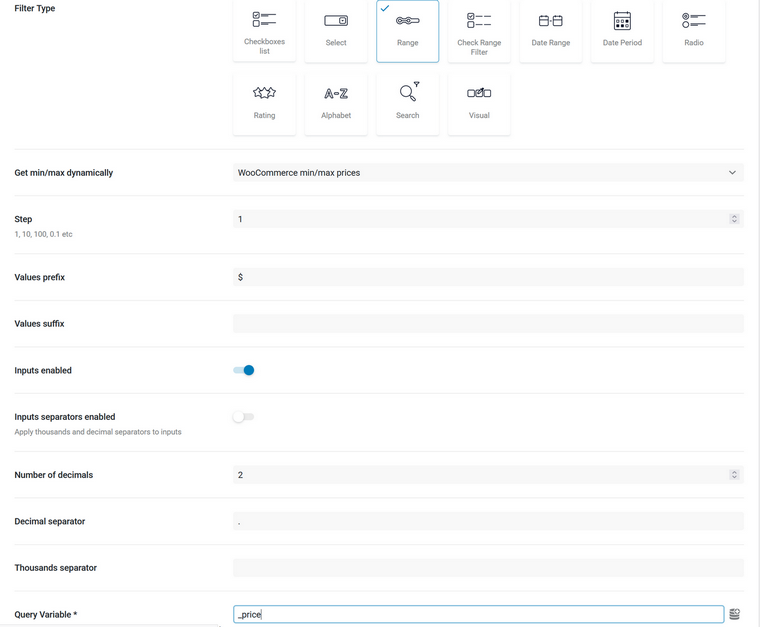
Now, go to one of the builders and insert the filter you’ve created. There are not too many settings there, as the filter is quite straightforward. However, you can stylize every little detail of the Range filter in the Styles tab.
Prevent Disruptions in Filter Interactions
When customers use filters, they should feel in complete control of the page – no surprises, no interruptions. Filters shouldn’t freeze the UI, making the page unresponsive for a second, nor should they randomly jump users to the top or bottom, causing disorienting layout shifts. It’s not a dance battle, after all – users shouldn’t have to keep up with unpredictable moves. Smooth, seamless filtering is the goal, keeping everything right where it should be.
Let me break it down into a few ways filter interactions can be disrupted.
- There should be no autoscrolling to the top or bottom of the page when users select a filter.
This is one of the most frustrating experiences – select a filter, get thrown to the top, scroll back down, select another filter, and repeat. It’s not a finger muscle training session, after all. Worse, this disrupts the user’s focus and makes comparing filtered results unnecessarily tedious.
Auto-scrolling often happens when filters trigger a full-page reload instead of dynamically updating the results section. This outdated approach should be replaced with AJAX-based filtering, ensuring results update instantly without shifting the user’s position. Additionally, make sure filter selections don’t trigger the browser’s built-in “scroll into view” behavior, which can unexpectedly reposition users.
Use AJAX-based filtering to load results without page reloads, but ensure that any type of autoscroll only happens when necessary and doesn’t disrupt the user’s flow.
- Avoid layout shifts at the filters panel – they disorient users.
When users are automatically scrolled to a different part of the page, it can be disorienting. Layout shifts are equally frustrating. Our brains work in a way that lets us scan the page with peripheral vision while selecting one filter, already “mapping” the next one. But what happens if the layout shifts while we’re doing this?
If filters change, becoming hidden or resized, or if dropdowns open and close automatically, it creates layout shifts that force the user to search for their place. This interrupts the flow, turning the process into an epic struggle with the filters. On top of that, layout shifts are considered poor UX and can negatively affect performance metrics, like Google’s Core Web Vitals.
Keep the filter panel layout stable to prevent disorientation and improve user flow.
- A whole page freezes for a moment when a single filter is selected.
If there are several filters on a page, they are all meant to be used, right? So why should I have to wait after selecting each one before I can move on to the next? That doesn’t even make sense! And beyond being frustrating, it leads to higher bounce rates and lower profits.
If the results section is refreshing due to a previously selected filter, the filter panel should always remain responsive. A smooth experience keeps users engaged instead of making them abandon the page.
Ensure the UI remains responsive after each filter input – load filters and results asynchronously.
Smooth user interactions with JetSmartFilters
JetSmartFilters are already made with all the best practices I described above in mind. So, if everything is set up correctly and there are no issues with caching, these AJAX filters will work without any layout shifts, autoscrolling, and UI freezing.
Extra Control Over Active Filters Above the Results
When users are focused on browsing results, they shouldn’t have to scroll back through the entire filter list to see what’s active. That’s why it’s important to give them controls to remove or clear filters right above the results.
This makes it easy for users to adjust their selections without losing their place or getting frustrated. It also helps them quickly understand what filters are applied and why certain results are showing. Adding simple options like an “X” to remove individual filters or a “Clear All” button to reset everything can save users time and make their experience smoother.
By making these controls easily accessible, you’re giving users the freedom to refine their search without interrupting their flow.
Controlling active filters with JetSmartFilters
The JetSmartFilters plugin has the Active Tags and Active Filters elements, so you can have full control over the filters you use.
These filters don’t need any settings from the back end, as they work as widgets/blocks/modules on the front end.
What do they do? They make all of the filters appear above the results section, so you can deactivate all of them at once or the particular ones individually.
Full Page Overlays for Mobile
If filters are displayed in a split-screen layout on mobile, the UI gets blocked, making it harder for users to browse and refine their search. That’s exactly what we want to avoid. Instead, filters should open in a full-page overlay, giving users the space to make selections without distractions.
A well-designed full-page filter should be easy to scroll through without trapping users in a tiny scrollable area. Categories should be clearly structured, ideally with collapsible sections to keep things organized. Buttons to apply or reset filters should be fixed at the bottom, so users don’t have to scroll back up just to confirm their choices.
To keep the experience smooth, the overlay should close with a swipe or a clear “X” / “Back” button so users can return to the same spot in the results instead of being thrown back to the top of the page. This way, filtering feels like a natural part of browsing, not an interruption.
Off-canvas filters with JetSmartFilters
You can make filters work off-canvas with the free Off-Canvas Add-on for JetSmartFilters. Install and activate it and enjoy the additional benefits it offers.
FAQ
Ensure filters load results asynchronously to prevent page freezes, avoid layout shifts that disrupt navigation, and provide clear controls for managing active filters. A well-structured filter panel with a logical hierarchy also enhances usability.
Use a full-page overlay instead of a split-screen layout to prevent UI blockages. Make sure filters are scrollable and organized into collapsible sections, and include a fixed “Apply” button to streamline the selection process.
Implement AJAX-based filtering to update results without reloading the page.
Takeaway
Good filters make browsing easy, not frustrating. Give users enough space to scroll, keep the interface smooth, and make it simple to tweak or remove filters. With JetSmartFilters, you can set up filters that work well and feel natural, making your site a better place to shop or explore.
