Are your customers choosing a product but leaving your site at the moment of payment? According to statistics by Analyzify, 80% of users abandon their cart without making a purchase.
What’s the point of creating a cool site and offering interesting products if no one buys them, isn’t it?
To reduce the bounce rate, you can optimize your checkout page and improve the user experience.
In this article, you will find some interesting ideas for such a task.
Table of Contents
- Why Do You Need a WooCommerce Checkout Page?
- Key Elements on the Checkout Page
- 5 Examples of Checkout Pages
- Tips and Best Practices for Checkout Pages
- How to Create a Checkout Page
- FAQ
- In Conclusion
Why Do You Need a WooCommerce Checkout Page?
A checkout page is a place on a website where a user can view the details of their order, choose shipping options, and pay for the product.
A checkout page is a critical component of any eCommerce website, and having one on your WordPress site offers several essential benefits.
Streamlined purchasing process
A dedicated checkout page ensures a smooth and user-friendly buying experience. Customers can quickly review their orders, enter payment information, and complete their purchases without unnecessary steps or distractions.
Increased conversion rates
A well-designed checkout page can significantly boost your conversion rates. By minimizing friction and making the process straightforward, you reduce the likelihood of cart abandonment and encourage customers to complete their transactions.
Security
A secure checkout page is crucial for protecting your customers’ sensitive information. WordPress offers various plugins that provide secure payment gateways and compliance with industry standards, building trust with your audience.
Customization and branding
With WordPress, you can fully customize your checkout page to align with your brand’s aesthetics and tone of voice. This consistency enhances your brand’s professionalism and leaves a lasting impression on your customers.
Data collection and analysis
A checkout page allows you to gather valuable data on customer behavior and preferences. This information can be used to optimize your marketing strategies, improve product offerings, and provide personalized experiences.
Integration with payment gateways
WooCommerce supports numerous payment gateways, making it easy to integrate your preferred payment methods. This flexibility ensures that you can cater to a diverse audience and accommodate various payment preferences.
Scalability
As your business grows, your checkout process can scale with it. WordPress plugins offer advanced features such as upselling, cross-selling, and customizable shipping options, allowing you to enhance the customer experience as your needs evolve.
But checkout pages have some challenges to face when designing, developing, and optimizing them:
- Complexity. Creating an effective page can be challenging as customer expectations and technology constantly evolve. You have to optimize and improve everything continuously.
- Technical issues. Checkout pages can sometimes experience technical problems, such as errors during checkout or issues with the form, leading to an increased number of abandoned carts.
- Security issues. While secure payment gateways are crucial, they can also become targets for cyberattacks.
- Mobile optimization. Most orders are made from mobile devices, so it’s essential to make this process convenient. The page should be optimized and displayed properly on different devices.
- Difficulty in the purchase process. Some users abandon their carts because the checkout form is too complicated or the shipping cost is too high.
Key Elements on the Checkout Page
A well-designed checkout page is crucial for providing a seamless and efficient purchasing experience. Here are the key elements that should be included on your checkout page:
- Order summary. Show a summary of the items in the cart, including the names of the selected items, quantities, prices, and any applicable discounts or promotions. This helps shoppers review their selection before proceeding to payment.
- Shipping information. Offer customers several shipping options, as not everyone can pick up an item in-store or at the post office.
- Billing information. Allow customers to enter their billing address, which can be the same as or different from the shipping address.
- Payment methods. Provide multiple payment options, such as PayPal, Apple Pay, Google Pay, and credit/debit cards, and let users choose the option that works best for them.
- Promo codes field. If you plan to run any promotions, include a field where customers can enter promo codes.
- Review and confirmation. Provide a final review section where shoppers can double-check all their details, including the order summary, shipping information, and payment details. This step helps minimize errors and increases buyer confidence in their purchase.
- Call to Action (CTA) buttons. Use clear and prominent CTA buttons, such as “Continue to Payment” and “Place Order.” Ensure they function correctly.
- Security assurance. Display security badges and SSL certificates to reassure customers that their personal and payment information is protected.
- Customer support. Provide easy access to customer support, such as via chat or a link to an FAQ section.
- Optimize for mobile devices. Ensure your checkout page is fully responsive and optimized for mobile devices.
If these elements are designed and implemented properly, users will have a smooth checkout experience.
5 Examples of Checkout Pages
Let’s take a look at what your checkout page might look like.
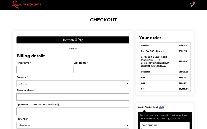
You can use a minimalistic design like the Scorpion Outdoors store.
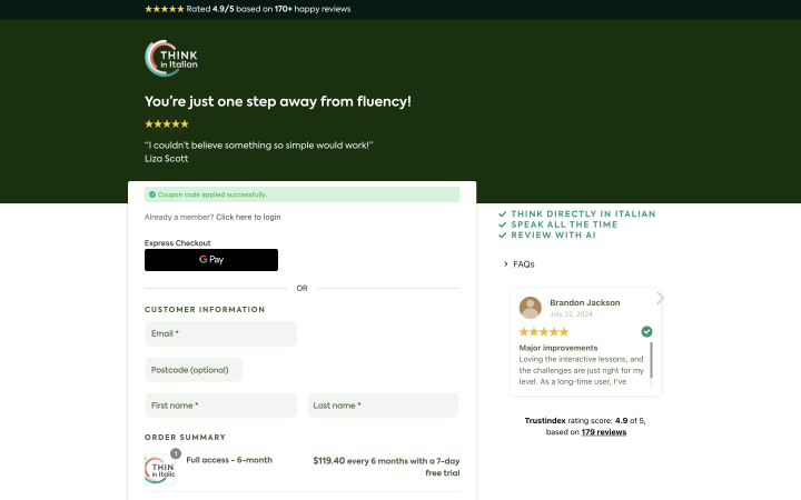
It can match your store’s design and contain additional social proof, such as reviews. This is an additional incentive for users to buy from you. That’s how it is implemented on the Think in Italian website.
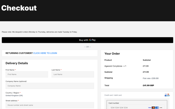
You can create a checkout page with minimal fields and place multiple payment options. In the Lee Valley Aquatics website example, you can see what this might look like.
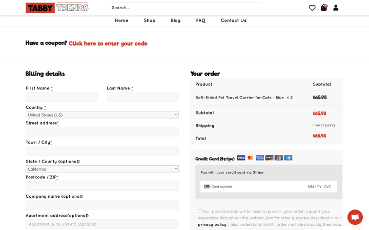
On the checkout page, you can add a feedback form or even offer additional products to selected items like Tabby Trends.
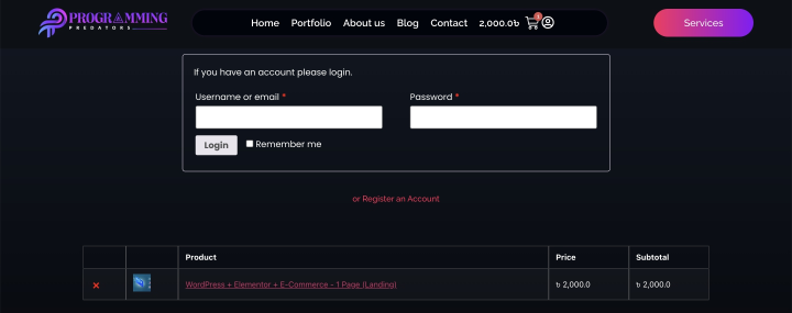
Also, your checkout page can look similar to the one on the Programming Predators website.
Tips and Best Practices for Checkout Pages
Here are some tips and best practices to optimize your checkout page for higher conversions and a seamless user experience.
1. Keep it simple and clean
Avoid clutter and unnecessary elements that can distract the user. Focus on the essential steps needed to complete the purchase. Remember, fewer steps mean less chance for the customer to abandon the purchase.
2. Ensure mobile responsiveness
With an increasing number of shoppers using mobile devices, it’s vital that your checkout page is fully responsive. Test it across different devices to ensure a smooth experience.
Make sure form fields are easy to tap and fill out on smaller screens. Autofill options and large buttons can help improve the mobile user experience.
3. Optimize for speed
A slow checkout page can lead to cart abandonment. Optimize images, enable caching, and use a reliable hosting provider to ensure fast load times.
4. Simplify the form fields
Ask only for the information you absolutely need. Implement inline validation to help users quickly correct any errors without having to reload the page.
5. Offer multiple payment options
Different customers prefer different payment methods. Offering a variety of payment options like credit cards, PayPal, Apple Pay, or Google Pay can help accommodate more users.
6. Provide a progress indicator
If your checkout process involves multiple steps, include a progress indicator. This reassures users and reduces anxiety by showing how close they are to completing their purchase.
7. Include trust signals
Adding customer reviews or testimonials on the checkout page can build trust and reassure potential buyers. Clearly display any guarantees or return policies to alleviate concerns and encourage purchases.
8. Enable guest checkout
Allow users to complete their purchase without creating an account. Forcing account creation can lead to higher cart abandonment rates.
9. Use exit-intent pop-ups
Implement exit-intent pop-ups to capture users who are about to leave without completing their purchase. Offer discounts or reminders to encourage them to finish the transaction.
10. Test and optimize regularly
Regularly test different elements of your checkout page, such as button colors, text, or layout, to see what works best for your audience. Keep an eye on your checkout page’s performance through tools like Google Analytics. Identify bottlenecks and areas for improvement.
How to Create a Checkout Page
The process of creating a checkout page can vary, depending on which plugin you choose and how you want to design your page.
The checkout page is created automatically when you install the WooCommerce plugin.
However, there are some nuances in the setup and customization that you need to keep in mind.
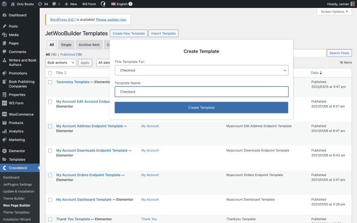
For customization, you have several options. If you’re working with Elementor, you can install JetWooBuilder and use it to customize each element. To do this, go to Dashboard > Crocoblock > Woo Page Builder and create a custom template. Click on the “Create New Template” button, pick the best template, or create your own. You can then modify and customize each element on this page.
By default, WooCommerce asks the user to enter their full address on the checkout page. But often, you don’t need this information, so feel free to remove unnecessary fields and leave only the most important ones.
If you want to customize your page with code, you can use shortcodes or hooks.
Also, remember that it’s better to include options not only for payment but also delivery on the page. Most often, delivery is handled by local companies whose services can be connected to your site using an API. Many large delivery services offer the opportunity to integrate directly with WooCommerce.
FAQ
Leave only the most necessary fields and steps, remove any unnecessary elements, and ensure it’s easy and convenient for users to place orders on your checkout page.
Choose one that fulfills your objectives. The JetWooBuilder plugin for Elementor lets you visually modify every element of the checkout page.
Opt for a simple, intuitive design with easy-to-use buttons and fields. Ensure that users can easily complete a transaction on your page.
In Conclusion
The WooCommerce checkout page is a crucial part of the user journey. The easier it is for a person to purchase selected products and view their order summary, the higher your conversion rates will be.
Don’t be afraid to test and experiment to find the best option, but remember that the simpler the ordering process, the better it is for both you and your customers.