Tables are an indispensable tool for organizing and presenting information, whether it’s product comparisons, pricing charts, or data visualizations.
However, creating tables that look good and function seamlessly across devices can be challenging, especially on WordPress. Responsive tables solve this problem by adapting their layout to fit screens of all sizes.
In this article, we’ll explore what responsive tables for WordPress are, why they’re important for your website, and how you can easily create and customize them in WordPress. Let’s dive in.
Table of Contents
- What Are WordPress Responsive Tables?
- Types of Responsive Tables
- Mobile Product Tables and Necessary Elements
- WordPress Responsive Tables: Use Cases
- Creating WordPress Responsive Tables
- FAQ
- Conclusion
What Are WordPress Responsive Tables?
WordPress responsive tables are designed to adapt their layout automatically based on the device or screen size they’re viewed on. This type of table ensures that your content remains accessible and user-friendly on desktops, tablets, and smartphones.
These tables use responsive design techniques, such as collapsing columns, stacking rows, or adding scrollbars. It helps to display information in a format that fits the available screen space.
Such functionality is crucial for maintaining a positive user experience, especially as mobile browsing continues to grow in popularity.
With responsive tables on your WordPress website, you can:
- ensure your data looks clean and professional across all devices;
- avoid frustrating your audience with cluttered or unreadable tables on mobile screens;
- improve SEO and engagement, as responsive design is a key factor in search engine rankings.
With plugins and built-in tools, creating responsive tables in WordPress is easy. They’re an essential feature for anyone looking to present information clearly and effectively in a mobile-first world.
Types of Responsive Tables
There are a few types of responsive tables you can use on your website. Let’s explore their differences:
- Collapsing tables. Collapsing tables are best suited for small or narrow tables. On mobile devices, columns are compressed to fit the screen. In some cases, non-essential columns can be hidden to maintain readability.
- Stackable tables. In stackable tables, each row transforms into a block-like card, with the table headers repositioned as side labels. Additional content can also be hidden under expandable sections (accordion style).
- Scrollable tables. Scrollable tables are the most common type for larger datasets. Instead of adjusting the layout, a horizontal scroll bar is added, allowing users to view the entire table by scrolling horizontally.
- Paginated tables. Paginated tables split long tables into multiple pages, making the content easier to navigate. Pagination can be combined with any of the above types to avoid overwhelming users with a single, lengthy table.
You will find some examples of different responsive tables in this article.
Mobile Product Tables and Necessary Elements
Mobile product tables are designed to provide a seamless shopping experience on smartphones and tablets, where screen space is limited.
Key elements for mobile product tables include:
- product images for easy identification;
- clear product names and prices to aid decision-making;
- add-to-cart buttons for quick purchases;
- filtering and sorting options to help users find products fast;
- compact design to avoid overwhelming small screens.
With these elements, you can create mobile-friendly product tables that are both functional and visually appealing.
WordPress Responsive Tables: Use Cases
Responsive tables are incredibly flexible and can increase the functionality and presentation of information on your WordPress website. They allow you to display data in a clear, organized, and mobile-friendly format. Here are some common use cases where WordPress responsive tables could be used:
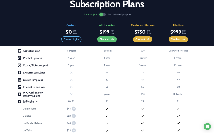
1. Product and services comparison tables
Product comparison tables are perfect for eCommerce websites to showcase product features, specifications, and prices side by side. It helps users make informed decisions, increasing engagement and conversions.
2. Responsive pricing tables
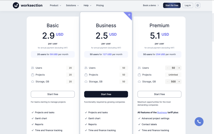
Pricing tables are needed for service providers, SaaS companies, or subscription-based businesses to present tiered pricing plans. They include features like column highlighting for recommended plans or call-to-action buttons for sign-ups.
3. Event schedules and timetables
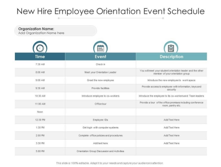
Event schedules and timetables are useful for conferences, workshops, schools, and everywhere where schedules are needed. It includes time slots, event descriptions, speaker names, and venue details in a clean layout.
4. Restaurant menus
It could be one of the variations of the product table. Such tables offer an organized way to display dishes, descriptions, prices, and availability. Menus enhance user experience, especially when viewing on mobile devices.
5. FAQ and feature lists
Such tables present answers or features in a structured, easy-to-read format. They are especially useful for tech or product-focused sites.
WordPress responsive tables provide a variety of use cases, making them a must-have for anyone looking to present structured data efficiently. Whether you’re running an eCommerce site or corporate page, these tables can elevate your website’s user experience and accessibility across devices.
Creating WordPress Responsive Tables
Creating responsive tables in WordPress can be tricky, but you have several options for accomplishing this task.
Using native WordPress table block
The Block Editor includes a basic Table Block that you can use to create simple tables. While not specifically designed for products, it can be customized to display basic product information.
To create a product table with Block Editor (Gutenberg), follow these steps:
- Go to your WordPress Editor and add a Table Block to your page or post.
- Insert your product details (e.g., name, price, description) into the cells.
- Use CSS media queries or responsive design tools to make the table adapt to smaller screens.
Using WordPress responsive table plugin for data
There are many plugins that can help you in creating tables. Let’s look at some of the options.
JetProductTables is a powerful WordPress plugin designed to create fully customizable and responsive tables. Ideal for eCommerce projects, it allows you to showcase product details such as attributes, descriptions, and prices with ease. The plugin’s features guarantee seamless browsing on both desktop and mobile devices. The plugin includes all the mobile table layout types mentioned at the beginning.
💡 Here is a detailed instruction on how to make a product table with JetProductTables.
TablePress is a free and popular plugin for creating tables in WordPress. It doesn’t have built-in WooCommerce integration but can be customized for product tables with additional effort.
WooCommerce Product Table by Barn2 is a premium plugin that is fully integrated with WooCommerce. It offers responsive design, filtering, and sorting options.
Ninja Tables is a lightweight plugin for creating customizable tables. It supports responsive layouts and integrates with WooCommerce.
Using WordPress responsive pricing and comparison table plugins
Responsive pricing and comparison tables are a special category of tables that function more like tabs than traditional tables. These interactive elements allow users to switch between different pricing tiers or compare products effortlessly. This format is ideal for presenting complex data in a user-friendly way, particularly in eCommerce and subscription-based services.
Tabs simplify navigation, letting users explore information without overwhelming them, and help users quickly compare features, prices, and benefits side by side.
You can create such types of tables with plugins like JetElements or TablePress. But if you have a WooCommerce website, use the JetCompareWishlist plugin for such a purpose.
FAQ
A responsive product table automatically adjusts its layout based on the screen size of the device it’s viewed on. This ensures that the table is easy to read and navigate on desktops, tablets, and smartphones, offering a smooth user experience regardless of device type.
Responsive product tables enhance user experience by making your product information accessible and well-organized across devices. They are especially important for eCommerce sites, as they allow customers to compare products easily, increasing the chances of conversion. Additionally, search engines favor mobile-friendly tables, potentially boosting your SEO rankings.
While it’s possible to create simple responsive tables using the built-in WordPress Table Block or custom HTML and CSS, using a plugin can simplify the process and offer additional features like sorting, filtering, and easy customization. Plugins like JetProductTables, TablePress, or Ninja Tables are popular options that provide powerful tools for creating responsive product tables.
Conclusion
Responsive tables are a great tool for improving the user experience on your WordPress website. They help to improve navigation, boost engagement, and increase the likelihood of conversions.
Now you know about the different elements that you need to add to your responsive tables. If you want to make your website user-friendly, make sure that your website is accessible on different devices and that all tables adapt to different screen sizes. Use this article as an instruction when creating your new table.
