Map Listing Overview
This tutorial includes information on creating a Maps Listing with the JetEngine plugin.
Module Location
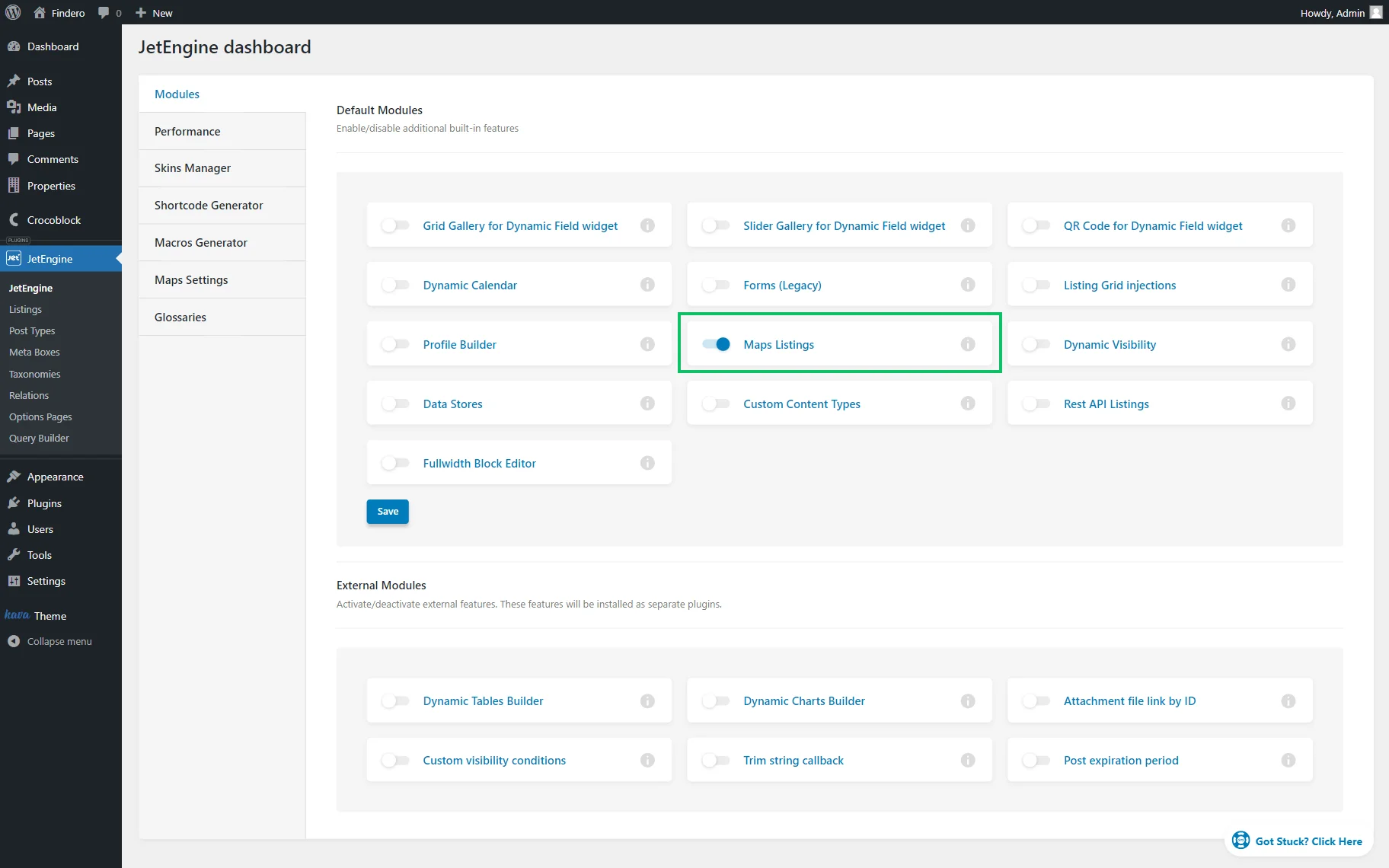
The Map Listing functionality can be enabled in WordPress Dashboard > JetEngine > JetEngine > Modules by activating the Maps Listings option and clicking the “Save” button.
Maps Settings Overview
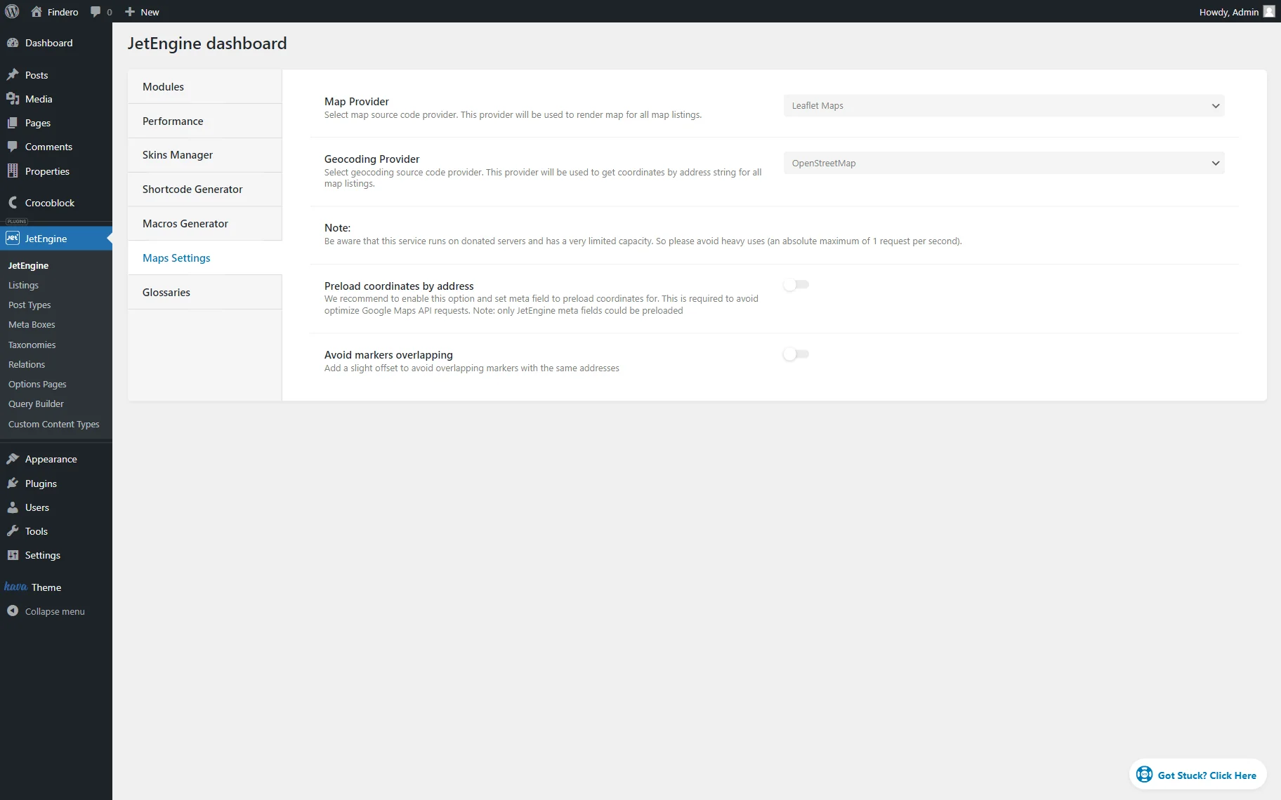
After that, the Maps Settings tab should be opened in the JetEngine settings dashboard.
The available settings should be adjusted depending on the selected map provider.
Map Listing Widget/Block Overview
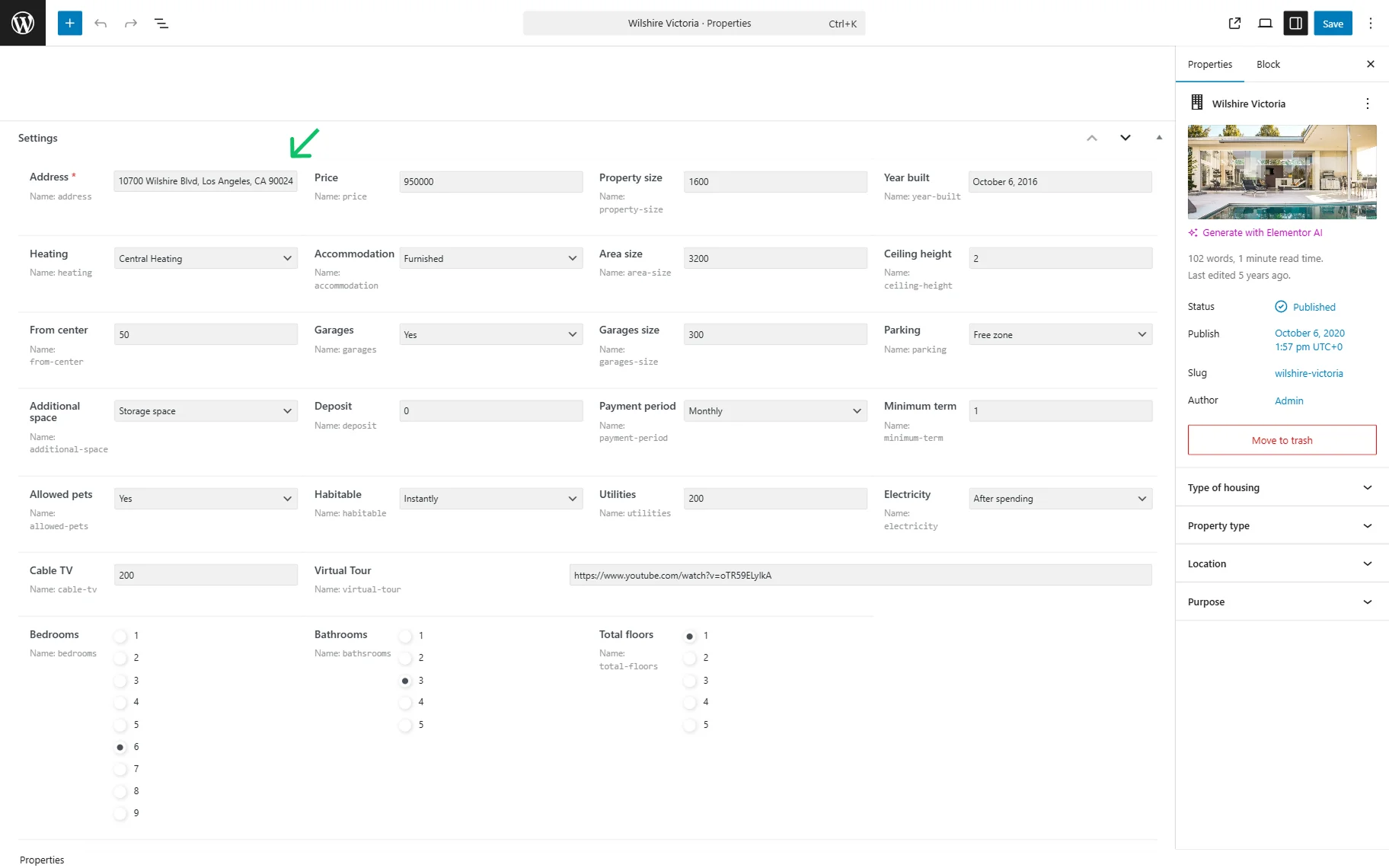
A Custom Post Type (CPT) with a meta field containing the address is required to create content for the map.
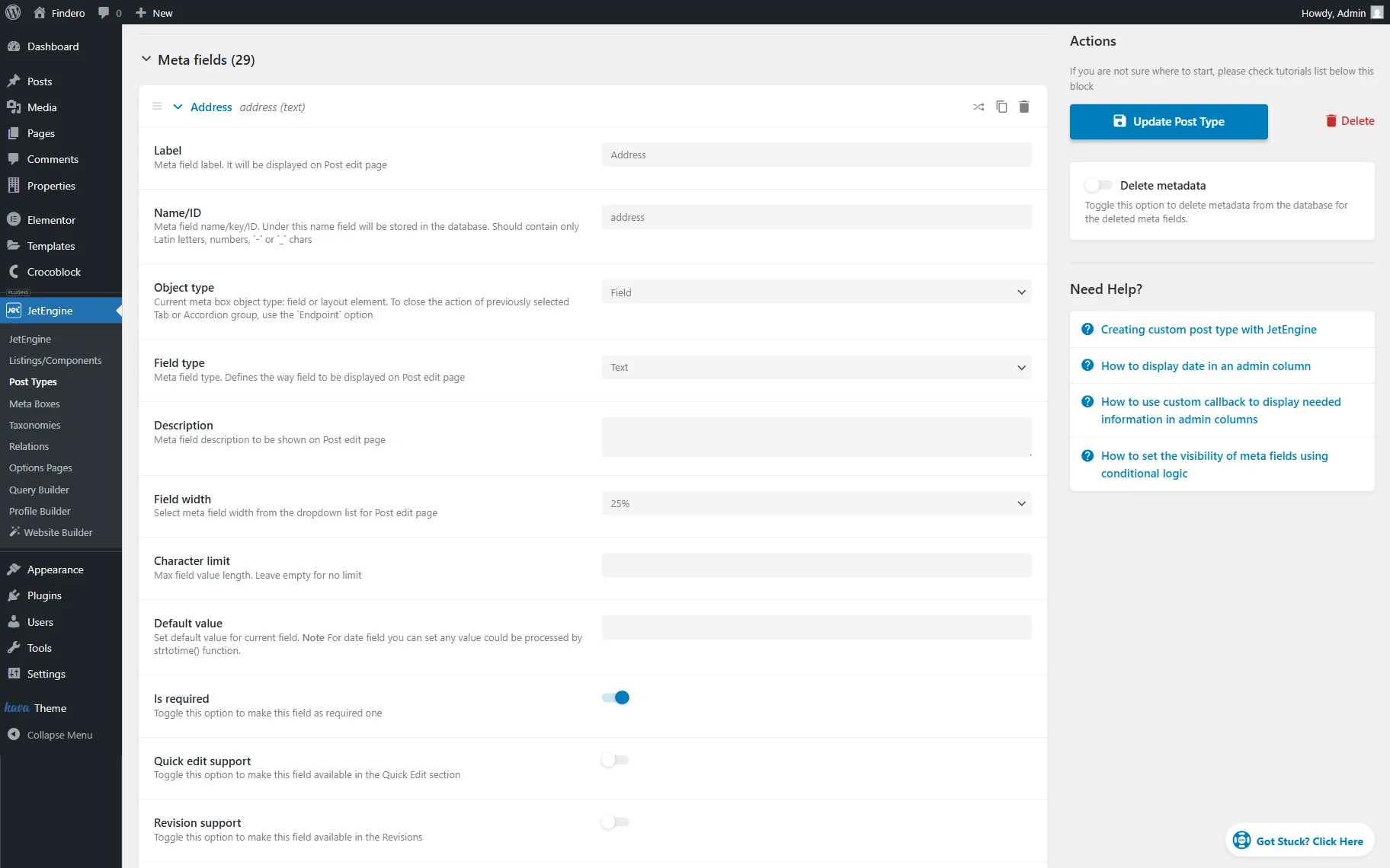
Also, meta fields should be completed in every post.
Then, the Listing template should be created to decide on the layout of the content.
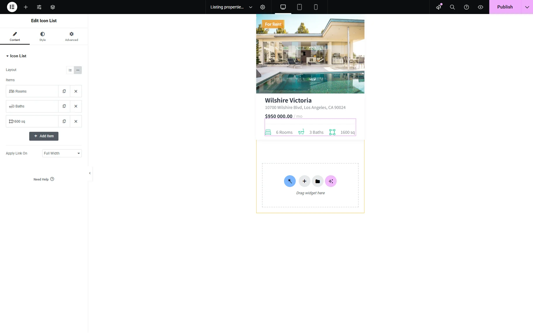
After building the CPT items and a Listing template, the content can be displayed via the Map Listing widget (in Elementor), block (in Gutenberg Editor), or element (in Bricks). The settings are similar for all page builders.
In this guide, we will look through the Elementor and Gutenberg editors. More information on the Bricks builder settings can be found in the How to Create Map Listings with Bricks tutorial.
General Settings Section
The first tab with the most crucial setting fields is General.
Before proceeding to the Gutenberg General settings, check how to implement the WordPress Interactive Map with Multiple Locations in Gutenberg.
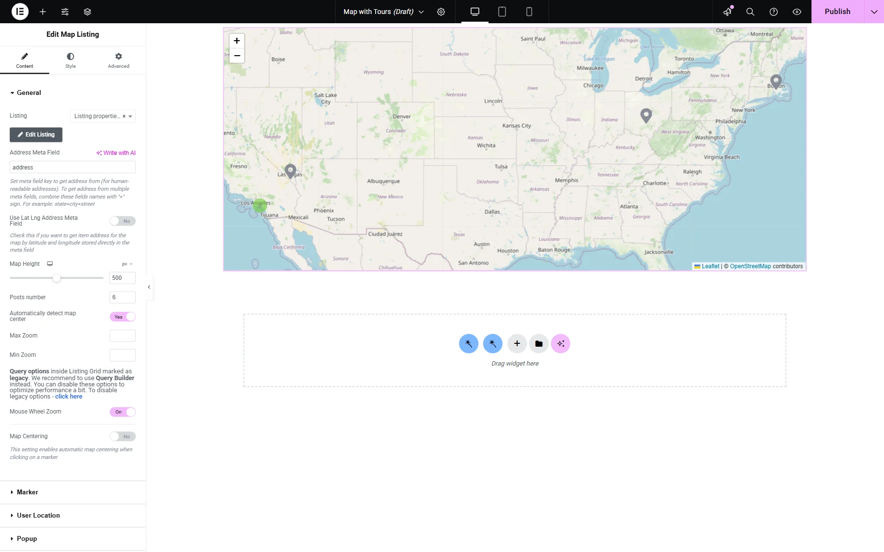
The settings in the General tab are the same for Elementor and Gutenberg editors:
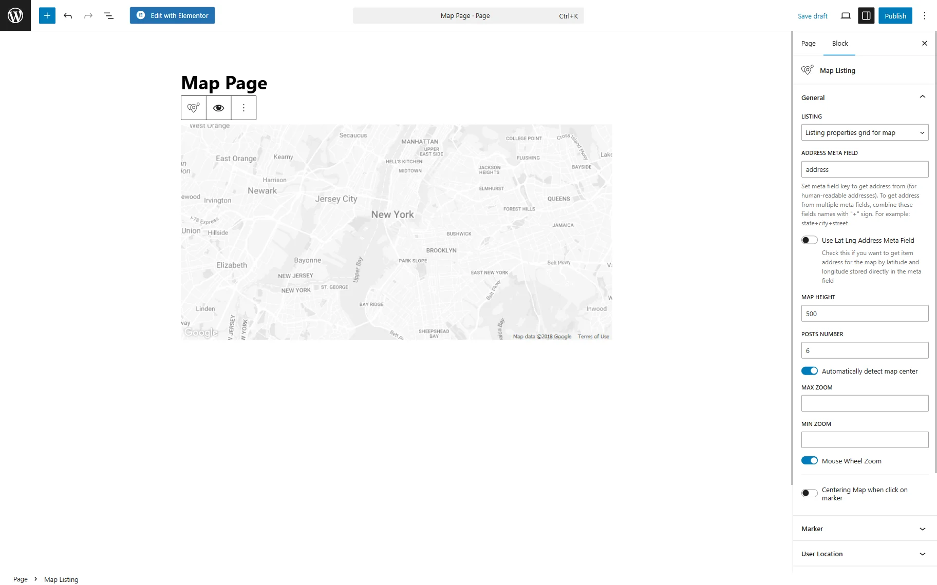
- Listing — a field to choose the Listing template created for the map;
- Address Meta Field — a bar to insert the name of the map meta field with the address;
- Use Lat Lng Address Meta Field — a toggle that displays a field for inserting an item’s latitude and longitude if they need to be stored in the meta field;
- Map Height — the height of the map element on the page that can be changed by typing the height into the bar;
- Posts number — every marker on the map is taken as one post. Here, define the number of markers to show at the same time;
- Automatically detect map center — a toggle which, when turned on, makes the map listing automatically define the center in relation to placed marks and shows the map centered accordingly;
- Max Zoom — a maximum value to which the map can be increased. For instance, the map scale is set to “5” by default when the map is opened, so if Map Zoom is set to “8”, the map can be zoomed three times;
- Min Zoom — a minimum value to which the map can be decreased. Like in the previous example, if the map scale is “5” and the Min Zoom is set to “4”, it can be zoomed out once;
- Mouse Wheel Zoom — a toggle that allows scaling the map up and down by spinning the mouse wheel when activated;
- Centering Map when click on marker — a switcher that enables centering a map when a specific item is clicked. Also, allows setting the Zoom Map value.
Once the “Google Maps” provider is set, additional settings are displayed:
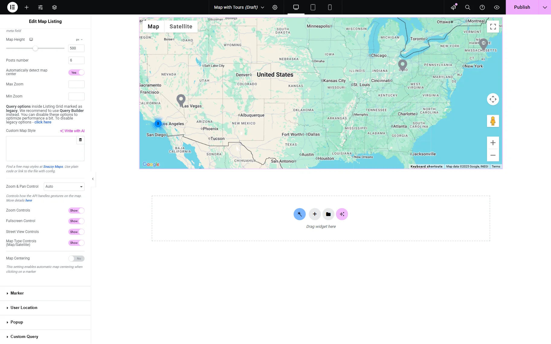
- Zoom & Pan Control — a drop-down menu to choose how users can interact with the map. The toggles below enable or disable various controls, including Zoom Controls, Fullscreen Control, Street View Controls, and Map Type Controls.
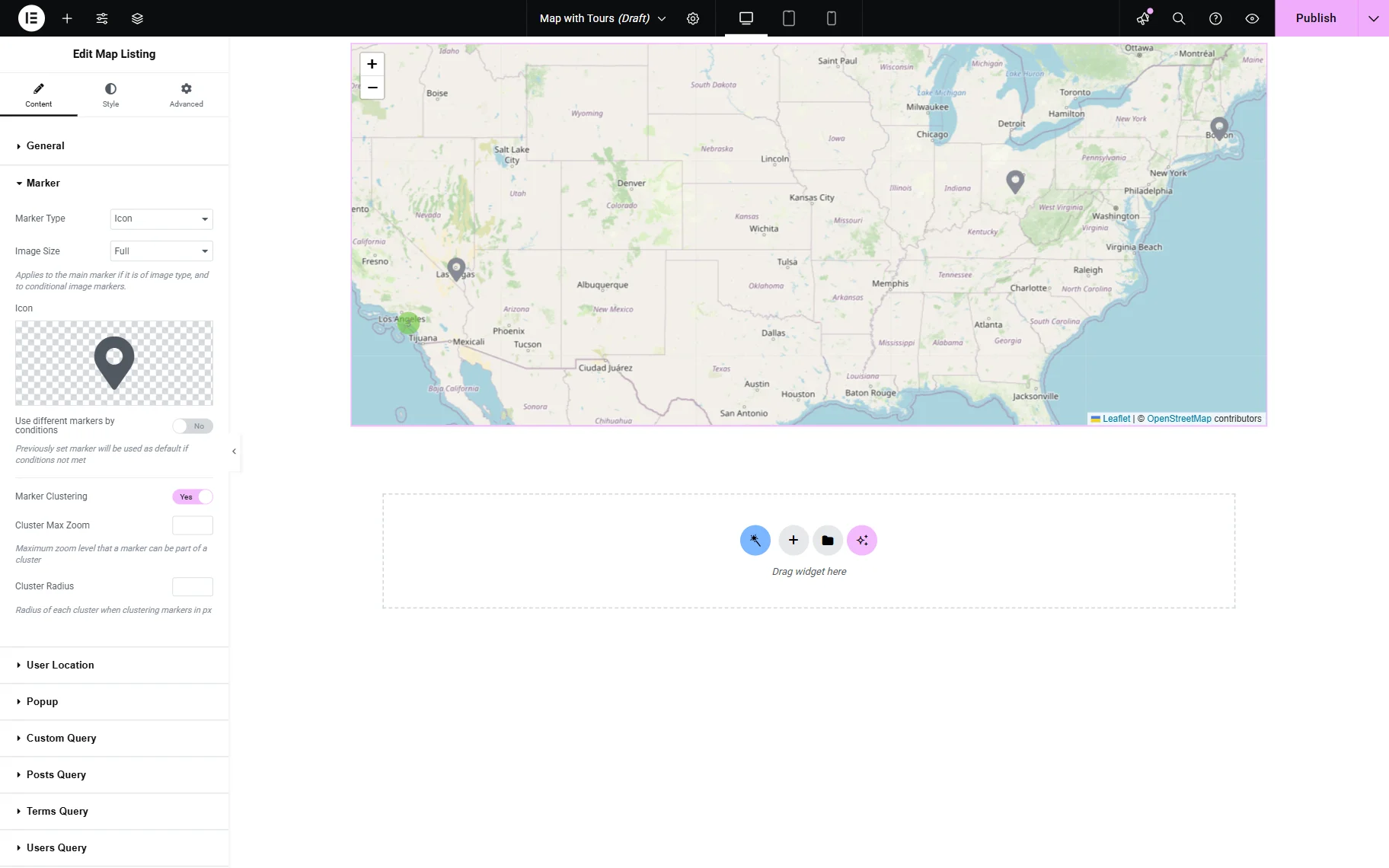
Marker Settings Section
Marker settings control how the markers look and function on the map. In Elementor, there are the following controls to check.
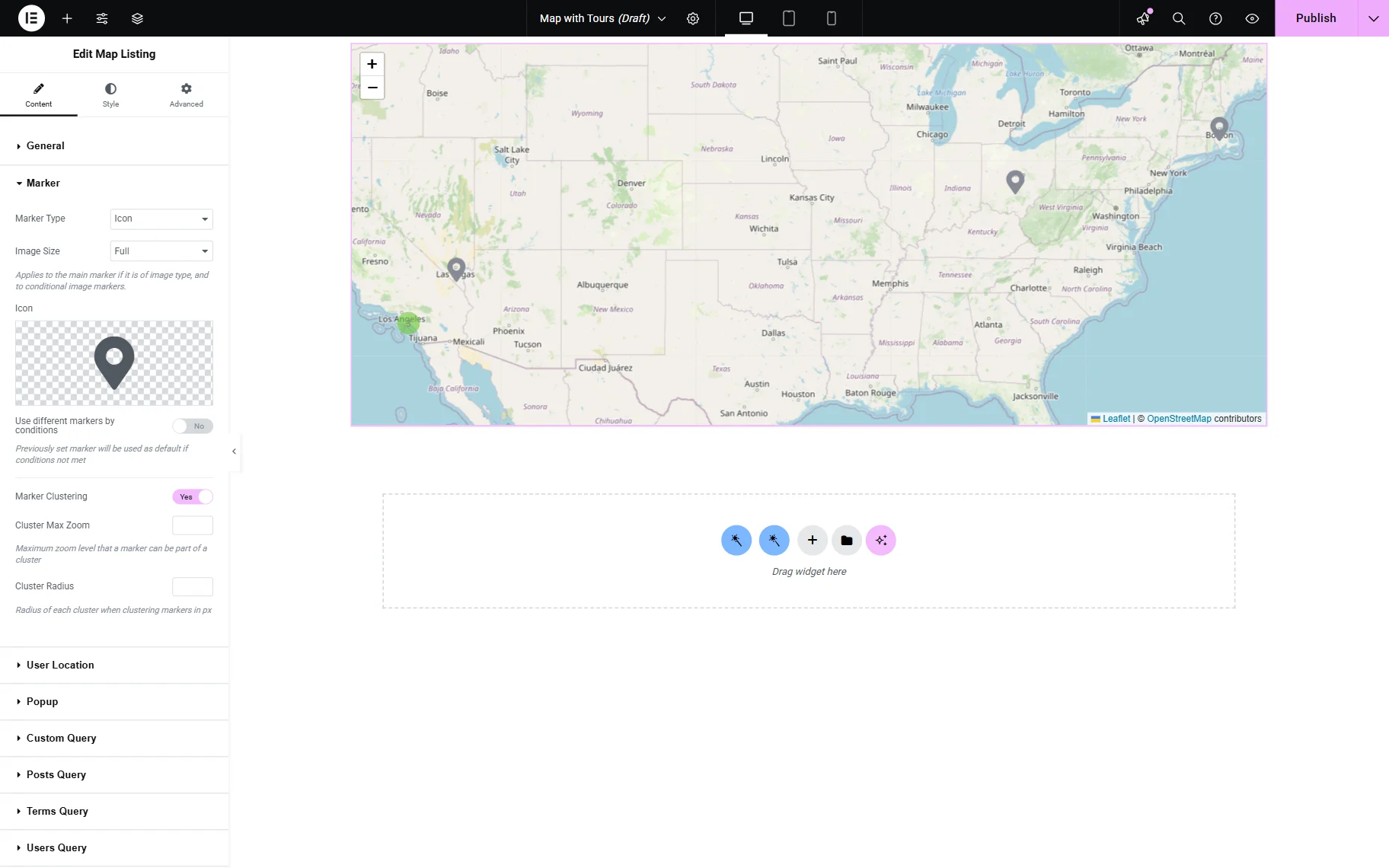
The settings are almost the same in Elementor and Gutenberg editors.
Marker type
Various markers can be placed on the map:
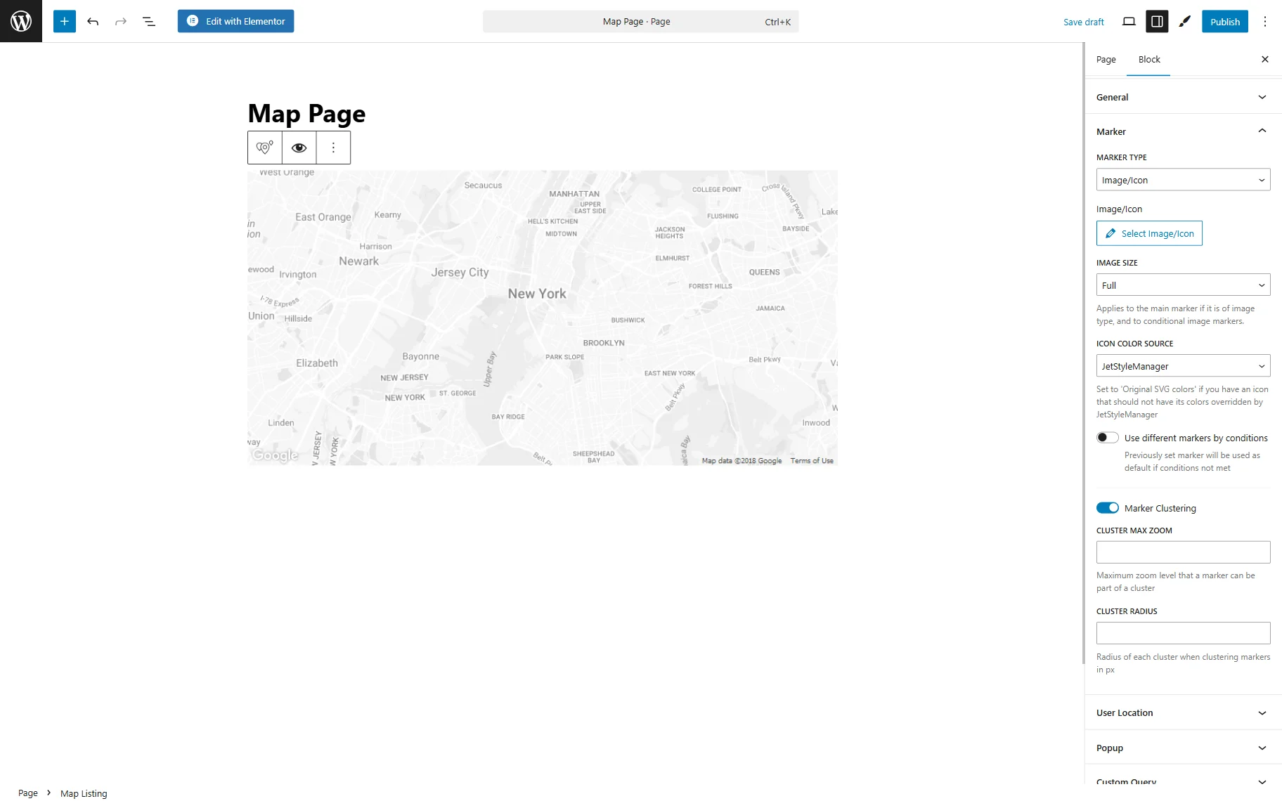
Image/Icon. It can be any image or icon from the Media Library. In Elementor, the icon from the Icon Library can be selected. In Gutenberg, only the SVG (or other) file can be uploaded. If this Marker Type is picked, all markers will look the same.
Text. This option adds the Marker Label drop-down menu, where the text source can be selected. The available options are:
- Post Title — a title of the CPT item;
- Meta Field — a meta field which name should be selected as Meta Field or completed in the Or enter meta field key bar;
- Static Text — all the addresses will be marked with the exact text written to the Marker Label bar;
- Custom Content Type Field — a meta field from Custom Content Type (CCT) that can be selected in the Field setting. This setting is available if the “Custom Content Types” module is enabled in the Modules tab of the WordPress Dashboard > JetEngine > JetEngine directory.
In Gutenberg for all the Marker types, one can also select the ICON COLOR SOURCE: “JetStyleManager” or “Original SVG colors”. The second option should be selected if you have a custom icon and don’t want the JetStyleManager to override the colors of your icon.
The “Text” Marker Type also has a Callback drop-down menu and a Customize output toggle. Callback allows choosing the type of desired data, and if output customization is activated, it enables adding custom text before and after the value (represented by “%s”).
Dynamic Image (from meta field). Unlike the “Image” type, this option allows setting the picture that changes according to the CPT item. The meta field with the images stored should be selected in the Meta Field drop-down menu, or its name should be entered into the Or enter meta field key bar.
Custom Content Type Dynamic Image. This option is activated by the “Custom Content Types” feature in the Modules tab of the settings. It works similarly to the “Dynamic Image” option, but with CCT meta fields.
Use different markers by conditions
Conditions can set different markers for the items. If this toggle is enabled, the settings chosen in previous fields will be used as the default. When the additional conditions are met, the marker changes. The “Add Item” button should be pressed to choose how and on what conditions the marker will change.
- Marker Type — is similar to the general Marker Type option, but only the “Image” and “Icon” variants are available. After selecting, the custom Image or Icon can be set. The “Icon” option contains additional settings:
- Apply Icon Color to — a dropdown menu, which allows choosing how the icon will be filled with a color:
- Fill — fills the icon with the adjusted color;
- Stroke — applies the adjusted color to the outline (stroke) of the icon only;
- Both — applies the adjusted color to both the fill and the stroke of the icon;
- Keep SVG colors — retains the original colors defined in the SVG file, ignoring any adjusted color settings.
- Dynamic Icon Color — a bar that allows applying a dynamic color from a custom field. For that, a shortcode or macro should be generated. More details are described in the How to Set Icon Color Dynamically in Maps Listing tutorial.
- Apply Icon Color to — a dropdown menu, which allows choosing how the icon will be filled with a color:
- Apply this marker if — a dropdown that allows selecting a dynamic condition for an image or icon:
- Meta field is equal to value — applies a marker set in the repeater item if the value of the specified Meta Field is equal to the specified Field Value;
- Post has term — applies a marker if a post has a specified term. For this condition, the Taxonomy slug and Term name, slug or ID should be entered;
- Dynamic color not empty — a condition that works with the Dynamic Icon Color option.
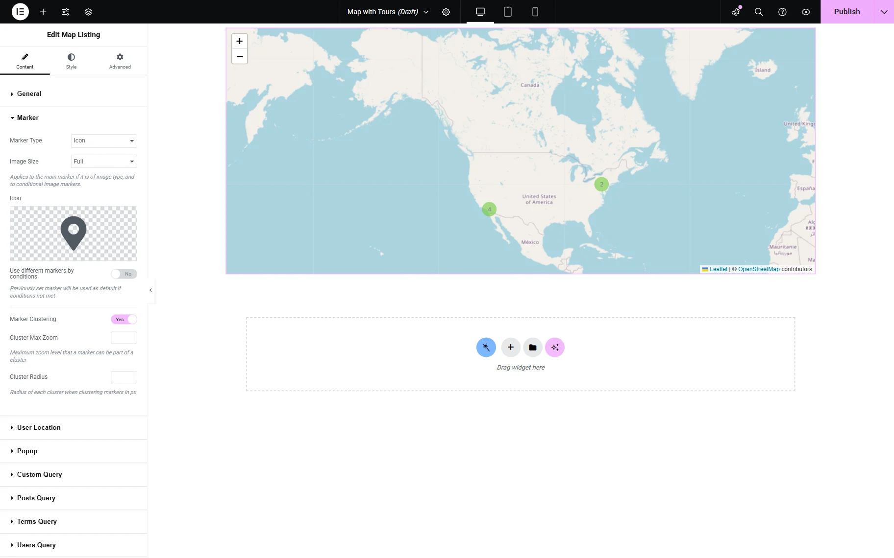
Marker clustering
If the map appears cluttered with numerous items, this toggle can be activated to group all markers into convenient clusters. Also, once activated, the Cluster Max Zoom and Cluster Radius features can be activated.
User Location Settings Section
The following tab is titled User Location. It allows the user’s location to be displayed on the map.

Gutenberg includes the same settings as Elementor. Initially, one toggle, Enable User Location Marker, is presented. When activated, the following field is shown:
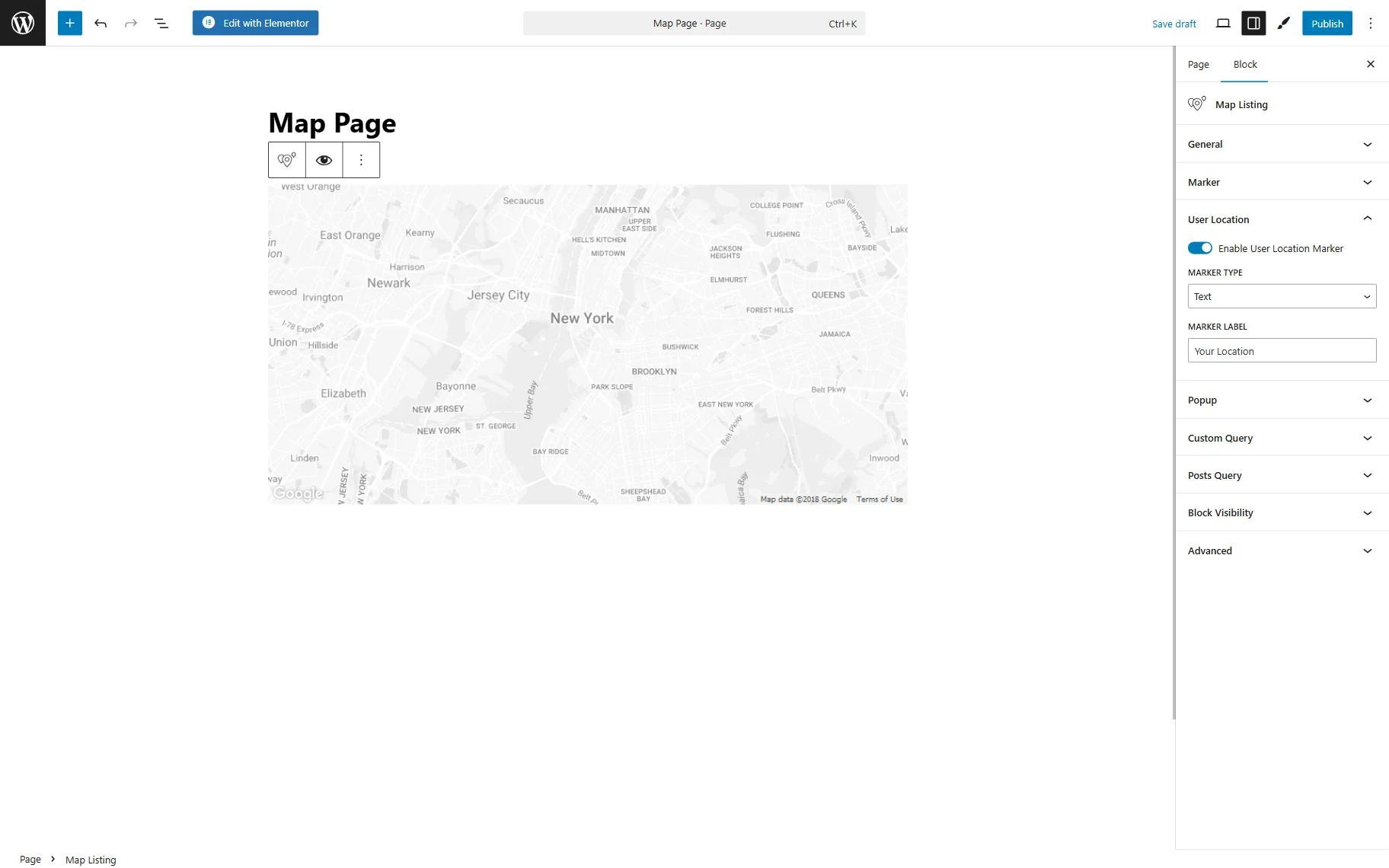
- Marker Type — a dropdown field allowing to select the type of the user geolocation marker. Depending on the selected option, various settings are presented.
If the “Text” Marker Type is selected, one can adjust the following setting field:
- Marker Label — the label that will be displayed as the marker of the user’s geolocation.
If one selects the “Image” option, the next settings are available:
- Image — the image that will be shown as the marker of the user’s geolocation;
- Image Size — the size of the image shown as the marker.
If the “Icon” option is selected, one can customize the following settings:
- Image Size — the size of the icon shown as the marker;
- Icon — the icon that will be shown as the marker of the user’s geolocation.
Popup Settings Section
The markers are shown in the pop-ups. In this section, some of the pop-up settings can be defined.
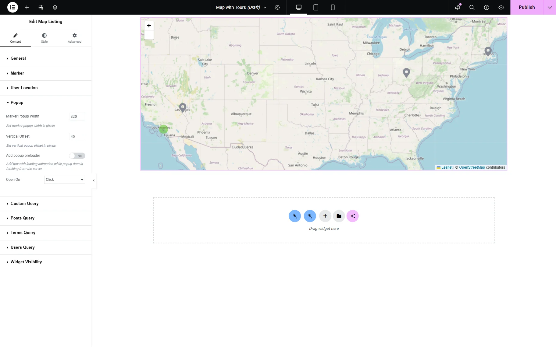
Gutenberg offers the same pop-up settings as Elementor:
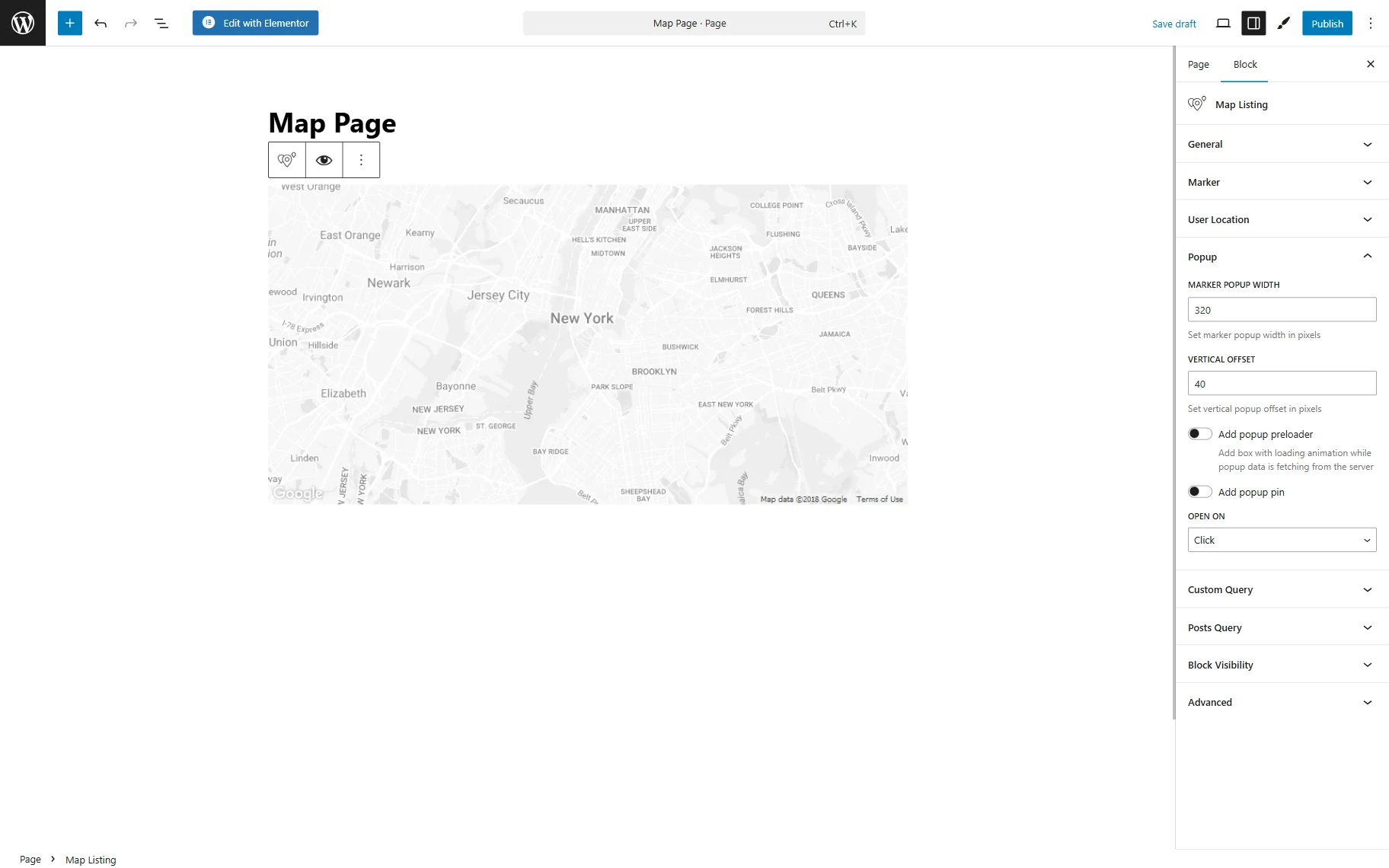
- Marker Popup Width — a field that defines the width of the pop-up window;
- Vertical Offset — a distance between the marker and pop-up in pixels;
- Add popup preloader — a toggle that enables adding the loading animation to the pop-up window;
- Add popup pin — a switcher that appears only if the “Google Maps” Map Provider is selected and adds a triangle-shaped pin to the pop-up;
- Open On — a drop-down menu to pick the opening event for a pop-up. It can be activated by “Click” or “Hover.”
Custom Query Settings Section
In Elementor, there is one toggle that can be enabled in this section.

The same toggle is displayed in Gutenberg:
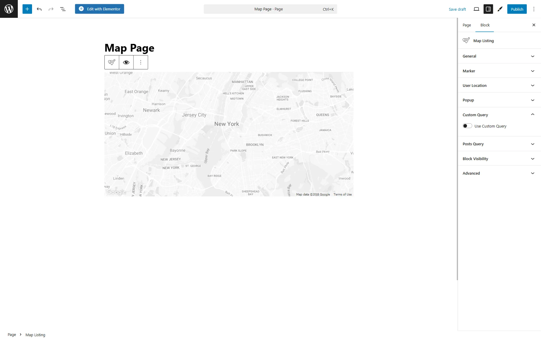
- Use Custom Query — a switcher that enables a custom query for a listing; it can be built beforehand with the Query Builder. When activated, the Custom Query should be picked.
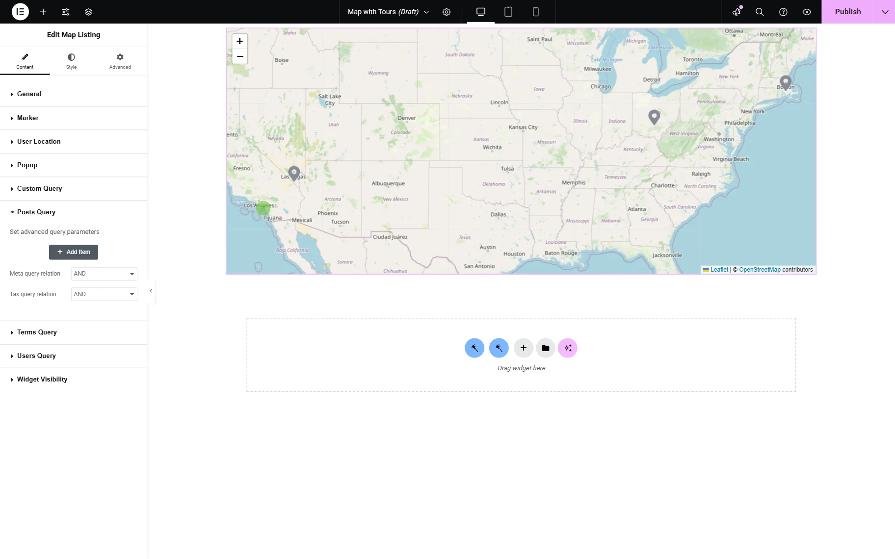
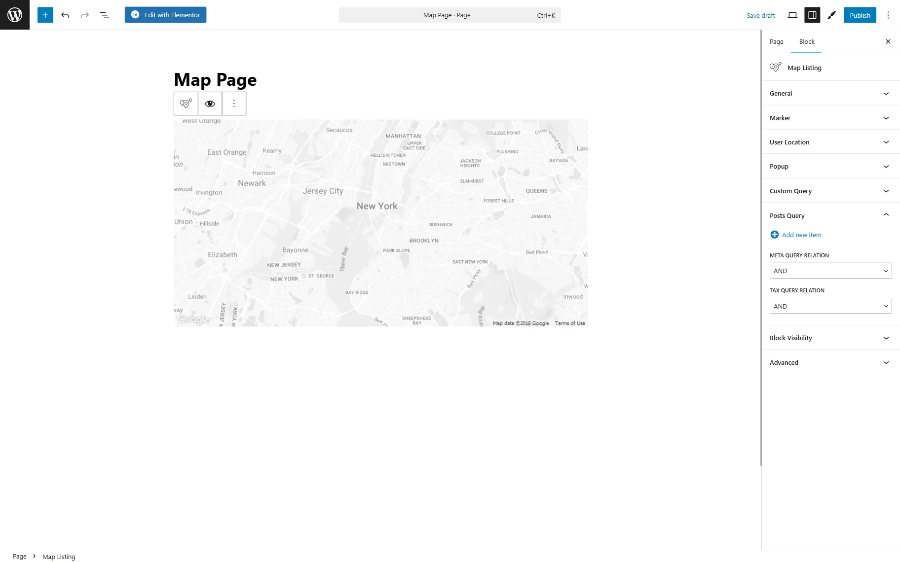
Posts Query Settings Section (Legacy)
The Posts Query settings enable users to filter the posts of the chosen Custom Post Type and display only those that meet the specified conditions.
The same settings can be customized in the Block Editor.
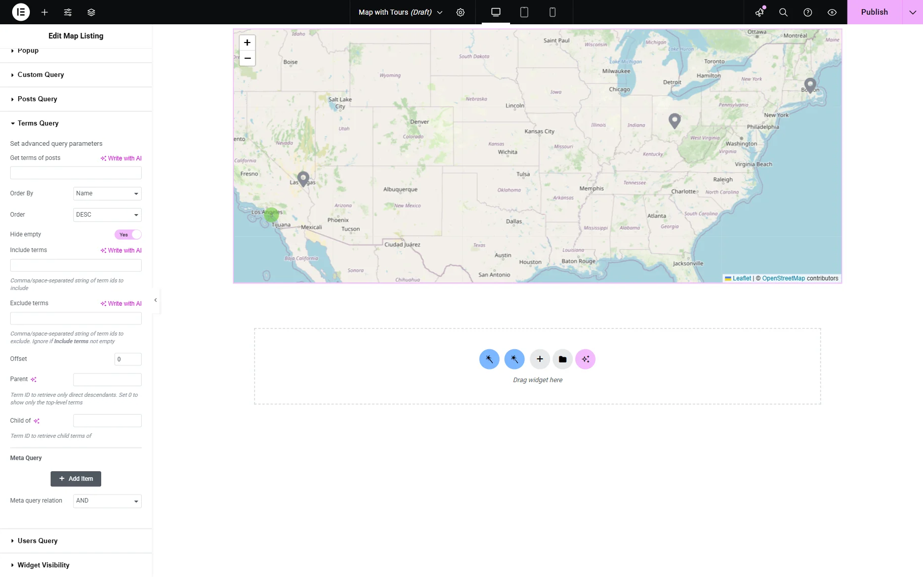
Terms Query Settings Section (Legacy)
The following Terms Query section is accessible only in Elementor. It can be used to display content depending on WordPress taxonomies.
Users Query Settings Section (Legacy)
The content concerning WordPress users can be received with the help of the next Users Query section. This section is also unavailable in the Block Editor.

Content Types Query (Legacy)
The settings of this query are hidden in the corresponding “Query Settings” button.
The settings include Offset, Status, Order, and Query.

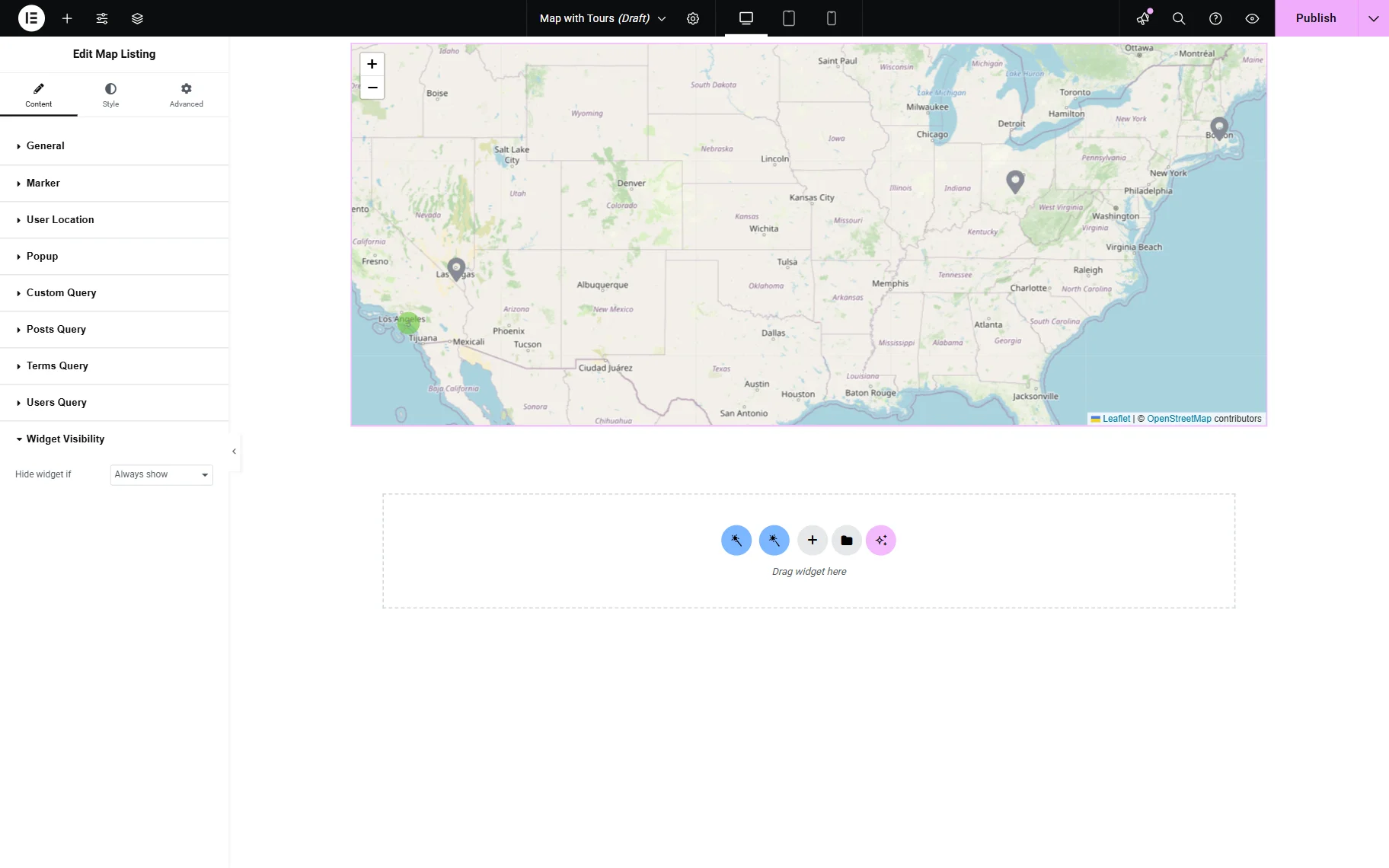
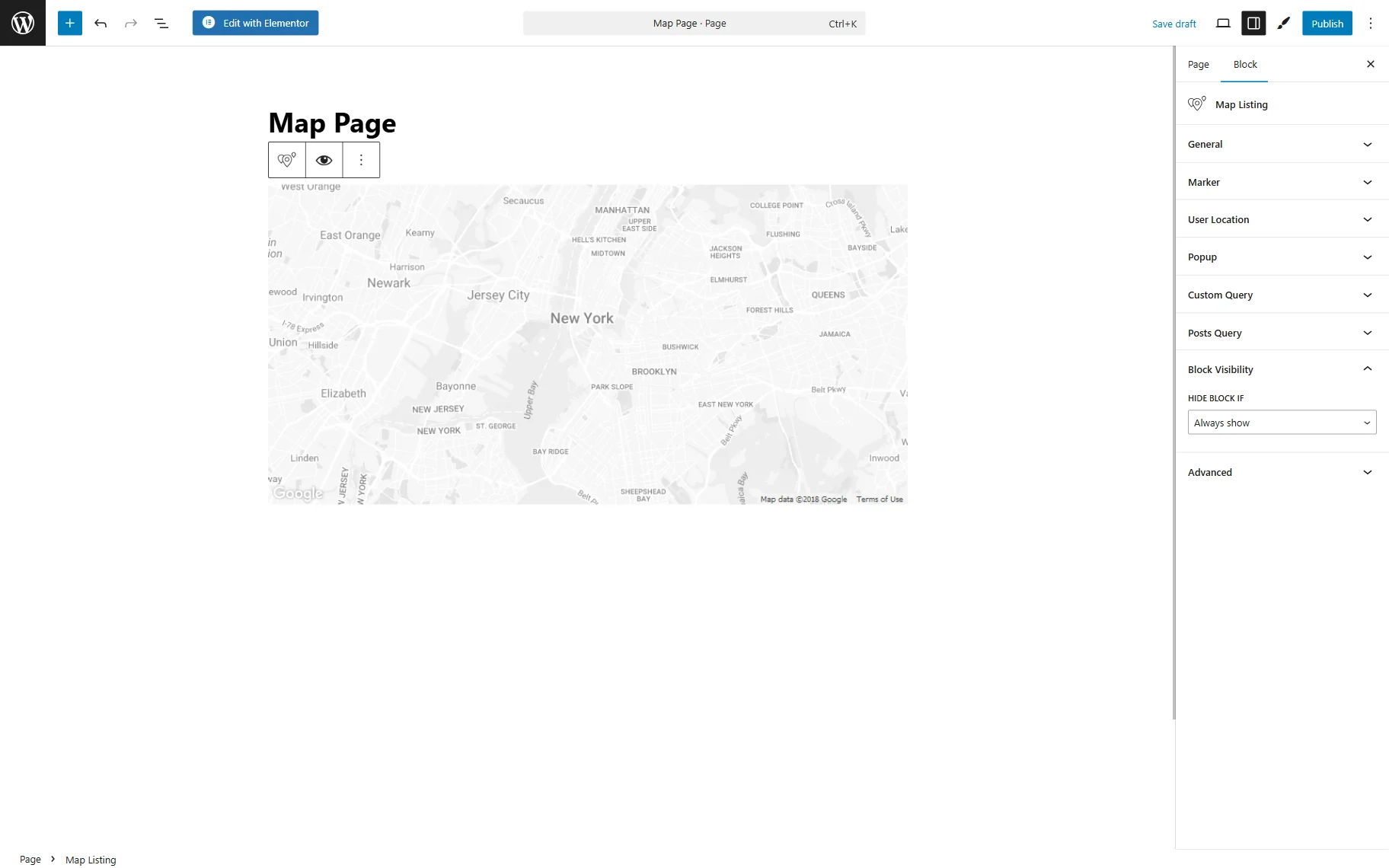
Widget/Block Visibility Settings Section
The last section in Elementor’s settings is Widget Visibility, where the widget can be hidden if the query is empty or set to always be displayed.
In Gutenberg, Block Visibility is presented accordingly.
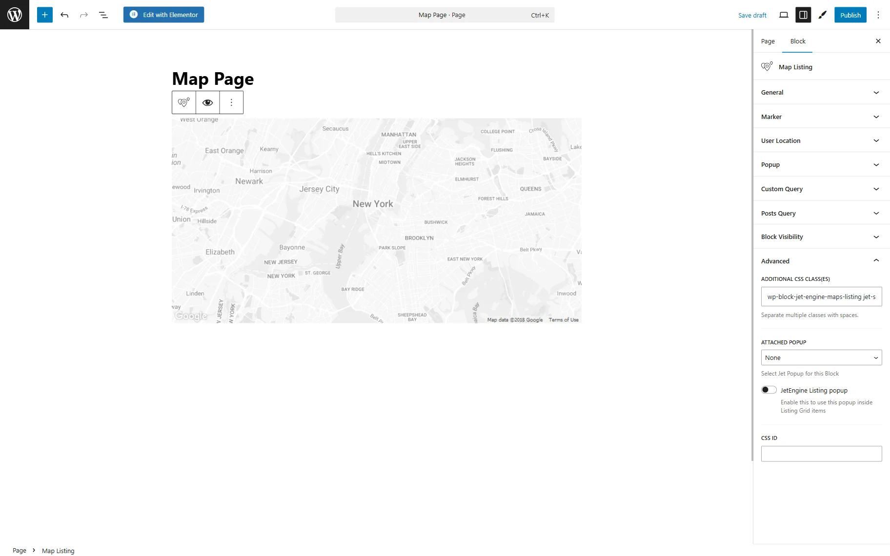
Advanced Settings Section
Moreover, the marker can be styled in Elementor’s Style settings section. In Gutenberg, one can adjust the CSS class in the Advanced section.
Here, the CSS class can be pasted to style the Map Listing block. A free JetStyleManager plugin can also be installed and activated to access additional style settings (this feature is only compatible with the Block Editor).
The block-style settings can be opened by pushing the brush-shaped button.
Once ready, the “Publish” button should be pressed.
That’s all about the Map Listing block/widget available with the JetEngine plugin for WordPress.