Need to display a lot of statistical information dynamically, and looking for the best WordPress chart plugin? JetEngine provides an effective solution for creating highly dynamic graphs for WordPress sites. The Dynamic Charts Builder tool lets you dynamically build charts and visualize data directly from your database.
In this article, I will focus on JetEngine’s Dynamic Charts Builder module, explore its features and benefits, and introduce you to practical use cases or provide insights into new ways to use dynamic charts. Let’s have a closer look now.
What Is Dynamic Charts Builder?
Let’s start from the basics. Dynamic Charts Builder is a JetEngine feature that allows you to create interactive, data-driven charts in WordPress without writing custom code. It is designed to visualize dynamic data pulled in real-time from your website databases and APIs, including posts, Сustom Post Types, meta fields, taxonomies, users, and even custom SQL queries. This makes it a powerful tool for building dashboards, reports, and analytics-style interfaces directly on the front end of a website. Charts can be displayed using Elementor, WordPress Block Editor, or Bricks, and styled to match the overall site design.
With Dynamic Charts Builder, you can visualize both simple records, for example, post counts or numeric meta fields, and complex datasets, such as summarized values, grouped data, or results from custom database queries. This flexibility makes it suitable for a wide range of use cases — from basic content statistics to advanced business reporting.
Let’s have a look at the main features of the Dynamic Charts Builder:
- No code required – charts can be created and adjusted via an internal dashboard, without writing JavaScript or PHP.
- Multiple data sources – build charts using posts, Custom Content Types, meta fields, taxonomies, relations, or SQL Query Builder results.
- Automatic data updates – charts refresh dynamically when the underlying data changes, ensuring up-to-date information.
- Various chart types – display data using bar, line, pie, doughnut, and other chart formats, according to your needs.
- Advanced data processing – group, sum, count, or average values to create meaningful comparisons and trends.
- Frontend-ready dashboards – embed charts into pages, templates, or user dashboards using popular page builders and a customizable widget.
- Styling and customization options – adjust labels, legends, colors, and layouts to fit your design and UX requirements.
Why Choose Dynamic Charts Builder?
Transforming your WordPress data into visual, interactive charts that are easier to read, interpret, and act on, Dynamic Charts Builder addresses the challenge of presenting complex information in a clear, easy-to-perceive way.
One of the main reasons to choose Dynamic Charts Builder is its tight integration with JetEngine’s data organization. Instead of exporting data to third-party tools or relying on external scripts, you can work directly with posts, meta fields, relations, and custom SQL queries inside WordPress. This keeps your data centralized and your workflows simpler, so you don’t need any external tools to make the dynamic chart work.
Another key advantage is flexibility without complexity. Dynamic Charts Builder is a ready-to-use solution that also provides space for customization. You can start with basic charts — such as post counts by category — and gradually move to advanced scenarios such as aggregated sales data, yearly comparisons, or user-specific profiles, all using the same toolset.
Dynamic Charts Builder is also a strong choice when you need real-time or frequently updated data. Any changes to the underlying data are reflected automatically, without manual updates or reconfiguration.
Top 5 Dynamic Chart Use Cases
In this article, I will focus on more advanced practical cases. Some of them can be applied to the WooCommerce website, others to the booking system, and others are not tied to the specific site structure and can be used wherever needed.
How to get the post count when the checkbox options are selected
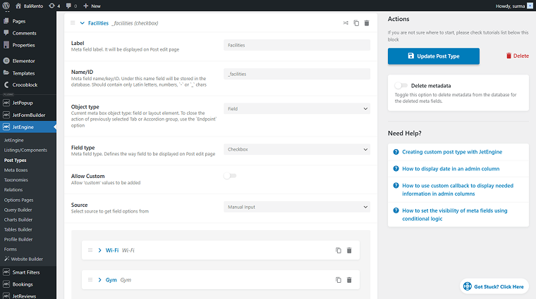
To begin with, I will create a dynamic chart to display the checkbox field’s options and the number of posts that match them.
First, I need the Custom Post Type prepared with the checkbox field with options.
💡 In this case, I use the BaliRento dynamic template. Crocoblock provides Dynamic Templates as a ready-up solution for various use cases, including booking systems. These templates are fully functional cheat sheets that can be installed in a couple of minutes and customized to your needs. Dynamic Templates is a good option for users who want to create a site themselves, with all the features, templates, and widgets in the correct place.
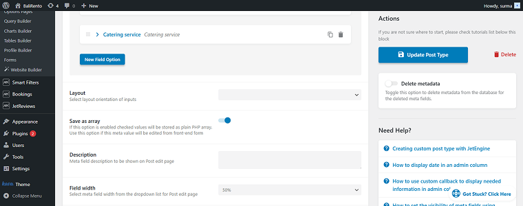
Ensure that the Save as Array toggle is enabled. Otherwise, the query won’t be able to process the checkbox values. If it wasn’t enabled before creating posts and selecting options in your checkbox metafield, you will need to reselect the options in each post and resave them to ensure the correct values are stored in the database.
Proceed to the Query Builder and add a new SQL Query. Enable the Advanced/AI mode toggle and add the following code to the SQL Query input:
SELECT 'Wi-Fi' AS option_name, COUNT(*) AS posts_count
FROM {prefix}postmeta
WHERE meta_key = '_facilities'
  AND meta_value LIKE '%Wi-Fi%'

UNION ALL

SELECT 'Gym', COUNT(*)
FROM {prefix}postmeta
WHERE meta_key = '_facilities'
  AND meta_value LIKE '%Gym%'

UNION ALL

SELECT 'Dining Area', COUNT(*)
FROM {prefix}postmeta
WHERE meta_key = '_facilities'
  AND meta_value LIKE '%Dining Area%'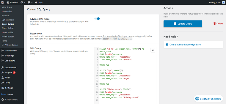
In my case, the checkbox is named “_facilities” and has options such as “Wi-Fi,” “Gym,” and “Dining Area.” Here, label and value are the same, but if you write the value in lowercase in SQL, we should first set up the label, then the value. Each option should be added manually by repeating the UNION ALL block. Save the query.
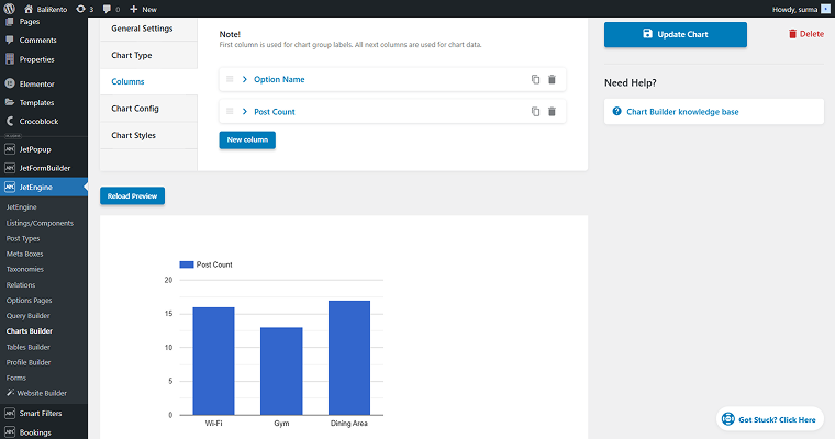
Now, open the Charts Builder and add a new chart. Set the Name and choose the query you have just created in the Data Query field, and click the “Re-fetch Data” button.

Select the desired Chart Type. I use the “Columns” option. Proceed to the most important part of the Dynamic Chart setup — Columns.
Choose the “Fetched Column” as a Data Source and select the available column (“option_name” in my case).

Add new columns with the “Fetched Column” and select another column you need to show in the chart — “post_count” in this case.
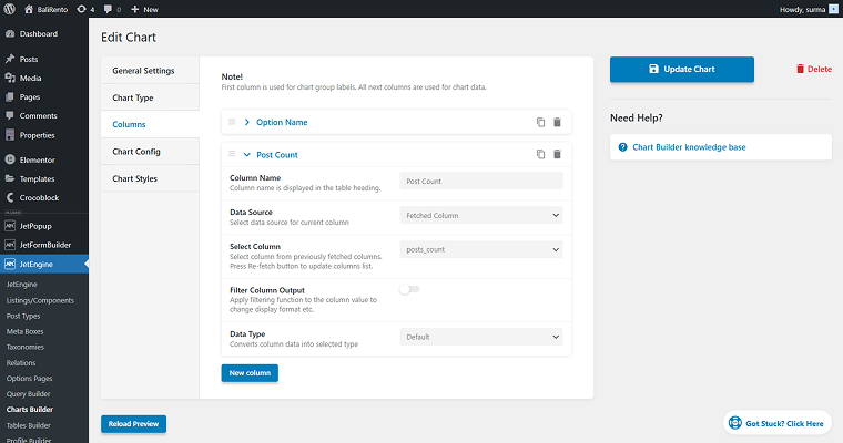
You can preview a chart you are getting by clicking the “Reload Preview” button.
Save the changes and move to the page where you need to display the chart. Add the Dynamic Chart widget and select the one you have just created.
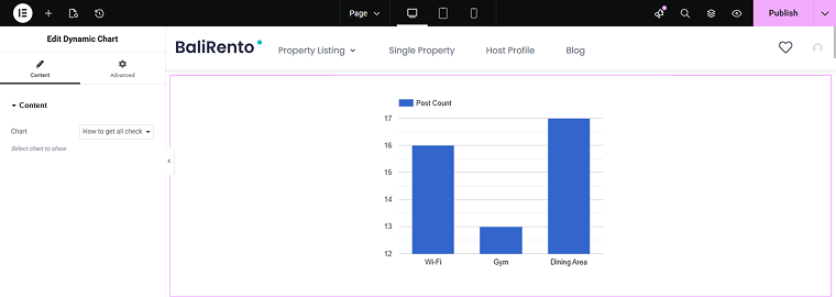
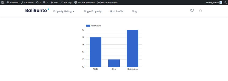
Publish the changes and check the front page — the dynamic chart displays the number of posts for each checkbox option.
How to get a list of terms with the post count
Now, let’s see how to display a post count for the terms list through the dynamic chart. So, in this case, I have a Post Type created and a taxonomy with terms applied to the posts.
💡 For this usage scenario, I use the Findero dynamic template.
Now, let’s create the SQL query. Add one in the Query Builder and add the following code:
SELECT
  t.name AS location,
  COUNT(p.ID) AS property_count,
  AVG(CAST(pm.meta_value AS DECIMAL(10,2))) AS avg_price
FROM {prefix}posts p
INNER JOIN {prefix}term_relationships tr
  ON p.ID = tr.object_id
INNER JOIN {prefix}term_taxonomy tt
  ON tr.term_taxonomy_id = tt.term_taxonomy_id
INNER JOIN {prefix}terms t
  ON tt.term_id = t.term_id
LEFT JOIN {prefix}postmeta pm
  ON p.ID = pm.post_id AND pm.meta_key = '_apartment_price'
WHERE p.post_type = 'properties'
  AND p.post_status = 'publish'
  AND tt.taxonomy = 'location'
GROUP BY t.term_id
ORDER BY t.name ASC;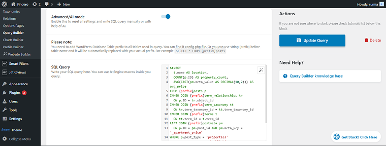
Save the query and proceed to the Dynamic Charts Builder. Add the chart name and add the query you have just created. Don’t forget to click the “Re-fetch Data” button.
Set the Chart’s type and proceed to the Columns settings. Enter the Column Name and select the “Fetched Column” Data Source, choose the needed column (“location” in my case). Add one more column with similar settings.
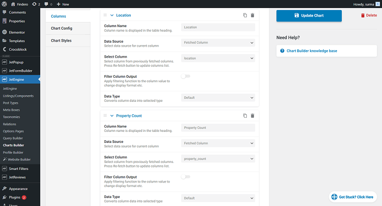
Finish style settings and save the chart. Go to the page where you need to display the chart, then add the Dynamic Chart widget. Select the chart you created and publish the changes.
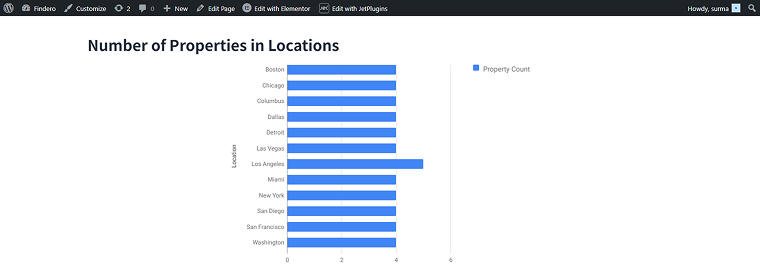
Now we have a list of terms and see how many posts are attached to each term.
How to get the minimum and maximum prices per day for booking items
This case provides a solution for the booking system that displays the minimum and maximum prices per day for the booking items. In this case, I use the BaliRento dynamic template.
JetBooking creates a price field to store the per-day price for each item. Our purpose is to retrieve these values and compare them.
Start with the SQL query. Add the following code to the query:
SELECT day_name,
       MIN(price) AS low,
       MAX(price) AS high
FROM (
    SELECT 'sun' AS day_name,
           CAST(SUBSTRING_INDEX(
                 SUBSTRING_INDEX(pm.meta_value, 's:3:"sun";a:2:{s:5:"price";i:', -1),
                 ';s:6:"active"', 1) AS UNSIGNED) AS price
    FROM wp_postmeta pm
    INNER JOIN wp_posts p ON p.ID = pm.post_id
    WHERE pm.meta_key = 'jet_abaf_price' AND p.post_status = 'publish'

    UNION ALL

    SELECT 'mon',
           CAST(SUBSTRING_INDEX(
                 SUBSTRING_INDEX(pm.meta_value, 's:3:"mon";a:2:{s:5:"price";i:', -1),
                 ';s:6:"active"', 1) AS UNSIGNED)
    FROM wp_postmeta pm
    INNER JOIN wp_posts p ON p.ID = pm.post_id
    WHERE pm.meta_key = 'jet_abaf_price' AND p.post_status = 'publish'

    UNION ALL

    SELECT 'tue',
           CAST(SUBSTRING_INDEX(
                 SUBSTRING_INDEX(pm.meta_value, 's:3:"tue";a:2:{s:5:"price";i:', -1),
                 ';s:6:"active"', 1) AS UNSIGNED)
    FROM wp_postmeta pm
    INNER JOIN wp_posts p ON p.ID = pm.post_id
    WHERE pm.meta_key = 'jet_abaf_price' AND p.post_status = 'publish'

    UNION ALL

    SELECT 'wed',
           CAST(SUBSTRING_INDEX(
                 SUBSTRING_INDEX(pm.meta_value, 's:3:"wed";a:2:{s:5:"price";i:', -1),
                 ';s:6:"active"', 1) AS UNSIGNED)
    FROM wp_postmeta pm
    INNER JOIN wp_posts p ON p.ID = pm.post_id
    WHERE pm.meta_key = 'jet_abaf_price' AND p.post_status = 'publish'

    UNION ALL

    SELECT 'thu',
           CAST(SUBSTRING_INDEX(
                 SUBSTRING_INDEX(pm.meta_value, 's:3:"thu";a:2:{s:5:"price";i:', -1),
                 ';s:6:"active"', 1) AS UNSIGNED)
    FROM wp_postmeta pm
    INNER JOIN wp_posts p ON p.ID = pm.post_id
    WHERE pm.meta_key = 'jet_abaf_price' AND p.post_status = 'publish'

    UNION ALL

    SELECT 'fri',
           CAST(SUBSTRING_INDEX(
                 SUBSTRING_INDEX(pm.meta_value, 's:3:"fri";a:2:{s:5:"price";i:', -1),
                 ';s:6:"active"', 1) AS UNSIGNED)
    FROM wp_postmeta pm
    INNER JOIN wp_posts p ON p.ID = pm.post_id
    WHERE pm.meta_key = 'jet_abaf_price' AND p.post_status = 'publish'

    UNION ALL

    SELECT 'sat',
           CAST(SUBSTRING_INDEX(
                 SUBSTRING_INDEX(pm.meta_value, 's:3:"sat";a:2:{s:5:"price";i:', -1),
                 ';s:6:"active"', 1) AS UNSIGNED)
    FROM wp_postmeta pm
    INNER JOIN wp_posts p ON p.ID = pm.post_id
    WHERE pm.meta_key = 'jet_abaf_price' AND p.post_status = 'publish'
) AS sub
GROUP BY day_name
ORDER BY FIELD(day_name, 'mon', 'tue', 'wed', 'thu', 'fri', 'sat', 'sun');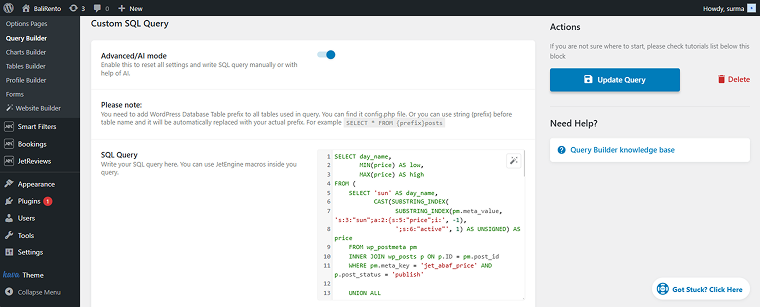
Save the query. In the Dynamic Charts Builder, add a new chart. Give it a name, then select the query you created. Choose the chart type, then proceed to the column settings.
Add one column with the “Fetched Column” Data Source and the “day_name” value, and two other columns — one for the minimum price, and another for the maximum price.
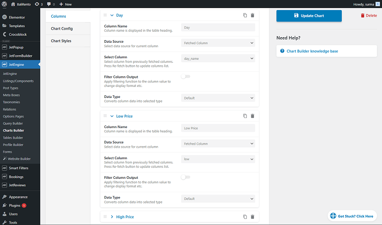
Set the styles and save the chart. Add it with the Dynamic Chart widget on the needed page and save the changes.
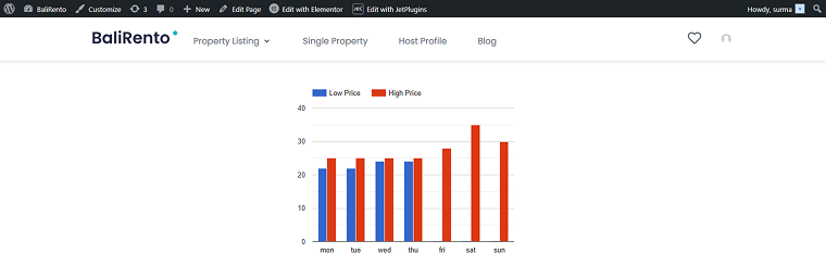
Thus, we get the price comparison graph for every weekday.
How to get total sales per day
This case can be a useful solution for the WooCommerce site, especially with the high turnover. This solution allows you to display statistical information on daily sales.
💡I use the Zolden dynamic template for this use case.
Start with the SQL query, and add the following code to it:
SELECT
  terms.term_id,
  terms.name AS category,
  SUM(
    CASE
      WHEN YEAR(posts.post_date) = 2024
      THEN CAST(order_itemmeta.meta_value AS DECIMAL(10,2))
      ELSE 0
    END
  ) AS total_2024,
  SUM(
    CASE
      WHEN YEAR(posts.post_date) = 2025
      THEN CAST(order_itemmeta.meta_value AS DECIMAL(10,2))
      ELSE 0
    END
  ) AS total_2025
FROM {prefix}posts AS posts
INNER JOIN {prefix}woocommerce_order_items AS order_items
  ON posts.ID = order_items.order_id
INNER JOIN {prefix}woocommerce_order_itemmeta AS order_itemmeta
  ON order_items.order_item_id = order_itemmeta.order_item_id
  AND order_itemmeta.meta_key = '_line_total'
INNER JOIN {prefix}wc_order_product_lookup AS product_lookup
  ON order_items.order_item_id = product_lookup.order_item_id
INNER JOIN {prefix}term_relationships AS rel
  ON product_lookup.product_id = rel.object_id
INNER JOIN {prefix}term_taxonomy AS tax
  ON rel.term_taxonomy_id = tax.term_taxonomy_id
  AND tax.taxonomy = 'product_cat'
INNER JOIN {prefix}terms AS terms
  ON tax.term_id = terms.term_id
WHERE posts.post_type = 'shop_order'
  AND posts.post_status IN ('wc-completed', 'wc-processing')
  AND YEAR(posts.post_date) IN (2024, 2025)
GROUP BY terms.term_id, terms.name
ORDER BY terms.name ASC;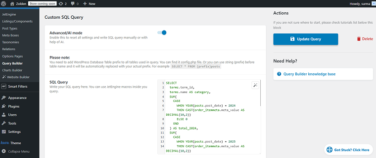
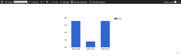
Save the query and use it as a Data Query in the new chart settings. Enter the Chart Name and click the “Re-fetch Data” button. Select the Query Type and open the Columns settings.
You need two Columns: one for the order date and one for the total sales.

Set up the styles and save the chart. Then you can add the chart to the required page using the Dynamic Chart widget. Thus, on the front, we get the report on the number of orders per day.
How to get the total revenue per product category
This solution might be useful for the internal reports for the eCommerce site, for example. Here, we are getting the total income in each category we sell.
Create an SQL query with the following code:
SELECT
    terms.name AS category_name,
    SUM(wc_order_product_lookup.product_qty * wc_order_product_lookup.product_net_revenue) AS total_revenue
FROM wp_wc_order_product_lookup AS wc_order_product_lookup
INNER JOIN wp_wc_orders AS wc_orders
    ON wc_orders.id = wc_order_product_lookup.order_id
INNER JOIN wp_term_relationships AS term_relationships
    ON wc_order_product_lookup.product_id = term_relationships.object_id
INNER JOIN wp_term_taxonomy AS term_taxonomy
    ON term_relationships.term_taxonomy_id = term_taxonomy.term_taxonomy_id
INNER JOIN wp_terms AS terms
    ON term_taxonomy.term_id = terms.term_id
WHERE term_taxonomy.taxonomy = 'product_cat'
    AND wc_orders.status IN ('wc-completed')
GROUP BY terms.term_id
ORDER BY total_revenue DESC;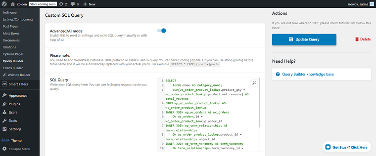
Save the query and add it to the Dynamic Charts Builder as a Data Query. Don’t forget to enter the chart’s Name and click the “Re-fetch Data” button.
After selecting the Chart Type, move to the Columns settings. Here, we need to retrieve two columns that were fetched — the category and total revenue.
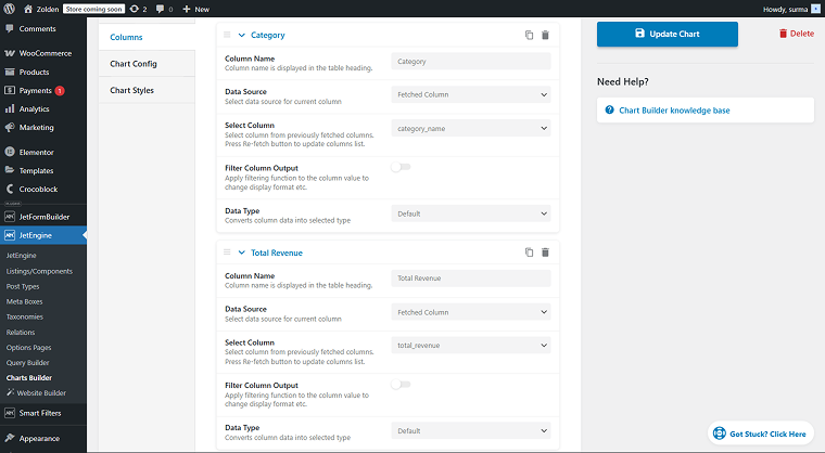
Finish the settings and save them. Add the Dynamic Chart widget to the needed page and publish the changes.
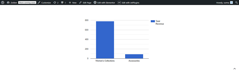
Here we can see how much we earned for each product category in a visually approachable way.
FAQ
Yes, you can. You can check the free versions of the popular plugins. You can check our plugin comparison article to find a perfect match. Otherwise, you can use custom code to build and customize the dynamic chart to meet your requirements. Read more about the codes for dynamic charts.
Yes. Dynamic Charts Builder supports data aggregation, including counting, summing, averaging, and grouping values. When using SQL queries, you have full control over how data is filtered, grouped, and ordered before it is visualized.
Yes. Charts are generated dynamically, so any changes to the underlying data — such as new posts, updated meta fields, or new orders — are reflected automatically without manual updates.
To Sum Up
After reading this article, you know the main features of the JetEngine’s Dynamic Charts Builder and what distinguishes it from other plugins on the market. Now you know about practical use cases, and I hope you got some fresh ideas for using dynamic charts.
I described cases applicable to any website type, such as showing counts by category or meta fields, building booking systems to compare the lowest and highest prices per day, and displaying statistics for WooCommerce sites.


