Looking for an effective way to display a lot of statistics?
For many people, visualization is the easiest way to perceive information. Instead of overloading your site with text descriptions, you can use charts, graphs, or diagrams to present large amounts of statistical information. Charts make it easier for users to understand the data and for you to organize it. If you are searching for a reliable graph plugin WordPress solution, Crocoblock provides several built-in tools.
In this article, I will present methods for creating static and dynamic charts, explore their differences, and provide a brief guide to choosing the most appropriate one for you.
Crocoblock offers the JetElements plugin, which serves as a full Elementor chart plugin with multiple visualization widgets, including Progress Bar, Line Chart, Circle Progress, Pie/Doughnut Chart, Bar Chart widgets, and the JetEngine Dynamic Charts Builder module. These tools allow you to build charts dynamically and visualize data directly from your database. Let’s have a closer look at each of them.
What’s the Difference Between Static and Dynamic Charts?
A static chart is one in which all values, labels, and data points are entered manually and remain unchanged unless you update them yourself. It doesn’t pull information from the database or respond to filters, queries, or user actions. Static charts are typically used to visualize fixed information – for example, predefined comparisons, performance summaries, or data that does not need to update automatically.
A dynamic chart automatically refreshes its data and visual display whenever the original data source is altered. Unlike static charts, these charts can access real-time data from databases, APIs, or specific fields, ensuring they always show the latest information.
The main difference between dynamic and static charts is the ability to refresh data automatically. For instance, you have a geographical chart and want to add new countries or delete some: a static chart will not update until you enter the changes directly in the widget. In contrast, a dynamic chart will refresh instantly to display the updated info. Both approaches are supported by the Crocoblock ecosystem, which provides a complete WordPress plugin toolkit for charts and graphs.
Where You Need Charts: Niches and Practical Scenarios
Using the charts or graphs, you are covering the following main purposes:
- Simplifying the perception of difficult or voluminous information – converting data into a visual format that is easier to understand.
- Highlighting trends – showing how values change over time or across categories.
- Comparing data – allowing users to visually compare multiple items, groups, or segments.
- Summarizing information – presenting complex datasets in a simplified, digestible form.
- Spotting patterns and insights – helping users immediately see relationships, outliers, or anomalies.
- Communicating results – providing a clear way to share statistics, progress, or performance indicators.
- Improving decision-making – supporting business or user decisions with visual evidence rather than raw numbers.
Keeping in mind all of the listed purposes and capabilities, you can apply the charts in almost any sphere of business on your site. Here are some ideas for graph implementations:
- fitness progress charts;
- school or course statistics, general or students’ progress;
- hotel occupancy charts;
- donation progress for organizations;
- WooCommerce sales charts;
- real estate market comparison;
- portfolio/project progress;
- online learning dashboards.
And of course, you can customize diagrams to your particular case. You can even structure hierarchical data by combining these tools as a WordPress plugin for an organization chart.
Create Static Charts
Let’s start with static charts you can build with Crocoblock tools. JetElements is a versatile charts plugin that WordPress site builders use to display static values beautifully. It works as an Elementor chart plugin, providing all essential widget types out of the box. The JetElements plugin offers the following widgets for Elementor:
- Progress Bar;
- Line Chart;
- Bar Chart;
- Circle Progress;
- Pie/Doughnut Chart.
I’ll look through each widget to examine its features, give you a brief description, and determine which solution best suits your needs. These tools provide a solid foundation if you are looking for the best WordPress chart plugin for visual statistics.
Progress Bar widget for Elementor
The first way to showcase important data is to use the Progress Bar widget. This widget is great for showing any kind of progress. For instance, you can easily tell your site visitors about your achievements, present the results as a percentage or another form of value, and do so in the most appealing way.
Let’s imagine you are responsible for the government website, specifically an educational page. A new program to attract English-speaking foreign volunteers has been launched. Native speakers already work in 64% of the country’s educational institutions.
You have to display the results on your website. With the options in this widget, you can design bars that perfectly match your entire interface.

There are different types of progress bars that you can choose from. They differ in the position of the Title, Icon, and Percentage, which can be inside, above, or on the right of the bar itself, so you can modify the styles accordingly to your site’s requirements.
Moreover, the bar animates, so once you open the page, the status bar moves from left to right.
📚 Read also: How to Use Progress Bar and Circle Progress Widgets
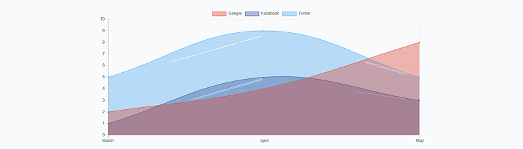
Line Chart widget for Elementor
Another effective way to visualize data is by using the Line Chart widget. This widget is ideal for illustrating how values change over time or across categories. It helps you present trends, comparisons, and performance indicators in a clean, easy-to-read format.
Imagine you are building a dashboard for a fitness center. Throughout the year, the number of active members varies with the season. With the Line Chart widget, you can display monthly membership growth, compare attendance peaks, or highlight performance cycles directly on your website.
This widget lets you fully customize the chart’s appearance to match your overall design. You can define multiple datasets, add labels, adjust axes, and fine-tune every detail from line thickness and fill options to tooltips and grid visibility.
You can also control the chart’s behavior. For example, you can enable animations so the line gradually appears once the page loads, making the data more engaging. If you work with several metrics – such as new members, cancellations, or class attendance – you can add multiple lines to compare them visually on a single graph.
Whether you’re working on business analytics, educational dashboards, booking statistics, or portfolio performance reports, the Line Chart widget gives you a structured and visually appealing way to share dynamic or static data with your audience.
Bar Chart widget for Elementor
Instead of setting up various sections to highlight differences in different aspects, you can use the Bar Chart widget, which provides this feature directly.
The widget is designed to showcase discrete data points or categories, particularly when large numbers are involved. The Bar Chart is a great solution for comparing results.
Let’s imagine you have to compare pasta production in tons in different countries.

The Bar Chart widget is highly flexible and offers a range of settings, allowing us to experiment with the chart’s layout and find the best one to meet the user’s needs. At the same time, it’s quite easy to adjust the settings and select whether the chart should be vertical or horizontal, whether the grid lines should be shown or hidden, etc.
📚 Read also: Bar Chart Widget Overview
Circle Progress widget for Elementor
The Circle Progress widget allows you to display not only percentages but also absolute values. Why is it so unique? Single-circle progress is made up of tiny details, and the good thing is that you can style and adjust each of them.
If you need to show how much progress has been made and how much remains, the Circle Progress widget is a good choice. It clearly shows whether the result was fully achieved.
If you want to display the number of people between 20 and 30 years old who use different social networks, you can use this widget.

The Circle Progress widget is a handy tool because it includes several settings that let you quickly adjust it and make it visually appealing. It’s an easy way to display information and make your website more engaging.
It is also helpful if you need to show the progress of a task or fill in a field.
📚 Read also: How to Use Progress Bar and Circle Progress Widgets
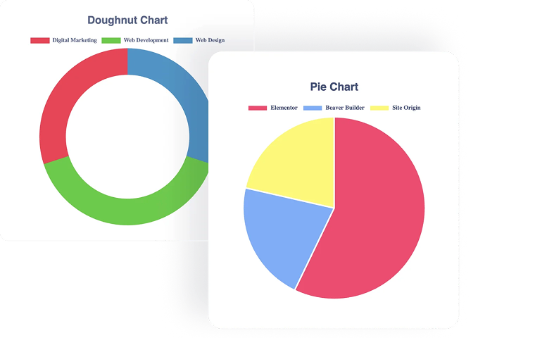
Pie/Doughnut Chart widget for Elementor
Displaying the statistics is as easy as pie with a Pie Chart widget. Here, you can make each section a different color and display the information above, below, or on hover.
The Pie Chart widget is the easiest way to show parts of a whole in WordPress and give your visitors a holistic view that remains visually understandable.
The Cutout Percentage option lets you turn a pie chart into a doughnut chart.
The Pie Chart widget can be one of the most eye-catching elements on your site, thanks to its clean layout and versatile settings. You can enrich it with tooltips, set the height and animation duration, select the best-fitting colors, etc.
The result will impress you, and the widget can be the cherry on the pie of your website.
📚 Read also: How to Create a Doughnut Chart and How to Use Pie Chart Widget
How to create a static chart?
Let’s have a closer look at the process of creating a static chart:
- Go to your site’s Dashboard.
- Make sure the JetElements plugin is installed and activated.
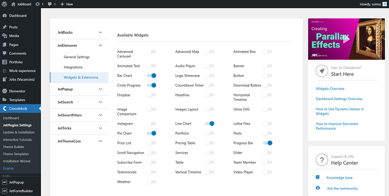
- Open the Crocoblock Dashboard > JetPlugins Settings > JetElements > Widgets & Extensions, and ensure that the needed widgets are enabled among the Available Widgets.
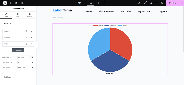
- Add a new page or post.
- Select the type of chart or graph widget and add it to the page.
- Specify the correct data, select the color, size, and other parameters of the chart.
Create Dynamic Charts
Crocoblock provides two ways to create charts dynamically: using the Dynamic Charts Builder, which makes JetEngine a powerful graph WordPress plugin for advanced data visualization, and adding dynamic behaviour to some JetElements’ widgets. Both methods enable you to dynamically build charts based on queries, fields, or user behavior. Let’s have a closer look at the settings.
💡 By the way, if you are interested in more advanced dynamic charts building using code, check our article on the top ways to create interactive dynamic charts.
JetEngine’s Dynamic Charts Builder
With the Dynamic Chart Builder, you can create the following types of charts:
- Bar;
- Line;
- Area;
- Pie;
- Donut;
- Bubble;
- Stepped Area;
- Candlestick;
- Histogram;
- Columns;
- Scatter;
- Geo.
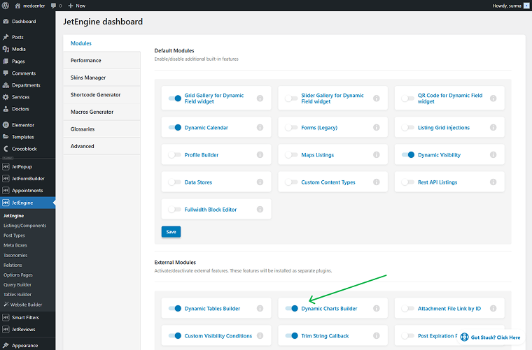
First, activate the Dynamic Charts Builder module in WordPress Dashboard > JetEngine > JetEngine > Modules > External Modules.
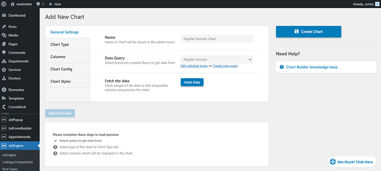
Afterward, navigate to the Dynamic Charts Builder page and create a new chart. On the General Settings tab, you can name the chart and define the Custom Query that provides its data.
You can choose your preferred dynamic chart type within the Chart Type tab.

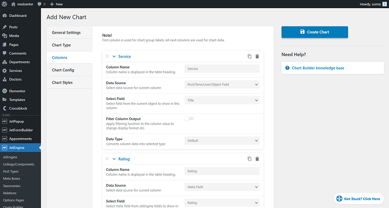
In the Columns tab, you can choose what data should be displayed.
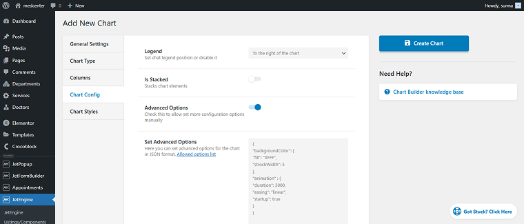
In the Chart Config section, you can customize the chart’s appearance and behavior, including options for the legend position, stacking, and advanced settings via JSON for detailed adjustments.
In the Chart Styles tab, you can adjust the width and set the height for the chart in pixels.
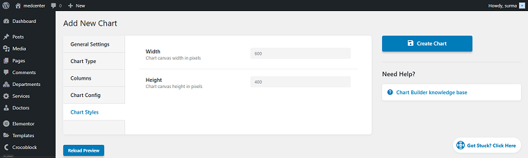
Save the settings, then go to the page where you need to display the chart and add the Dynamic Chart widget. Select the chart you created.
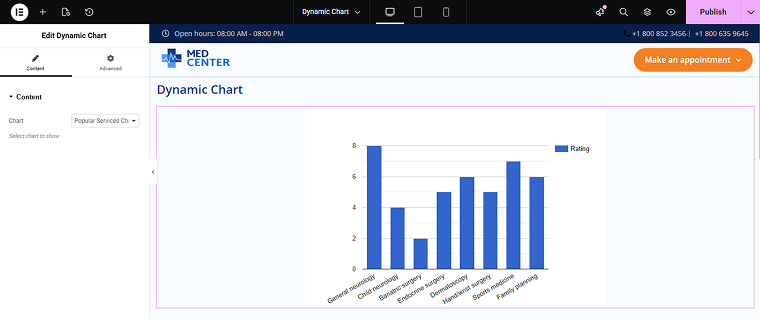
After publishing the changes, you can see a dynamic chart on the front end that displays statistics for service posts, making JetEngine a strong candidate for the best WordPress chart plugin for data-driven websites.

Adding dynamic behavior to JetElements’ widgets
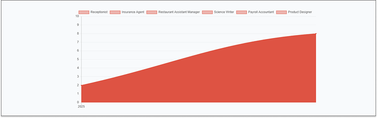
Additionally, Bar and Line Charts from JetElements can be set either as static or as dynamic charts. Here you can check how to set the Bar Chart widget. In this article, let’s see how to make the Line Chart widget dynamic.
First, we need a custom query prepared. In this case, I use the Posts Query to return the most popular jobs.
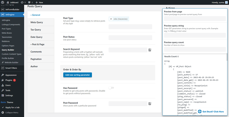
Navigate to the page where you need to display the chart, then add the Line Chart widget. Move to the Use JetEngine Query toggle and enable it.
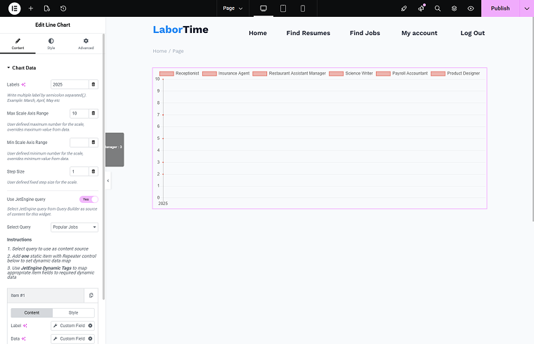
Consequently, we can access the 2025 post-job ratings statistics, and any alterations to these ratings will be shown in the flowchart on the WordPress front-end pages.
Which Method to Choose?
So, which way to select in your particular case? Let’s examine the aspects you need to pay attention to when choosing the best solution.
- Type of data. If your data is static data and values that rarely change, use static charts. If you use dynamic data and values stored in CPTs, CCTs, WooCommerce, or other sources that are updated regularly, use dynamic charts with JetEngine queries.
- Update frequency. If you’re comfortable updating values yourself, static charts work well. If data should refresh automatically, choose dynamic charts.
- Desired chart style. Both JetElements and JetEngine support different visual formats. Choose based on your needs:
- Line Chart – perfect for trends over time;
- Bar Chart – useful for comparing categories;
- Pie/Doughnut Chart – ideal for illustrating parts of a whole;
- Progress Bars / Circle Progress – great for completion rates or KPIs.
- Data source. When no database connection is needed, choose a static widget. If it requires CPT/CCT/forms/bookings data, choose a dynamic chart with Query Builder.
- Data complexity. If you work with simple values such as progress, percentages, and small datasets, use static widgets. When working with complex datasets (multiple fields, relations, time series), use dynamic charts. More structured datasets may resemble use cases for a WordPress plugin organization chart, which dynamic charts can handle efficiently.
- Interactivity and filtering. If no filtering is needed, a static chart is sufficient. If filtering with JetSmartFilters is required, choose dynamic charts so users can interact with the data.
- Maintenance expectations. Dynamic charts automatically handle ongoing data changes. If you need high-control editing, static charts allow fully manual fine-tuning.
- Performance requirements. If you work with large data volumes, dynamic charts with optimized queries will be the way to go. If you have lightweight visuals, static charts load faster and require fewer resources.
Understanding the details listed for your case will help you select the best-fitting solution.
FAQ
Yes, dynamic charts work with JetSmartFilters. You can apply filters to your datasets (e.g., date ranges, categories, authors, product types), and the charts will adjust accordingly.
Static charts have almost no performance impact. Dynamic charts may require optimized queries if your dataset is large, but caching and lightweight queries keep them efficient.
To Sum Up
Charts and graphs are among the most valuable tools for presenting large amounts of data to users. They are an effective solution if the site needs to display changeable numbers or extensive data. With a well-configured WordPress plugin for charts and graphs, even complex data becomes easy to present.
Fortunately, there are ready-made tools to create them. You need to add information, choose a style and hints, and look at the result. Whether you need simple statistics or a flexible flowchart plugin for WordPress, Crocoblock covers both.
You can add dynamic and static graphics to your website or keep one. It depends on how much information you want to add.
After reading this article, you know the difference between static and dynamic graphs, the kinds of static and dynamic charts, and how to create them with the Crocoblock plugins. I hope it helped you understand how to select the chart for your particular project. Together, JetElements and JetEngine provide features expected from the best chart plugin for WordPress.

