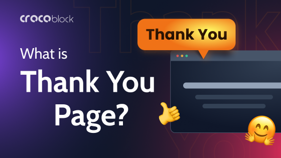
A “Thank You” page is often treated like an afterthought – just a polite confirmation after a user completes an action. But in reality, it can do much more than just say “thanks.”
Whether a user made a purchase, signed up for a newsletter, or submitted a form, the Thank You page is your chance to continue the conversation.
In this article, we’ll walk through seven creative ideas you can implement to upgrade your Thank You page from a dead end to a powerful UX and marketing asset. So keep reading.
Why Customize Your Thank You Page?
From a technical point of view, the Thank You page may seem like just a final route in the user flow. But in terms of user experience and business strategy, it’s a key moment of engagement.
Here’s why it makes sense to customize it:
- Keep the user journey going. Instead of ending the session, use this page to guide users to the next logical step – whether it’s exploring more products, signing up for something else, or sharing your service.
- Increase user trust and brand value. A personalized or thoughtful Thank You page shows users that you care about their experience. This small UX detail can boost brand perception.
- Upsell or cross-sell. It’s the perfect low-pressure place to suggest relevant products, upgrades, or premium features – while the user is still engaged.
- Collect more data. You can ask for quick feedback, run a micro-survey, or encourage users to complete their profile – all without extra pop-ups.
- Encourage sharing or referrals. Happy users are more likely to share their experience. Smart customization can include social share buttons or referral invites.
In short, this one page can support retention, boost conversions, and even drive new traffic – if you build it with purpose.
How to Customize a Thank You Page: 7 Creative Ideas
1. Add a personalized video message
Text-based confirmation is fine. But adding a short video message takes it to the next level. It could be the founder welcoming the user, a team member explaining next steps, or even a simple animated thank-you message.
Why it works: Video builds trust and increases time on page. When users see a real face, it humanizes the brand.
Developer tip:
Use lightweight embeds (e.g., YouTube with no ads to hide distractions or Loom with autoplay off). You can also set conditional rendering for personalized videos based on UTM tags or user roles.
2. Show a time-limited offer
If you’re in eCommerce or SaaS, you’ve probably already seen how effective urgency-based upsells can be. The Thank You page is a low-resistance place to offer a limited-time discount, free trial extension, or one-click add-on.
Why it works:
Users are still emotionally committed after making a purchase or signing up. A time-based CTA leverages that momentum.
Developer tip:
Implement a countdown timer using JavaScript and localStorage/sessionStorage to prevent refresh abuse.
3. Suggest the next best action
The Thank You page shouldn’t be the end of the line. Think of it as a “checkpoint” – the perfect place to nudge users toward another meaningful step. For example:
- read a related blog post;
- book a free onboarding call;
- download a toolkit or app.
Why it works:
Contextual suggestions reduce bounce rate and increase user satisfaction.
Developer tip:
Use conditional logic (e.g., based on the product they purchased or the form they submitted) to render content modules dynamically. If you use WordPress, try ACF or JetEngine for this task.
4. Invite users to share or refer
After completing an action, many users will be happy to share it – they just need a nudge. Add social sharing buttons or a referral invite block with pre-filled messages and one-click copy.
Why it works:
Low-friction social proof spreads awareness organically.
Developer tip:
Use libraries like react-share or custom share URLs.
5. Collect quick feedback
The best moment to ask for feedback? Right after the user has done something. On the Thank You page, they’re still mentally present and more likely to give genuine answers.
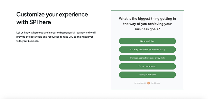
Why it works:
Feedback at this stage can be more insightful than a later NPS pop-up.
Developer tip:
Keep it simple – one question form via AJAX. Store in a lightweight backend or send it to Google Sheets via a webhook.
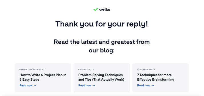
6. Recommend useful content
If you’re running a content-heavy product, blog, or academy, the Thank You page can help you showcase value immediately. For example:
- “You signed up for a course – here’s a starter video.”
- “You bought Product X – here’s a how-to guide.”
Why it works:
Improves onboarding and reduces confusion or buyer’s remorse.
Developer tip:
Use tagging or product metadata to match content recommendations. Pull in dynamic content via API, RSS, or even WordPress hooks.
7. Add a touch of surprise
Add a bit of play – something the user didn’t expect. A hidden bonus, such as an animation, mini-game, or coupon, can leave a lasting impression. You can create it with the JetPopup plugin.
Why it works:
Delight leads to memorability. Even something small can generate positive emotions and shares.
How to Choose the Right Ideas for Your Thank You Page
Not every idea will be a good fit for your product or users. The smartest approach is to first understand the purpose of this page in your specific flow. For some businesses, it’s all about building trust after a sign-up. For others, it’s a chance to increase order value right after purchase. Once you define what the user should do next, the right customization becomes much easier to choose.
User context plays a big role, too. Someone who just signed up for a free trial is likely in a different mindset than someone who bought a physical product or submitted a contact form. In each case, their expectations are different – and so should be your Thank You page. Try to meet them where they are, instead of pushing a generic message that doesn’t move the journey forward.
There’s no need to roll out all ideas at once. In fact, a good starting point is choosing just one or two enhancements and testing them. Add a personalized video, a one-question feedback form, or a content block – then monitor how users engage with it. Tools like Google Analytics, Hotjar, or even basic event tracking can help you understand what works and what doesn’t.
And finally, keep in mind that a Thank You page is still part of your user experience – not a billboard. Avoid turning it into a noisy wall of CTAs. Choose one main goal for the page, and make sure everything else supports that goal, not competes with it. A clean, focused page with one smart addition is often far more effective than trying to do everything at once.
FAQ
It’s always up to you. Technically, a basic “Thanks, we got your message” works. But from a UX and business perspective, you’re missing a key opportunity. Users are still engaged at that point – customizing the page allows you to guide them, deepen the connection, or even drive more conversions with minimal effort.
Absolutely, especially if you’re adding CTAs, upsells, or personalized flows. Even small changes – like switching from a static message to a video – can impact engagement.
As a rule of thumb: one primary CTA, one supporting idea (like a video or bonus), and clean design. Avoid overwhelming users with too many options.
Conclusion
The Thank You page might seem like a small part of your website, but it’s actually a powerful moment to deepen your connection with users. So think of it as a chance to keep the conversation going.
Remember, the best customizations come from understanding your users and your goals.
Start small, pick one or two ideas that fit your flow and tech stack, and test how they perform. Don’t overload the page with too many options; keep it simple and focused.
With thoughtful tweaks, your Thank You page can become a quiet but effective conversion booster, making users feel appreciated and guiding them further down your funnel.